Job marketplace mobile app design
Bere Studios
Project overview
Florence is a marketplace that helps power the healthcare workforce across the UK. When I worked with Florence, my focus was on improving the experience for current users as these users will be key in helping with the businesses continued growth; The aim for the solutions I worked on were to help reduce a growing churn rate.
The process
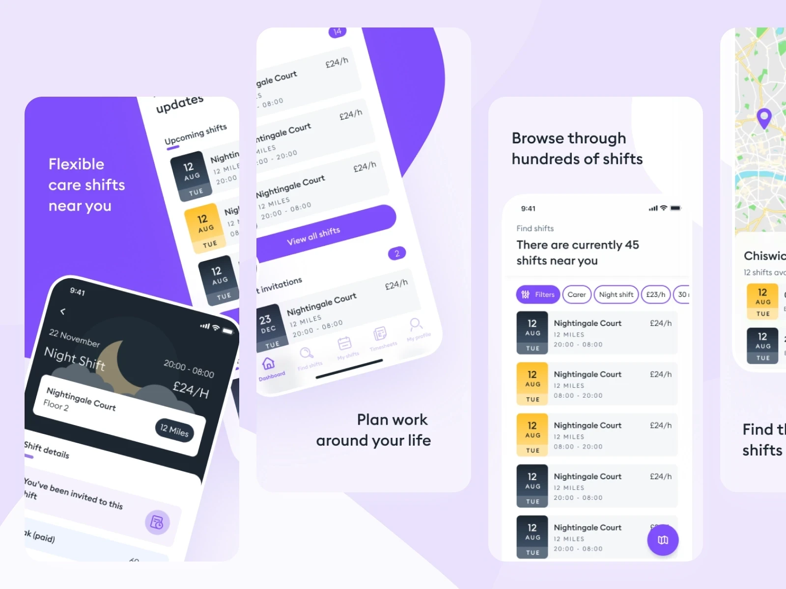
After carrying out some interviews with users of the Florence flex app, I was able to Identify 3 key pain points for exisiting and previous users that had led to them either leaving the app inactive for more than 30 days or deleting thier accountsShift visibility - Users were judging shifts just from the thumbnails and not going further to read, so the question was how would we bring some of this information forward.Shift applications - Users didn't want to over commit to shifts so usually would hold back applying for multiple shiftsUnavailable shifts - Users complained about shifts not being available after topping on notifications to apply or view.
Ideation
We ran a number of ideation and prioritisation sessions to see how we could solve these problems and ultimately came out with a prioritised list of problems and potential solutions that we worked through over the subsequent 6 months between other urgent project work. Each of the following were released as A/B tests until they had a positive impact and were rolled out to 100% of users.
01 - Shift Visibility
As mentioned users were visiting the app going through the list of shifts but not clicking into shifts to view more details as often as possible; The downside to this was users were missing out on shifts that were potentially perfect for them but were simply just utilising the date time and location to make their decision. After researching a number of different competitors and market places, I was able to identify that a key way to bring this information forward and increase the click through rate on the app was to utilise tags on the shifts. these would be unique aspects of shifts that users often wanted to be made aware of such as 'Early Applicant' ' Shift Role' 'High Approval Chance' and more
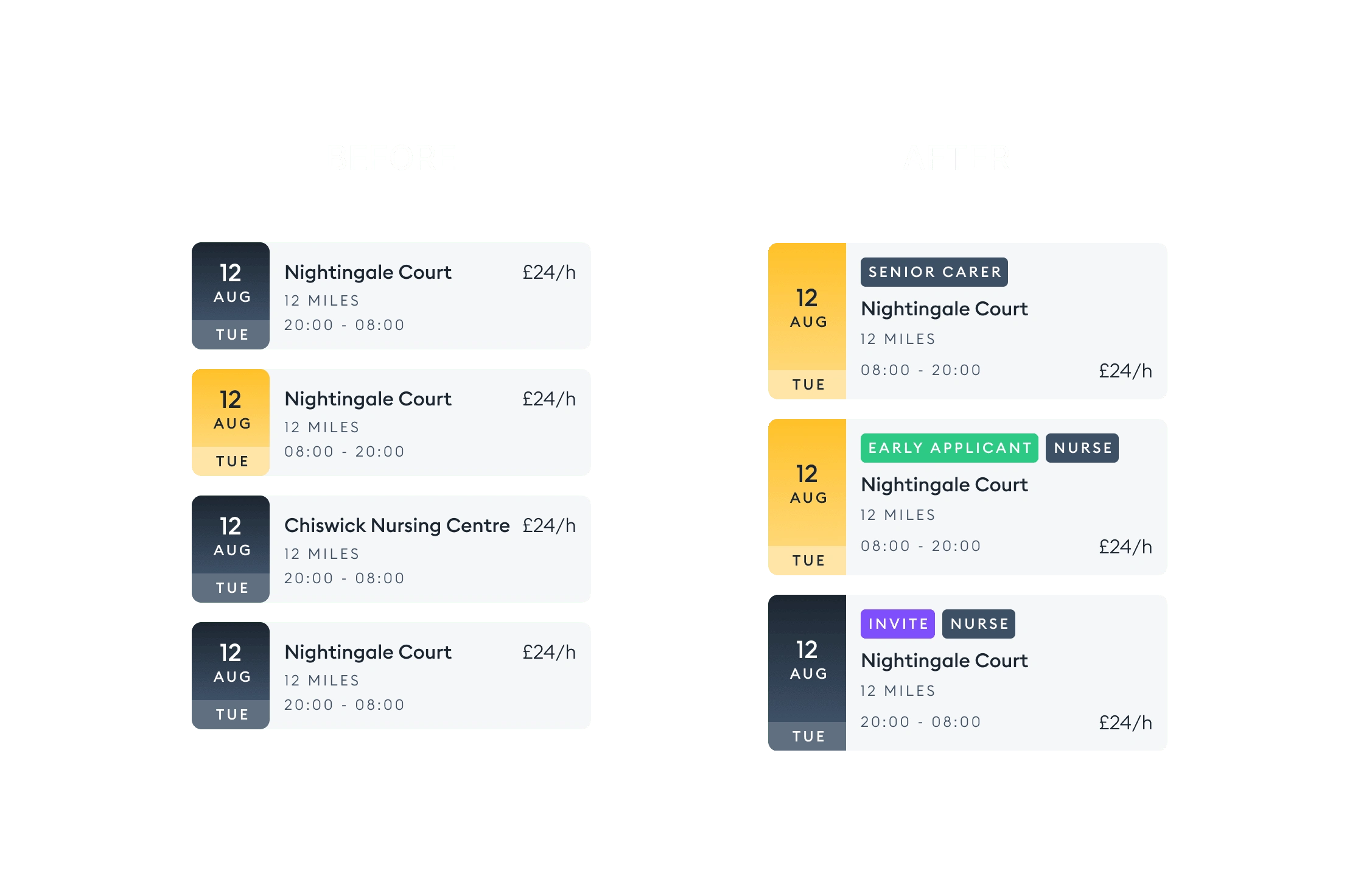
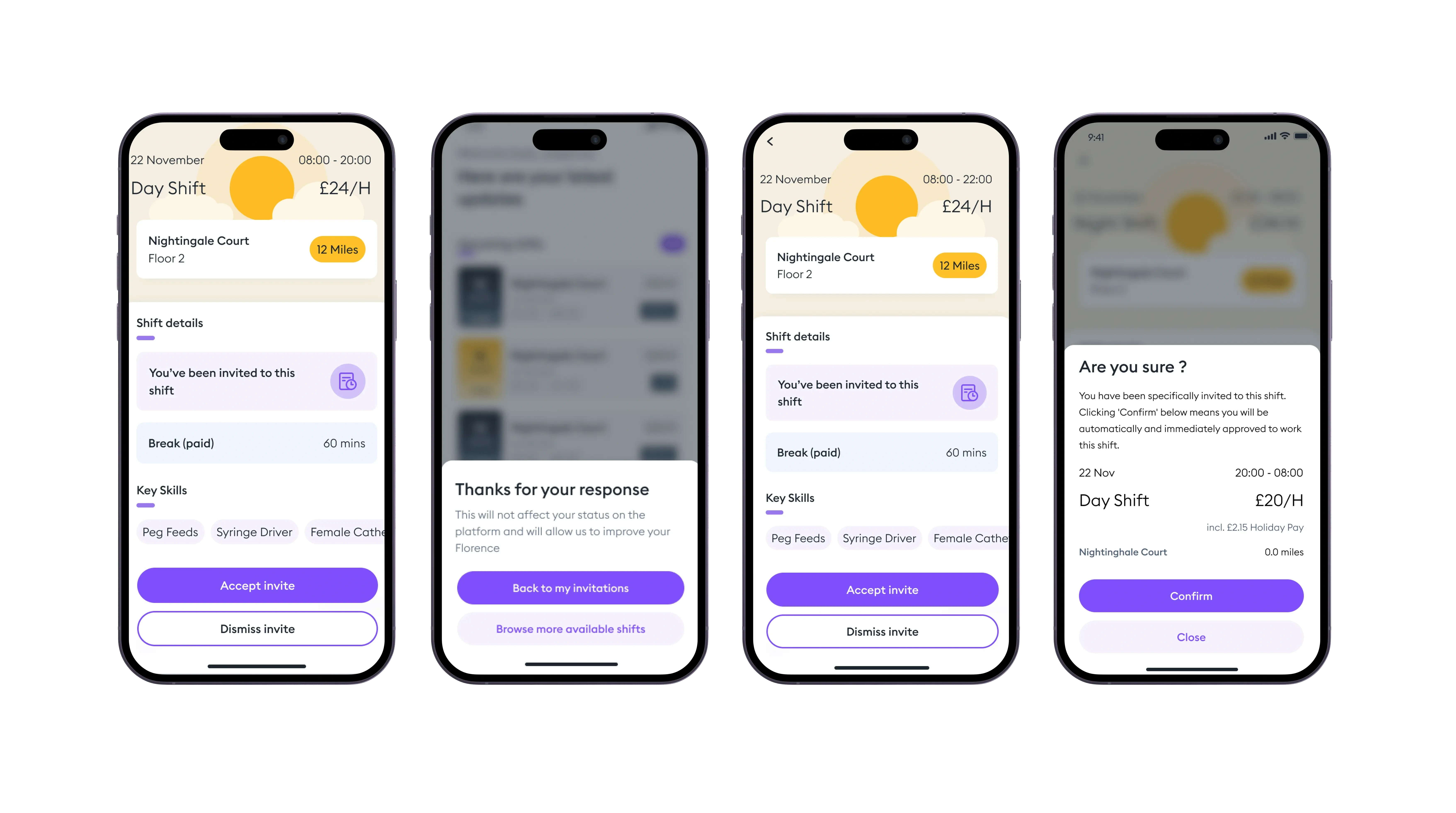
02. Shift Dismissal
Another area observed during discovery was the lack of users who were dismissing or rejecting shifts they were not interested in. It was important to get users to do this for a number of reasons, such as the length of available shifts list, care home managers would have a better idea of the success of some of their shifts posted and can correlate data e.g if a shift had several rejections but also the lowest pay. This was done simply by bringing forward the accept and dismiss invite buttons rather than just the dismiss at the bottom of the page, now both are fixed at the bottom of the screen.
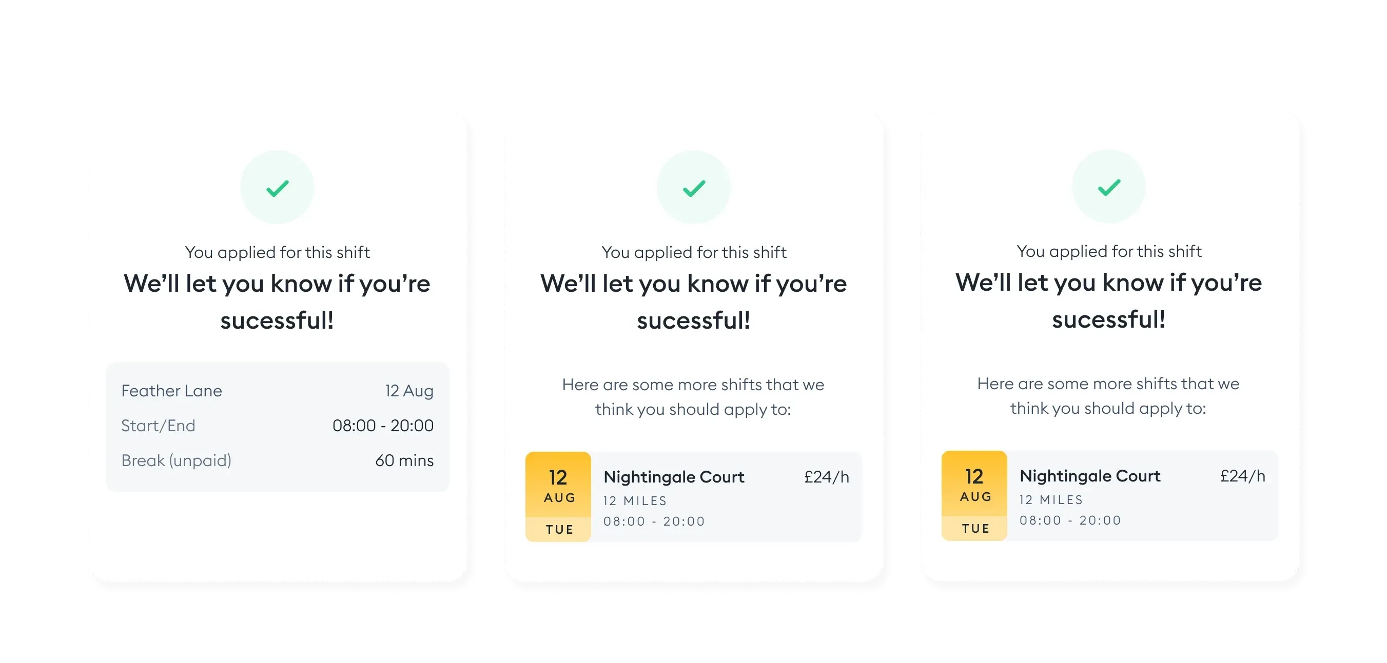
03. Follow up shifts
To increase the number of users who apply to multiple shifts we worked on including messaging and ctas to the app that would encourage more shift applications. This would work based on a simple calculation of showing users related shifts. The increased number of applications benefited both the workers and care home managers.
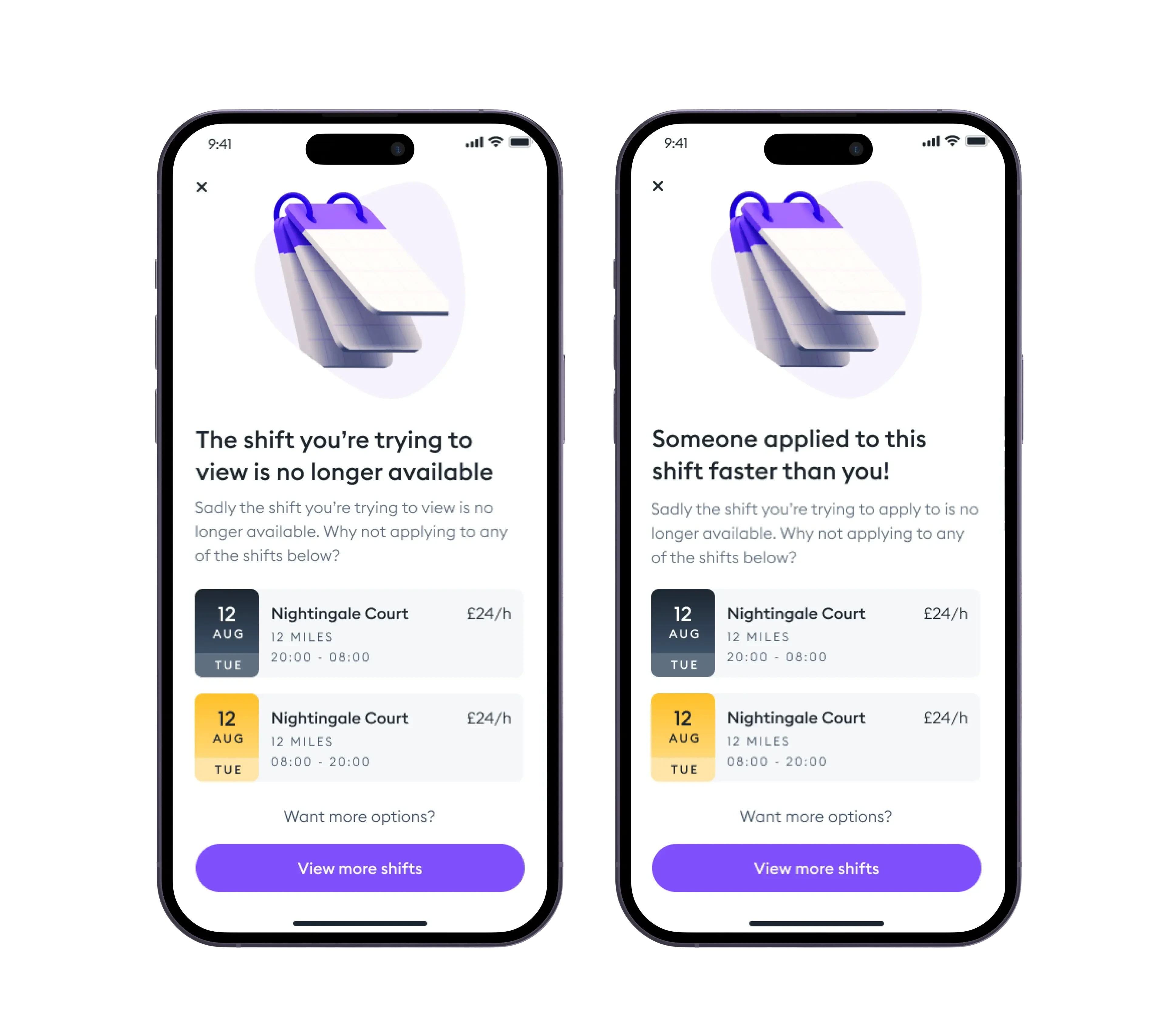
04. Out of Stock messaging
Just like on ecommerce website we added out of stock messaging, one of the growing pain points for users was logging onto the platform after receiving a notification to apply, and seeing just a screen that said the shift was no longer available. So the aim of this new feature was to upsell additional shifts similar to what users had applied for.
Implementation
Working closely with the mobile and backend developers, I helped hand over the designs and also design any component or state that wasn't discussed in the early phases of the project.
Like this project
Posted Apr 5, 2024
Florence Flex is a mobile app designed by myself in order to better serve a growing market of carers. My support helped Florence push through to Series B.
Likes
0
Views
18