Logo for "Cardamon" spice store
Anastasiia Sedykh
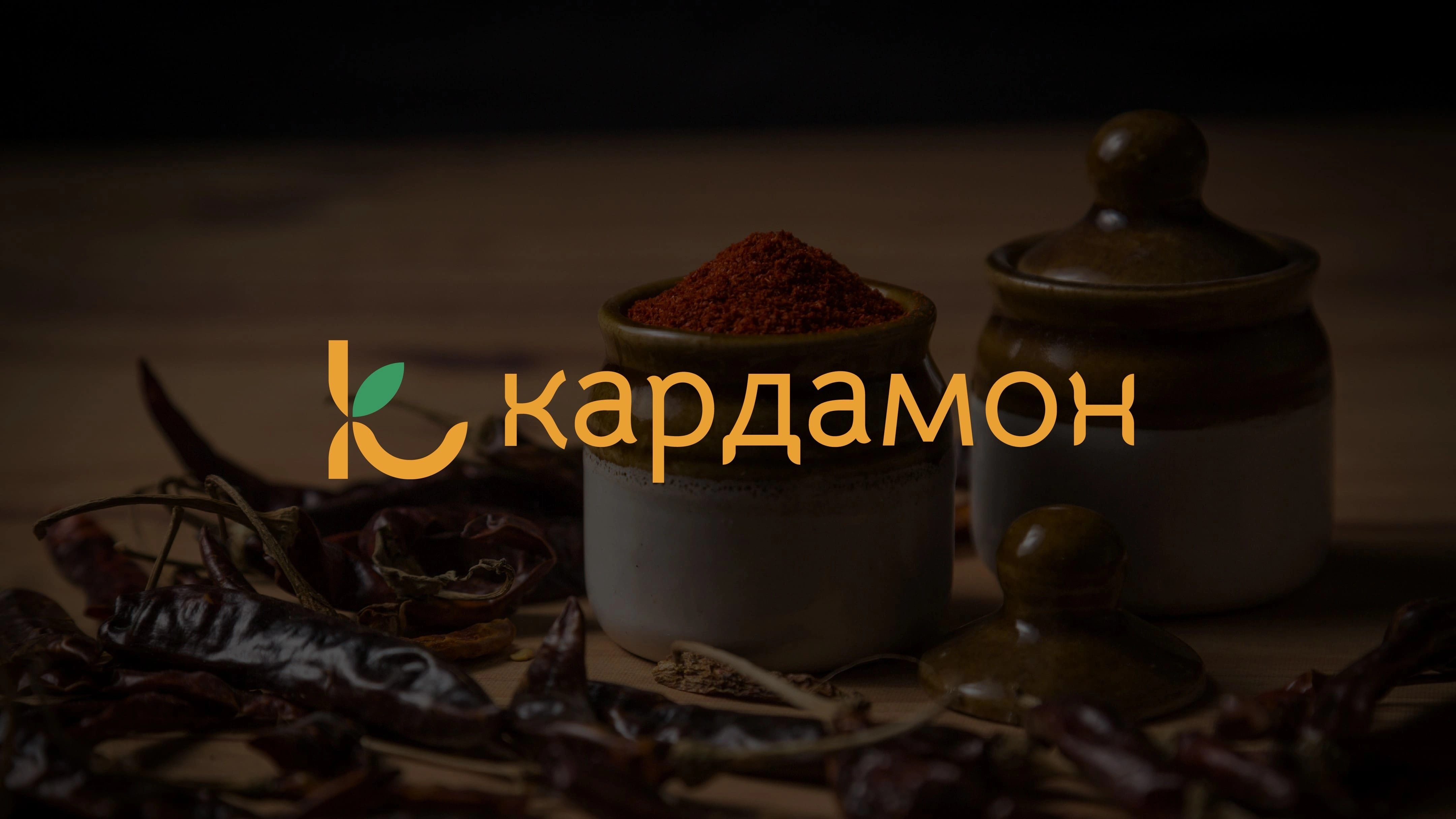
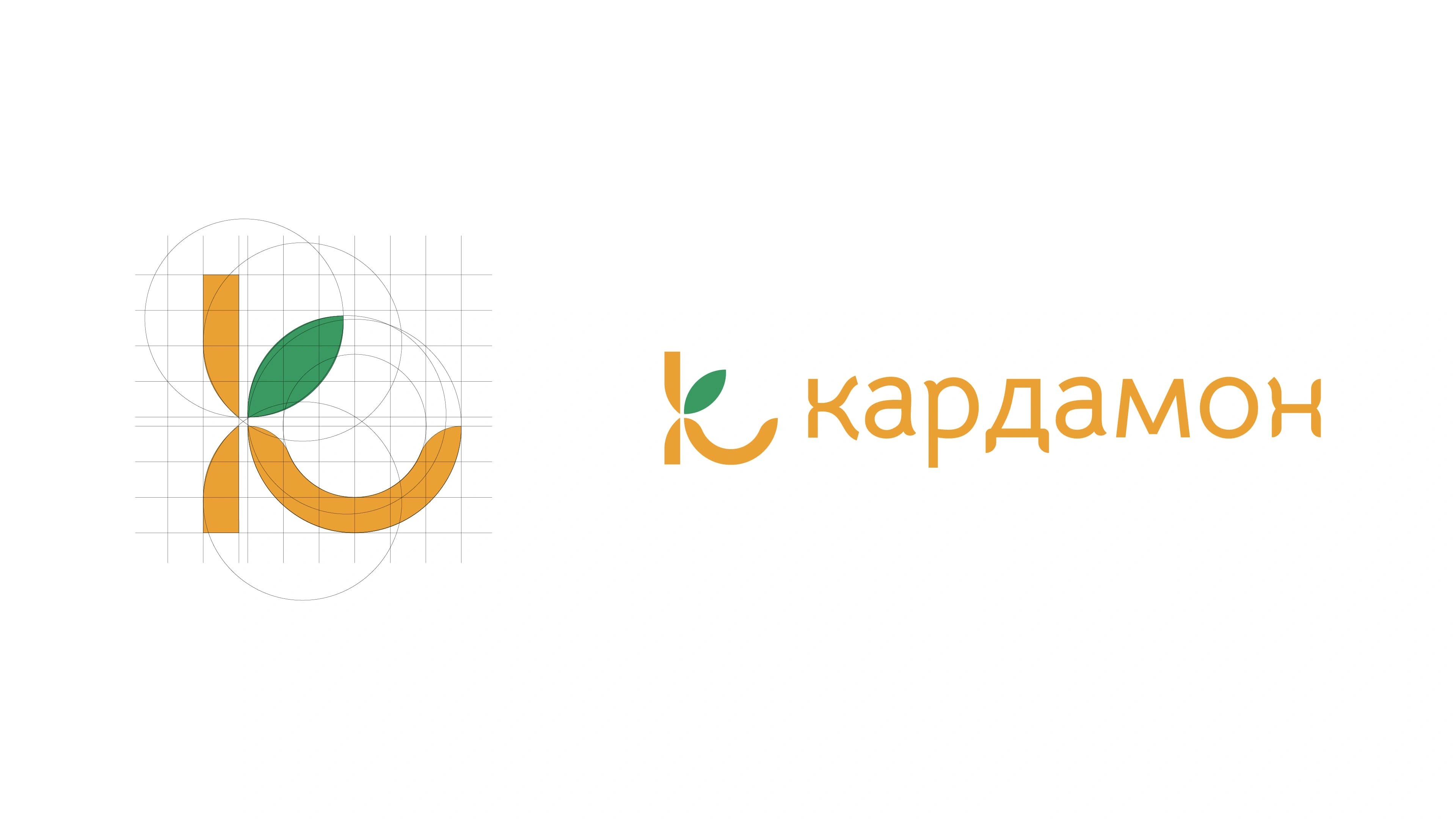
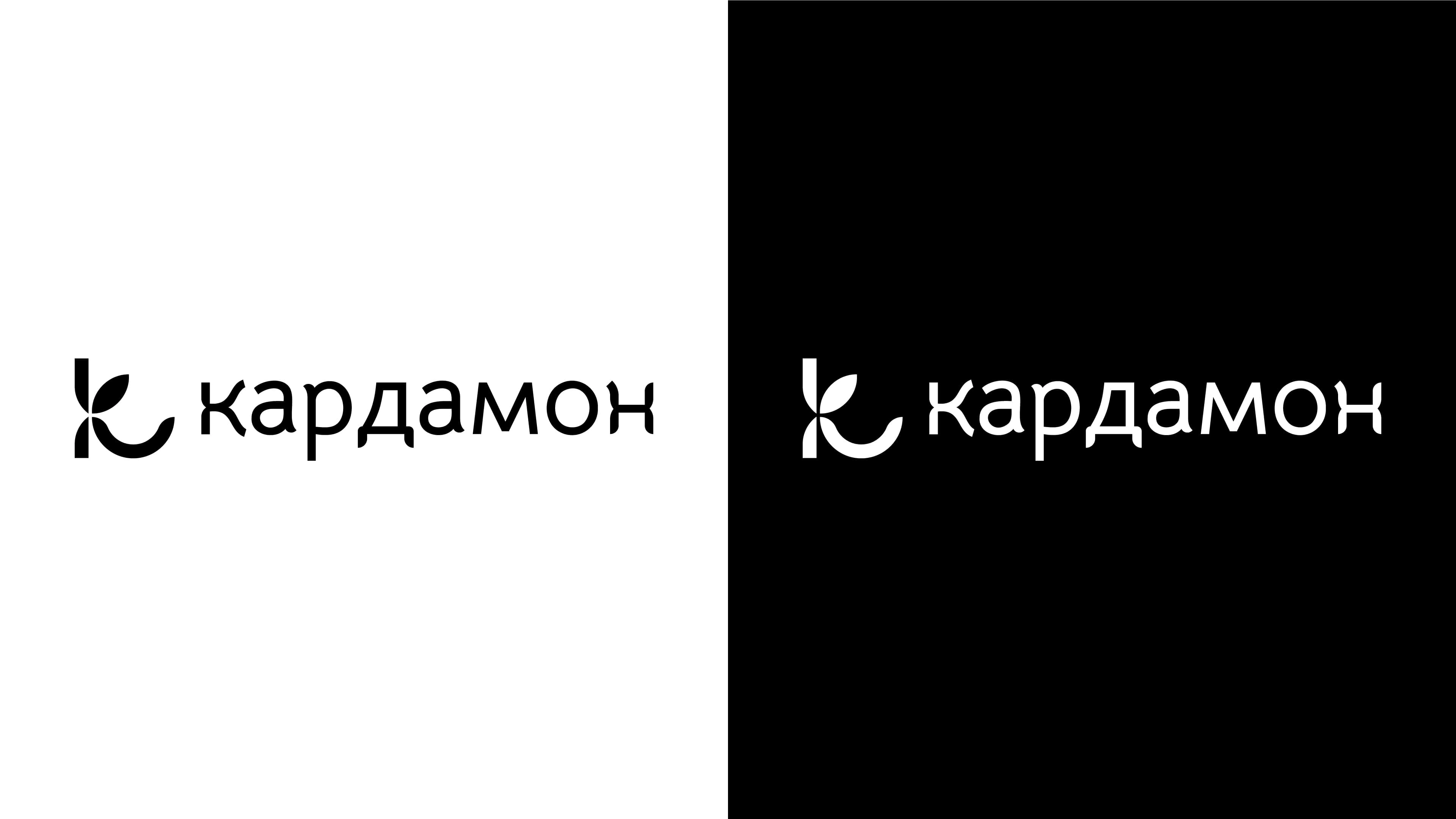
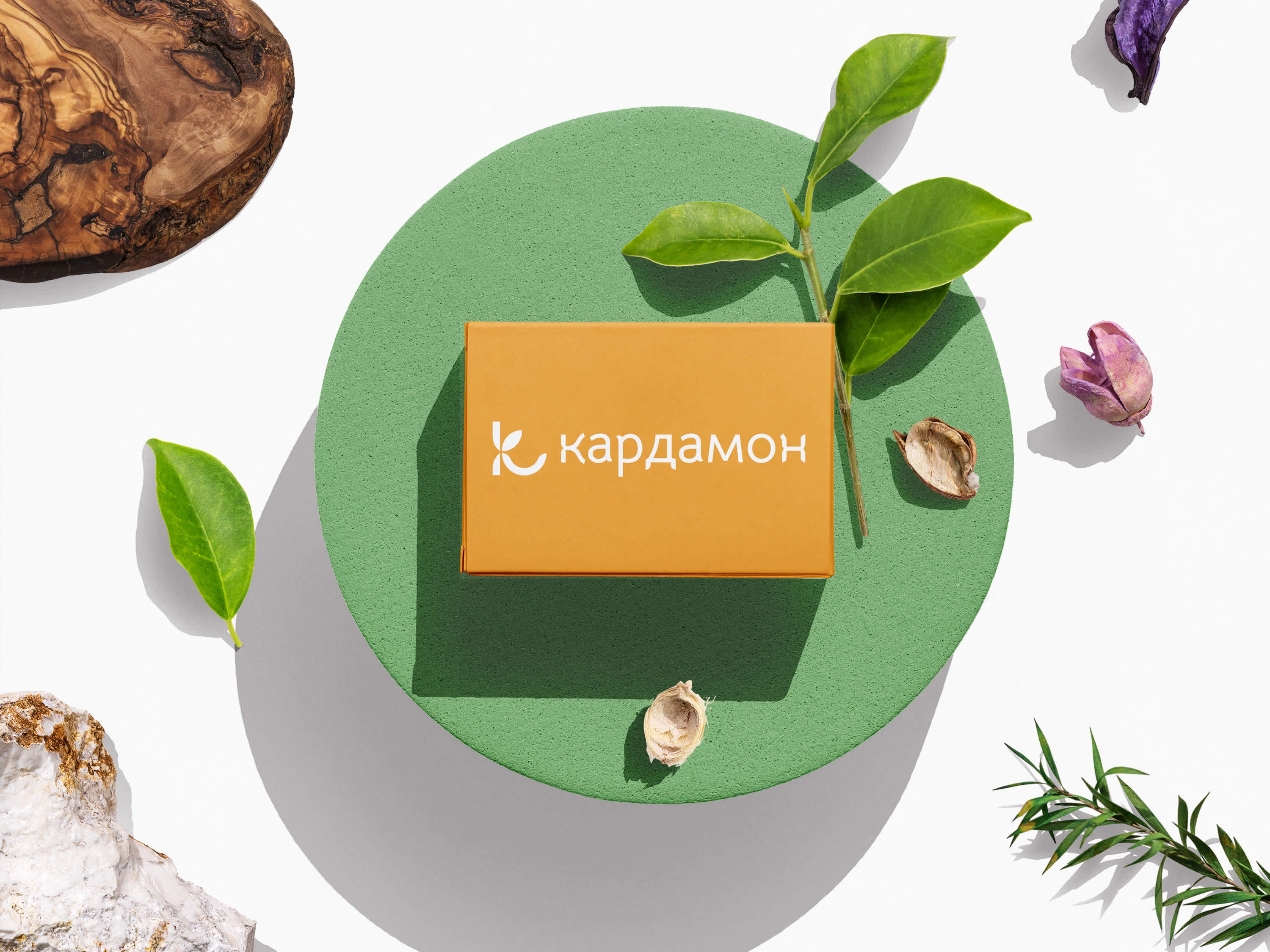
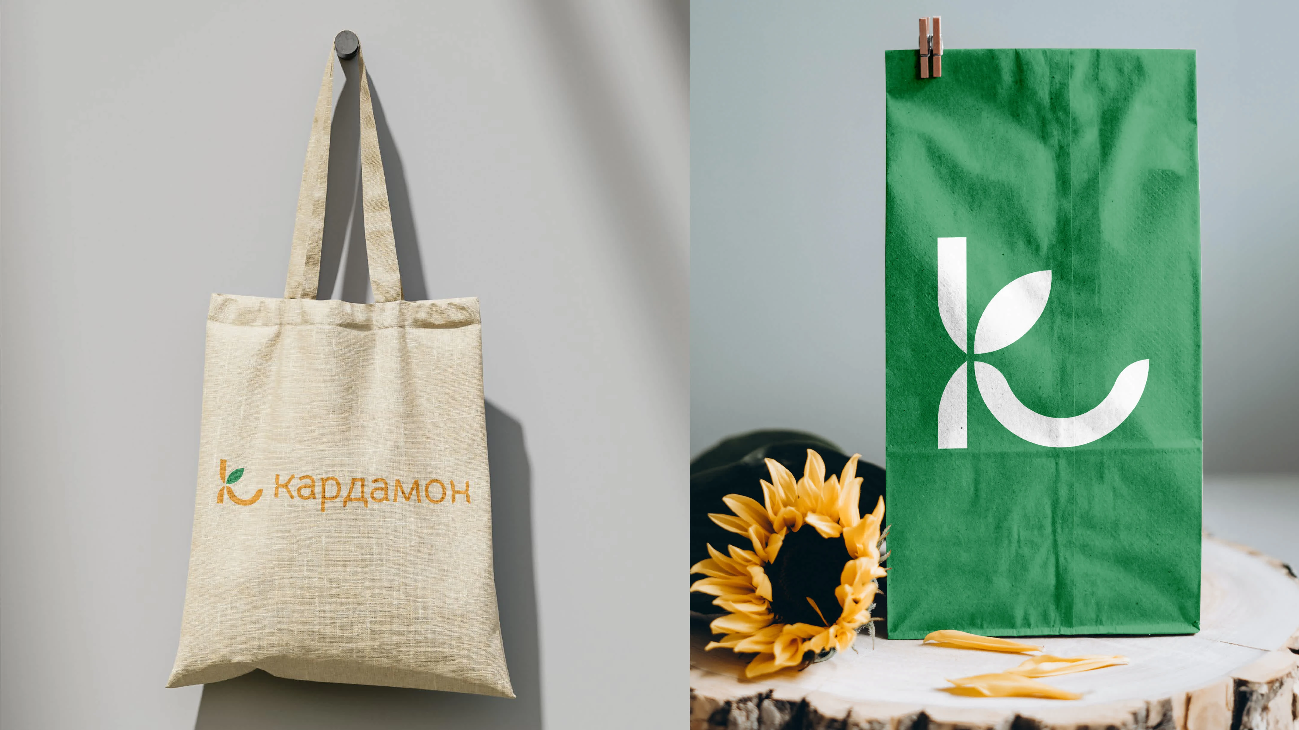
The task is to create a logo for a spice shop called "Cardamon." The client wanted a hint of ethnic style and authenticity. The solution – based on the brief analysis, the decision was made to use the letter "K" as the foundation of the logo's form. The lower leg of the "K" represents a plate that could hold spices, while the upper green part represents a cardamon pod with seeds.

Like this project
Posted Apr 5, 2025
Created a logo for "Cardamon" with the letter "K." The lower leg represents a plate, and the upper part resembles a cardamom pod with seeds for authenticity.