Stint: A Calm Race-Strategy Dashboard Design

BEY AGENCY

Dark mode, dense data, zero chaos. 10 rules I used to make a race-strategy dashboard look expensive. The Figma file's free. The taste isn't.
Article cover image
I designed a race-strategy pit wall for a fictional motorsport team: 8 pages, light and dark, 104 variables, one dataset. Here is everything I learned about making dense screens feel calm, and the file is free.
It is lap 34 of 57. The leader is 4.4 seconds up the road, the tyres on your car are 19 laps old, and a rain cell is 18 km away and moving at 58 km/h. Somebody on the pit wall has about two laps to make a call that is worth more points than anything the driver does all afternoon.
That moment is the brief for Stint, a race-strategy product I designed from scratch: the screen a strategist looks at when everything changes at once. The thesis fits on one line:
A calm wall for a chaotic race.
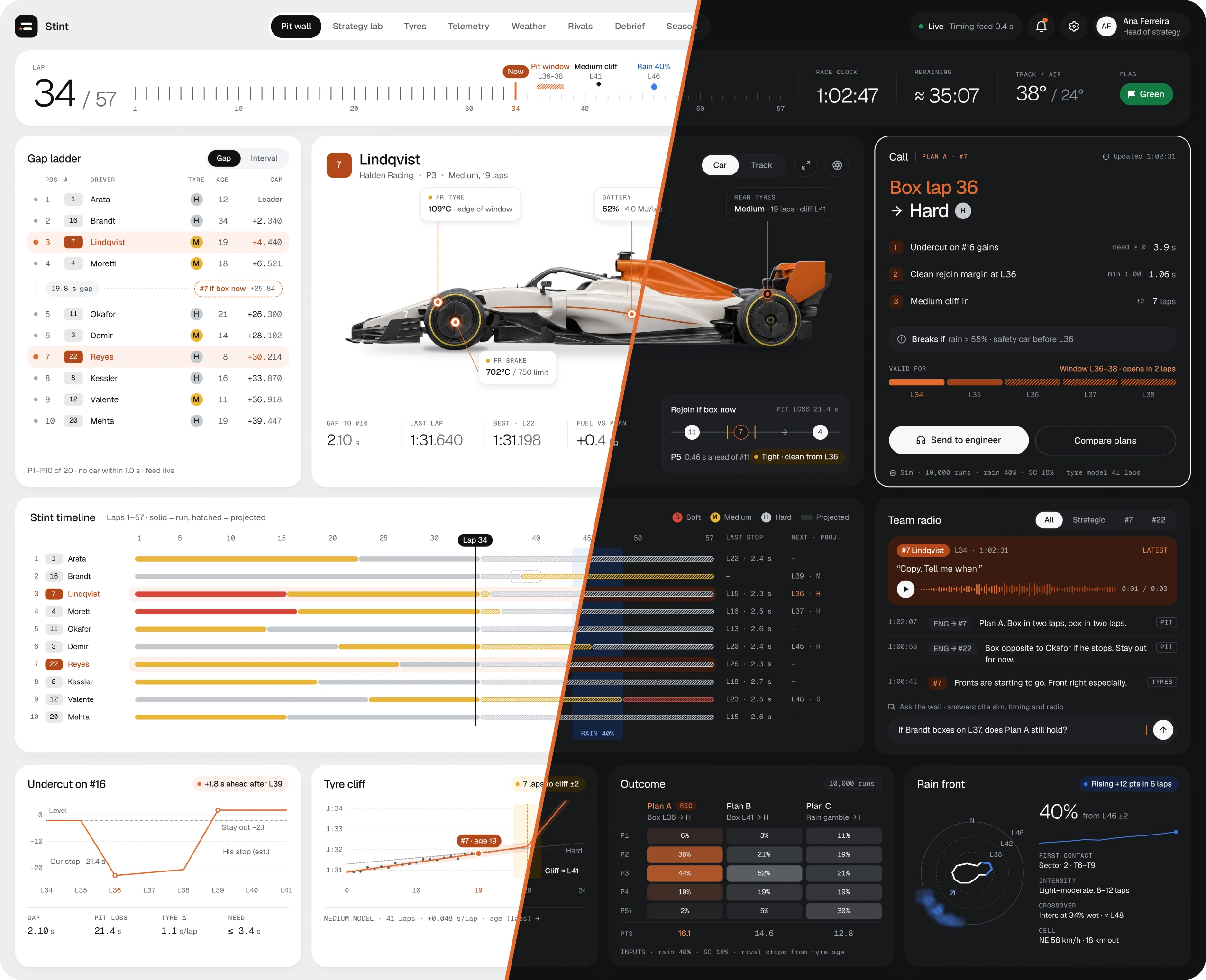
The more chaotic the race gets, the calmer the interface must become. That sounds like a slogan, but it turned into ten very practical rules. None of them are about motorsport. They work for any product where people make decisions under pressure: trading, logistics, healthcare ops, incident response, analytics.
The whole file is free on Figma Community. The link is at the end, and the case study is on Behance.
1. Start with the decision, not the data
Most dashboards start with "what data do we have?" Stint starts with "what does this person have to decide in the next 90 seconds?"
On the Pit Wall, the answer is a single card. It does not show a chart. It shows a call:
Box lap 36 → Hard. Three reasons, what would break the call, and the laps in which it stays valid (L36–L38).
Every other block on the screen is evidence for or against that card. If a block cannot say which decision it serves, it does not ship.
Rule of thumb: write the question each block answers in the layer name. If you can't, delete the block.
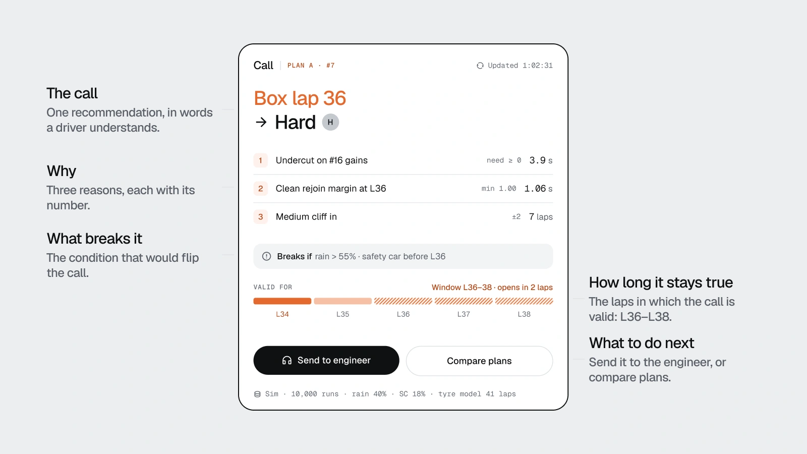
The call card answers one question: what do we do next? Box lap 36, Hard, valid L36–L38.
2. Write the dataset before you draw a pixel
Before the first frame, I wrote one dataset: the running order, the tyre model, the weather, the sim results, the radio. Every number on every screen comes from it.
This sounds slow. It is the fastest thing I did. Because the pages share one race, they agree with each other. Plan A is worth 16.1 expected points on the Pit Wall, in the Strategy Lab and in the Debrief, and it is the same 16.1 because it comes from the same table.
It also catches you lying. Three times I typed a "nice-looking" number into a callout, and three times the dataset said it didn't exist. Once the maths itself was wrong: a rain cell 18 km away moving at 12 km/h arrives in 90 minutes, not in 12 laps. The fix was 58 km/h, and every screen that mentions the rain changed with it.
Fake data makes fake design. Real data makes you design the edge cases you'd otherwise never see.
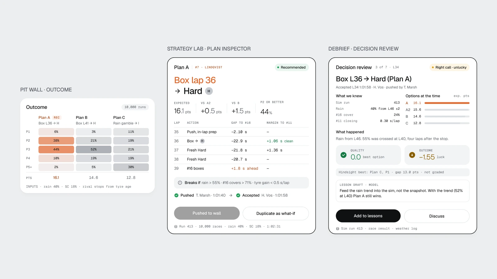
One dataset, three pages: 16.1 expected points for Plan A on the Pit Wall, in the Strategy Lab and in the Debrief.
3. Show how long every number stays true
A number on a live screen has a shelf life. Stint shows it.
The call has a validity window: L36–L38.
The Strategy Lab has a "what would change my mind" table. Rain above 55 % flips the plan to inters. #11 closing slower than 0.27 s per lap flips the stop to lap 37.
Inputs are sorted by headroom, so the most fragile one is on top: the #11 closing rate has 0.03 s to spare.
Strategists don't need more numbers. They need to know which number is about to betray them.
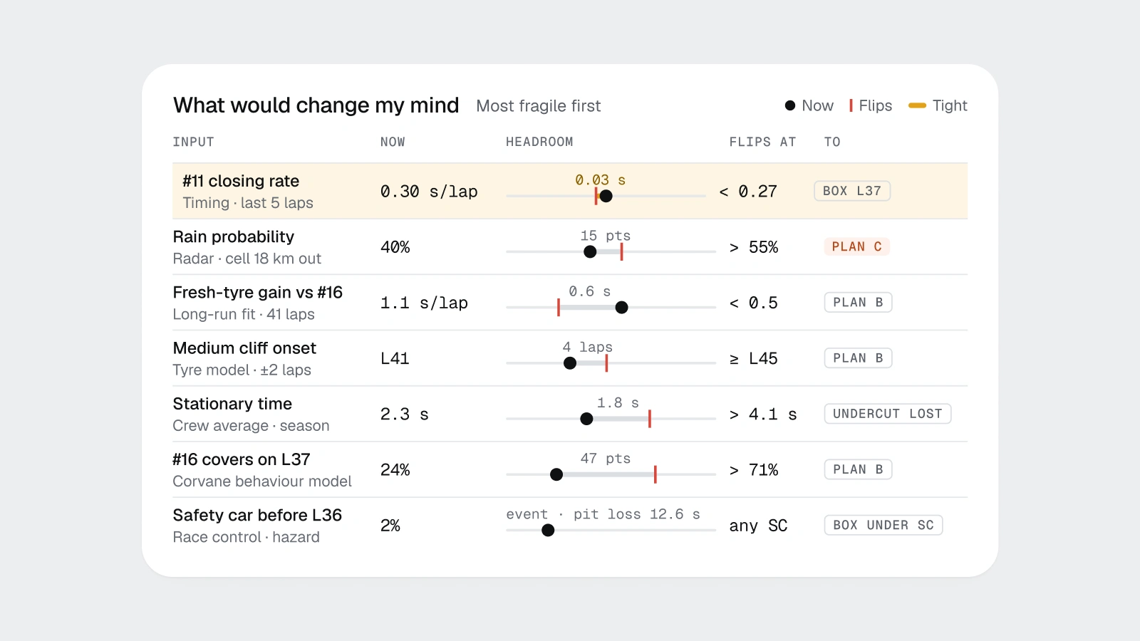
"What would change my mind": each input with its flip point, sorted by how little headroom it has.
4. Make the object the interface
Dashboards love abstract cards. Stint puts the real object on screen: a photoreal car with hotspots on the parts that decide the call (front-right tyre at 109 °C, the edge of its window), and a clay diorama of the circuit with the live field on it.
The rule I learned the hard way: never draw a vector illustration of a real object next to real UI. It looks cheap immediately. Generate or photograph the object, then design the interface around it.
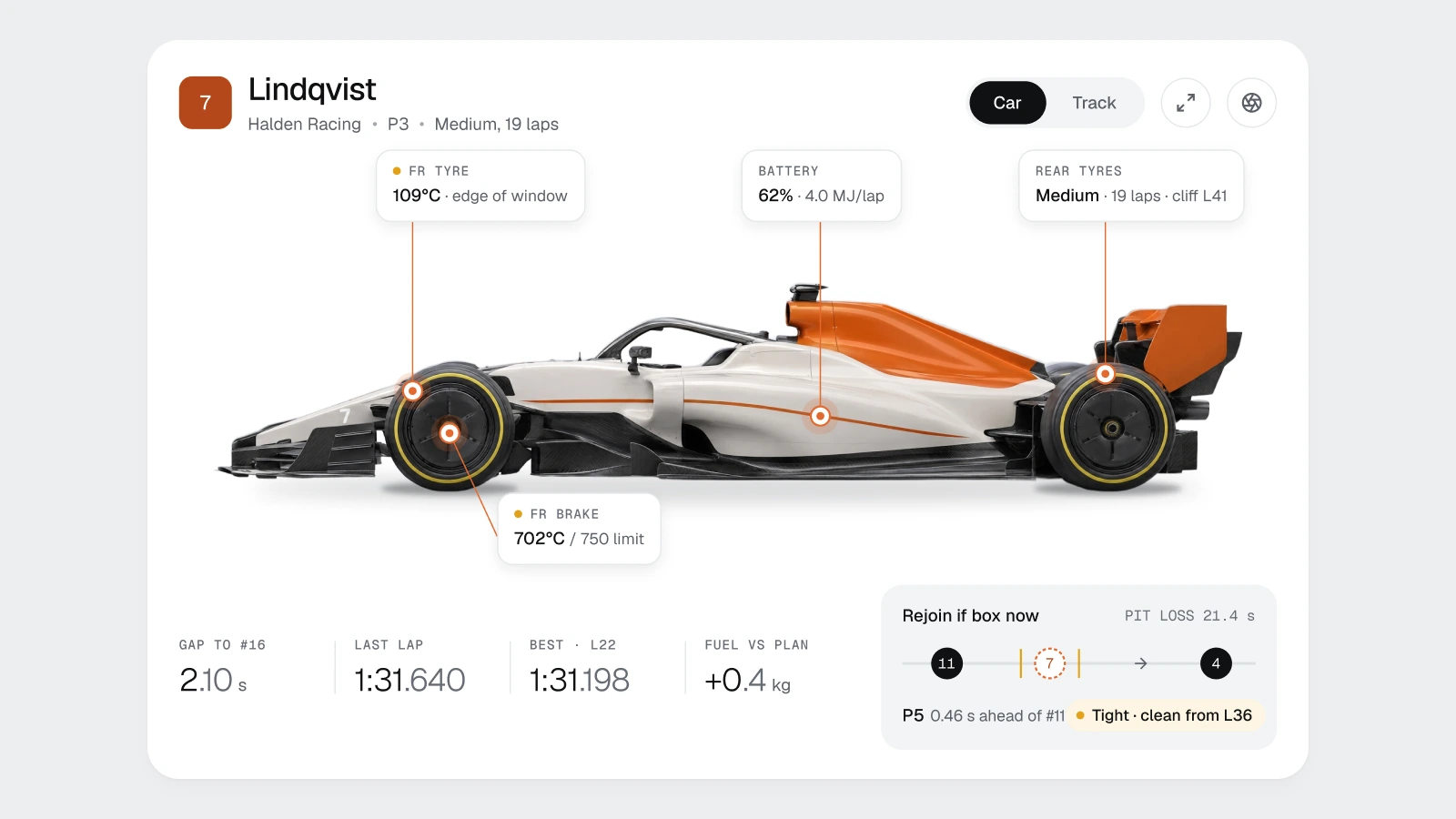
The car is the interface: hotspots sit on the parts that decide the call.
5. Let the accent mean exactly one thing
Stint has one accent, pumpkin orange, and it means our car, or the action we recommend. Nothing else gets it. Not hover states, not links, not decoration.
When the accent has one meaning, a strategist finds car #7 in a 20-car field in a fraction of a second. The moment orange also means "button" or "warning", it means nothing.
State colours follow the same discipline: green, amber, red and blue each mean one thing, and coloured text always uses the darker step of its colour so it passes 4.5:1.
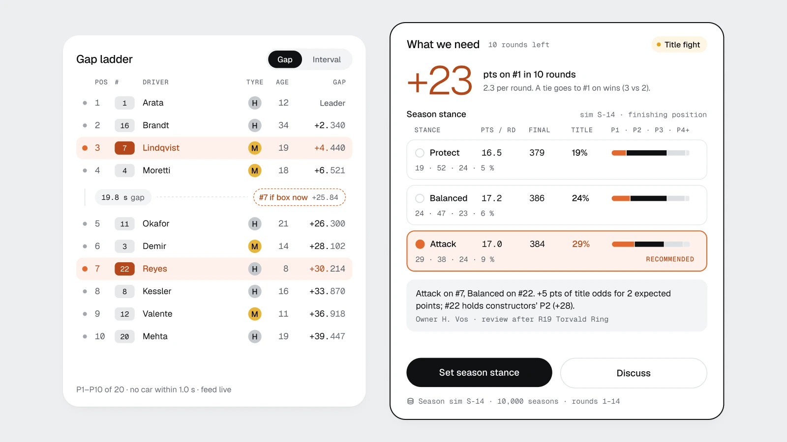
Orange means one thing: our car. Everything else stays neutral.
6. Give numbers their own typography
In a data product, numbers are the content. Stint treats them that way:
Large numerals are light, not bold. A big bold number shouts; a big light number is read.
Decimals are smaller and grey: +4.440. The part that changes slowly is quiet; the part you compare is loud.
Timing and tables use a monospaced face, so columns align and digits don't jump when they update.
Two families do all of it: Geist for the interface and Geist Mono for data. 19 text styles, no exceptions.
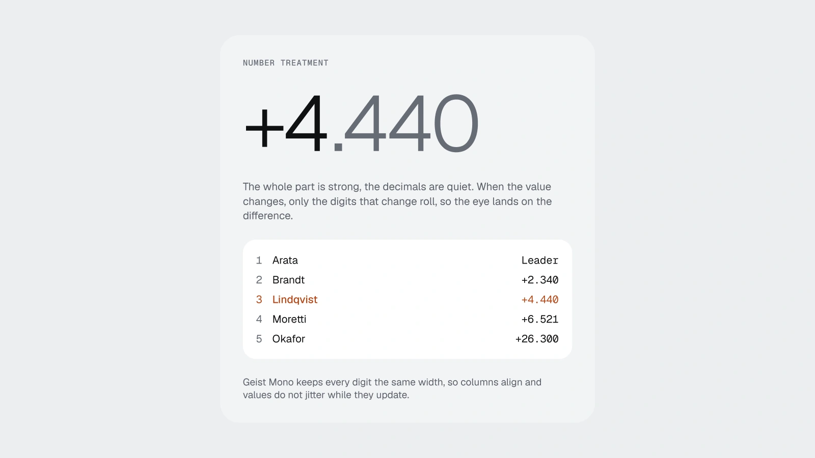
Light numerals, quiet decimals, monospaced data.
7. One token set, two modes
Every colour in Stint is a variable: 104 of them in one collection with Light and Dark modes. The dark pages are not redesigns. They are the light frames with the mode switched.
That only works if you bind surfaces to semantic roles, not to raw colours. It also surfaces mistakes you'd never see in one mode. My green text was fine in light mode and failed in dark at 3.29:1. The fix was a new role, so every green label everywhere fixed itself.
If your dark mode needs its own design file, you don't have a design system. You have two designs.

One token set, two modes: the same card, with only the variable mode switched.
8. Design the calm state, not just the busy one
Under a safety car, everything happens at once. That is exactly when Stint's Pit Wall is designed to get quieter: secondary tiles dim, the call card expands to the one decision that matters, the gap ladder compresses as the field bunches up.
Motion follows the same rule: data moves, chrome does not. A ribbon draws because a scenario is being evaluated. A ghost car laps because a lap is being compared. Nothing moves just to look alive.
9. Grade decisions, not outcomes
The Debrief page is my favourite, because it is honest. It replays the race as a sequence of decisions and grades each one twice: was it the right call with what we knew, and how did it turn out?
In the race on screen, car #7 finished P4 with 12 points against 16.1 expected. The page splits that gap: 1.85 points to bad luck (the rain came) and 2.25 points to one decision (holding the car out two laps too long because the driver said "still dry in sector one").
A product that separates luck from skill teaches its users. One that only shows results teaches them superstition.
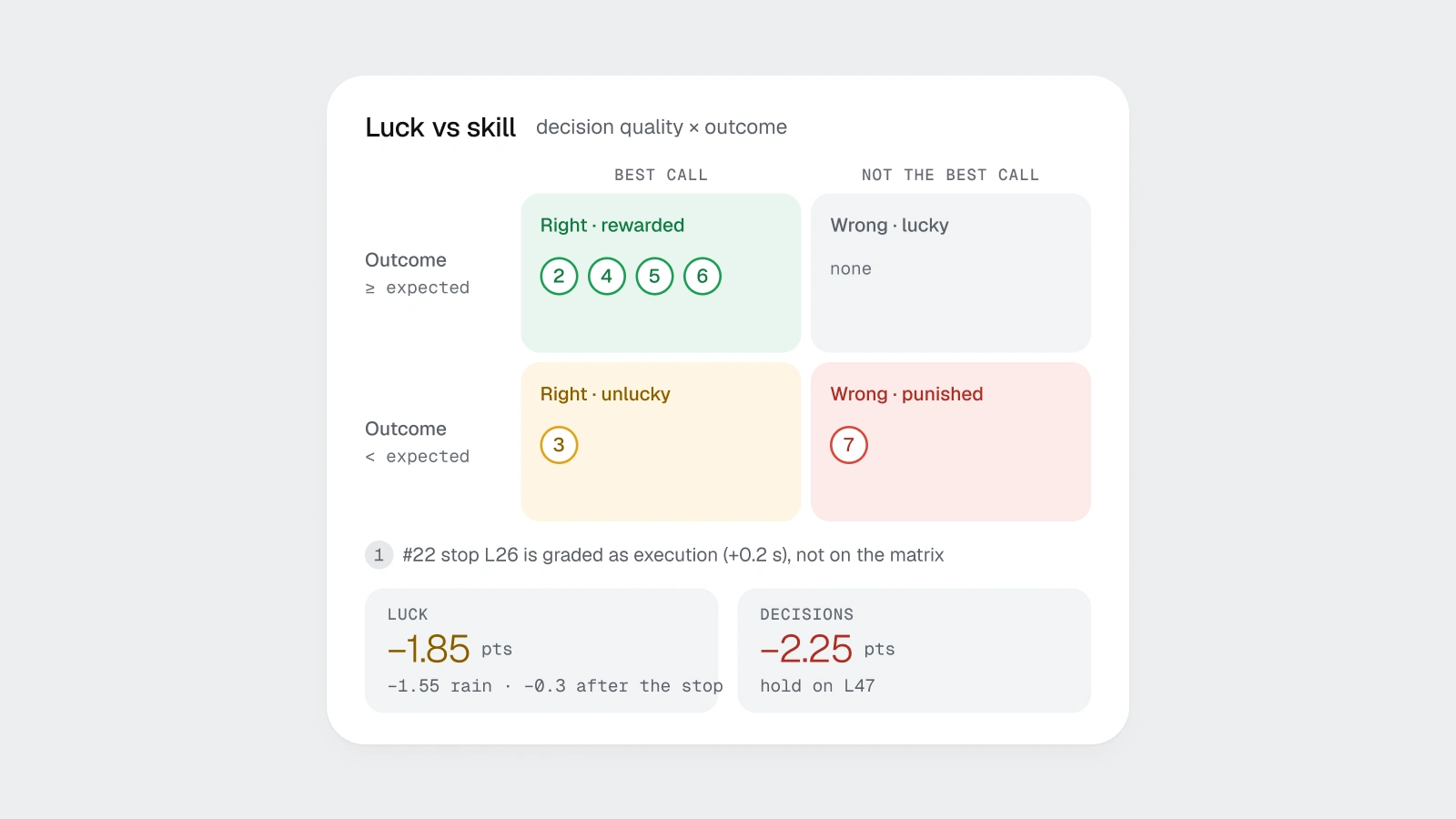
The Debrief separates luck from decisions: 1.85 points lost to rain, 2.25 to one call.
10. Build one page at a time, and measure everything
The process that made this possible was boring on purpose:
Plan the page: who uses it, what they decide, which blocks answer which question.
Extend the dataset, and check every new number against the old ones.
Make a visual target and pick a direction.
Build the light page with fixed widths first, then charts.
Measure: contrast in both modes, overflow, unstyled text, duplicate names. Fix, measure again.
Clone to dark, switch the mode, measure again.
Eight pages, eighteen frames, the same six steps every time. The design system came out of the pages, not the other way round: 12 component sets with 49 variants, all of them in use somewhere.
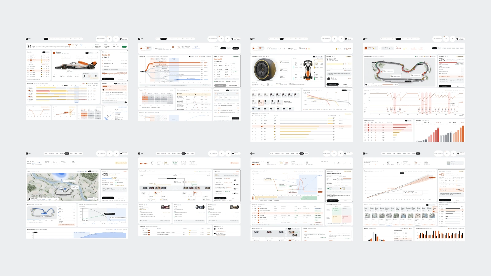
Eight pages, one race, one dataset.
Get the file
Stint is free on Figma Community: all 8 pages in light and dark, the components, the variables, the type system and the motion scenes. Use it for your own product, learn from it, take it apart.
If this was useful
I make files like this in my own time and give them away. If Stint saved you a week of work or taught you one trick, buy me a coffee. Every supporter's name goes on the Supported by page in the next release of the file.
Like this project
Posted Oct 4, 2026
Designed Stint, a calm race-strategy dashboard for high-pressure decisions.
Likes
0
Views
5
Timeline
Oct 1, 2026 - Oct 4, 2026