Salüd Prebiotic Soda
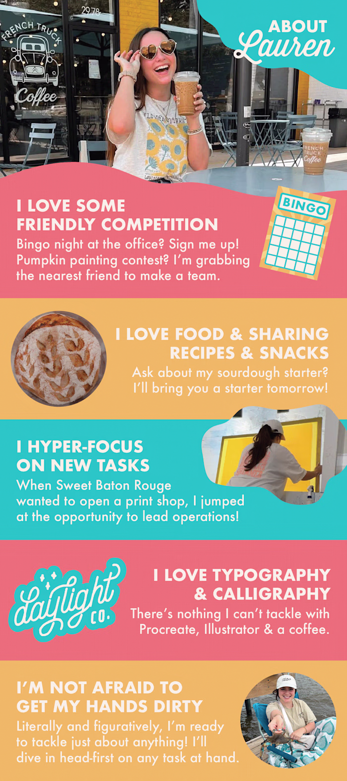
Lauren Leopold
Logo, Brand Identity, and Product Packaging
Salüd
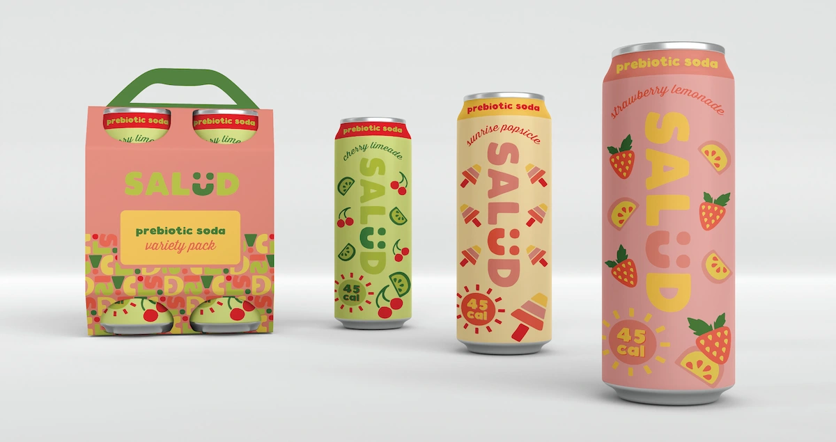
Salüd reimagines soda with a prebiotic twist. Healthy choices should be enjoyable, not daunting. That's why offering a refreshing, fruity alternative to your favorite soda is perfect for any occasion. From on-the-go adventures to leisurely meals, Salüd makes healthy hydration a delightful experience. The vibrant colors and playful patterns make choosing Salüd the perfect decision.

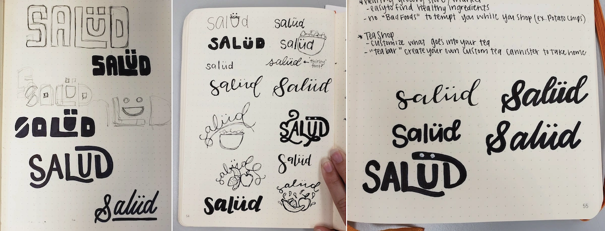
Salüd began as a project during my undergraduate program at Louisiana State University. Motivated by my personal journey with PCOS and insulin resistance, I undertook the creation of a brand-new company dedicated to simplifying dietary management.
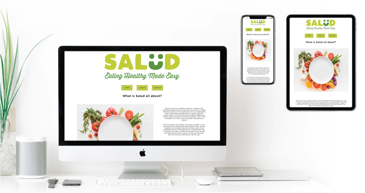
This project aimed to develop an app that simplifies recipe discovery for individuals with dietary restrictions. Whether gluten intolerant, managing allergies, or simply selective eaters, users can easily filter recipes based on their specific needs. I designed the app's intuitive interface using Adobe XD and built a fully responsive website through original, hand-coded development.
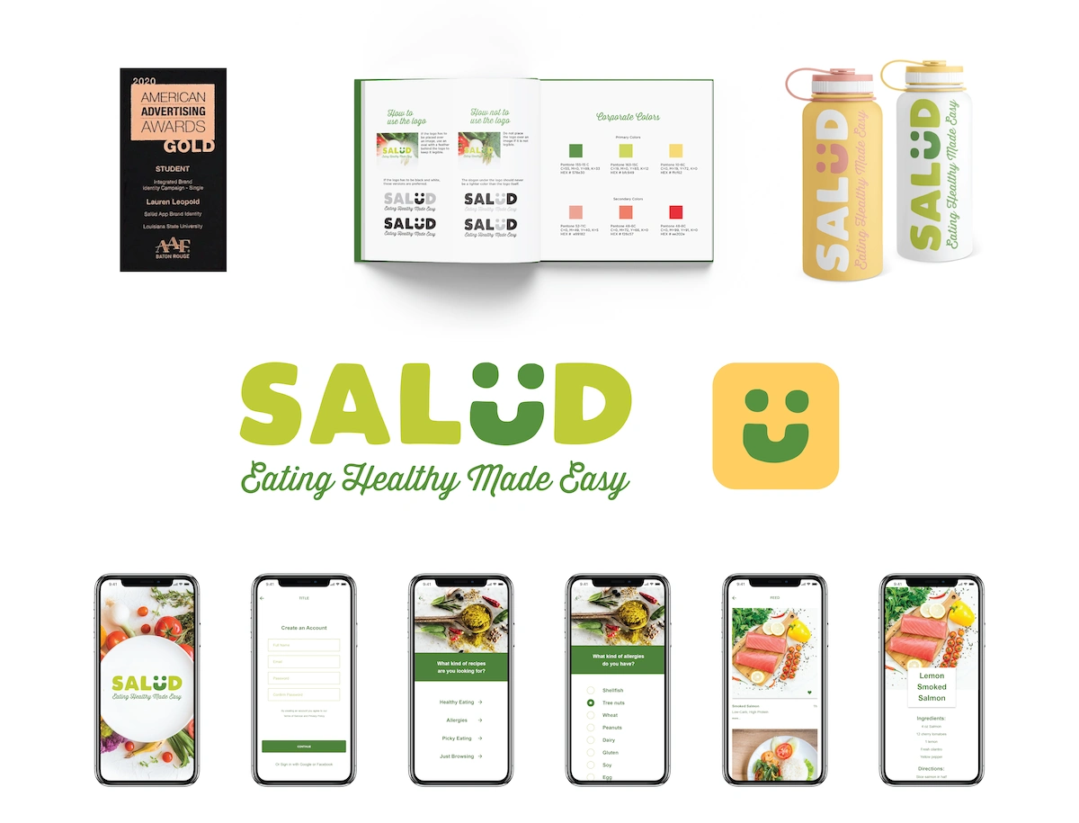
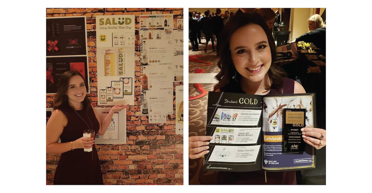
The project received a gold Addy Award for the Integrated Brand Identity Campaign category in the student division.
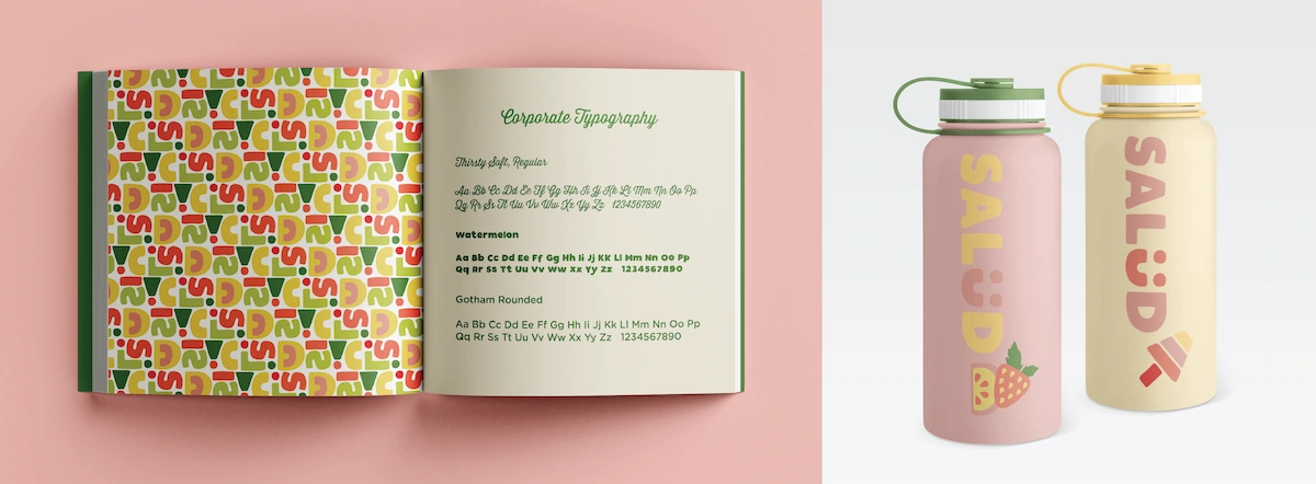
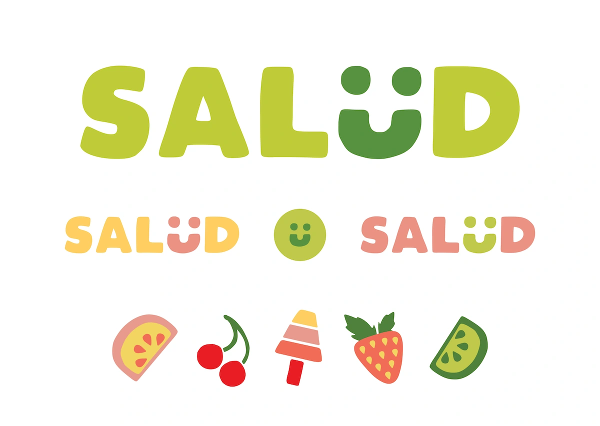
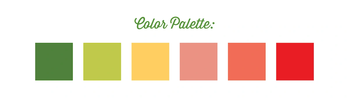
Inspired by the project's potential, I strategically pivoted the brand to focus on prebiotic sodas, enabling a more visually rich and imaginative approach. Maintaining the original logo, color scheme, and typography, I developed a unique pattern based on abstracted logo letterforms. Additionally, I designed a collection of fruit icons, drawing inspiration from the same letterform shapes, to clearly communicate the flavor profiles of each soda variety.
Like this project
Posted Sep 3, 2025
Salüd reimagines soda with a prebiotic twist. The vibrant colors and playful patterns make choosing Salüd the perfect decision.