Positive Candles (Miami, FL)
Brand Strategy, Creative Direction, Brand Identity, Social Media
Positive Candles is a Miami-based startup dedicated to the production of handmade organic candles. With the growing demand for their products, they needed a graphic identity that accurately conveyed their personality. More than just a product, this brand seeks to empower and inspire women through the simple act of lighting a candle.
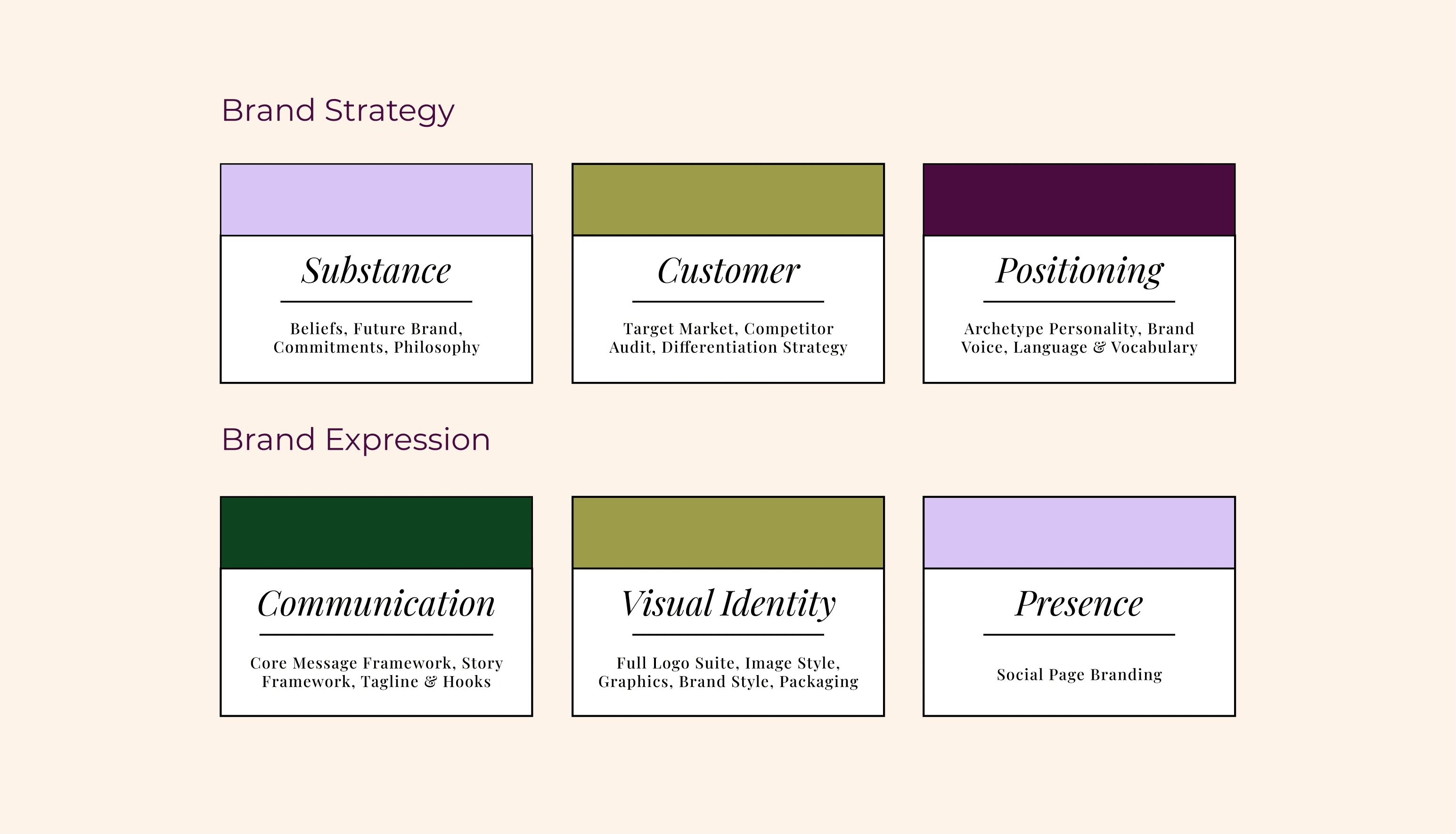
Our approach is centered on inspiring and supporting the members of their community. To begin, we conducted a competitor’s audit to identify the challenges faced by their target customers.
To provide solutions to these challenges, we created engaging content focused on our unique approach. Highlighting the success stories of others who have faced similar obstacles, we were able to create a sense of community and encouragement through meaningful connections.

03: Research & Creative Direction

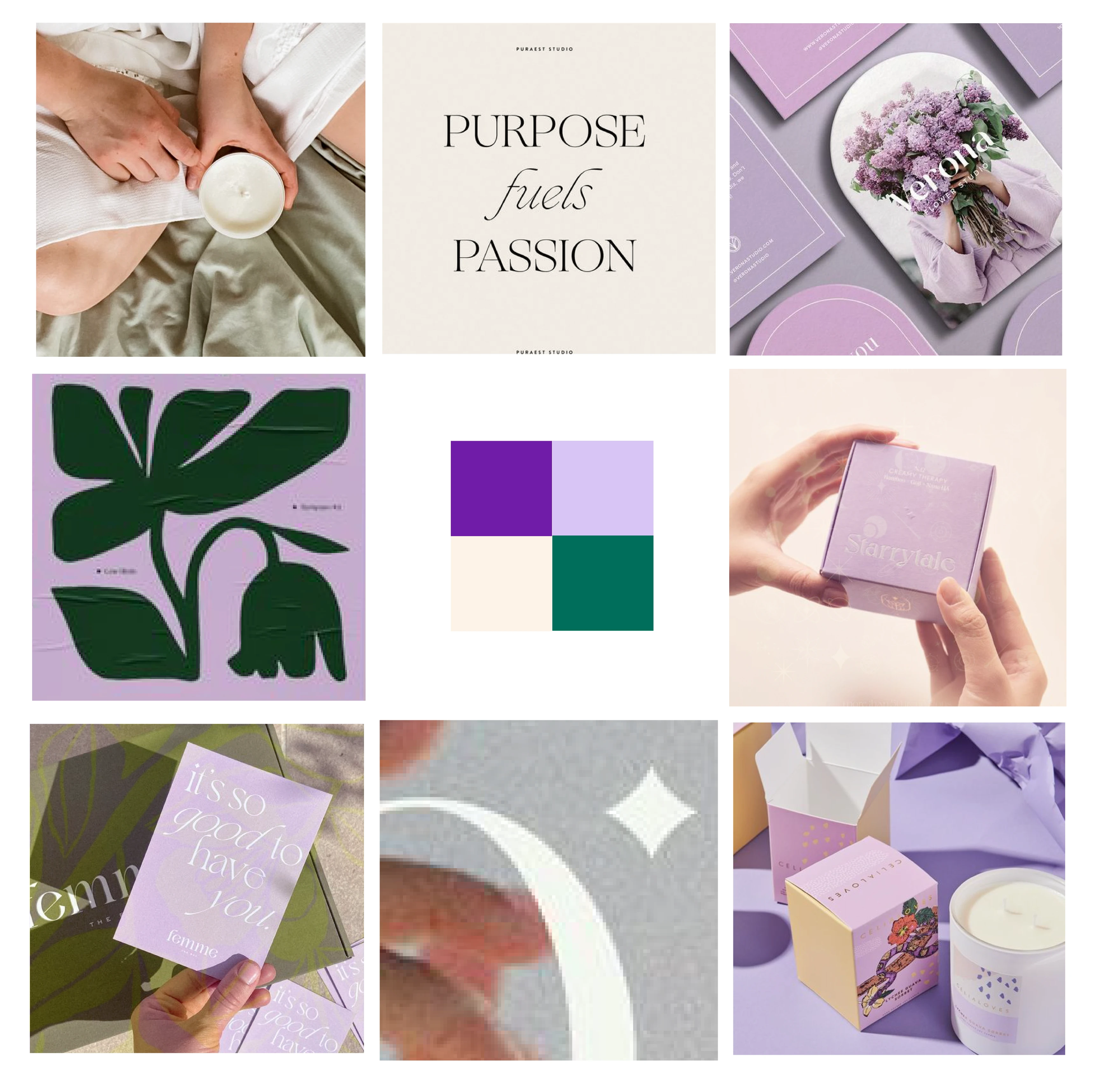
Design: Calm, feminine, and modern. The feminine touch is very present but remains flexible while also being inviting, interesting, and down to earth.
Typography: a serif font that can lean into cursive typography to create curves and movement, conveying confidence and accessibility, or incorporate characteristic flourishes of script fonts. Letters will be modified to make the brand unique.
Colors: this color palette is warm and feminine. Shades of purple and lavender create a sense of calm and femininity associated with color psychology, generating interesting contrasts. The cream color complements the rest of the palette and allows for the incorporation of other visual elements.
Brand Words: Fresh, Feminine, Organic, Professional.
04: Brand Strategy

05: Design

Like this project
Posted Oct 3, 2023
Branding Strategy, Creative Direction, Visual Identity, Packaging and Social Media Assets for Positive Candle (Miami, FL)


