Headcount365
Brittany Ladion-Lucero
Overview 🔎
HR representatives, such as talent leaders and hiring managers, have trouble tracking the lifecycle of a requisition/role, managing the yearly headcount plan, and efficiently allocating requests between team members. Their current industry solutions boil down to two options: spreadsheets or expensive, bloated software. Neither option is preferred. Headcount365 seeks to create an affordable, full-featured yet streamlined solution.
Cover graphic.
Research & Information Gathering 📚
Most research on competitors was provided by the founders. Since HC365 was created by people well-versed in the headcount space, I leveraged their knowledge to understand the current pain points of their target users. In addition to the cofounders, a previous UX designer created some screens from a previous implementation. However, they were not up to the founders’ standards as a final reference for the engineering team. For certain features, I was also able to utilize some prior form-building experience and knowledge from other jobs.
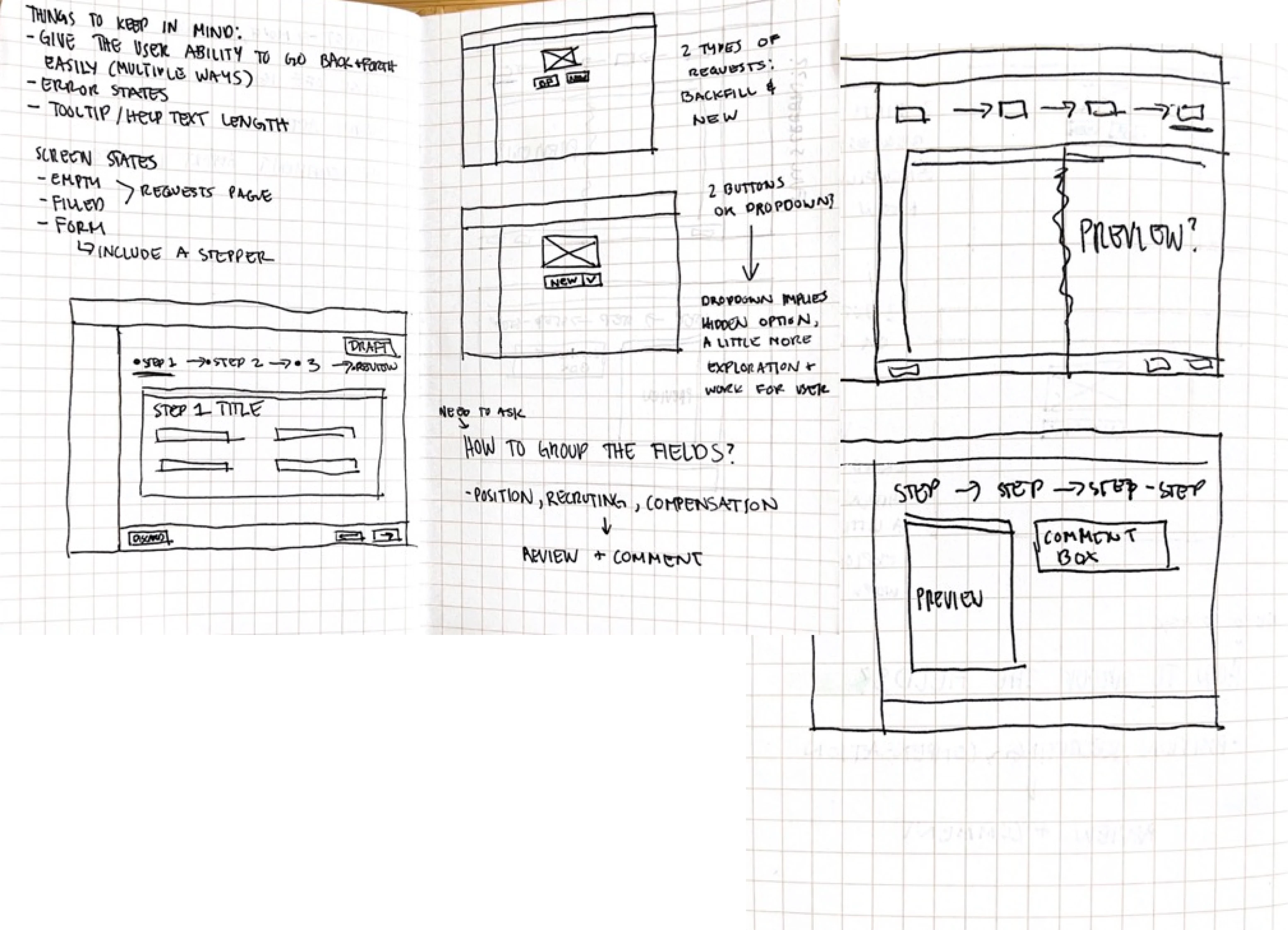
Sketches from the beginning of the process that show an updated flow.
Design 🎨
With the gathered information and research, I sketched out the improved steps and flow first. Those served as my first wireframes. The frontend team utilized Tailwind to speed up their development process, so I tried to balance what they had available and integrate it into my designs as I went further into the process. That way, I also wouldn’t have to worry about smaller interactions since they would already be built into Tailwind - like hover or mouse-over effects. Brand design was also a collaborative process with the cofounders to completely change their color scheme to something both playful and polished.
Example of documentation for the team library.
Setbacks, Testing, and Iterating 🧪
Since we would review often, new requirements would be set mid-design because they would be discovered in this iterative process. Other times, there would be engineering pushback on possible functionality. Depending on the issue, the solutions could be as simple as documenting spacing guidelines or more complex like the structure of the comment box.
For testing, I would hand off either finished screens or complete prototypes to the head of product who would then conduct informal reviews with our target users.
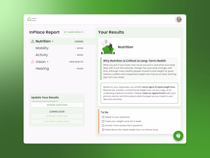
Final UI Designs 💫
For the initial 8-week contract, these are the “final” screens - containing about 8 distinct features:
Examples of the initial deliverables after the first contract (before extension).
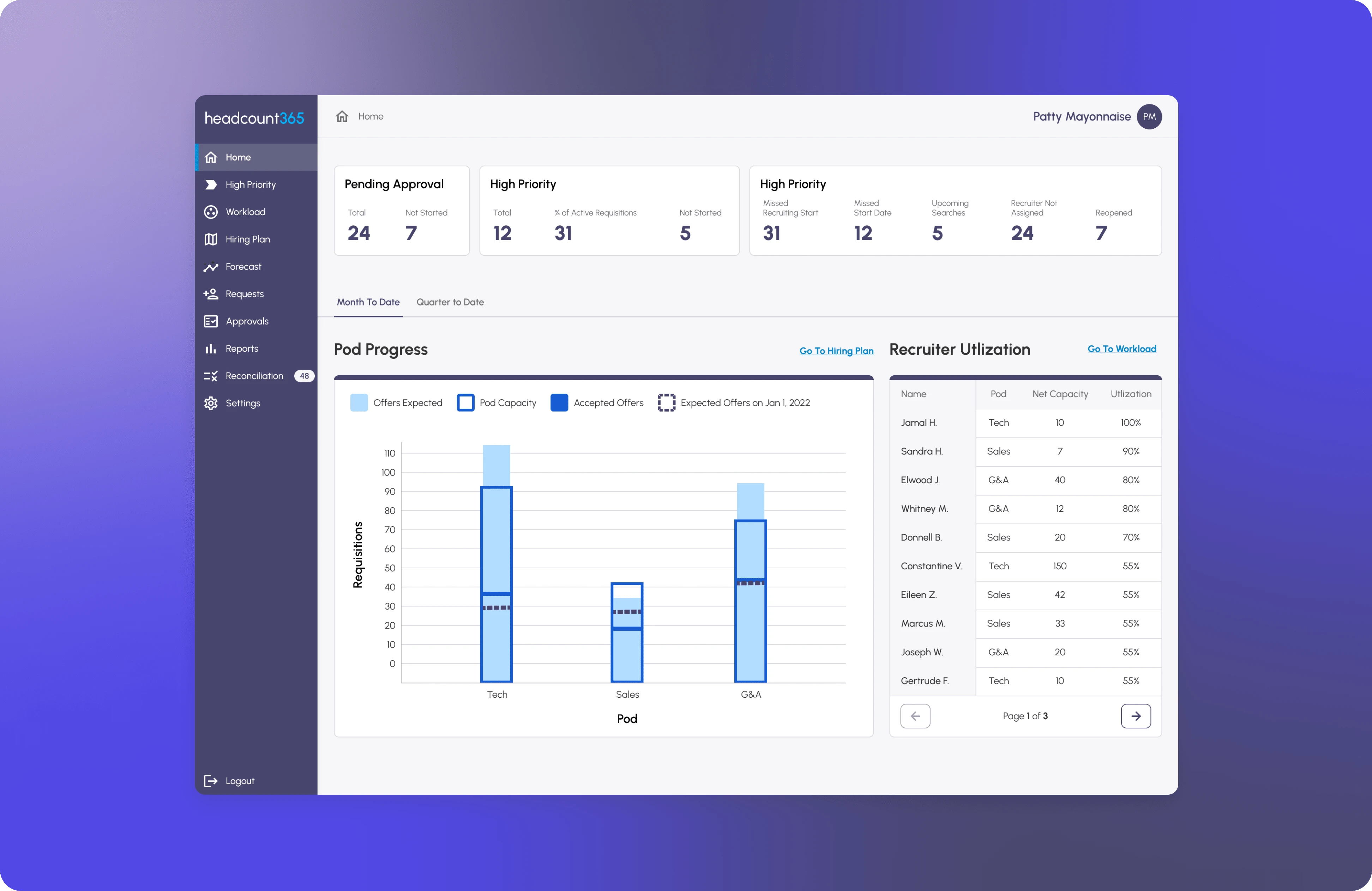
But after some feedback and more time with the extended contract, the "final final" screens looked more like:
More "final" UI screens from contract extension.
Takeaways 📣
Ask Lots of Questions: The headcount process was new to me, so I had to get up to speed as much as possible. The cofounders - former Talent Leaders - were pivotal in my understanding of the process and the space HC365 occupies. They were always available if I needed some quick feedback on a design or had a question about a step’s necessity or ordering.
More Videos: Since we were an all-remote team in different time zones and there was no formal onboarding, I found that I did not utilize video services like Loom as much as I would like. I found that some video walkthroughs could help facilitate a more asynchronous work environment.
Improvements: Thankfully, since it became a rolling contract for a few months, I had time to iterate on the design and better document said design decisions and assets while working on any additional new features the MVP would need. However, you can see the next section for even more improvements I’d want to make…
What I Might Want to Change
Reimagined dashboard with a new bar chart scheme.
Updated features with a new table layout to improve UX.
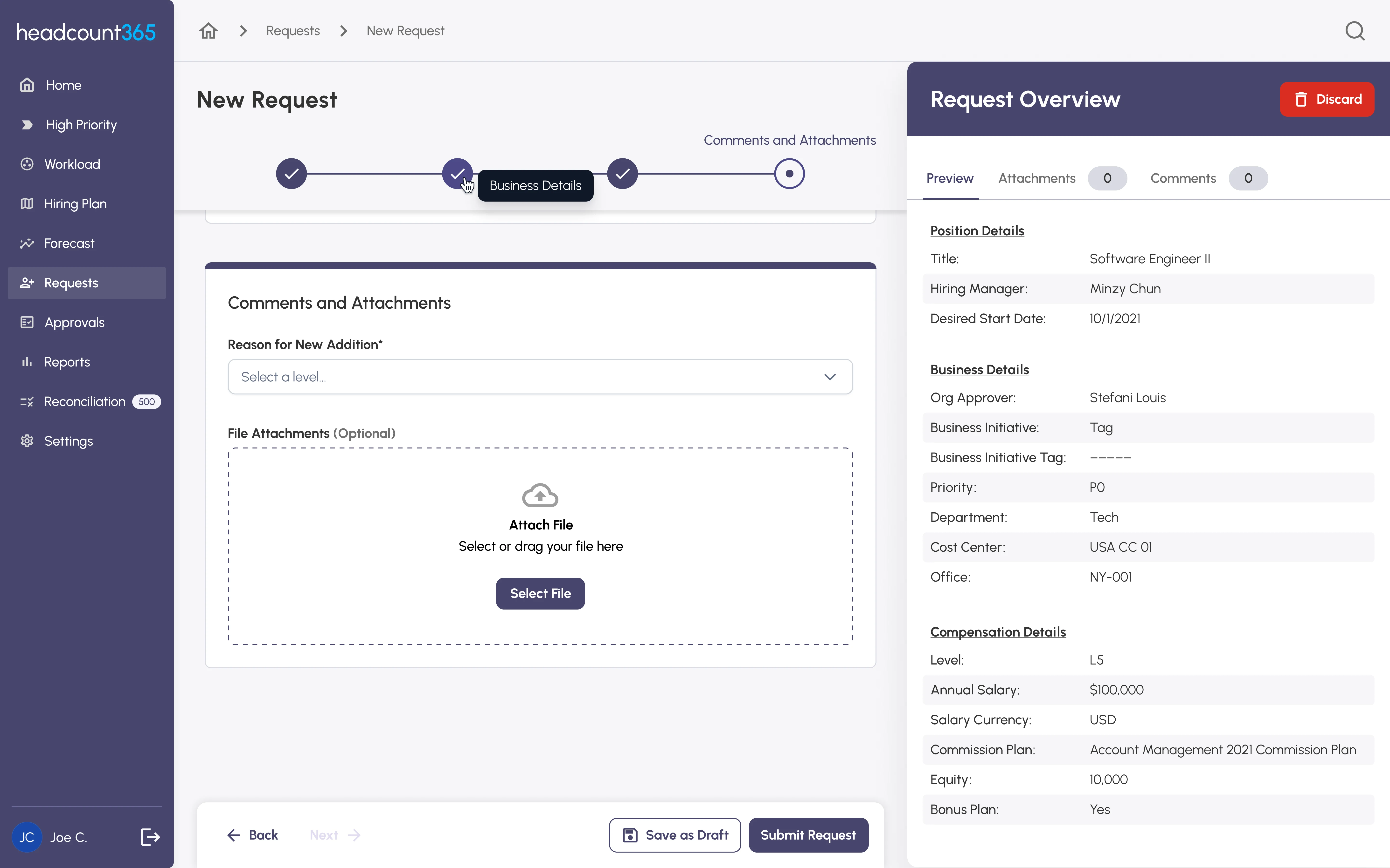
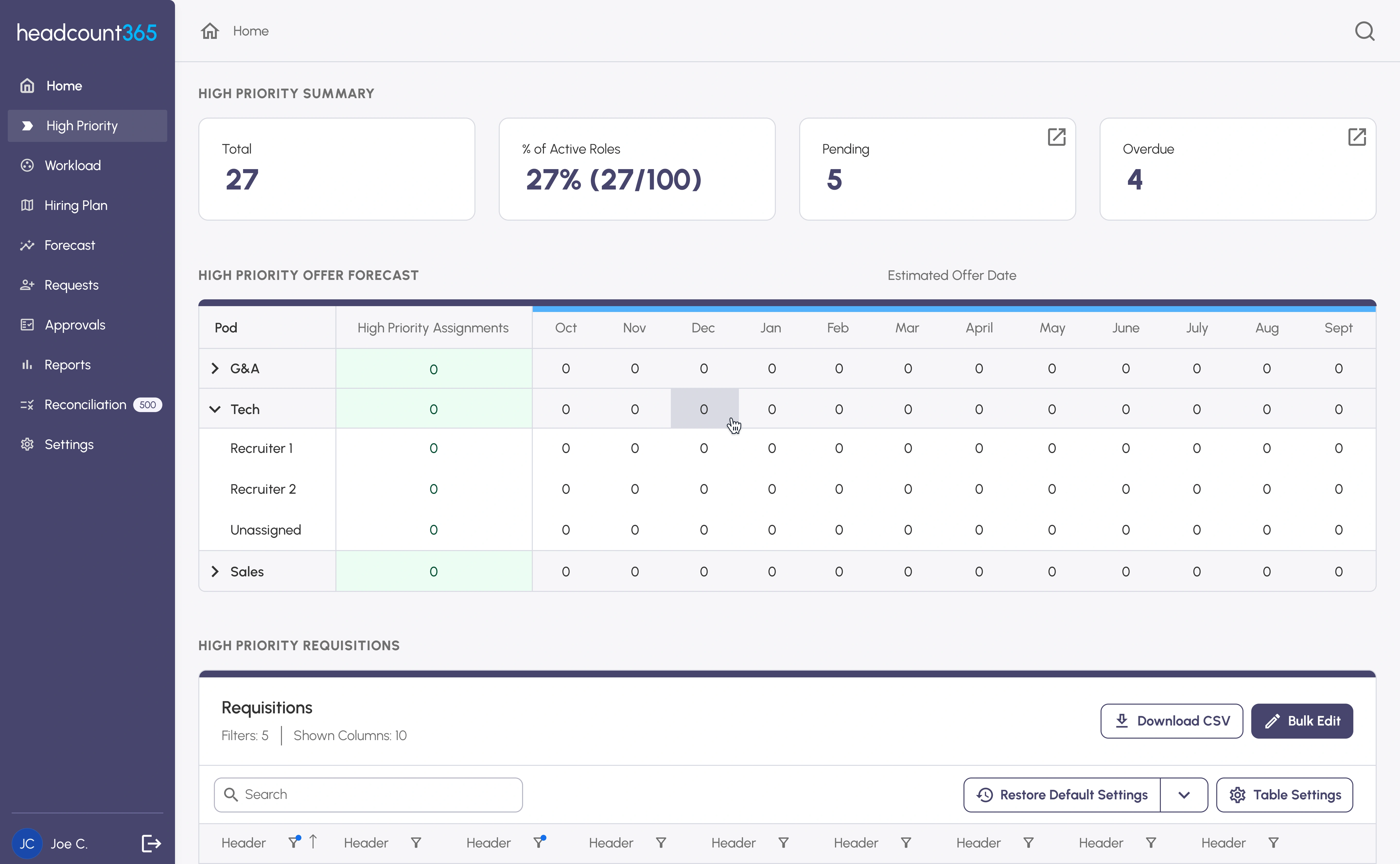
Reimagined flow for requests that feature an omnipresent overview and a more updated layout.
Like this project
Posted May 8, 2023
A workflow transformation from spreadsheets to a full web app
Likes
0
Views
31