InPlace Health
Brittany Ladion-Lucero
Overview 🔎
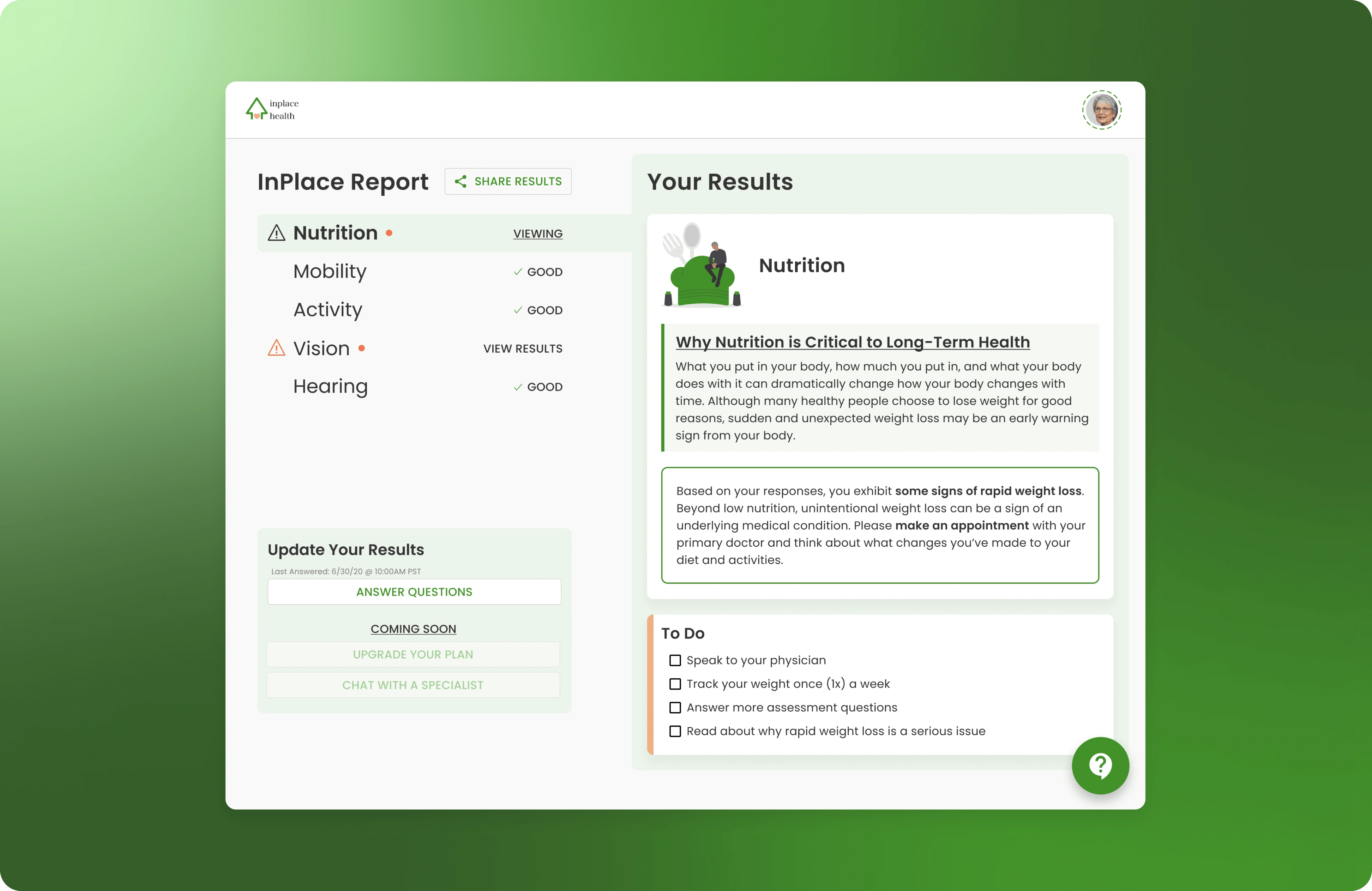
Designing an app for seniors presents unique challenges since they may not be tech-savvy or have disabilities that limit their ability to interact with digital interfaces. The app should be user-friendly and address the specific needs of seniors while maintaining a modern and engaging design. Enter InPlace Health: a personalized care plan that allows seniors to “take control of their health.” Unfortunately, the project never found funding and the founder went on to other opportunities.
Cover image.
Research 📚
I was provided prior research from the founder, as well as doing some of my own research on designing for seniors finding that:
Seniors want an app that is easy to use and navigate, with simple and straightforward features.
Some seniors have difficulty reading small text or seeing small icons on a screen.
Many seniors have multiple chronic conditions that require medication management and symptom tracking.
Seniors want an app that can help them stay motivated and accountable to their health goals.
Some things to keep in mind were:
A user would only access a care plan by answering 10 common questions that would encompass a variety of potential care topics.
After report generation, the next steps needed to be easily accessible, readable, and discoverable.
Design 🎨
With UX research and some wireframes provided by the product lead, I was tasked with creating a polished, intuitive app. Features included: a step-by-step questionnaire that would generate a report and a detailed, personalized care plan with accompanying goals and tasks related to the aforementioned report.
Testing 🧪
Since this project was trying to get funding, not much could be developed. I used my prototypes to conduct informal user tests with seniors to see if they could accomplish certain tasks and understand what was being shown on the screen.
Final UI Design 💫
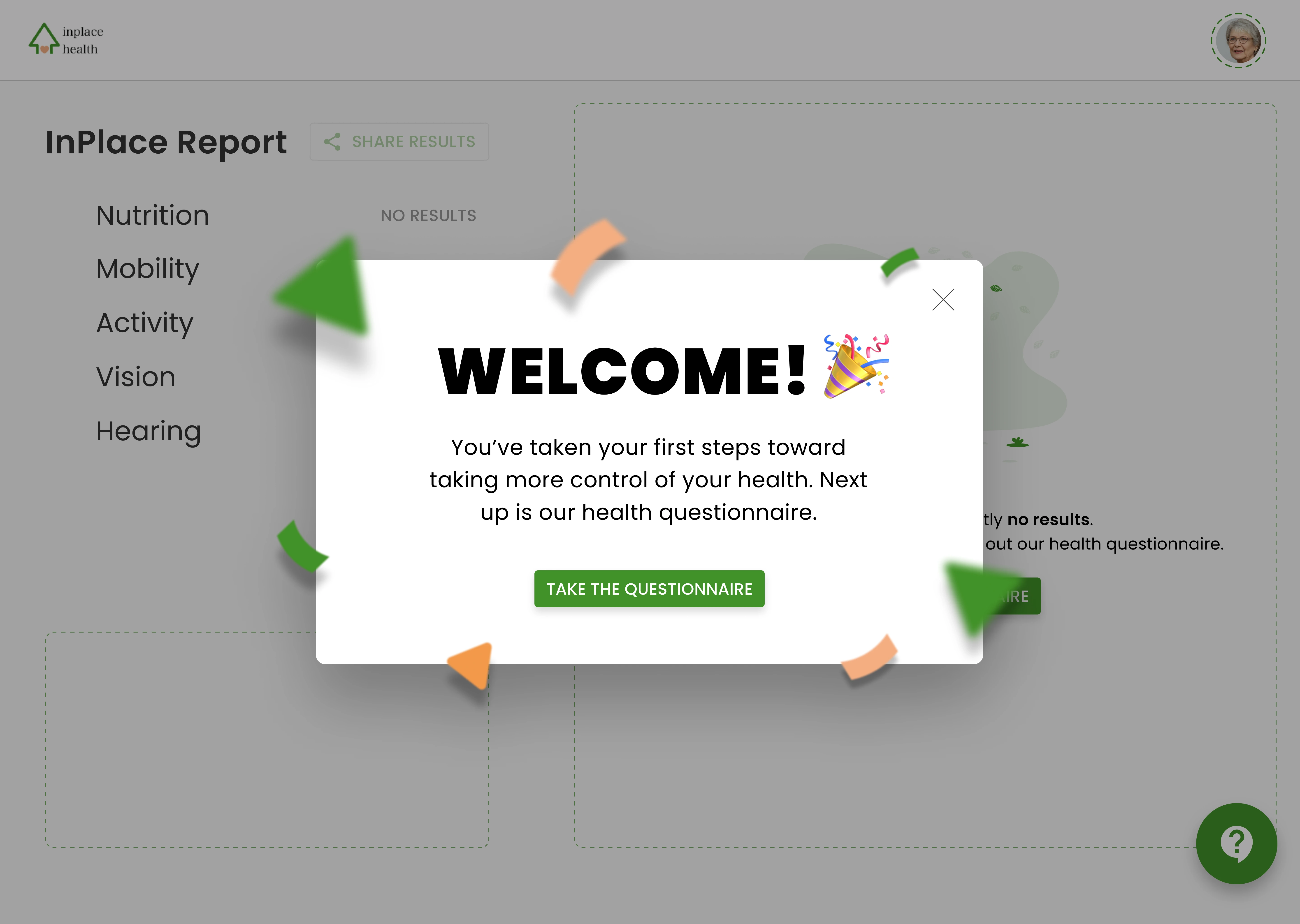
Welcome screen example.
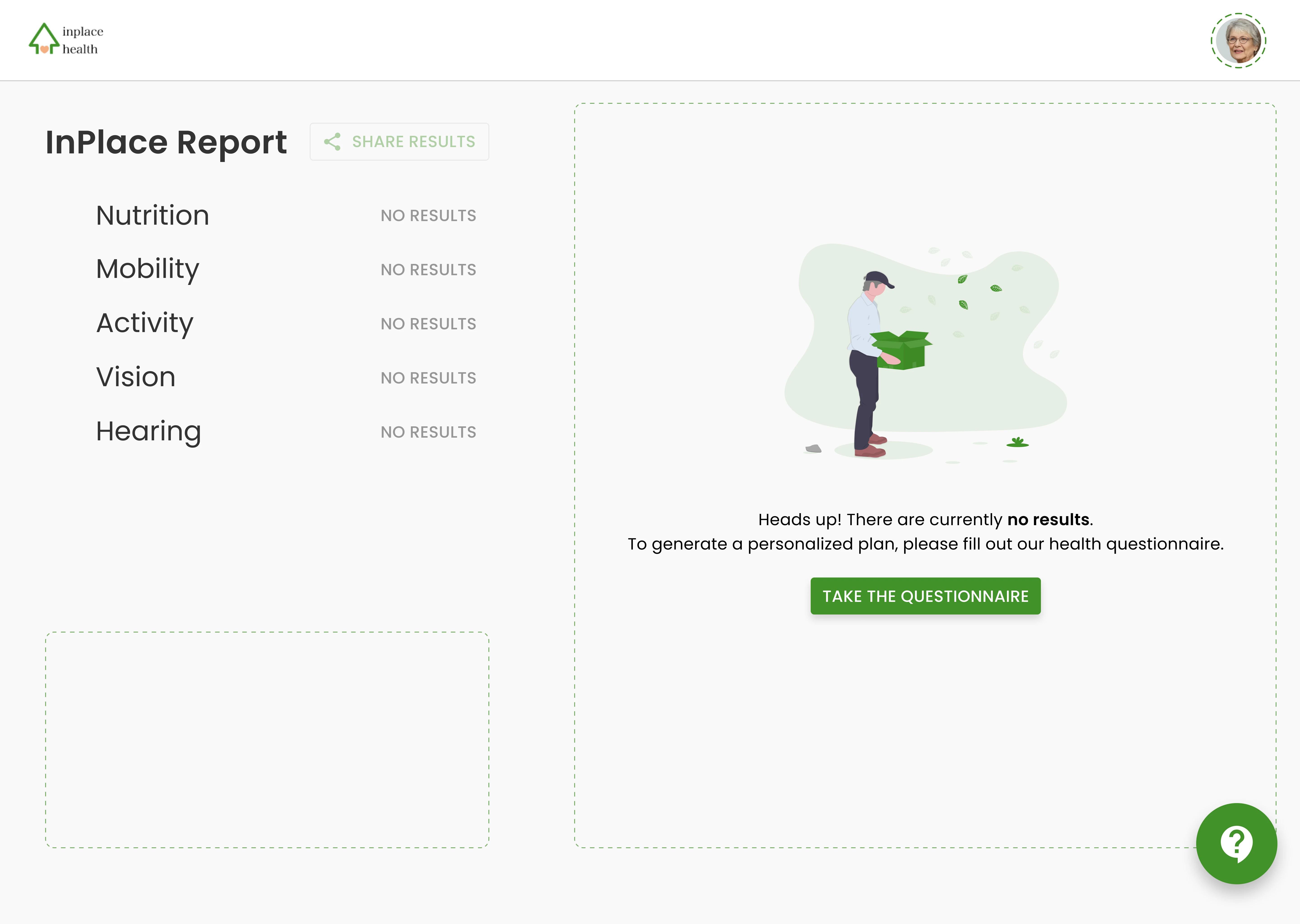
Empty screen/default page for a new user.
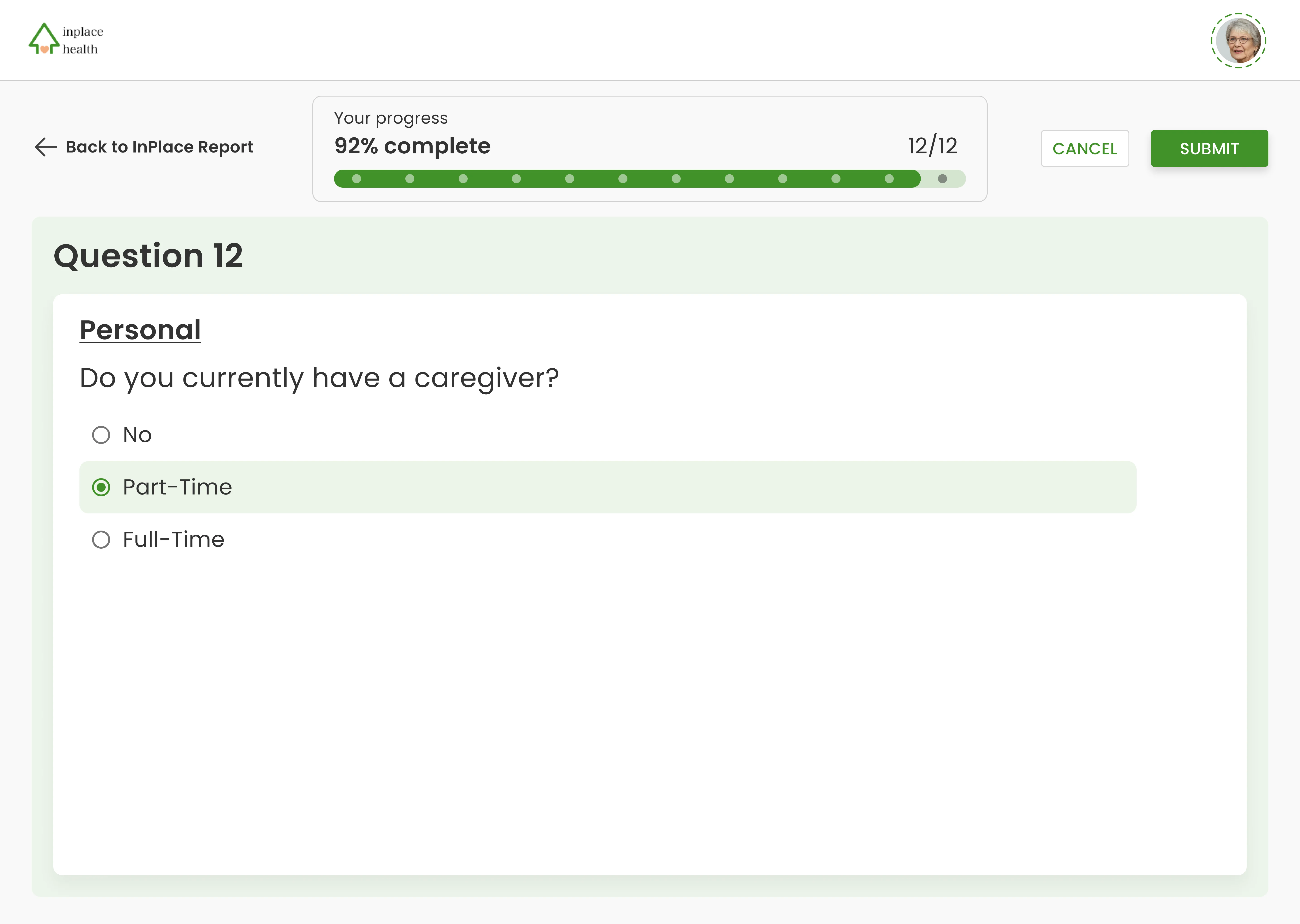
Example of a questionnaire page.
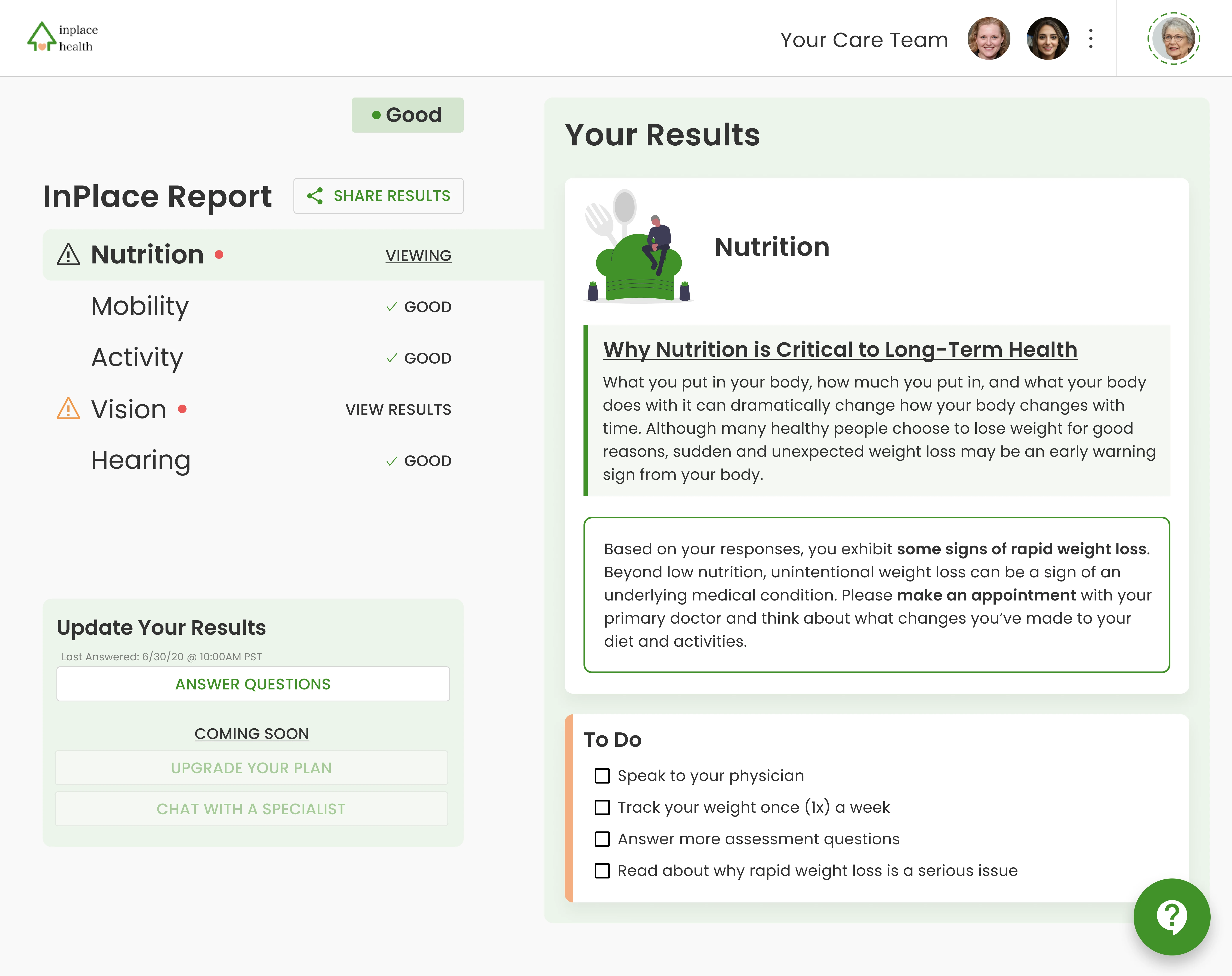
Example of a fully completed profile.
Takeaways 📣
Balance: I didn’t want to fall into a trap that the application would be too vague for the sake of keeping things brief. So, I made sure the text was broken up and visually grouped so as not to be overwhelming. Besides that, I made the text a default 18px for the body copy to ensure it would be legible enough.
Unfortunate Endings, But Good Learnings: While the project didn’t receive any funding, it opened my eyes to the constant change of such a nascent stage product. Since these screens were being seen by folks who had control of what was being funded, we would have to iterate often enough to where I’d have to balance this project with my full-time design job.
Improvements: The button placement on the final design in the questionnaire is odd. I would change that in a heartbeat…which you can find below:
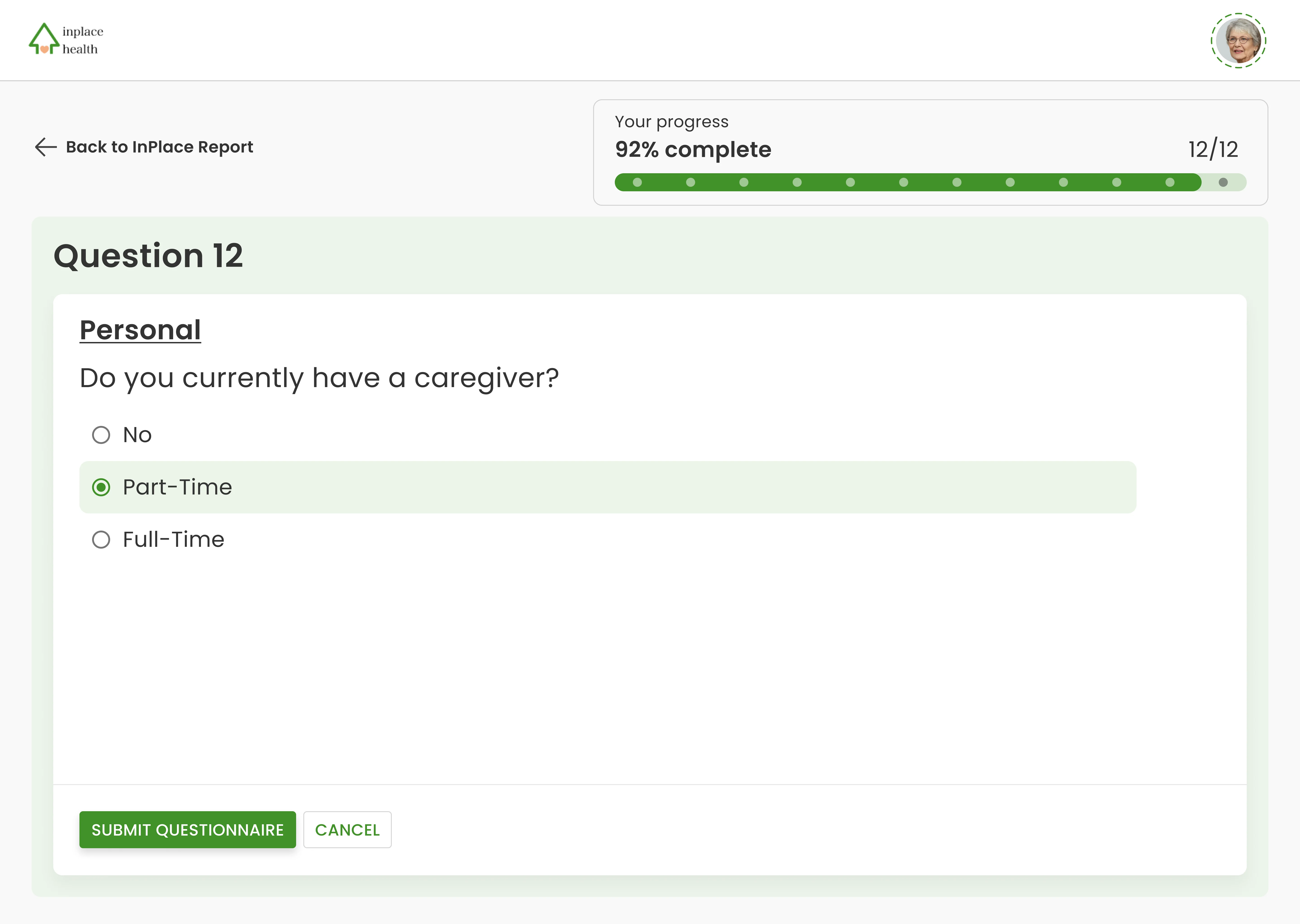
Improved screen with the submit button following a more "natural" progression with sightline.
Like this project
Posted May 8, 2023
Giving seniors control of their health
Likes
0
Views
38