Arrow® | Visual Identity
next mahamud
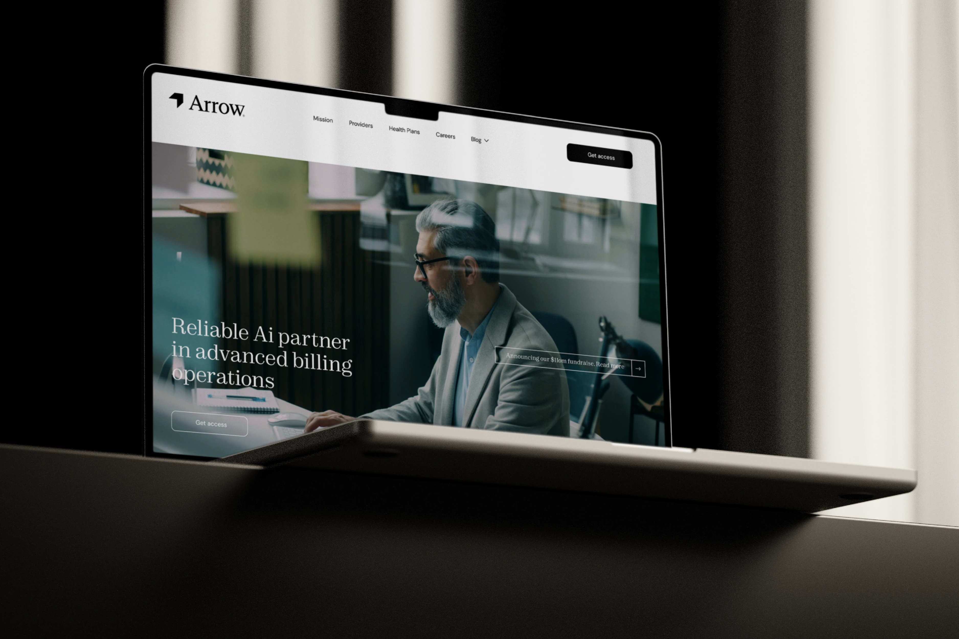
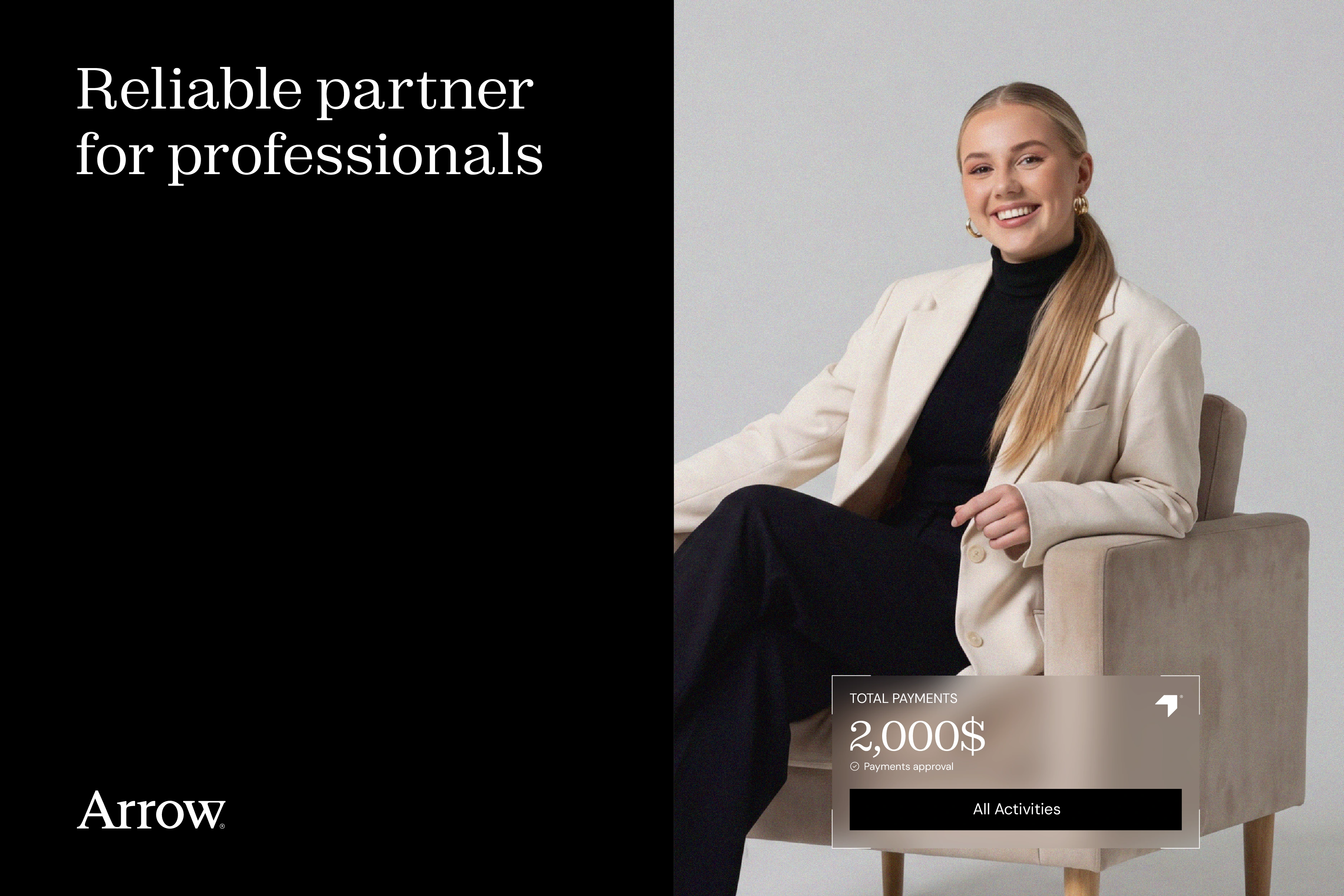
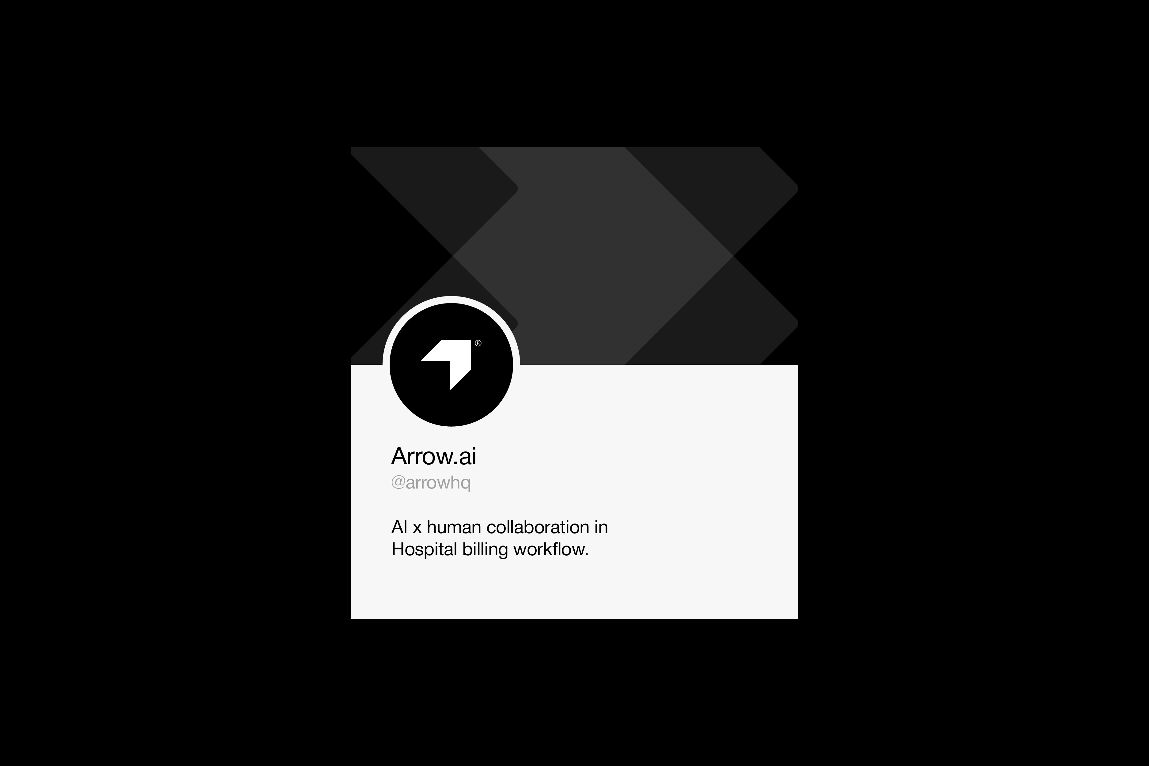
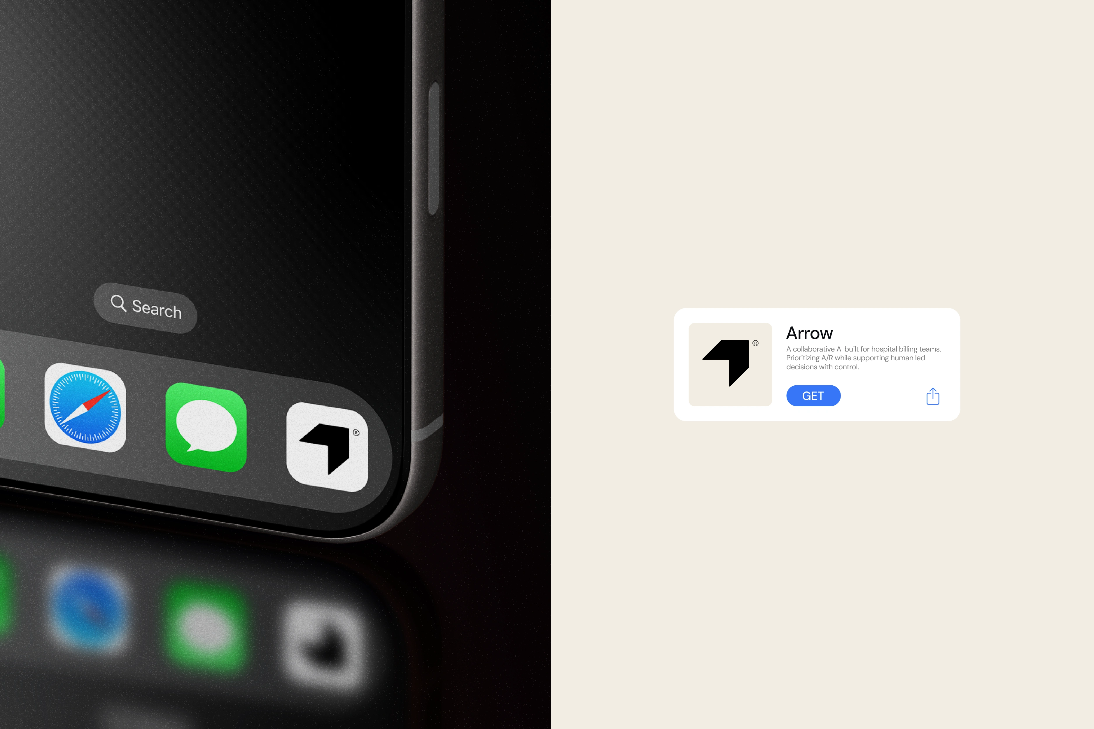
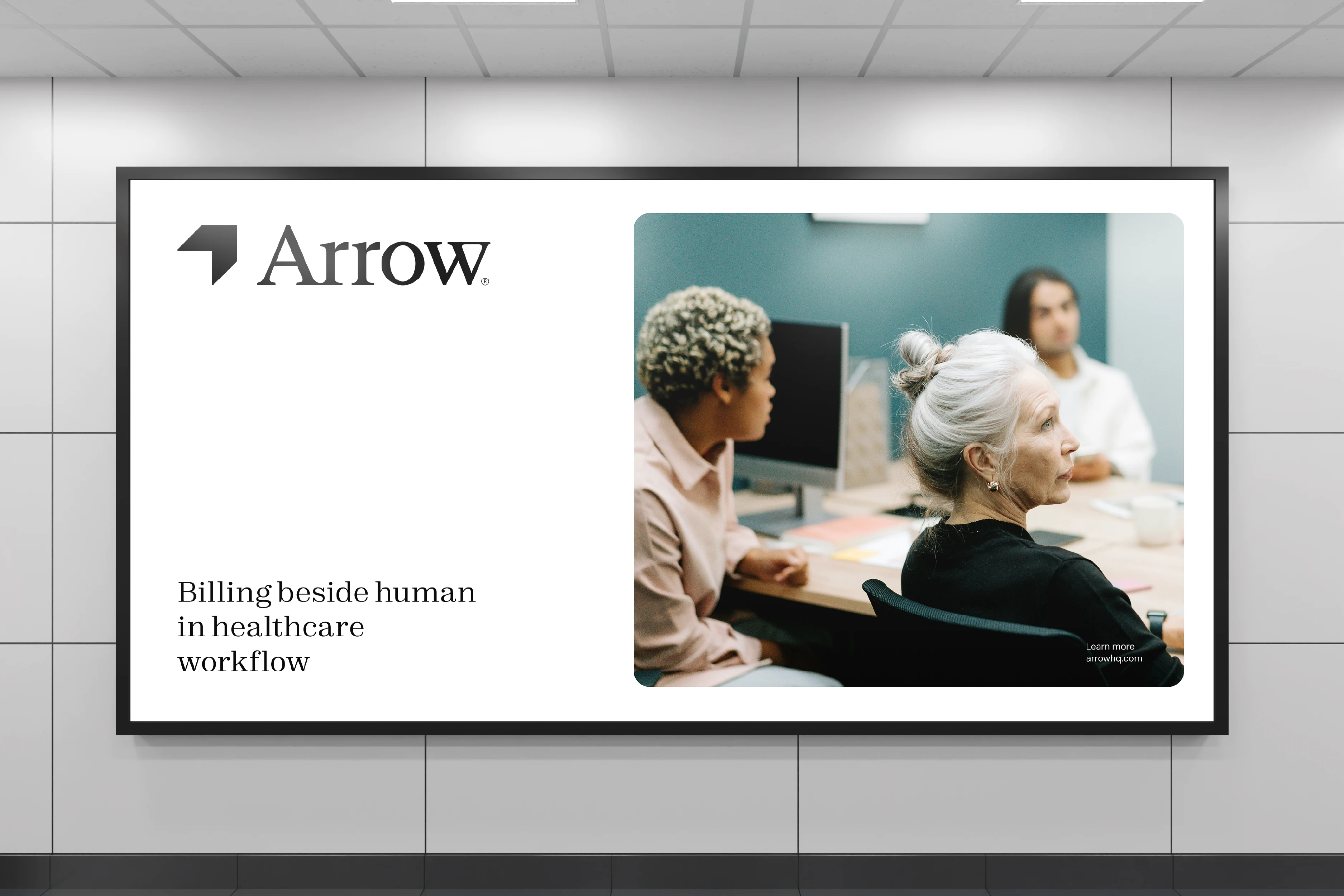
Arrow is a modern healthcare billing platform designed to simplify complex financial workflows for medical providers.
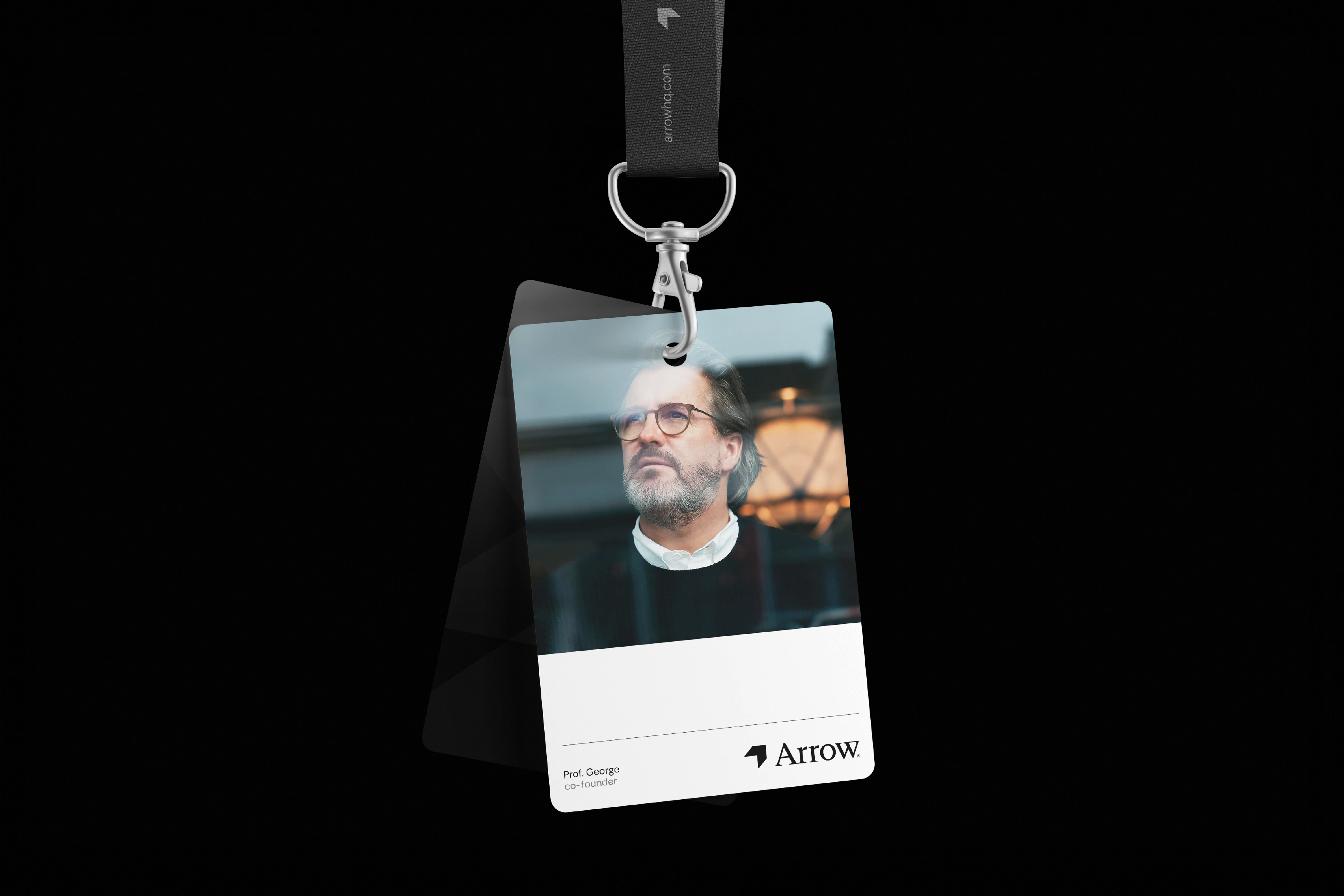
I led the complete visual identity system, including logo design, brand guidelines, and UI visual language, focused on building trust and clarity in a traditionally sterile industry. The result was a clean, human-centred brand that positions Arrow as approachable yet professional.
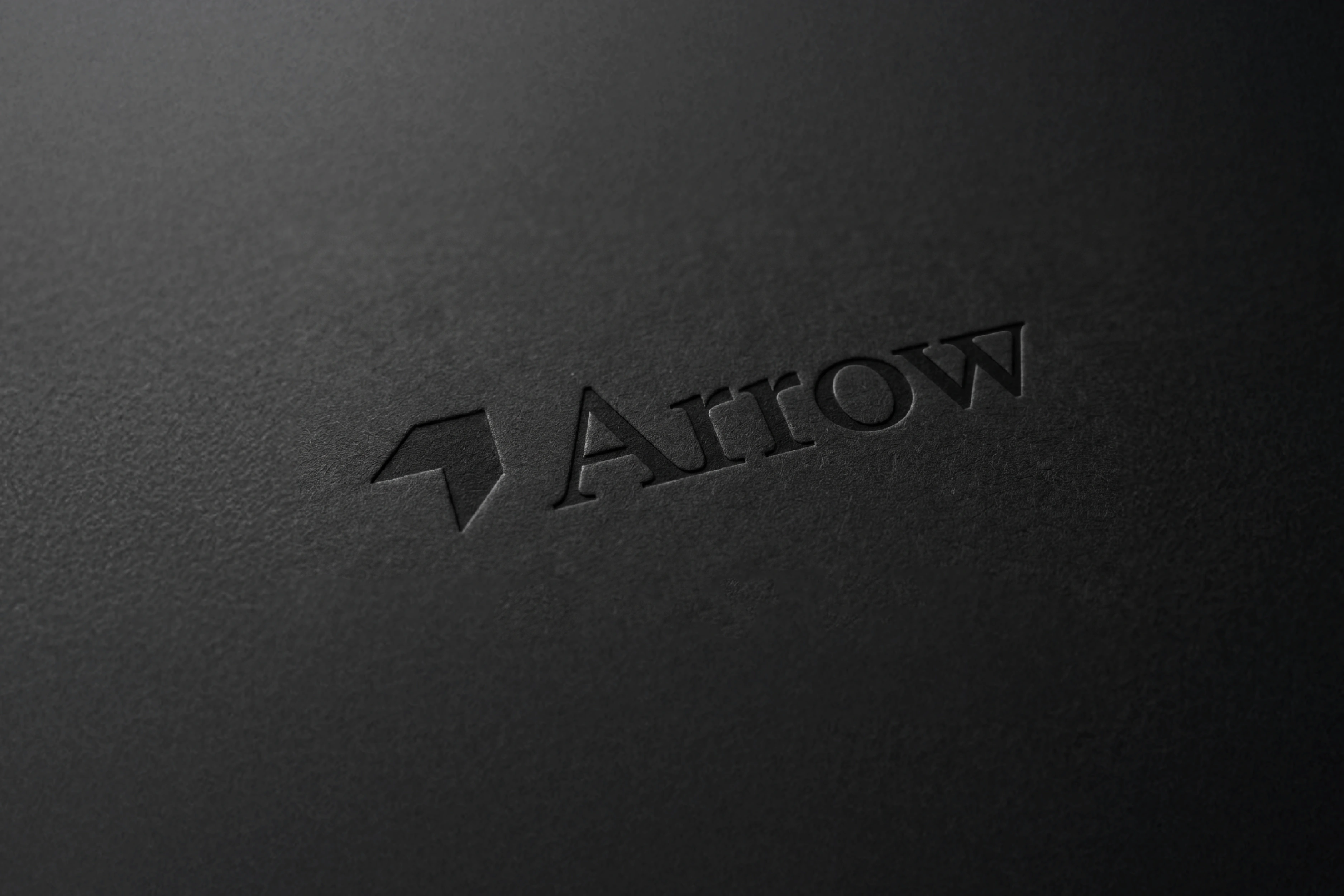
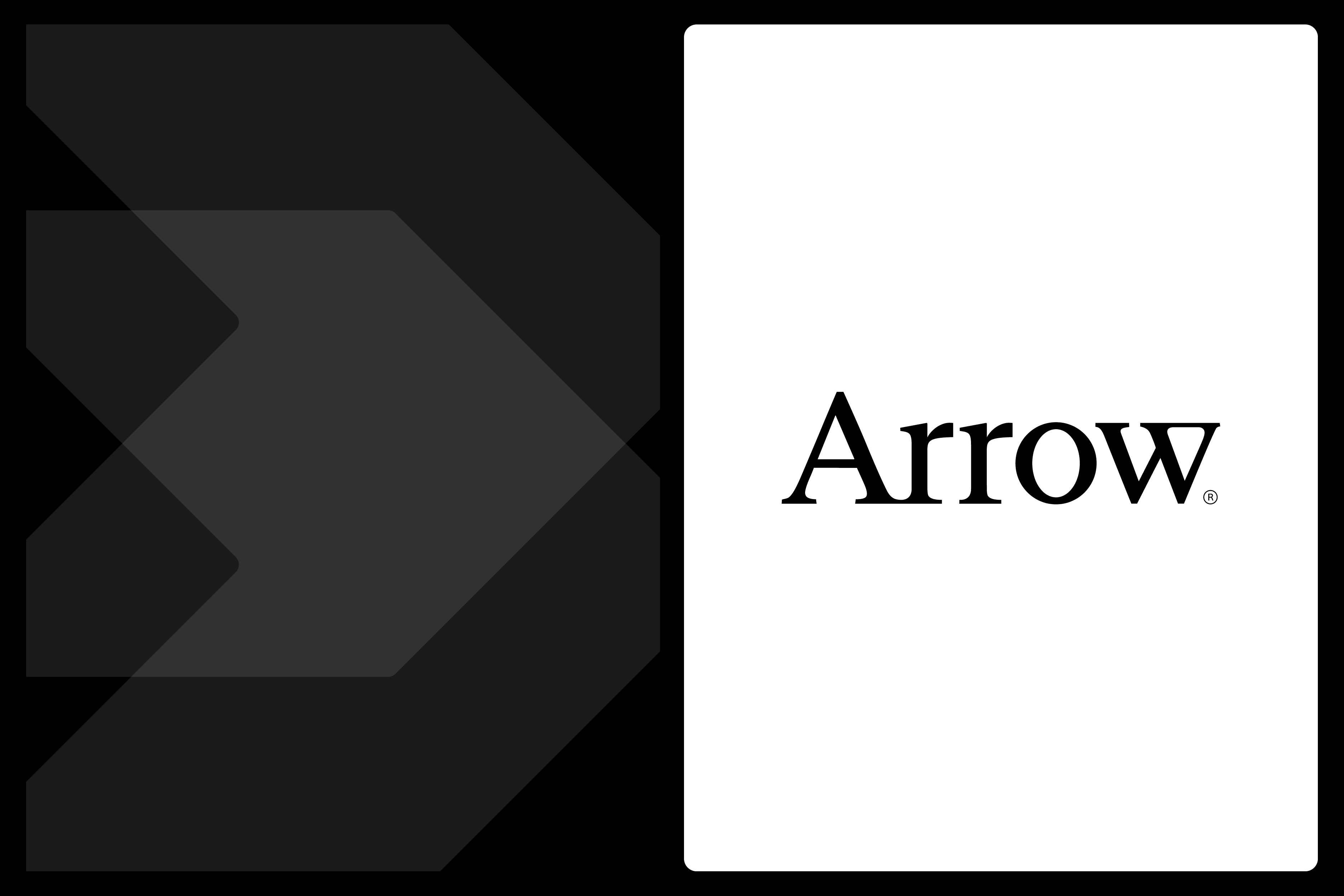
Arrow®
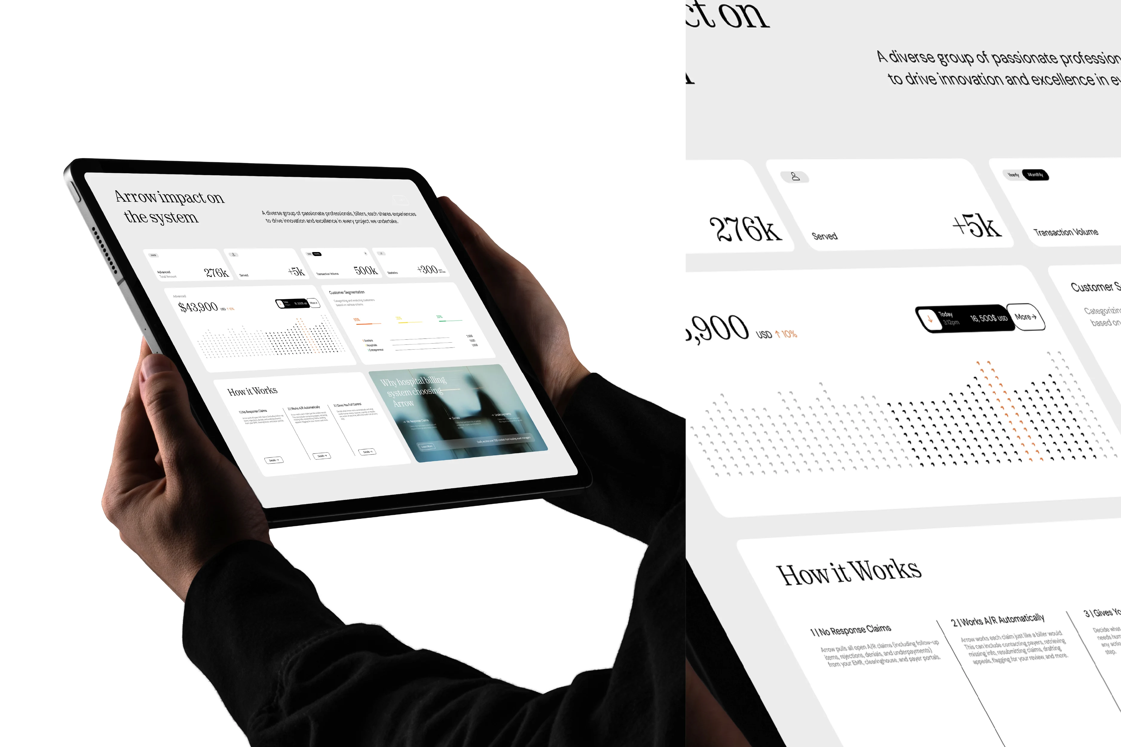
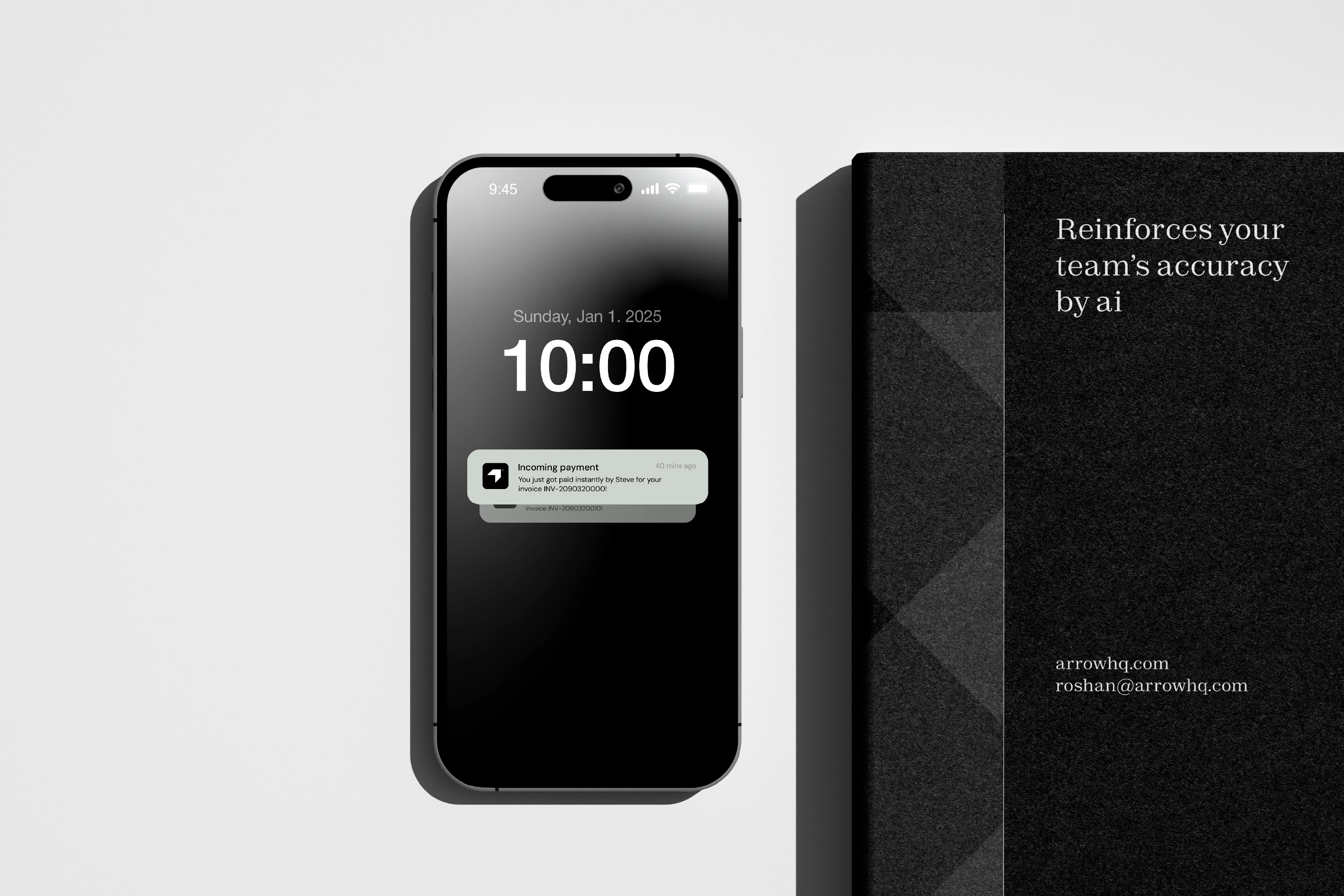
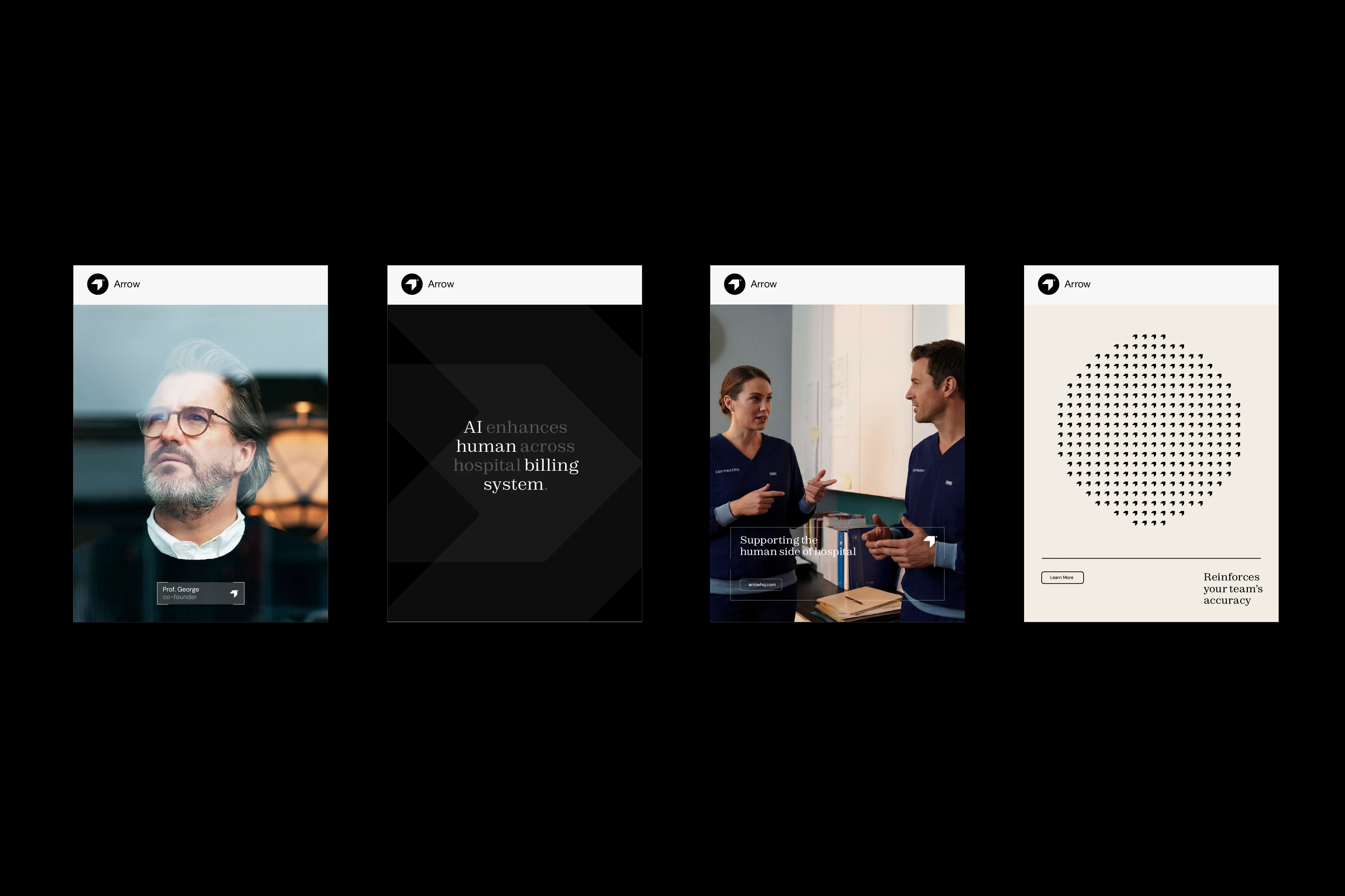
Arrow is built on AI, but it doesn’t present itself as an AI product. It is designed to work alongside healthcare billing teams, supporting every stage of the hospital billing process.
Managing invoices in a hospital environment is complex and demanding, and Arrow exists to reduce that burden. It does not replace people or their expertise; it assists them.
Challange |
Arrow’s current branding feels too similar to typical tech products, which makes it hard to stand out from competitors. It doesn’t clearly show the authority, trust, and seriousness on which the product is built on.\
\
Because of this, the brand struggles to feel mature and reliable at first glance. The goal is to move away from a generic tech look and create a more distinctive, premium identity that feels modern, responsible, and easy to trust, helping Arrow stand confidently on its own.
Solution |
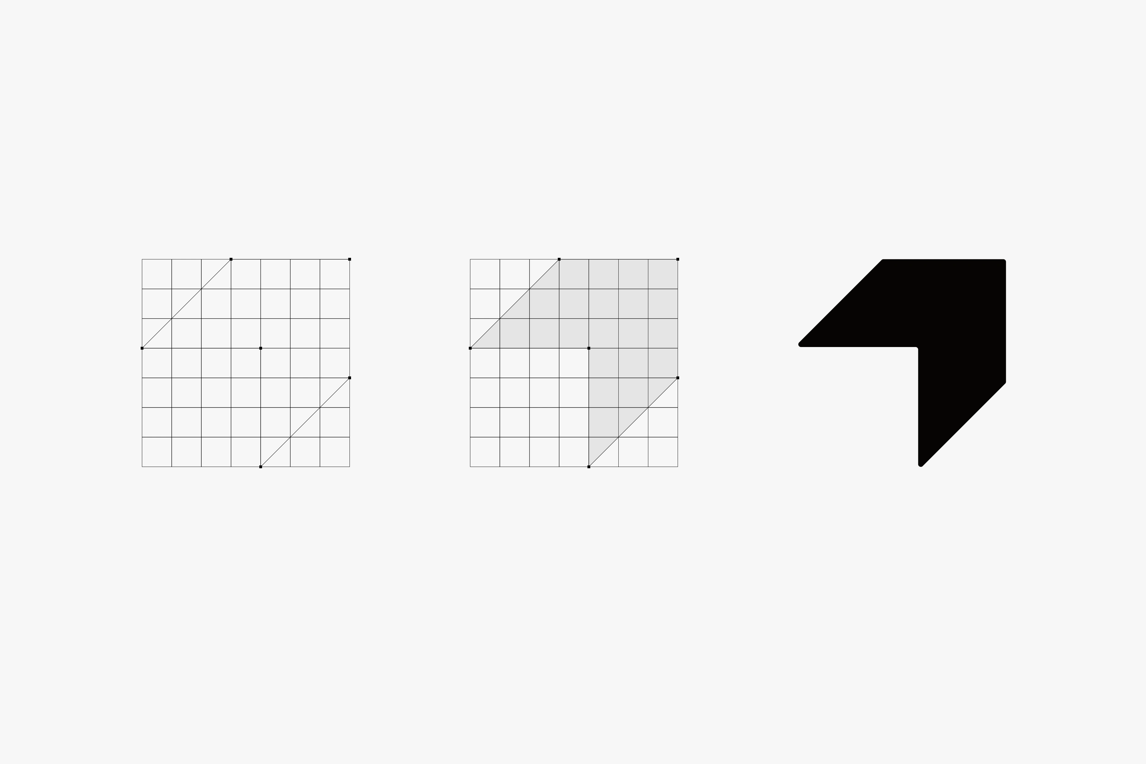
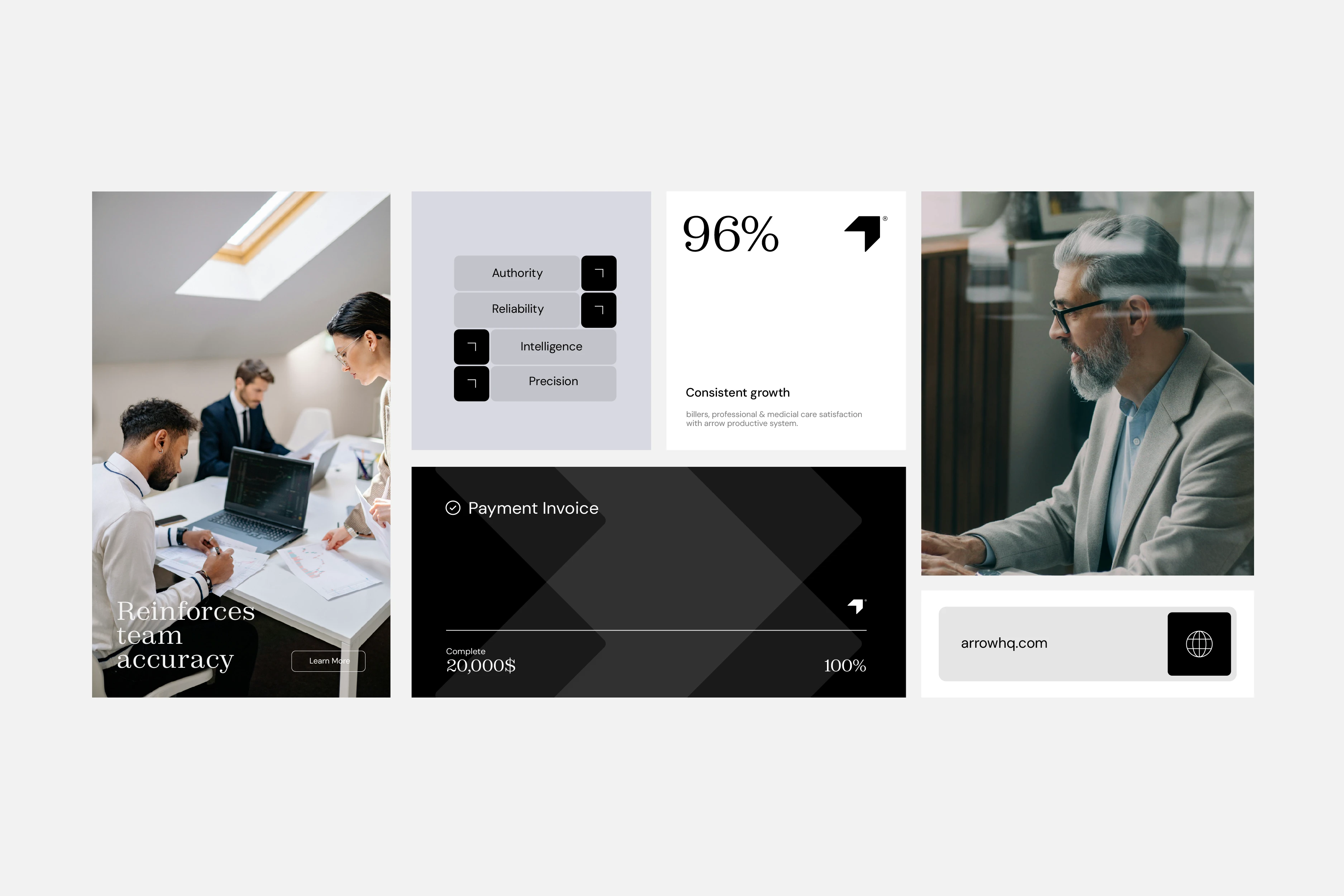
Arrow direction translates authoritative words to open a path to make the brand more reliable from a perspective. Strategies instinctively portrays itself as an expert in healthcare billing practices, confidently approaching the field as a reliable problem solver for complex human tasks.
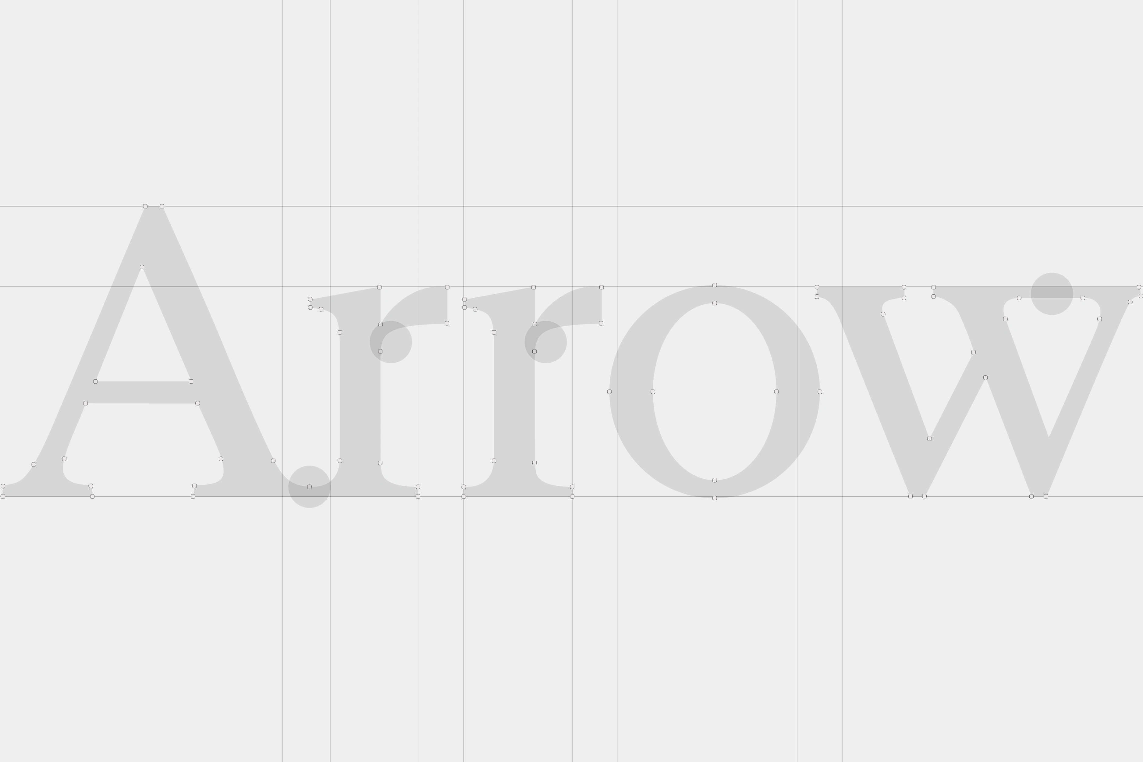
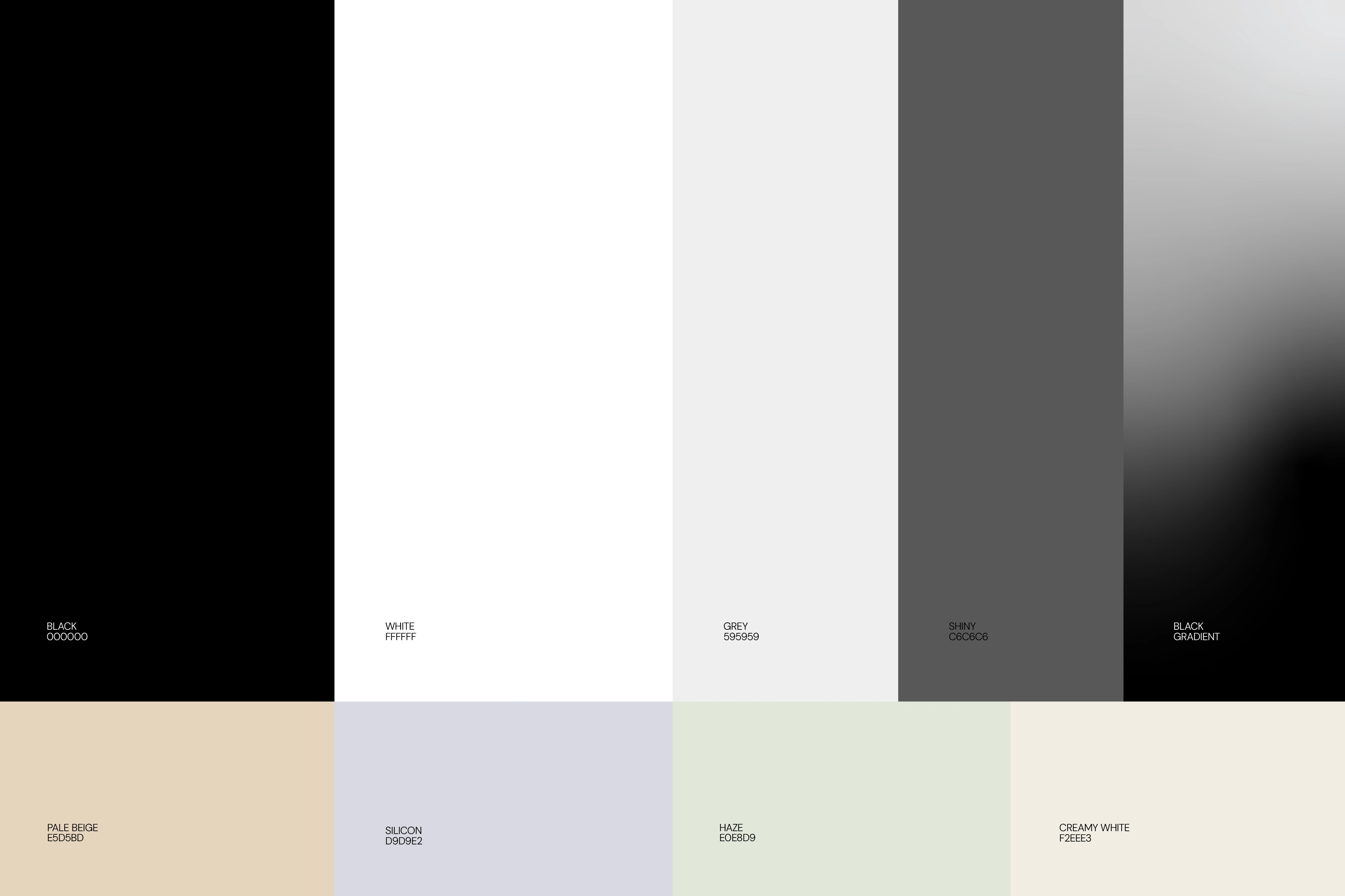
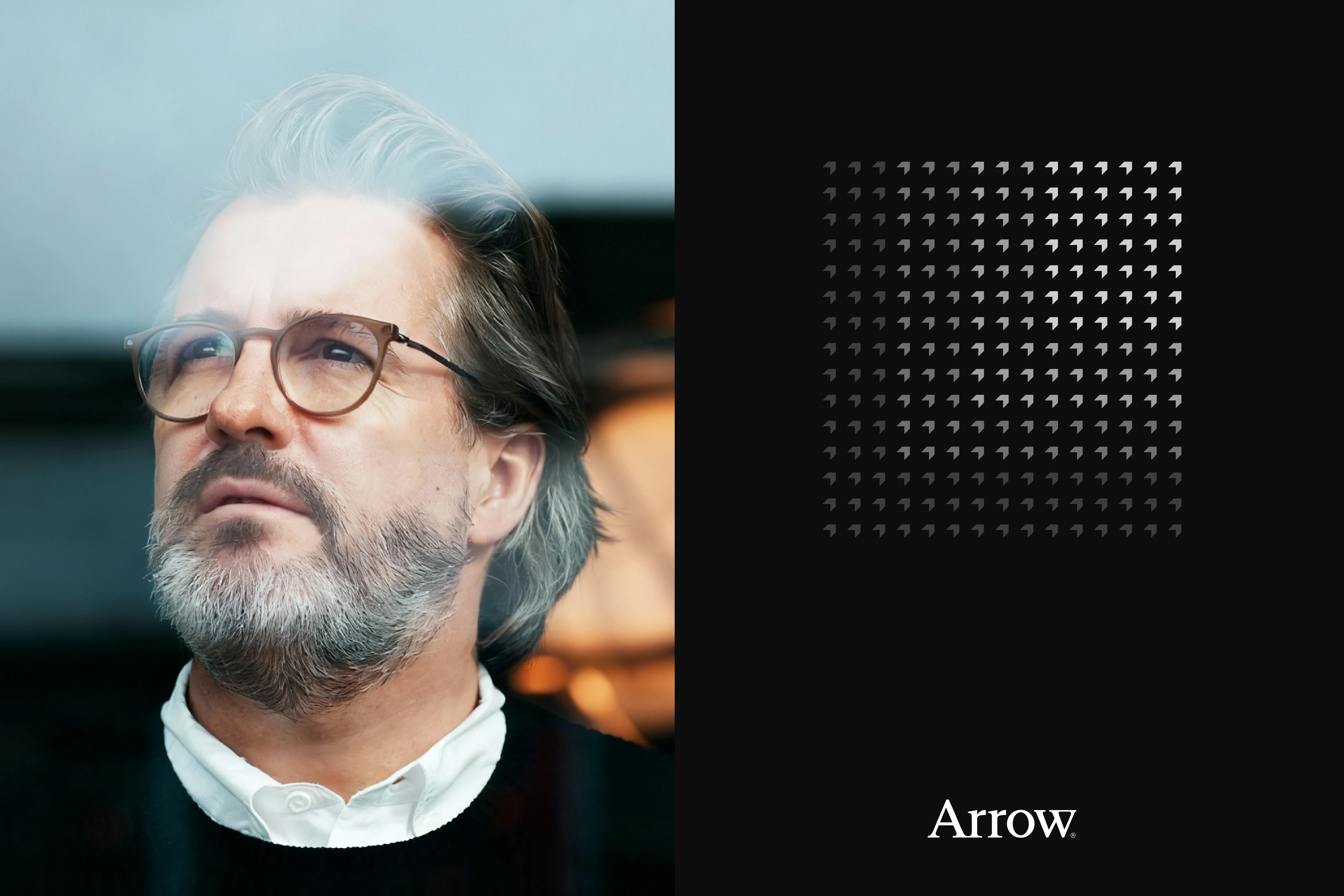
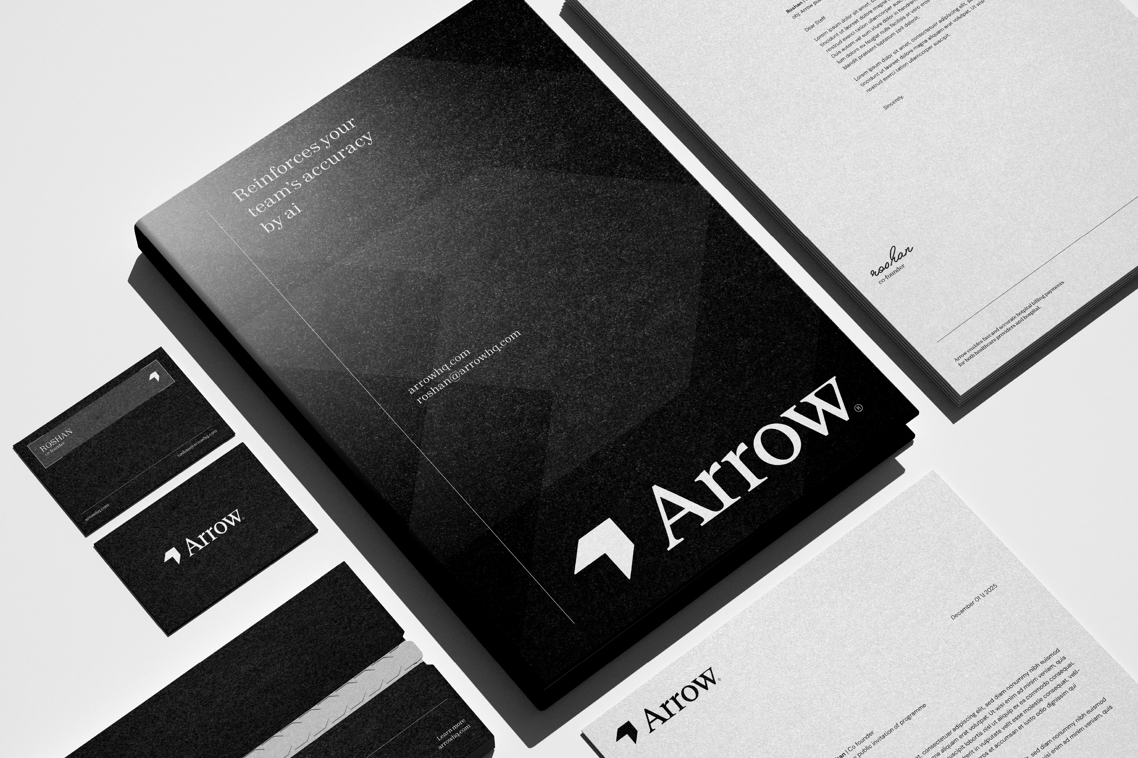
Conveying the message more clearly, we position the brand in a serious, confident & efficient way. The Serif characters are built to personalise a brand as an authoritative, stability & trustworthy position. Serif convey a message in a human form by adding the legacy are drives from the historical scenario. Its accent insight is expert, serious & luxurious, which this brand requires to pursue.
//
Project Scope: Visual Identity | Brand Guideline\
Creative Direction: Nextmahamud®\
Client: Roshan Patel
2026© All Rights Reserved

Thank you for viewing
Arrow® Visual Identity
Let’s work together: nextmahamud@gmail.com
2025© All Rights Reserved
Get in Touch
Like this project
Posted Apr 30, 2026
Arrow is a modern healthcare billing platform designed to simplify complex financial workflows for medical providers.