Logo & Packaging // Nonna Pasta
Thao Le
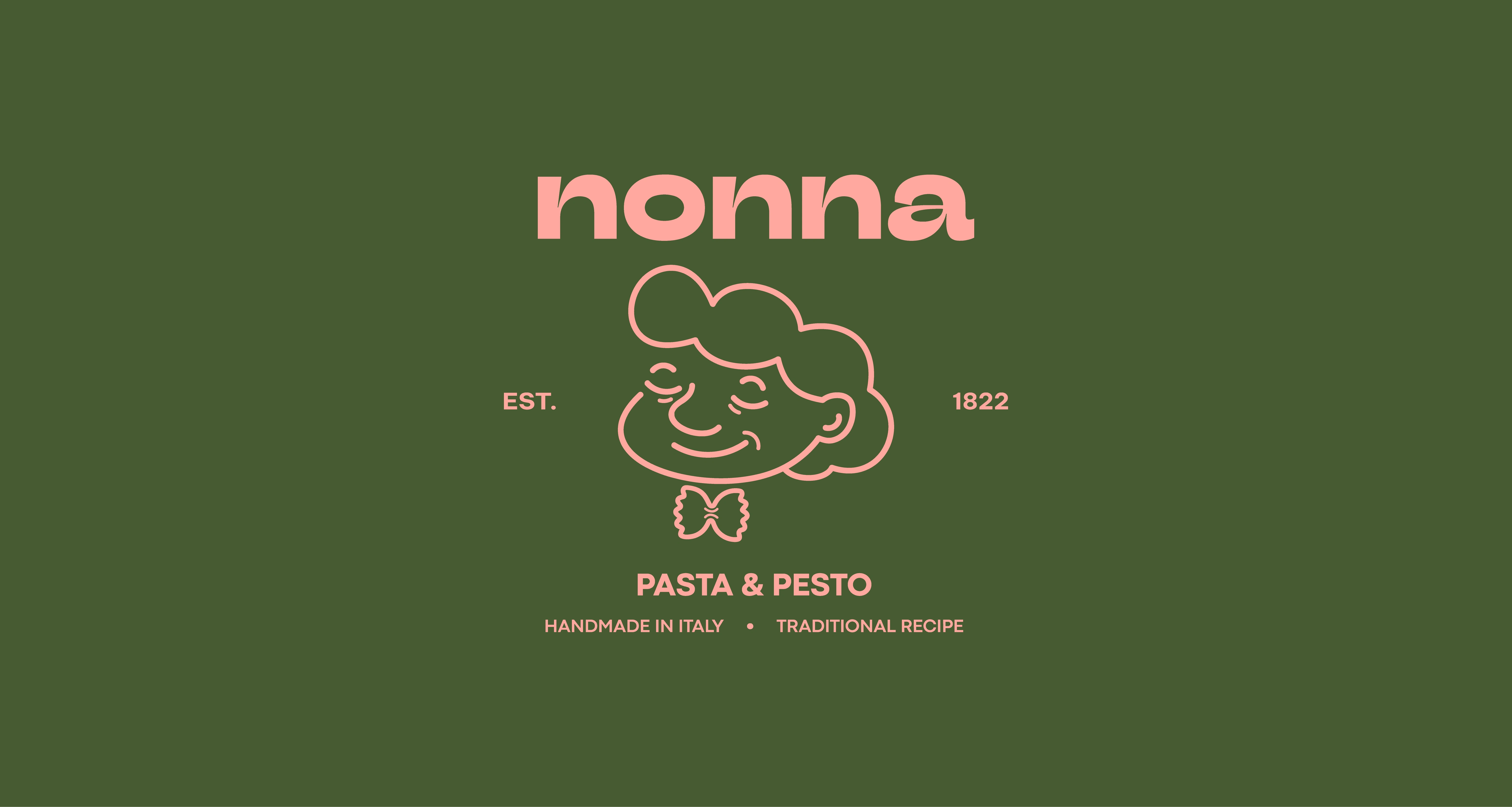
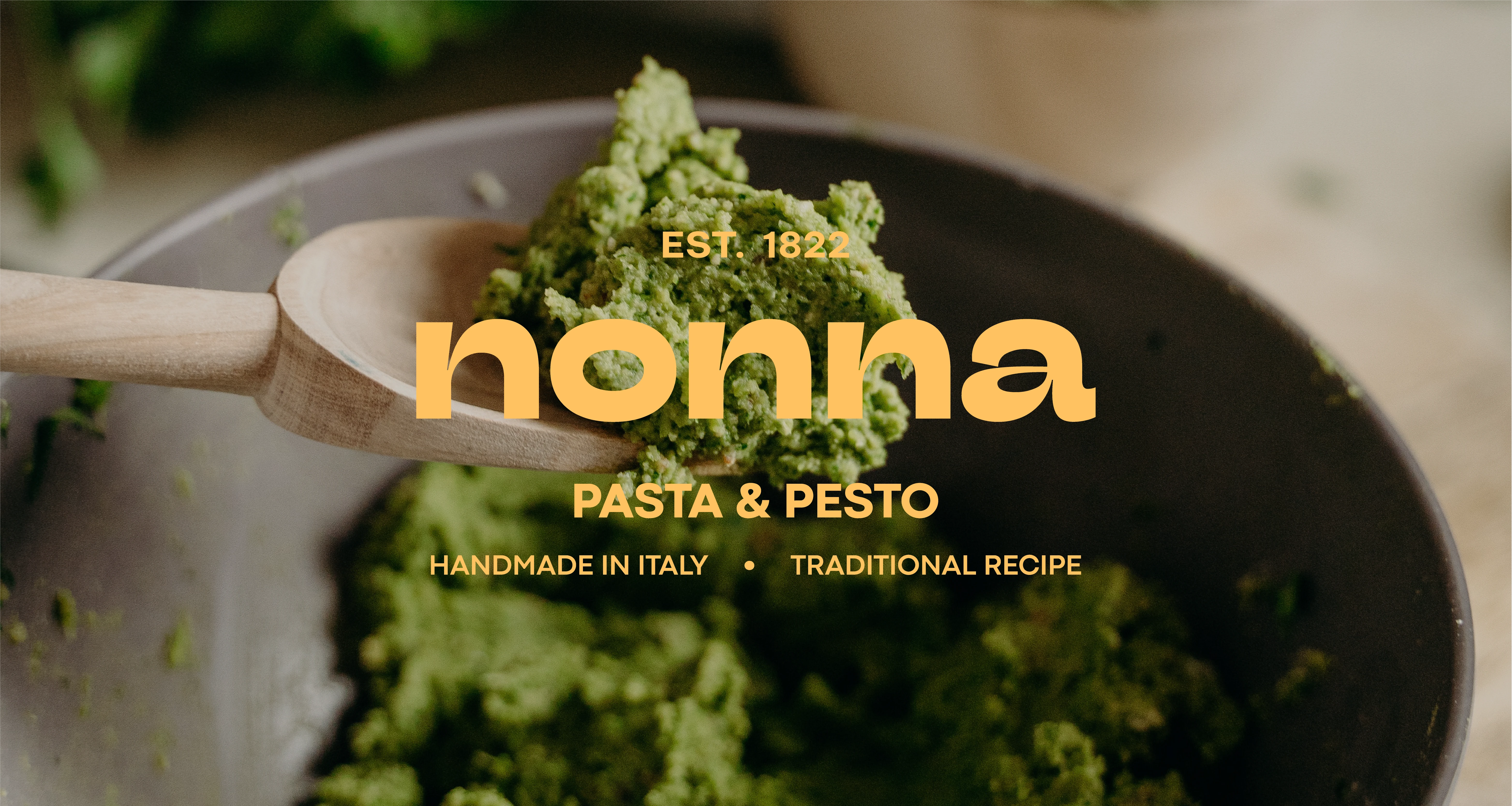
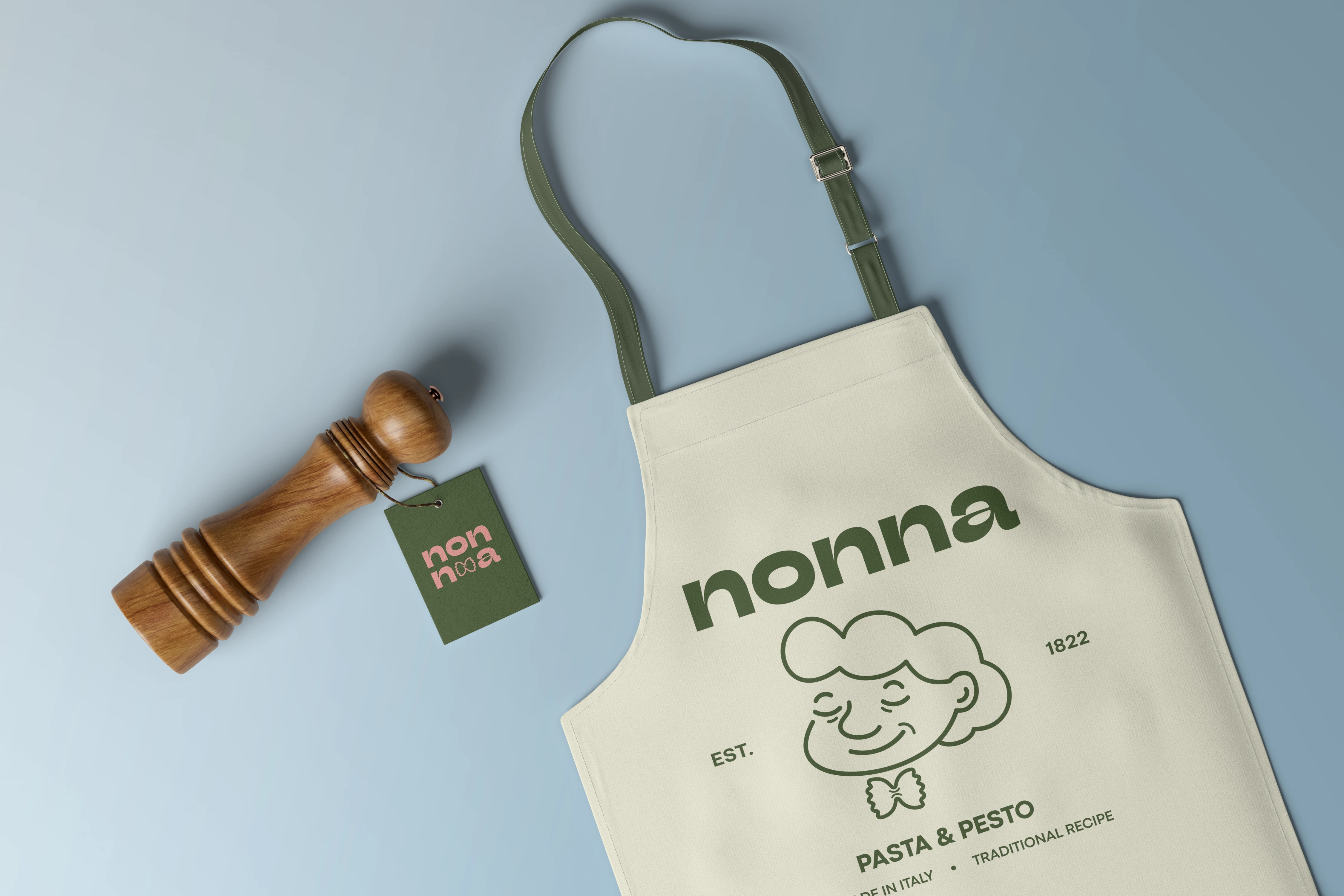
Problem: Nonna is a family business that has been selling homemade pasta and pesto in Italy since 1822. The recipes come from the grandmother of the current owner, Francesco, and have never been changed. Nonna looked for a new brand identity that is younger, fresher, while also keeping an eye on the traditional qualities of the business.
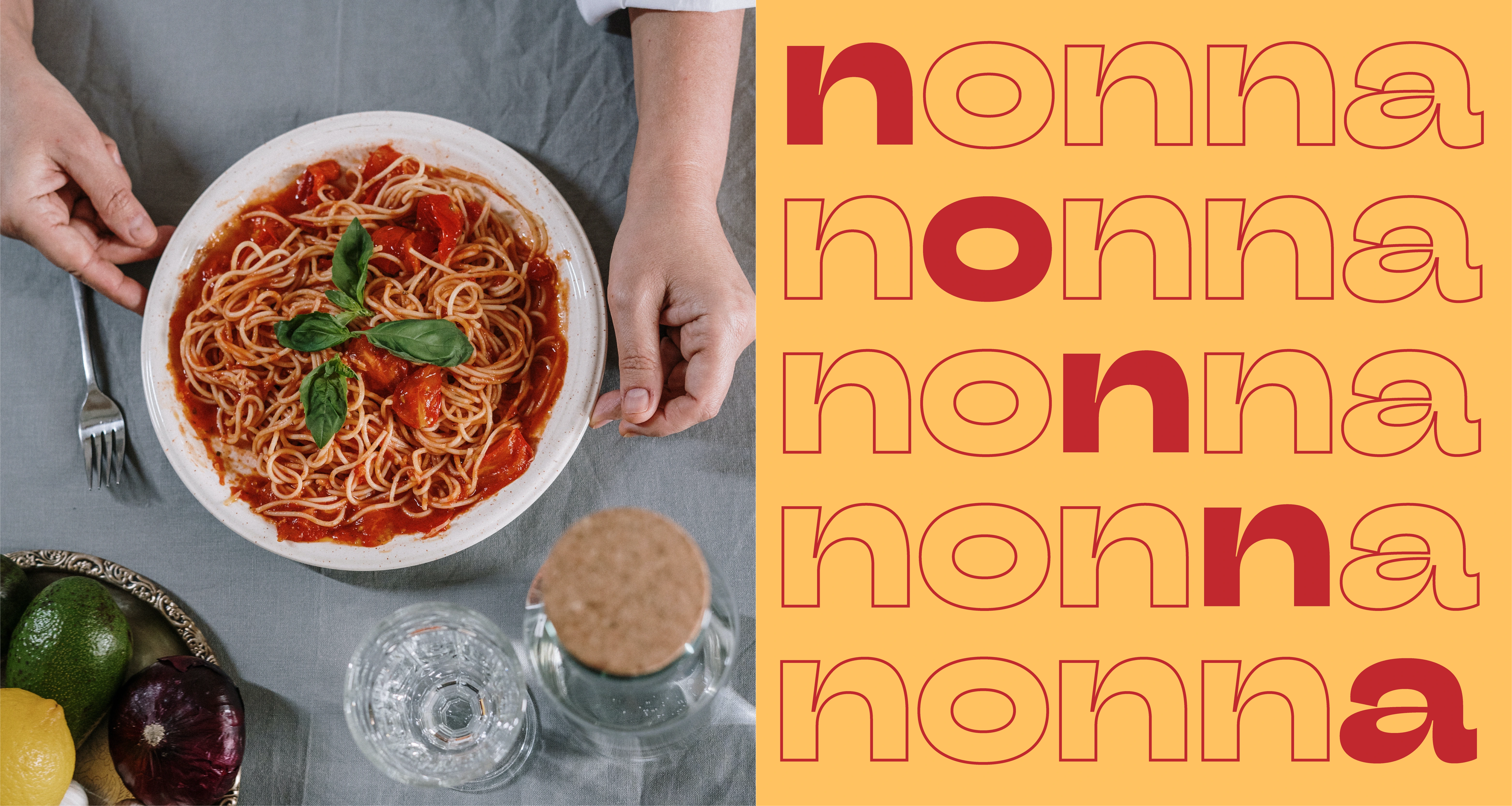
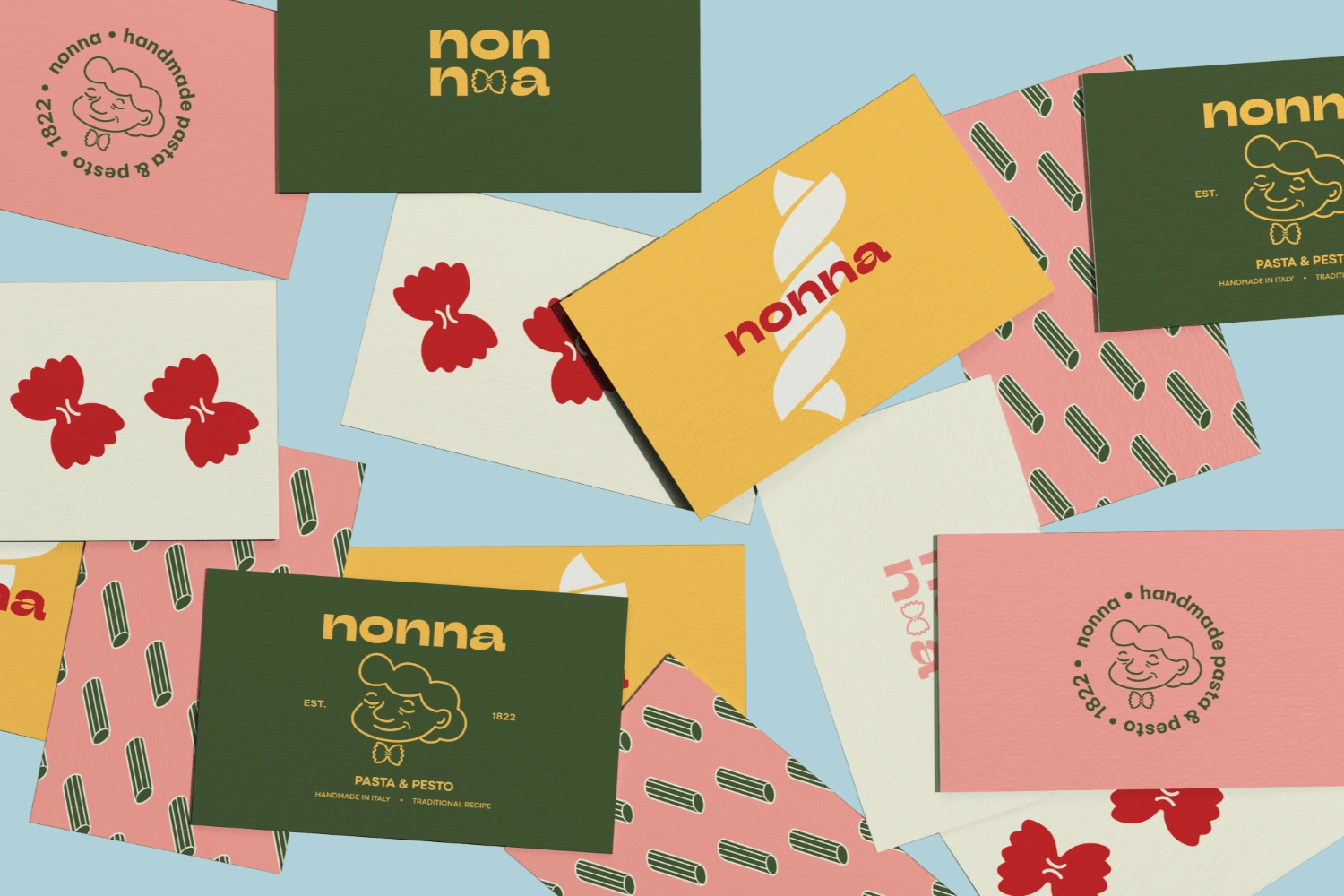
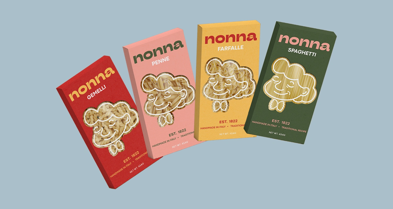
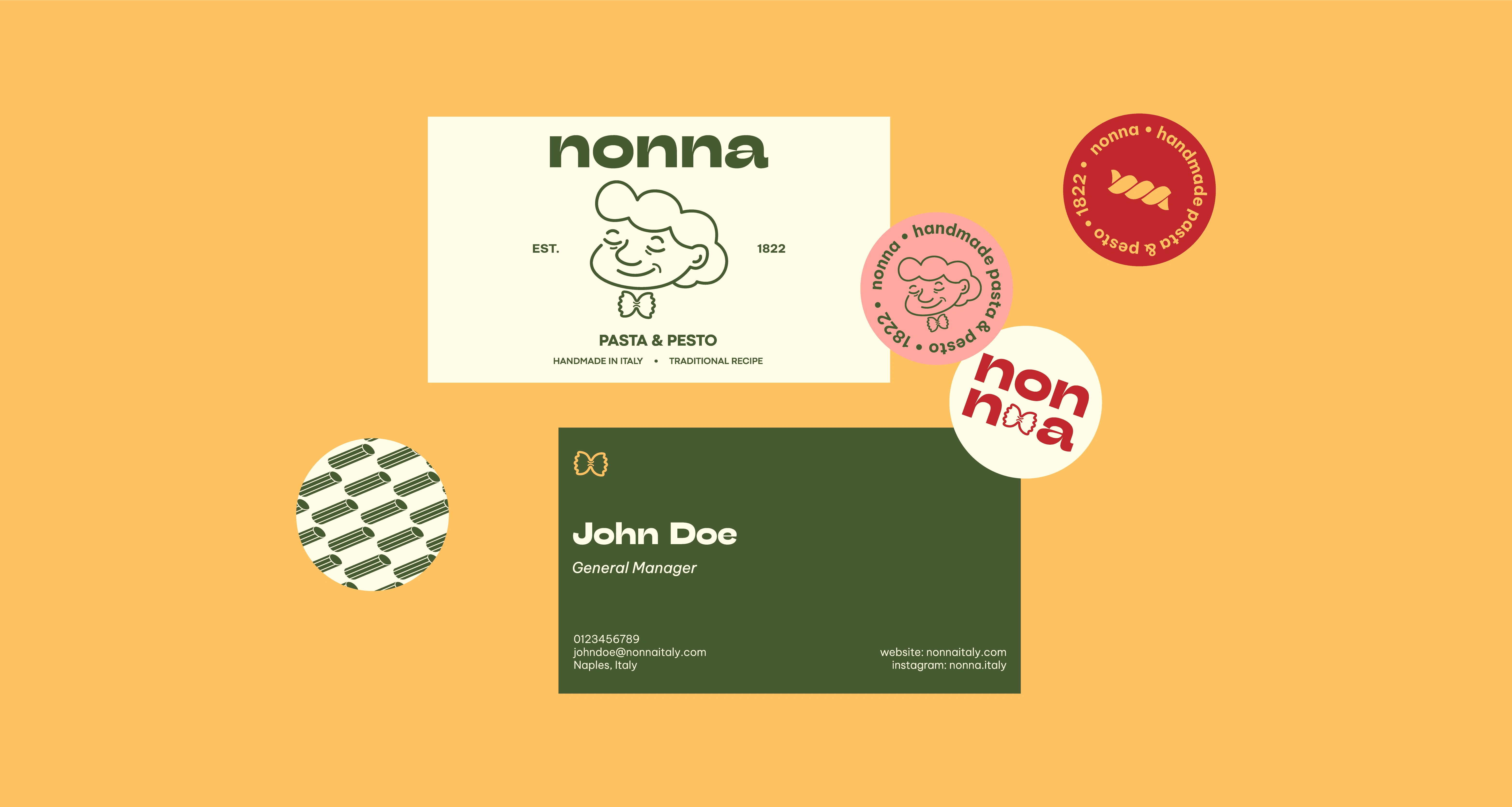
Solution: The color palette for Nonna employs a range of vivid, food-inspired colors, with a touch of pastel pink to soften the otherwise bold combinations. I also made a grandma illustration to use in the primary logo and as a key visual for the pasta boxes. The illustration shows the traditional qualities and heritage of the brand ("nonna" means "grandma" in Italian), but it is rendered in a more youthful and friendly way. The grandma wears a neck bow shaped like bowtie pasta, which adds a fun twist that aligns with the new brand image of Nonna.
Like this project
Posted Jan 5, 2023
Logo and packaging design for Nonna, a family business that has been selling homemade pasta and pesto in Italy since 1822