Idea!Zarvos

Juliana Verlangieri
Idea!Zarvos is a real estate developer from Sao Paulo that creates residential and commercial buildings based on high architectural standards. We were invited to create a simple and direct visual system that highlights the architecture and company's brand.
Design System, Social
Idea!ZarvosDesign System, Social
00:06
Tocador de vídeo
00:00
00:07
Use as setas para cima ou para baixo para aumentar ou diminuir o volume.
00:03
00:00
00:24
Use as setas para cima ou para baixo para aumentar ou diminuir o volume.
00:03
00:00
00:11
Use as setas para cima ou para baixo para aumentar ou diminuir o volume.


00:03
00:00
00:07
Tocador de vídeo
00:03
00:00
00:06
Use as setas para cima ou para baixo para aumentar ou diminuir o volume.
00:00
00:06
Use as setas para cima ou para baixo para aumentar ou diminuir o volume.
00:01
00:00
00:07
Use as setas para cima ou para baixo para aumentar ou diminuir o volume.
00:01
00:00
00:24
Use as setas para cima ou para baixo para aumentar ou diminuir o volume.
00:00
00:11
Use as setas para cima ou para baixo para aumentar ou diminuir o volume.
00:01
00:00
00:07
Use as setas para cima ou para baixo para aumentar ou diminuir o volume.
00:06
Use as setas para cima ou para baixo para aumentar ou diminuir o volume.
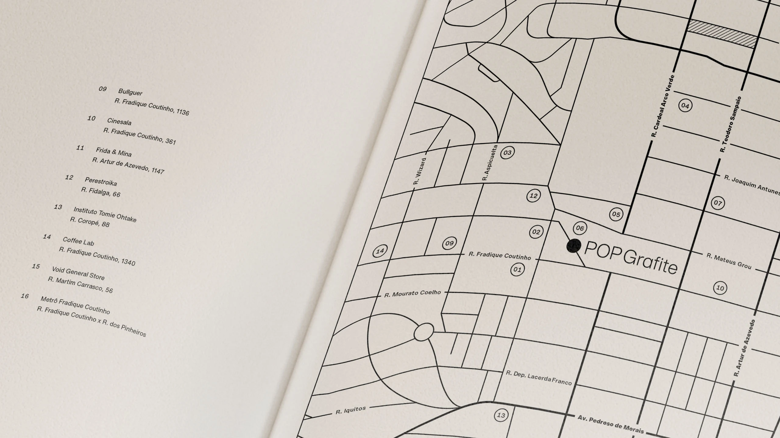
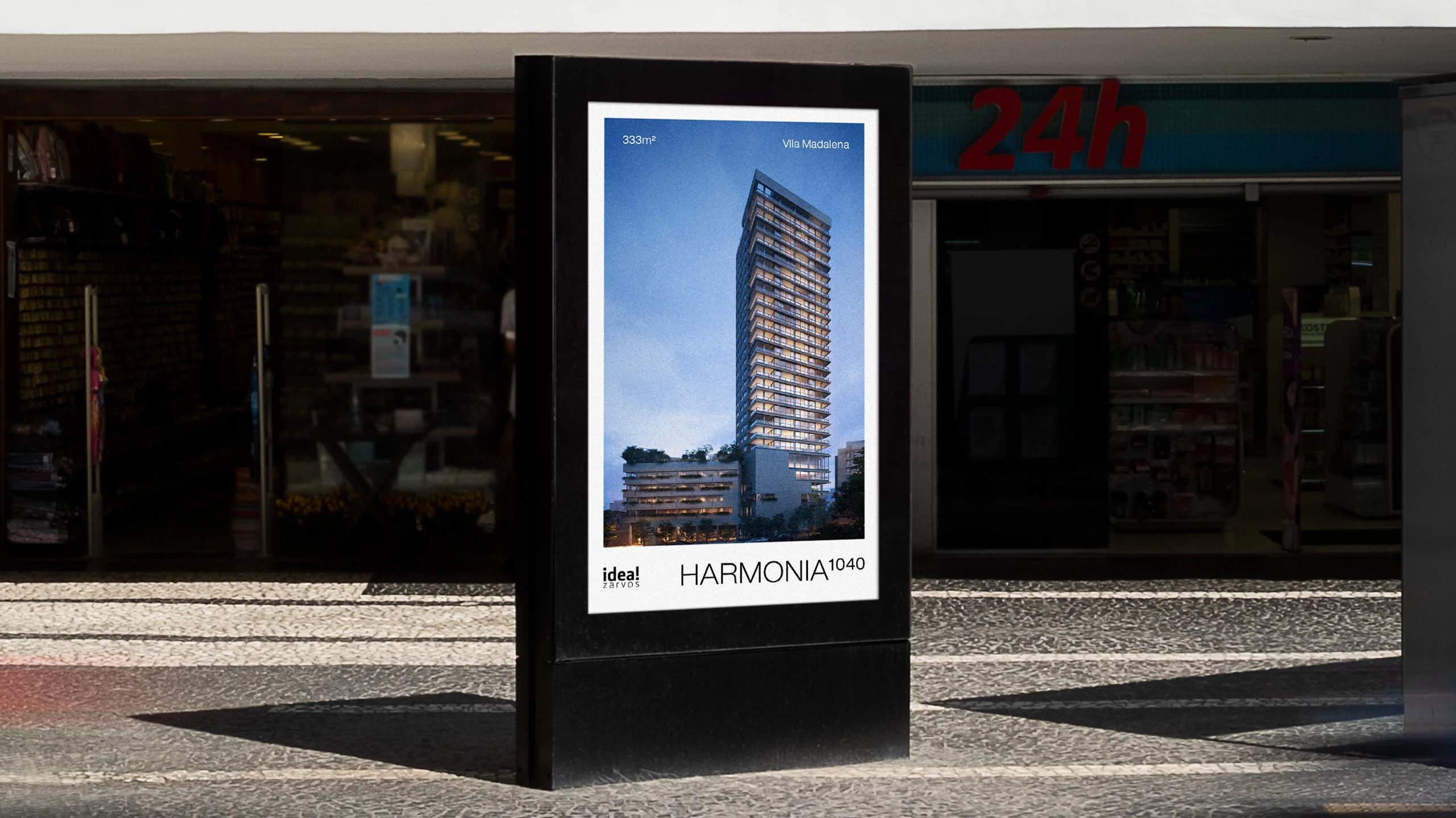
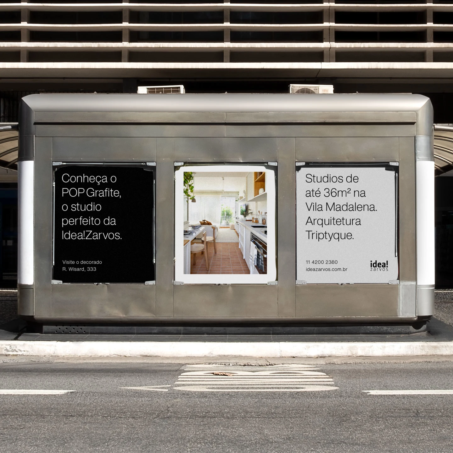
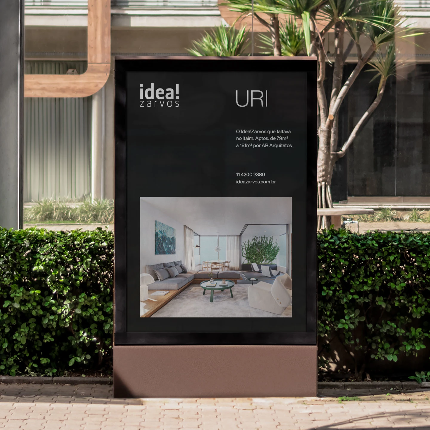
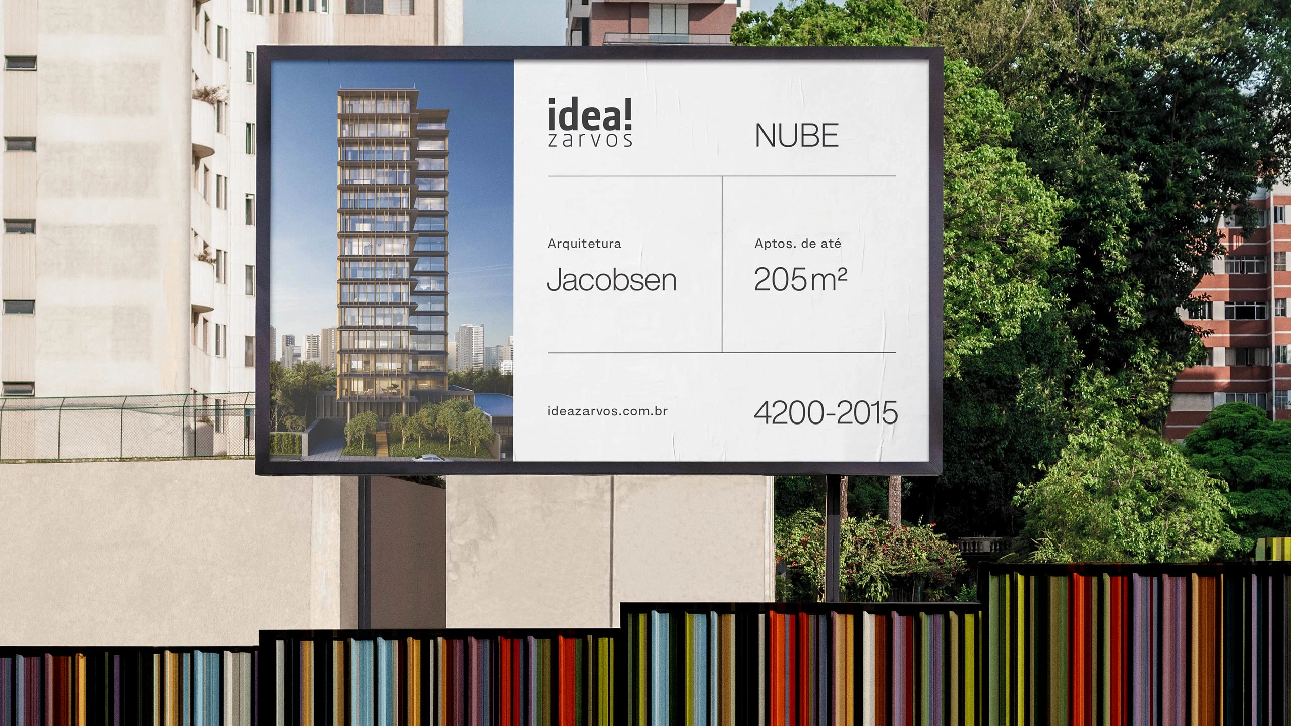
Sao Paulo is experiencing an explosion of real estate. The new buildings are almost always treated as independent projects, with their own brands. This is a dynamic context where standing out can be hard. Idea!Zarvos established itself as a reference in the market and needed to present a simpler and more professional image. To highlight the company's brand and make the process of launching new projects more visually consistent, we created an identity system that unifies the communication of the company.
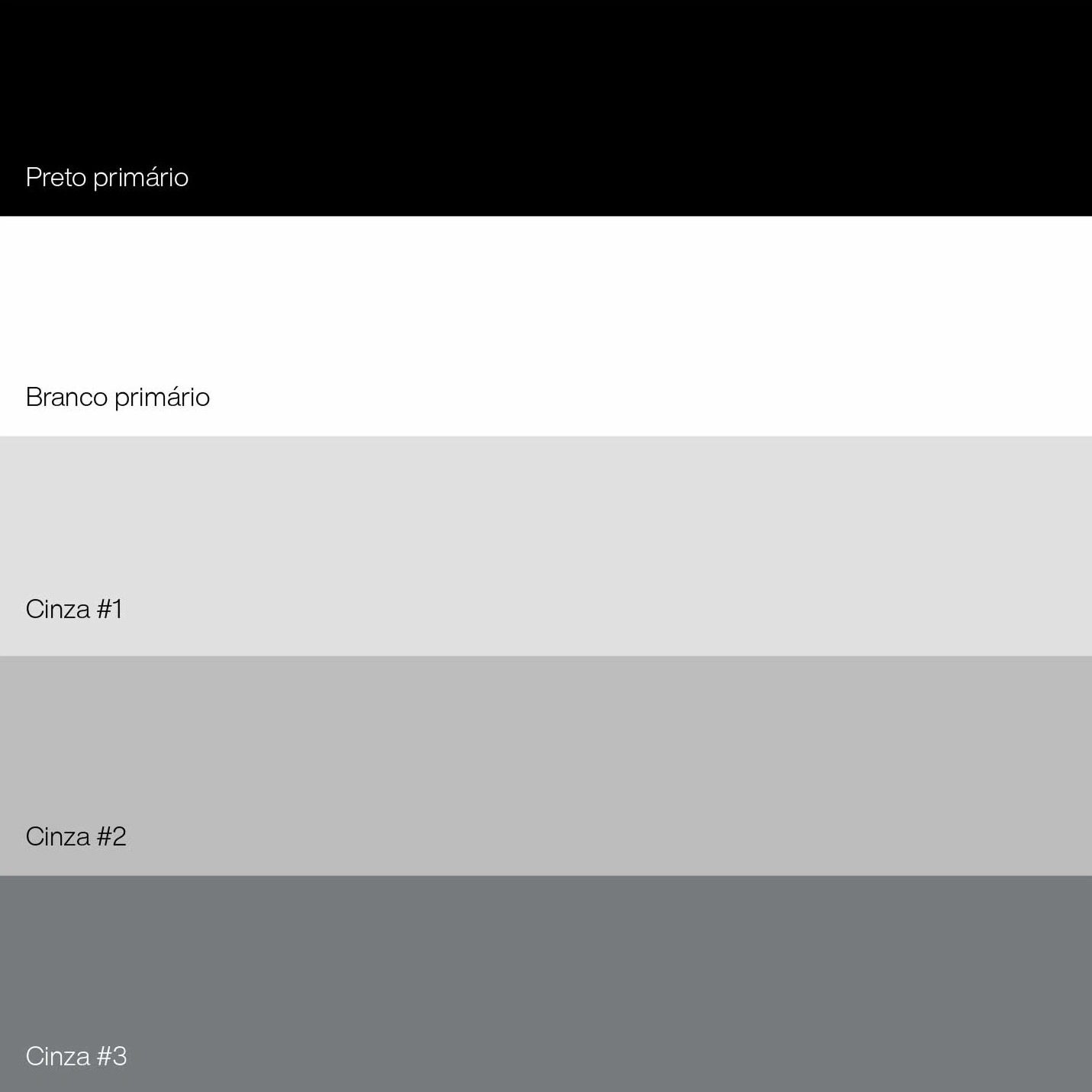
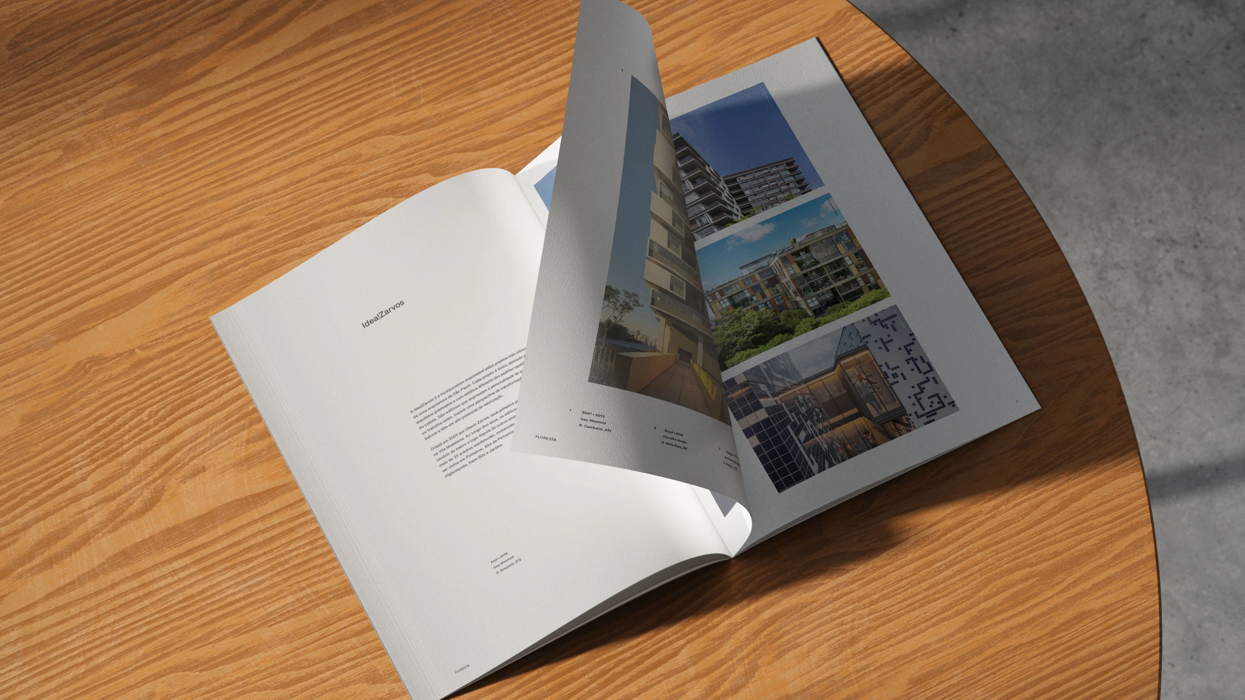
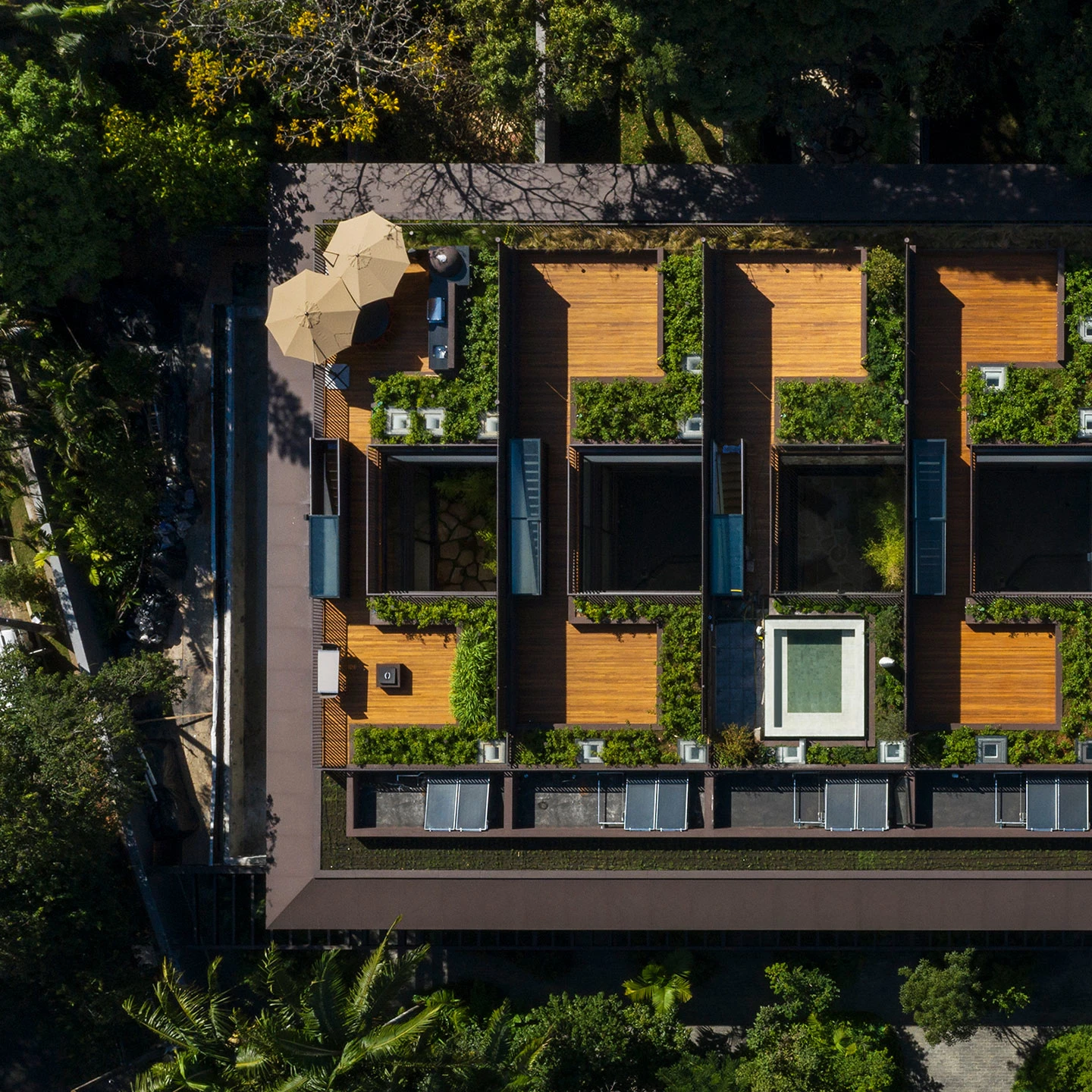
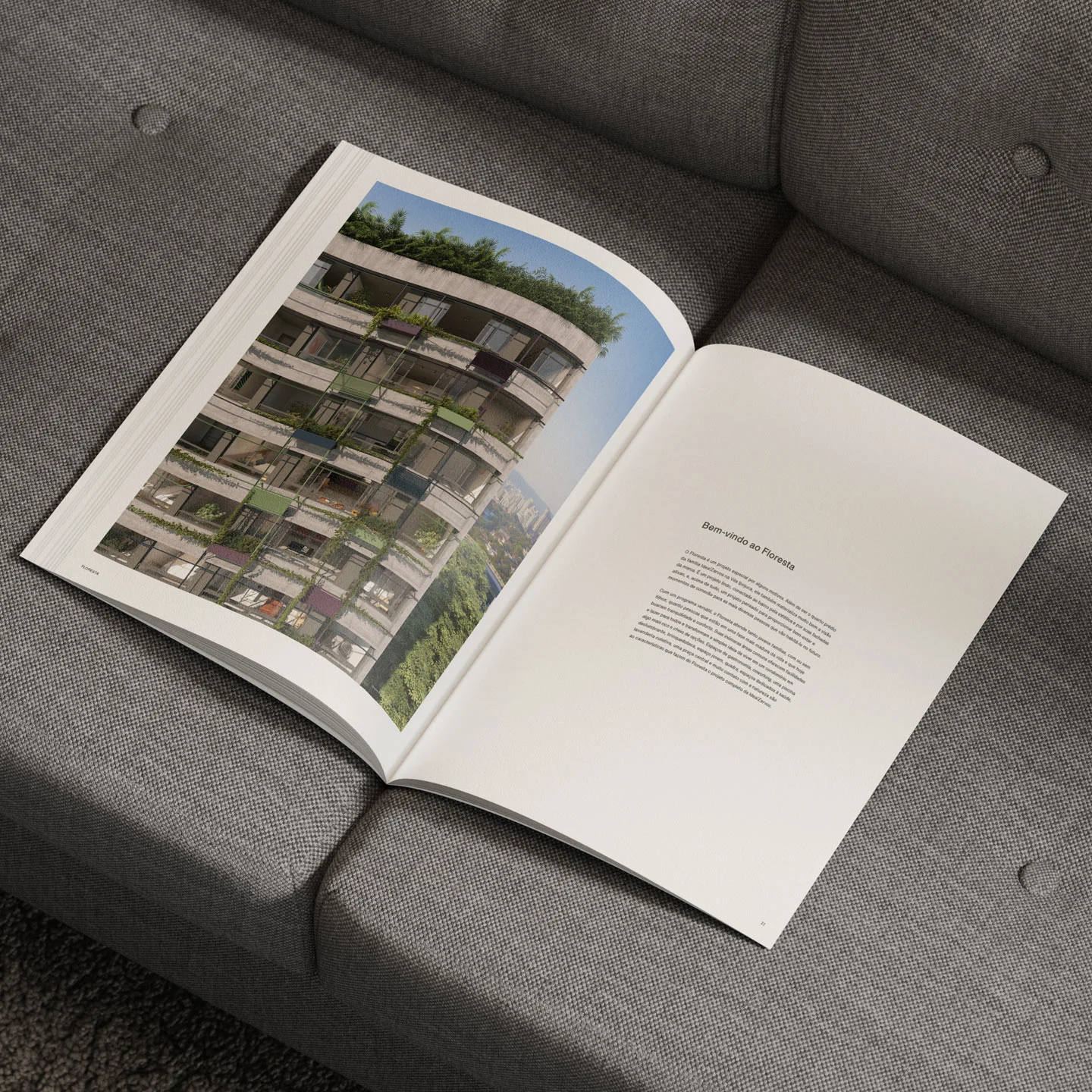
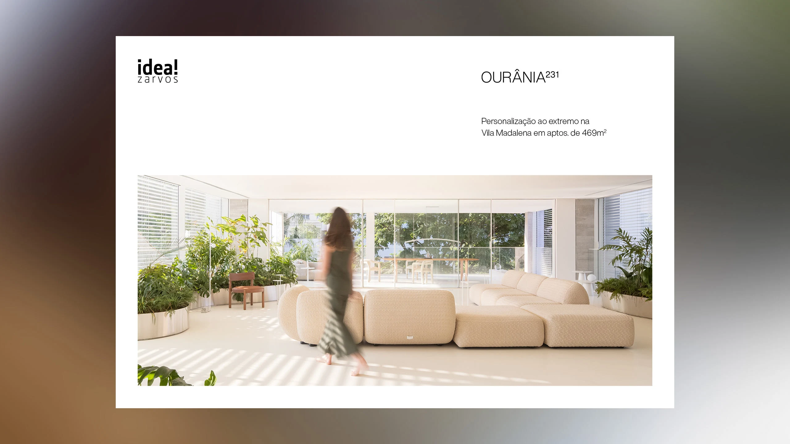
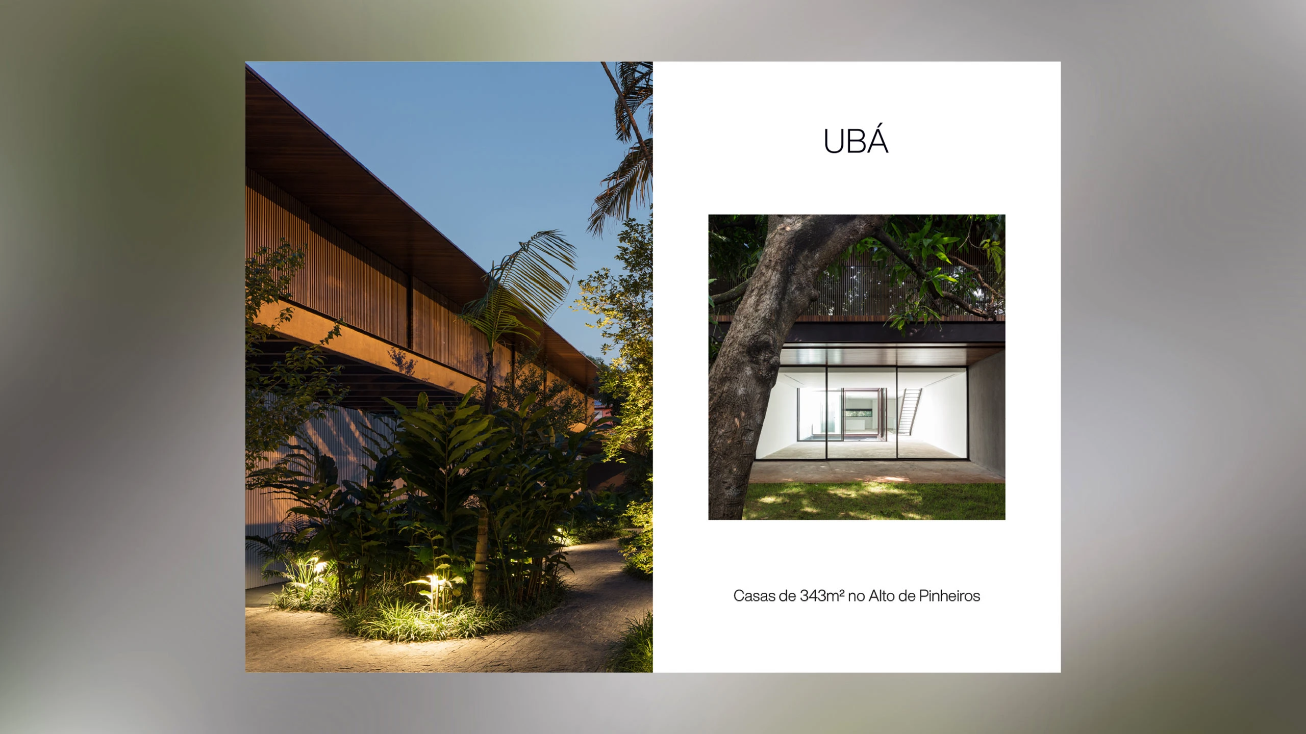
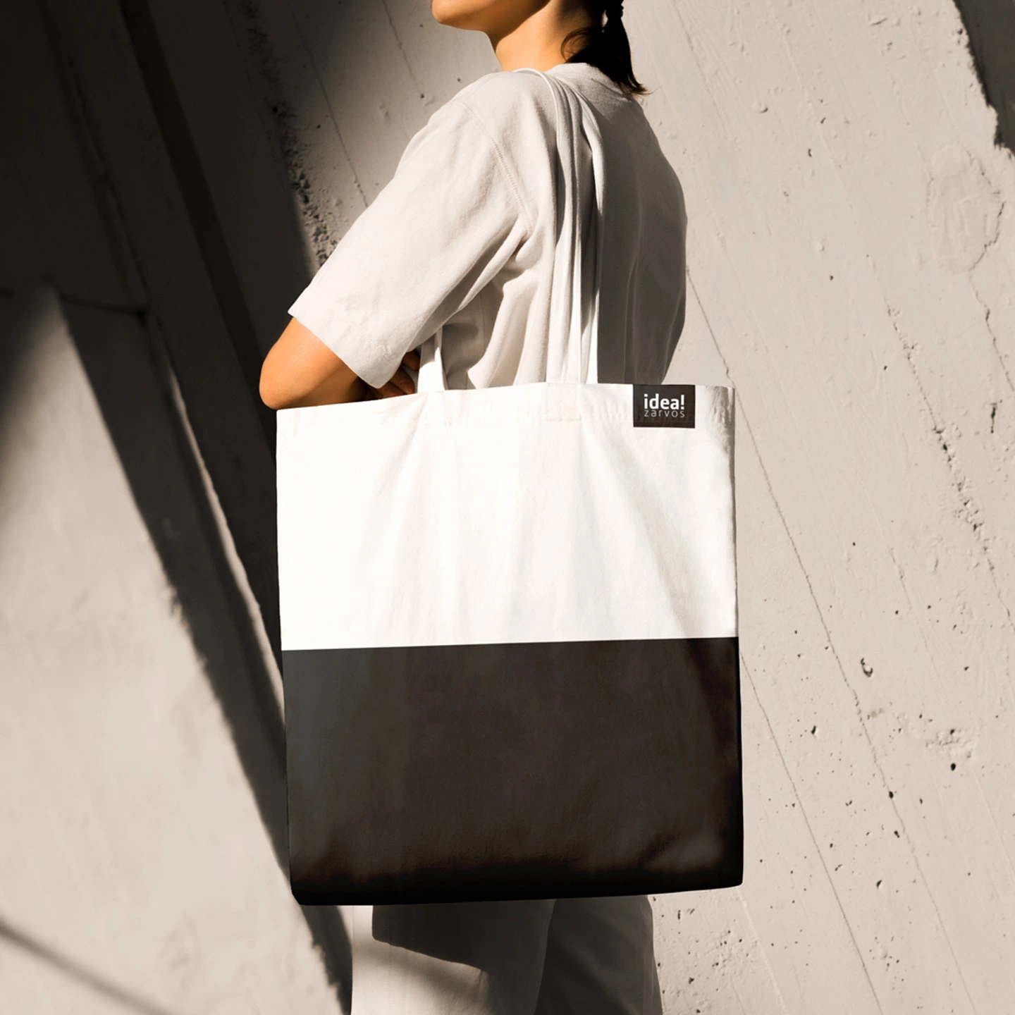
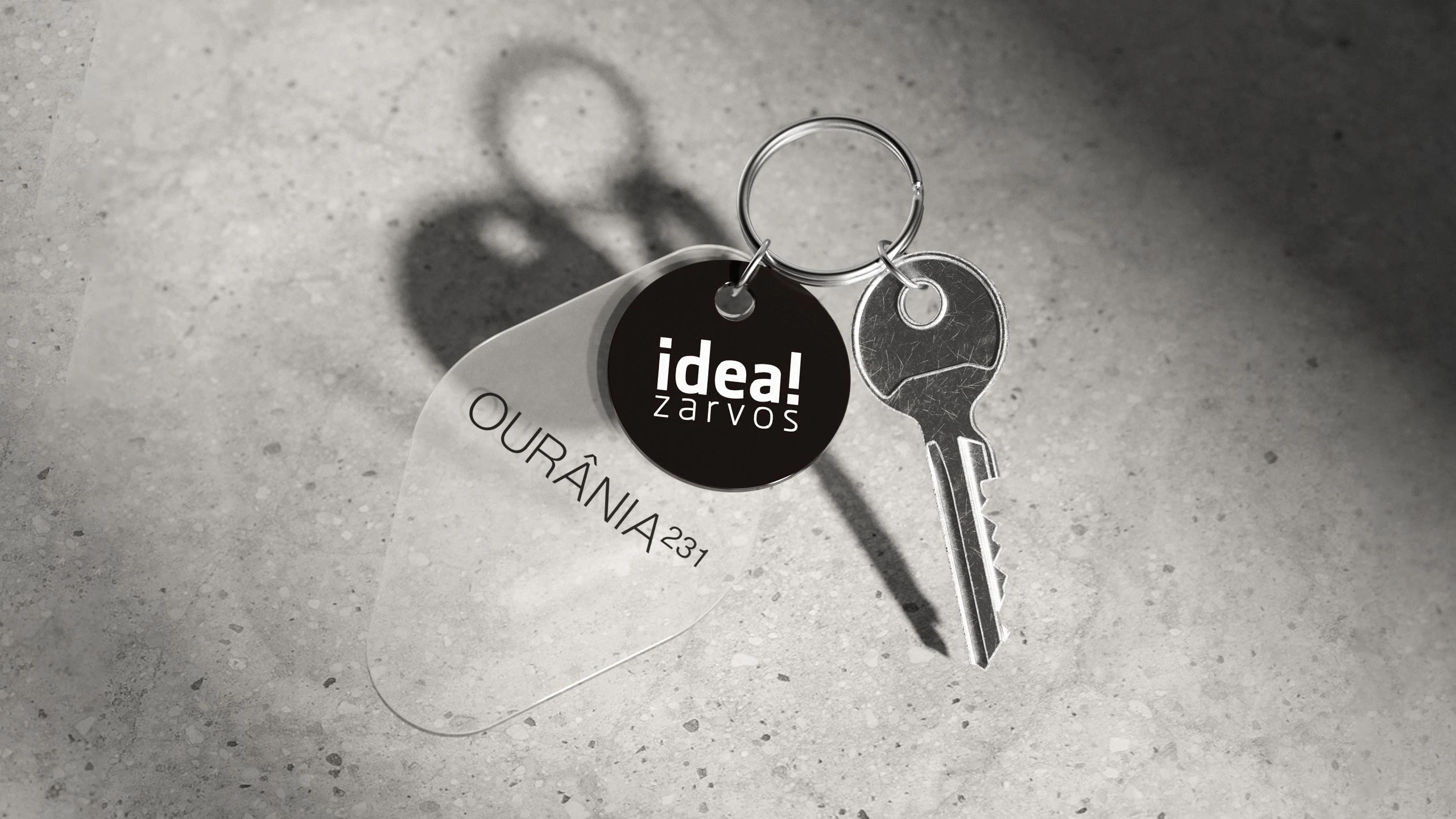
We chose a minimalistic approach to make architecture the protagonist: black and white as the main colors, few elements, focus on images and lean design. Helvetica Now was a functional and definitive typographic choice that creates a direct connection to architecture's world.
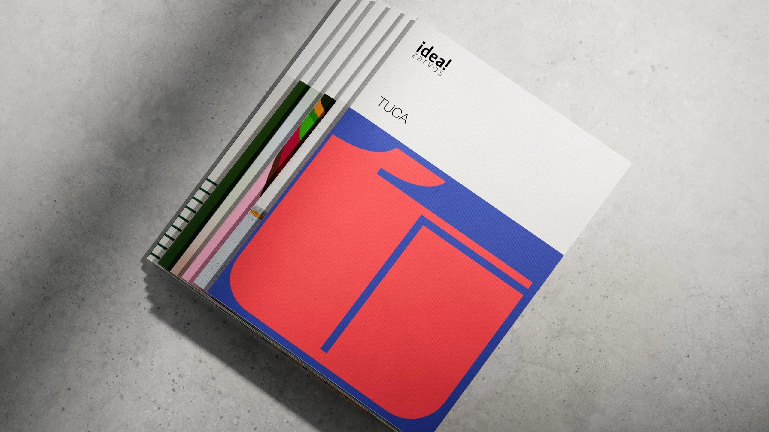
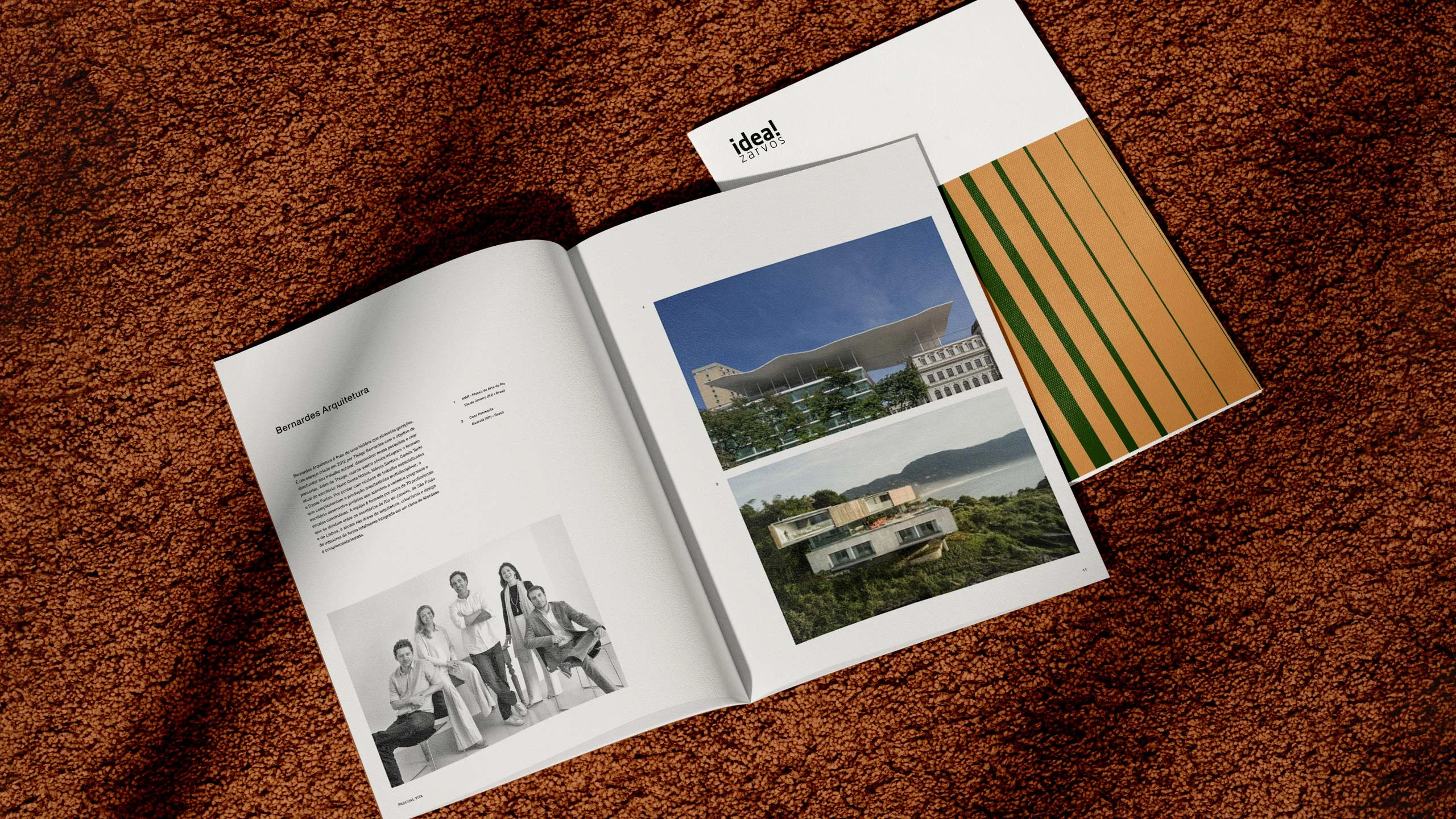
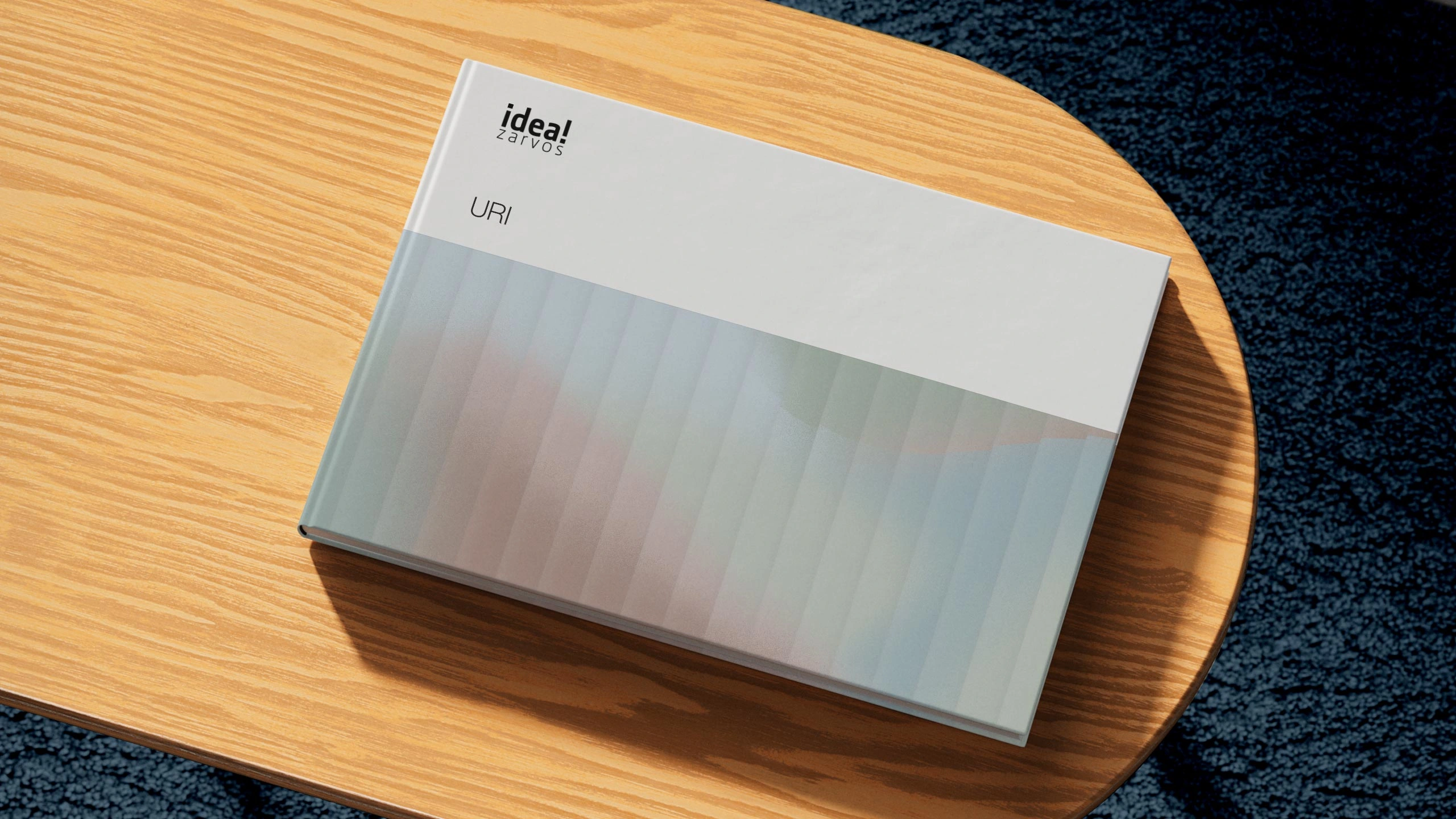
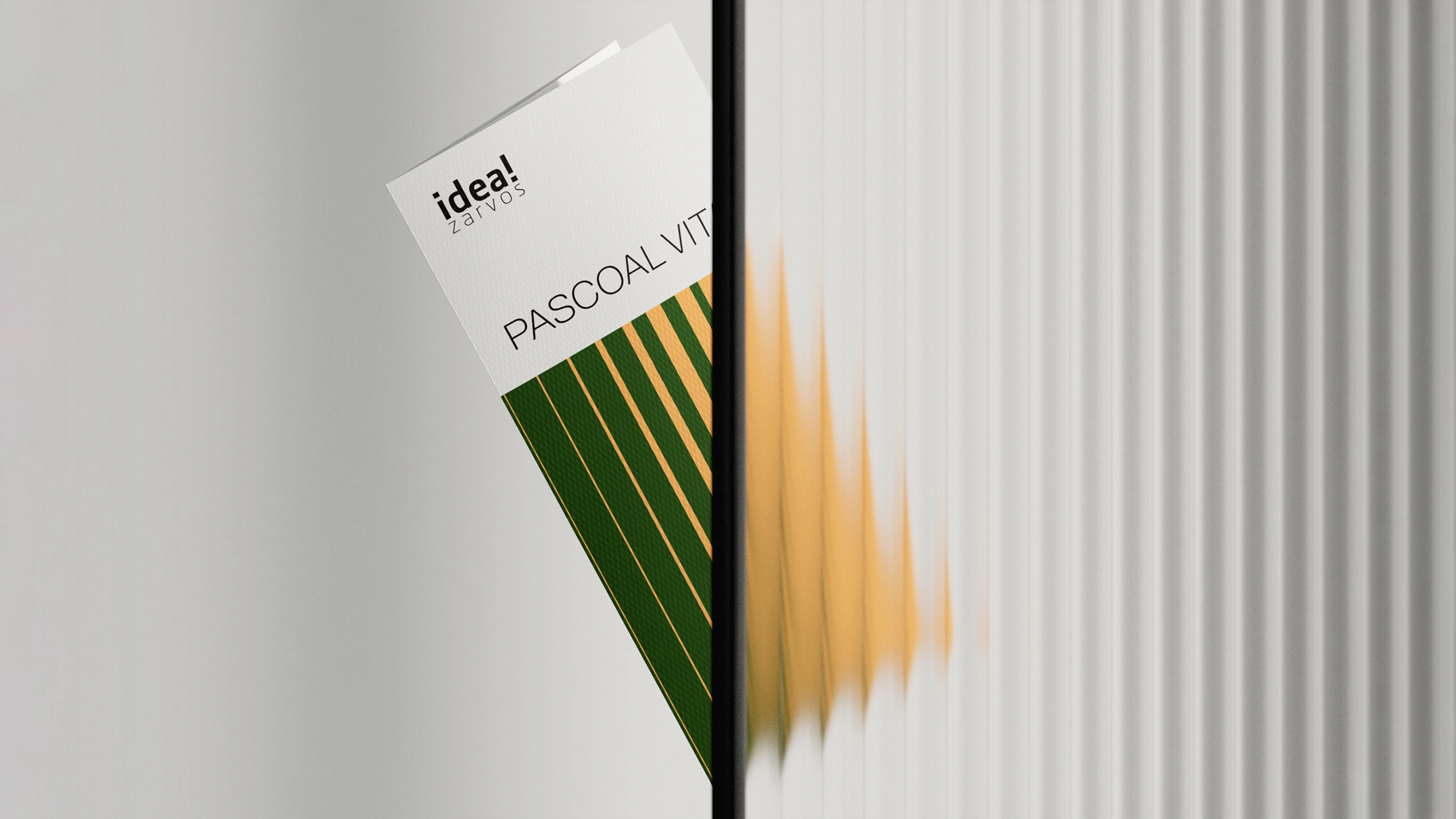
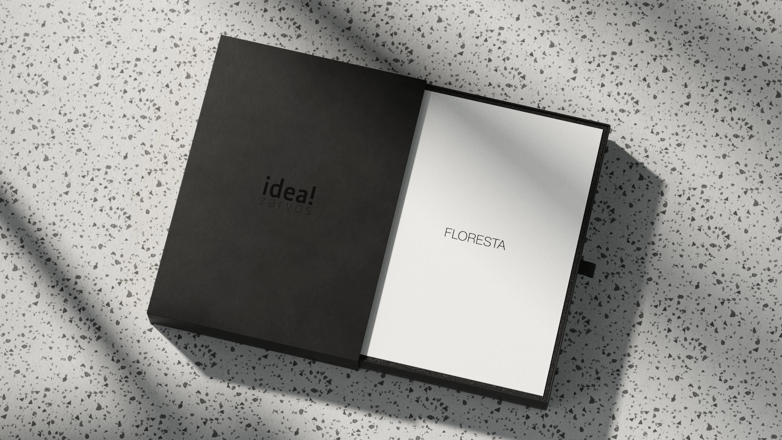
We also created a cover system that was applied to all of the brand's printed materials. The catalogs have a white upper strip reserved for the Idea!Zarvos logo and project logos, which are always used in uppercase letters. The remaining area is filled with an artistic illustration inspired by the architecture of each building. When viewed side by side, these printed materials make up a large brand collection. With an objective and scalable visual system that conveys all of Idea!Zarvos best qualities, the brand has now a strategic and complete design asset.
Credits
Design and Art DirectionLucas Andrade, Murilo Fonseca, Juliana Verlangieri, Victor De Bone
PhotographyFederico Cairoli, Fernando Guerra, Fran Parente, Leonardo Finotti, Maíra Acayaba
Architecture 3DArqluz, Blackhaus, CP Visual, Esphera Virtual, Panorama
Website designTry Consultoria
Case study 3DBruno Faiotto
Like this project
Posted Aug 12, 2026
Minimalist design system for Idea!Zarvos that highlights architecture through black-and-white treatment, focused imagery and a cover system for printed materials.
Likes
0
Views
0
Tags