newnew

Juliana Verlangieri
newnew is a corporate education consultancy focused on transforming companies through personalized learning. Born from another consultancy Sputnik, it brings a methodology shaped by broad market vision and by building communities that strengthen culture, purpose and everyday practices inside organizations.
Branding, Web, Social
newnewBranding, Web, Social


Use as setas para cima ou para baixo para aumentar ou diminuir o volume.
00:13
Tocador de vídeo
Use as setas para cima ou para baixo para aumentar ou diminuir o volume.
00:02
Tocador de vídeo
Tocador de vídeo
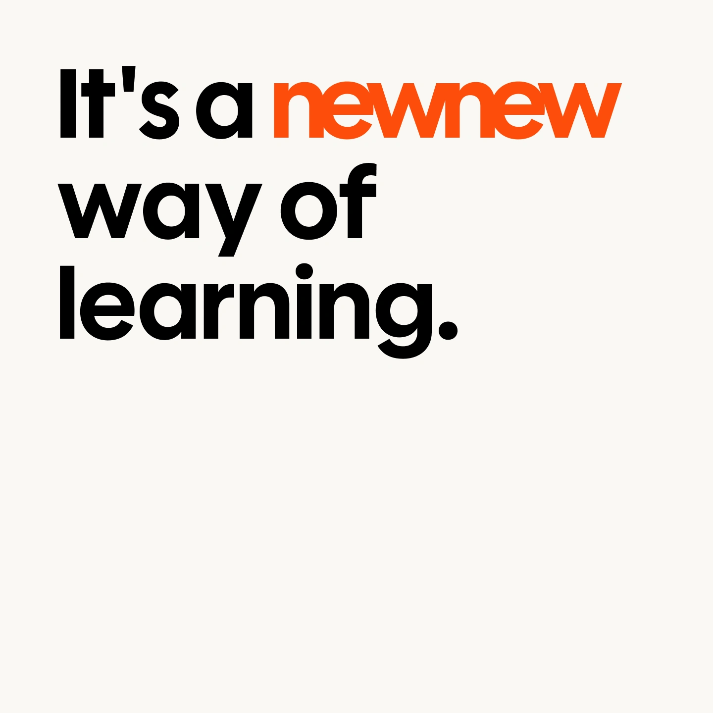
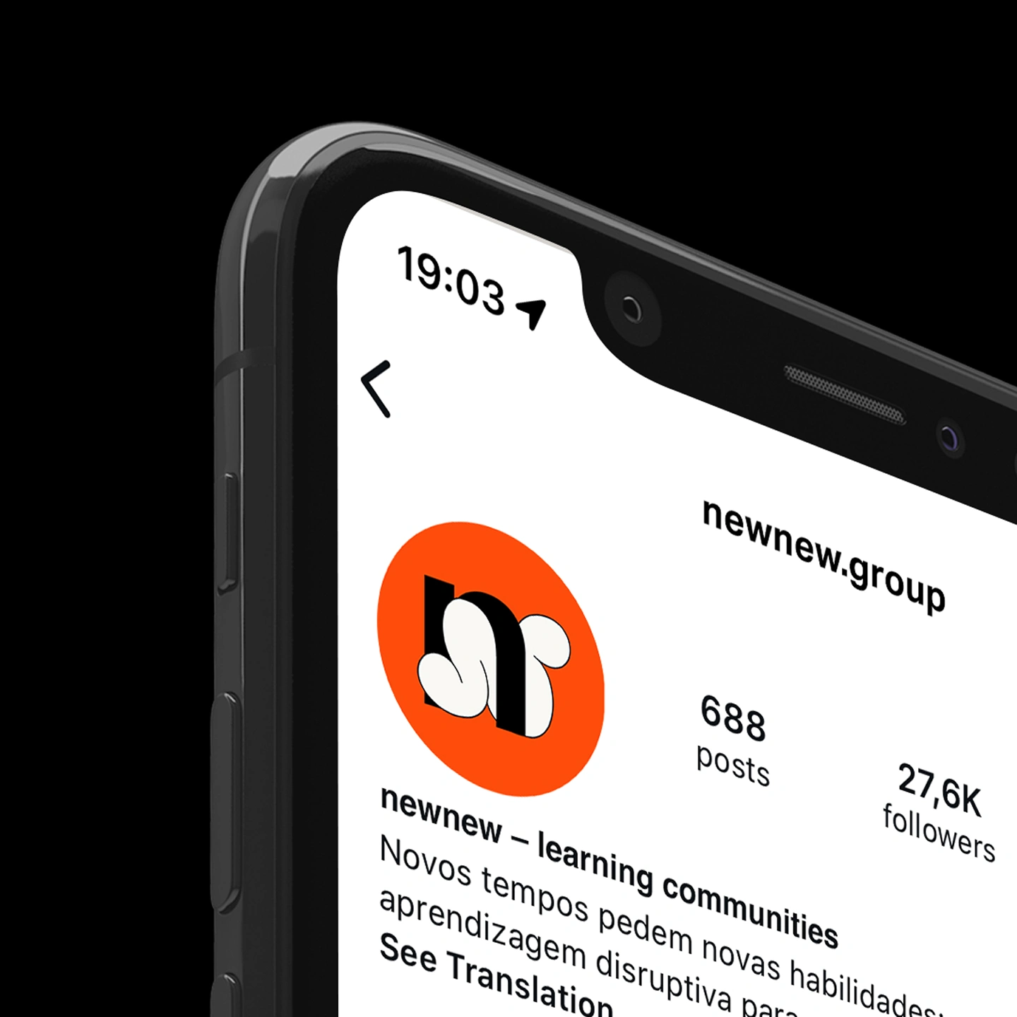
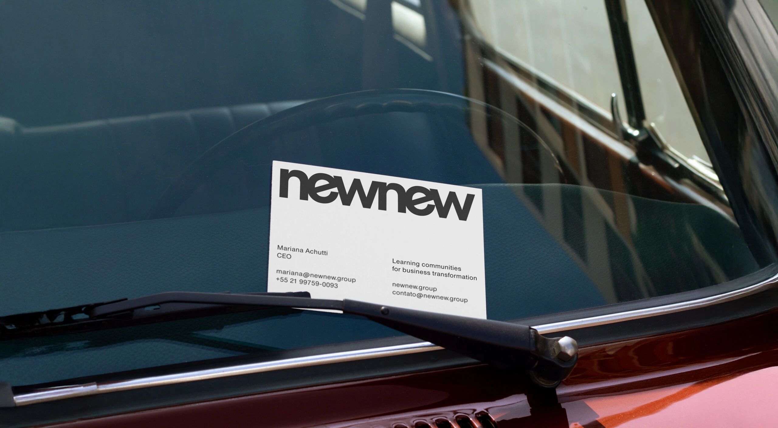
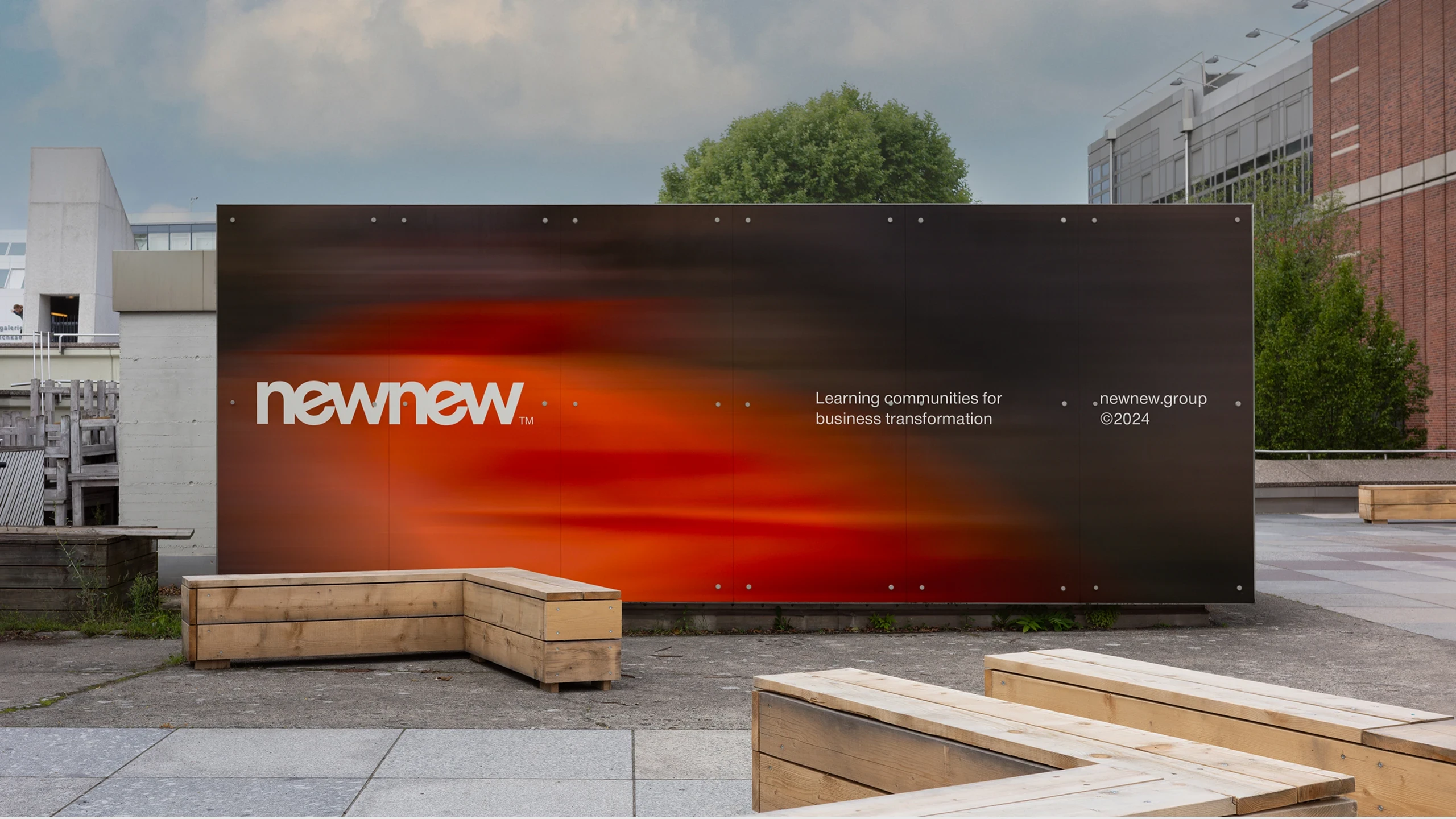
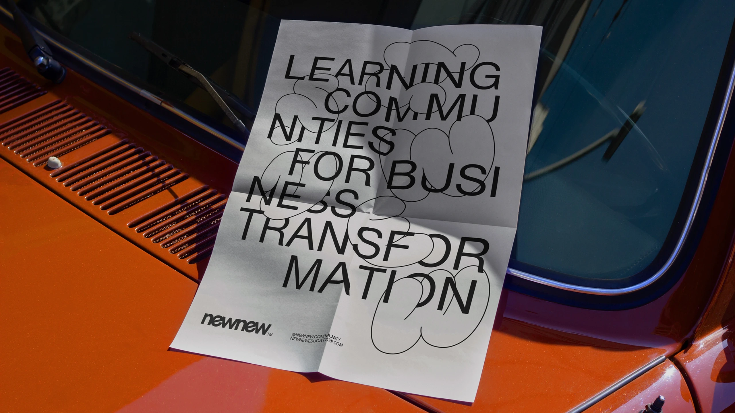
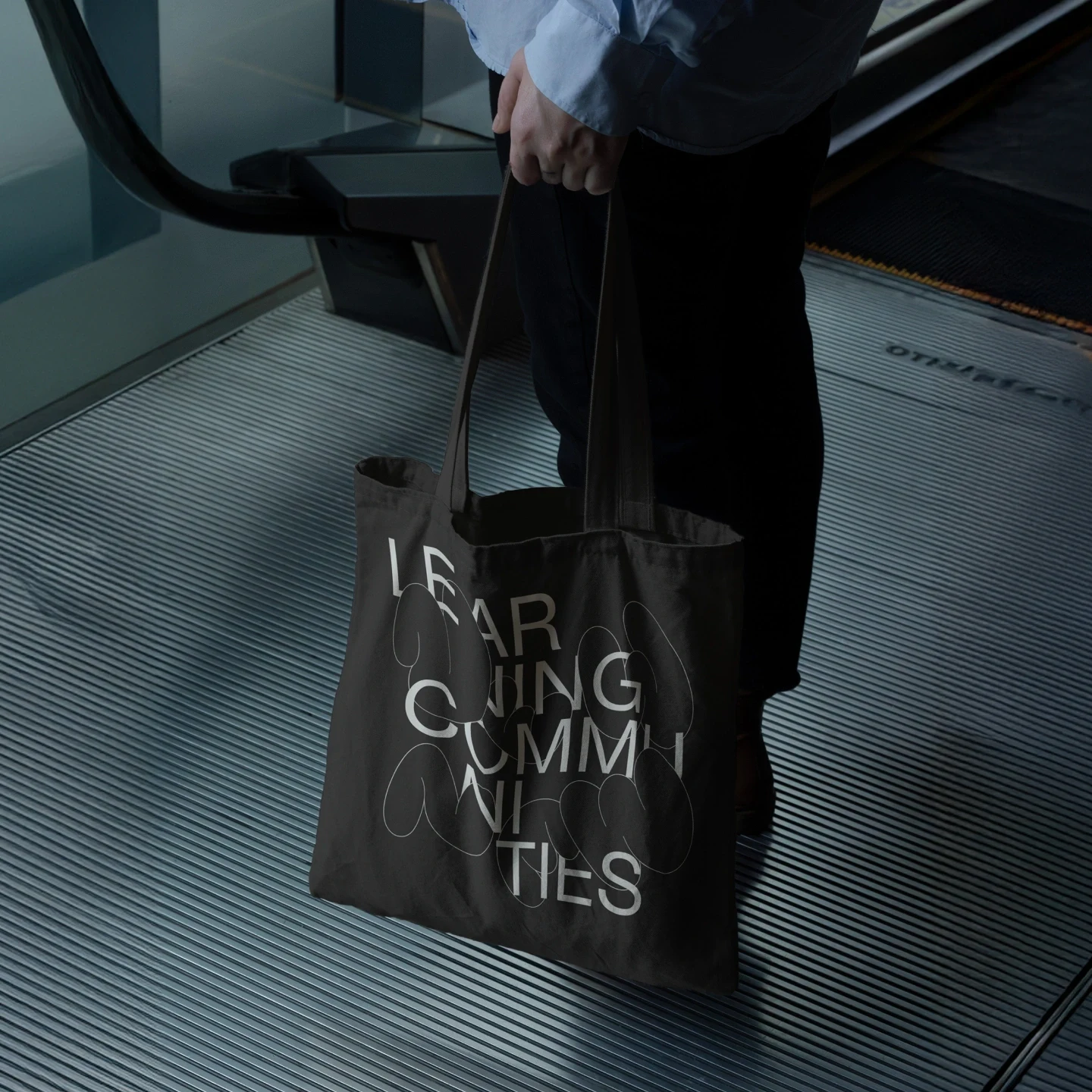
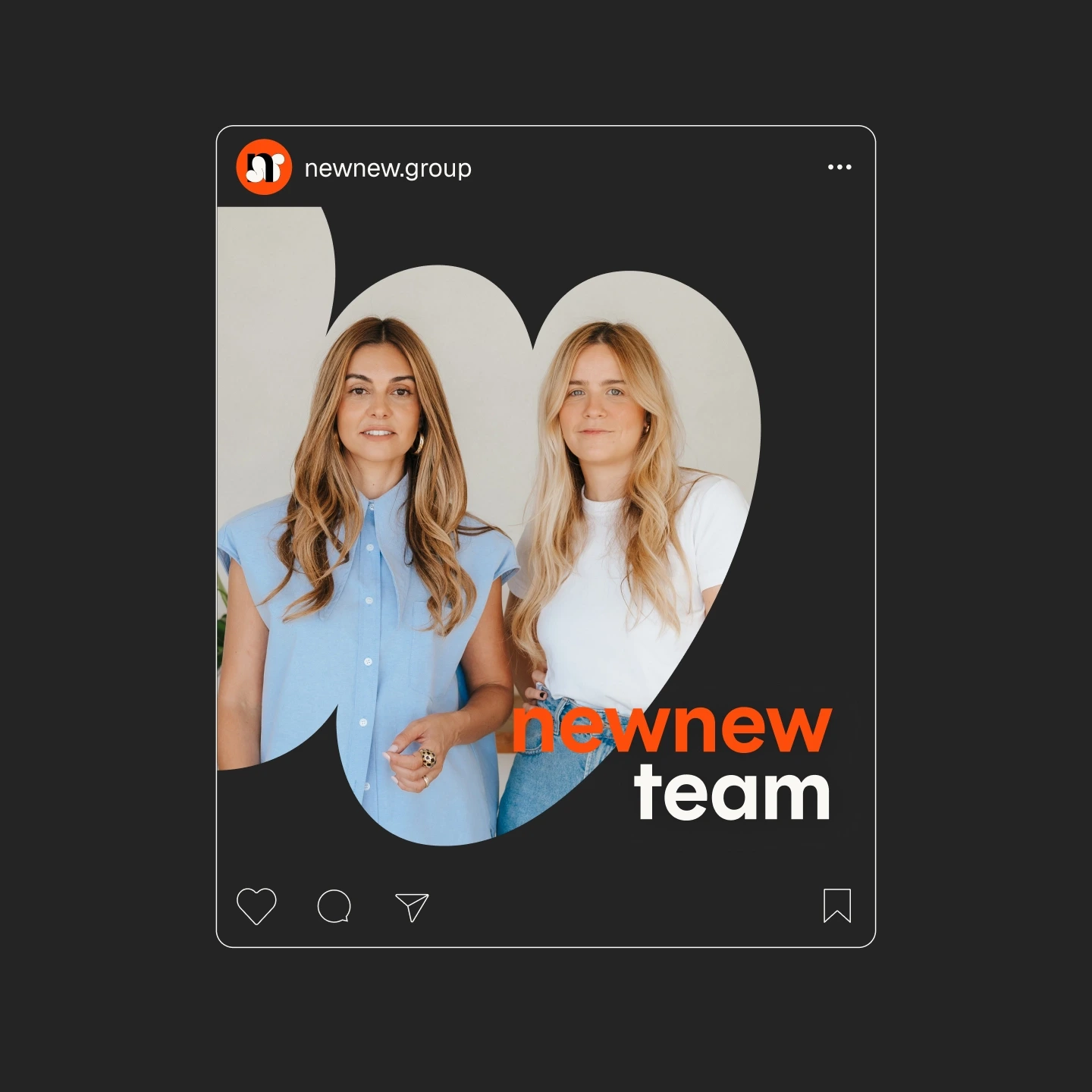
To shape this new moment, we designed a visual identity that balances experimentation and pragmatism. The system preserves the creative and exploratory spirit of the former SPUTNiK, now supported by a clearer, more corporate and results-oriented aesthetic. Dynamic colors work alongside a neutral foundation, while the graphic language unfolds into flexible models. This structure organizes specialties, highlights content and presents educational programs consistently across all channels.
The new visual system prepares the organization for its next chapter. A community of educators, creators and specialists who teach in a way that feels alive, connected and inspiring. With the right tools and a brand that reflects this shift, newnew positions itself as the school for a new era, an ecosystem that learns, evolves and transforms together with its clients and partners.
Design and Art DirectionJuliana Verlangieri, Murilo Fonseca
Illustration and Motion DesignJuliana Verlangieri
Photographynewnew
Like this project
Posted Aug 12, 2026
Designed a visual identity that balances experimentation and pragmatism to reposition newnew as a results-oriented corporate education consultancy.
Likes
0
Views
0