Built with Base44
TC Settimo Tennis Club Website Redesign

Sergey Bertagnini
Verified


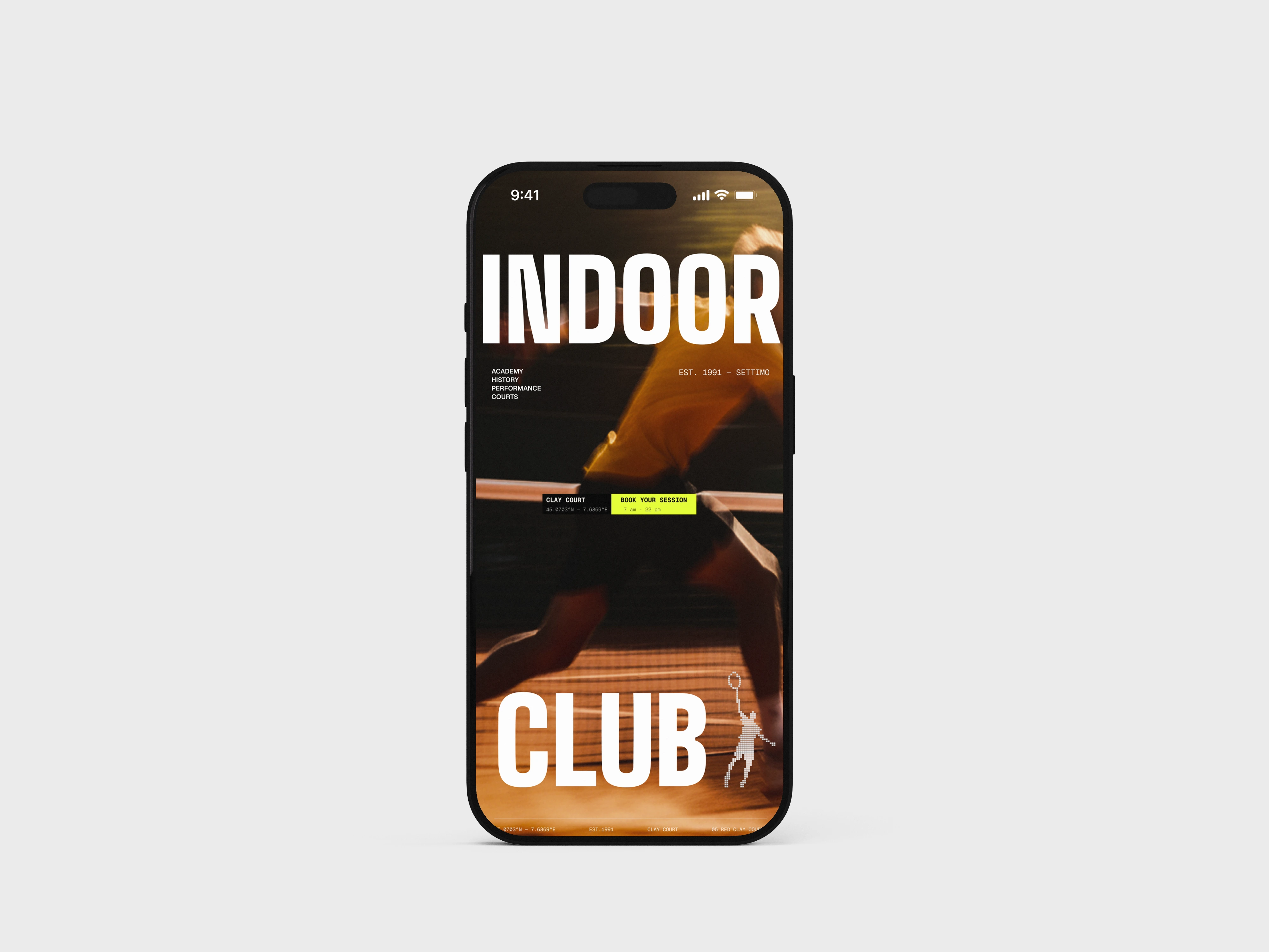
INDOOR CLUB — TC Settimo
A 1991 red-clay tennis club, redesigned as a digital experience that plays like the sport it sells.
Type: Brand system + web experience · Role: Design Partner (strategy, brand, UX, build) · Built in Framer · Client: TC Settimo — Settimo Torinese, Italy
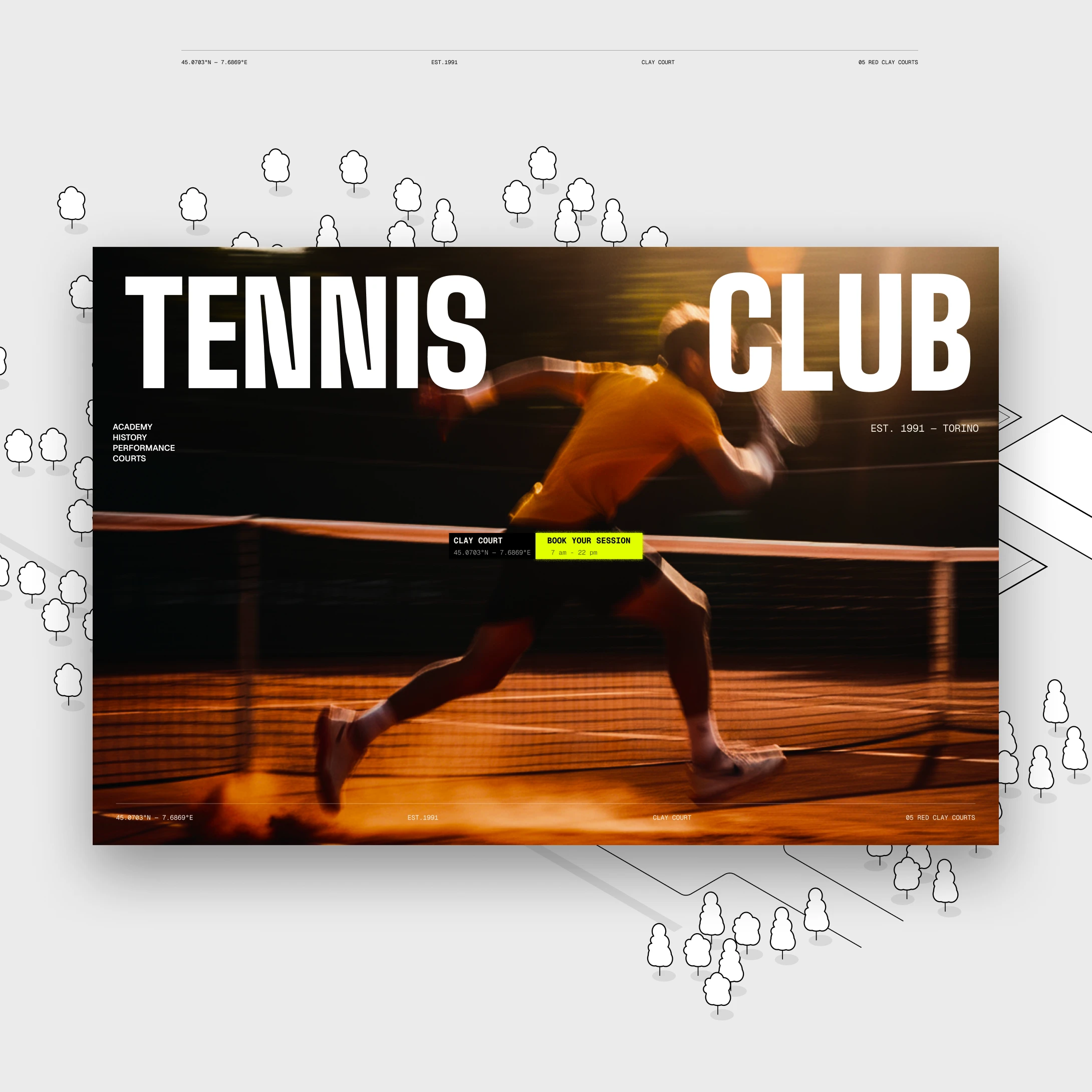
Most tennis clubs put a photo of a court, a phone number, and a booking button online — and then wonder why nobody feels anything. TC Settimo has five courts of Italian red clay and 30+ years of history. It deserved a site that hits like a passing shot, not a brochure. So I built one.
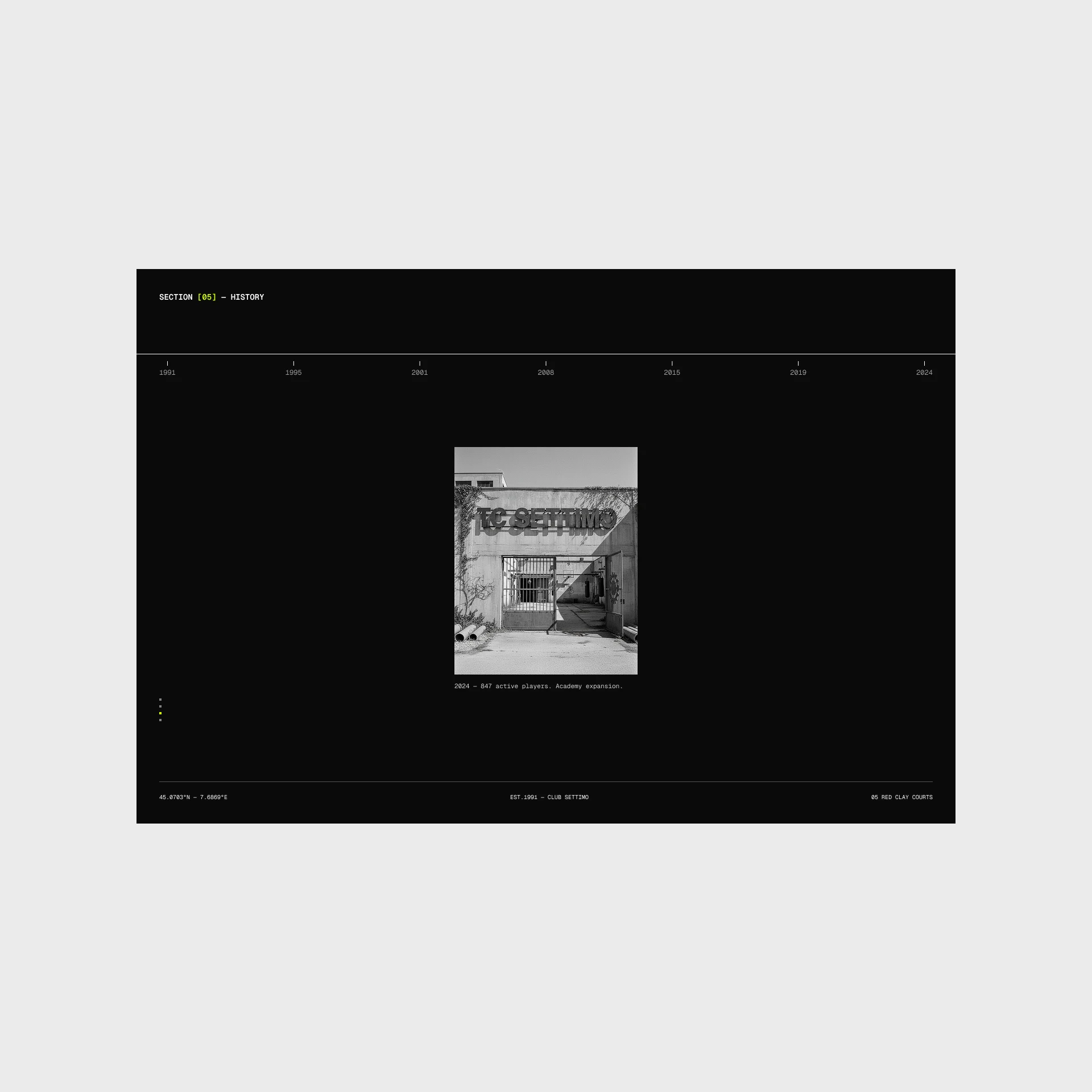
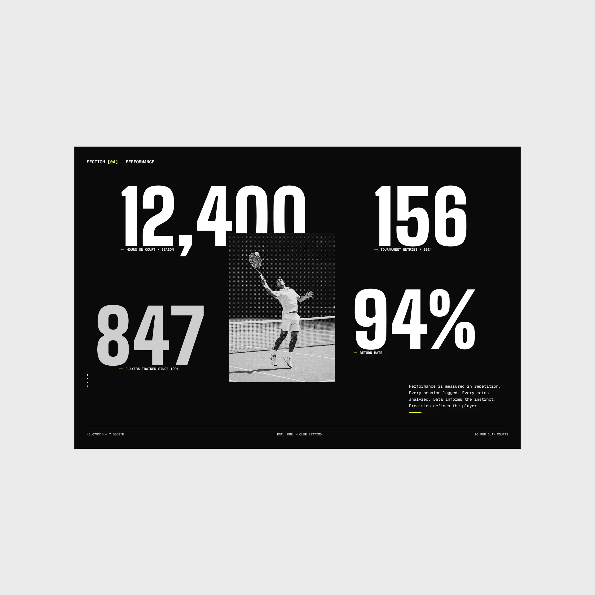
TC Settimo isn't a startup. It's a real club — established 1991, in Settimo Torinese, just outside Turin. Five red clay courts. 847 active players. An academy that's been quietly turning kids into competitors for three decades.
Most tennis clubs put a photo of a court, a phone number, and a booking button online — and then wonder why nobody feels anything. TC Settimo has five courts of Italian red clay and 30+ years of history. It deserved a site that hits like a passing shot, not a brochure. So I built one.
So the brief I set for myself was simple to say and hard to do: make the website feel like the club feels when you actually walk onto court one. Serious. Physical. A little intimidating. Worth showing up for.
Go look at ten tennis club websites right now. I'll wait.
They're the same site. Green and white or blue and white. A stock hero of a smiling player mid-swing. A grid of "Our Services." A calendar plugin bolted on. Rounded buttons. Comic-sans energy dressed up in a nicer font.
None of them are bad, exactly. They're just invisible. And invisible is the worst thing a brand can be, because it costs you nothing you can see on a report and everything you can't. The player who bounces in four seconds never shows up in a testimonial. They just don't come back.
The instinct, when you're asked to redesign a tennis club, is to go look at other tennis clubs. That instinct is the trap. If you take your references from your own category, the best you can do is a slightly nicer version of what already exists — and "slightly nicer" is not a reason for anyone to remember you.
So I didn't look at tennis. I looked at editorial sports posters, Swiss grid systems, terminal interfaces, the way ATP broadcast graphics stamp data over live footage. I looked at how clay actually behaves — unforgiving, precise, punishing to anyone who cuts corners — and I decided the whole design system should behave the same way.
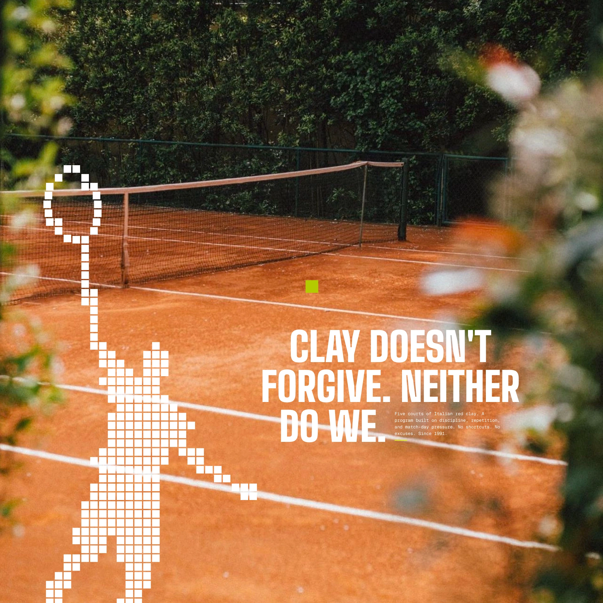
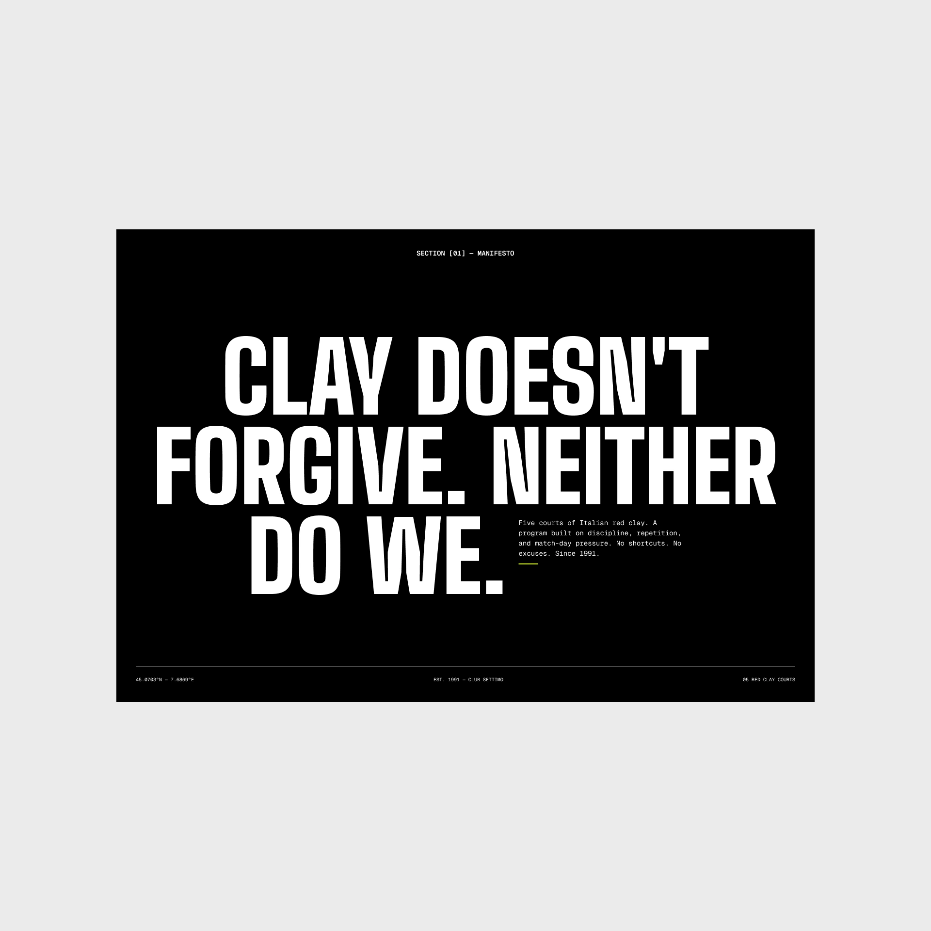
"Clay doesn't forgive. Neither do we."
That line came before a single pixel. It's not a tagline I wrote to fill a hero section — it's the strategy compressed into five words. Clay is the most demanding surface in tennis. It exposes bad footwork, rewards patience, punishes shortcuts. That's not just a court description. That's the club's entire personality, and its entire value proposition to a serious player: we are not the easy option, and that's the point.
Once you have that, every design decision has an answer. Should the buttons be soft and friendly? No — clay doesn't forgive. Should the layout be safe and centered? No — this club has an edge, so the grid should too. Should the copy reassure? No — it should challenge. The strategy stops being a document and starts being a filter you run every choice through.
This is the part of the work people don't see and clients don't ask for, but it's the part that makes the difference between a site that looks designed and a site that is designed. The aesthetic is downstream of the idea. Always.
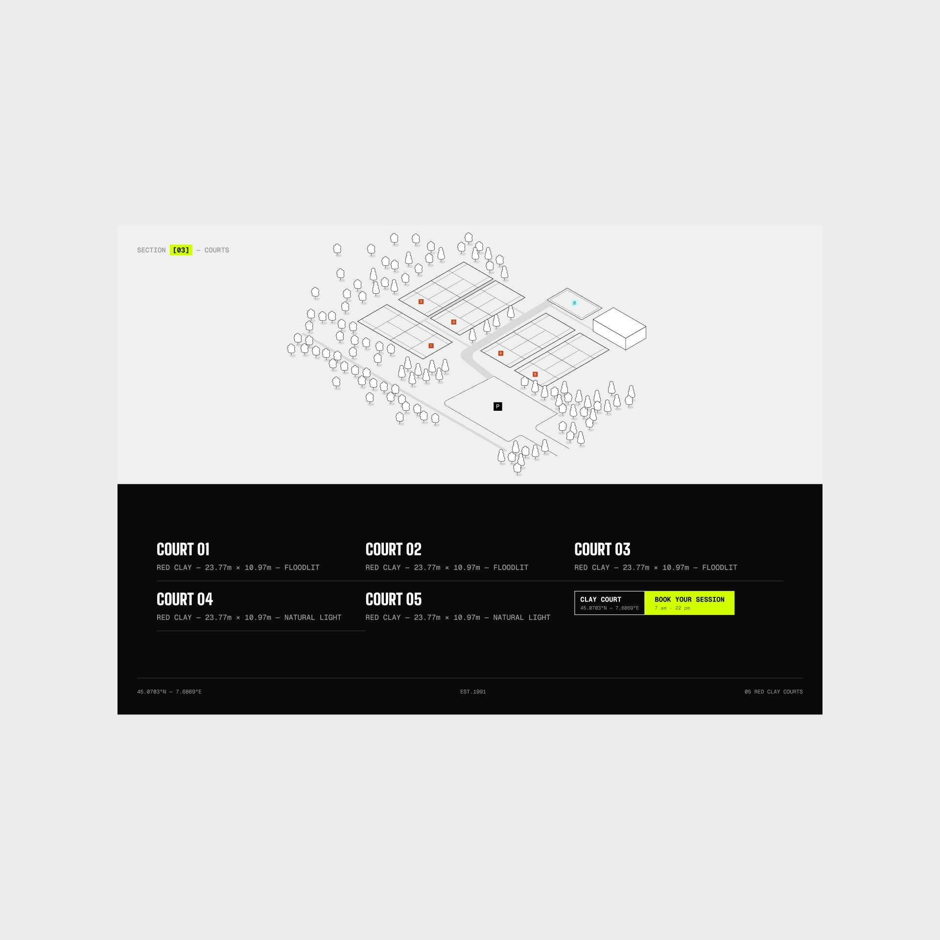
The courts section flips the whole palette to light and drops in an isometric map of the grounds — five courts numbered in clay-orange, trees, the parking marker, the clubhouse. Below it, on black, each court gets a spec line like a product:
COURT 01 — RED CLAY — 23.77m × 10.97m — FLOODLIT. Treating the courts like precision equipment, with exact dimensions and lighting, reinforces the entire promise. This isn't "come hit some balls." This is a facility.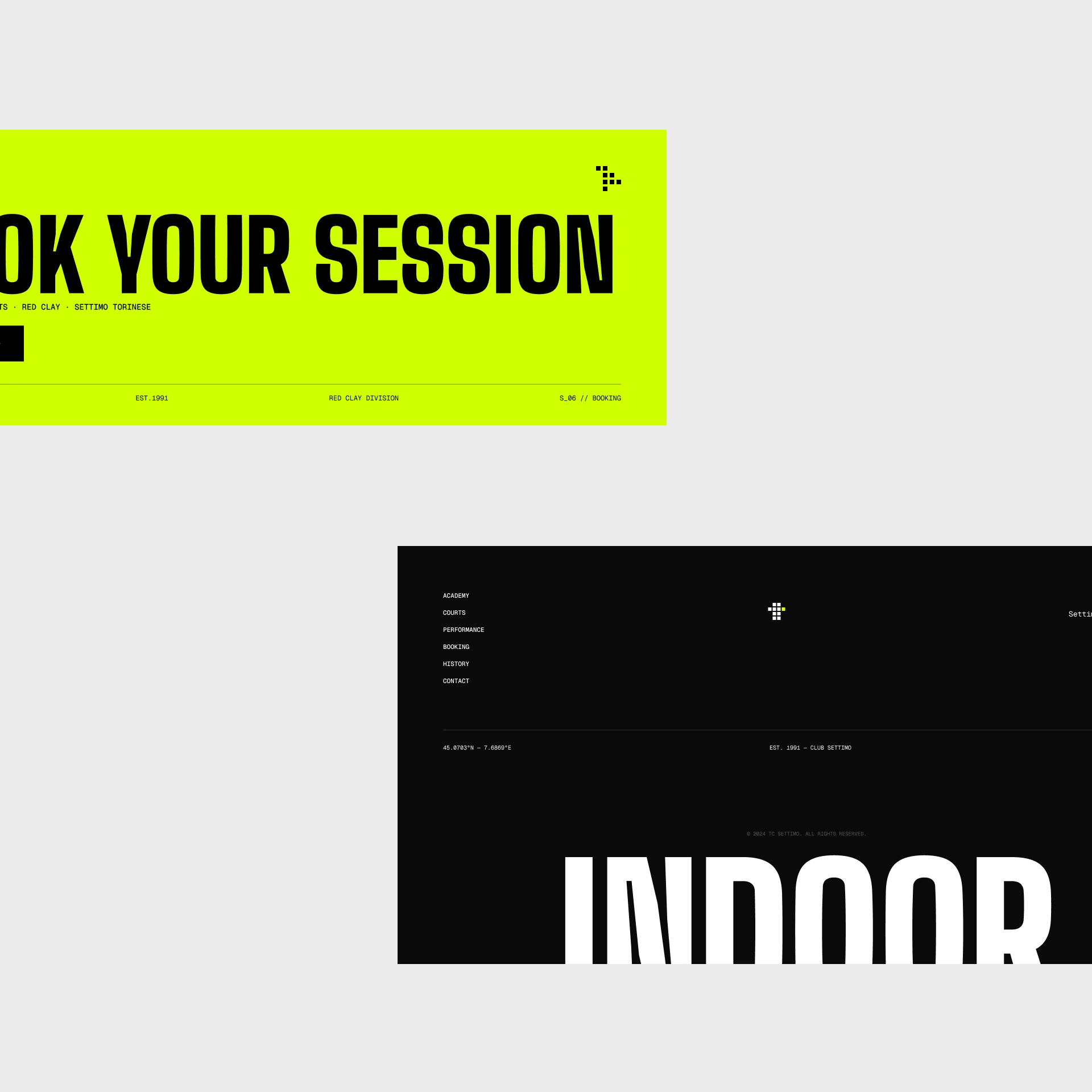
The details I'd defend in a room
The booking tag is the same object everywhere — black label, green action,
7am–22pm. Repeat one thing enough and it becomes a reflex. By the third time you see it, you know exactly what it does.Every footer carries the coordinates. It's a small thing that quietly says: this is a real place, at a real point on the map, and it's not going anywhere.
The type is never centered and comfortable. It's flush, tight, and slightly too big — because a club with an edge shouldn't have a timid grid.
The green is rationed. The fastest way to kill an accent color is to use it twice on the same screen. Discipline in the palette is the same discipline the club sells.
This is the argument I'd make to anyone deciding whether their website is worth doing properly.
A booking button works whether the site is beautiful or not. That's the trap — because "it works" is the lowest bar there is, and it hides the real cost. The real cost is every serious player who felt nothing, assumed the club was average, and booked somewhere else. You never see them. They never argue. They just don't come.
What I build isn't decoration on top of a working site. It's the thing that makes someone decide — in the first four seconds, before they've read a word — that this place is different and worth their time. That decision is made by the experience: the tension in the type, the confidence in the copy, the single green thing telling you where to go. Get that right and the website stops being a cost. It becomes the club's best salesperson, working every night from 7am to 22pm without complaining once.
TC Settimo already had everything that matters — the clay, the history, the players, the standard. My job was to make the website finally tell the truth about it.
Clay doesn't forgive. The design shouldn't either.
Design partner for ambitious brands. Strategy first, aesthetics second — because the website is the final product, but knowing who you are is the actual work. Currently taking a maximum of two clients at a time.
Sergey Bertagnini — sergeybertagnini.com
Like this project
Posted Jul 24, 2026
Redesigned a tennis club's website to reflect its unique and challenging nature. (2nd place in the Base44 challenge