Maple syrup master label system for 12 SKUs

Vincent L. Anderson


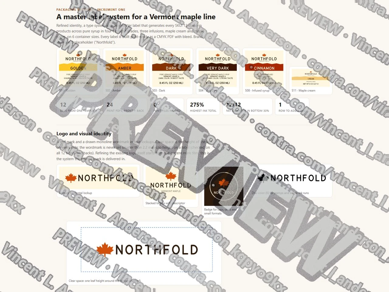
A demo built for a specific brief. Not client work: the material shown is sample data, so what is on display is the mechanism.
I built a packaging rebrand for a fictional Vermont maple brand. The identity is a leaf mark and a drawn monoline wordmark in four lockups (primary, stacked, badge, one color) with clear-space and minimum-size rules, and all label lettering is a drawn capital alphabet, so the print files need no fonts. I explored three packaging directions (Ridgeline, Sugarhouse, Tapline) on the same three products and carried Ridgeline into a master label system: one template plus one SKU table produces front and back labels for 12 SKUs (pure syrup in Golden, Amber, Dark and Very Dark, cinnamon, vanilla and coffee infusions, maple cream, maple sugar) on 6 container sizes, 24 CMYK PDFs in all with 0.125 in bleed and trim boxes. Every label is checked for net quantity against 21 CFR 101.7 (bottom 30% of the panel, minimum height for the panel area, ounces plus pints at a pint or more, NET WT for weight), the Vermont grade rules (grade words at one size, VERMONT with the grade, a batch code field), UPC check digits, a 3 mm safe area, single-plate small text and an ink ceiling of 275%. Adding a thirteenth SKU took one table row.
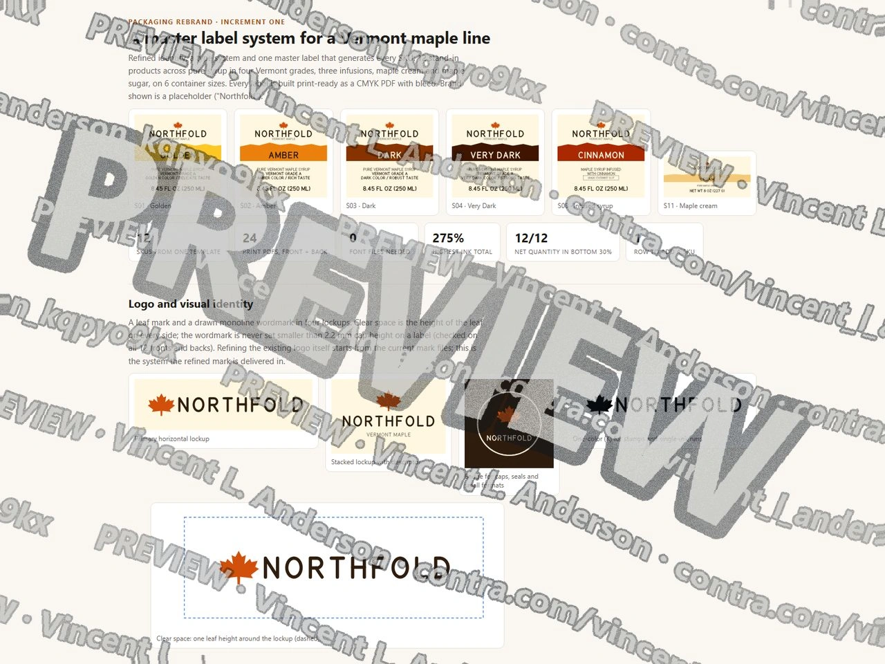
Maple syrup master label system for 12 SKUs 1
Like this project
Posted Sep 23, 2026
I built a packaging rebrand demo for a stand-in Vermont maple brand.
Likes
0
Views
2