Built with Webflow
Onemind's Branding, App and Web Design
Key Services
Branding, Strategy, Content Writing, Design, Project Management
Description
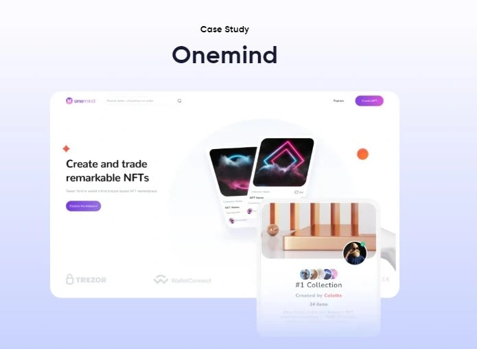
Embark on a captivating exploration of our agency's transformative journey in crafting a groundbreaking NFT marketplace that defies convention. This case study delves into our role as architects of innovation, narrating the design and implementation of a creator-centric platform that revolutionizes the very essence of NFT marketplaces.
Branding Work
Our journey with Onemind began by distilling their visionary goals into a cohesive brand identity. Meticulously crafting a visual language that resonates with their mission of empowering creators, we forged a unique brand that stands at the forefront of innovation in the NFT marketplace landscape. This section unravels the strategic decisions, color choices, and typography that breathe life into Onemind's brand, setting the stage for a truly distinctive digital presence.
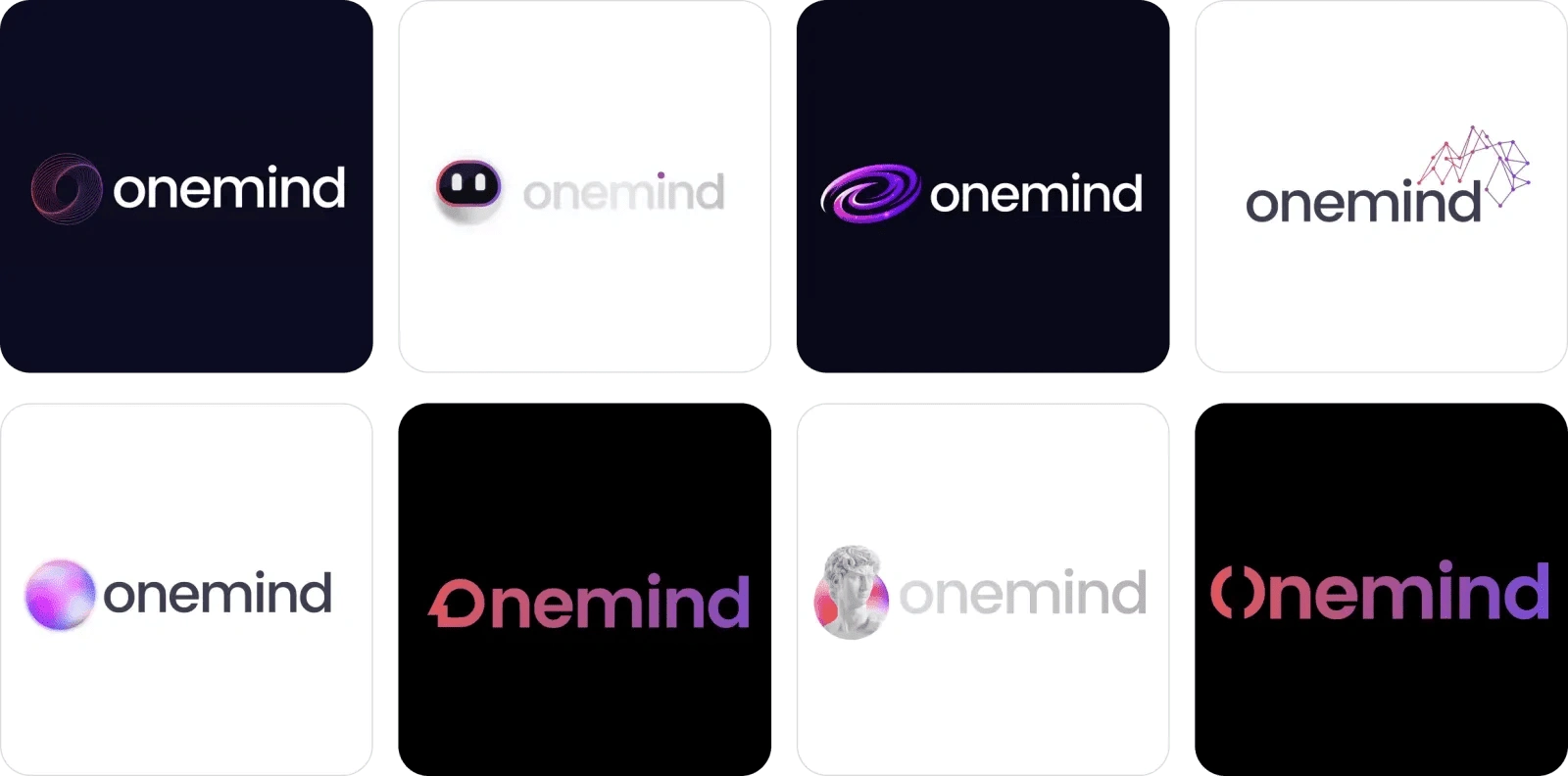
Logo Exploration
Monochrome Logo
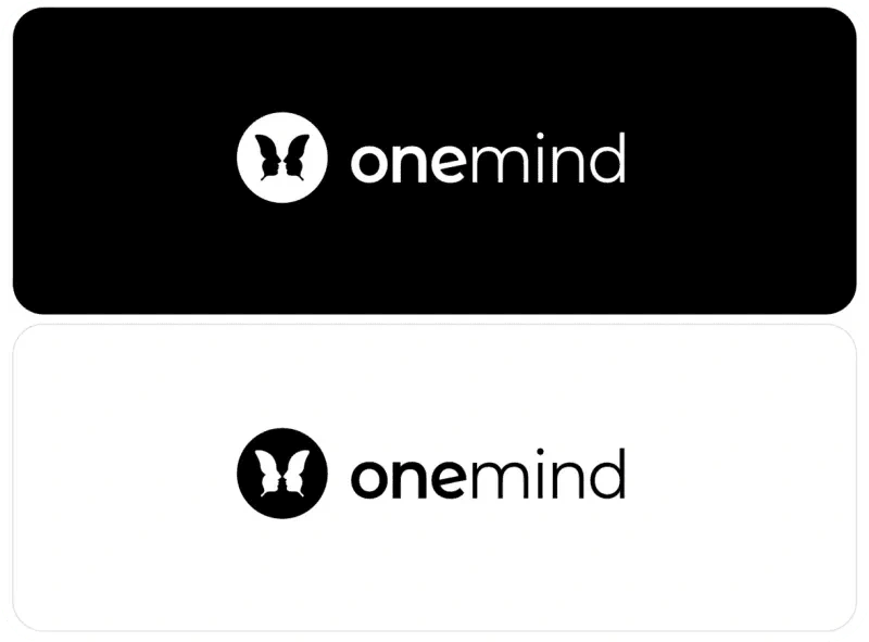
Onemind's monochrome logo isn't just about simplicity; it's a strategic move to reinforce brand recognition. This choice aids cost-effective printing, ensures clarity in scanning and faxing, and fosters seamless partnerships and collaborations.
Clear Space
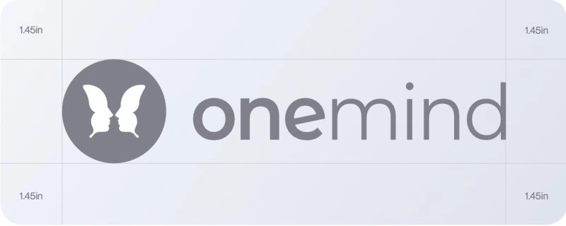
We prioritized clear space around Onemind's logo for maximum visibility. This intentional design ensures the logo stands out in all communications, with a minimum clear space of 50% relative to its height, promoting legibility and visual impact.
Master Logo
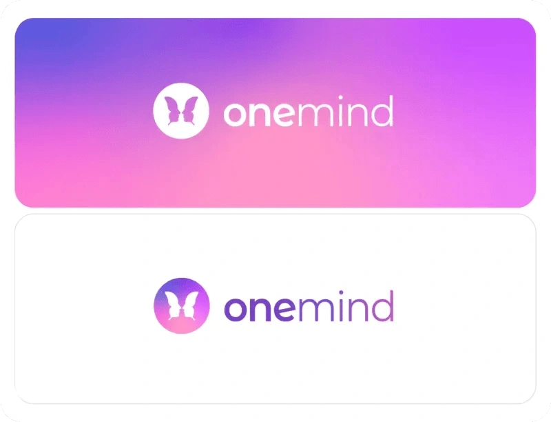
We, as the design architects, crafted Onemind's logo to convey a multilayered narrative. It embodies a butterfly for change, two faces for connection, and a trophy for success. This intentional design stands as the face of Onemind, symbolizing transformation and innovation across all media.
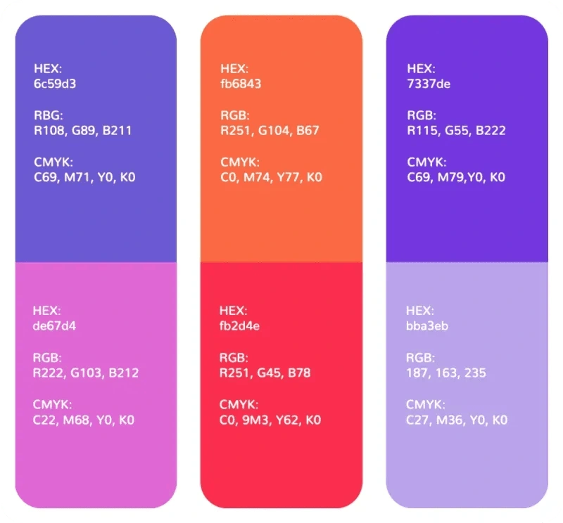
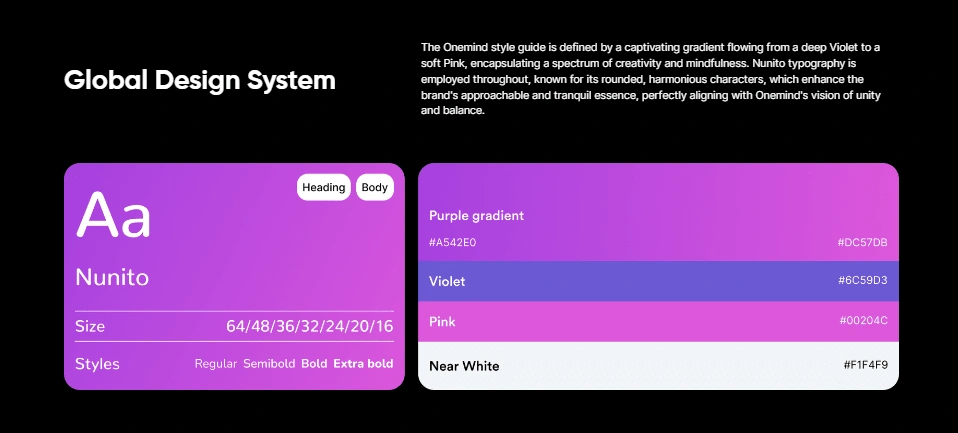
Primary Solid Palette
The primary color palette is constant throughout all communications. A color hierarchy has been implemented.
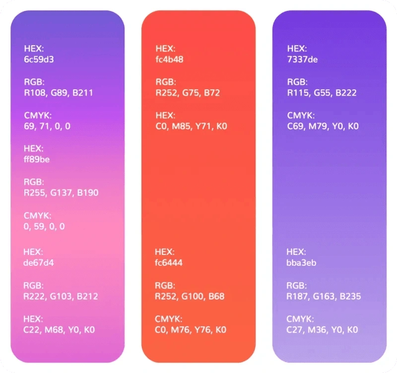
Primary Extended Gradient Palette
The primary gradient color palette is constant throughout all communications. A color hierarchy has been implemented.
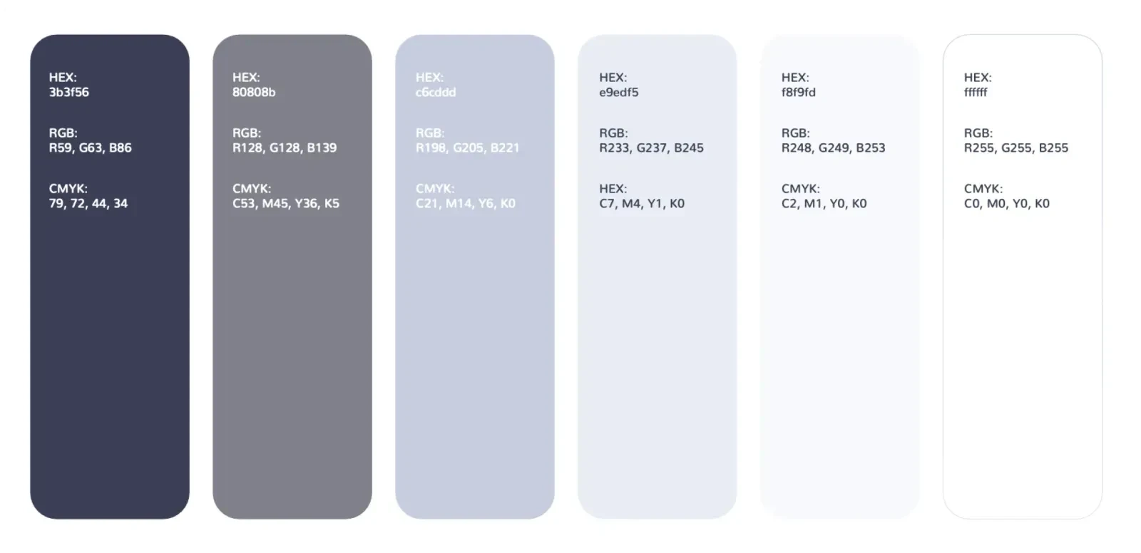
Primary Solid Palette
Applications
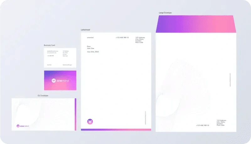
Stationery
We decided to infuse the Onemind stationery set with the brand colors. We recommend special print finishes like logo foiling and business card duplexing for a distinctive touch.
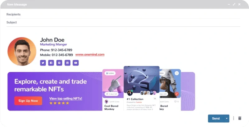
Email Signature
We decided to infuse the Onemind stationery set with the brand colors. We recommend special print finishes like logo foiling and business card duplexing for a distinctive touch.
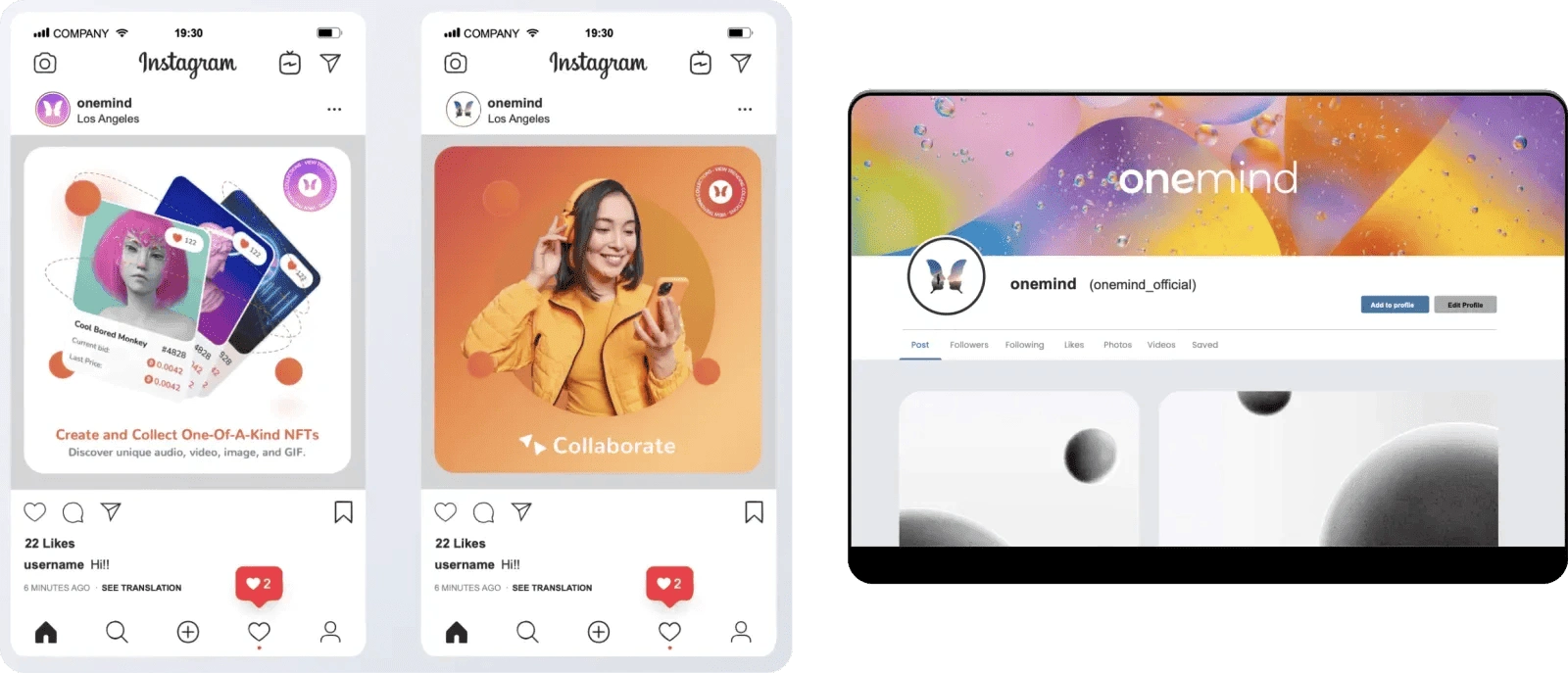
Social Media
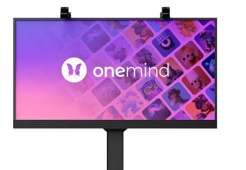
Billboard Mockup Example
Assets
Avatar
Onemind avatars symbolize different industries within the company. Additionally, within the community, gradients indicate achievement tiers like Silver, Gold, Ruby, Emerald, and Sapphire, each corresponding to specific Bitcoin earnings or purchases.

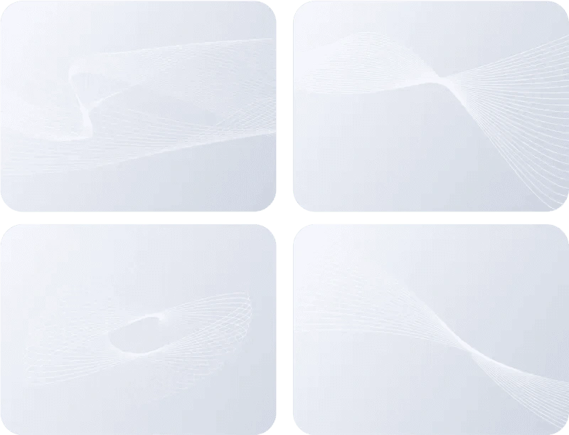
Patterns | Geo-Waves
The geo-wave pattern can be used throughout marketing and design collateral. Adding waves will enhance the design and provide a futuristic tone to Onemind.
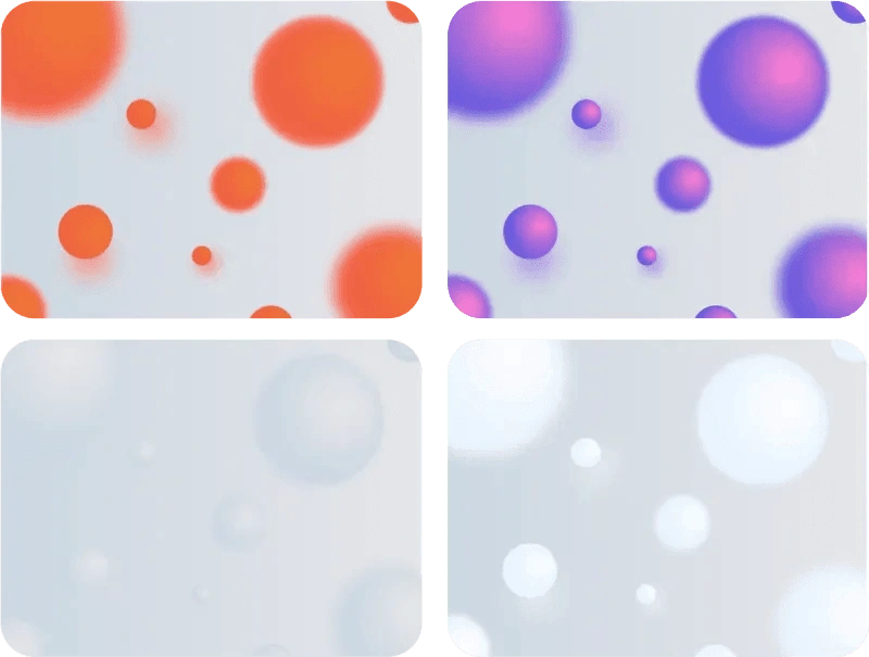
Patterns | Sphere
The 3D sphere pattern can be used for digital and print material such as; popup banners and social media posting.
Web Design
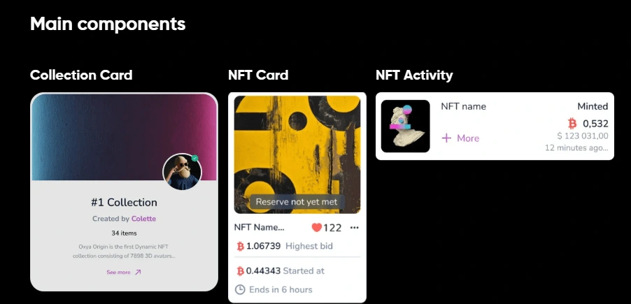
Crafting Onemind's web design, we prioritized seamless user experiences. The intuitive navigation, visually engaging layouts, and intentional color choices reflect the brand's contemporary essence. This design ensures a user-friendly interface that not only captivates but also aligns with Onemind's vision, setting a new standard in the digital landscape.
Homepage

We’re empowering business growth for our clients. Take the first step towards growth today.
Like this project
Posted May 11, 2024
Discover our agency's transformative journey in creating a game-changing NFT marketplace, designed to empower creators and redefine the NFT experience.
Likes
0
Views
30

