Community-Rooted Real Estate Brand Development
Brian Olson
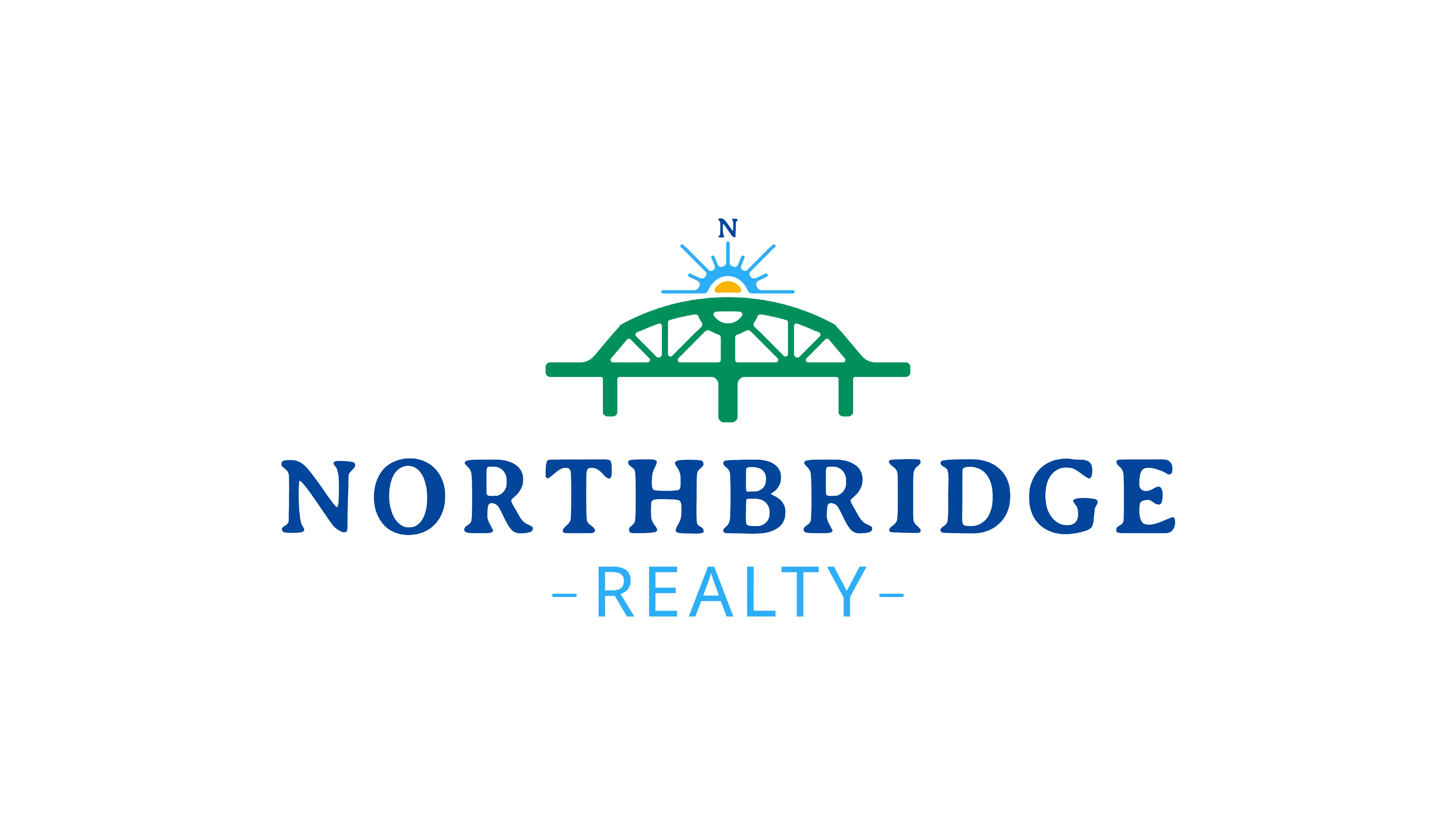
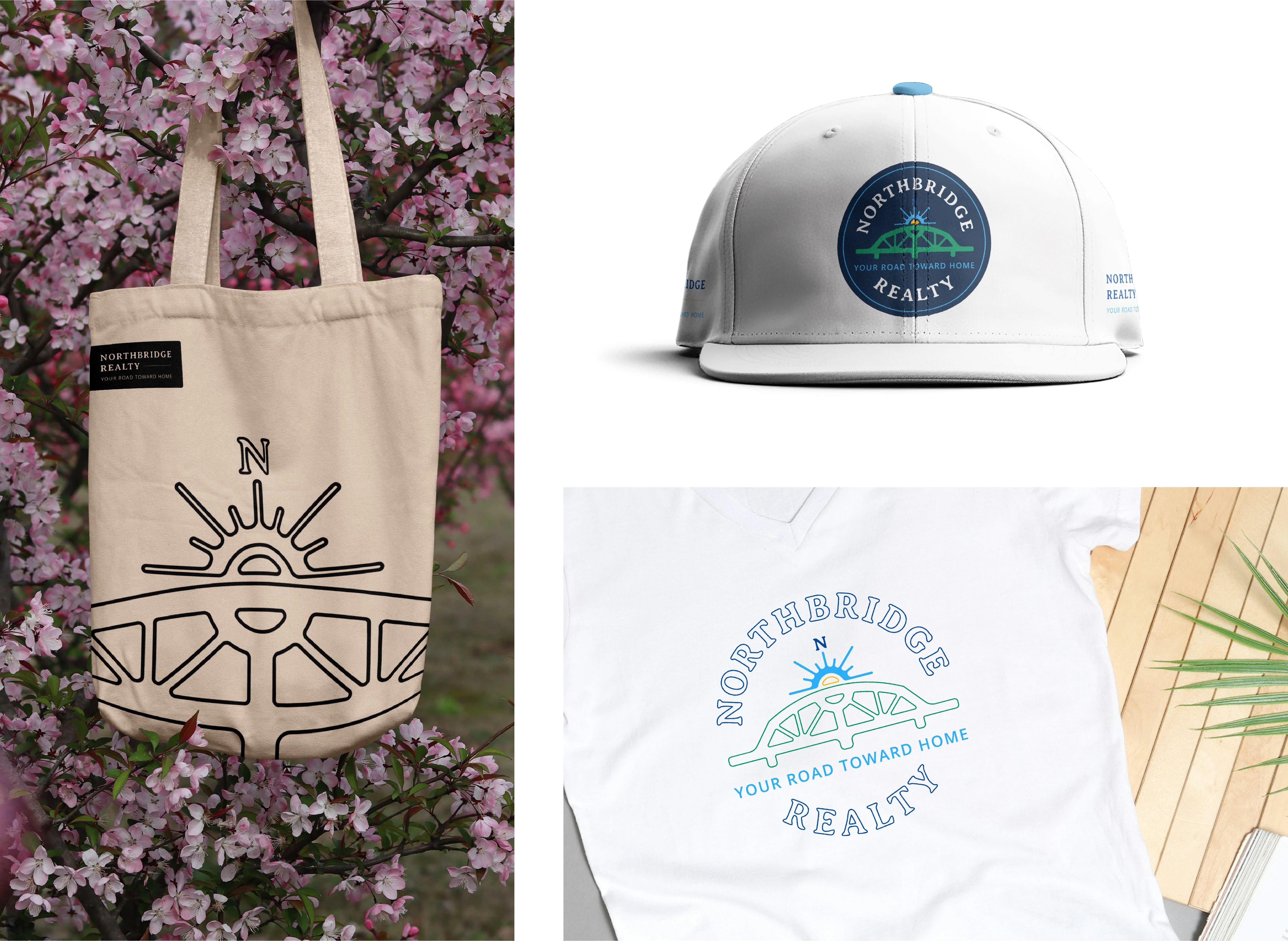
We amalgamated more than a few symbols to create this logo suite.
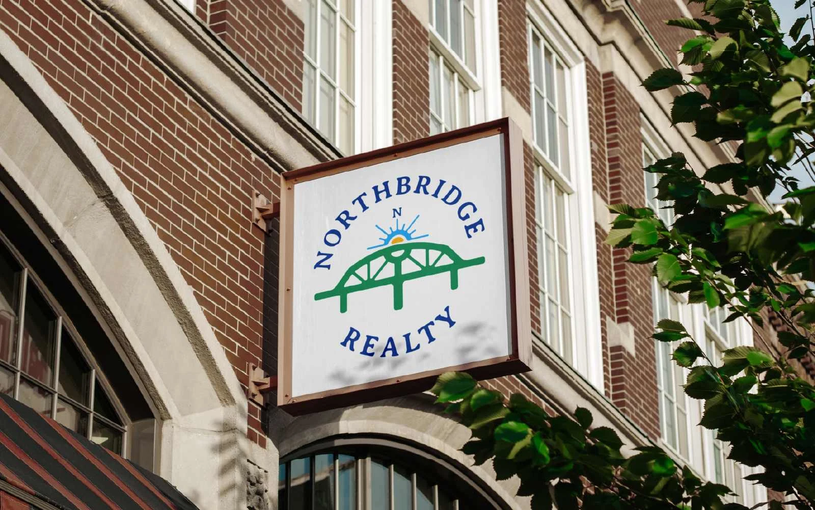
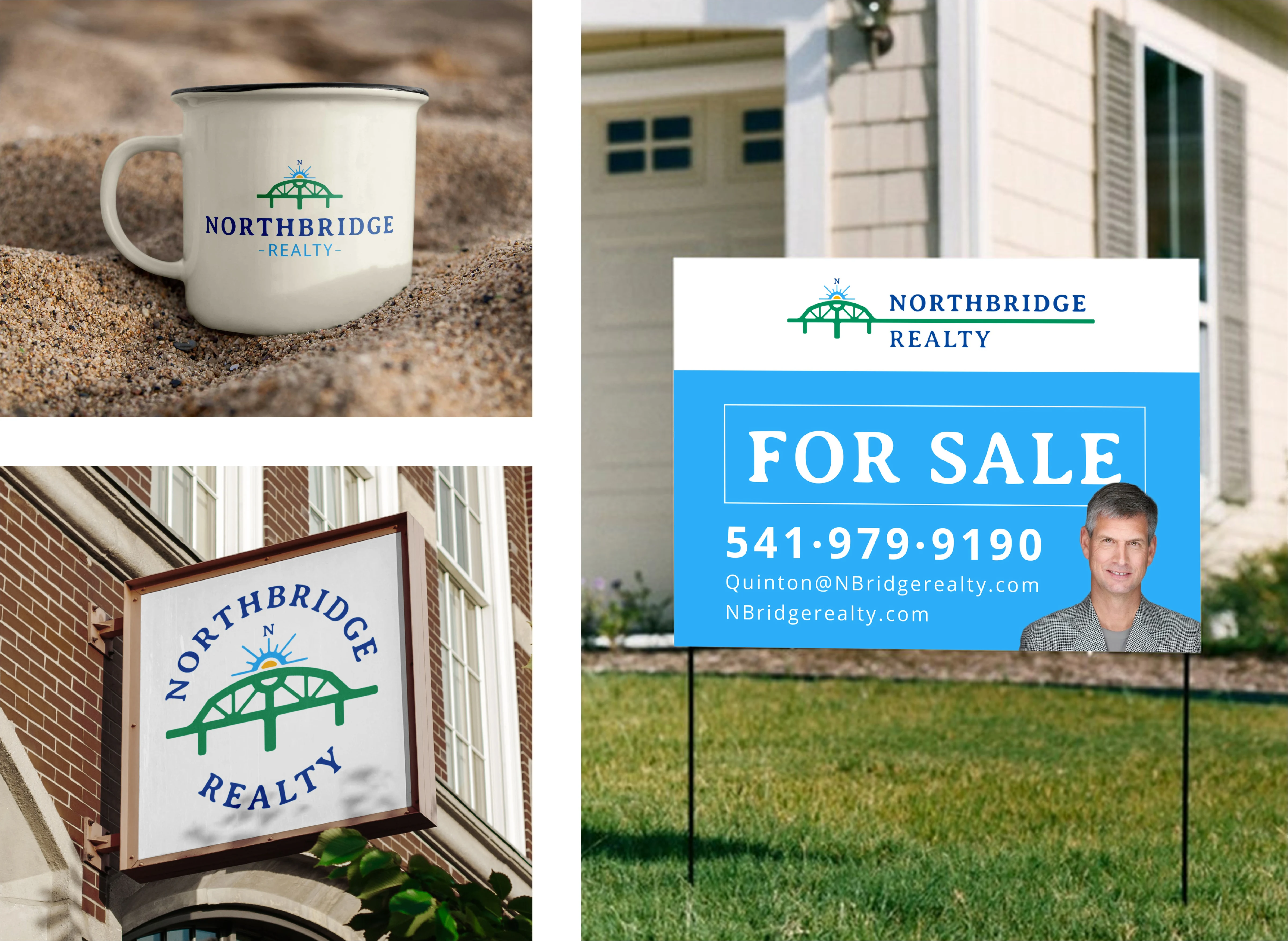
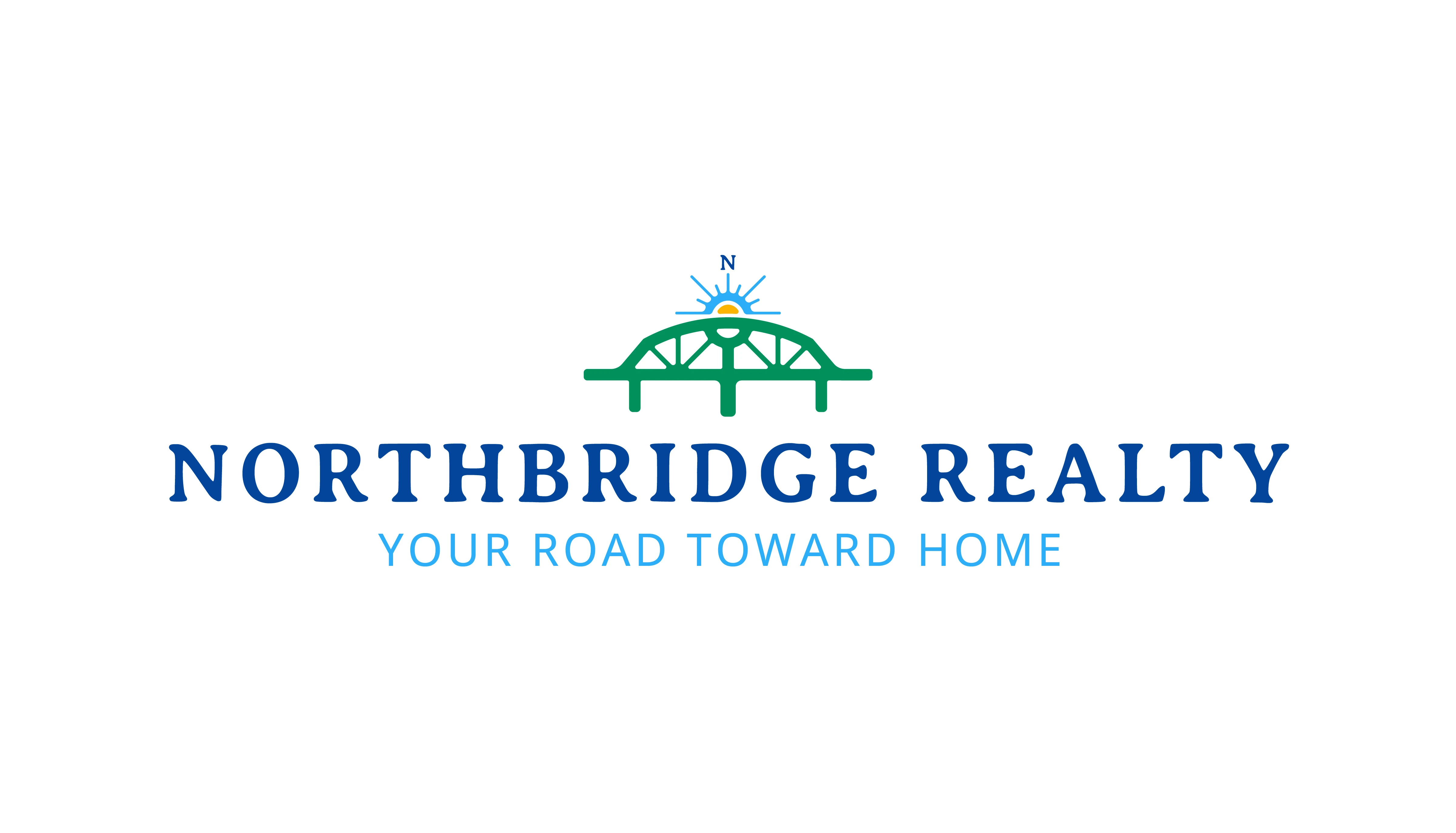
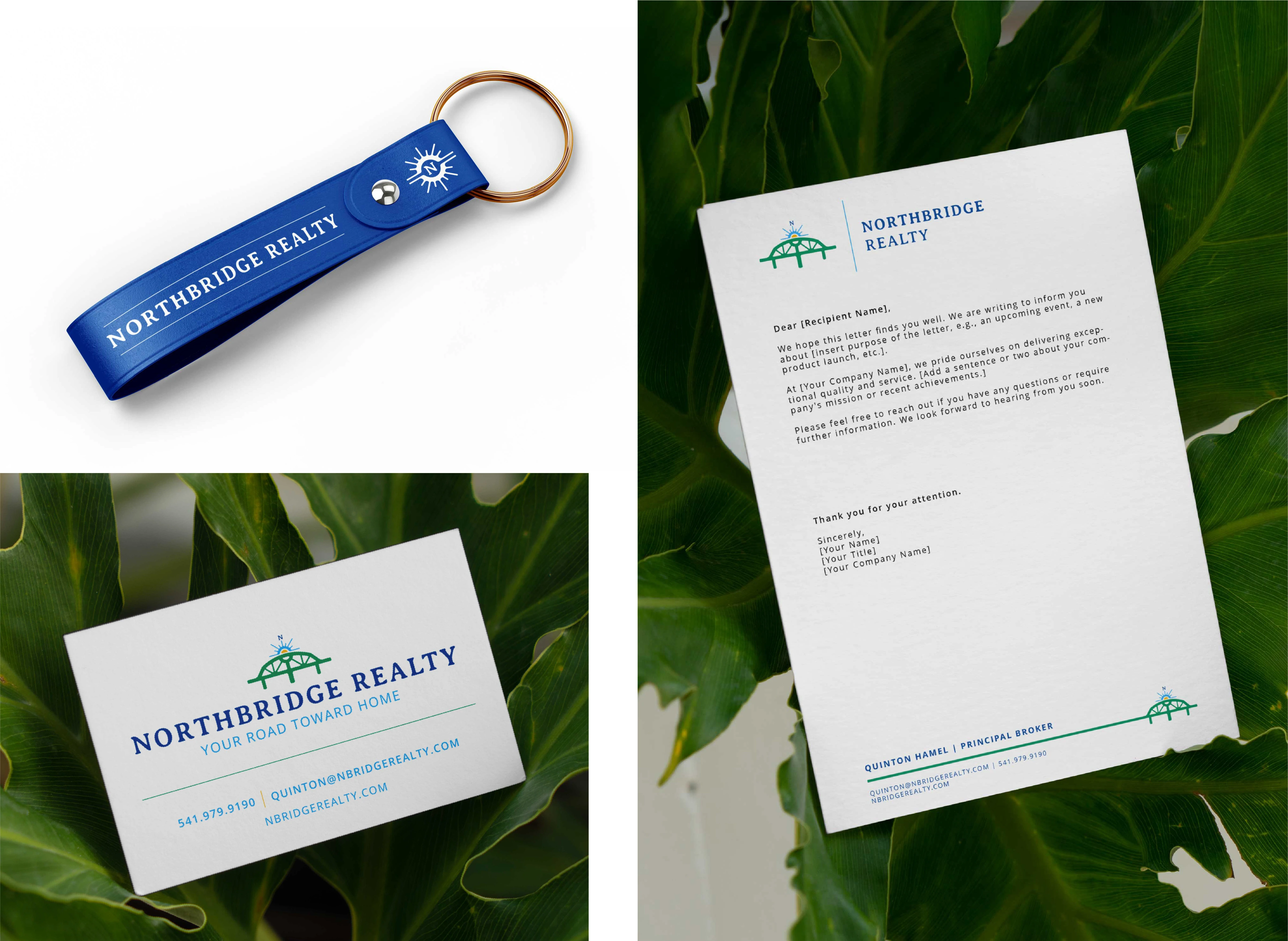
Northbridge Realty is deeply rooted in faithfulness in many senses of the word. To strongly identify with the local community which embodies their client base, a prominent and beloved bridge drove our inspiration. Through simplification and tasteful reimagining, the form was idealized to correspond with the complementary form of the sunrise. The sunrise inspires the dual image of a compass rose - pointing due North toward truth and excellence. A good-natured yet striking color selection gives a sense of distinction balanced by northwestern American charm. The fonts were chosen specifically to walk a fine line between the professional results NB garners and the personal relationships they prize above all.
--
Are you looking for your own cutting-edge graphic design assistance? Pierce through the noise of the market with clear, compelling visuals.
Like this project
Posted May 22, 2025
To strongly identify with the local community which embodies their client base, a prominent and beloved bridge drove our inspiration.