Study Buddy

Jefferson Nnaji


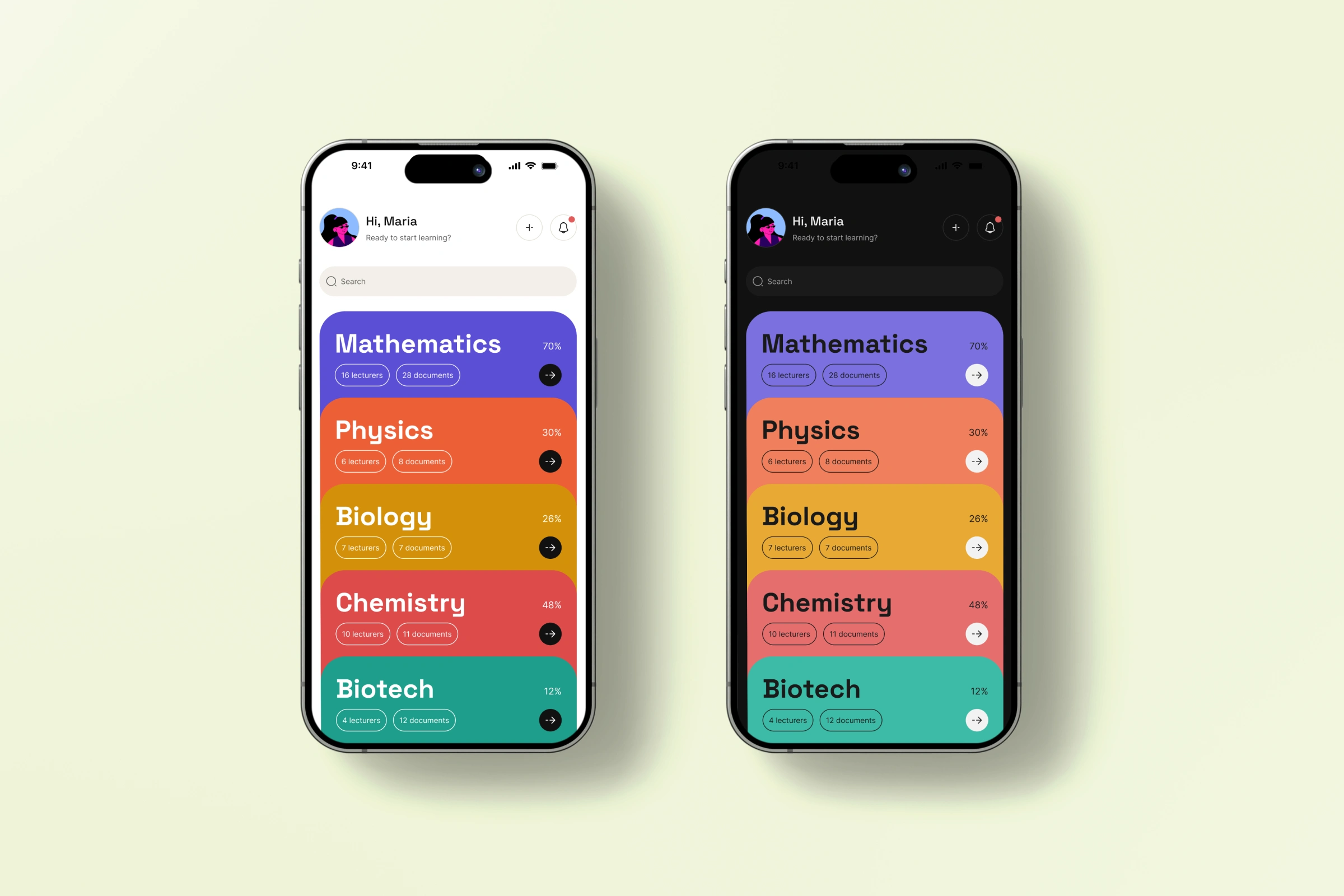
STUDY BUDDY
Help without losing your place
The tiredness this is actually about
There's a particular kind of tired that comes from studying alone at night with a phone as your only tool. Not the tiredness of the material itself, the tiredness of managing everything around it, which lecturer posted which file, where you left off, whether the AI tab open somewhere else actually understood the question you asked it. That's a design problem, not a discipline problem, and it's solvable.
Who it had to work for
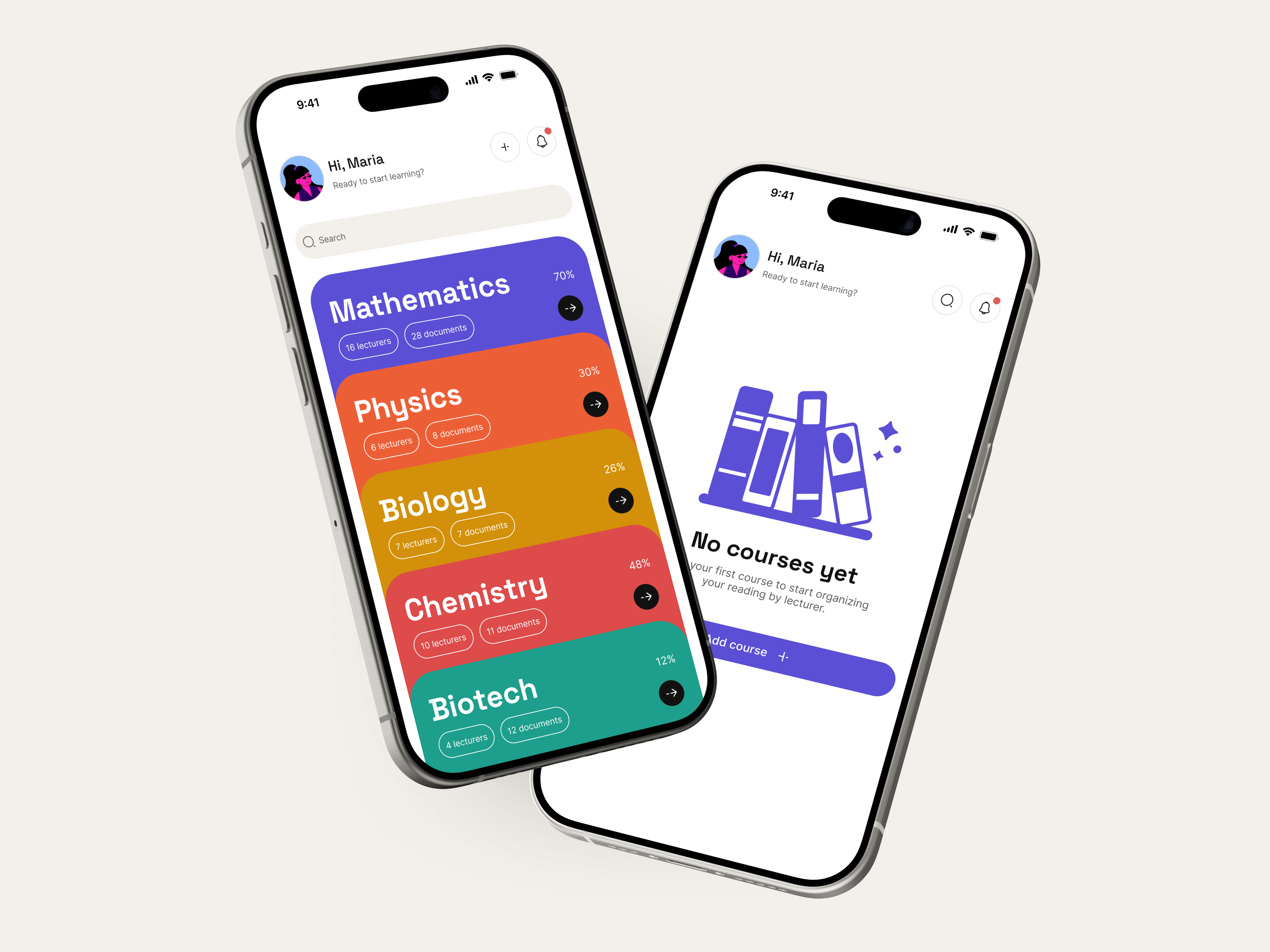
One student, deliberately narrow. A 200-level Nigerian university student, three courses running at once, studying on her phone because it's what's in her hand at 9pm, not because it's what anyone would choose for dense reading. She's not disorganized, she's managing a fragmented system nobody designed on purpose, PDFs dropped into WhatsApp with no folder structure, a different habit per lecturer, and a two hundred person group chat that is the last place she'd post "I don't understand this."
"I don't have time to read this twice."
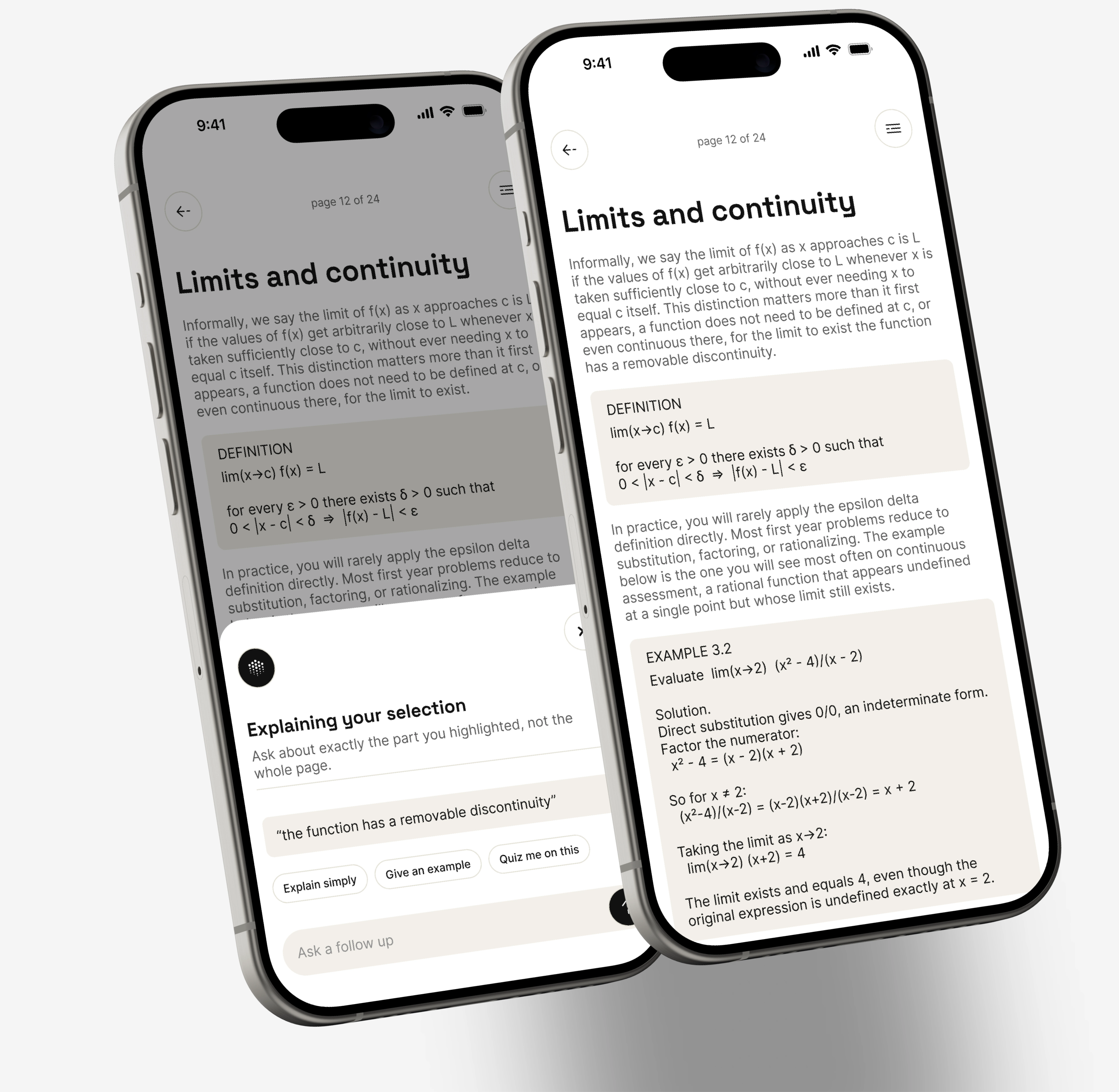
That line came out of early empathy work and ended up doing more design work than almost anything else. It reframed the whole premise, this isn't competing with tutoring or trying to be a better PDF viewer, it's removing the tax she pays every time she has to leave a page to go find an answer and then find her way back. The idea, in one sentence, get help with what you're reading without ever leaving the page you're on. Everything either serves that or it got cut.
The nav bar that pointed at nothing
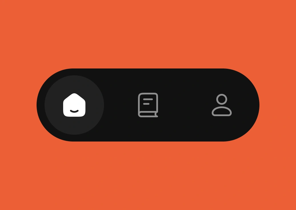
Early on the interface had a three item bottom tab, Home, a middle tab, Profile. The middle tab looked reasonable in isolation and fell apart under one question, where does it actually go. There was no real destination behind it, just a pattern that's common elsewhere. Removing it wasn't simplification for its own sake, it was correcting an actual mistake. Every screen gets its full height back instead of giving up sixty pixels to a bar defending a destination that didn't need defending.
Dark, then a considered light
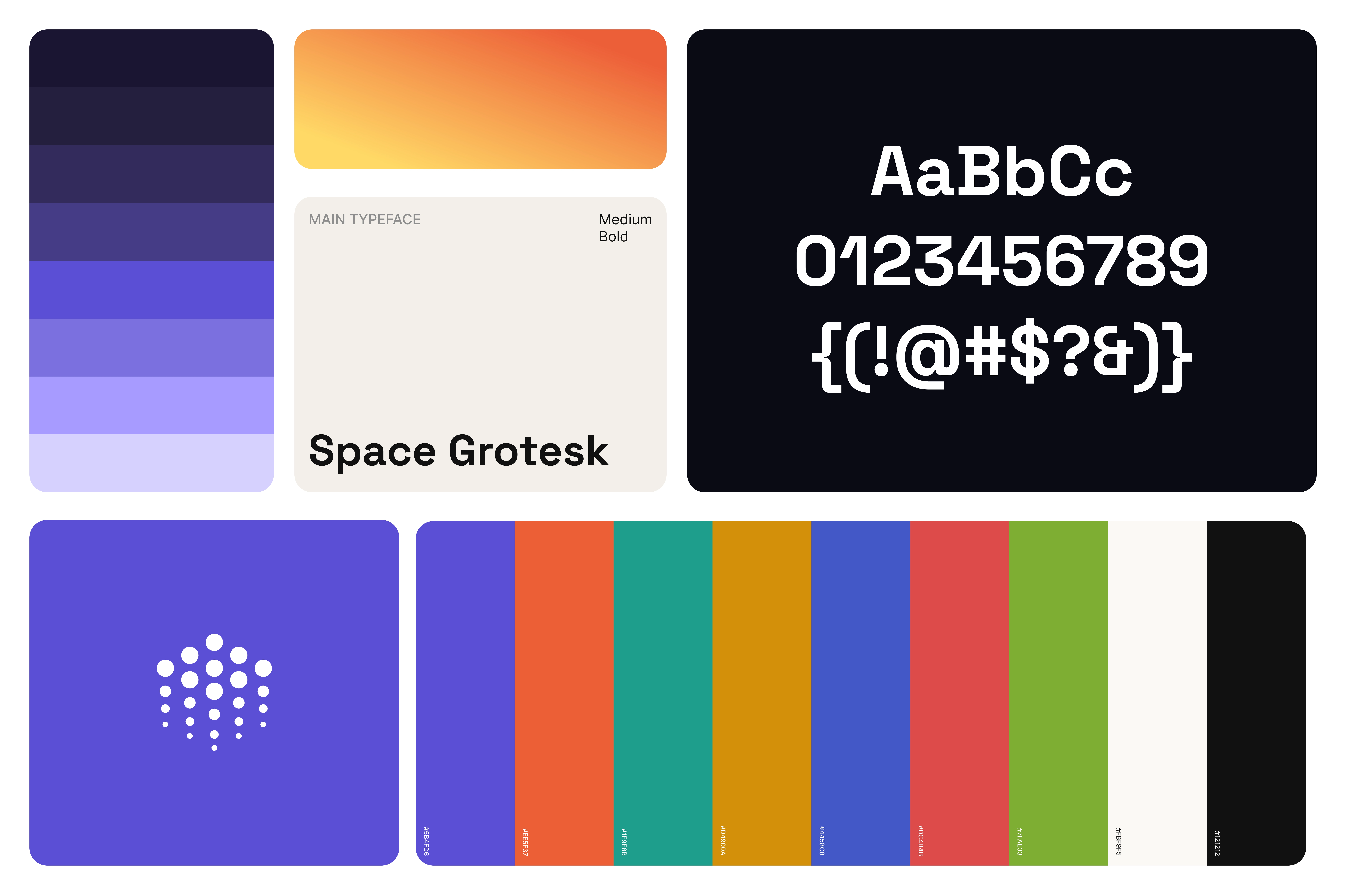
The interface went through a full dark phase, the logic being a late night study tool should look like it belongs at 9pm. Not wrong exactly, but once real content was sitting inside it, a white, high contrast surface did a better job of the one thing that actually mattered, making dense academic text genuinely comfortable to read for more than a minute. Dark mode didn't disappear, it became a fully specified second mode instead of the whole identity.
What's built and what isn't
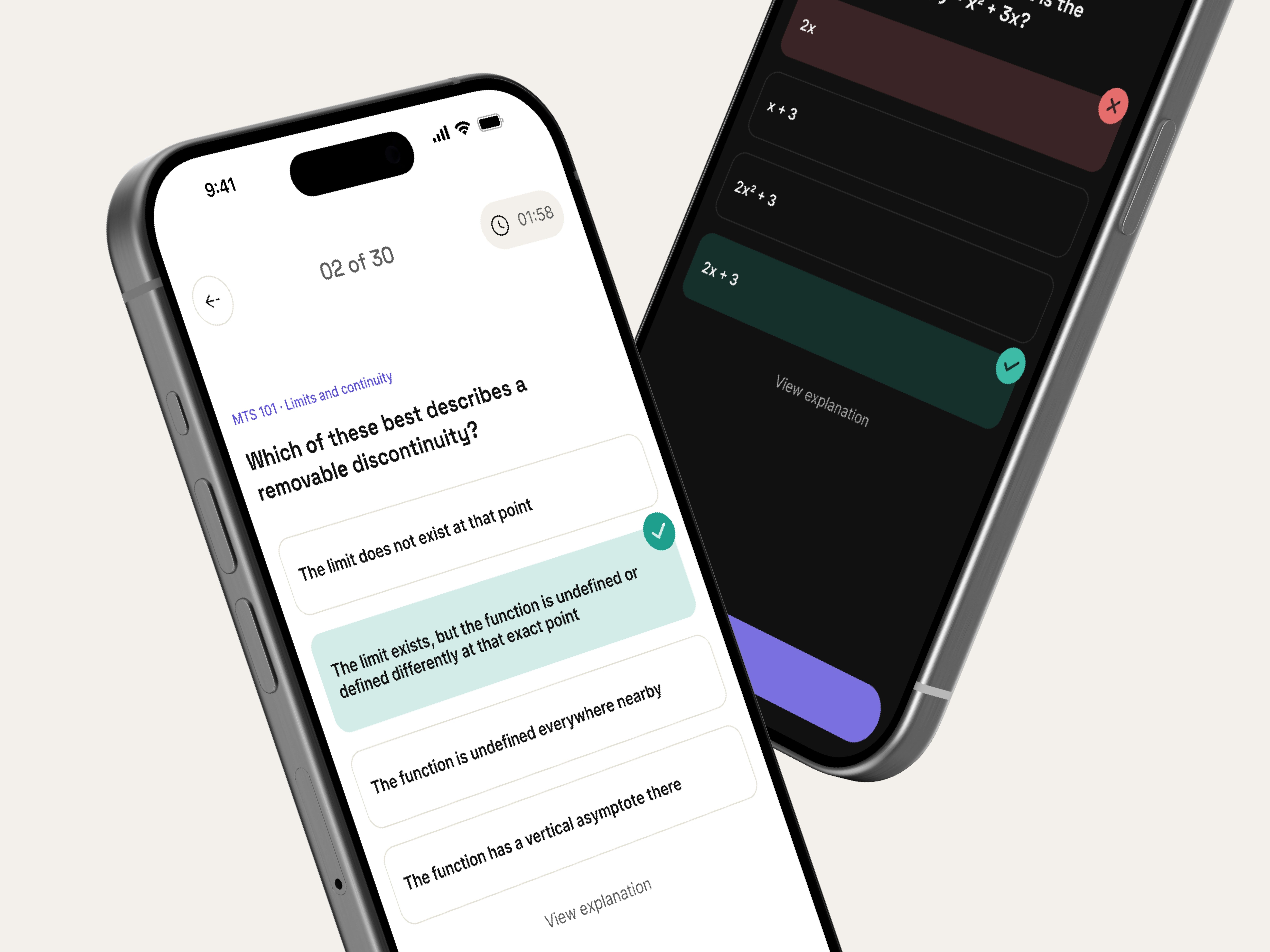
The Document Reader shows what the content looks like today. What it doesn't do yet is the actual mechanic that makes this different from any other reading app, highlighting a line and asking about exactly that part, choosing a page range and getting a quiz on just those pages. That loop is the real thesis of this product, and it's the first thing I'd build if I picked this back up.
Like this project
Posted Aug 19, 2026
Designed a study tool interface for efficient mobile learning.
Likes
1
Views
5