UX and Visual Design for Rhythm, Mental Health App
Karina Sam
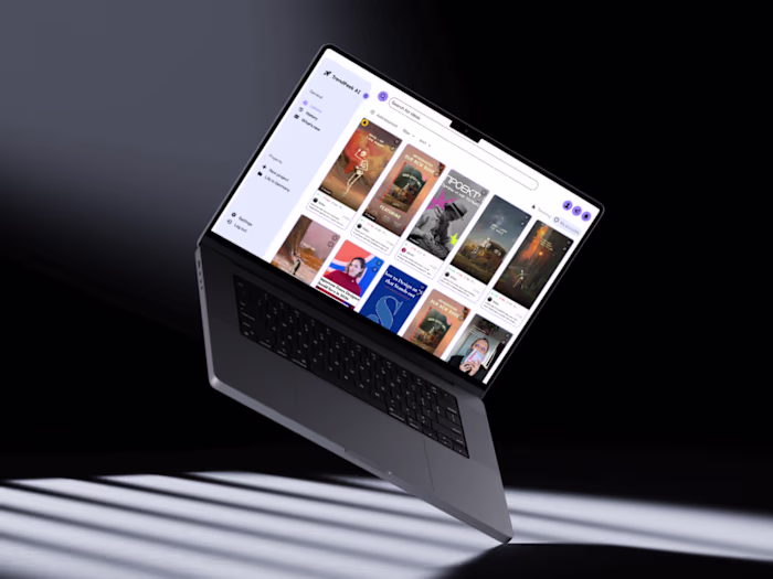
Rhythm, a mental health app, that feels like adventure.
The concept
Rhythm is a mental health concept app built around psychological and philosophical practices, like stoicism, mindfulness, dream analysis, breathing techniques, body scans, all framed as an exploration and an adventure. Users move through a hand-crafted pixel-art map, unlocking practices at their own pace, guided by beacons that surface newly added content.
The app was designed for two kinds of people: those who want evidence-based approaches grounded in real psychology, and those who are too overwhelmed to commit to a structured routine and need something gentler, something that meets them where they are.
Industry: Mental Health
Year: 2025
Timeline: 3 months
Role: UX/UI Solo Project
Tools: Figma, Adobe Photoshop
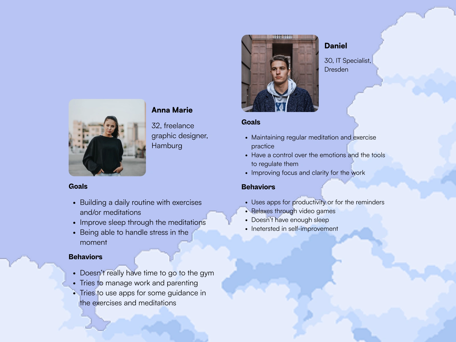
Two personas shaped the design: Anna Marie, a busy parent who wants a daily practice but never has the energy to start; and Daniel, a productivity-minded user who needs the science behind whatever he tries.
What research told us
I conducted competitor analysis and qualitative user interviews. The key insights that shaped every major decision:
Users need fast, in-the-moment help. A technique they can use right now.
Routine matters for long-term clarity, but it needs to feel chosen, not enforced.
Users want to understand why a practice works, not just how. The science behind is important.
Keywords and quick summaries are essential, users need to understadn fast if the practice is for them or not.
Guided discovery and free exploration need to coexist.
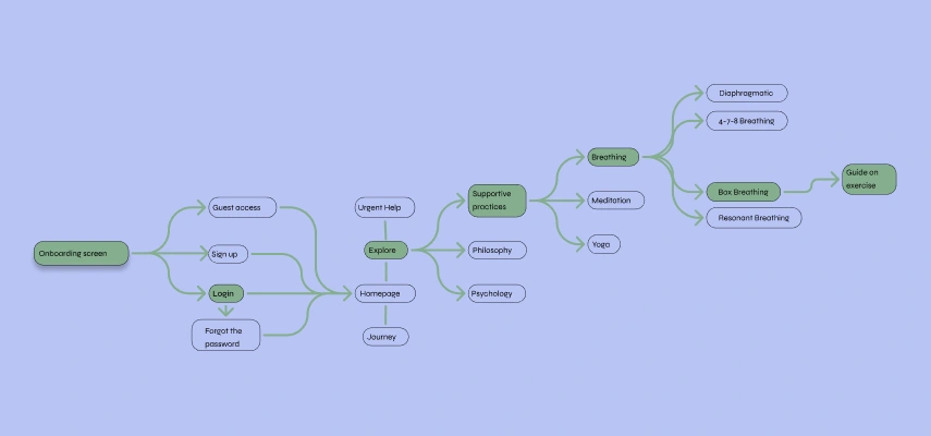
User flow mapping how both personas moved through the app: researching a technique, choosing a practice, reading the explanation, and implementing it.
Wireframing & iteration
Early wireframes were deliberately generic, I needed the structure before the building the visuals of the app. As the information architecture solidified, one thing became clear: the journey map had to be the heart of the experience, not a feature buried in a tab.
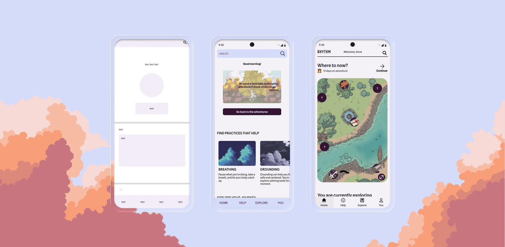
From wireframes to mid-fidelity to final UI. As the structure solidified, the focus shifted to the map and the pixel-art visual language.
Usability testing: 6 participants, 4 tasks
Onboarding & registration: 100% success | SEQ 1.2 (very easy) | 😃
Search function: 80% success |SEQ 2.8 (neutral) | 😞
Exploring a practice: 100% success | SEQ 1.3 (very easy) | 😃
Using the journey feature: 80% success | SEQ 1.3 (very easy) | 😊
The search function was the clearest pain point, an 80% success rate and a noticeably higher difficulty score meant discoverability needed rethinking before finalising. I iterated the designs, considering the WCAG best practices, and made sure to test the new one with the users.
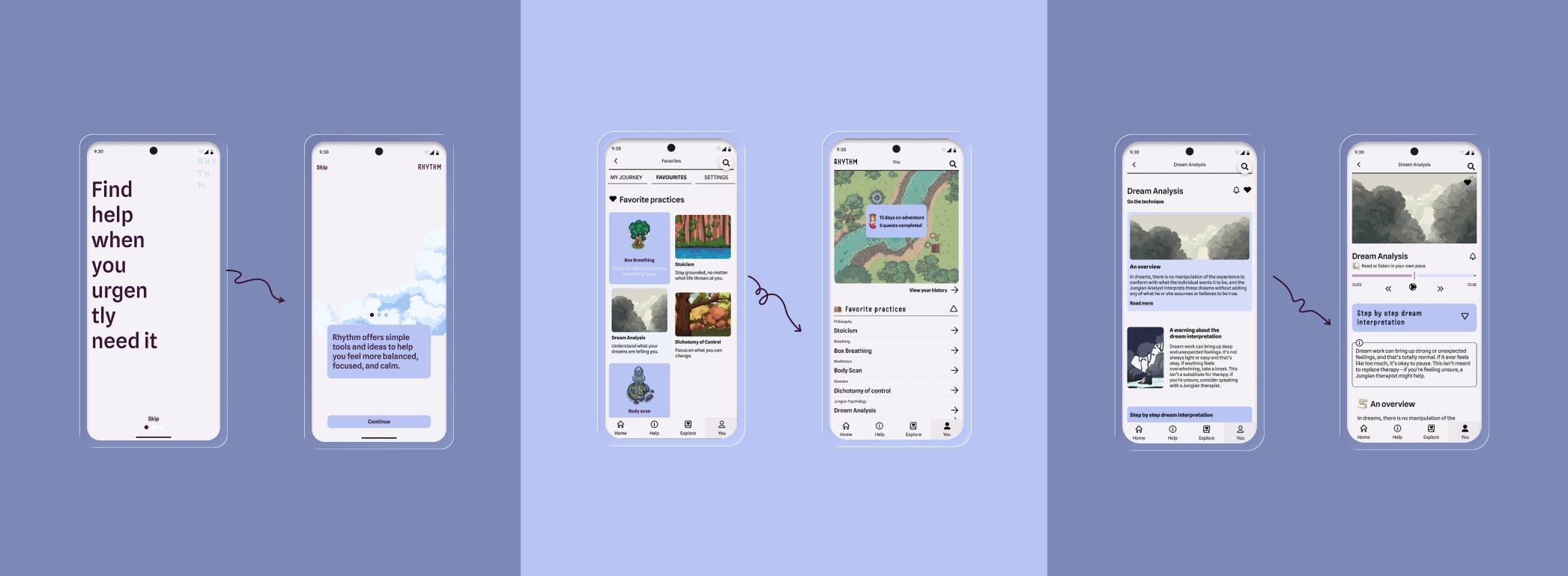
Updates: onboarding copy and layout, the YOU section restructure, and the Dream Analysis practice page.
The map is the heart of Rhythm
The pixel-art journey map took the most time of anything in the project. It needed to feel immersive and explorable without ever becoming disorienting.
Users move through it at their own pace. Each discovery and completion of the practice is celebrated with a small firework animation. Beacons guide travelers toward newly uploaded practices waiting to be explored. The map is clean enough to be navigable but rich enough to reward curiosity.
The pixel-art aesthetic wasn't decorative, it was intentional. Retro games evoke a particular kind of comfort and safety. I wanted users who feel lost or burned out to open Rhythm and feel adventure and ease before they've even read a word.
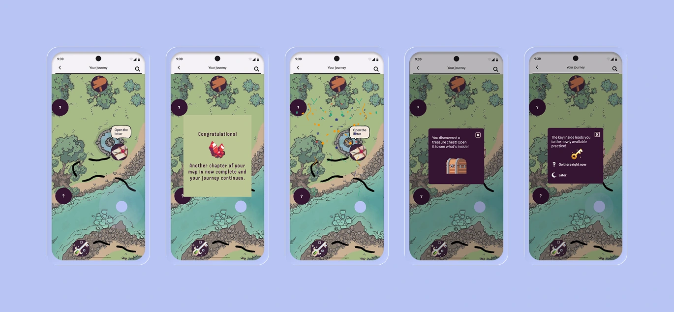
The journey map hand-crafted to balance the thrill of new discoveries with a gentle, predictable path.
Outcome & reflection
Leading the entire process: research, interviews, wireframing, visual design, usability testing, and WCAG accessibility work, pushed me significantly as a designer. Rhythm proved that mental wellness tools don't have to feel like obligations. With the right framing, self-discovery can feel like an adventure worth coming back to.
Like this project
Posted Apr 15, 2026
A mental wellness app where self-discovery feels like an adventure. Pixel-art world, psychological practices, designed solo end-to-end.
Likes
1
Views
2