Famako App visual identity and user experience revamp
Anandu Gopal
Redesign
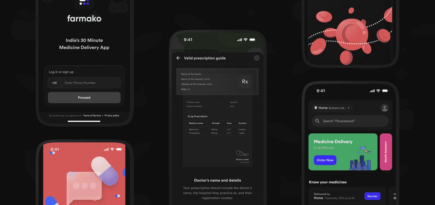
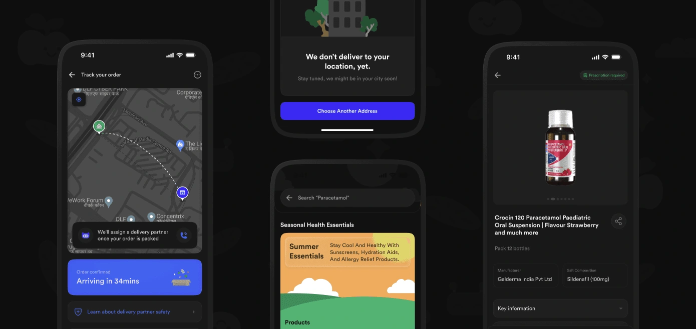
The previous Farmako branding featured dull, desaturated colors, which, while often associated with serious fields like healthcare, conveyed a sense of nervousness and unease. As a medicine delivery brand, we aimed to eliminate this feeling. We opted for bright, bold, and modern colors to create a more inviting experience for users, making the process feel less intimidating. Additionally, we focused on creating welcoming illustrations and a pleasant UI design. Our central goal was to alleviate the anxiety and discomfort typically associated with the healthcare sector.
Redesign
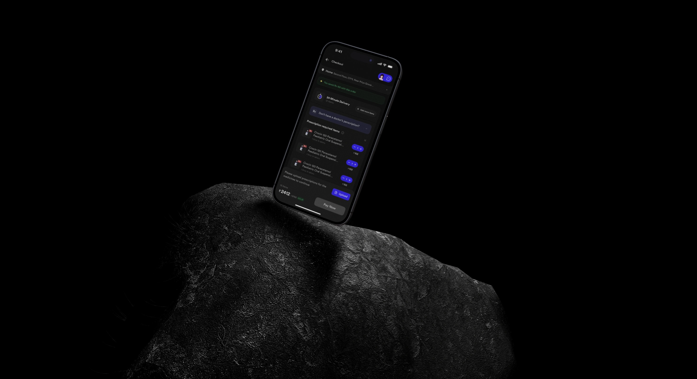
The previous version of the Farmako app relied heavily on a chat-based ordering system with pharmacists, which proved to be unsustainable as the user base grew. The redesign introduces a more intuitive medicine marketplace, enabling users to browse freely while still accessing pharmacist assistance—an essential feature of Farmako. Additionally, the revamped checkout and prescription flow provides timely feedback and simplifies navigation for verifying carts containing prescription-required medications. This along with seamless integration of pharmacist chat ensures users receive ongoing support and builds trust throughout the entire ordering process.
Like this project
Posted Jan 14, 2025
Redesigned Health care app's user experience and visual identity which led to 50% more sales and revenue.
Likes
0
Views
3
Timeline
Sep 1, 2024 - Dec 31, 2024