Building a Desing System from Scratch in Figma
Luda Boss
I created the Figma Design System meticulously to enhance the design and development processes for various digital products.
The challenge
Many companies face the common yet complex issue of maintaining a consistent, intuitive user interface across their expanding digital ecosystems. With a range of distinct products and services, creating a unified user experience is a significant challenge.
Benefits of using a design system
Using a design system ensures consistency and efficiency by promoting the reusability of content and design components across different projects.
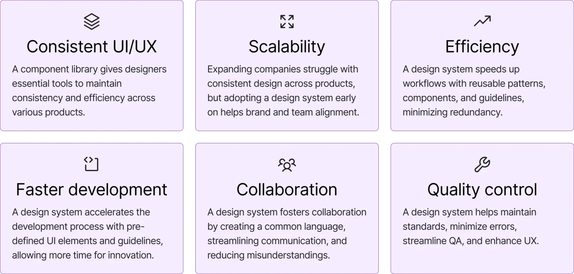
Design System benefits.
Best design practices inside a design sytem
Start off quickly with best practices for UI design and Figma already applied.
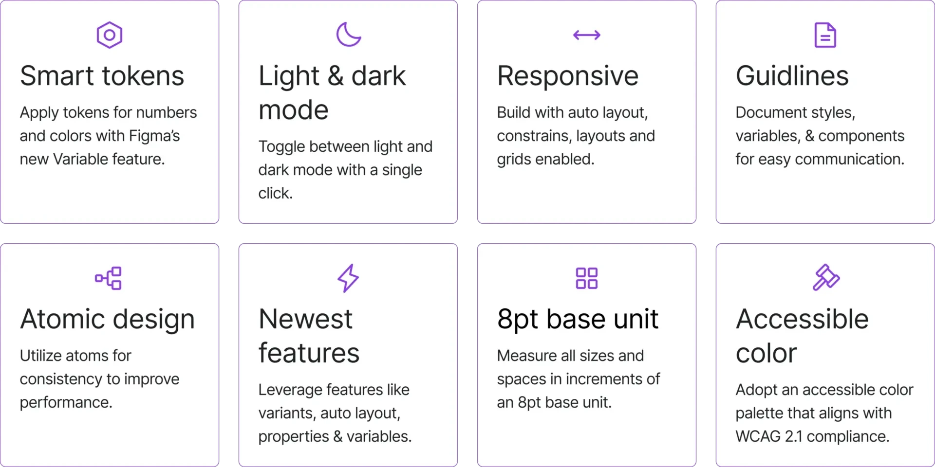
Best design practices.
Adobe’s Spectrum design system
My design system is inspired by Adobe Spectrum’s guidelines, the industry leader in color, ensuring precise color selections.
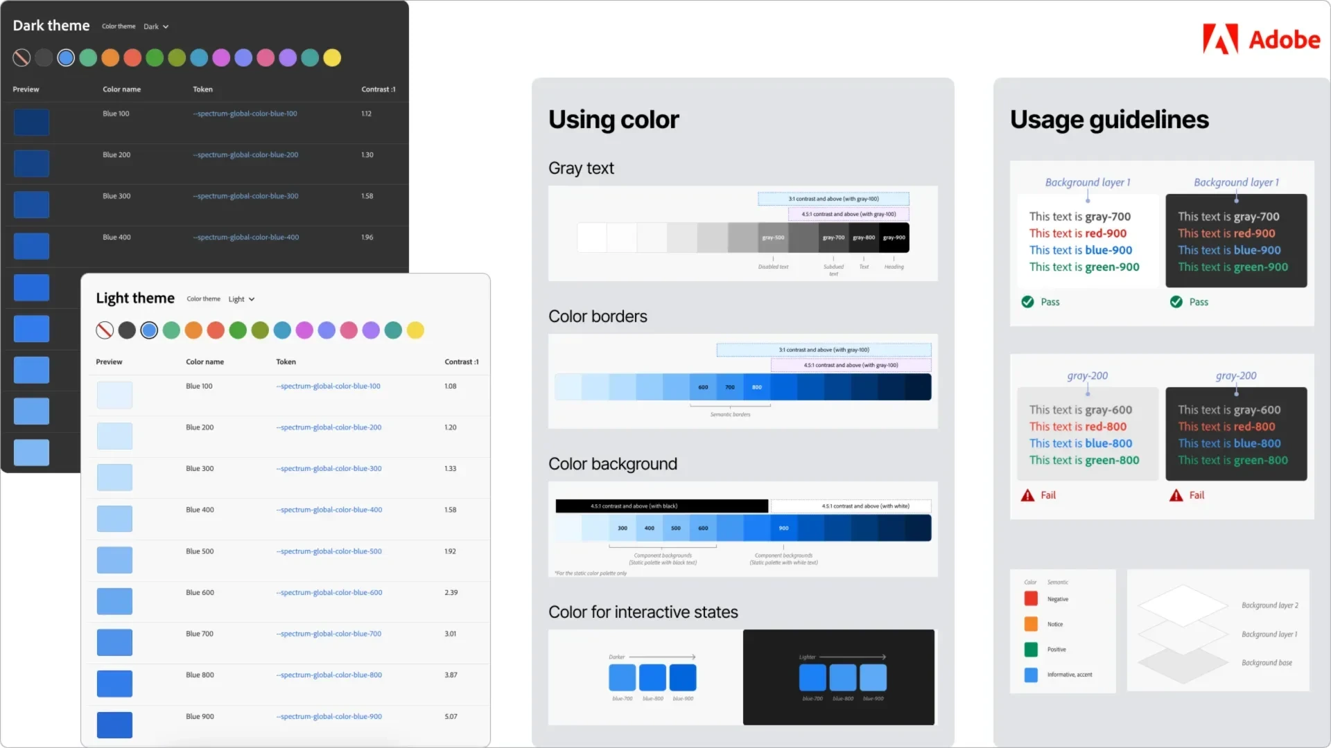
Adobe design system.
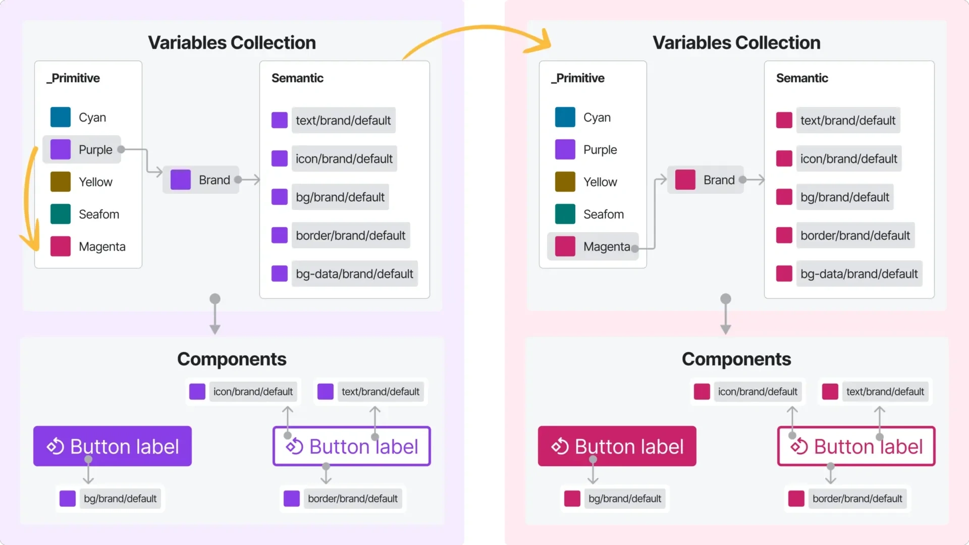
Fully tokenized with COLOR variables
The design system is fully tokenized using Figma’s latest feature, Variables, enabling colors to be adjusted, used, and synced with the dev team like never before.Color Variables are divided into two collections: Primitive and Semantic.
1. Primitive color variables
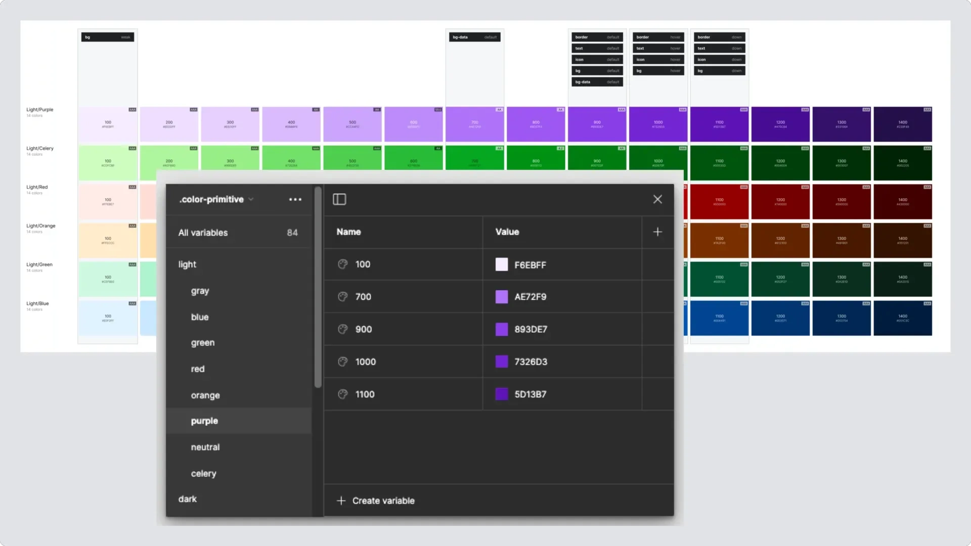
Primitive color variables.
2. Semantic color variables
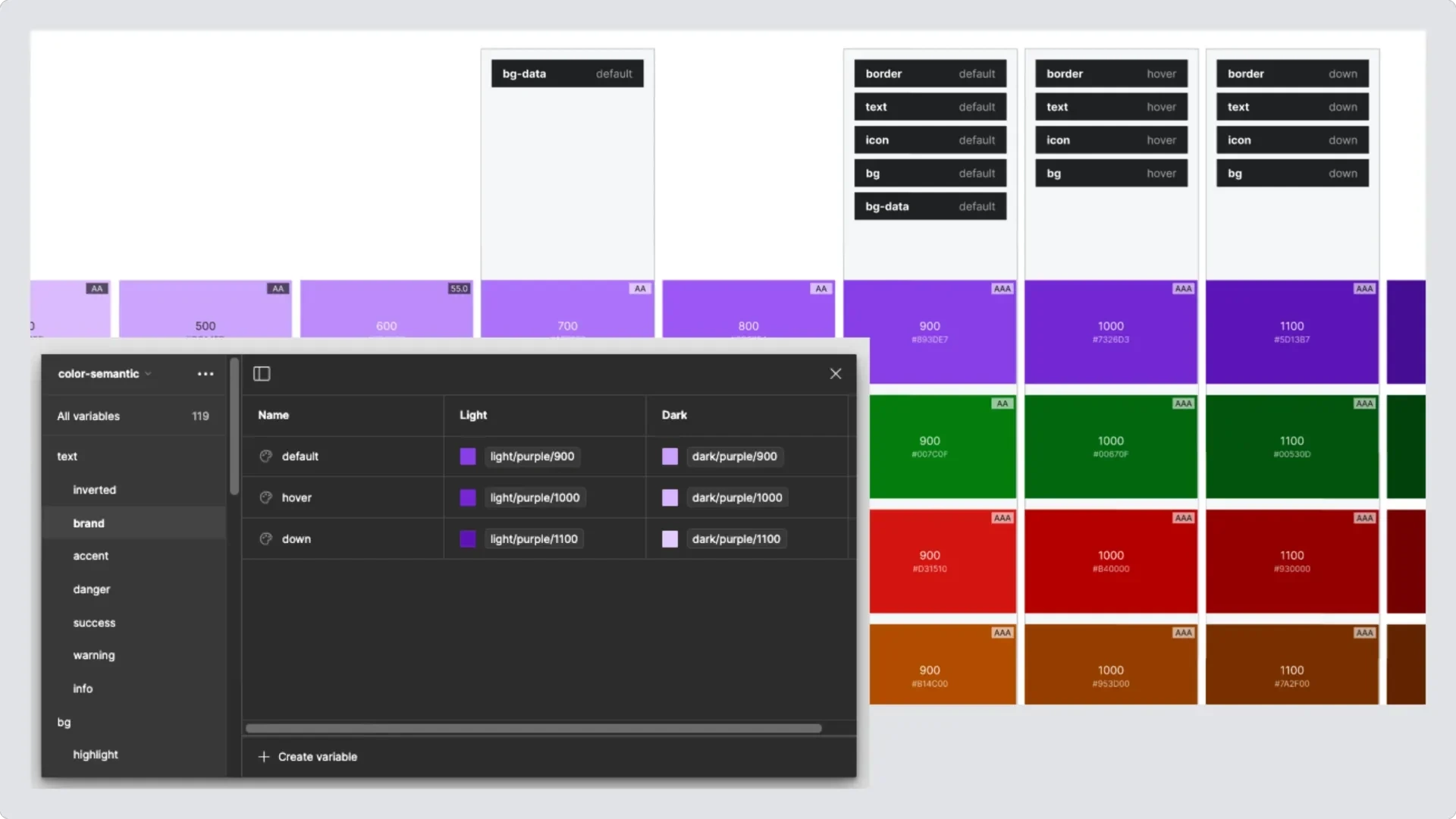
Semantic color variables.
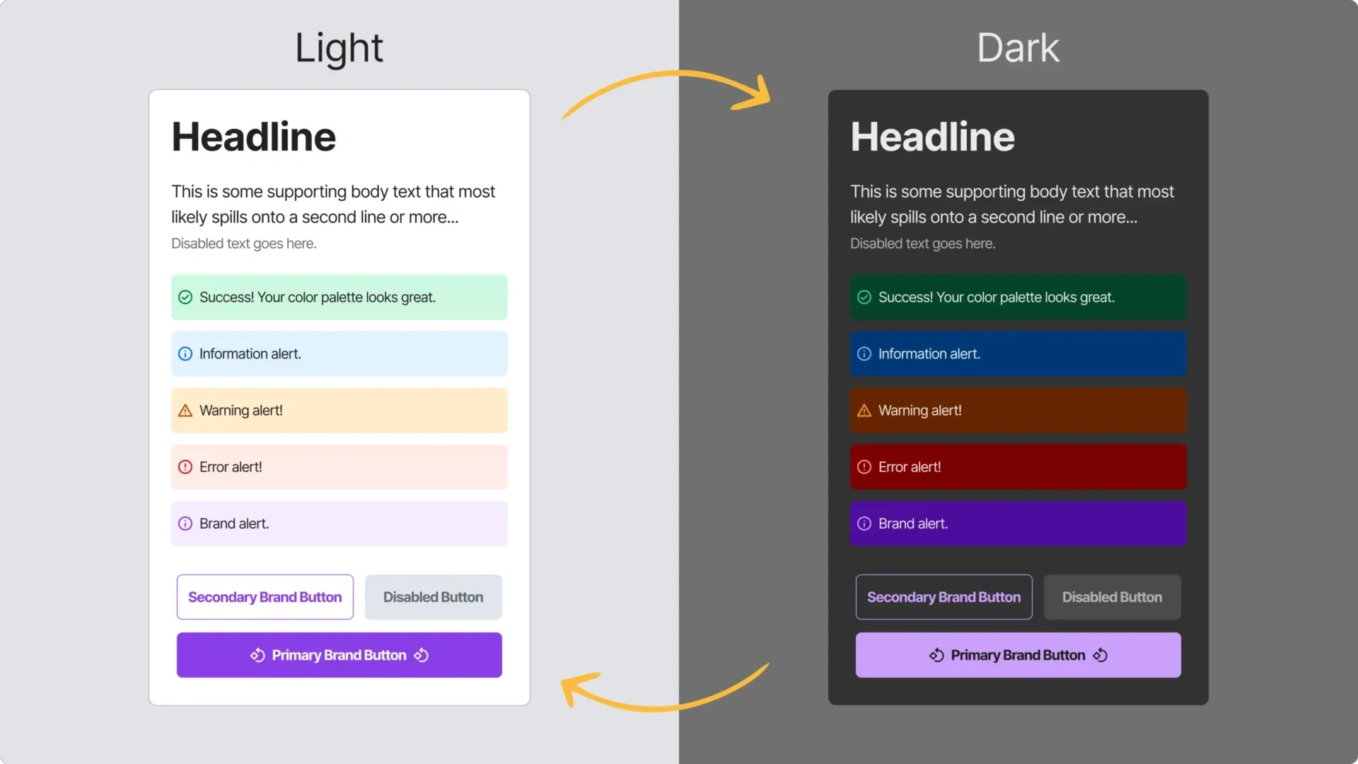
Customize colors in seconds
Modify the primary color within the Primitive color collection to dynamically alter the color scheme throughout the entire design system, impacting all components consistently.
Customize colors in second.
Toggle between light and dark with a signle click!
The design system is completely tokenized with variables, ensuring a seamless experience for designing, theming, and development.
Toggle between mode.
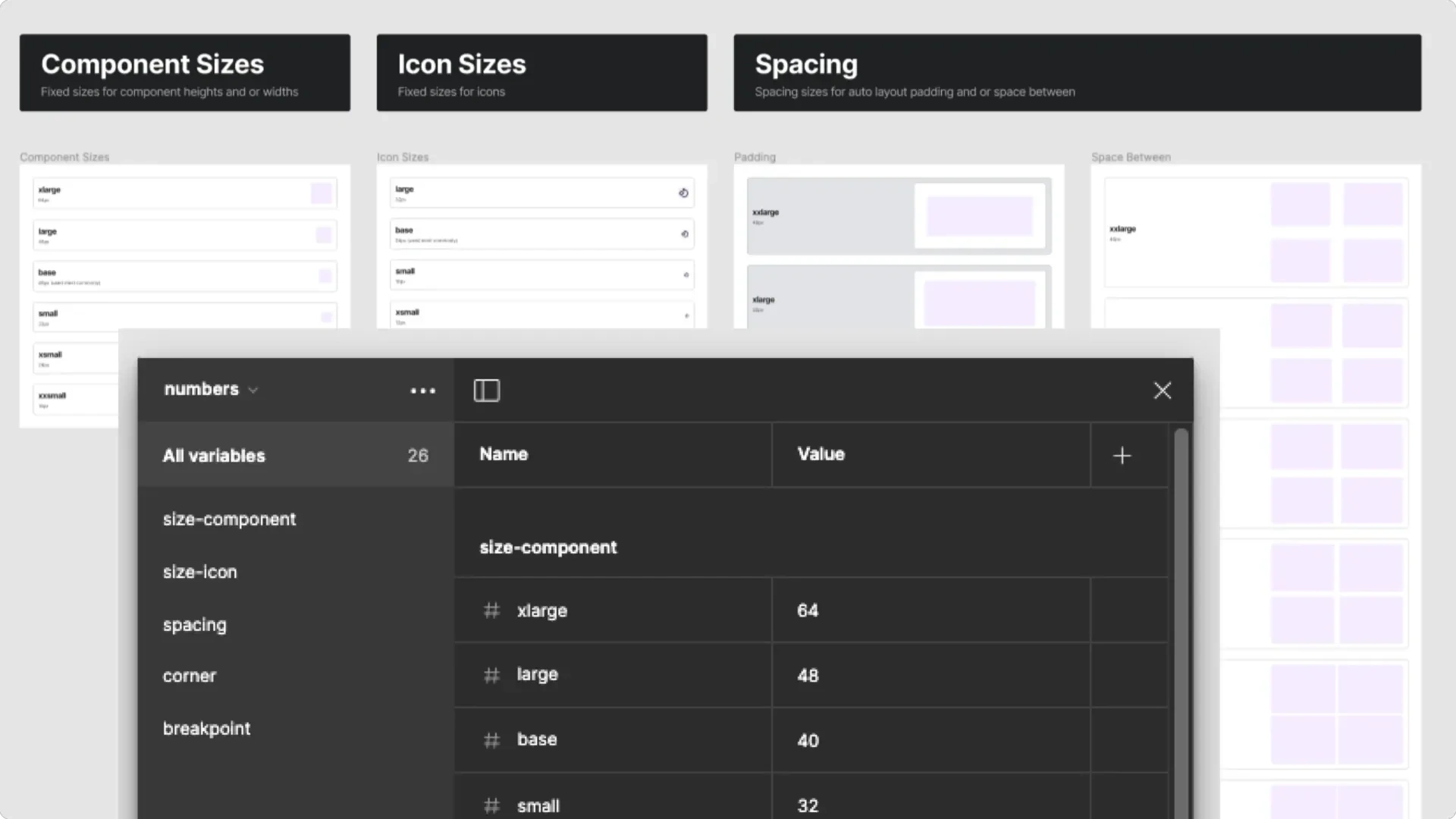
Fully tokenized with NUMBER variables
The design system is entirely tokenized with number variables, enabling updates to component sizing, corner radius, and spacing.
Number variables.
Corner variables
Simply adjust the corner radius of any element by selecting an alternative variable from the Numbers collection.
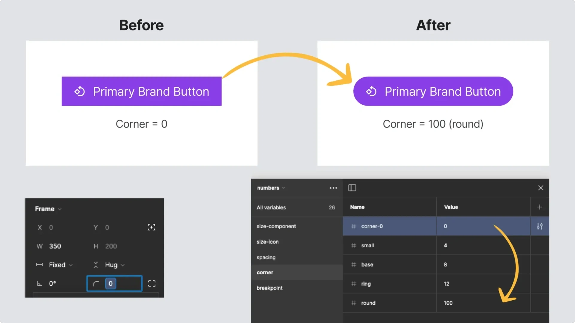
Corner variables.
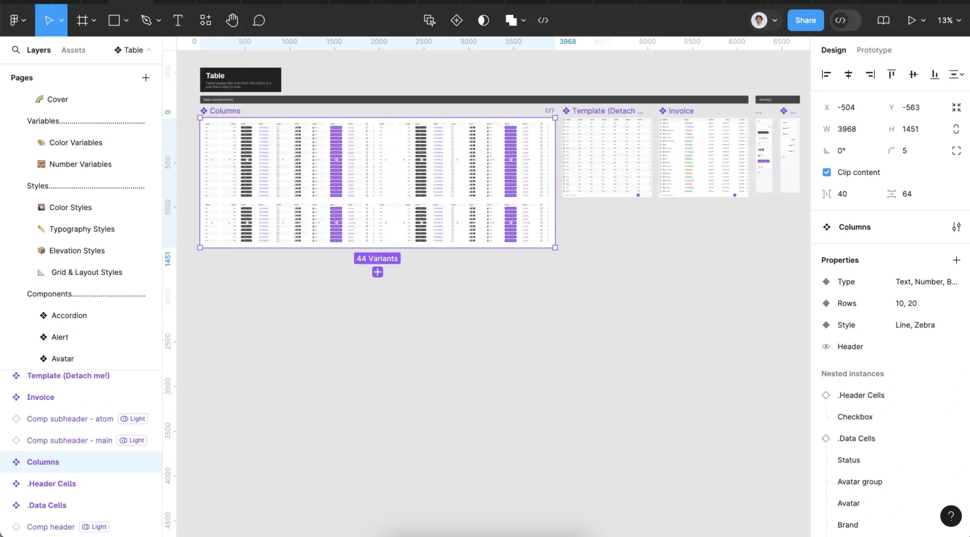
Component collection
Components are crafted with Figma’s most powerful features. Ensuring each one is easy to manage, explore, and customize with Properties and Variants.
Variants provide choices for components with different types, states, sizes, and more.
Properties facilitate quick and intuitive adjustments during the design process.
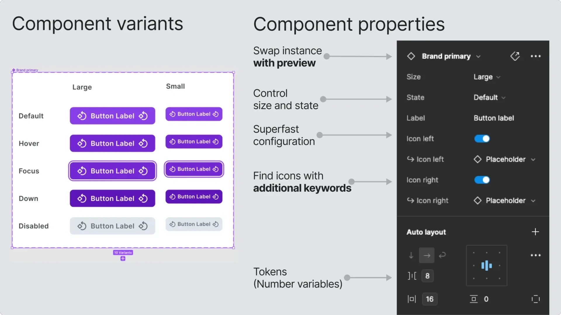
Component example.
Intuitive components
Production-ready components allows to speed up the design process, skip the redundant work and go straight to problem-solving.
Auto Layout dynamically adjusts to expand, shrink, or adapt as their content changes.
Exposed nested instances simplify customization of embedded elements in larger, complex components.
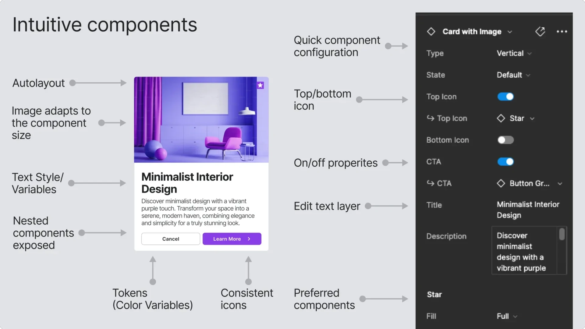
Component property.
Smart and easy-to-use design system
Simple, intuitive and scalable file structure organization. The exact components that you need, nothing more, for fast and efficient use.
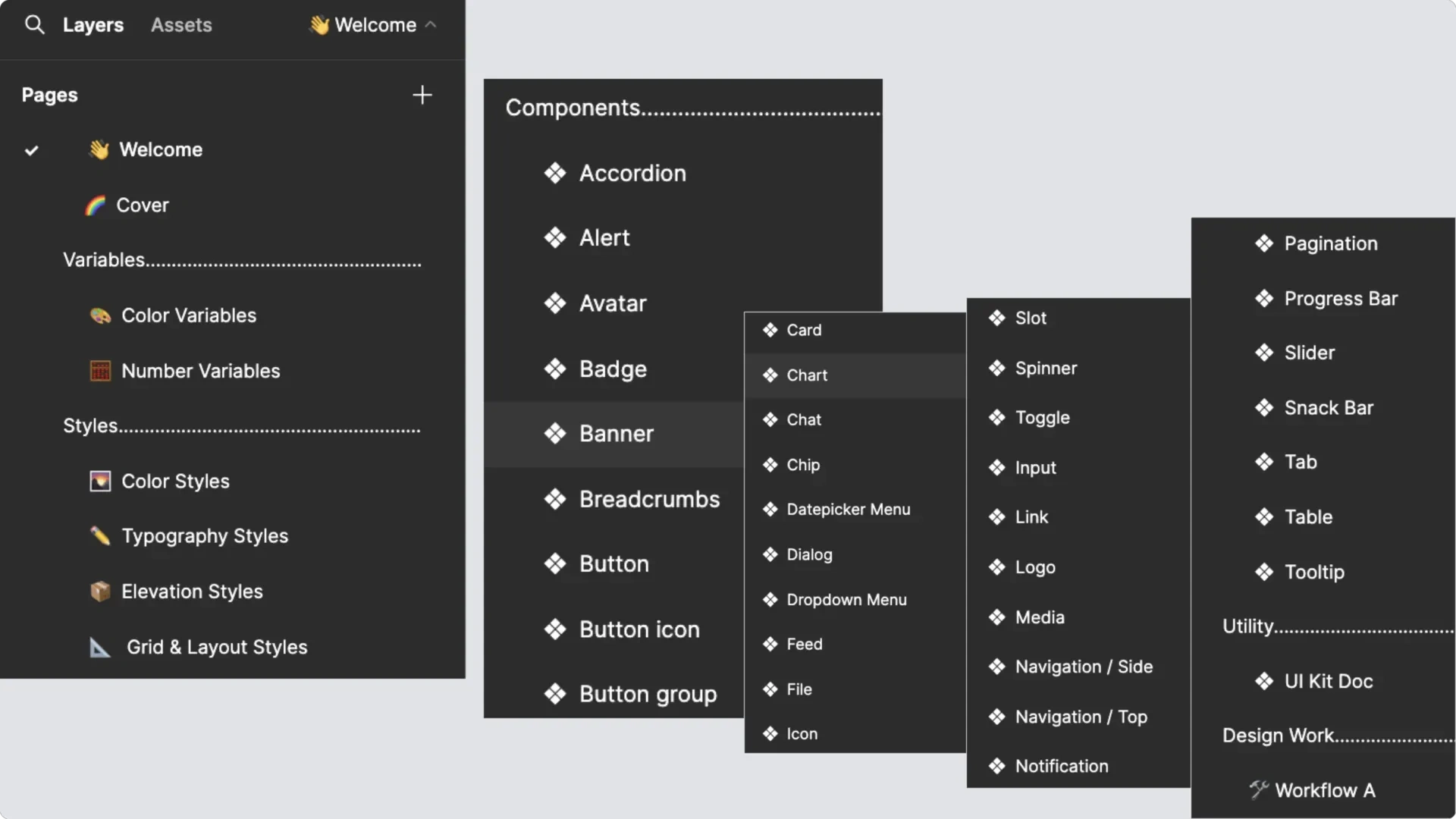
Page structure.
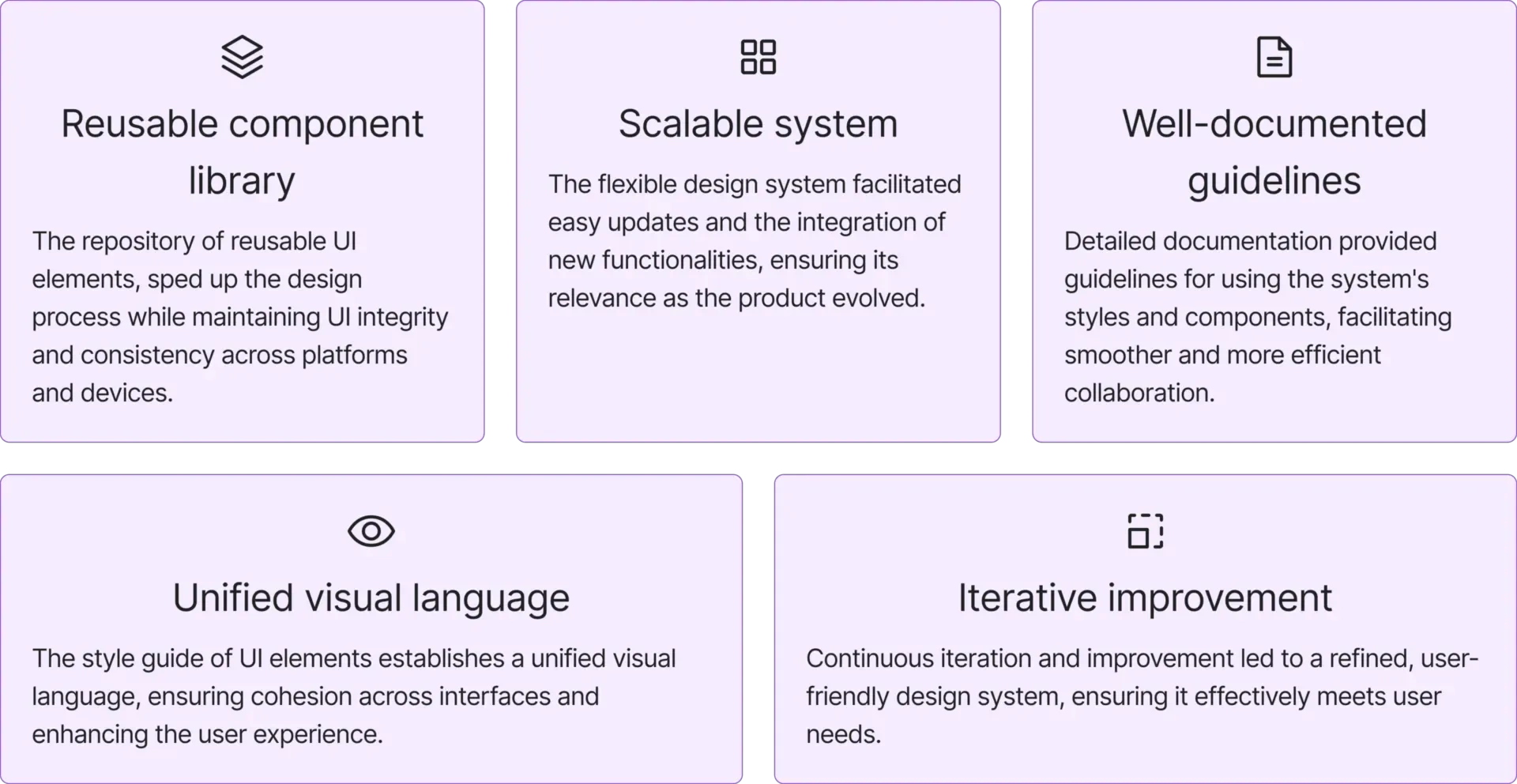
The result
The process culminates in a comprehensive design system which serves as a “single source of truth” for various products.
The project result.
Figma
Please check out my design in Figma (opens in a new tab).
Figma file.
Reflection and learning
This project underscored the importance of paying close attention to detail, embracing an iterative design process, and fostering effective collaboration within a cross-functional team. It also highlighted the need for balance between user experience and visual polish to create a design system that is not only aesthetically appealing but also functional.
Thank you for taking the time to read this article until the end.
Originally posted on Linkedin.
Like this project
Posted Feb 13, 2025
I created the Figma Design System meticulously to enhance the design and development processes for various digital products.
Likes
1
Views
10