Rovia Ride-Hailing App UI/UX Design

Seemak Iqbal


Overview
Rovia is a ride-hailing app designed to make booking a ride faster and clearer. Most people don't think about how many taps, screens, and moments of uncertainty stand between "I need a ride" and actually getting in a car until the process breaks down. I designed the app so a rider can go from opening it to getting dropped off without confusion at any step.
The Problem
Booking a ride sounds simple, but a lot of ride-hailing apps make it harder than it needs to be. Riders often deal with:
Cluttered home screens that bury the one thing you actually want to do book a ride
Confusing or delayed pickup confirmation, leaving riders unsure if a driver is actually coming
Poor visibility into driver details and live location once a ride is booked
Fare and payment steps that feel disconnected from the rest of the flow
I designed Rovia so a rider can book a ride in as few steps as possible, and stay informed at every stage after that.
Design Process
I mapped out the full rider journey onboarding, booking, tracking, and payment before starting on the UI. This helped me find exactly where confusion or delay was likely to happen, and design each screen to remove it.
Onboarding & Home / Booking
The first-time experience needed to get riders oriented fast without over-explaining. Onboarding is short and benefit-led, moving quickly into account setup so riders reach the home screen with minimal delay.
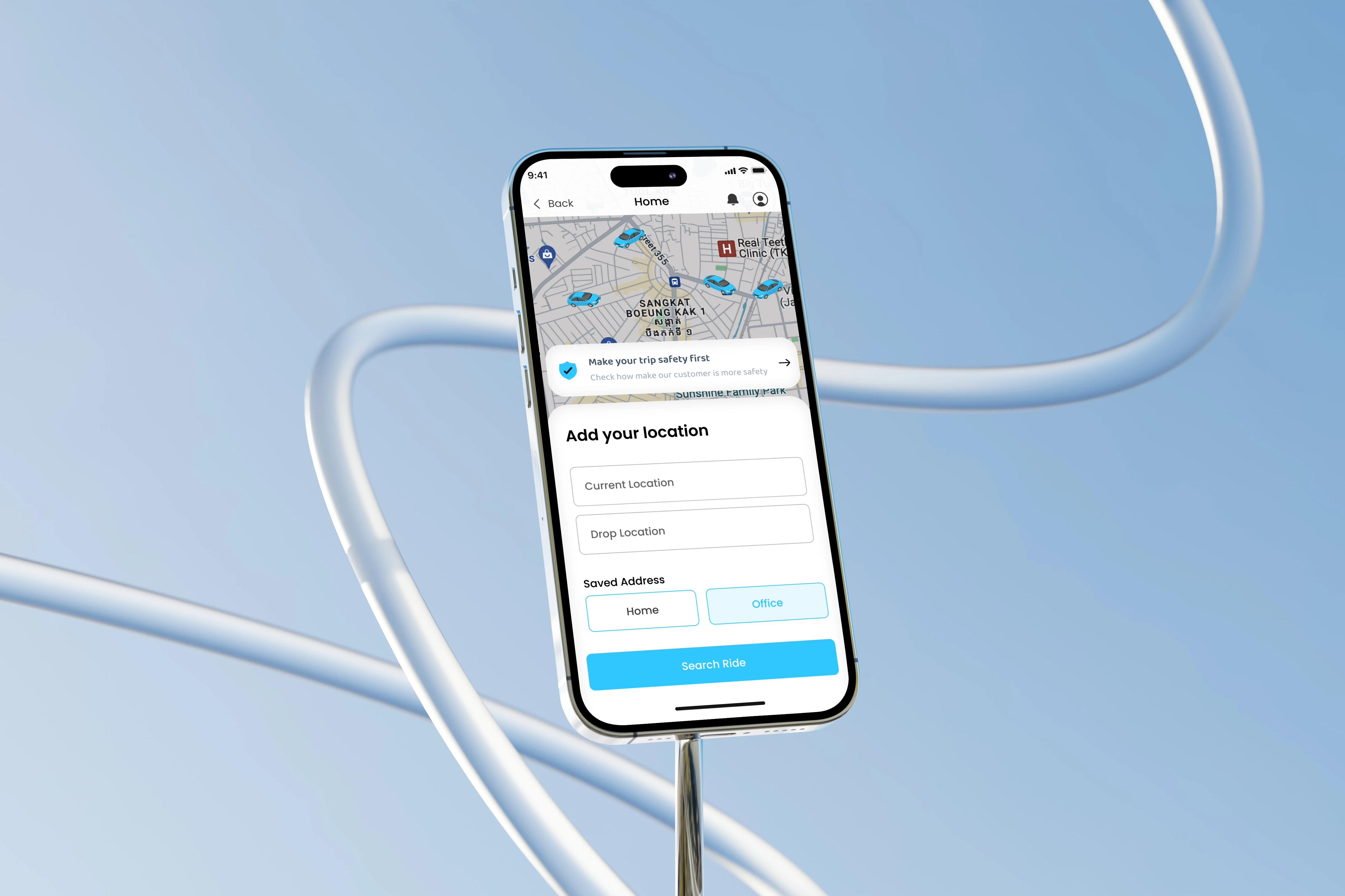
The home screen is built around one action: enter a destination and book. There are no promotions or extra features competing for attention the map and the pickup/drop-off search bar take center stage. Ride options (economy, comfort, premium) only appear after a destination is entered, so the rider isn't asked to make several decisions at once.
Ride Tracking & Driver Details
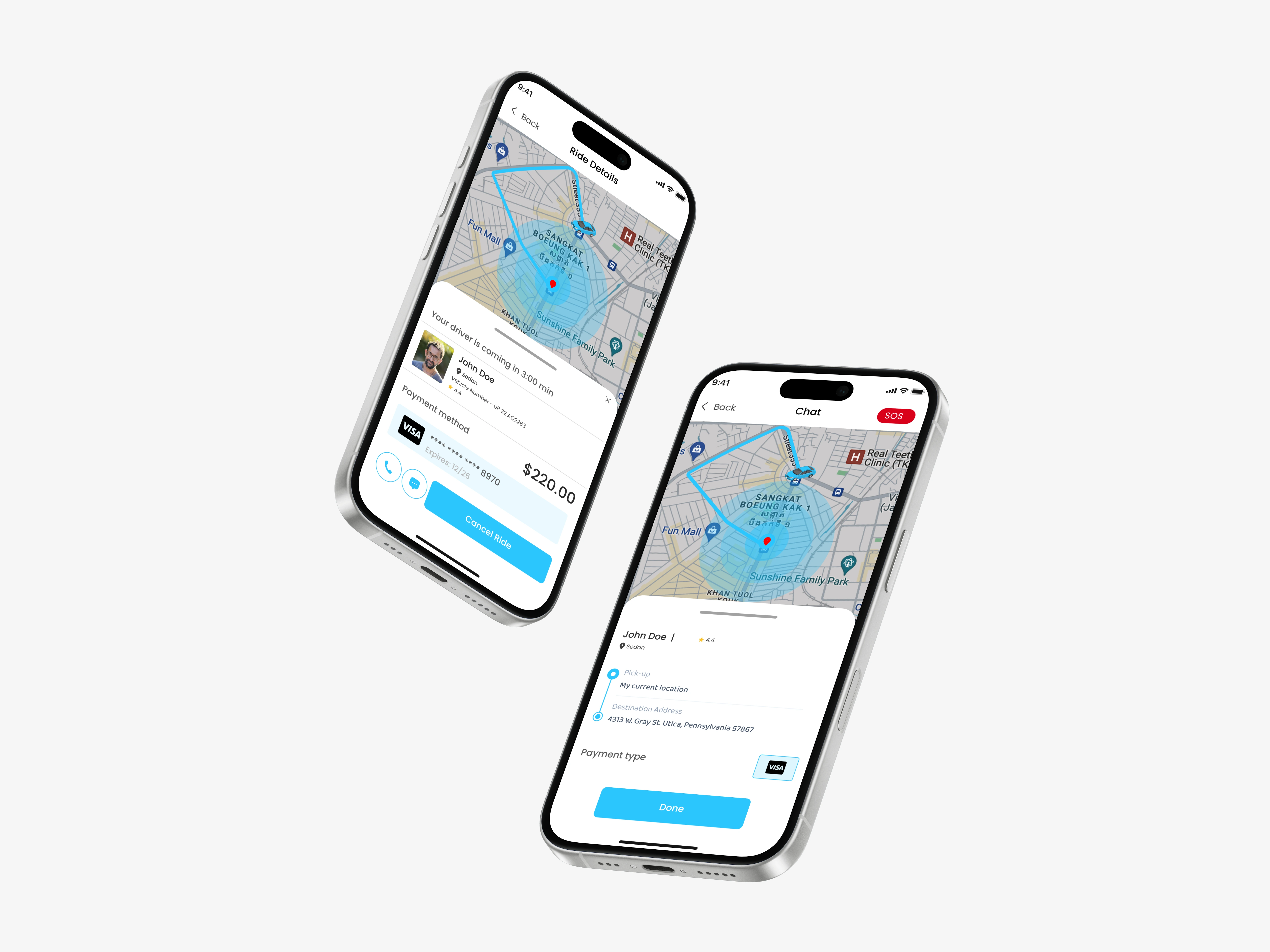
Once a ride is booked, not knowing what's happening is usually what makes riders anxious. A live map shows the driver's location and ETA, along with a driver details card showing photo, name, rating, vehicle info, and license plate, so riders can identify their ride.
I also designed clear status labels driver assigned, driver arriving, driver arrived, trip in progress so riders know where things stand without guessing.
Fare & Payment / Ride History
The main goal here was clarity. The fare breakdown is shown before the ride is confirmed, not after, so there are no surprises at drop-off. Payment method selection sits directly in the booking flow instead of a separate settings area, so it doesn't interrupt the process.
Ride history is a simple list each past trip shows route, date, driver, and total fare, with the option to open a full receipt.
Visual Direction
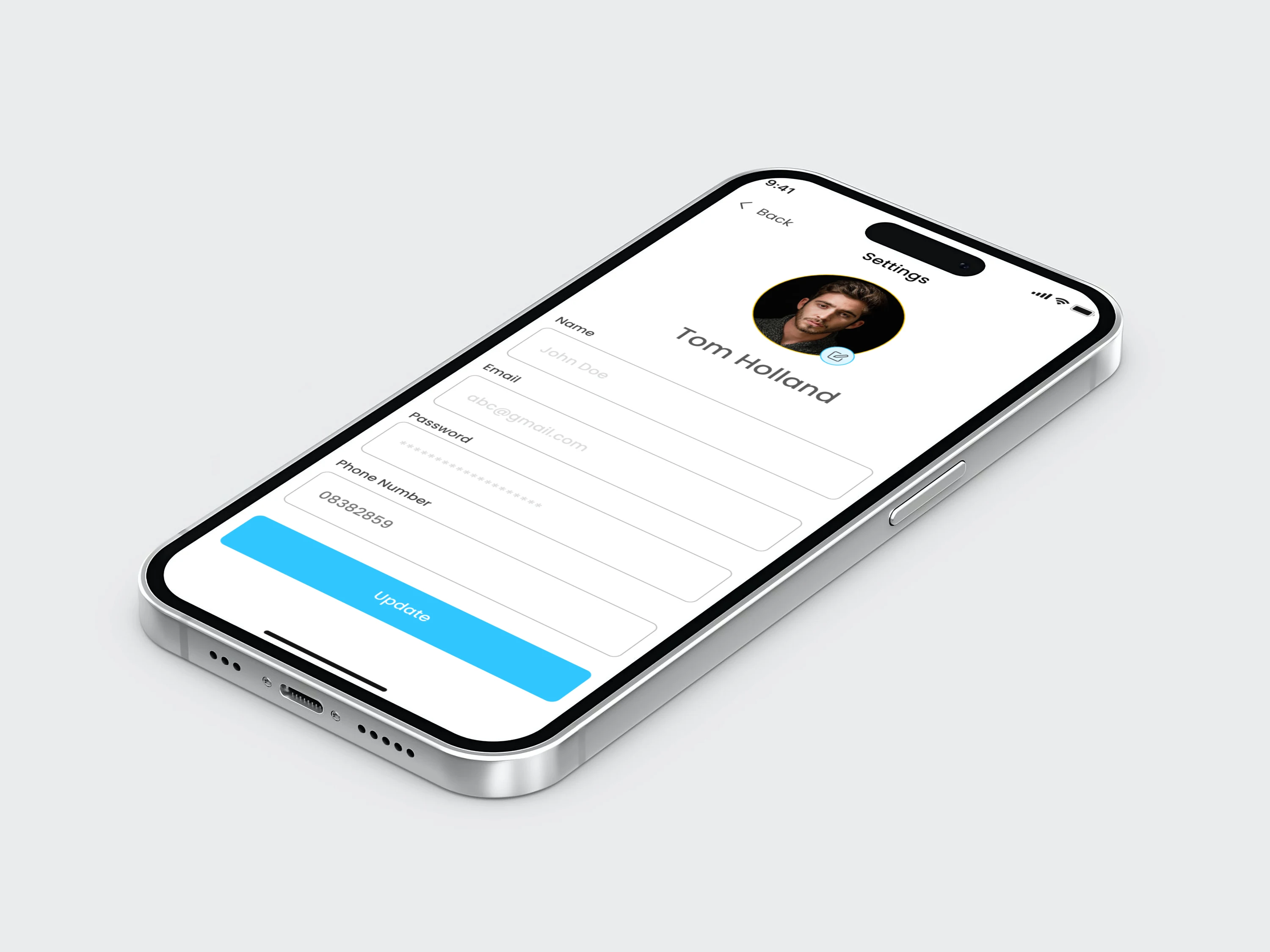
Rovia uses a clean, high-contrast interface meant for quick glances while on the go large touch targets, a limited color palette, and clear text hierarchy so key information (fare, ETA, driver status) is easy to read at a glance.
Outcome
Each screen answers one question for the rider Where am I going? Who's picking me up? What am I paying? instead of asking them to work through several at once. The flow from onboarding through payment is built to feel fast and clear.
UI Design, UX Design, Mobile App Design, Ride Hailing App, Ride Sharing App, Product Design, Figma, App Design, User Experience, Interaction Design, Mobile UI, App UI, Transportation App, Booking App, Travel App, Map UI, Onboarding Design, Dashboard Design, iOS Design, Android Design, Case Study, Portfolio, Wireframing, Prototyping, User Flow, Payment UI, Fintech UI, Driver Tracking, Location Based App, Startup App, Clean UI, Minimal UI, Mobile First Design, App Concept, UX Research, Visual Design, Design Process, Freelance Designer, Contra Portfolio, On Demand App
Like this project
Posted Aug 26, 2026
Designed Rovia app for faster, clearer ride bookings with a focus on user experience.
Likes
2
Views
3
Clients
Rovia