Nectar Landing Page Design SaaS dashboard UI/UX Design

Seemak Iqbal


Overview
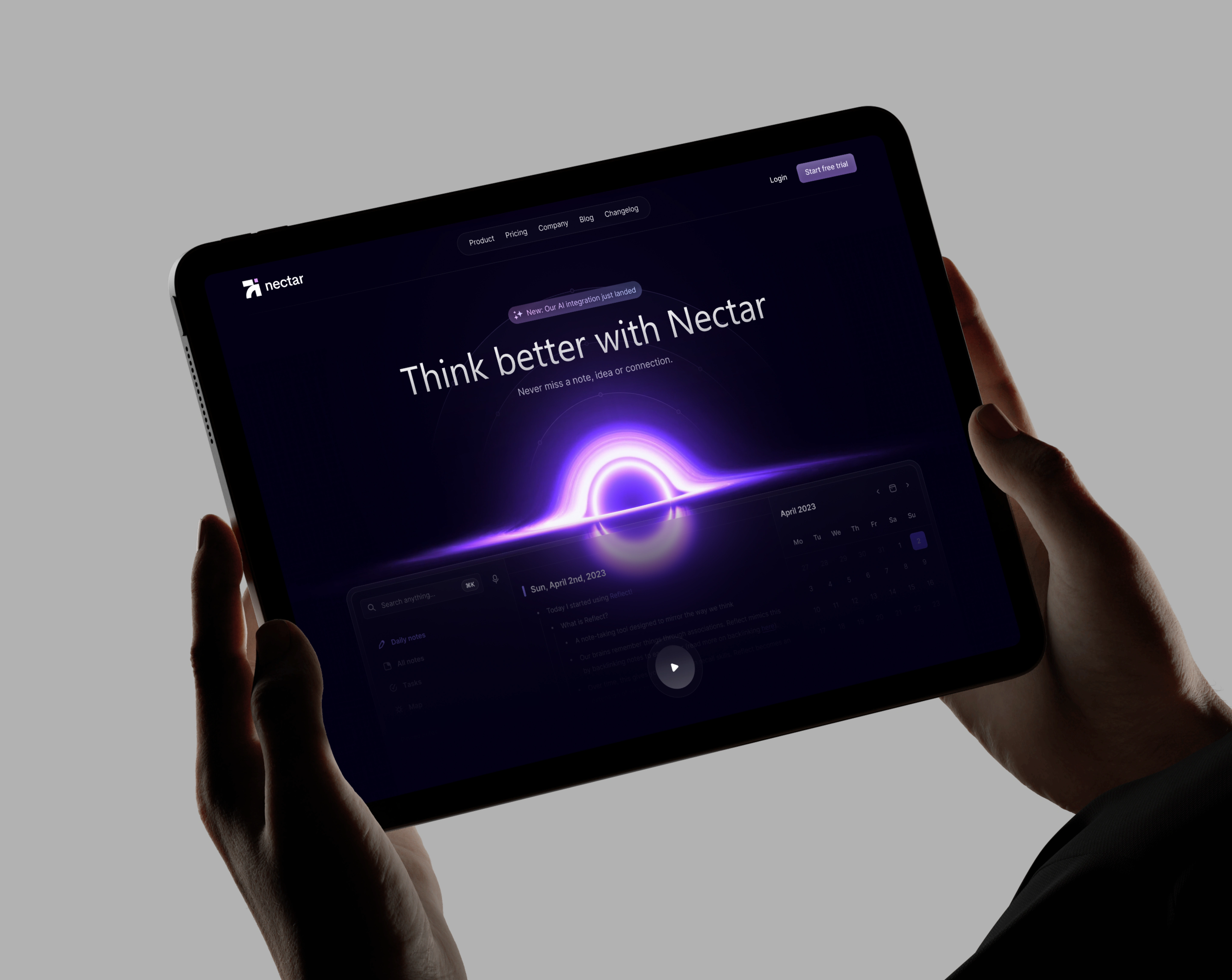
Nectar is a note-taking app that uses AI to help people capture and connect their ideas. I designed the landing page the first thing a visitor sees before deciding to try the product.
Problem
Most note-taking apps look and feel the same: cluttered, generic, and forgettable. Nectar needed a landing page that felt different calm and premium, matching a product built around "thinking better," while still clearly explaining what the tool does and why it's worth trying.
My Process
I started by looking at how AI-first products present themselves dark themes, soft gradients, minimal text and thought about how to apply that without losing clarity. The headline needed to carry the whole pitch in one line, so I went through a few versions before landing on "Think better with Nectar," short enough to read instantly, clear enough to explain the product's purpose.
For the visual centerpiece, I wanted something that felt alive without being distracting a glowing gradient orb became the focal point, drawing the eye down naturally toward the product preview
The Solution
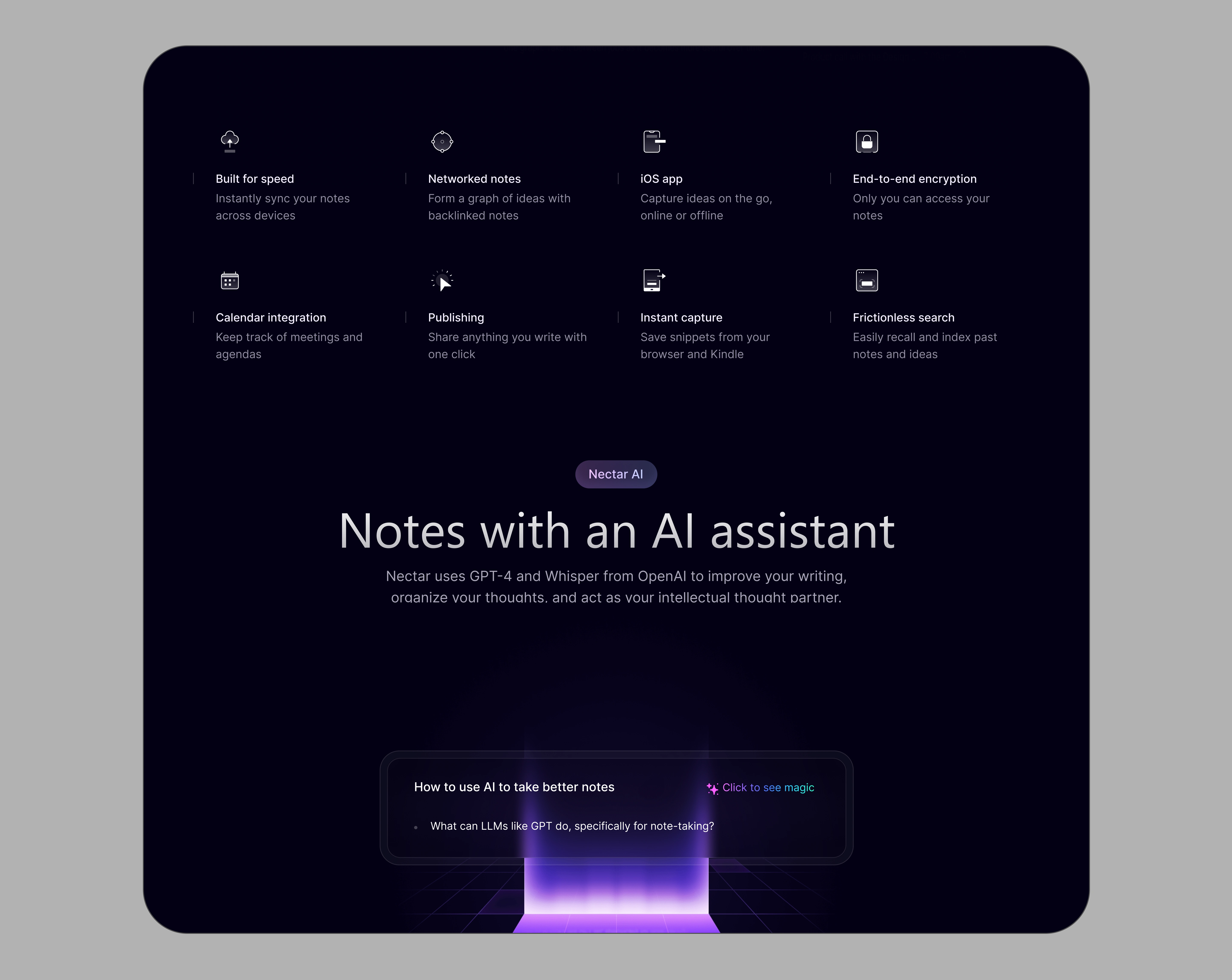
As a product designer, the first question wasn't what the page should look like it was what the user actually needs from Nectar before they'll trust it with their thinking. People don't adopt a note-taking tool casually; they're trusting it to hold ideas they don't want to lose. So the product had to prove two things immediately: that it understands the problem (scattered notes, lost ideas, disconnected thoughts), and that it's capable enough to solve it, especially with AI involved.
The design decisions follow from that. The messaging leads with the outcome the user actually wants never losing a note, idea, or connection rather than describing features, because users don't care how the product works until they believe it solves their problem. Momentum and relevance (a recent AI update) are surfaced early, because trust in an AI tool depends on it feeling current and actively developed, not stagnant. And the product itself is shown, not described, because users trust what they can see functioning over what's promised in copy.
Net effect: Nectar meets the user at the point of hesitation "will this actually help me think better, or is it just another note app" and answers that before asking for any commitment.
Like this project
Posted Sep 25, 2026
Designed a compelling landing page for AI-driven note-taking app Nectar.
Likes
0
Views
4
Clients
Nectar