Designing for Habitual Engagement
Amanda Wallis
This project presented us with a specific goal of using interface design to hook users to engage daily with their app.
The current app had a fast-growing user base with clear messaging but the design needed to evolve to cultivate long-term user engagement.
From this project we gained an understanding of the psychology behind how people form habits and experience on applying visual and experience design to encouraging habit formation.
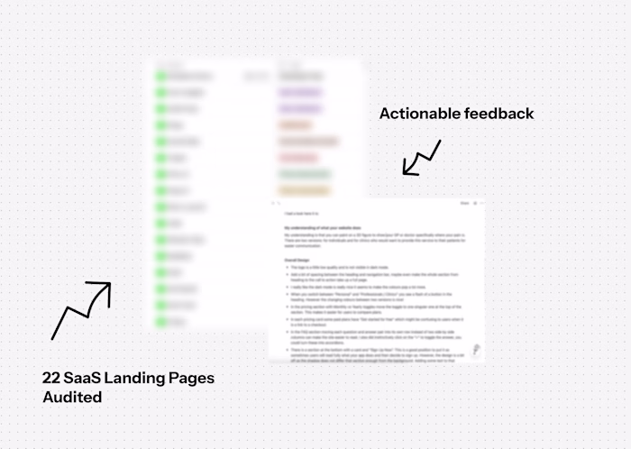
#The Audit
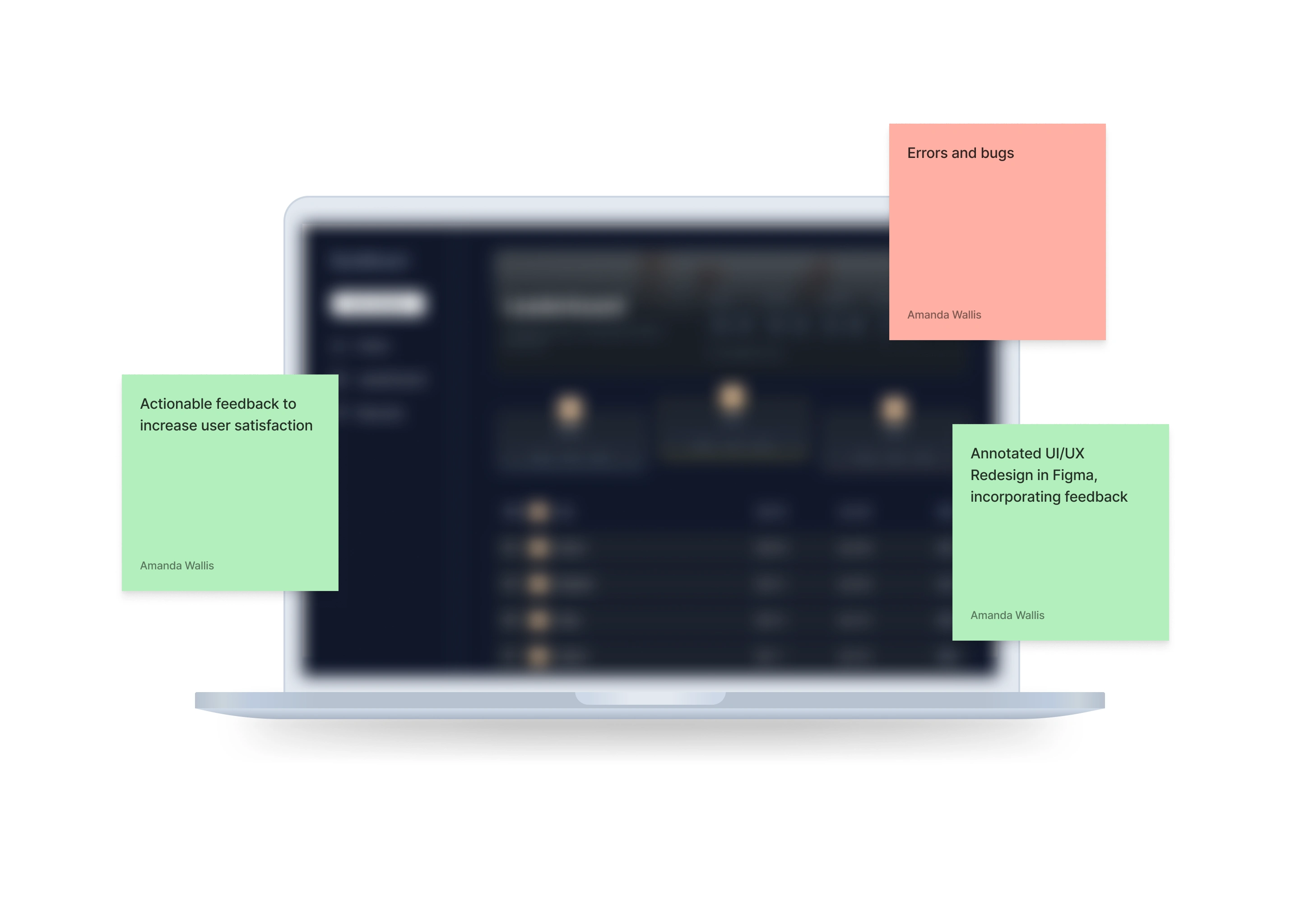
Before making changes to anything, it is important to first understand the lay of the land. We did this by completing an audit. Our audit looks at:
Actionable ideas for further development based on your goals.
Analysis of competitors vs your application in terms of features, community and unique selling points.
Bugs and blockers a user would come across.
Landing page conversion optimisation improvements.
What a first-time user understands about your product.
This audit was summarised in an 8-page report separated into several sections which allowed the client to understand the decisions made in the design stage.
#The Design
From the audit we found a few focuses for our redesign:
#Reducing Visual Fatigue
Apps that are made for daily-use tend to allow for different screen lighting including dark and light mode. This is to allow users who need feel one type of lighting or another that would reduce eye-strain. Habitual-engagement is about making it easier for a user to use your app and removing any blockers in their way.
Going deeper we can use softer colours like off-black and off-white to reduce strain. Furthermore, high-contrast colour combinations such as off-white and black do not comply with some accessibility rules such as the A11Y rules. This also helps with the next point: contrasting focus points.
#Contrasting Focus Points
There were some focus points the app had such as the voting percentages between a thumbs-up and thumbs down, call-to-actions to post or sign-in, text that users should pay attention to such as deadlines. By decreasing the contrast in the most used colours it allows other colours to pop. Which makes it easier for users to pay attention to these focus points.
#Simpler Information Processing
Users tend to process imagery before text to understand information faster. This can be used to simplify our interface and help users get what they need quicker.
One example is the percentage thumbs-up compared to thumbs-down. On top of displaying the percentage we can user a progress bar to visually show the user the ratio for better understanding.
Another example is for onboarding. Onboarding in this instance was short and straight to the point with imagery that communicated the brands' identity. To add on to that, we can show imagery related to the idea we are trying to communicate. For example, when discussing liking/disliking we can show an image related to rating or voting.
#Our Role and The Outcome
The project concluded with a better understanding for both parties in how the project can encourage user-engagement, simplifying processing, encouraging clicking on call-to-actions and elevating the overall experience of the app.
This article is based on real client work with details anonymized to preserve confidentiality.
We are always open to helping teams and individuals tackling challenging problems in software development. If this project sounds like something you would need help with, please do not hesitate to schedule a 30-minute call with us to discuss your challenge.
Like this project
Posted Feb 19, 2026
Redesigned app to boost habitual user engagement and streamline UX.
Likes
0
Views
2