Educational Social Media Design for a Physiotherapy Brand

Agu Charles


Project Overview
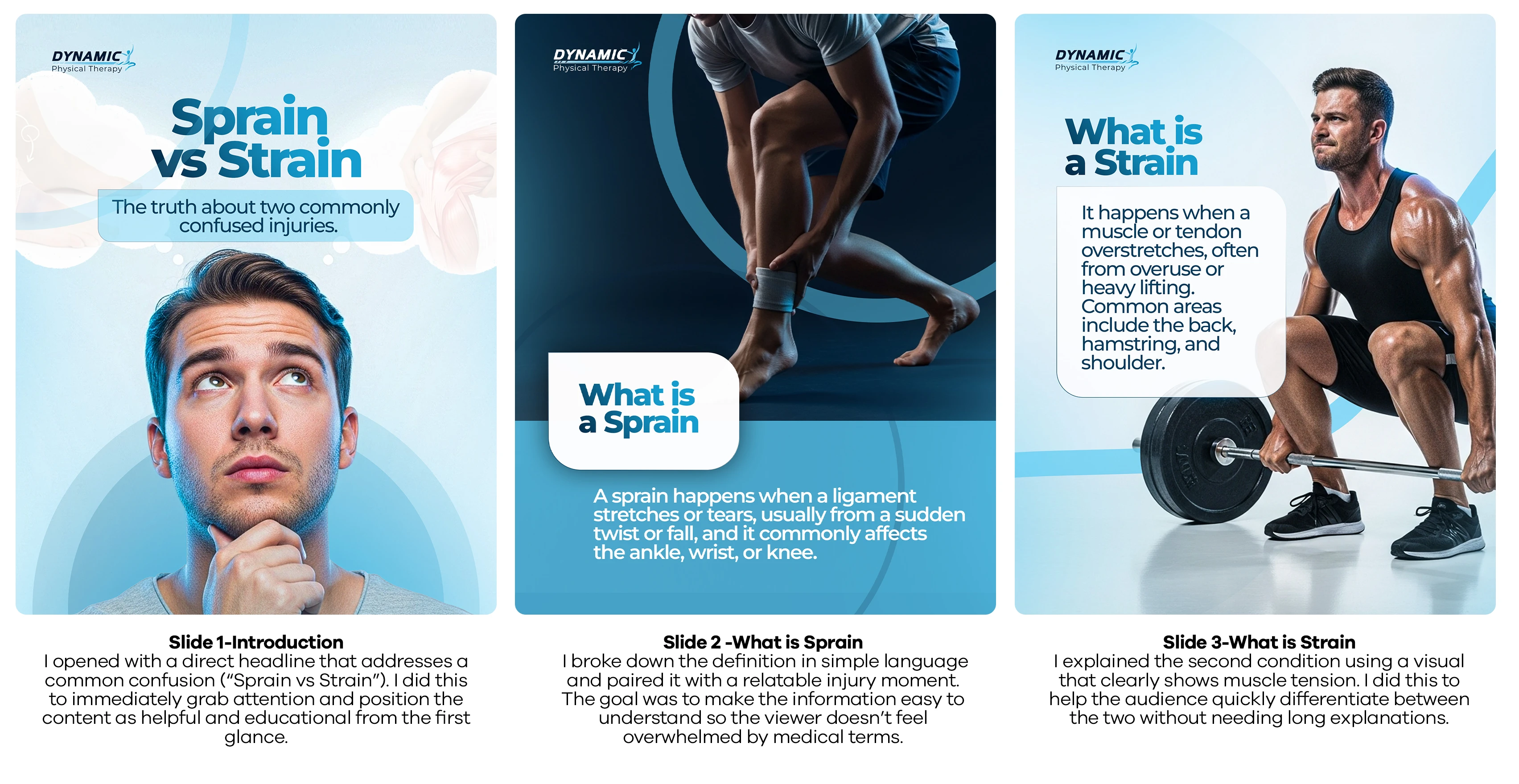
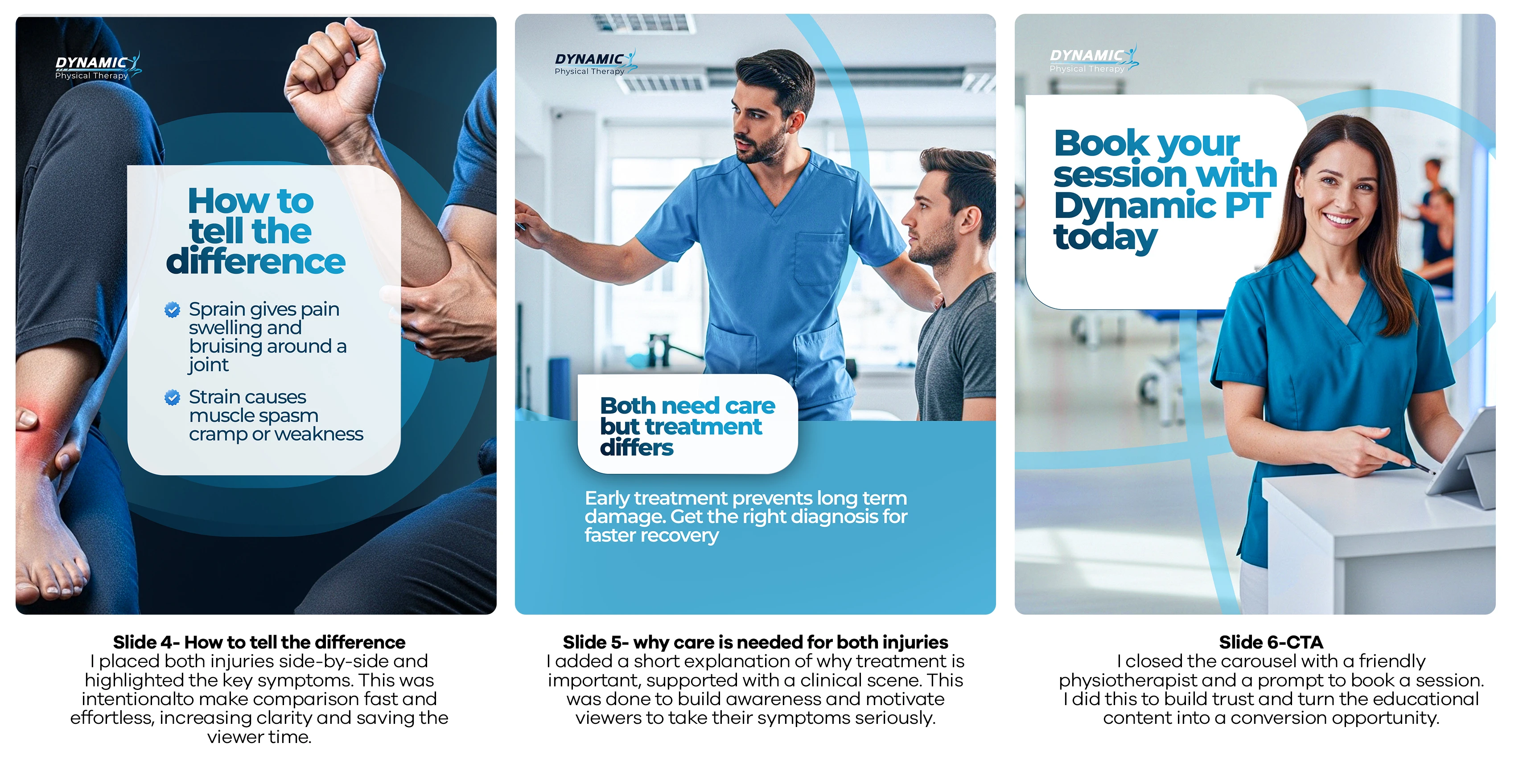
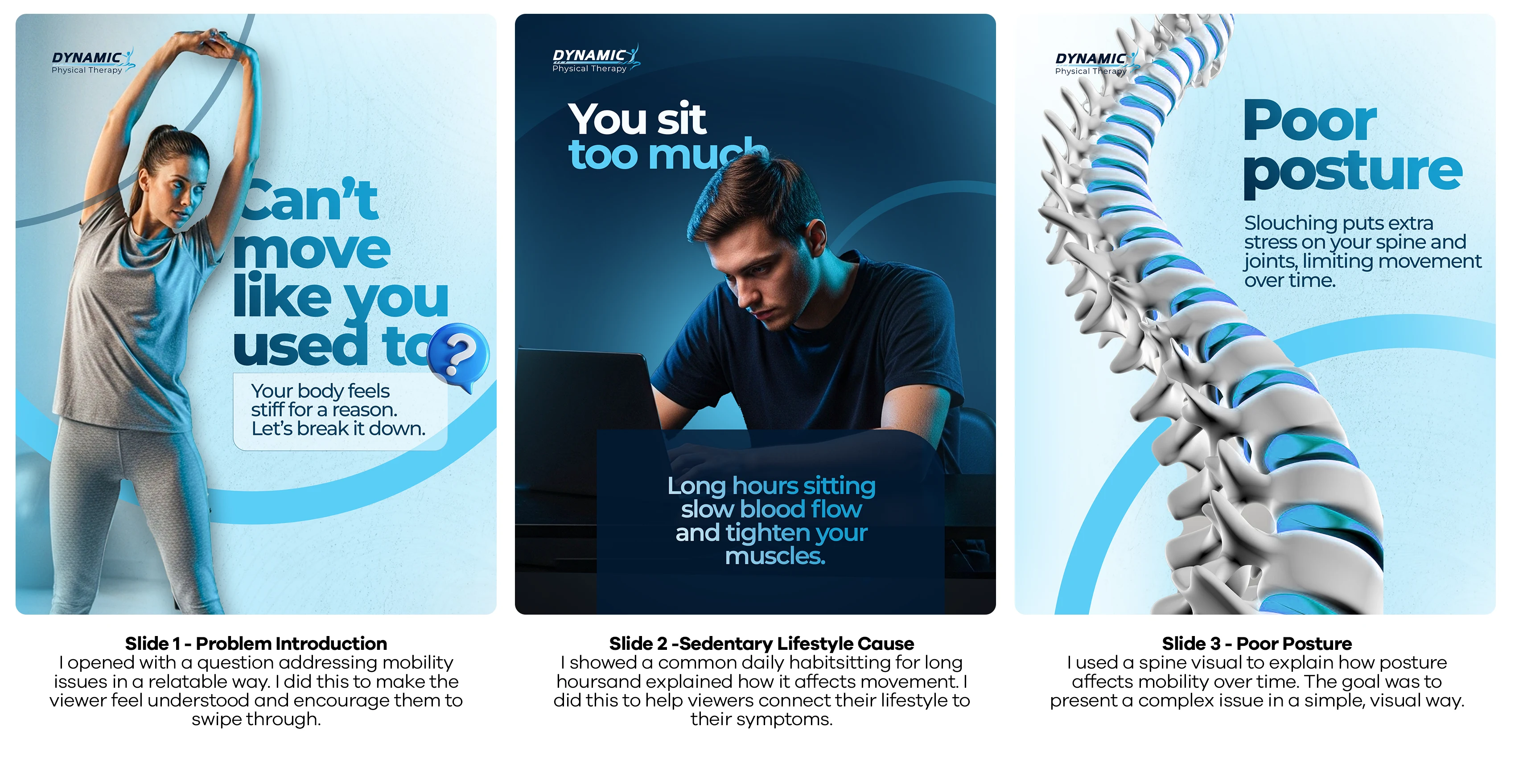
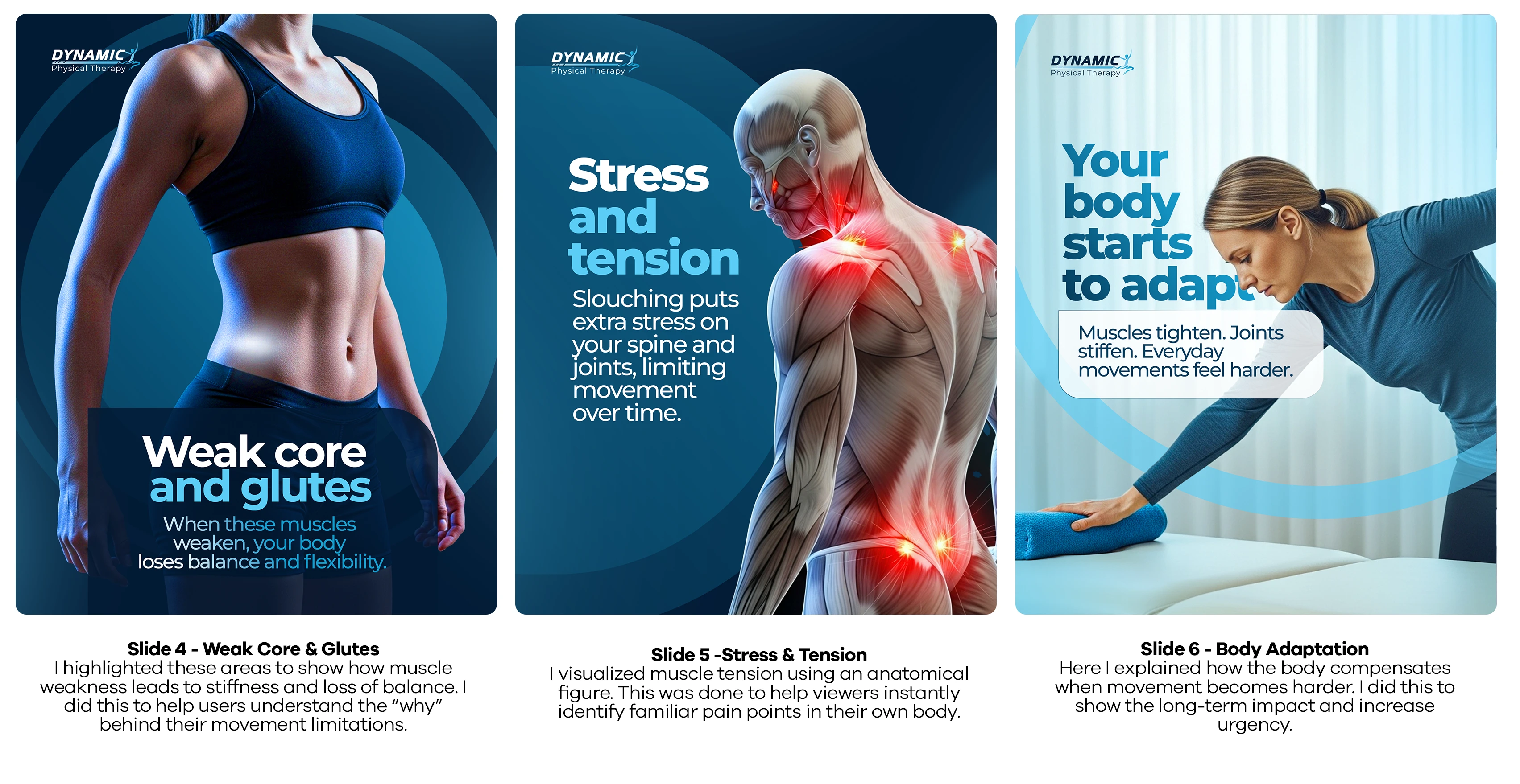
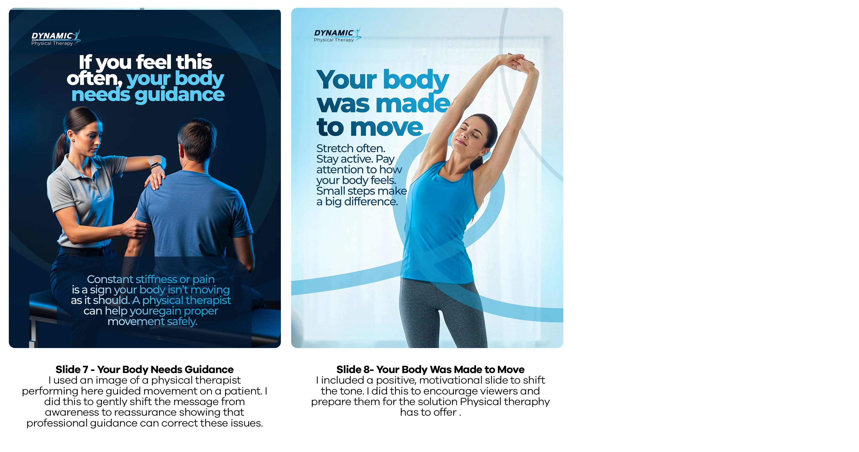
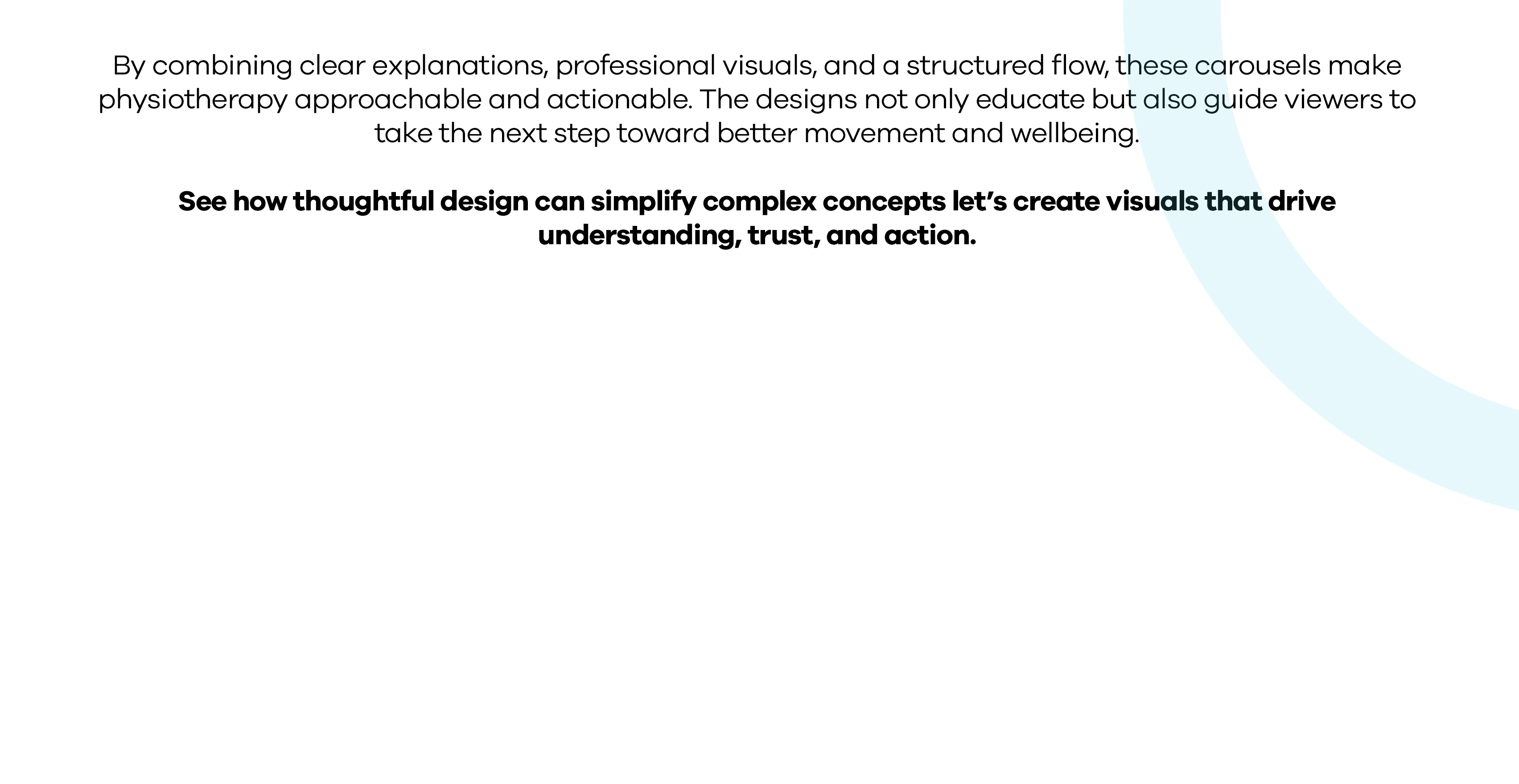
I designed a series educational carousel series for a physiotherapy brand to simplify movement-related issues and guide viewers toward meaningful action. My approach breaks down complex physiotherapy concepts into short, relatable explanations that anyone can understand. Each carousel follows a clear flow: awareness → understanding → trust → action, a structure that drives high engagement and conversions on social media.
I used a clean, clinical color palette of soft blues, neutrals, and calm gradients to communicate trust, professionalism, and safety. Consistent colors, paired with clear typography, minimal layouts, and real-life movement imagery, create visual continuity and keep the focus on key educational points. Every design choice supports clarity, retention, and emotional connection, encouraging viewers to seek physiotherapy guidance.
Project Goals
Simplify common pain, mobility, and injury concepts
Make physiotherapy easy to understand
Build trust through clear, professional visuals
Encourage viewers to take action
Like this project
Posted Nov 25, 2025
The final designs delivered two carousels that simplify physiotherapy topics, build trust, boost engagement, and guide viewers toward booking professional care.