UI/UX Design for Wellness App
Yurii Funkendorf
UI UX Design Mobile apps, Health & Wellness Wellness app with clinical data
Validating Mental Wellness through Physiological Evidence
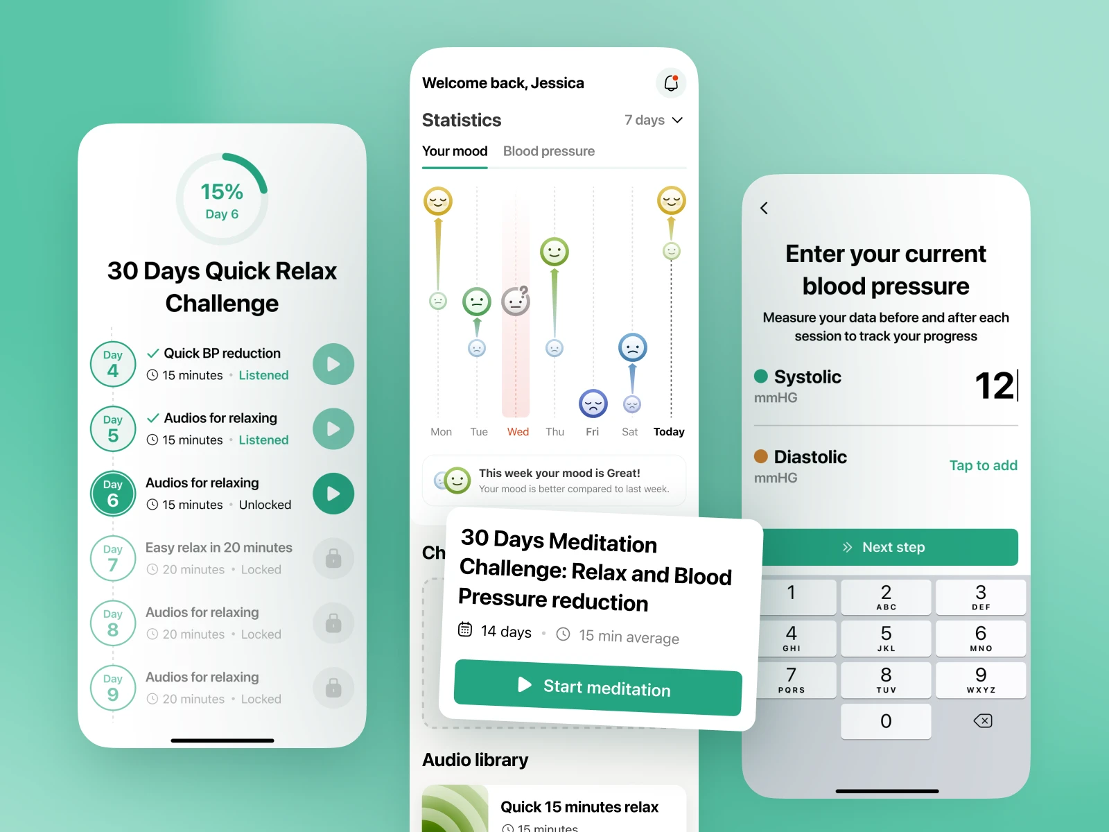
BP Buddy is a mobile health platform designed to bridge the gap between subjective feelings and clinical data. While most meditation apps rely solely on mood tracking, our client wanted to provide tangible proof of progress by measuring blood pressure alongside emotional states. The primary challenge was to create a frictionless experience that encourages regular data entry without disrupting the user's calm. We transformed a specialized expertise in mental health into a data-driven mobile ecosystem that demonstrates the immediate and long-term impact of meditation on physical health.
Product Discovery, UX/UI Design, Data Visualization, Design System
Bridging the Gap Between Mindfulness and Clinical Data
Meditation is often met with skepticism by users who value hard data over subjective sensations. Our client, an expert in mental health and wellbeing, sought to solve this by creating a platform that tracks blood pressure as a direct indicator of stress reduction. The design challenge was two-fold: we needed to minimize cognitive friction during the data entry phase to prevent "user fatigue" before a session, and we had to visualize complex medical data in a way that felt encouraging rather than clinical. By focusing on a "before-and-after" logic, we provided users with immediate physiological validation of their efforts.
What we did
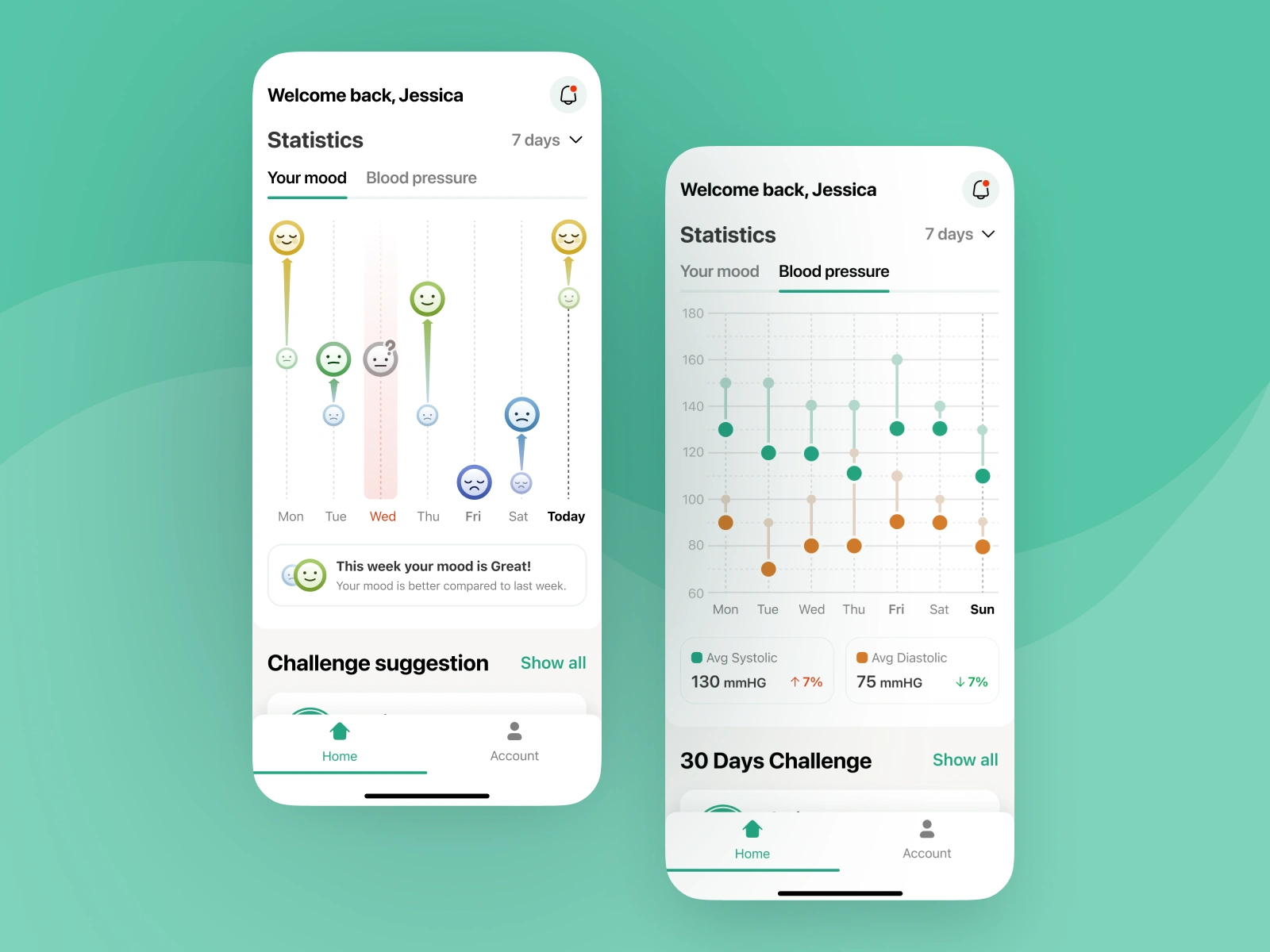
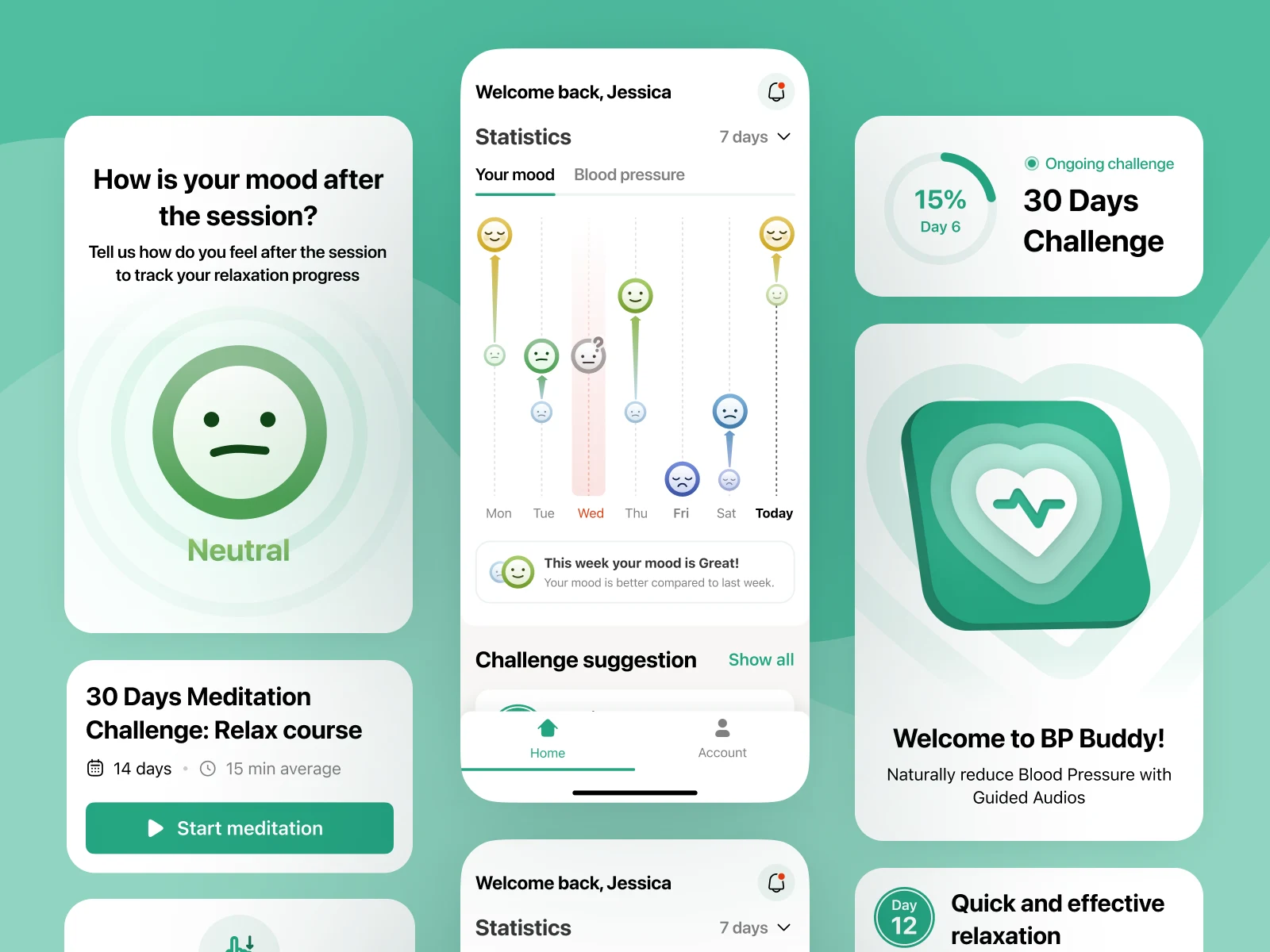
Core Features and Health Ecosystem
We designed a functional and serene mobile environment featuring:
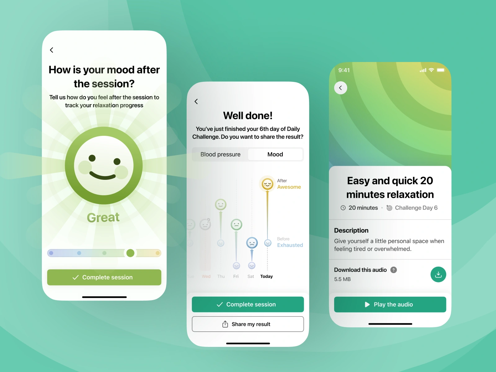
A streamlined 3-step entry flow for recording mood and blood pressure before sessions.
Multi-day challenges (7, 14, 30 days) with curated audio content for consistent habit-building.
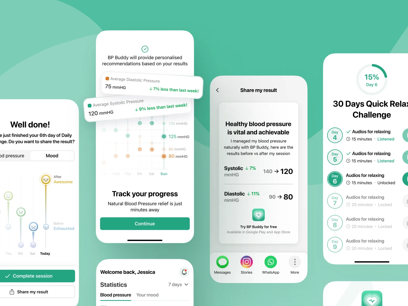
Dynamic Success Screens providing instant comparison of "Pre" and "Post" meditation metrics.
A comprehensive health dashboard with switchable views for mood trends and cardiovascular health.
A smart notification system designed to maintain consistency without becoming intrusive.
How We Did It
Discovery and UVP Definition
We held a series of workshops with the client to "crystallize" the unique value proposition: proving meditation’s efficacy through science. By analyzing existing wellness solutions, we identified that most failed to provide "hard" proof of success. We countered this by placing the physiological results at the heart of the UX. For the visual identity, we chose a light, mint-green palette and a soft aesthetic. This choice was strategic, intended to lower the user's stress levels from the moment the app is opened, supporting the overall goal of the product.
Working process
Frictionless Flow and Insight-Driven Design
Minimizing Entry Barrier and Micro-Moment UX
We focused on reducing the steps required to start a meditation to prevent any barrier to entry. Our solution was a highly optimized 3-step sequence where data entry felt like a part of the ritual rather than a chore. By implementing automatic transitions and simplified sliders for mood tracking, we ensured that the user reached the audio content in seconds, maintaining their focus on the upcoming relaxation session.
Data Interpretation and Long-Term Engagement
To keep users motivated, we designed the dashboard to offer more than just raw numbers. We integrated a layer of "insights" directly beneath the primary graphs, providing users with actionable summaries of their progress over weeks and months. This approach helped translate abstract blood pressure readings into meaningful milestones, clearly showing the correlation between their meditation discipline and their improving physiological state.
Outcome
A High-Fidelity Blueprint for Wellness Success
The project was delivered as a production-ready Figma library, including all necessary assets for cross-platform implementation. We provided the client with a detailed breakdown of the interaction logic, specifically focusing on the transitions between the data entry screens and the audio player. The delivery also featured a flexible design system, ensuring that the client could easily add new "one-off" meditations or expand the challenge library without needing a complete design overhaul, making the product highly scalable for future market expansion.
Results
Impact on Habit Formation and User Trust
The resulting application provides a professional tool for both skeptics and long-term practitioners of mindfulness. The design successfully balanced medical utility with emotional wellness. Key results included:
A habit-forming loop validated by immediate visual feedback on the success screen.
High user retention driven by clear, understandable insights into long-term health trends.
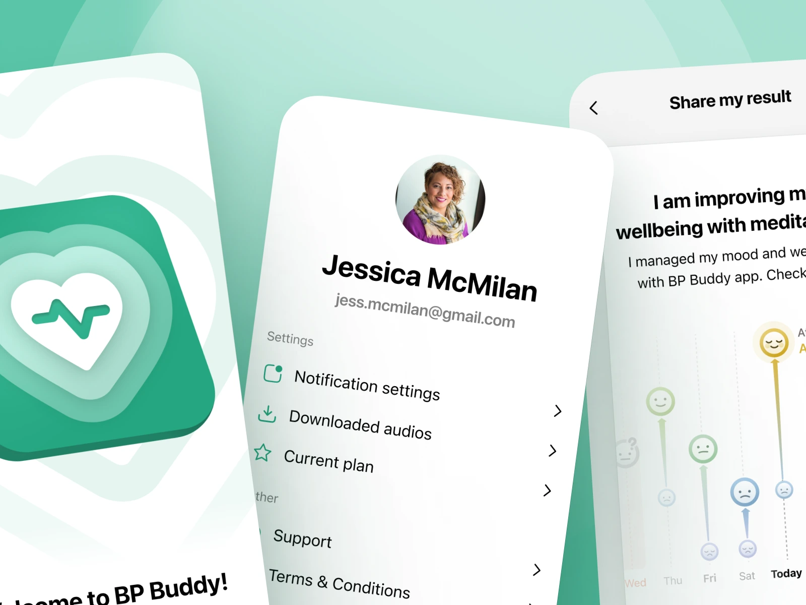
Seamless social integration allowing users to share their progress and build community engagement.
"The team provided us with a super detailed moodboard, information architecture, and made a lot of recommendations for ways we can improve the app's functionality. Since that was already a 3rd project together with Cre8 Team, we felt in very good hands, and everything was executed stage by stage on time and within budget." - Chris Soll, Founder @ Mindspo Pte
Like this project
Posted Apr 21, 2026
The design successfully balanced medical utility with emotional wellness. Service included: Product Discovery, UX/UI Design, Data Visualization, Design System
Likes
5
Views
26