Rootwise Architects - Visual Identity
Sunil Kumar
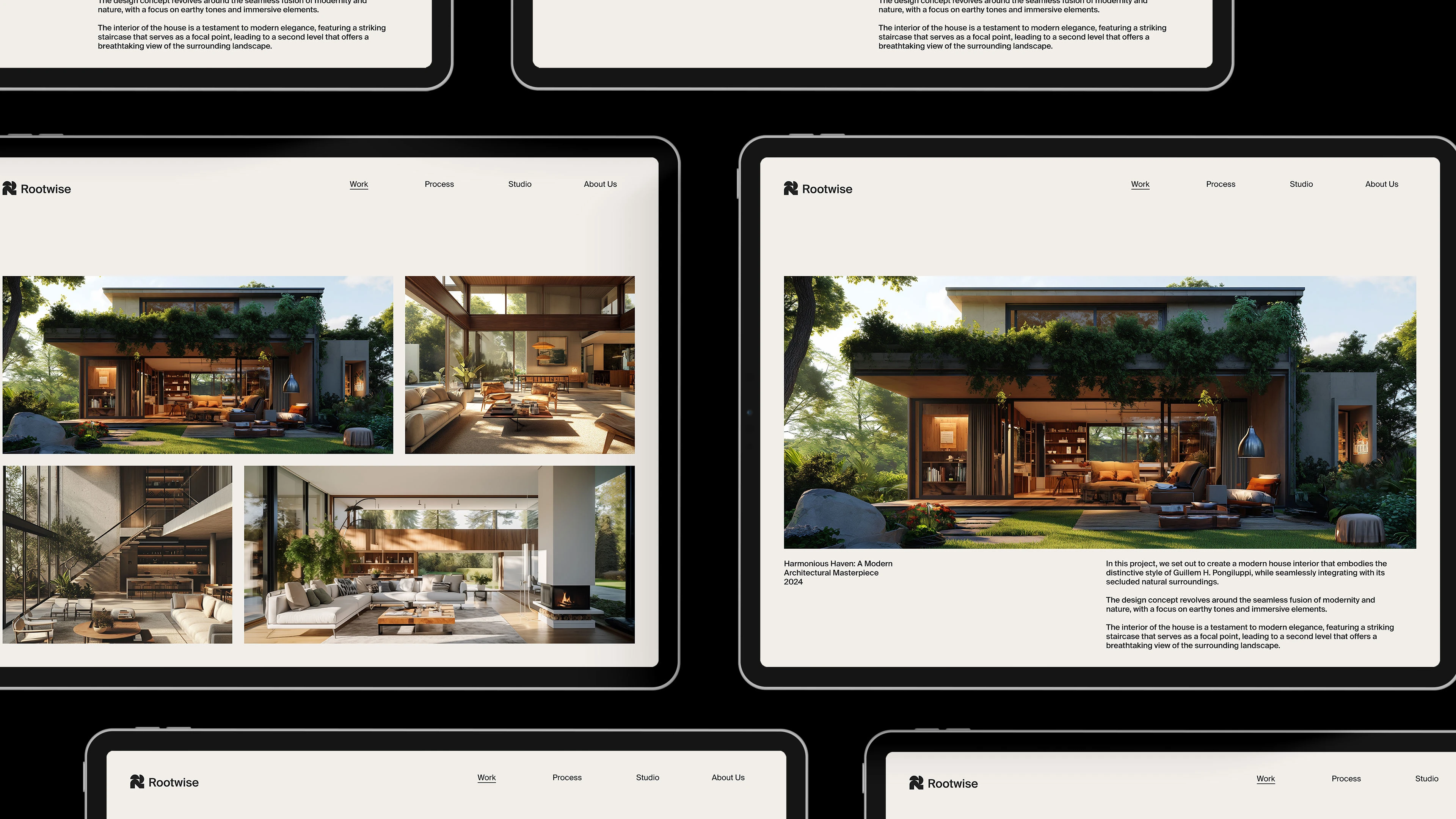
Brand Name: Rootwise Architects
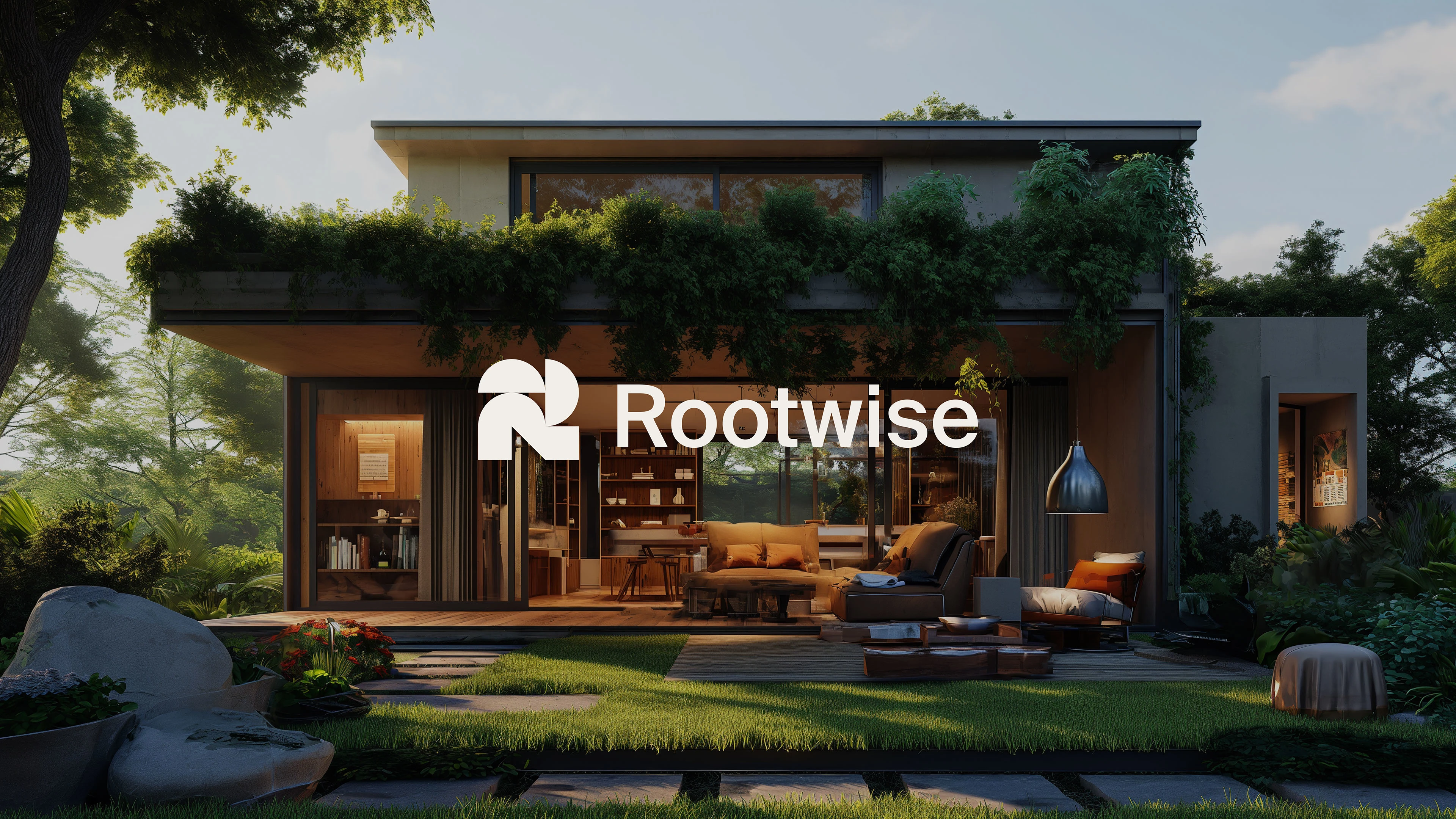
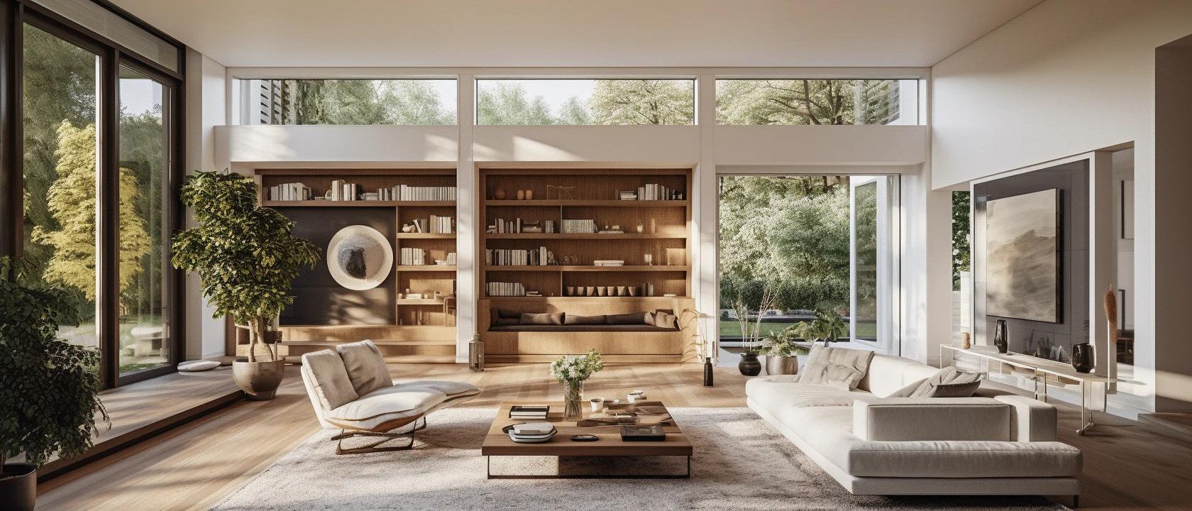
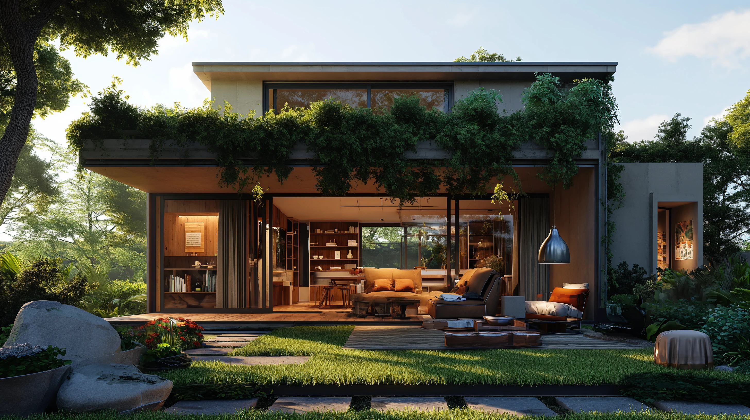
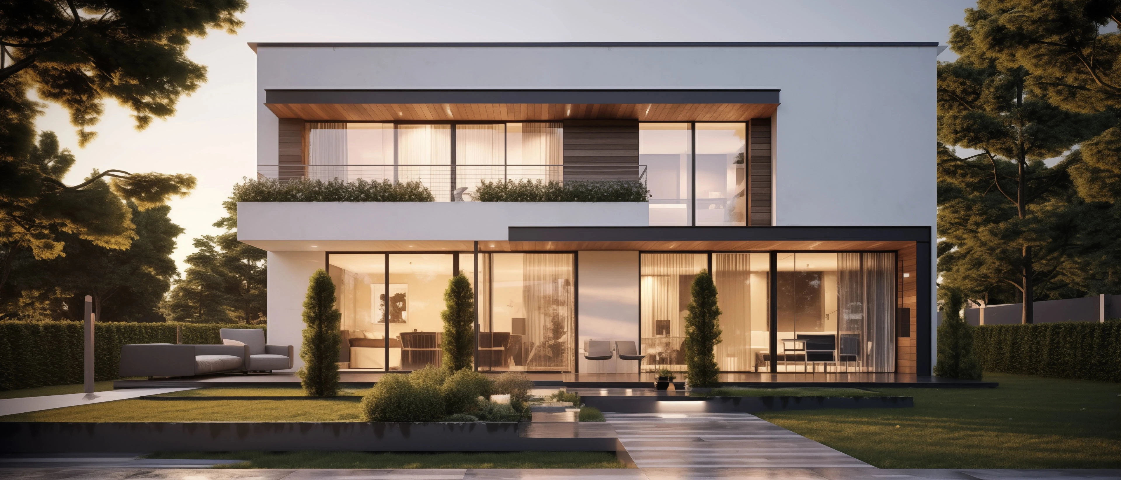
About the project: Rootwise Architects was tasked with designing a commercial space that seamlessly integrated traditional and modern architectural elements. The project aimed to create a unique and sustainable workspace that reflected the client's appreciation for both classic and contemporary design styles. The firm's approach was to carefully blend traditional architectural wisdom with innovative modern technologies and materials to achieve a harmonious and visually striking result.
Target Audience: The target audience for this project was a client who sought a residential space that embodied a fusion of traditional and modern design elements. The client was likely someone who valued sustainability, unique architectural solutions, and the seamless integration of the past and the present in their living environment.
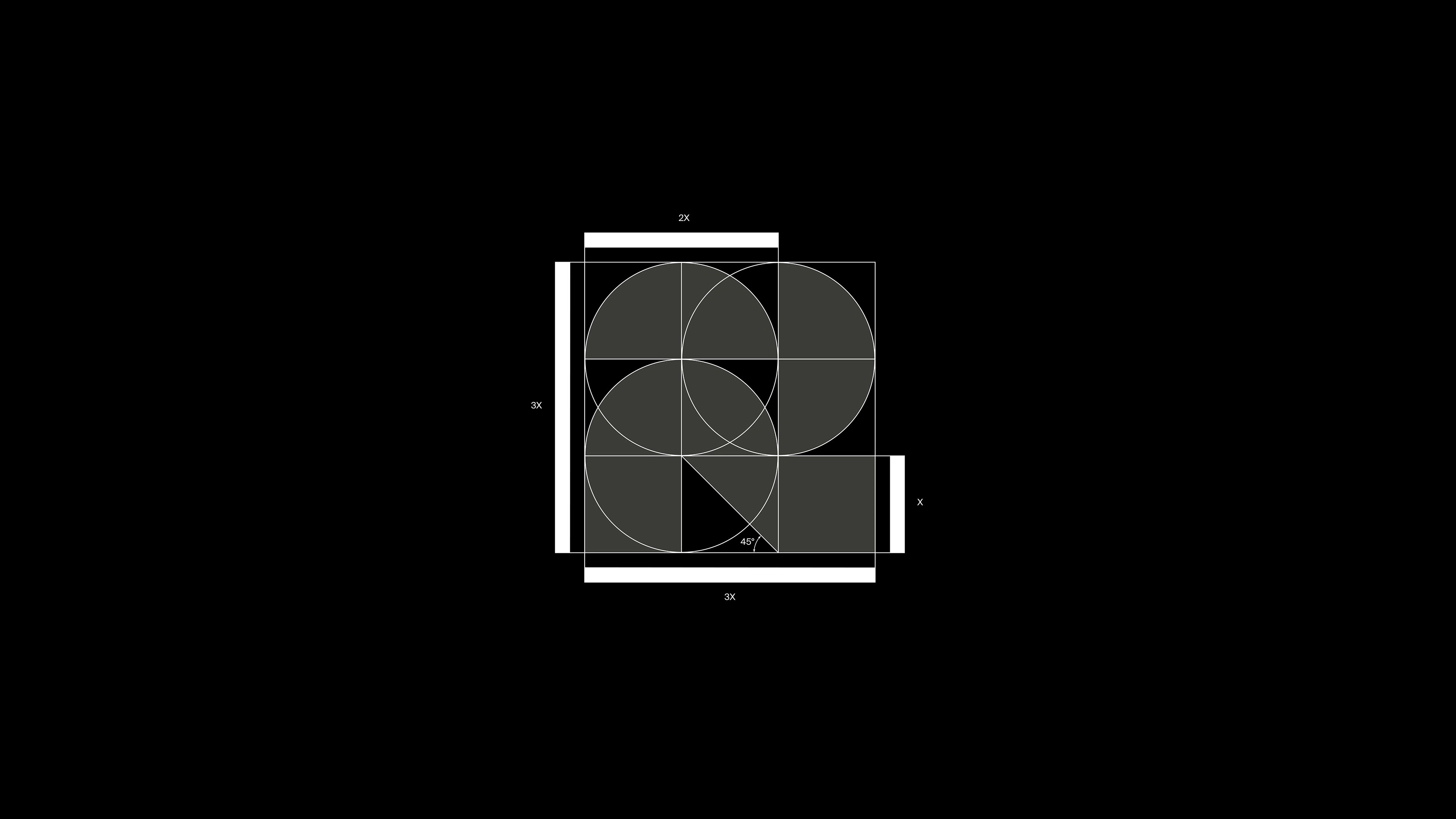
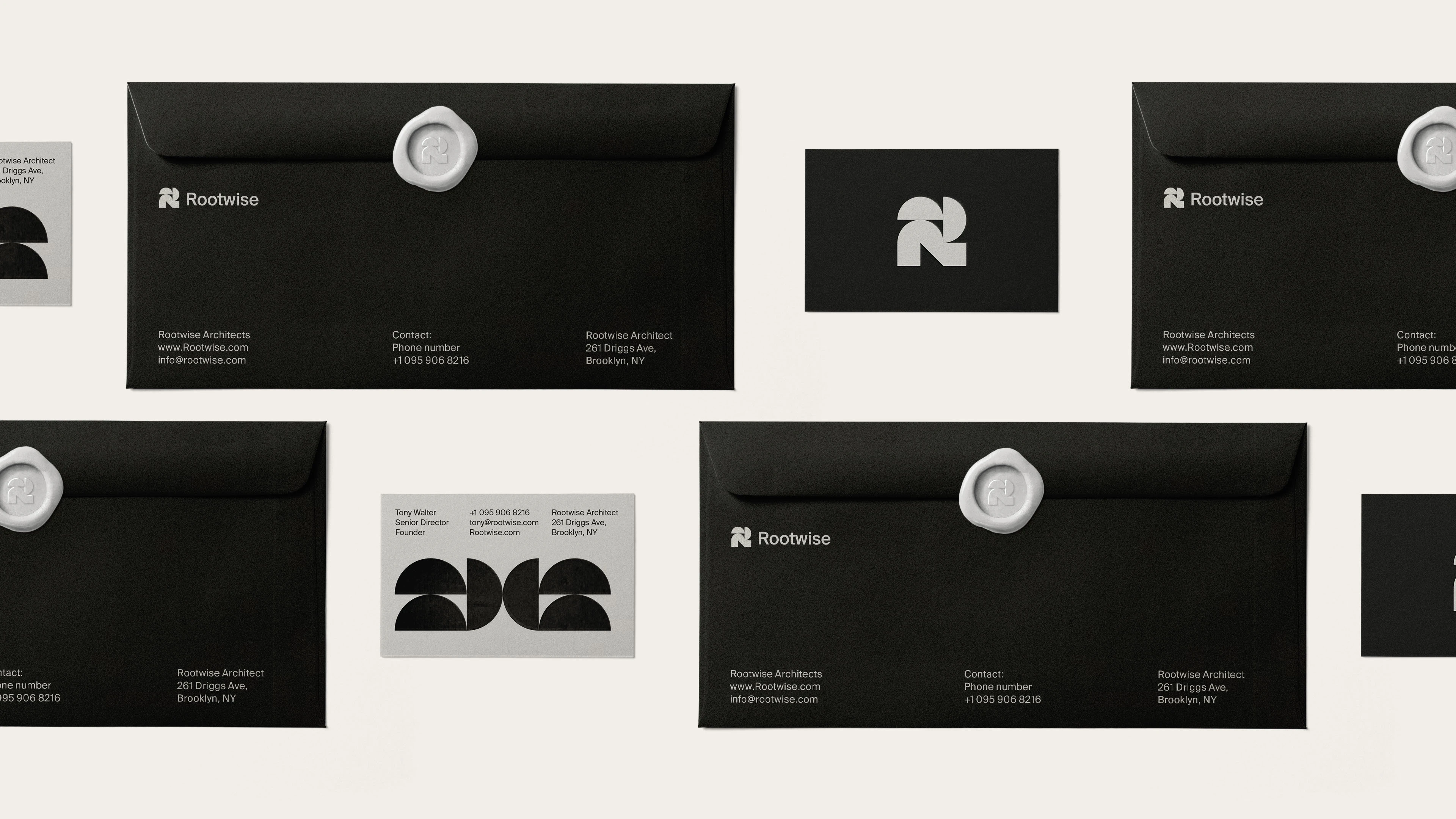
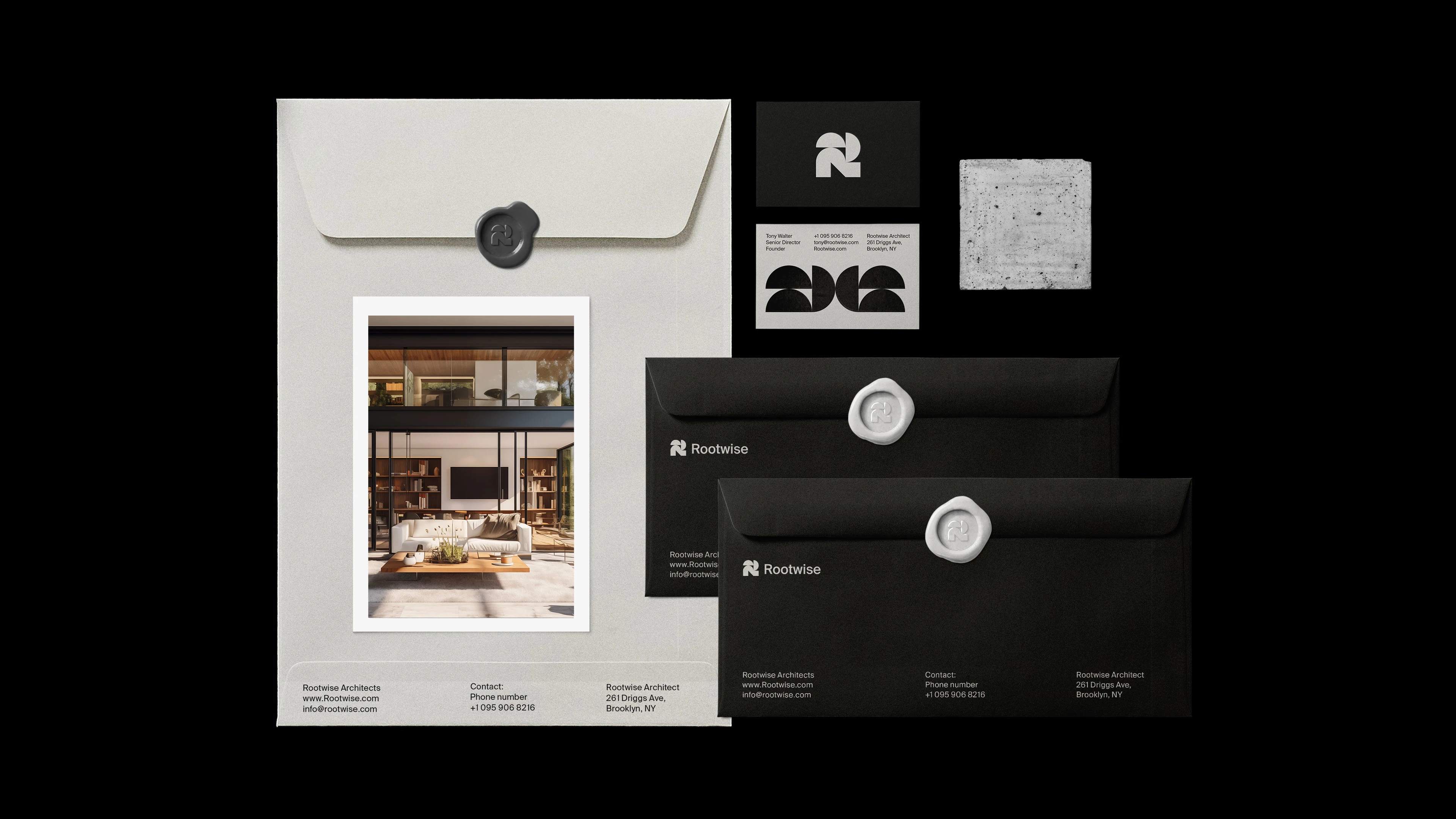
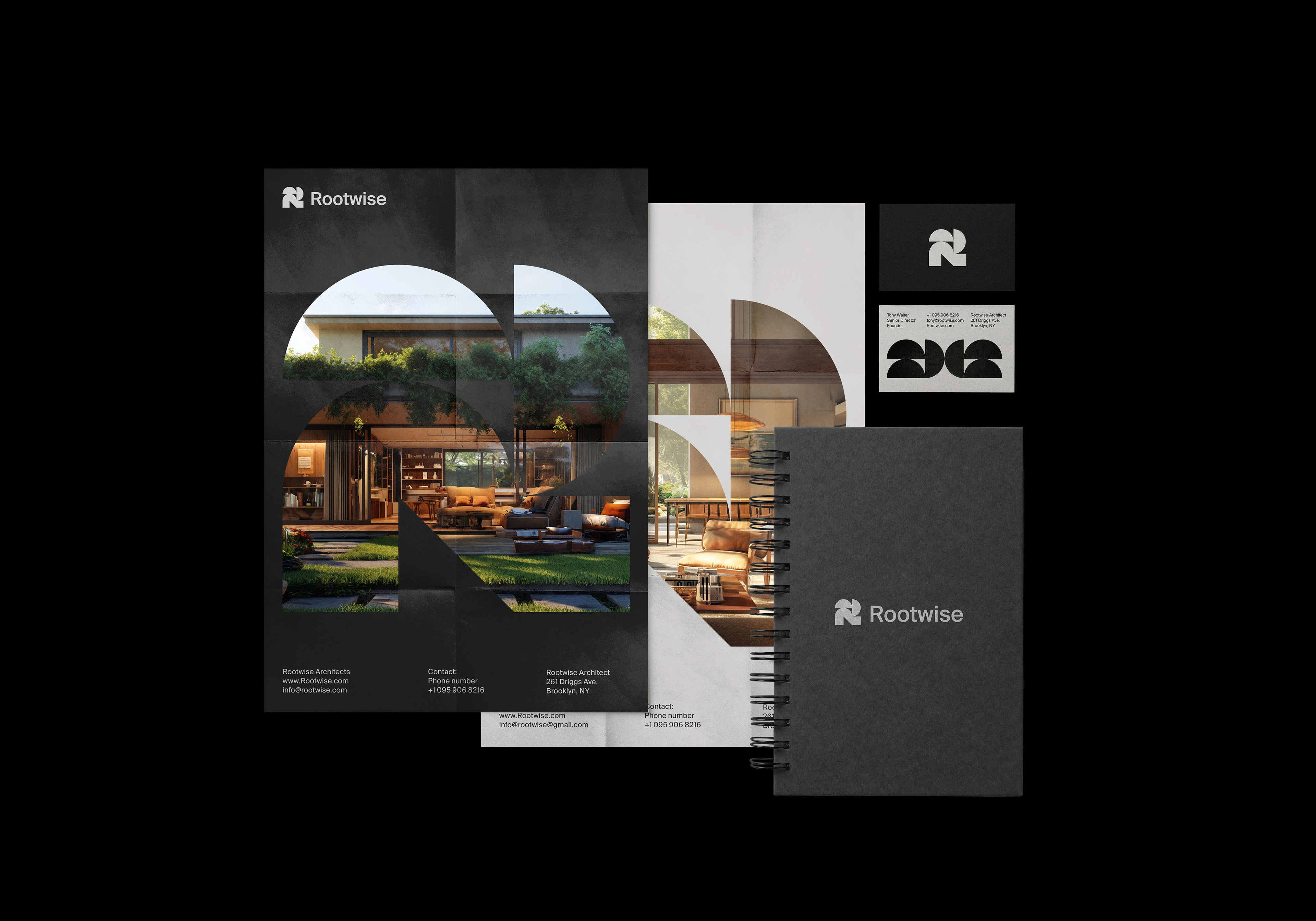
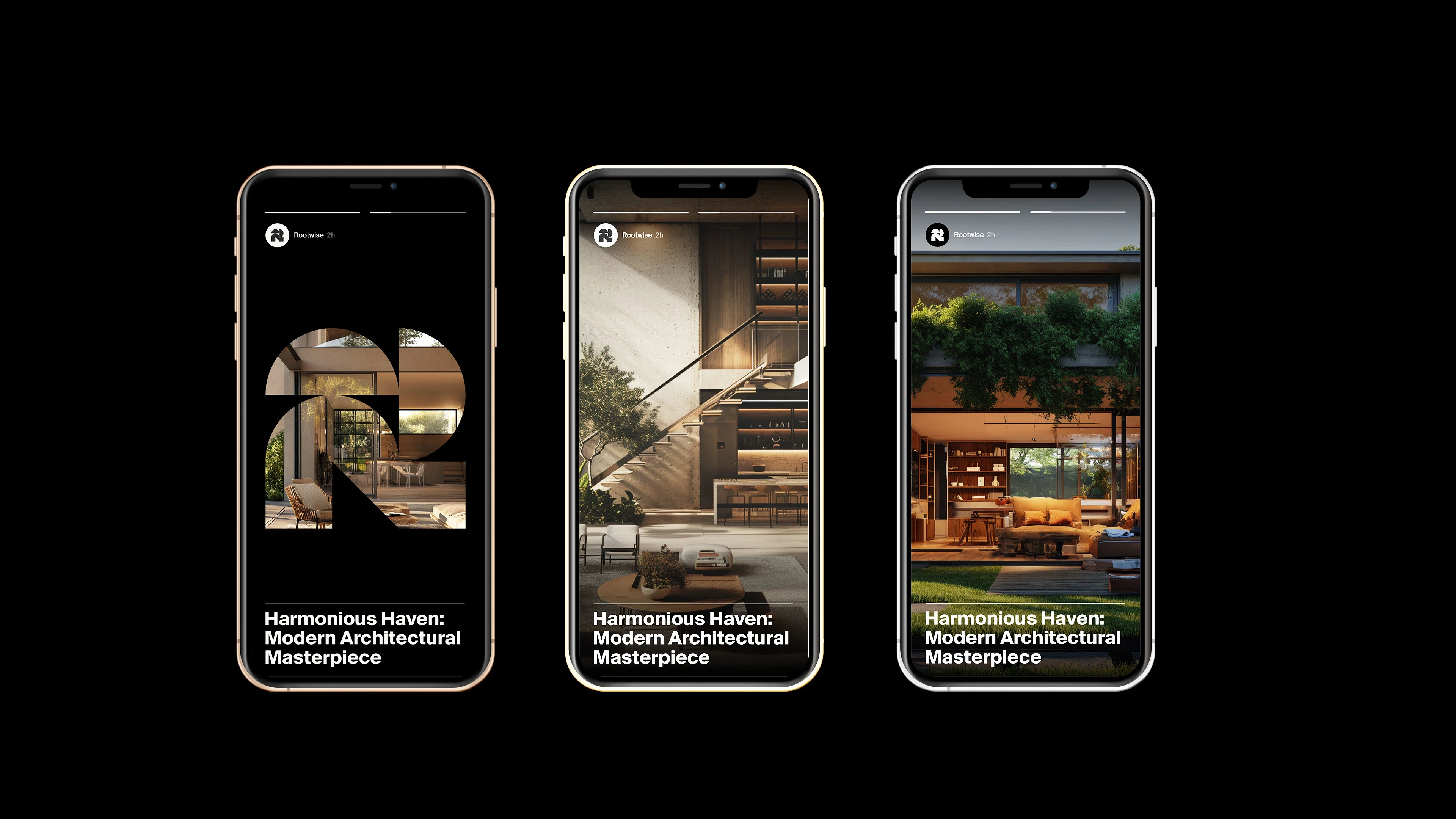
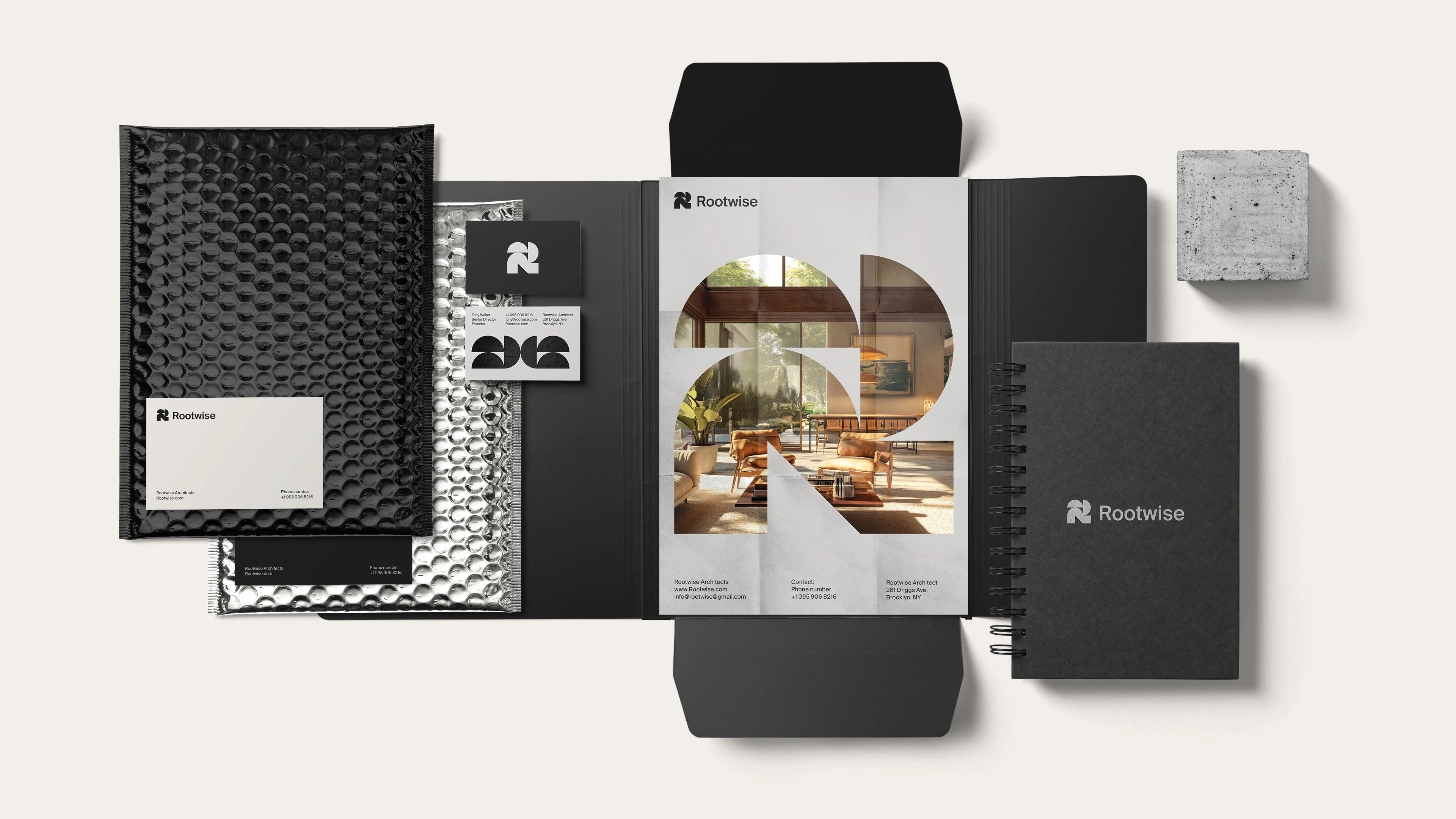
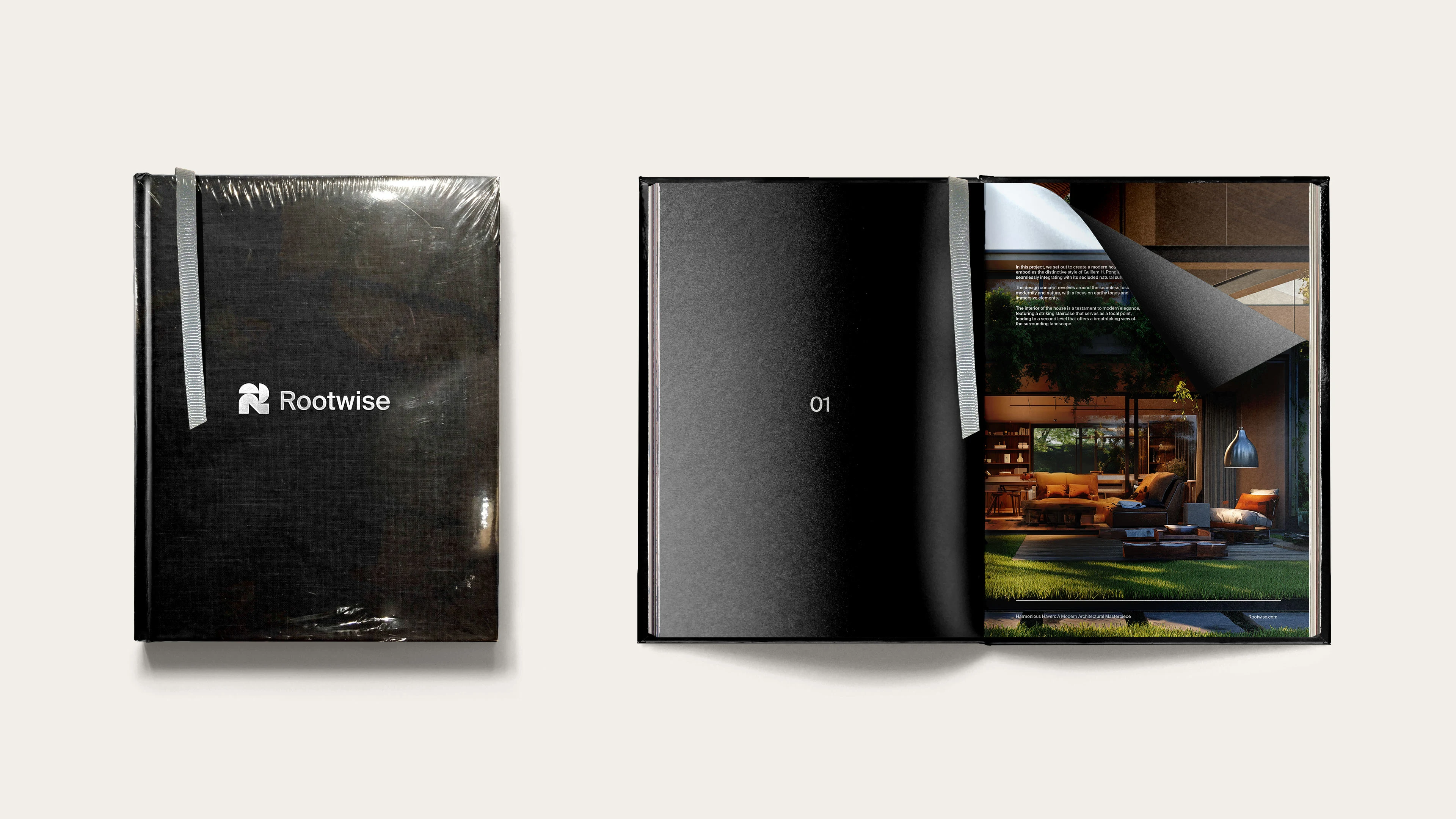
How We Solved It: When designing Rootwise Architects’ logo and visual identity, I embarked on a creative journey. I settled on an abstract letter “R” mark, representing both the firm’s name and its commitment to roots (foundation) and growth (wisdom).
The simplicity of this mark allowed for versatility across various applications. Clean typography reflected professionalism and forward-thinking. High-quality imagery showcased completed projects, emphasizing the blend of tradition and modernity. In summary, the visual identity became a symbol of architectural wisdom rooted in creativity and innovation.
Like this project
Posted Nov 25, 2024
Graphic Design, Art Direction, Branding, Adobe Illustrator, Adobe Photoshop, Adobe InDesign