STILL (Brand identity + Packaging)
Chavi - Brand Designer
1 collaborator
STILL - because less is enough
Branding & Art Direction in collaboration with Not Blank Designs
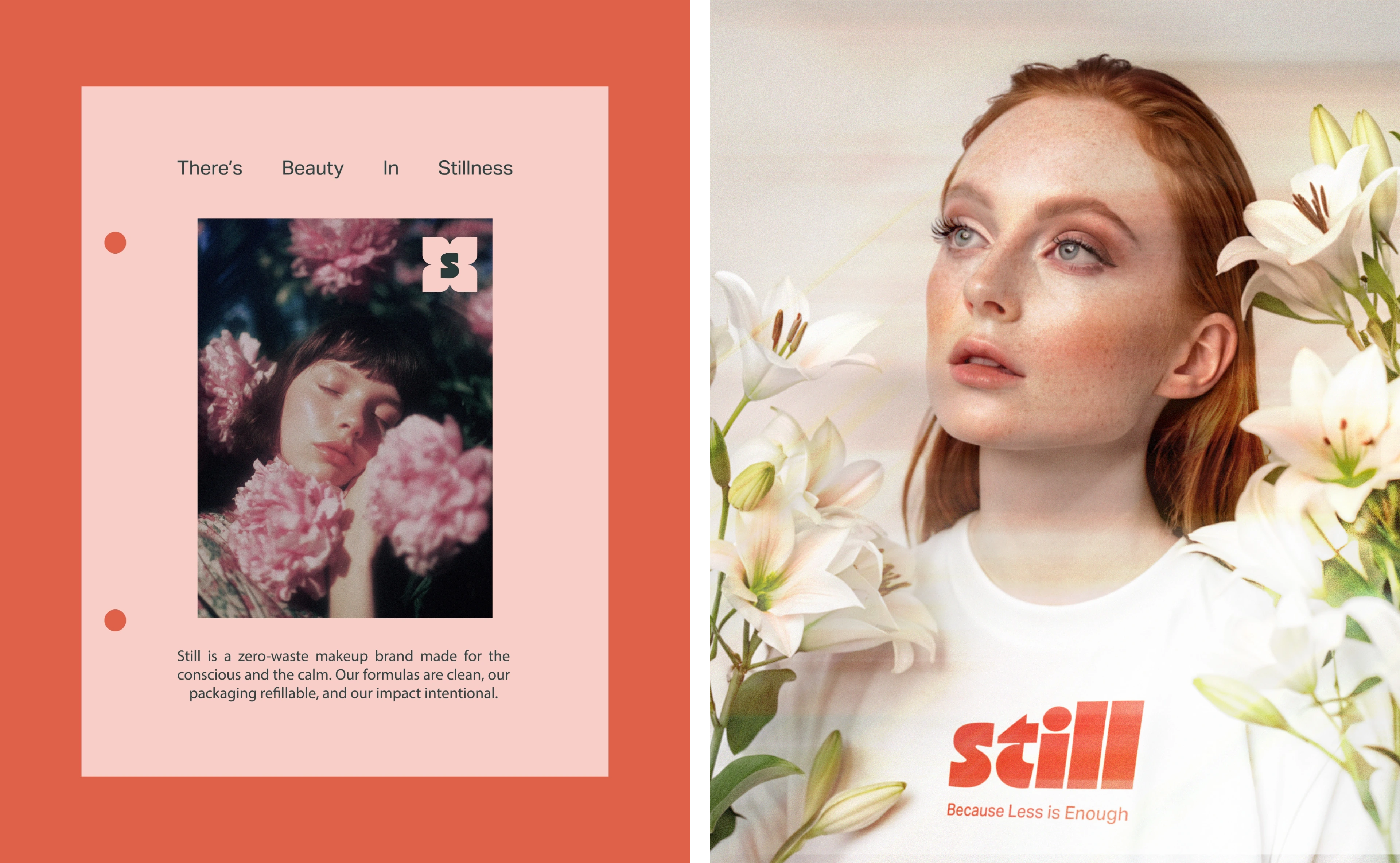
Visual Language: In a world that rewards speed, STILL offers pause. This branding project merges clean design with emotional depth, crafting a visual identity that is soft yet grounded, calm yet memorable. The brand lives in a space of quiet beauty-where design choices reflect ethical care and tactile connection.
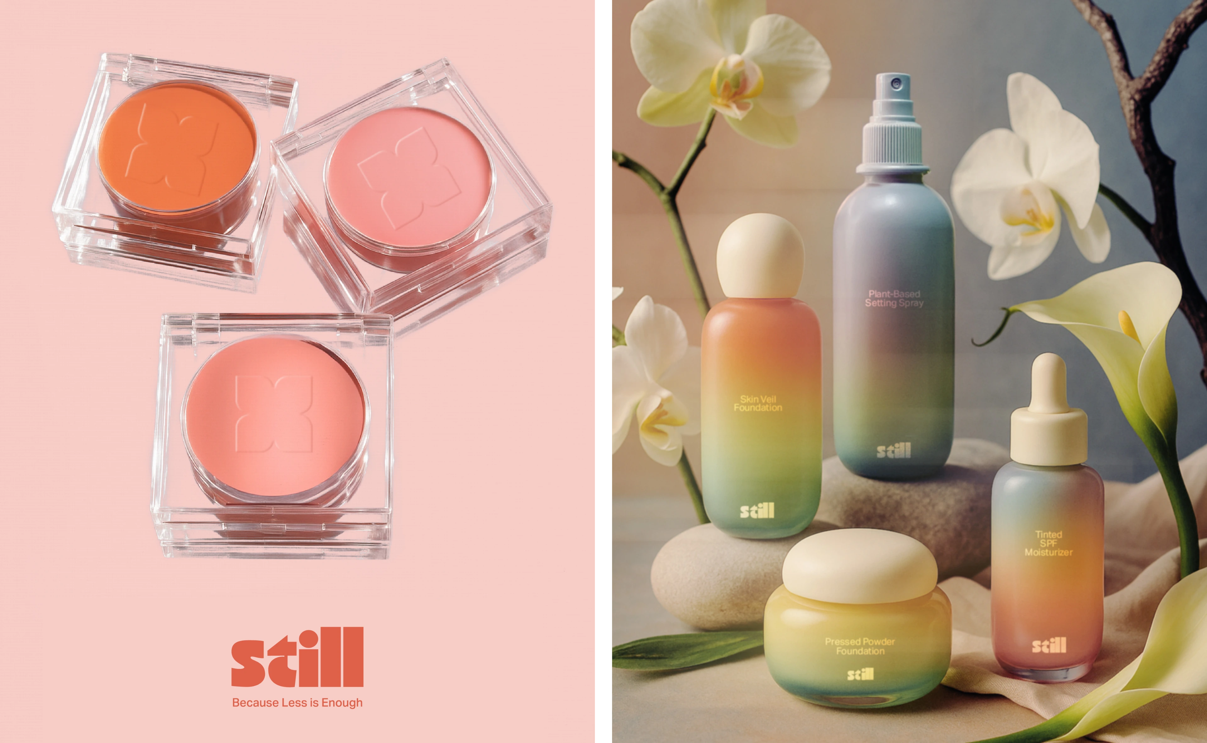
Color Palette & Gradients: Inspired by nature, the palette blends earthy greens, soft ambers, and muted corals into gentle vertical gradients. These transitions reflect growth, calm, and the slow beauty of ritual.
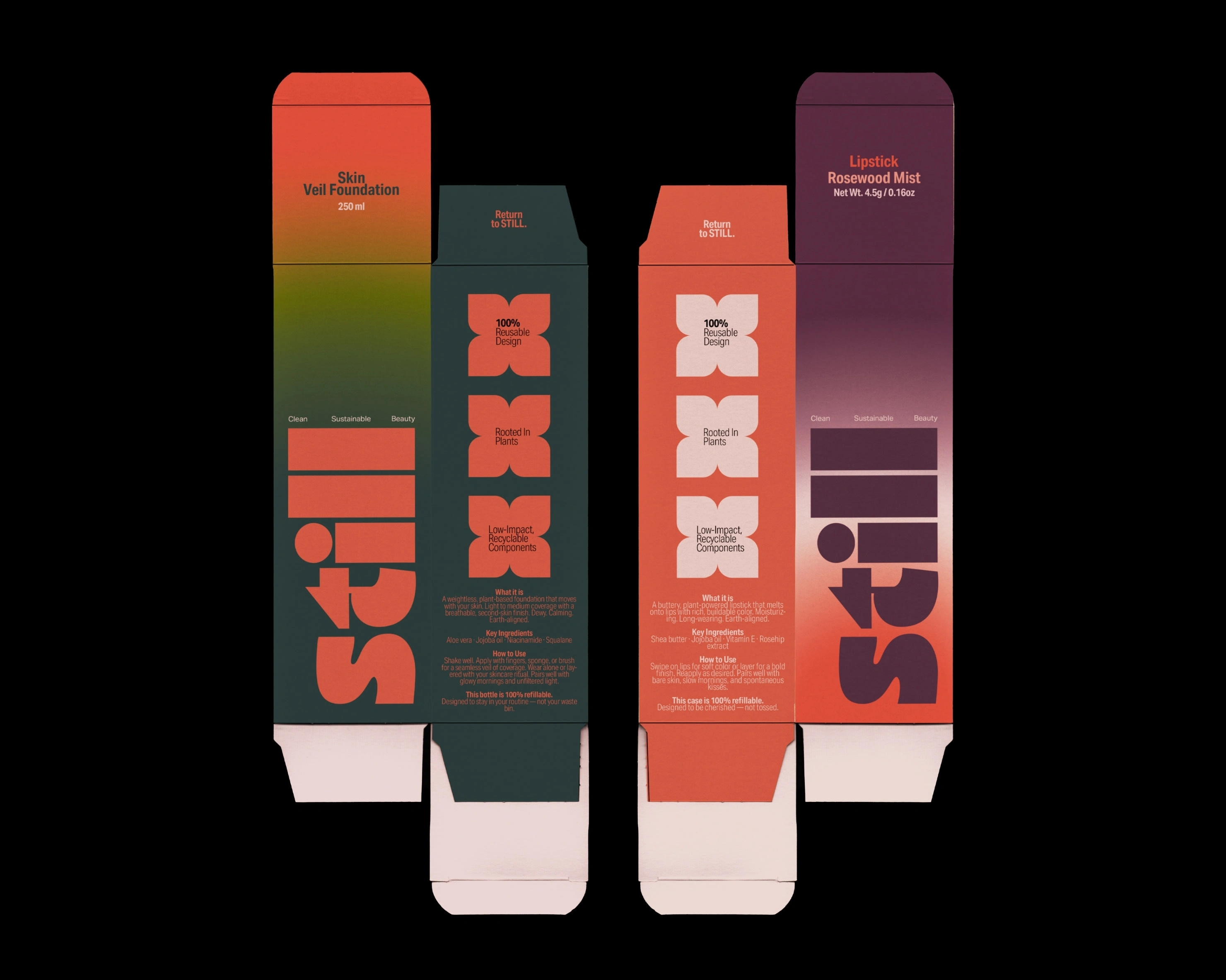
Packaging Design: Refillable. Reusable. Circular by design. Packaging across all products emphasizes sustainability through structure and materiality. Gradients are placed only where needed-often on the base - while caps and tops remain simple to enhance the feeling of lightness and purity.
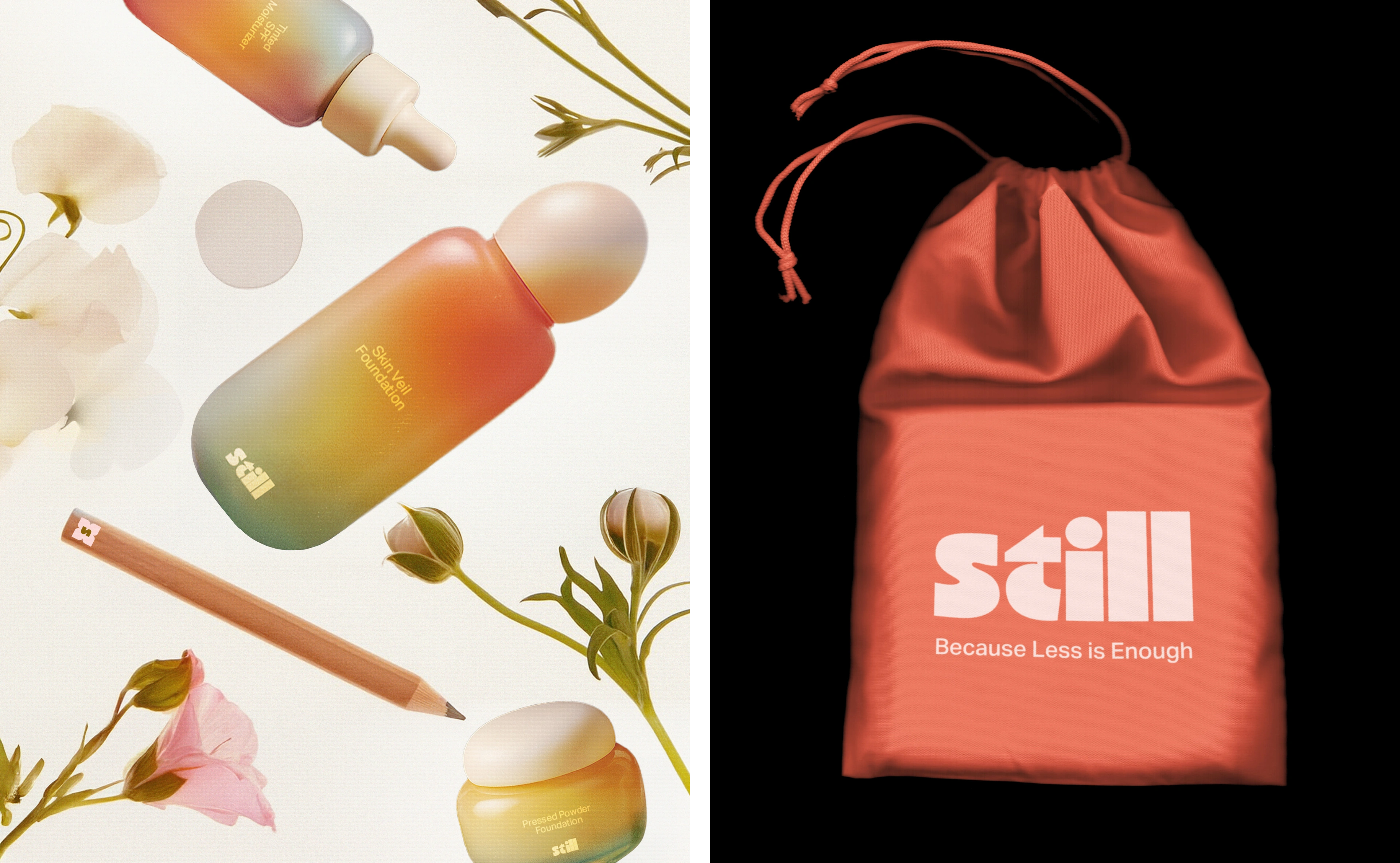
Photography & Art Direction: Shot in soft studio lighting and natural setups, the imagery juxtaposes models and botanicals, emphasizing skin textures and the serenity of nature. The tone is editorial, dreamy, and tactile-designed to feel like a slow inhale.
Thank you!
Follow our work on Instagram: notblankdesign & brandsbychavi 💜
Like this project
Posted Aug 6, 2025
We designed the brand identity and packaging for Still, a zero-waste makeup brand that believes in choosing less, but better.
Likes
16
Views
186
Collaborators