Your website looks perfect on

Viet ito

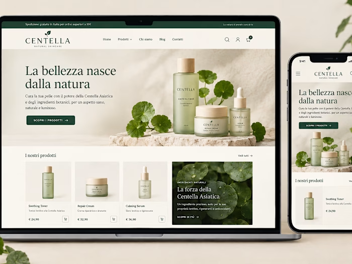
Your website looks perfect on desktop. But can your customers actually use it on mobile? 👀
A beautiful website isn't enough if visitors can't complete the most important action.
Imagine a potential customer visiting your website on their phone:
The text is too small to read comfortably.
The form gets clipped when they zoom in.
The keyboard covers the Submit button.
The layout looks great, but navigating it feels frustrating.
These small issues can cost you leads and sales without you even noticing.
As a WordPress, Webflow, and Shopify developer, I believe good website development goes beyond making things look pixel-perfect. It's about making every interaction work smoothly on real devices.
My mobile QA checklist includes testing real user journeys, form validation, text zoom, keyboard behavior, and responsive layouts.
When was the last time you tested your website on your phone—not just looked at it, but actually tried to use it?
#WebDevelopment #WordPress #Webflow #Shopify #WebDesign #UX
Like this project
Posted Oct 19, 2026
Your website looks perfect on desktop. But can your customers actually use it on mobile? 👀 A beautiful website isn't enough if visitors can't complete the m...
Likes
0
Views
0