
Viet ito
WordPress, Webflow & Shopify Developer | Pixel-Perfect


WordPress vs. Webflow vs. Shopify: Choosing the Right Platform for Your Business
One of the most common questions when starting a new website project is:
Which platform should I choose: WordPress, Webflow, or Shopify?
After working with all three platforms, I've learned that there isn't one perfect solution for every business.
Each platform has its own strengths, limitations, and ideal use cases. The right choice depends on what you're trying to build, how you plan to manage your website, and where your business is heading.
Here's how I look at them.
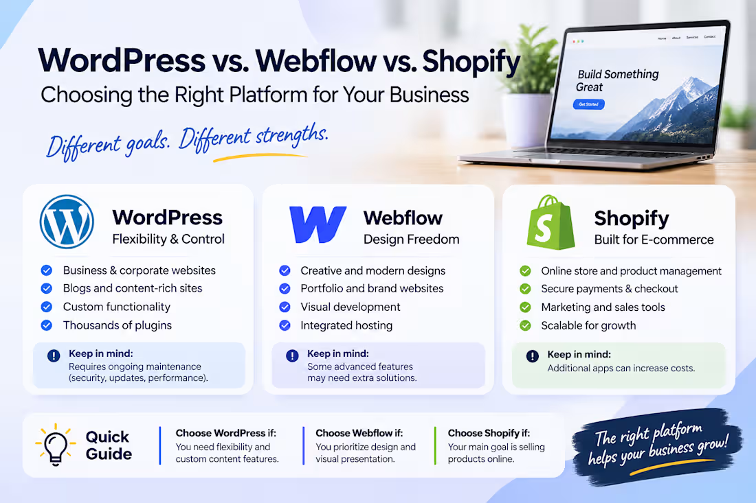
1. WordPress – Flexibility and Customization
WordPress is a great choice for businesses that need flexibility and control over their websites.
It's particularly suitable for:
Business and corporate websites.
Blogs and content-heavy websites.
Custom landing pages and marketing websites.
Membership websites and complex functionality.
Projects that require extensive customization.
One of WordPress's biggest advantages is its ecosystem. With thousands of plugins, themes, and development possibilities, you can build almost anything.
However, that flexibility comes with responsibility. Plugin management, security, updates, and performance optimization need ongoing attention.
2. Webflow – Design Freedom and Visual Precision
Webflow is an excellent option for businesses that prioritize visual presentation, modern design, and a more integrated website-building experience.
It's particularly suitable for:
Creative agencies and design studios.
Startup and SaaS websites.
Portfolio websites.
Marketing and brand-focused websites.
Projects with sophisticated layouts and animations.
What I particularly like about Webflow is the level of design control it offers. Developers can translate detailed designs into responsive websites while maintaining a more visual approach to development.
It's also convenient that hosting and many core website features are integrated into the platform.
However, more complex functionality, advanced integrations, and certain content or e-commerce requirements may need additional solutions.
3. Shopify – Built for E-commerce
If your primary goal is selling products online, Shopify is often the most straightforward choice.
It's designed specifically for e-commerce, with features such as:
Product and inventory management.
Shopping carts and checkout.
Payment integrations.
Order management.
Discount codes and marketing tools.
Shopify also provides considerable customization opportunities through Liquid, theme development, and its Online Store 2.0 architecture.
For businesses that need a scalable online store, Shopify offers a strong foundation without having to build an entire e-commerce system from scratch.
The main consideration is that additional apps, advanced customization, and certain features can increase ongoing costs.
So, Which One Should You Choose?
Here's my general recommendation:
WordPress: When flexibility, content management, and custom functionality are priorities.
Webflow: When visual design, branding, and a streamlined website-building experience are priorities.
Shopify: When selling products online is the primary business objective.
Of course, there are exceptions. WordPress can handle e-commerce very well with WooCommerce, and Shopify can support content-driven marketing websites. The important thing is understanding the project's actual requirements.
My Final Thoughts
I don't believe in choosing a platform simply because it's popular or because a developer is most familiar with it.
A good platform should support the business, not create unnecessary limitations or expenses down the road.
Before starting any project, I prefer to understand the client's goals, required functionality, budget, and long-term plans. Only then can we determine which technology makes the most sense.
What about you? Which platform do you prefer working with: WordPress, Webflow, or Shopify? And why?
1
51
Launching a Website Is Just the Beginning
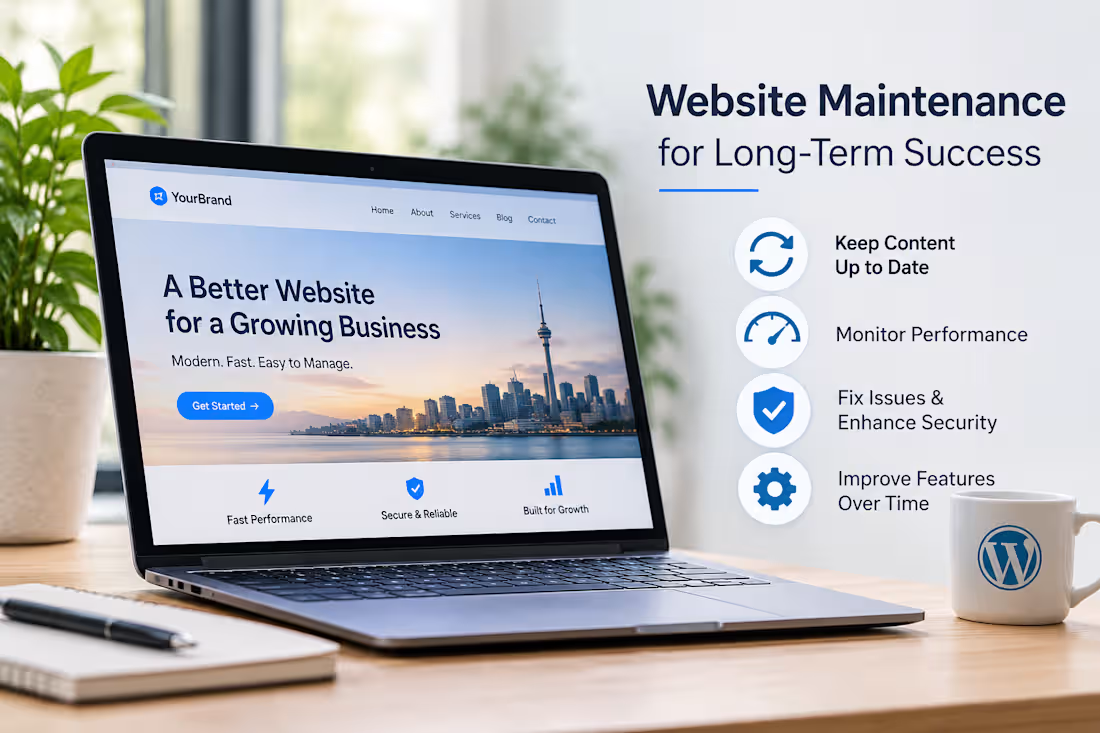
A website shouldn't be considered finished the moment it goes live.
Over time, businesses need to update content, improve performance, fix issues, and adapt to changing needs.
That's why I believe a good website should be built with long-term maintenance in mind.
A few things I always consider:
Clean and organised structure.
Easy content management.
Reliable plugins and integrations.
Performance and security.
Flexibility for future improvements.
Building a website is one thing. Building one that's easy to maintain is just as important.
#WordPress #WebDevelopment #WebsiteMaintenance
4
5
210
Your Figma design looks perfect. But will your WordPress website look the same?
This is where things often get challenging.
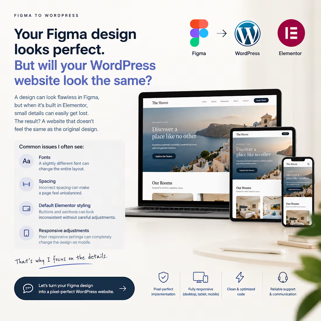
A design can look flawless in Figma, but when it's translated into Elementor, small details can easily get lost.
I've seen how much difference these details make:
A slightly different font can change the entire layout.
Incorrect spacing can make a page feel unbalanced.
Default Elementor styling can make buttons and sections look inconsistent.
Poor responsive adjustments can completely change the original design on mobile.
After 10+ years of building websites with WordPress and Elementor, I've learned that the real challenge isn't just building a page.
It's translating someone's design vision into a working website without losing the details that make it special.
That's exactly what I focus on.
Have a Figma design waiting to become a WordPress website? I'd love to help bring it to life.
#WordPress #Elementor #FigmaToWordPress #WebDevelopment
2
222
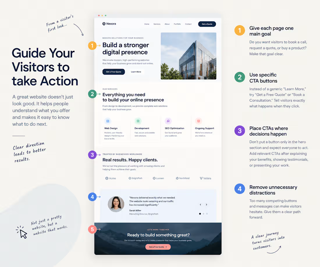
Your website looks great. But do visitors know what to do next?
Imagine someone lands on your homepage.
They like the design, scroll through a few sections, and then leave.
Not because your website looks bad, but because they aren't sure what to do next.
Here are 4 simple ways to fix that:
1. Give each page one main goal
Do you want visitors to book a call, request a quote, or buy a product? Make that goal clear.
2. Use specific CTA buttons
Instead of a generic “Learn More,” try “Get a Free Quote” or “Book a Consultation.”
Tell visitors exactly what happens when they click.
3. Place CTAs where decisions happen
Don't put a button only in the hero section and expect everyone to act. Add relevant CTAs after explaining your benefits, showing testimonials, or presenting your work.
4. Remove unnecessary distractions
Too many competing buttons and messages can make visitors hesitate. Give them a clear path forward.
A good website doesn't force people to guess their next step. It guides them naturally from understanding your offer to taking action.
A question for designers and developers: When reviewing a homepage, do you check the visual design first or the user journey?
1
181