Luxury Skincare Brand Identity & Logo Design | Harmonalita

Tamás Kurucz


Harmonalita
Luxury Skincare Brand Identity & Logo Design
Case study of a luxury skincare brand identity and logo design for Harmonalita, a fictional high-end skincare brand built on natural ingredients, artisanal formulas and holistic self-care.
CLIENT: Fictional Brand
YEAR: 2024
INDUSTRY: Luxury Skincare; Cosmetics
Project Overview
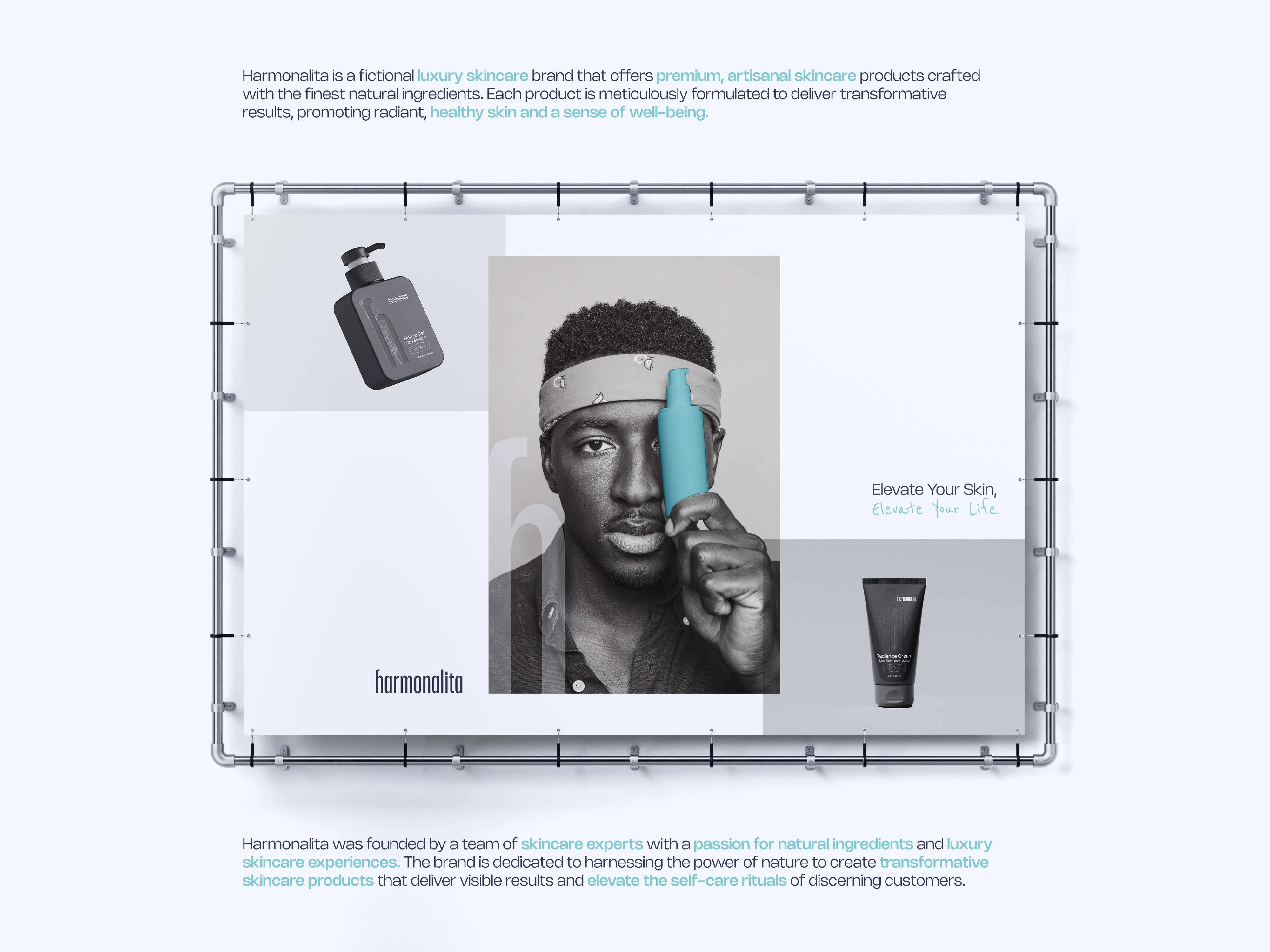
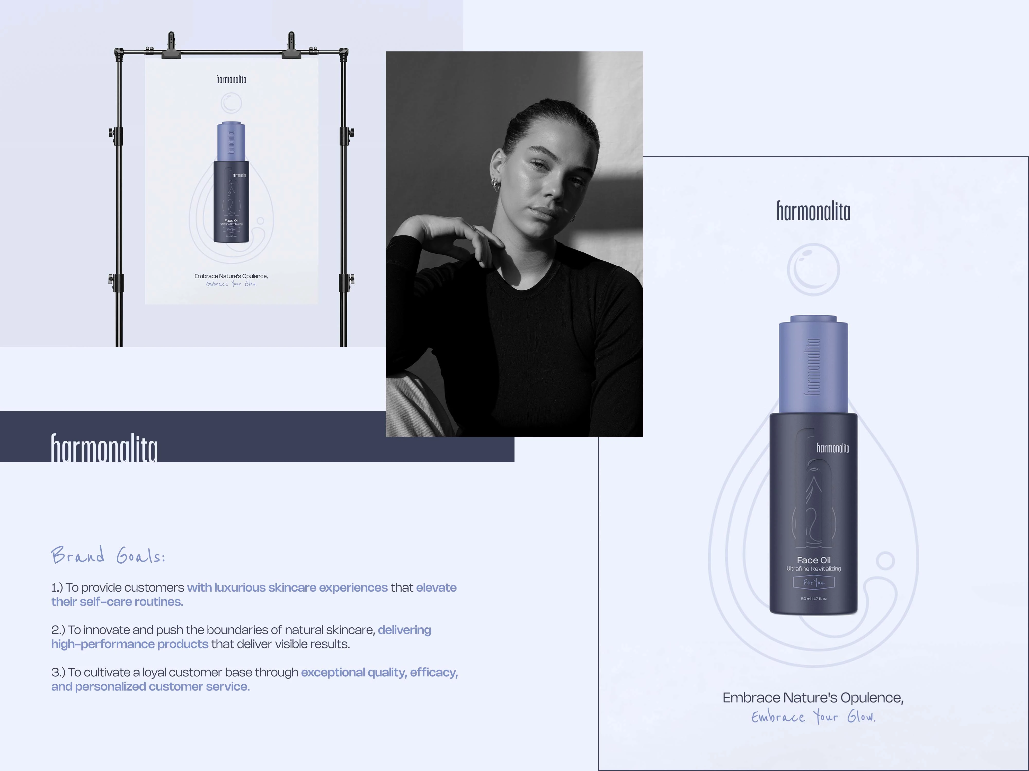
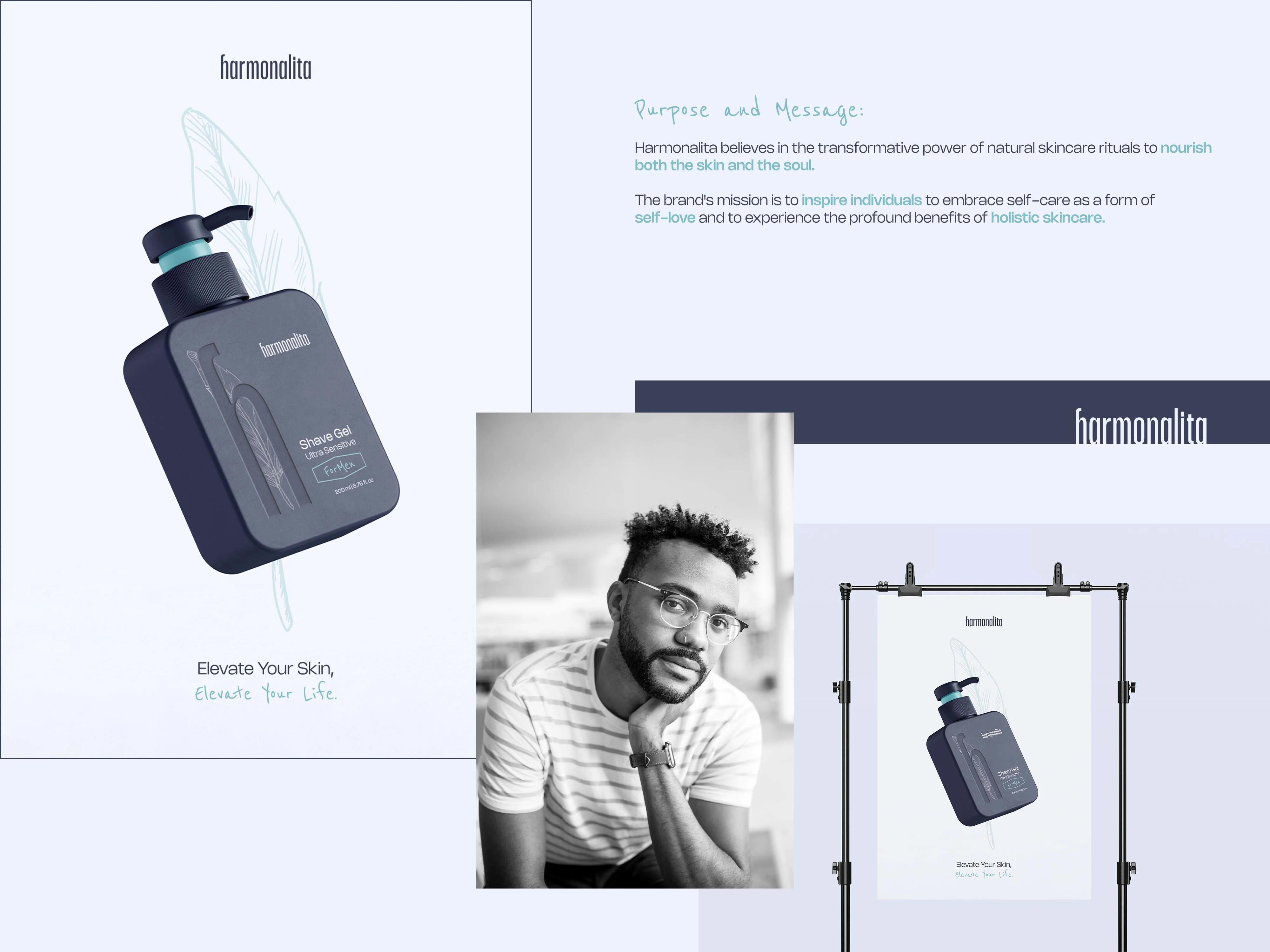
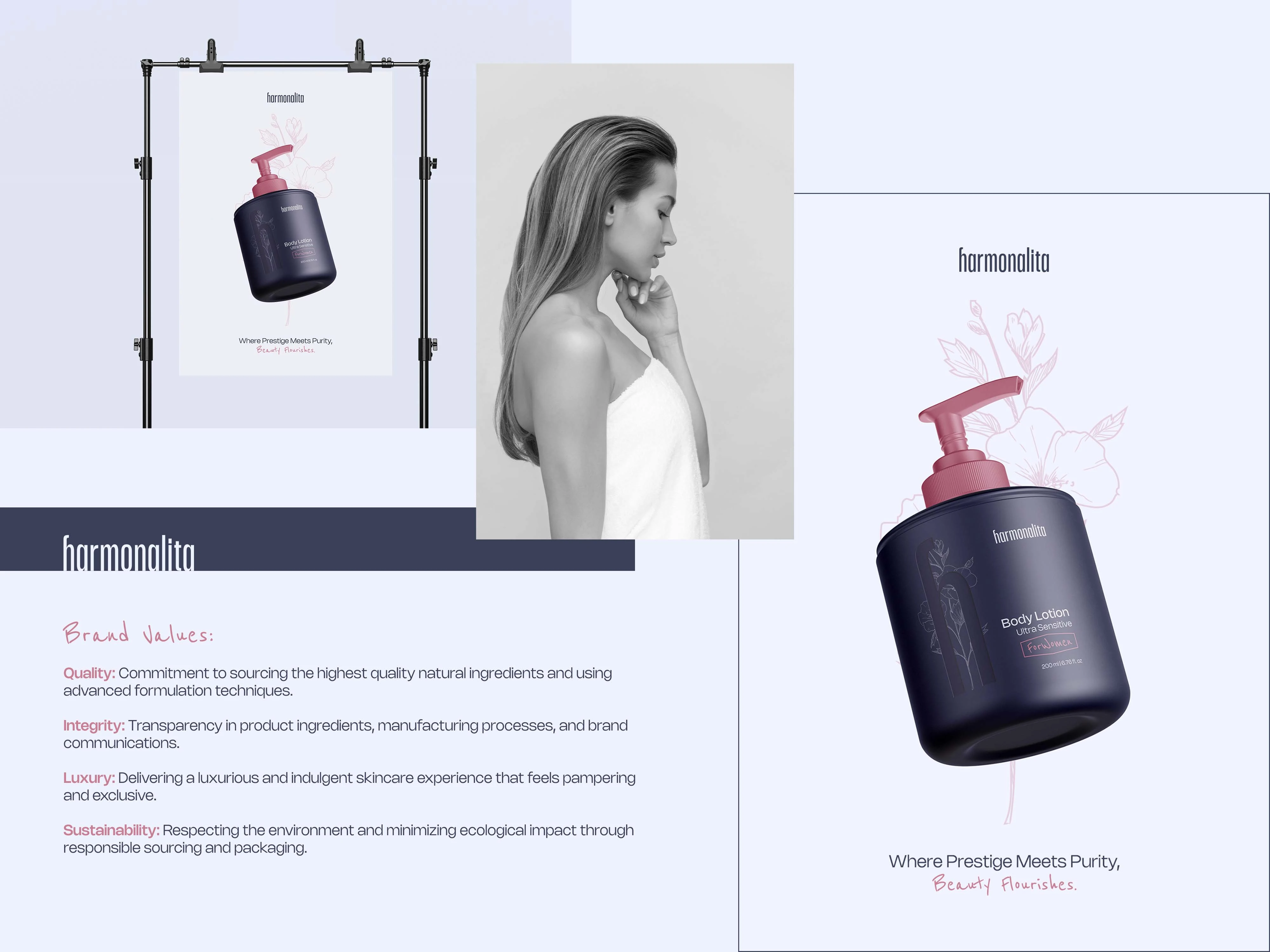
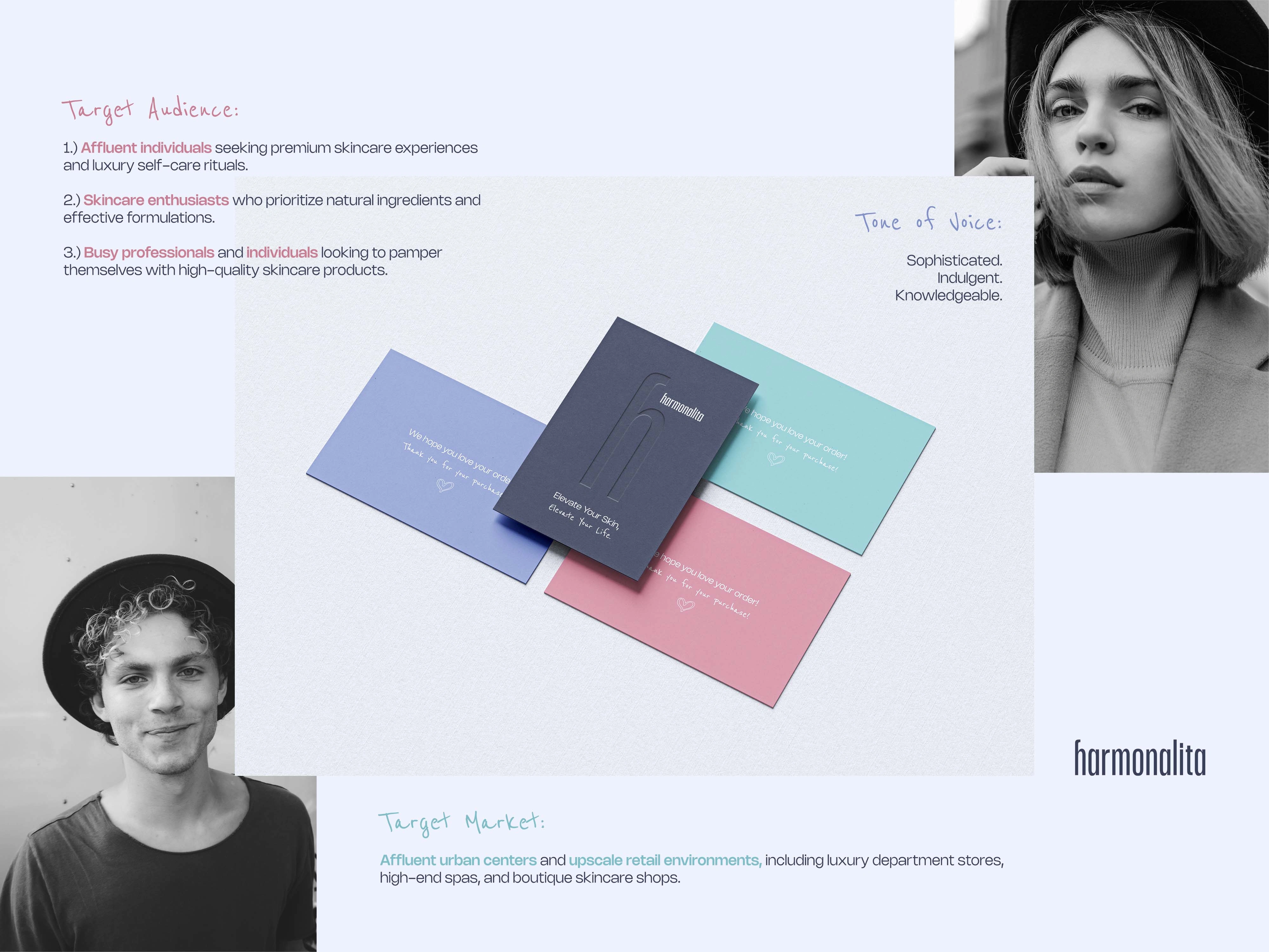
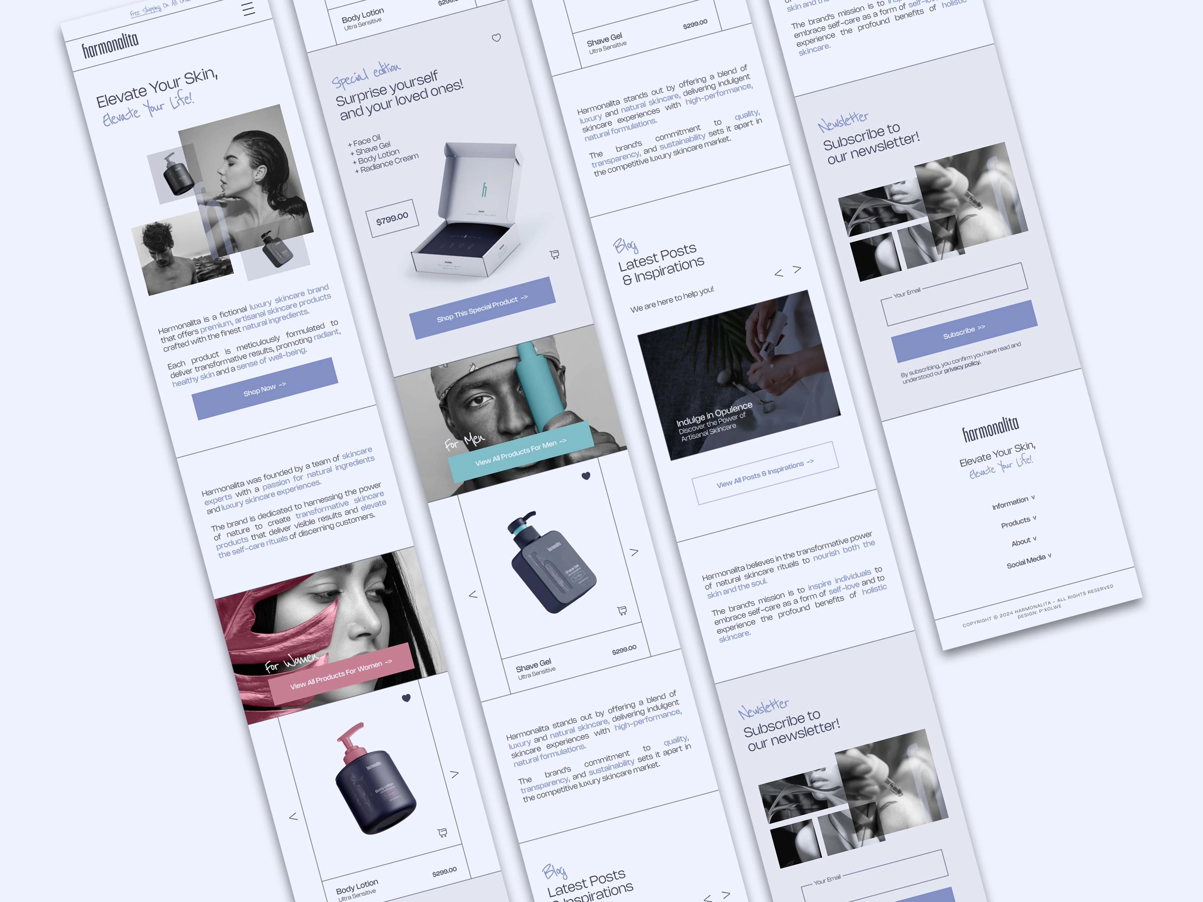
Designing the brand identity for Harmonalita—a fictional high-end skincare brand—required creating a complete visual world built on artisanal formulas and the finest natural ingredients. Envisioned by a team of skincare experts and wellness enthusiasts, the brand is rooted in the philosophy that skincare should nourish both skin and soul. The core mission is to transform everyday routines into restorative rituals of self-love and inner harmony. Targeted at affluent individuals, busy professionals, and natural-beauty enthusiasts in upscale urban markets, Harmonalita positions itself among industry leaders by offering a unique blend of high-performance formulations, total transparency, and deep sustainability. The resulting identity embodies radiant, healthy living, conveying elegance and holistic well-being at every touchpoint.
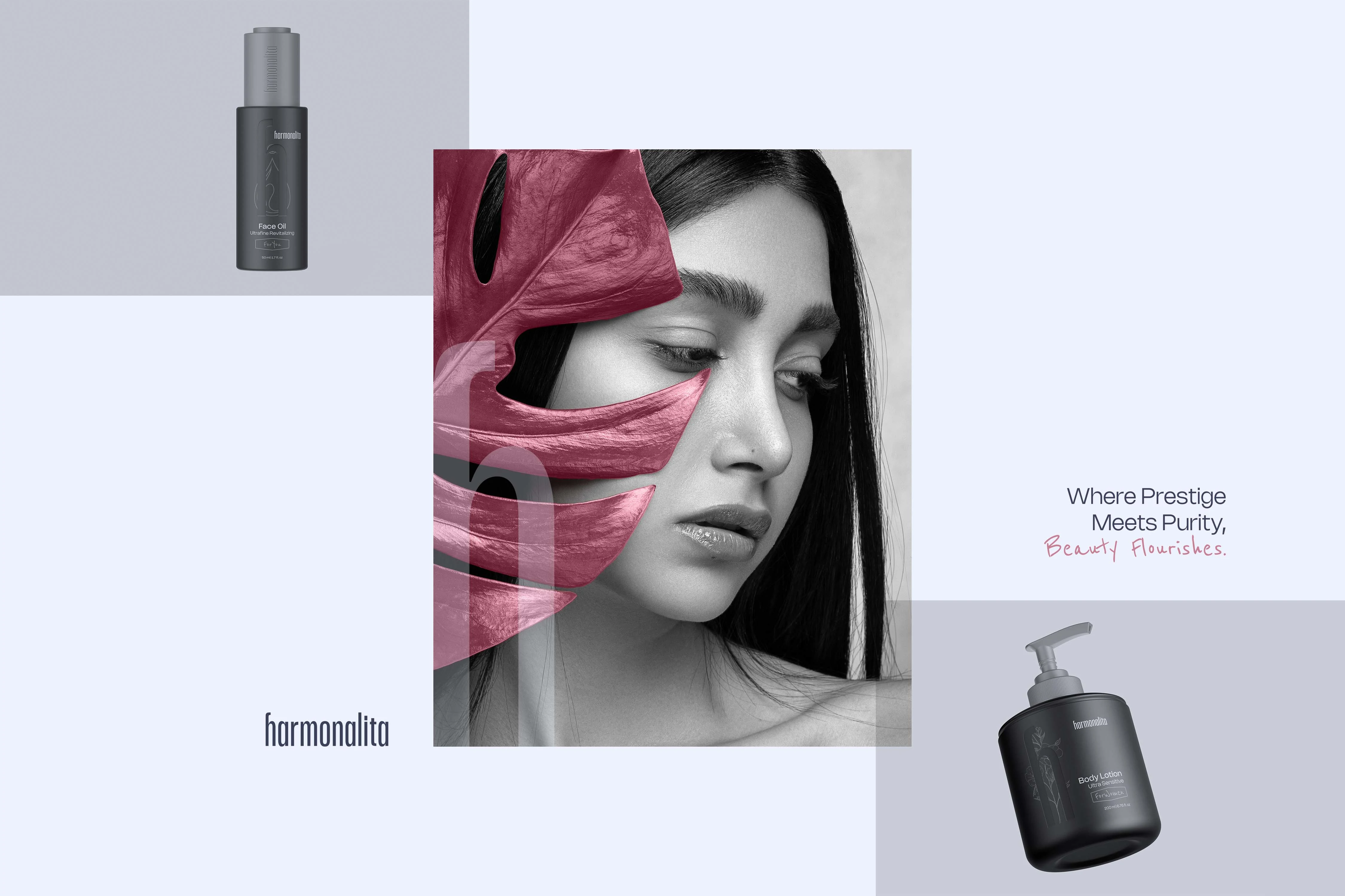
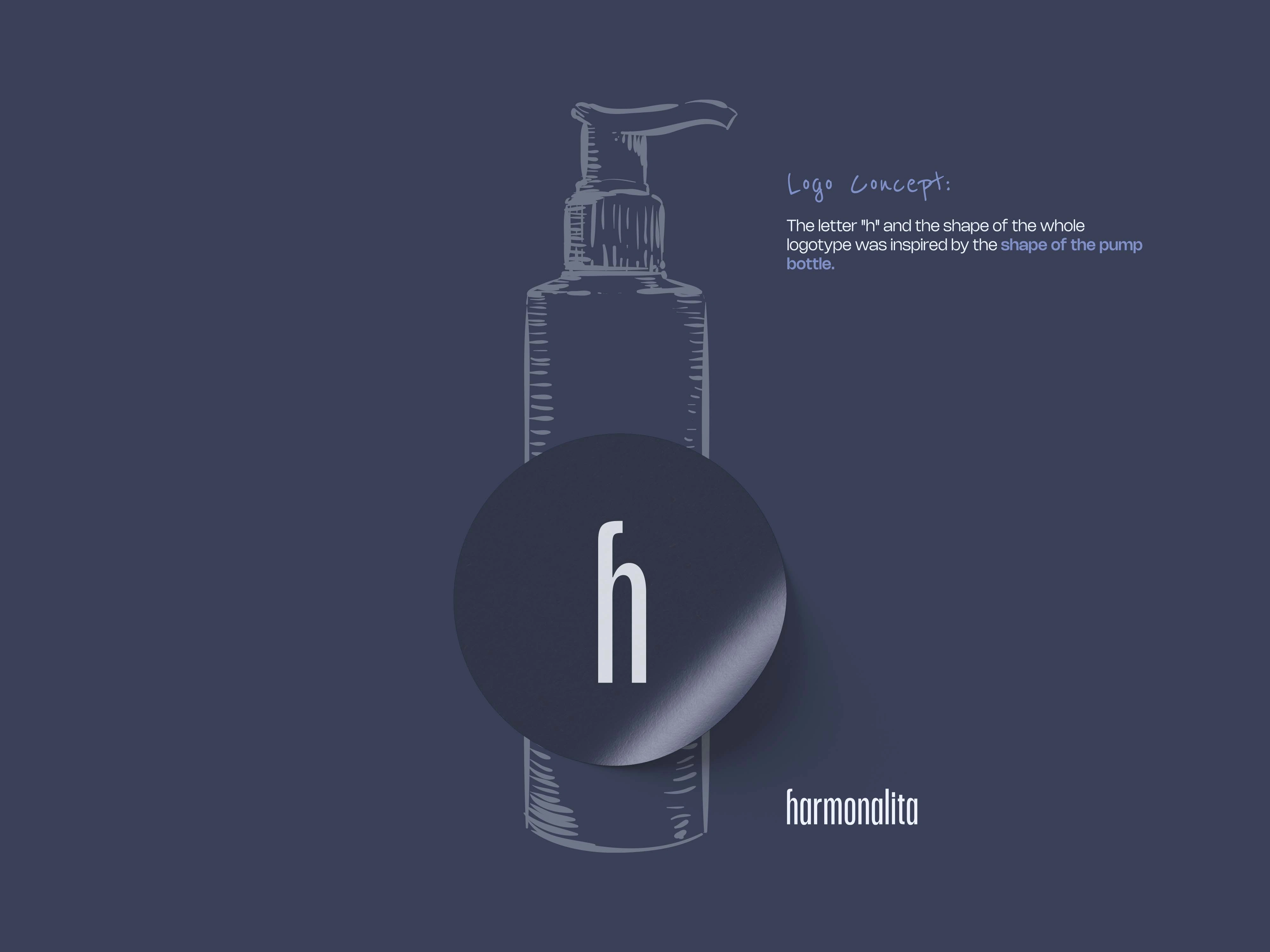
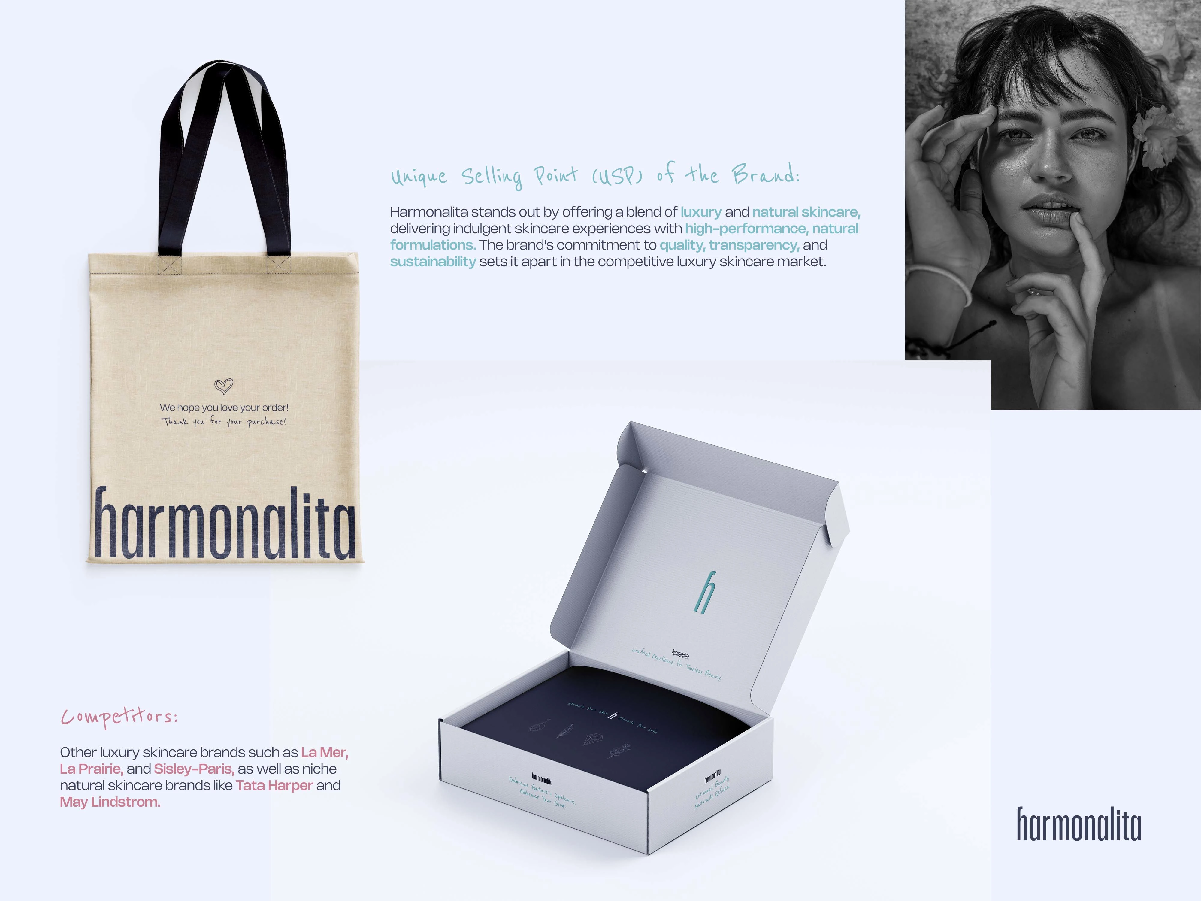
At the heart of this sophisticated identity is a conceptual, timeless logo that draws direct inspiration from luxury skincare rituals. The letter "h" and the overall silhouette of the logotype are carefully designed to echo the sleek shape of a pump bottle. This structural foundation provides the mark with a highly recognizable, minimal form. Defined by soft curves and understated geometry, the logo conveys ultimate cleanliness, purity, and refinement, aligning perfectly with the brand's promise of sensorial pleasure without relying on overly decorative elements.
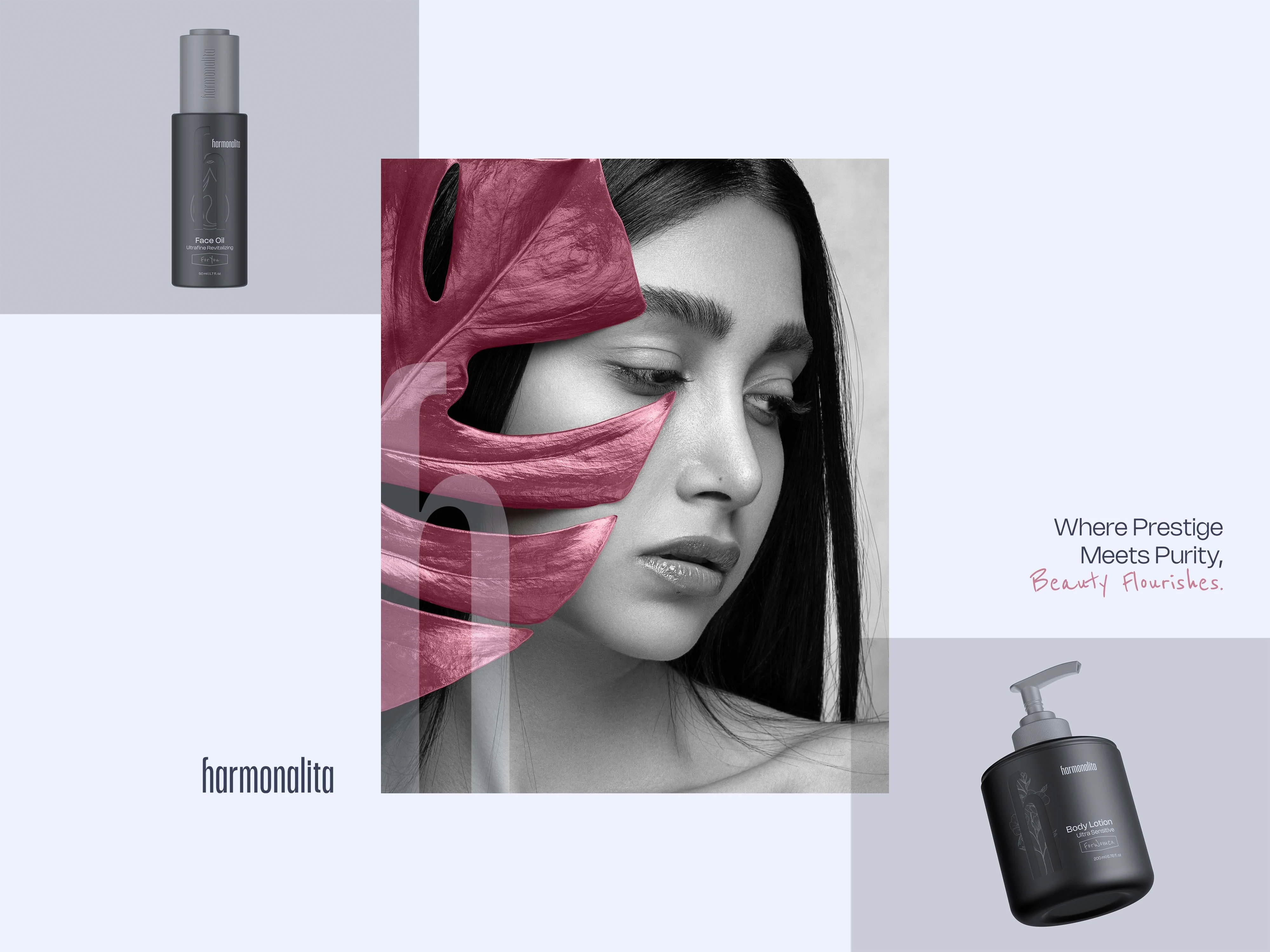
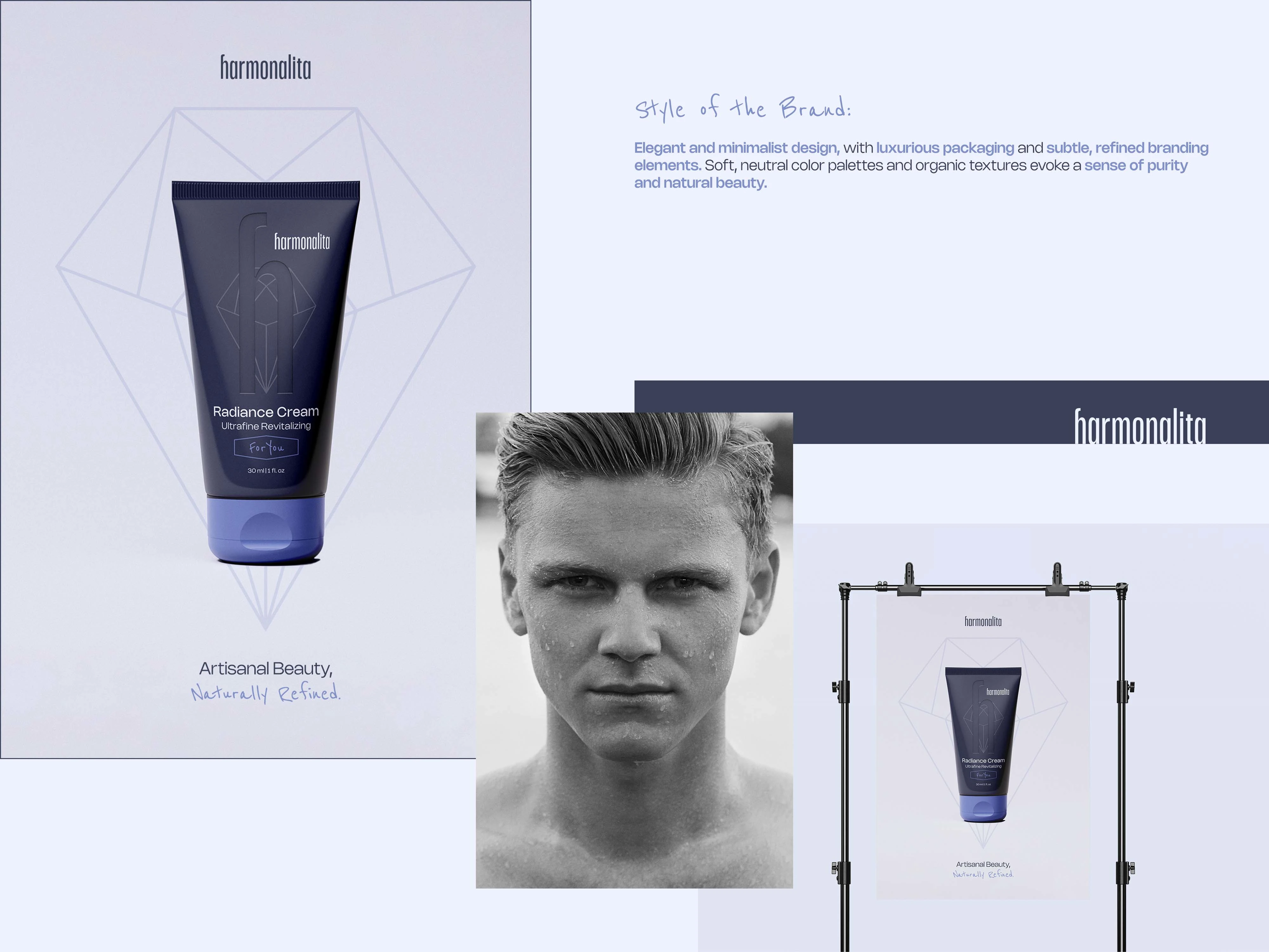
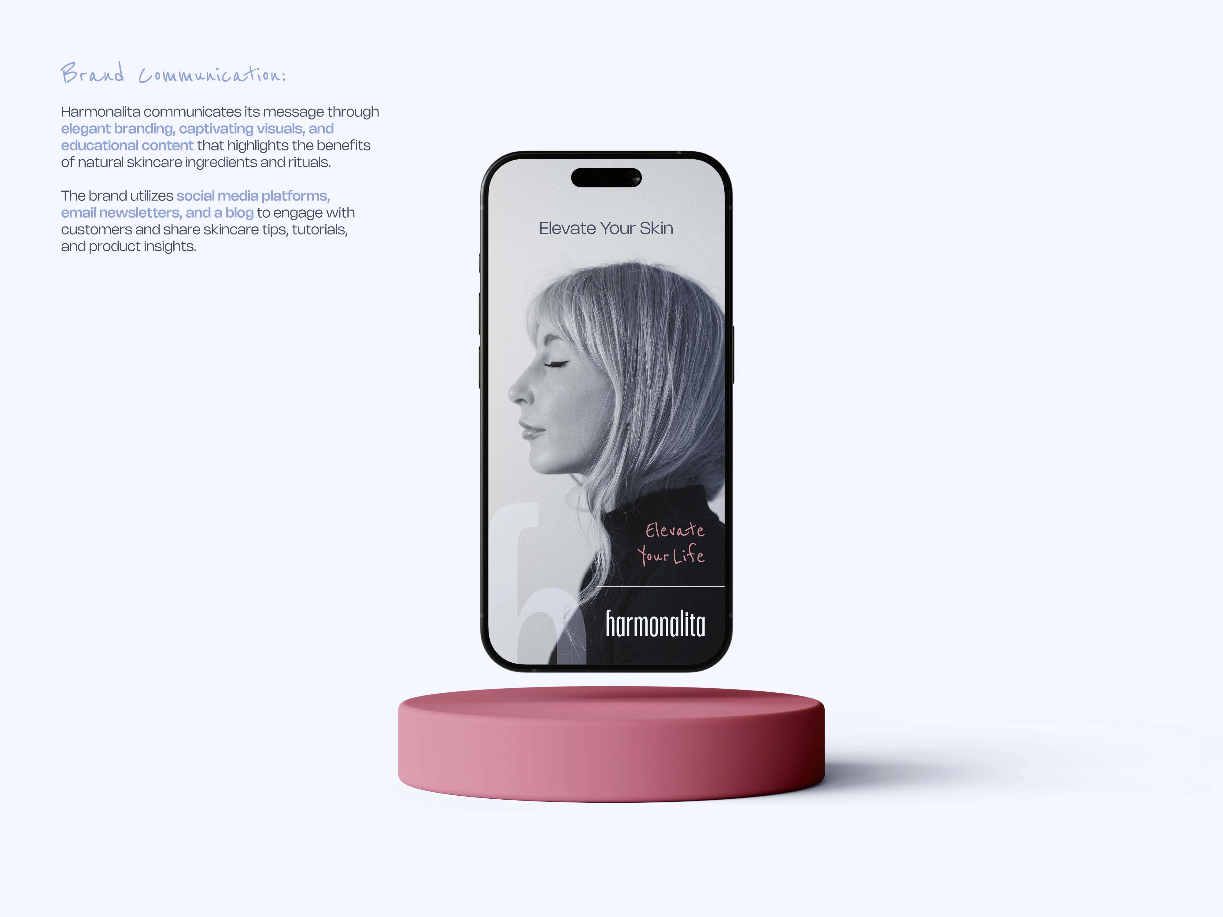
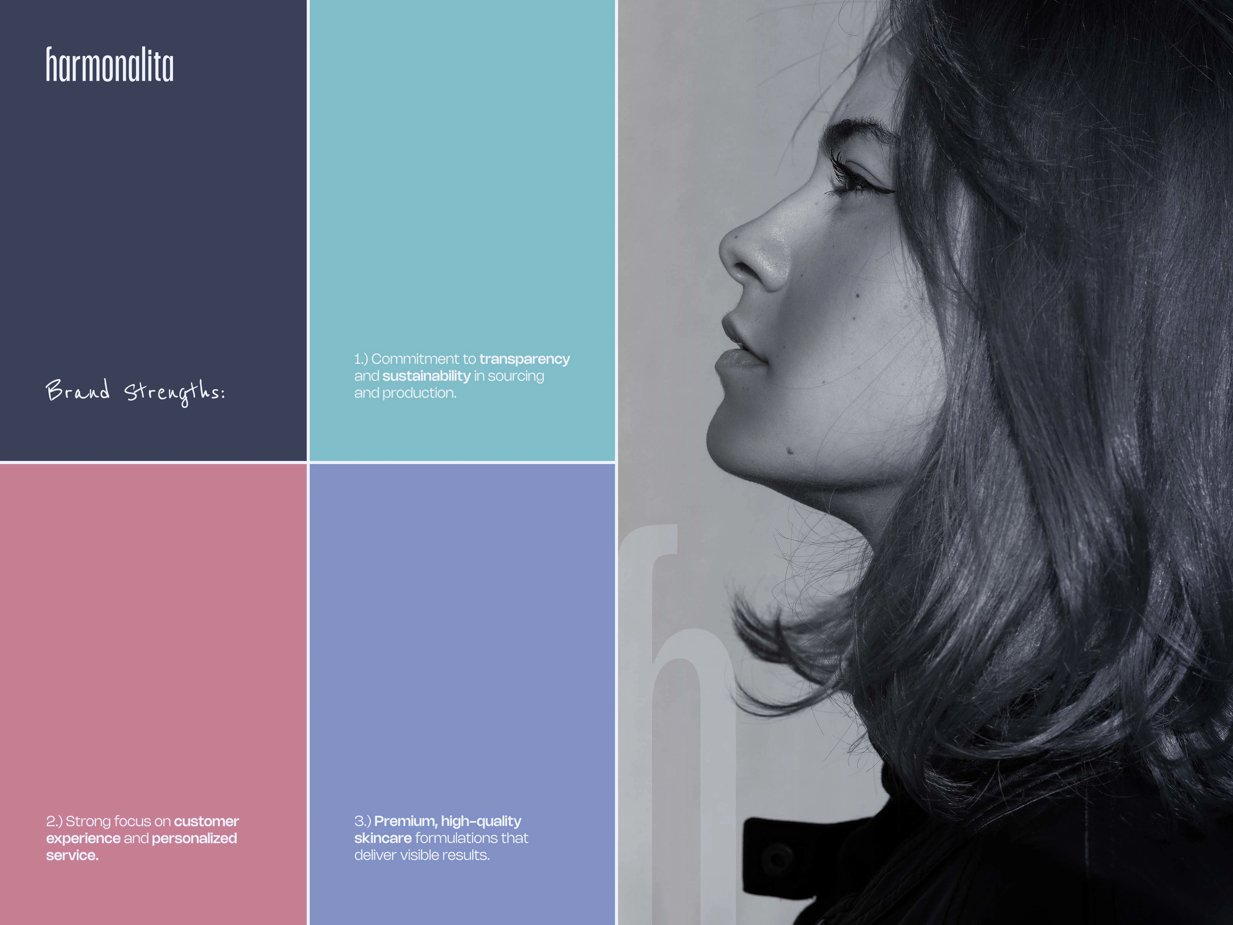
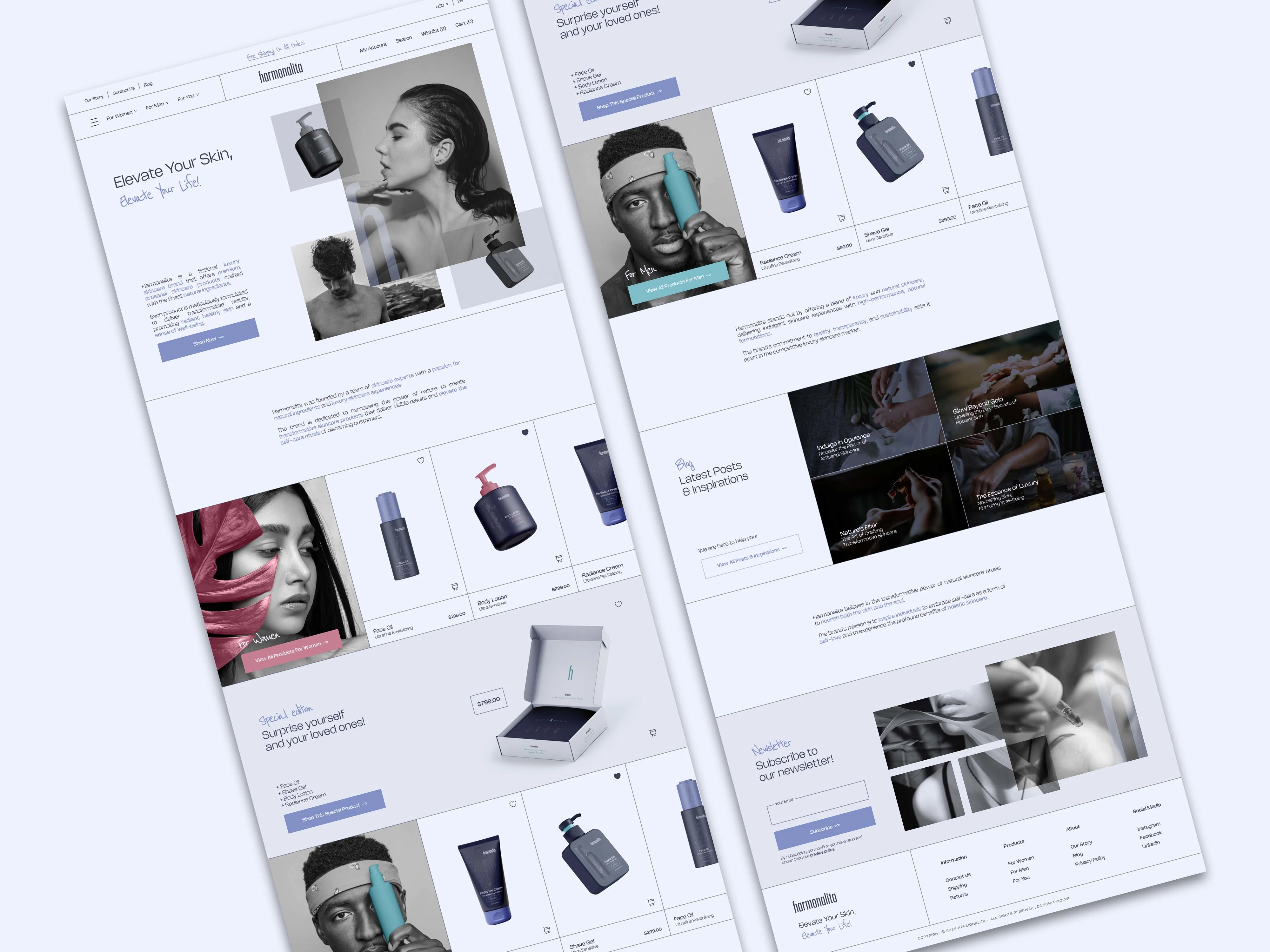
The broader visual language is an exercise in elegant minimalism and quiet luxury. A calming atmosphere is achieved through soft neutral tones, organic textures, and airy compositions, ensuring the artisanal formulas always remain the focal point. Premium packaging details, such as tactile matte finishes and understated metallic accents, reinforce the brand's high-end craftsmanship. This serene aesthetic is seamlessly matched by a restrained typographic system. Clean, uncluttered letterforms with generous spacing create breathable layouts across print and digital interfaces, allowing the brand's sophisticated tone and ingredient transparency to speak with absolute confidence and ease.
Ultimately, the Harmonalita identity represents a masterful balance of natural purity, artisanal craftsmanship, and scientific credibility. By uniting a pump-bottle-inspired logotype with a minimalist, deeply atmospheric visual world, the concept shows how thoughtful design can elevate a product line and build genuine emotional connections. It provides a cohesive, premium foundation for a brand designed to meet the demands of discerning customers who expect transformative results, sensorial richness, and unwavering integrity from their luxury skincare rituals.
Like this project
Posted Jul 7, 2026
A high-end brand identity for Harmonalita, blending natural skincare rituals with elegant minimalism and a premium, cohesive visual system.