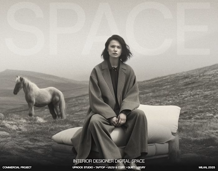
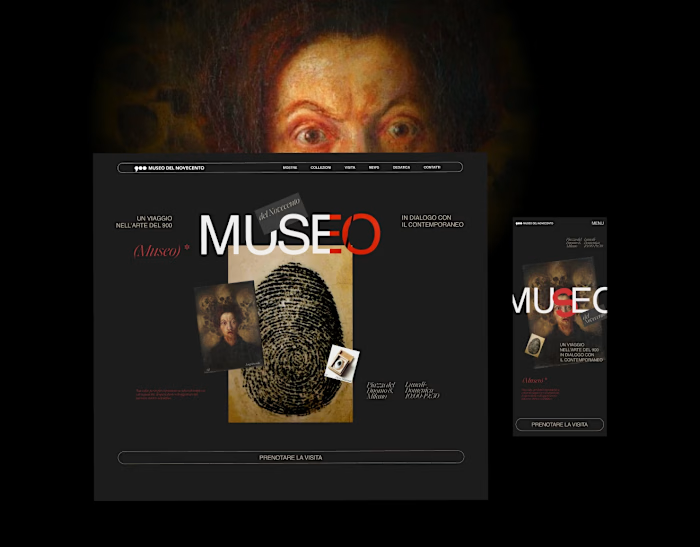
Studio web site redesign

Marina Goncharenko


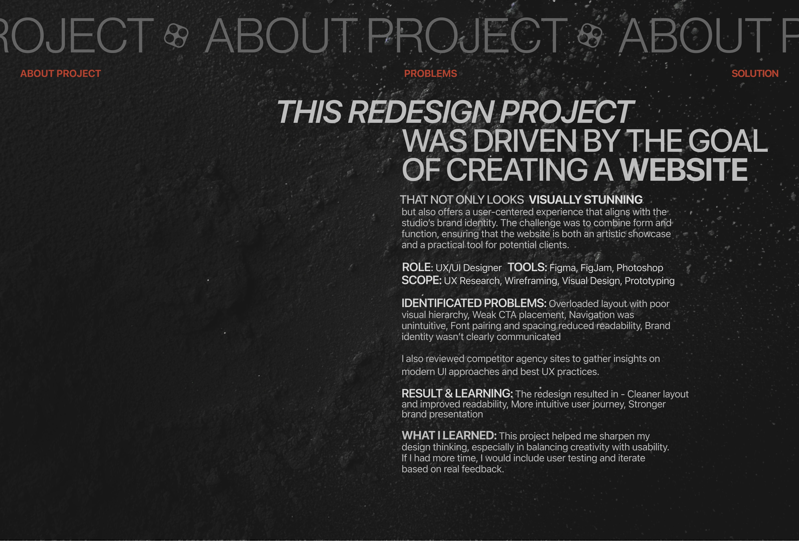
THE CHALLENGE
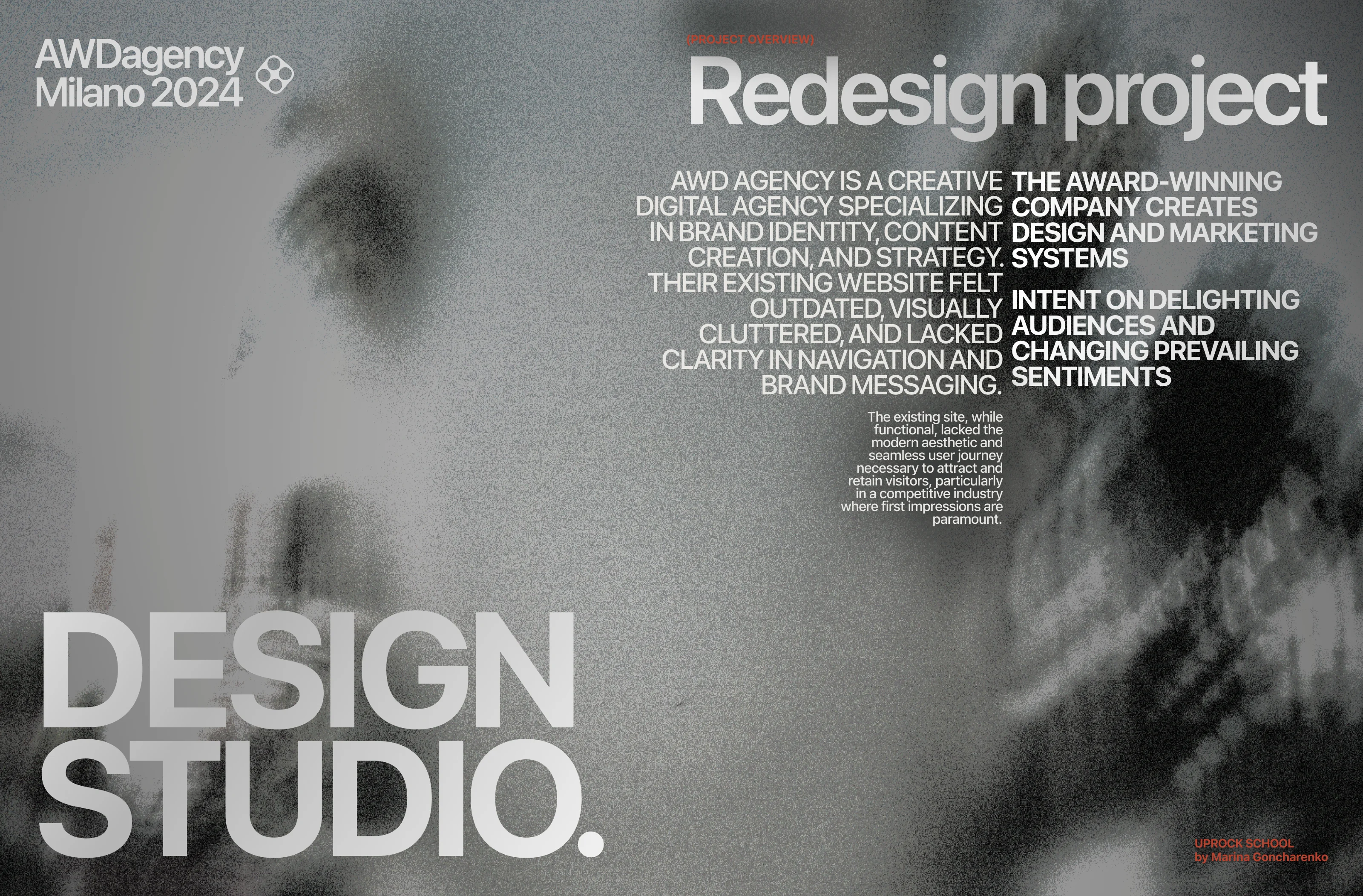
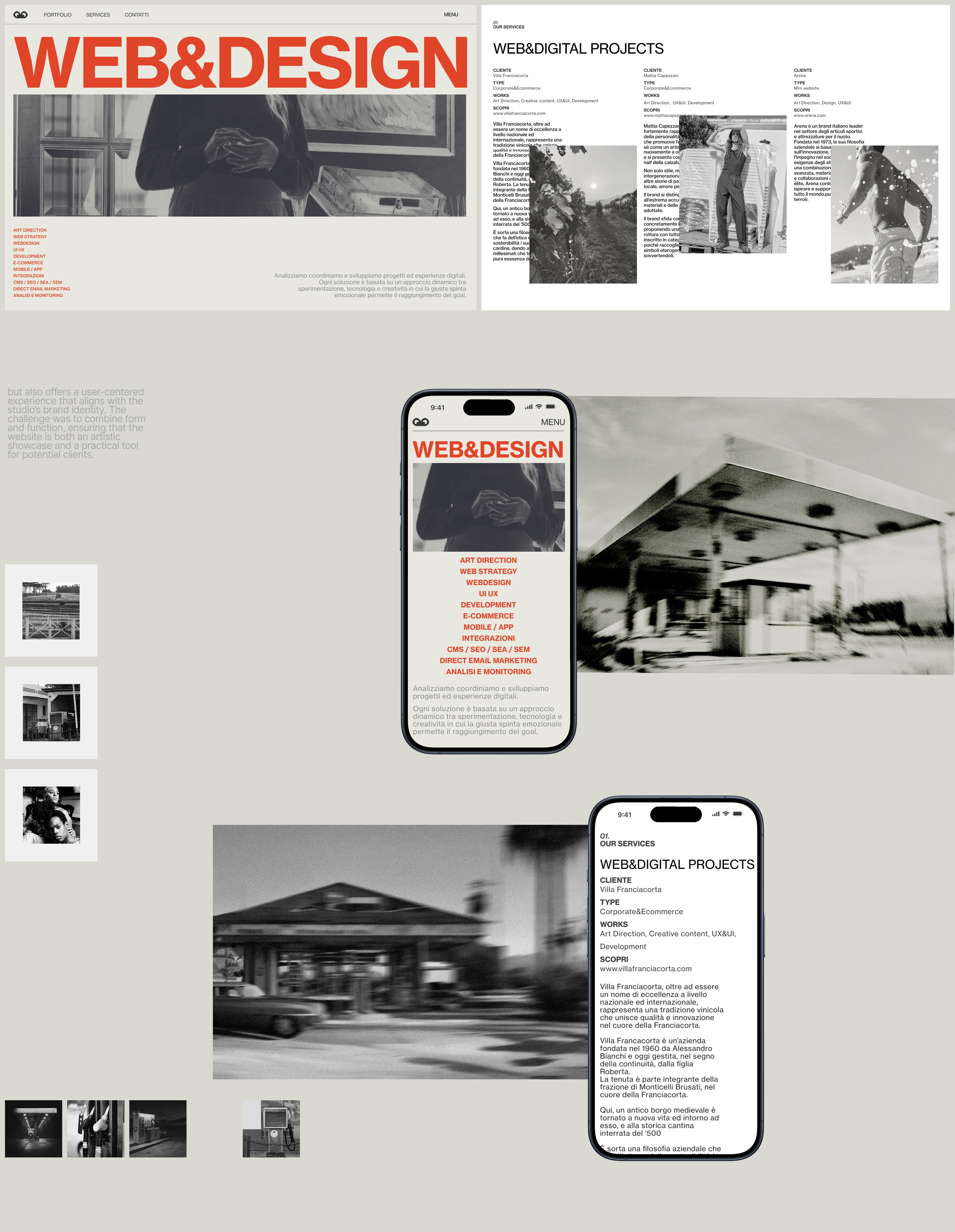
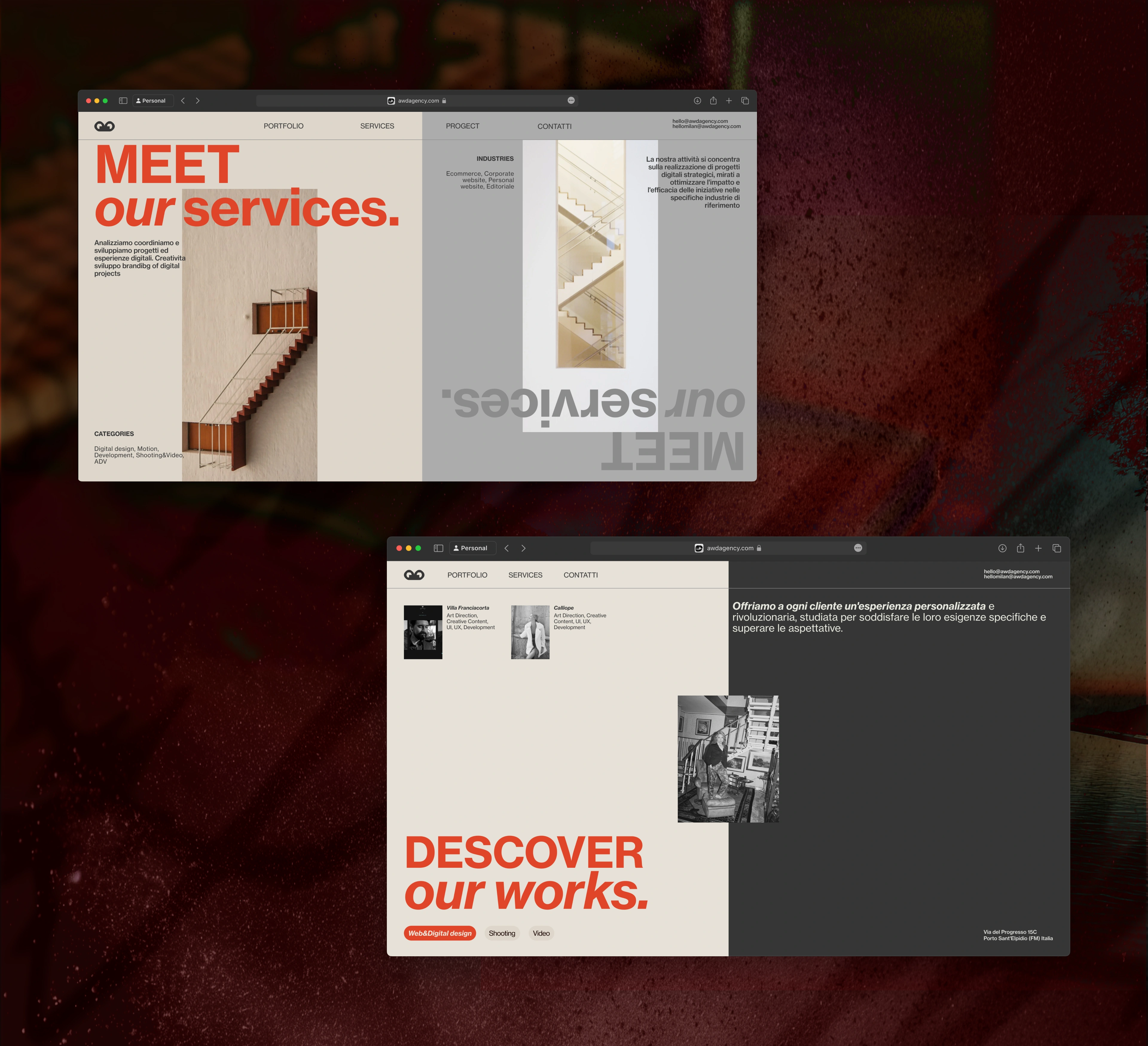
The studio had a strong body of work, but its digital presence did not communicate that value with the same clarity and impact. The challenge was to improve hierarchy, simplify navigation and make the portfolio easier to explore.
THE SOLUTION
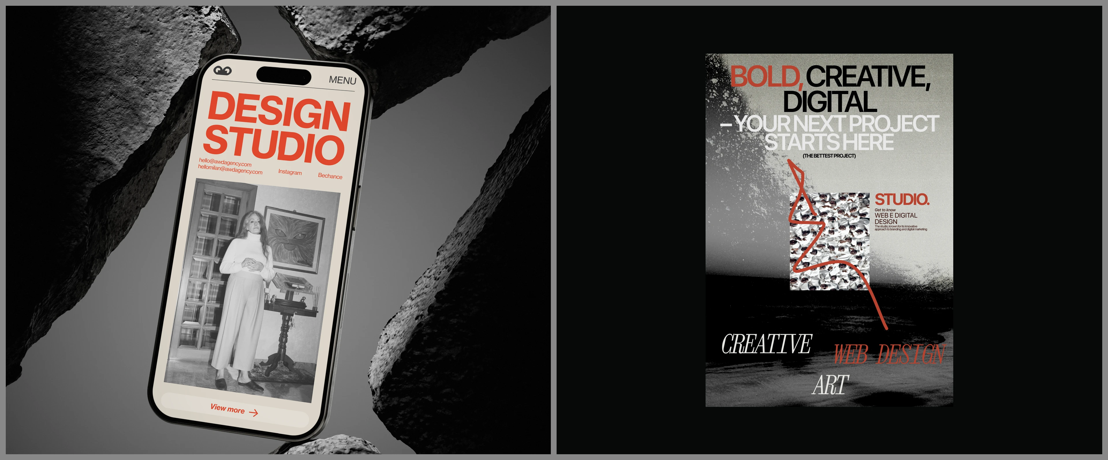
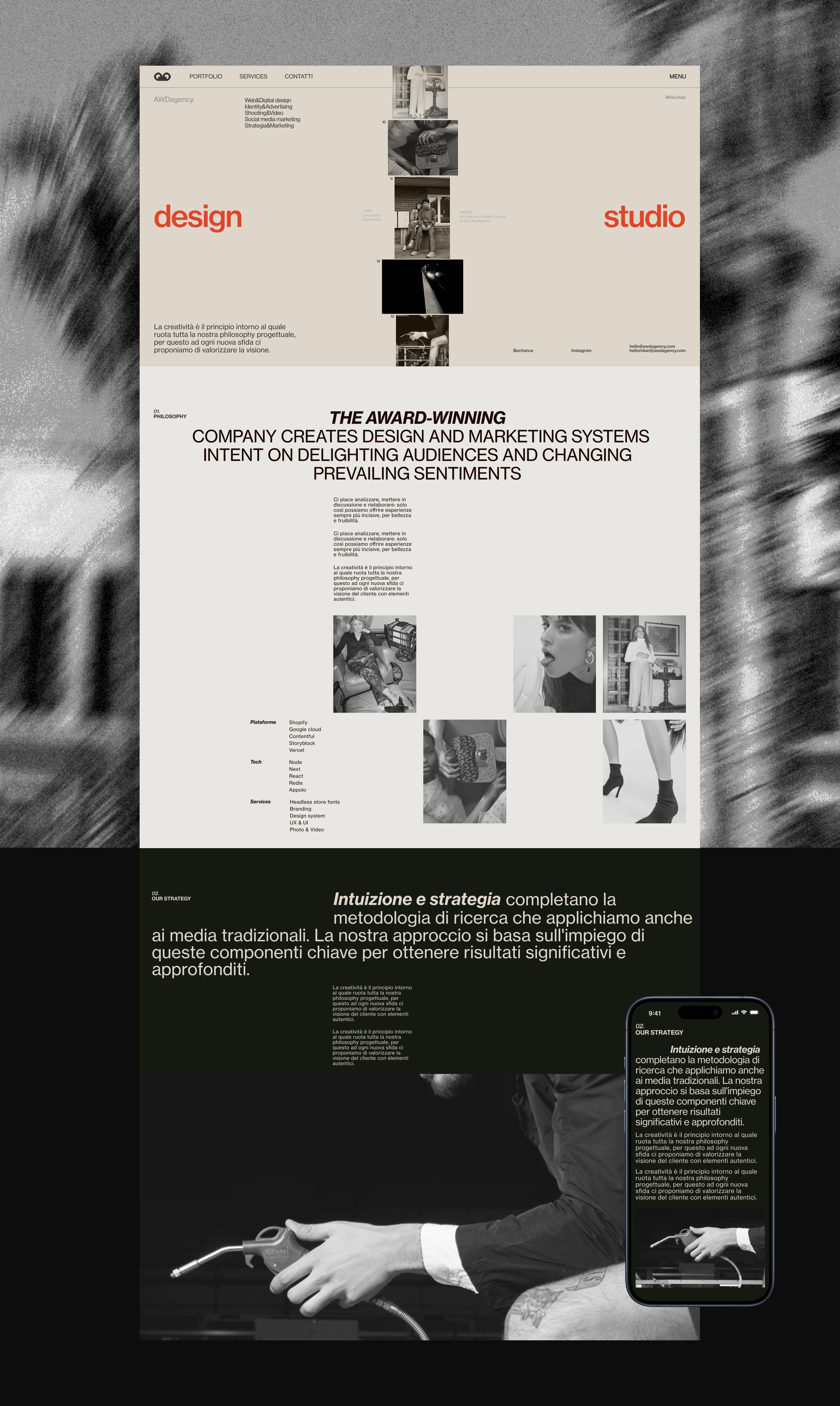
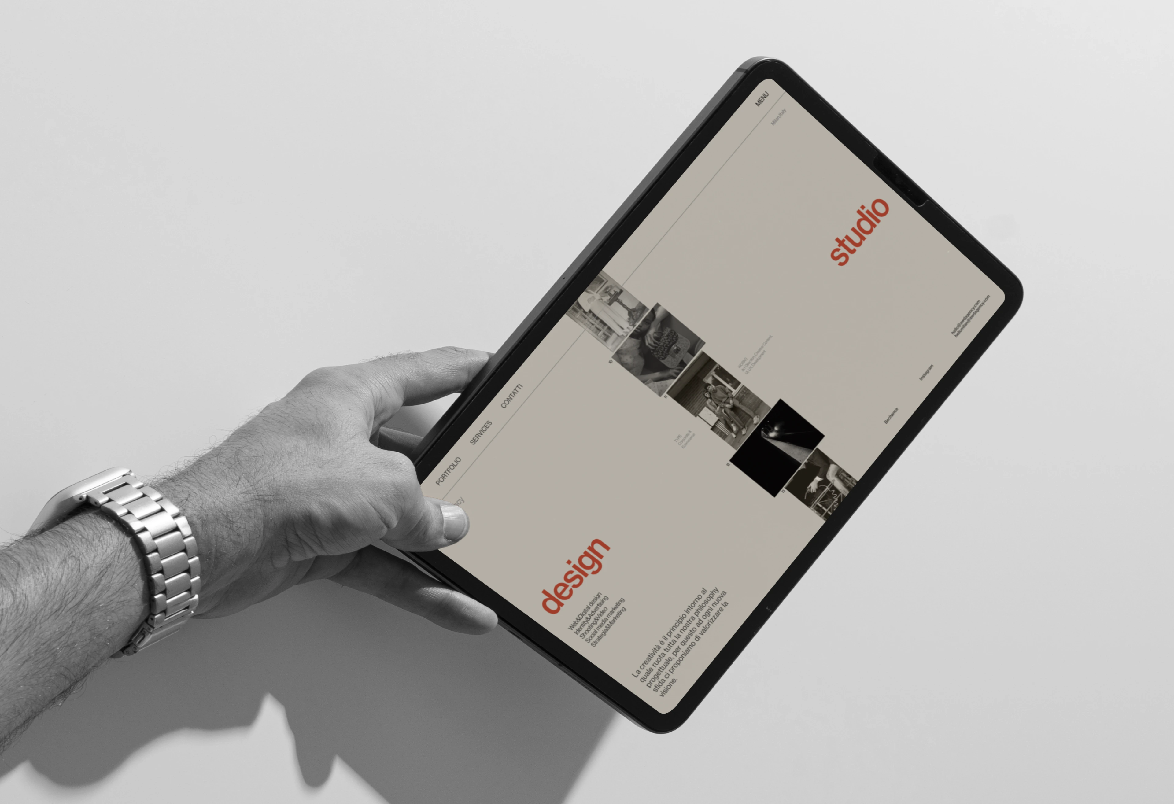
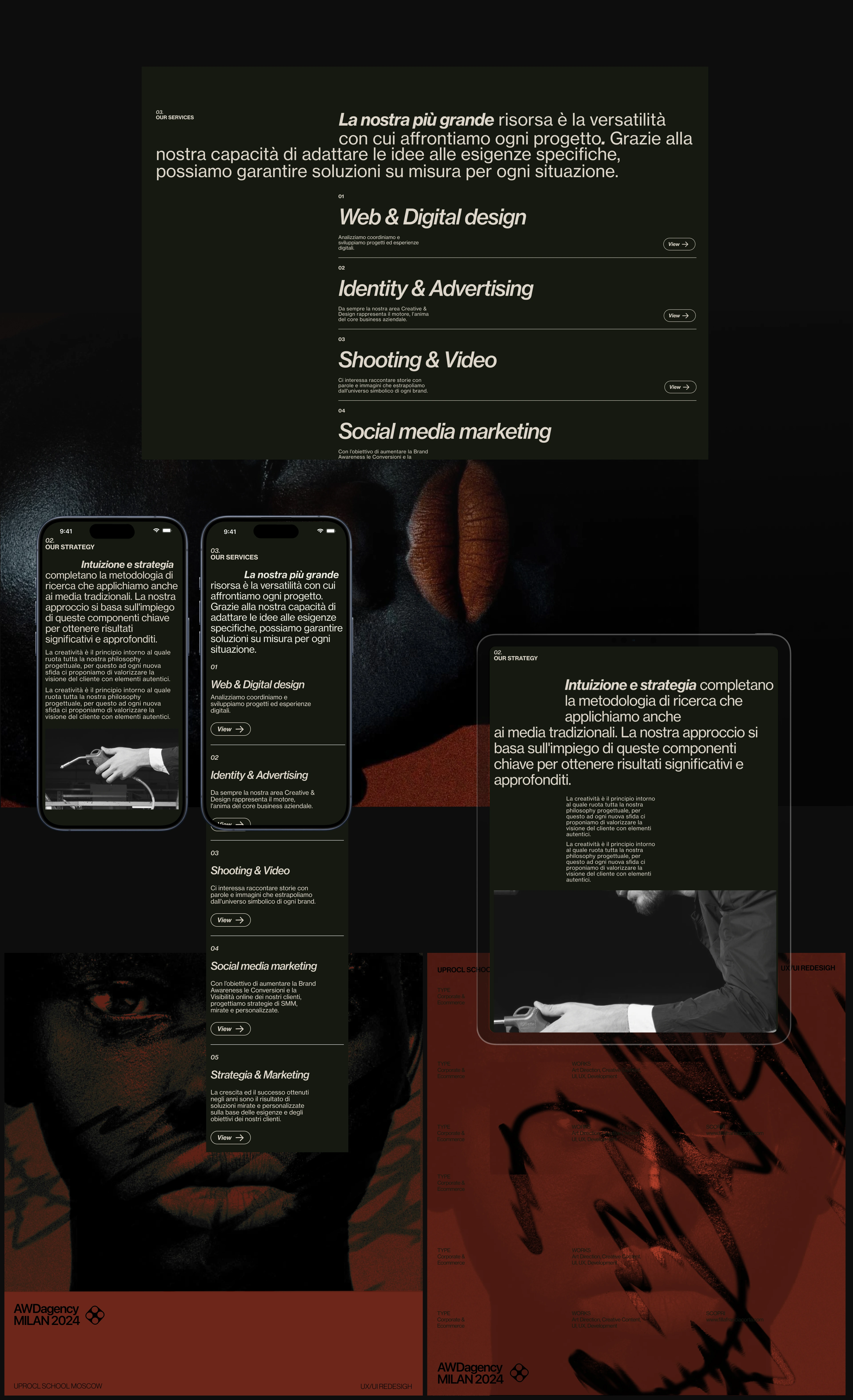
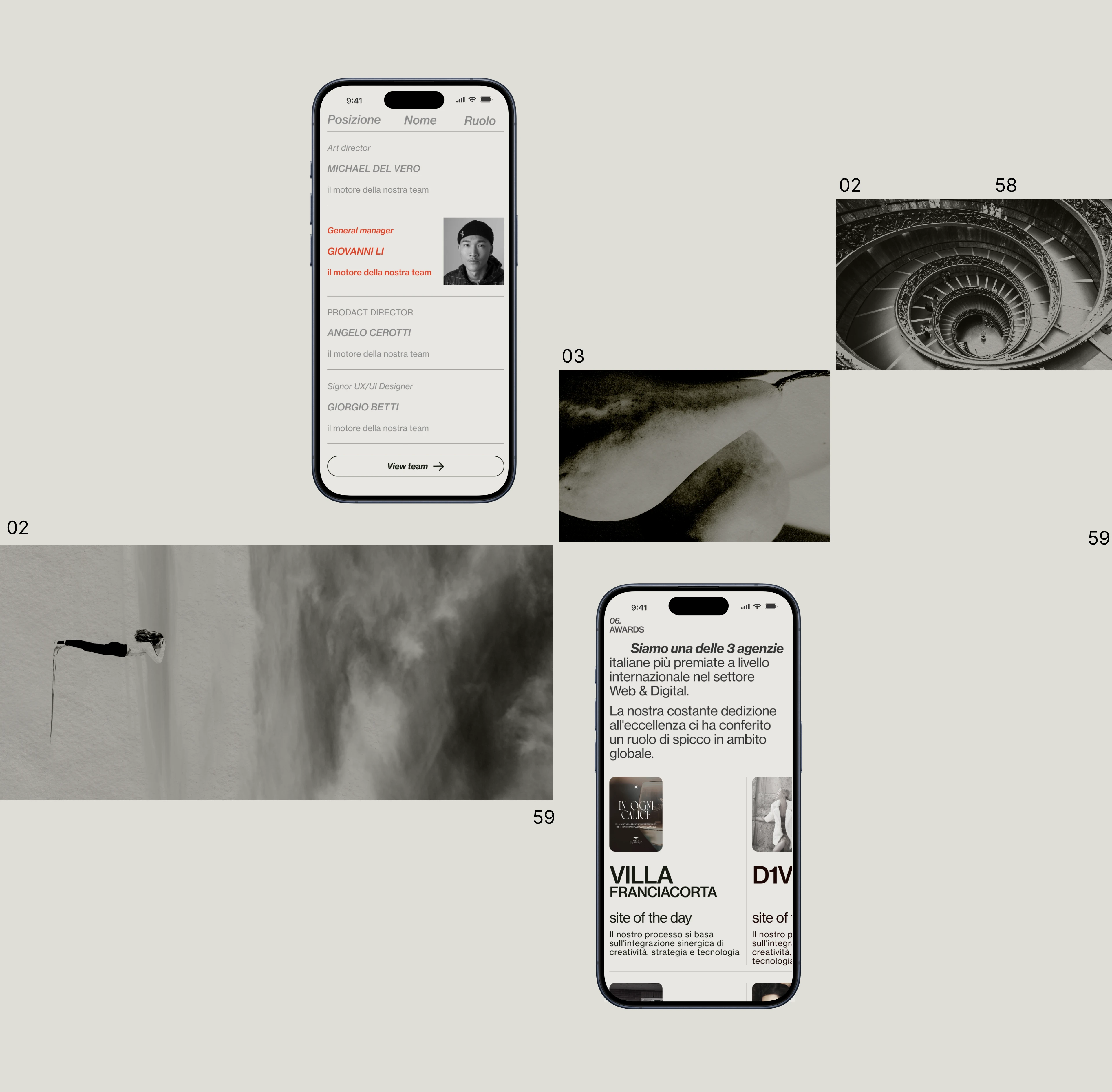
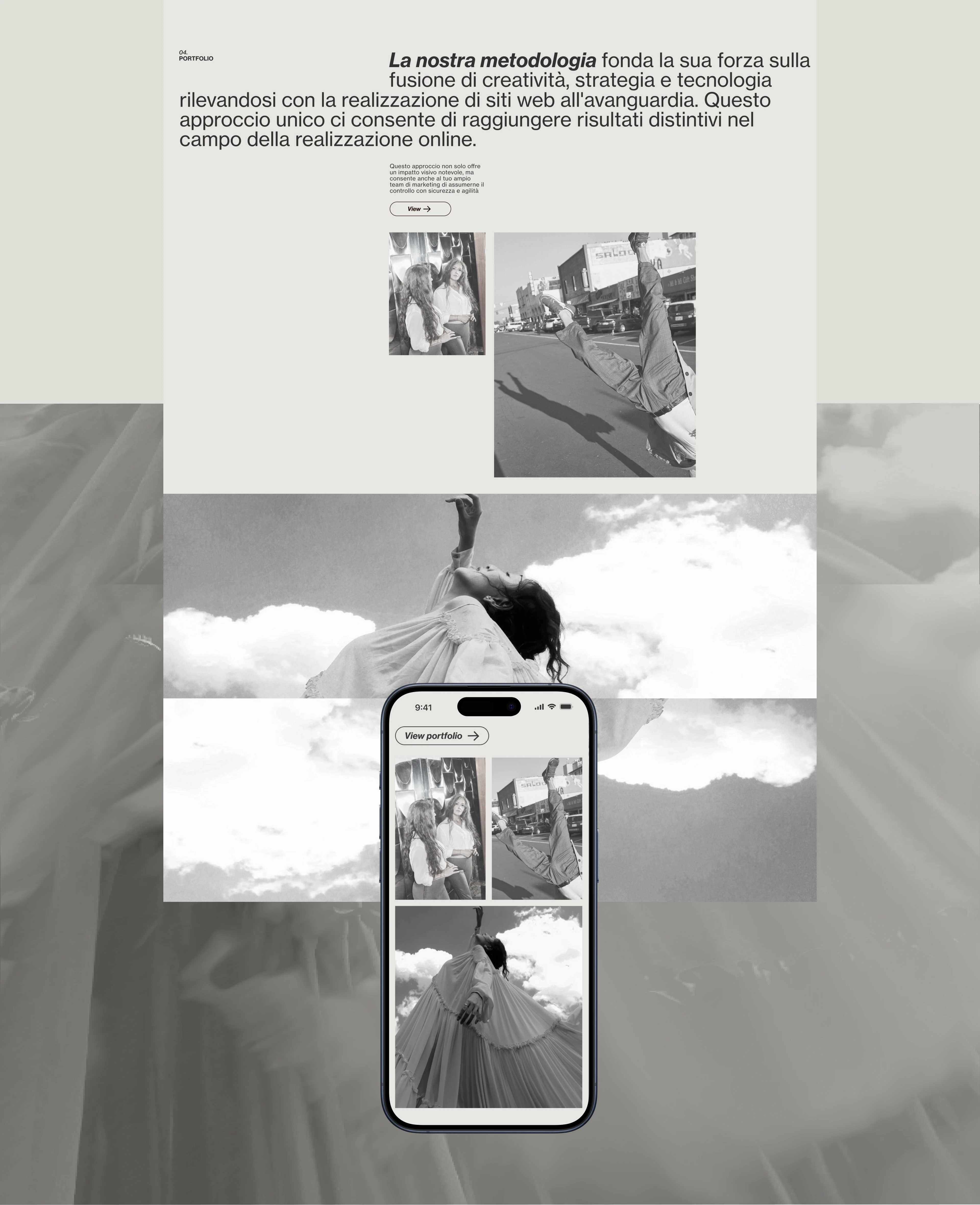
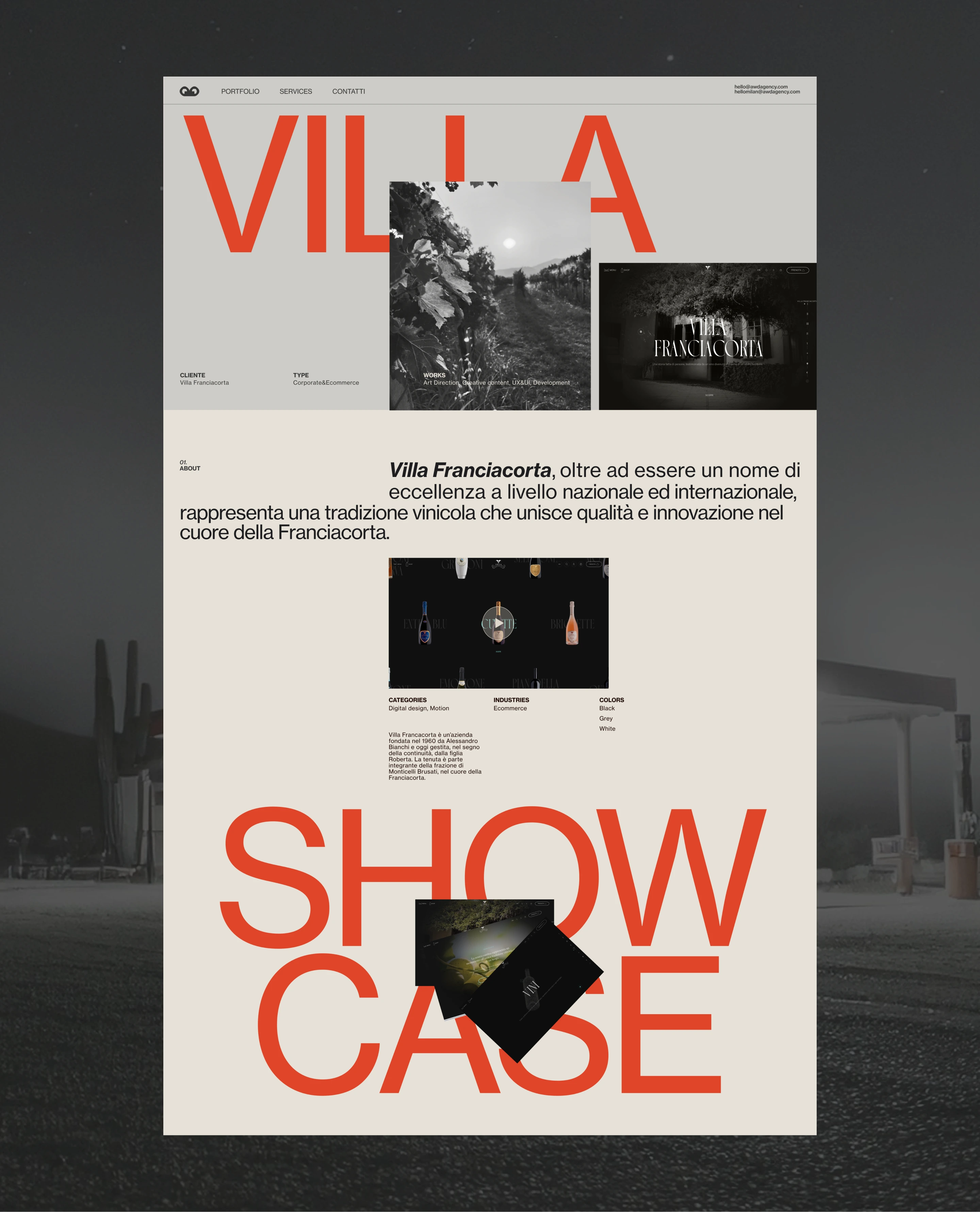
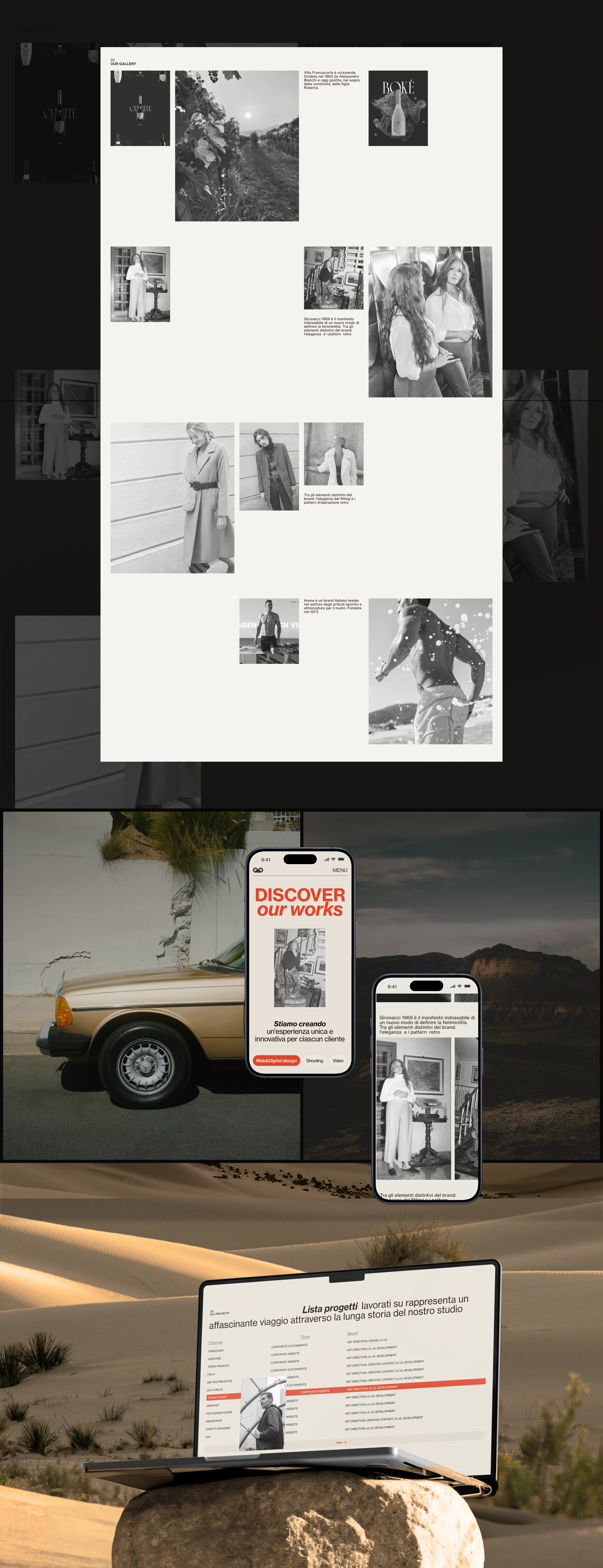
I redesigned the website around a bold editorial system with clearer information architecture, stronger typography and a more structured project presentation. Motion and visual contrast were used to guide attention and give the studio a more distinctive digital identity.
THE OUTCOME
The concept creates a clearer and more memorable experience, allowing visitors to understand the studio’s positioning, explore its work more easily and move towards an enquiry with greater confidence.
Like this project
Posted Jun 10, 2026
Created a concept redesign for a creative studio, improving hierarchy, navigation and visual impact through a bold editorial system.
Likes
1
Views
7
Timeline
Sep 27, 2024 - Oct 27, 2024