Blue Badge Bay
Project Overview
This is a concept mobile application designed specifically with Blue Badge holders in mind. The main purpose of this app would be to identify and guide users to available Blue Badge parking spots in a clear manner.
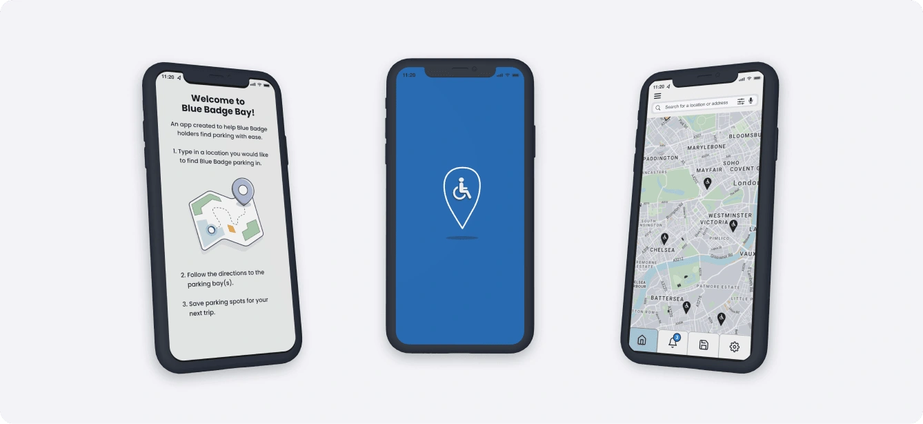
Blue Badge Bay app UI design concepts.
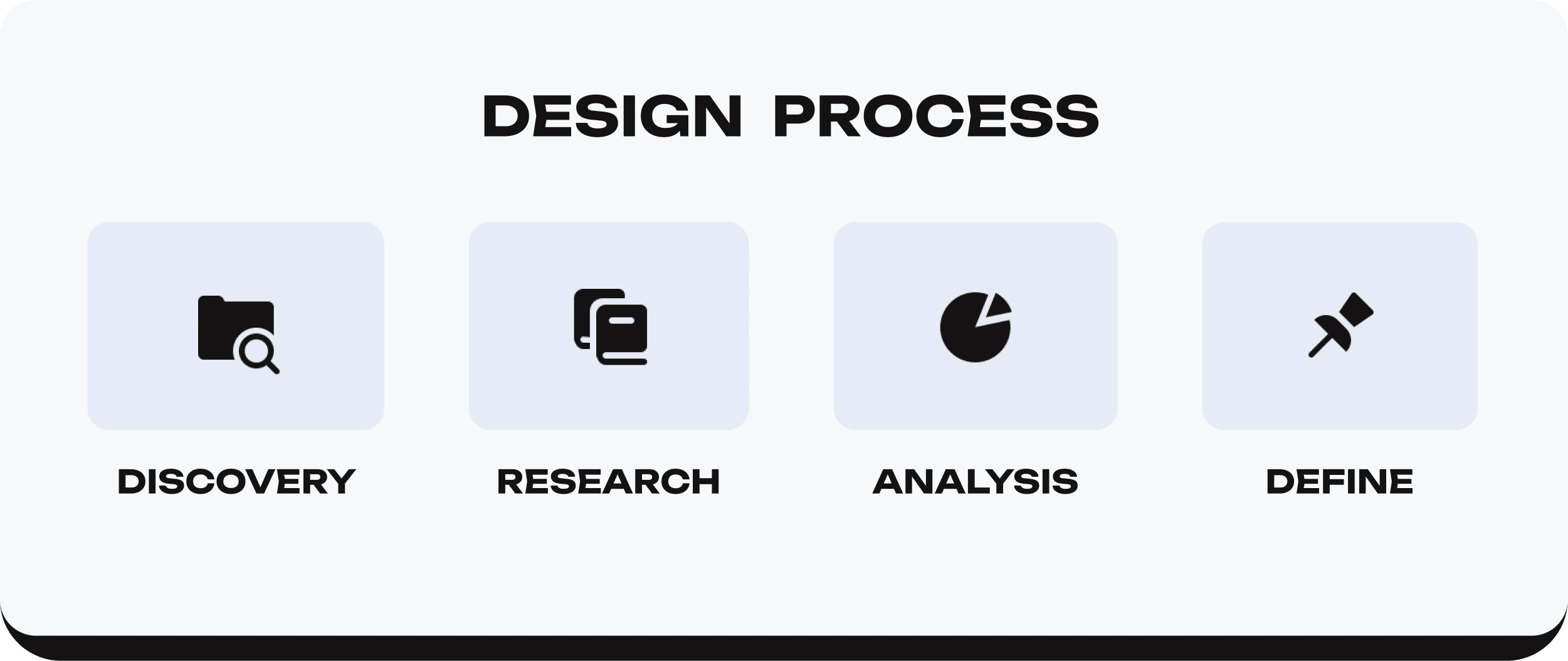
UX Design process used so far in the project.
Discovery
Background context
Exploratory research
Background
As a carer of a Blue Badge holder, I was searching for a Blue Badge parking application to find Blue Badge parking within London and only found one viable app. While there were applications for general parking, I discovered only one dedicated to Blue Badge parking.
Having an app specifically for Blue Badge parking is important as users may have disabilities that other parking apps may not accommodate. Some examples of useful features would be text-to-speech, legible fonts and a good colour contrast ratio.
Exploratory Research
I created a mindmap to delve into Blue Badge parking issues, explore user research methods, and identify key areas for investigation. This helped me prioritise questions for the survey as I could refer to aspects of Blue Badge parking I wanted to further explore on the mindmap.
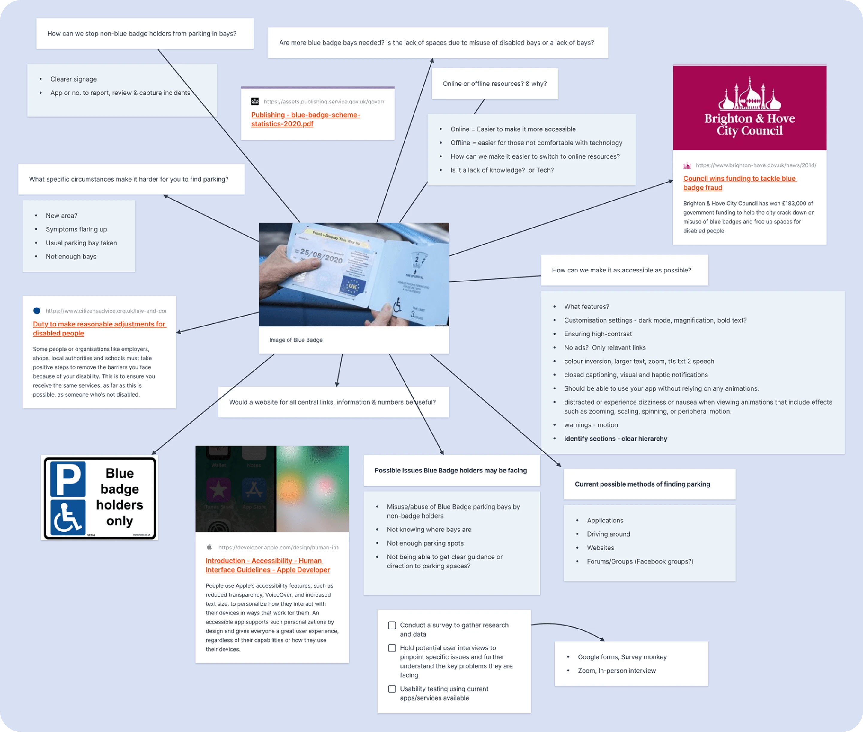
Notes exploring possible issues Blue Badge holders may face in regards to parking.
Research
Competitor analysis
User research
Surveys
Interviews
Project possibilities
Competitor Analysis
There has only been one application created solely for Blue Badge parking. The "Blue Badge Parking" app had a disorganised user interface which affects the usability and user experience of the app.
I also explored other parking applications such as "RingGo" and "DisabledPark". "RingGo" offers users a great user experience and has a good UI design but is used for general parking, not Blue Badge parking.
The “DisabledPark” app does focus on disabled parking but is currently only available on the Play Store or directly on their website. As this app is based in Spain, it doesn’t show all the Blue Badge spaces available in the UK. Though there is an option to change the language to English, it switches back to Spanish when you search for a location.
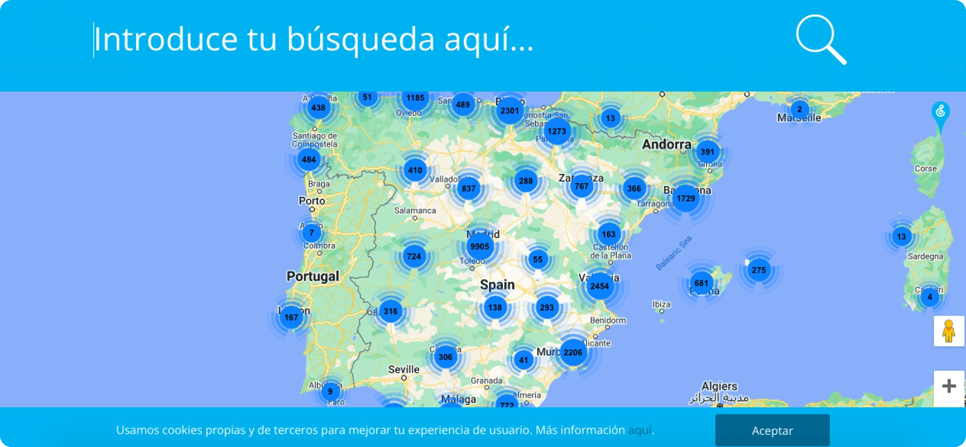
Screenshot of the "Disabled Park" website.
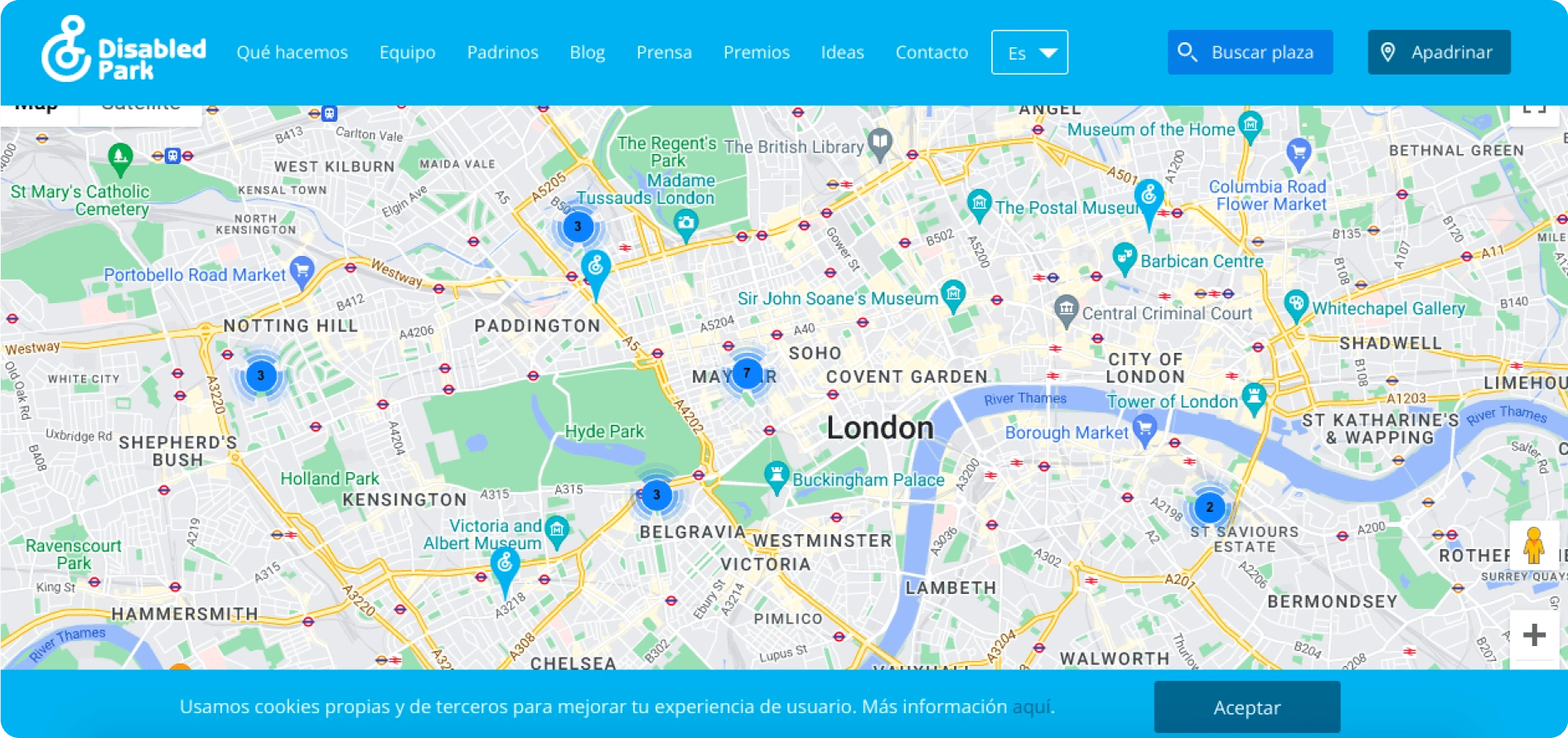
Screenshot of the "Disabled Park" website when searching for parking within London.
User Research
I conducted user research to better understand and empathise with Blue Badge holders. First, I listed key objectives to guide my research. The research objectives were: to understand parking issues Blue Badge holders face, current workarounds and possible solutions. After defining key objectives, I created a survey to gather valuable insights into their parking experiences.
Survey Research
Most participants said they find it challenging to locate available Blue Badge spaces and often find spaces are full or abused by non-badge holders. Participants said the majority of the time they drive around to find disabled bays as opposed to using parking apps, online forums or websites. Potentially highlighting a need for more accessible Blue Badge parking solutions. I'd like to explore the reasons behind this in future research.
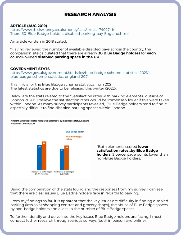
Research analysis notes.
Interviews
I conducted interviews with a Blue Badge holder and carer to further comprehend and define key issues. The Blue Badge holder mentioned that she currently uses the "Ringo" app but that "they don't recognise that you have a Blue Badge or are a motability car...that is a really difficult part of finding Blue Badge parking."
The second participant, a carer, said it would be "extremely useful to have an app to view Blue Badge spaces nearby." The responses I gained from the interviews reinforced the fact that an app or website is needed.
Another key issue raised was the lack of Blue Badge parking bays. Though this is not an issue an application could resolve, I believe knowing if a parking space is taken could be helpful so Blue Badge holders don't have to spend their time driving around, searching for alternative parking.
Analysis
Affinity diagram
State project objectives
UX review
Usability testing
Project possibilities
Affinity Diagram
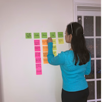
To create an effective problem statement, I used affinity mapping to gather the research and data I acquired from the research and discovery stage. This also helped me organise my research into categories to see which areas needed further exploration. Using this method, I could pinpoint key issues raised and see which ones an application could solve or facilitate.
The problem statement I created was “Blue Badge holders need to locate and access disabled parking spaces to simplify, expedite, and reduce the stress of their journeys."
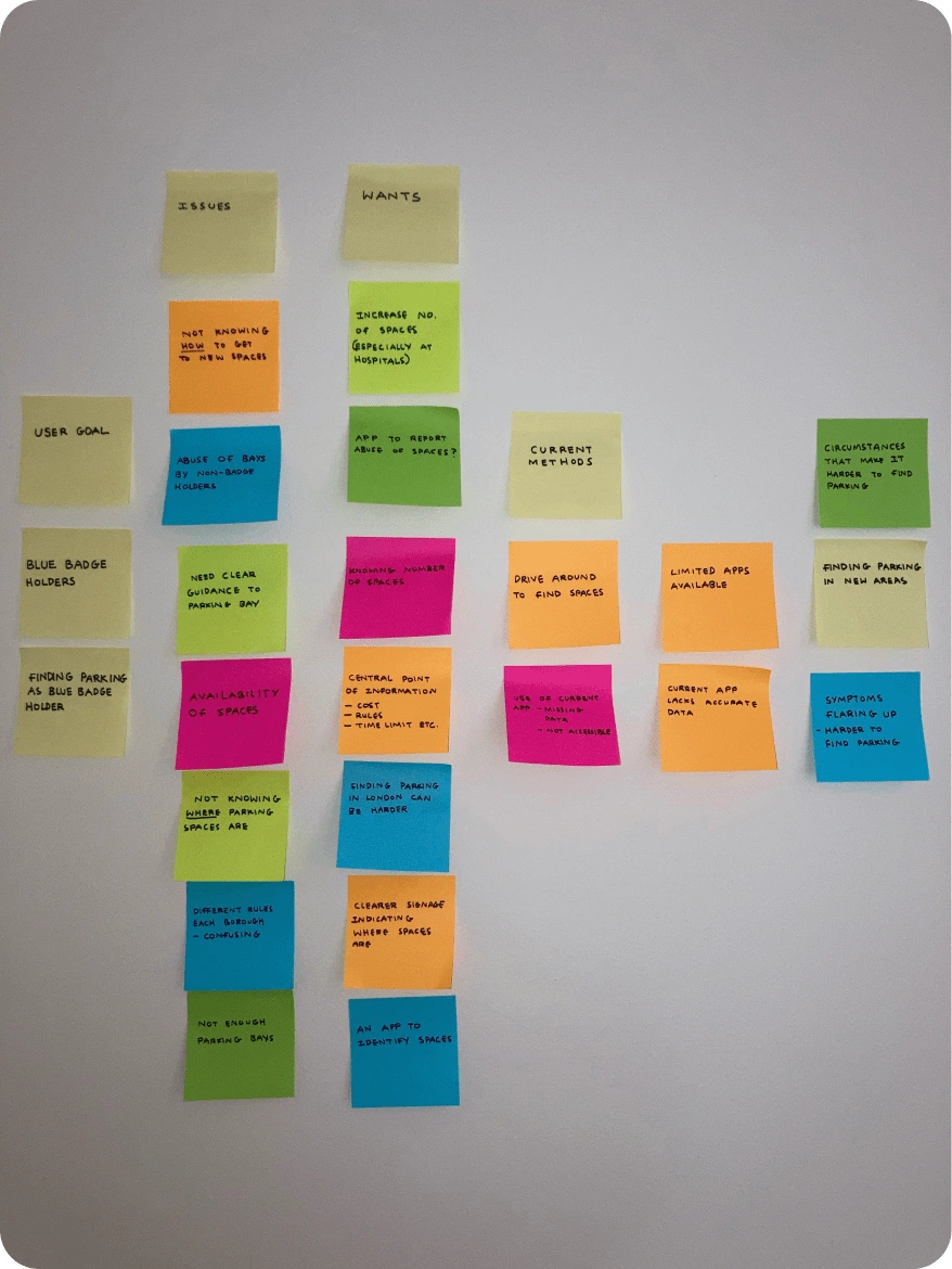
Affinity map that is organised into several categories with subheadings.
Project Objective
The main goal of this project is to design an application or website to help Blue Badge holders find disabled parking bays as quickly and efficiently as possible. I would also like to provide users with accurate, up-to-date information regarding disabled parking rules and regulations. Ideally, this project would guide Blue Badge holders to available parking spaces in a clear and accessible manner, relieving them of the stress associated with searching for parking.
UX Review (Blue Badge Parking app)
When searching for which applications focus solely on Blue Badge parking, I found the "Blue Badge Parking" app. I conducted a UX review by downloading and using the Blue Badge Parking application.
Whilst assessing the app's accessibility and ease of use, I found the progress bar very confusing starting from 190 and ending with 8020. The notice in the middle of the screen also constantly changes colour and is hard to read due to the poor colour contrast, posing challenges for users with visual impairments.
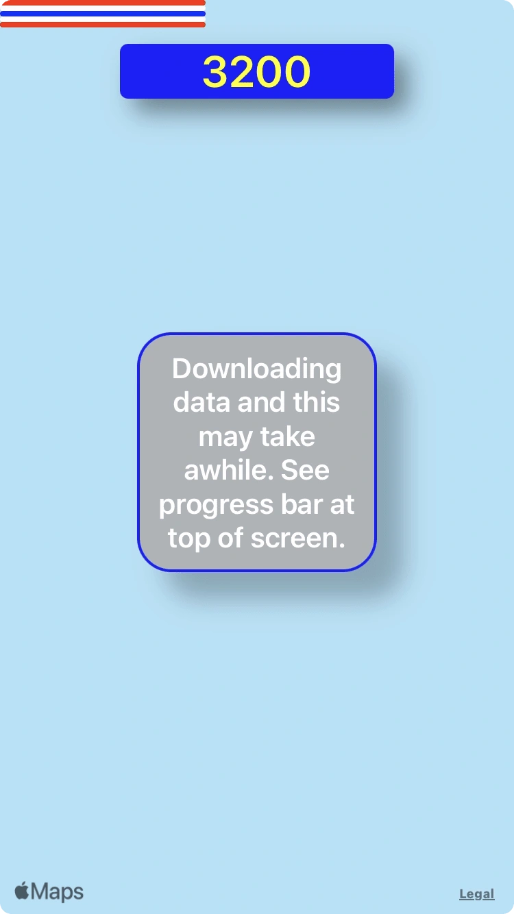
Screenshot of the loading screen on the Blue Badge Parking app.
Once I searched for parking, the results appeared instantly with icons representing where the Blue Badge spaces would be. Rather than being shown results within close proximity to the chosen area, I was presented with an overwhelming amount of parking spaces in surrounding areas too. I had to zoom in further to find parking within the desired area.
When I clicked on a parking space, I was provided with navigation options such as being directed to a map application where I could get directions to the parking space. There is also a satellite view in the corner but having it constantly on the edge of the screen could lead to accidental clicks, impacting user experience. This could be improved by adding it as an option in a search filter.
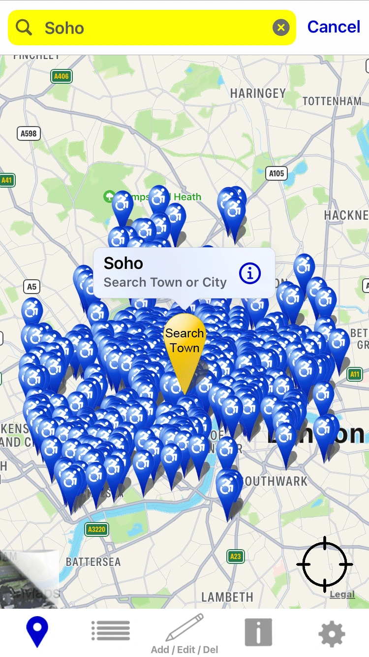
Screenshot of the Blue Badge Parking app.
The app, though not overly challenging, requires improvement. User reviews mentioned inaccuracies due to open editing on the location of the spaces and some suggested UI enhancements. Considering the developer stated that he is visually impaired and lacks graphic design experience, it was a commendable effort.
UX Review (Blue Badge Bay Website)
I found the UI of the website a lot messier than the application. As soon as I entered the website, I found the layout crowded and the design disorderly. There was a lot of unnecessary text and the floral-shaped icons that represented spaces were overwhelming to look at. Upon entering the website, I found the layout crowded and disorderly with excessive text and overwhelming floral-shaped icons representing spaces. This impeded my task of finding parking. The elements cluttered the page and obstructed the map making it harder to navigate.
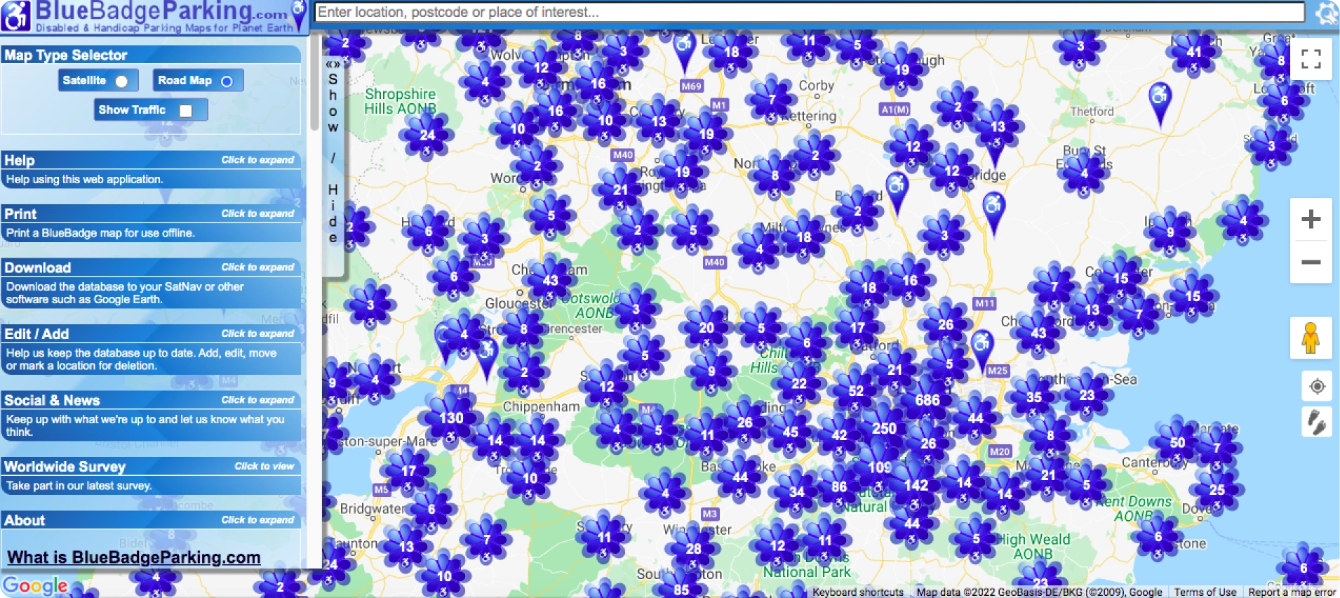
Screenshot of the "Blue Badge Parking" website. (Floral elements represent parking spaces)
As the site loaded, there was an array of loading tiles which could set off symptoms for users with motion sensitivity. I believe the improvements are needed for better usability and accessibility for all users.
Affinity Mapping
To prepare for the usability test, I created an affinity map outlining tasks I wanted users to complete, assessment measures and questions I wanted to answer. I then organised the information into categories and prioritised it accordingly.
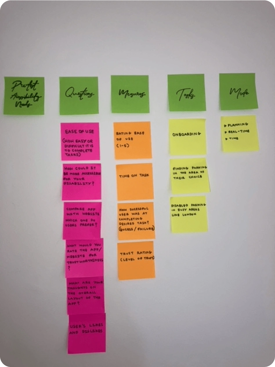
Affinity map organised into categories.
Usability Testing
I conducted usability tests to see if there was a correlation between my UX review and a user's experience with the application and website.
After explaining the usability test process and going through the tasks, we began the test. The first participant found the website particularly challenging to use due to her disability. She found the website "difficult to use due to the motion of the loading icons". Due to her disability, she cannot view flashing images and motion effects. The moving icons in the background set off her symptoms which meant it took her longer to complete the task of finding parking.
She also found certain elements of the application triggered her dizziness. Particularly the loading bar and the "overwhelming cluster of icons". This reinforced the conclusion from my UX review that the application needs to be more accessible
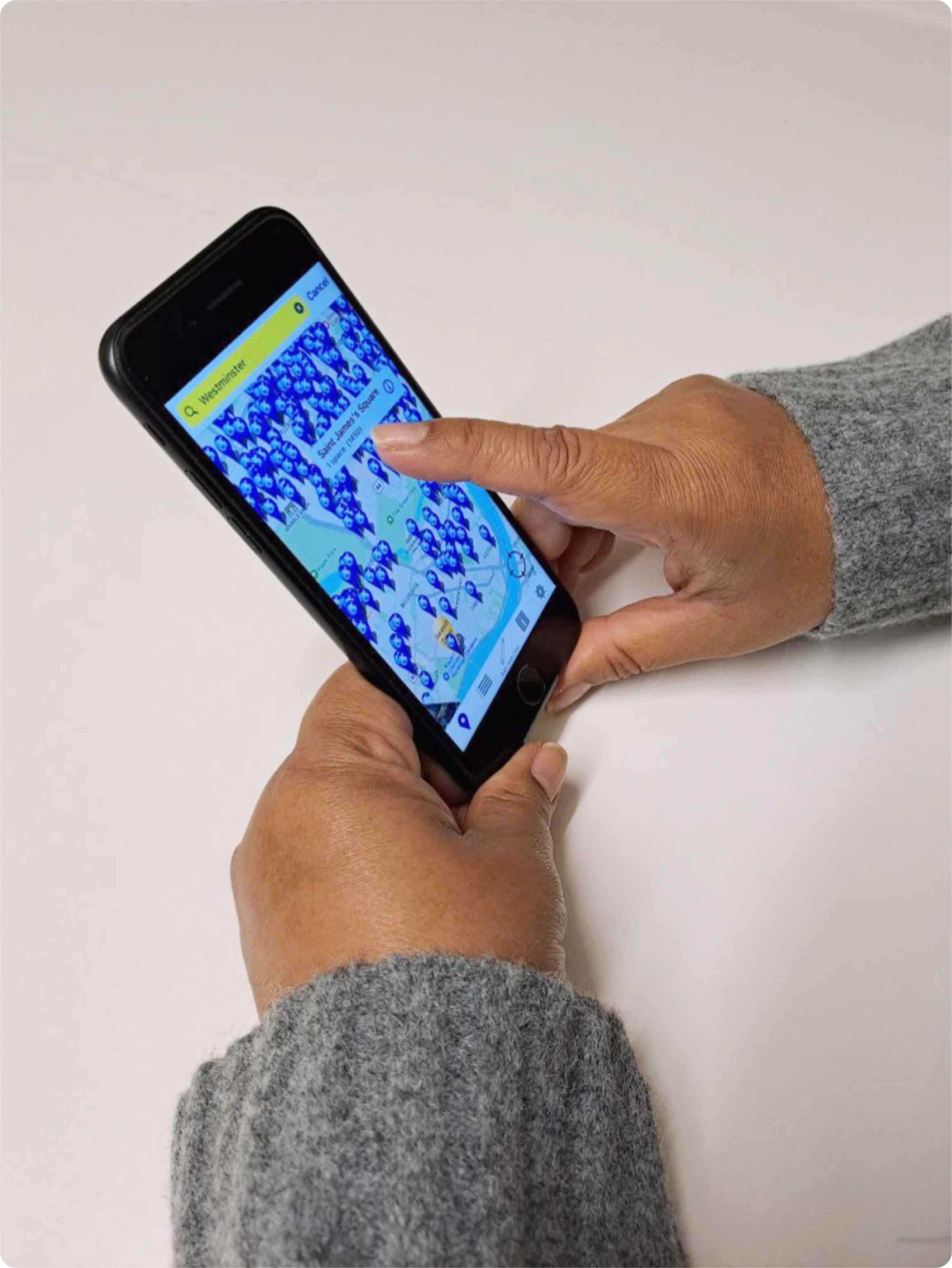
Usability test with Blue Badge holder using the Blue Badge Parking app.
Using Zoom, I had a call with the second participant where I got her consent to record the session so I could refer to it when taking notes and analysing her responses. During the usability test, I discovered that the Blue Badge Parking application differs for Android users. Android users are directed to the website as opposed to the application.
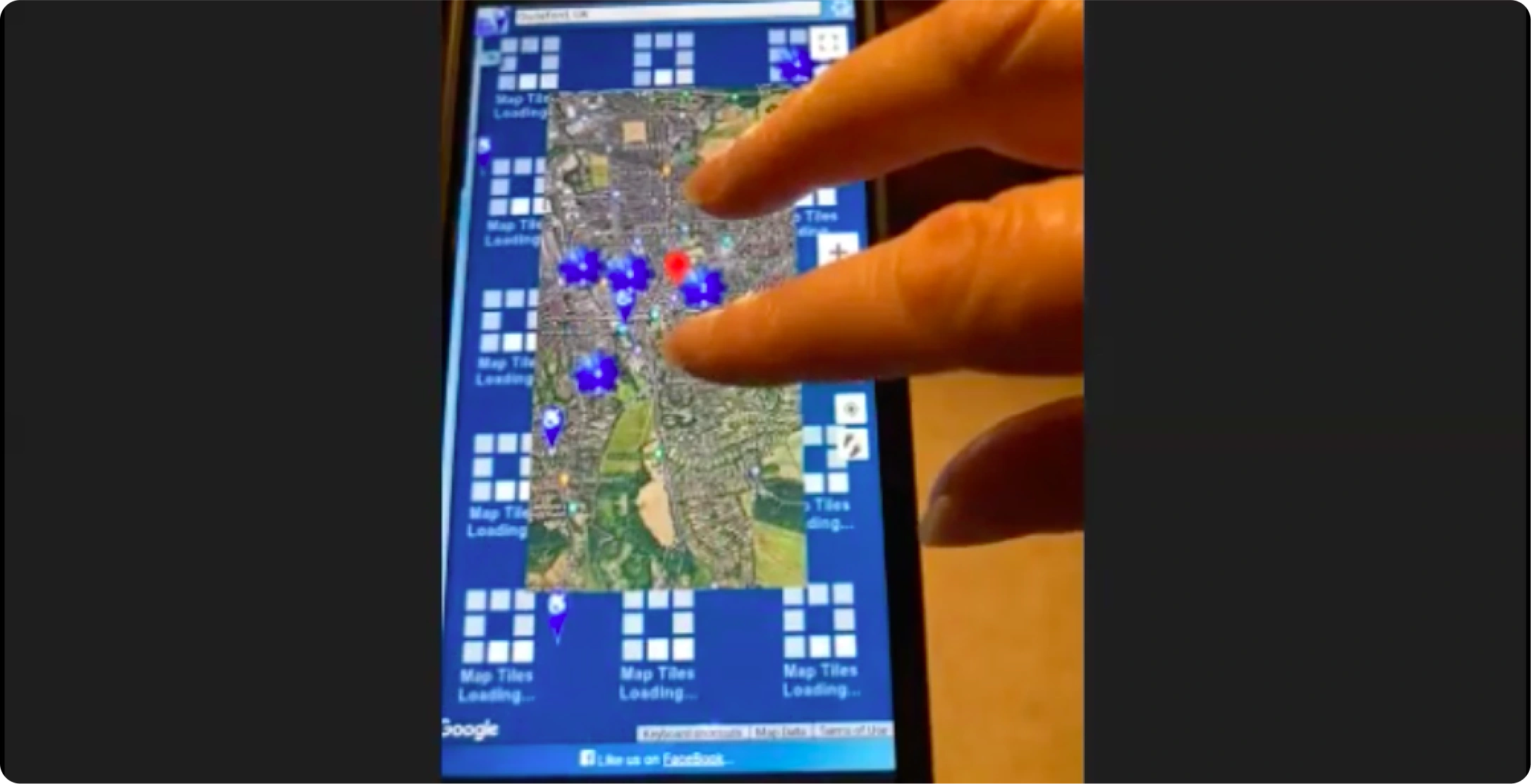
Screenshot from usability test showing the cluttered loading icons.
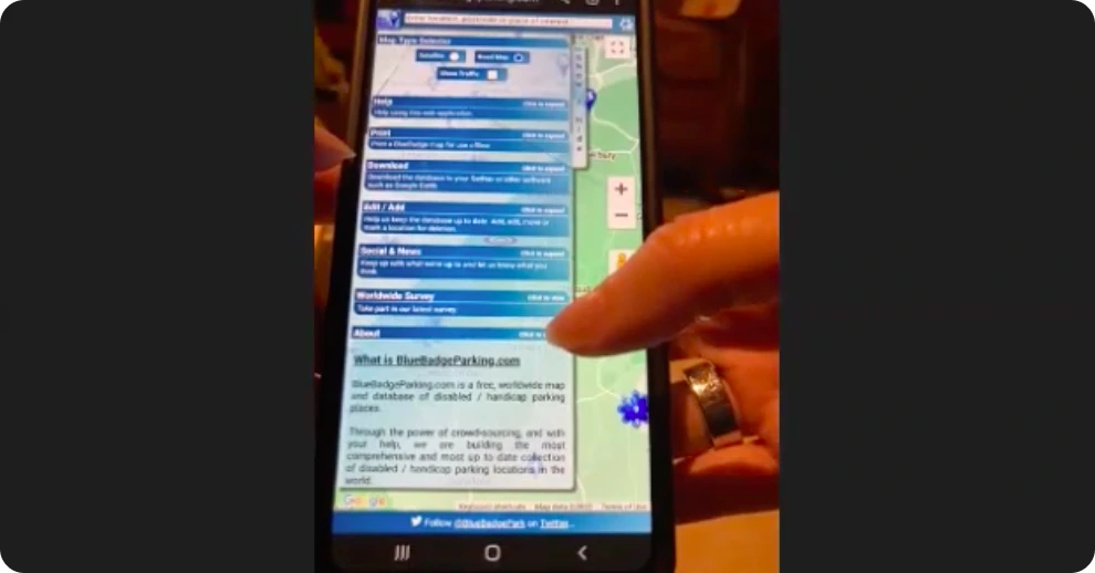
Screenshot of usability test where participant finds the buttons too small to click.
In the second usability test, the participant highlighted the issue of small and difficult-to-click buttons, evident in the cramped layout shown in the screenshot. Despite completing the tasks successfully, the participant felt the application was overwhelming and stressful, referring to the excessive amount of elements. It was clear that it had not been adapted for mobile screens and needs improvement.
Project Possibilities
After reviewing existing Blue Badge parking services, I believe there may be an opportunity to develop and improve the current Blue Badge Parking application to make it more user-friendly. Alternatively, creating a new app or website combining parking space guidance and user location could be more efficient. Further research into this would determine the optimal approach.
Mockups
To explore the concept of a user-friendly Blue Badge application, I created the mockups seen below. Using Figma, I experimented with various app features, colours, fonts and designs. I aim to enhance and modify the mockups based on any new information and research acquired. To view the interactive Figma prototype, you can follow this link: https://bit.ly/3LlYKUk.
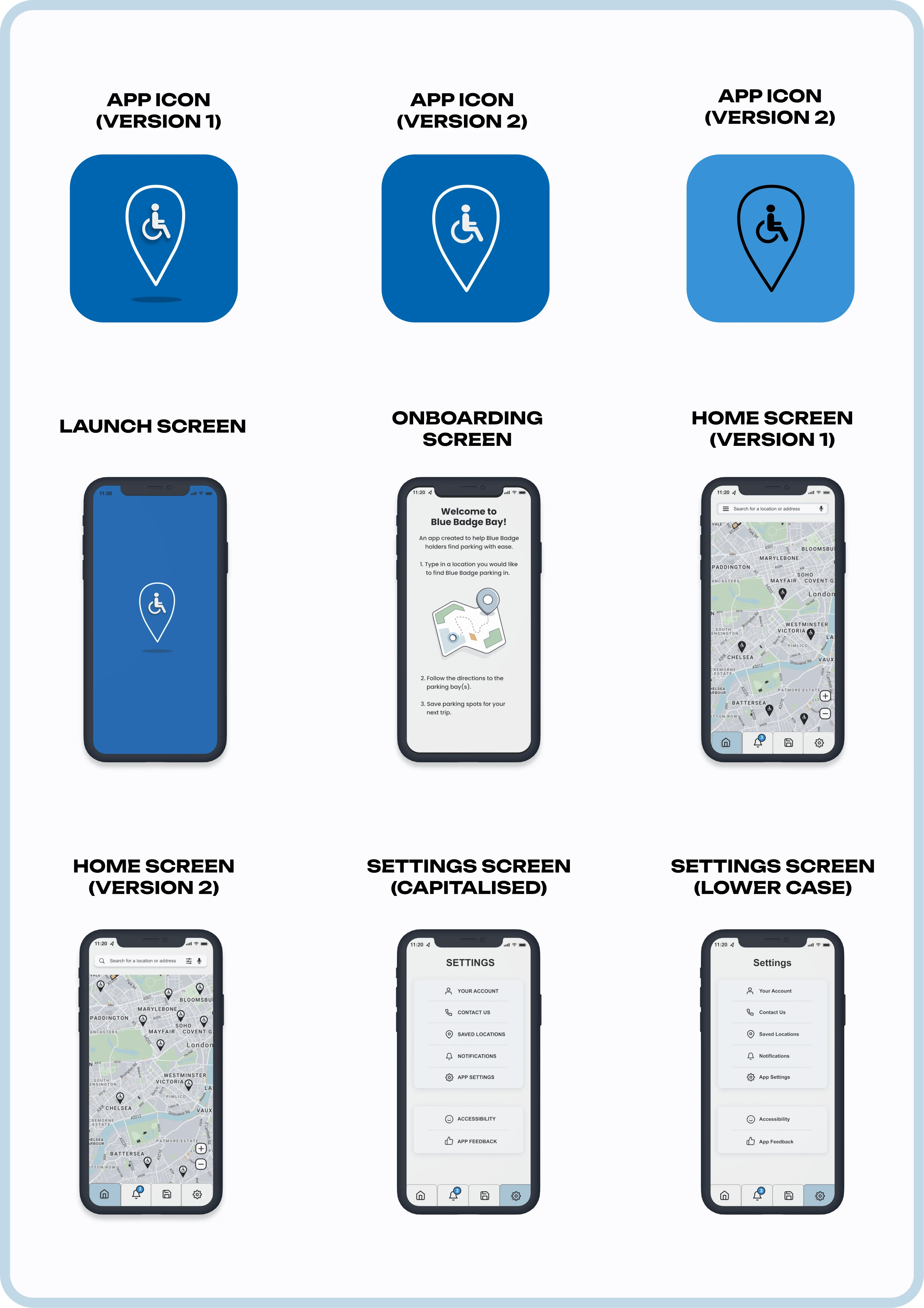
Figma screen and app logo mockups.
Complications
Recruiting participants for my research survey has been challenging due to restrictions on surveys in Blue Badge groups and forums. Despite initial permission from one group, my survey was later removed, hindering participant recruitment. I've also shared the survey on Reddit and Twitter and intend to conduct street surveys near Blue Badge parking areas to increase participation.
Next Steps
As this project advances, I plan on updating this case study whilst allowing it to develop and grow before building an application or website. Research and analysis play an important role in this project so I'd like to ensure I have enough data. This is so I have a strong foundation for the designs and can create an optimal user experience.
Like this project
Posted Jan 9, 2024
Tailored for Blue Badge holders, this app identifies and guides users to accessible parking, ensuring a user-friendly and transparent experience.
Likes
0
Views
9
