Built with Framer
AdCamping Marketing Website Design
Tolulope Amao
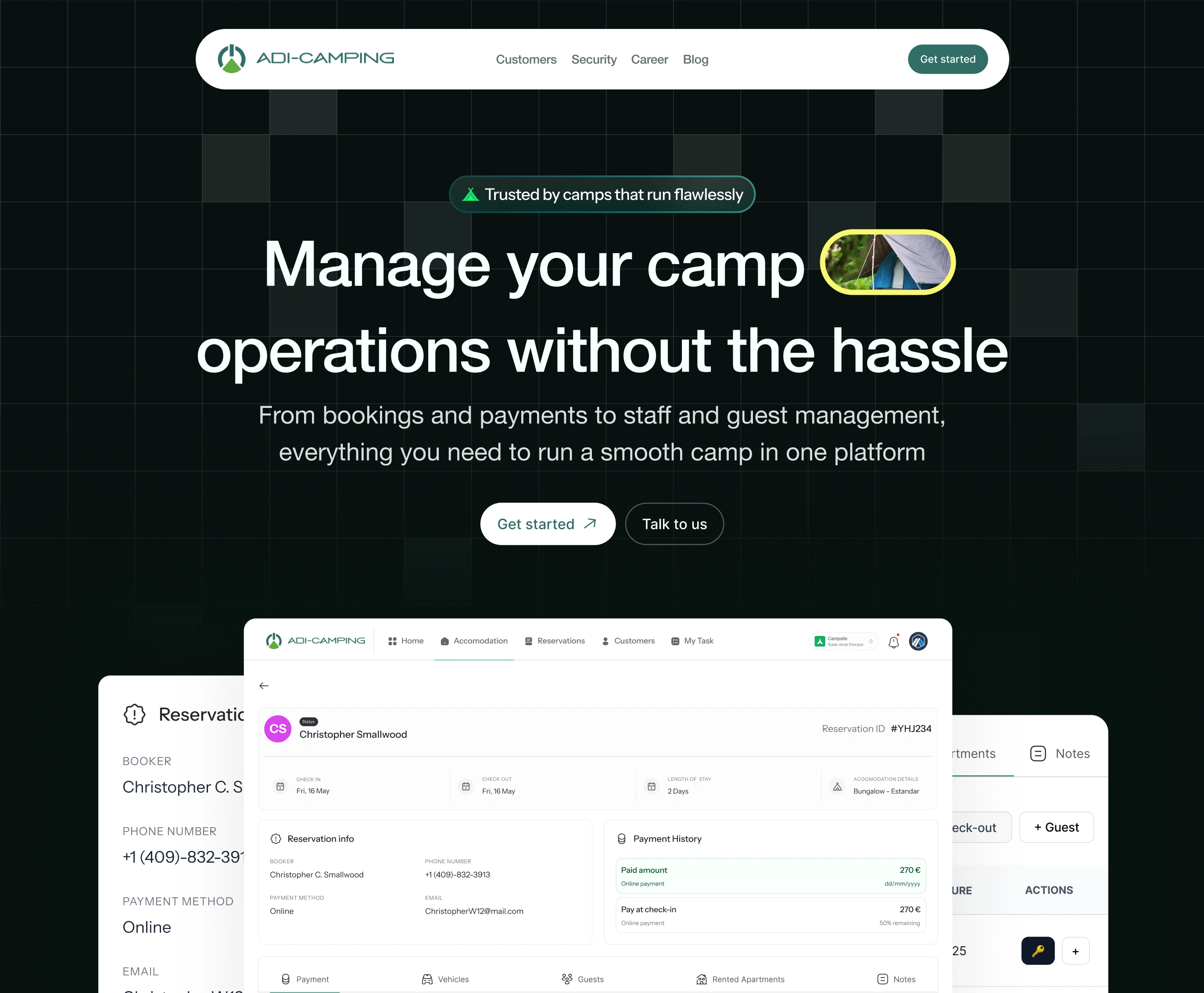
AdCamping — Camp Management Platform Website Case Study
AdCamping is a modern camp management platform designed to help camp operators streamline bookings, manage guests, and run operations efficiently, all from a single, unified system.
This project focused on designing and building a high-converting marketing website that communicates clarity, simplicity, and operational power to fast-growing camp businesses.
How It Started
The client discovered my work through LinkedIn, particularly my approach to simplifying complex SaaS products into clean, conversion-focused experiences.
They reached out with a clear challenge:
“We have a powerful product, but our current website doesn’t communicate its value clearly or convert visitors effectively.”
The goal was not just to redesign a website, but to reposition AdCamping as a modern, scalable, and essential tool for camp operators.
Project Goals
• Clearly communicate the product’s value within seconds
• Simplify complex operational features into digestible flows
• Build trust with a clean, modern SaaS aesthetic
• Improve conversion through better structure and CTAs
• Create a scalable design system for future growth
View Live Website
What It Does Well
1. Immediate, Value-Driven Messaging
The hero section was designed to answer three questions instantly:
What is this?
Who is it for?
Why should I care?
Instead of vague statements, the messaging focuses on clarity and outcomes, positioning AdCamping as an all-in-one solution for managing camps effortlessly.
This eliminates confusion and ensures visitors immediately understand the product’s relevance.
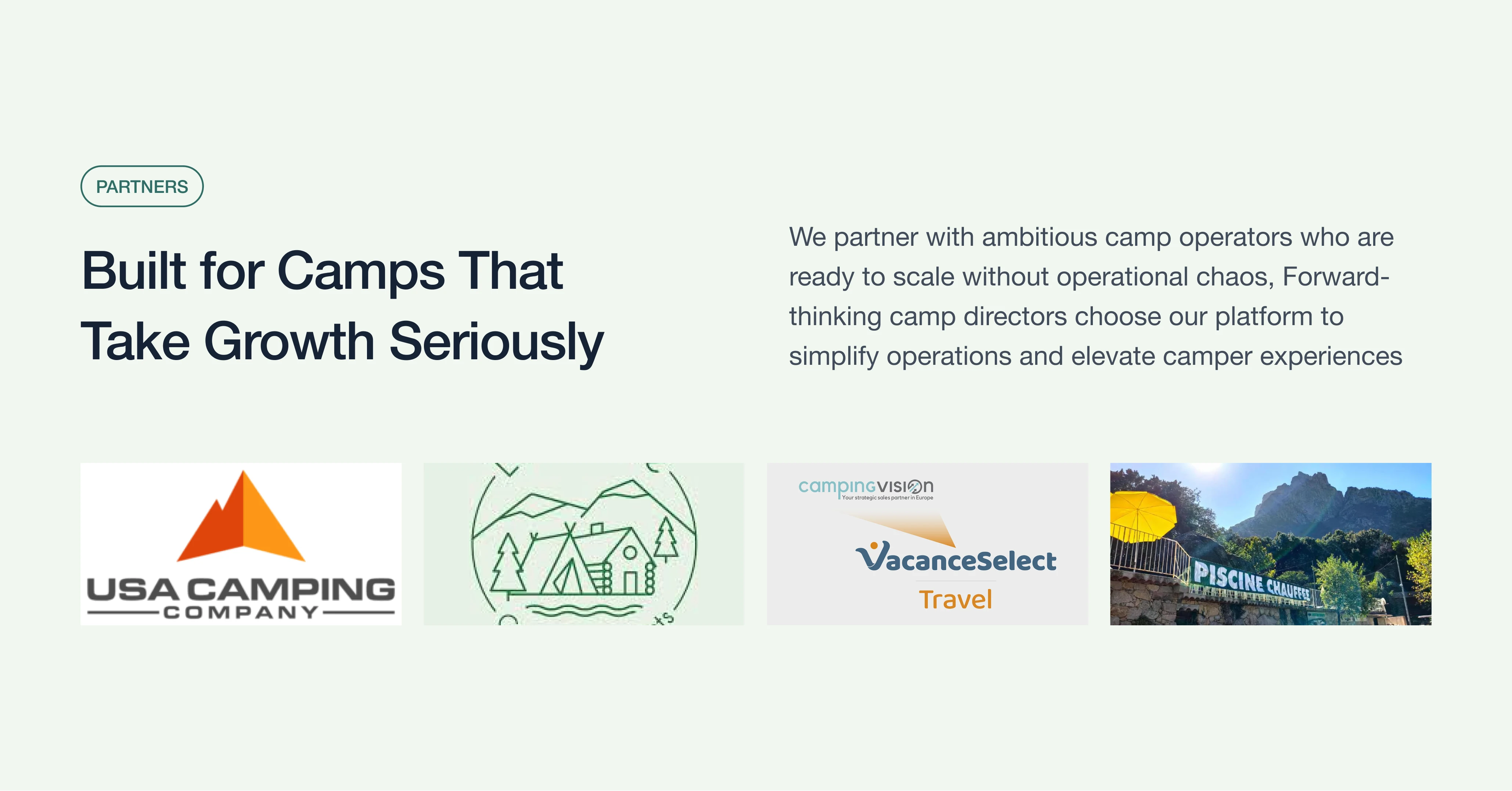
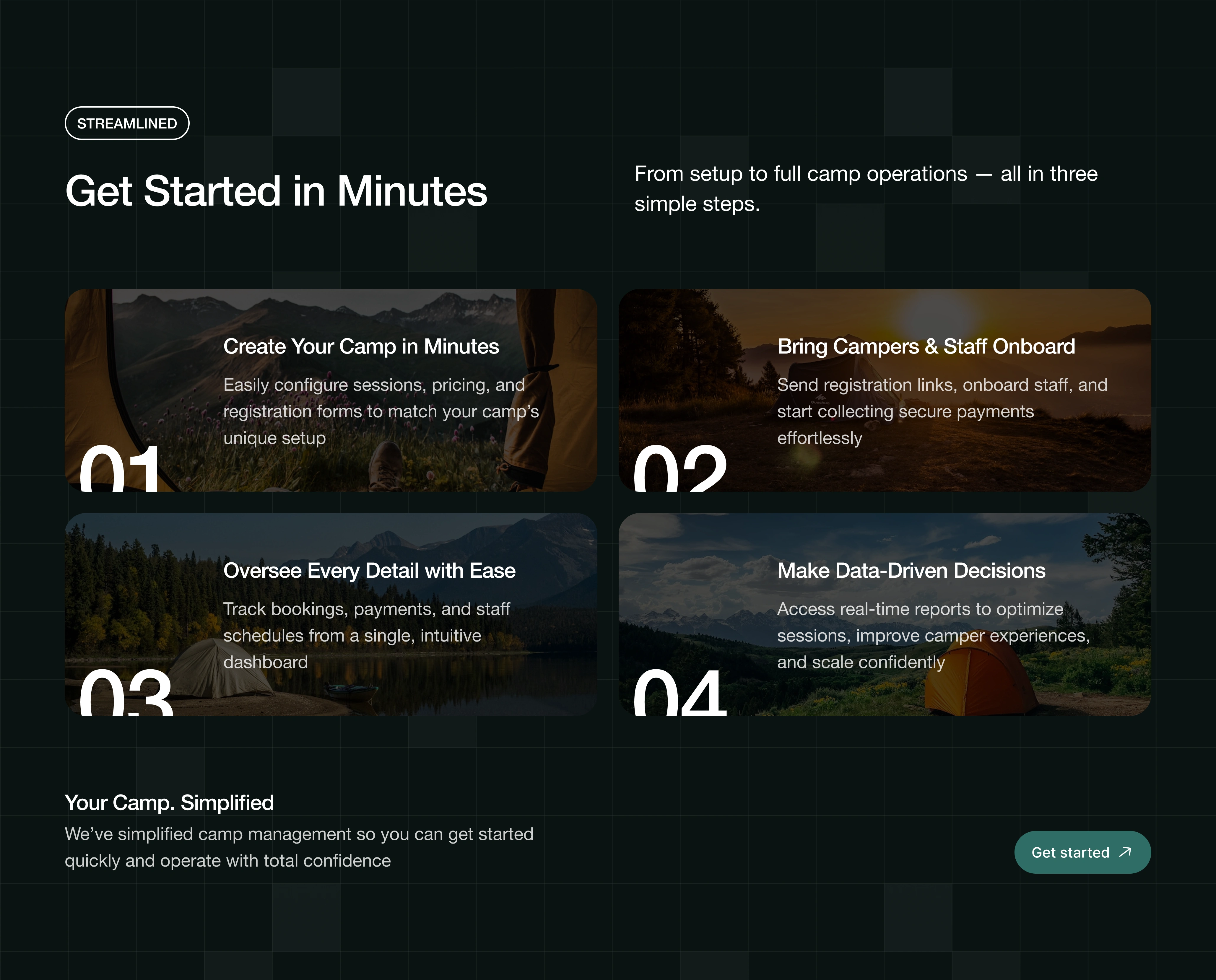
2. Simplifying Complex Camp Operations
Camp management involves multiple moving parts, bookings, schedules, staff, payments, and guest coordination.
Rather than overwhelming users with features, the experience breaks this complexity into clear, structured sections:
• Booking management made seamless
• Centralized guest and staff coordination
• Streamlined payment handling
• Real-time operational visibility
Each section focuses on clarity over volume, helping users quickly grasp how the platform fits into their workflow.
3. Designed Around Outcomes, Not Features
One of the key strategic decisions was shifting from feature-heavy messaging to outcome-driven communication.
Instead of saying what the platform does, the site emphasizes what users gain:
• Less manual coordination → More time to focus on experience
• Faster booking processes → Higher conversion rates
• Centralized system → Reduced operational chaos
• Better visibility → Smarter decision-making
This approach makes the product feel practical, valuable, and results-oriented.
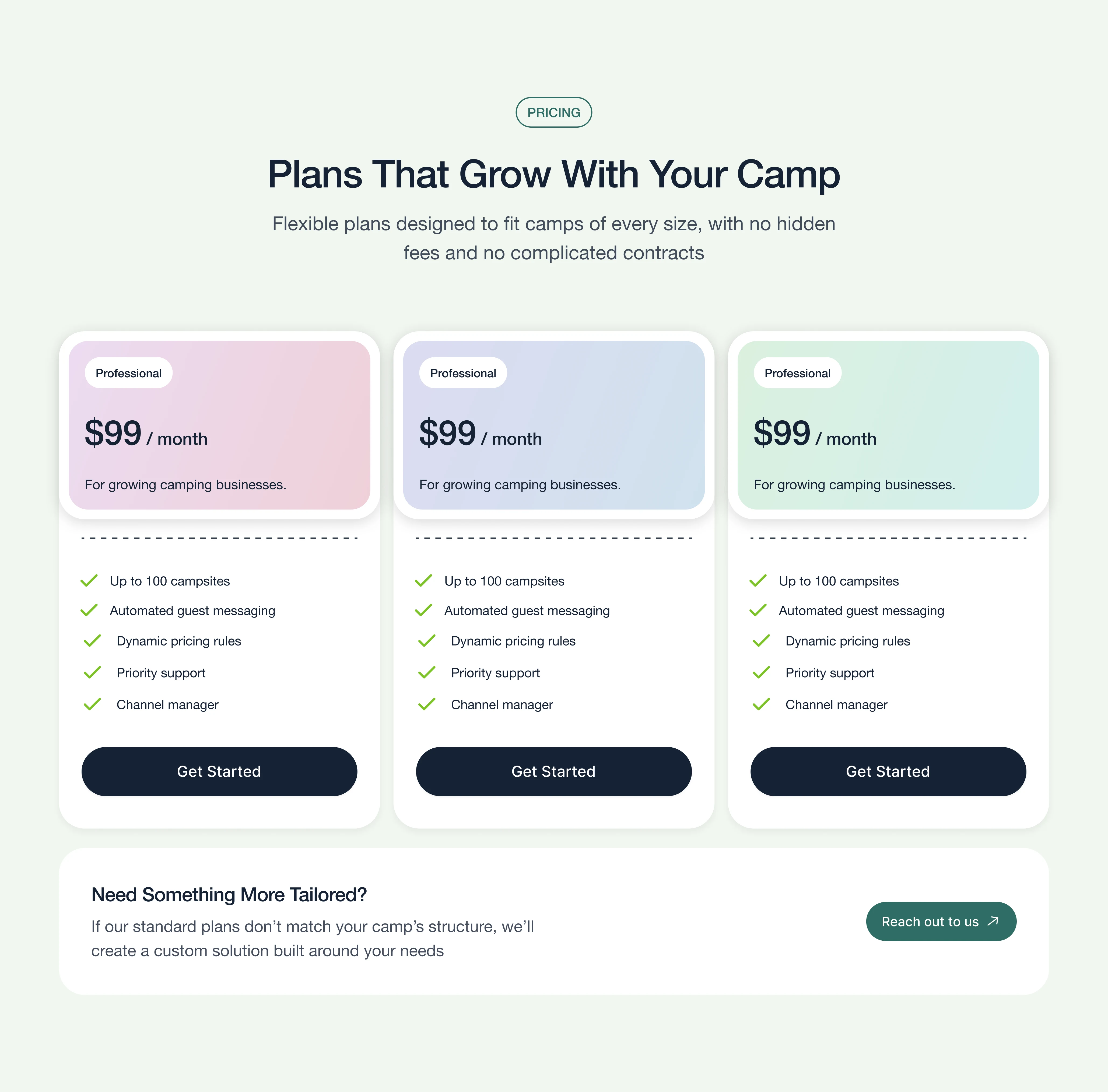
4. Strong, Conversion-Focused Structure
The entire website was structured to guide users naturally from curiosity to action.
Each section answers a specific layer of intent:
Awareness → What is AdCamping?
Understanding → How does it work?
Trust → Why should I trust this product?
Action → What should I do next?
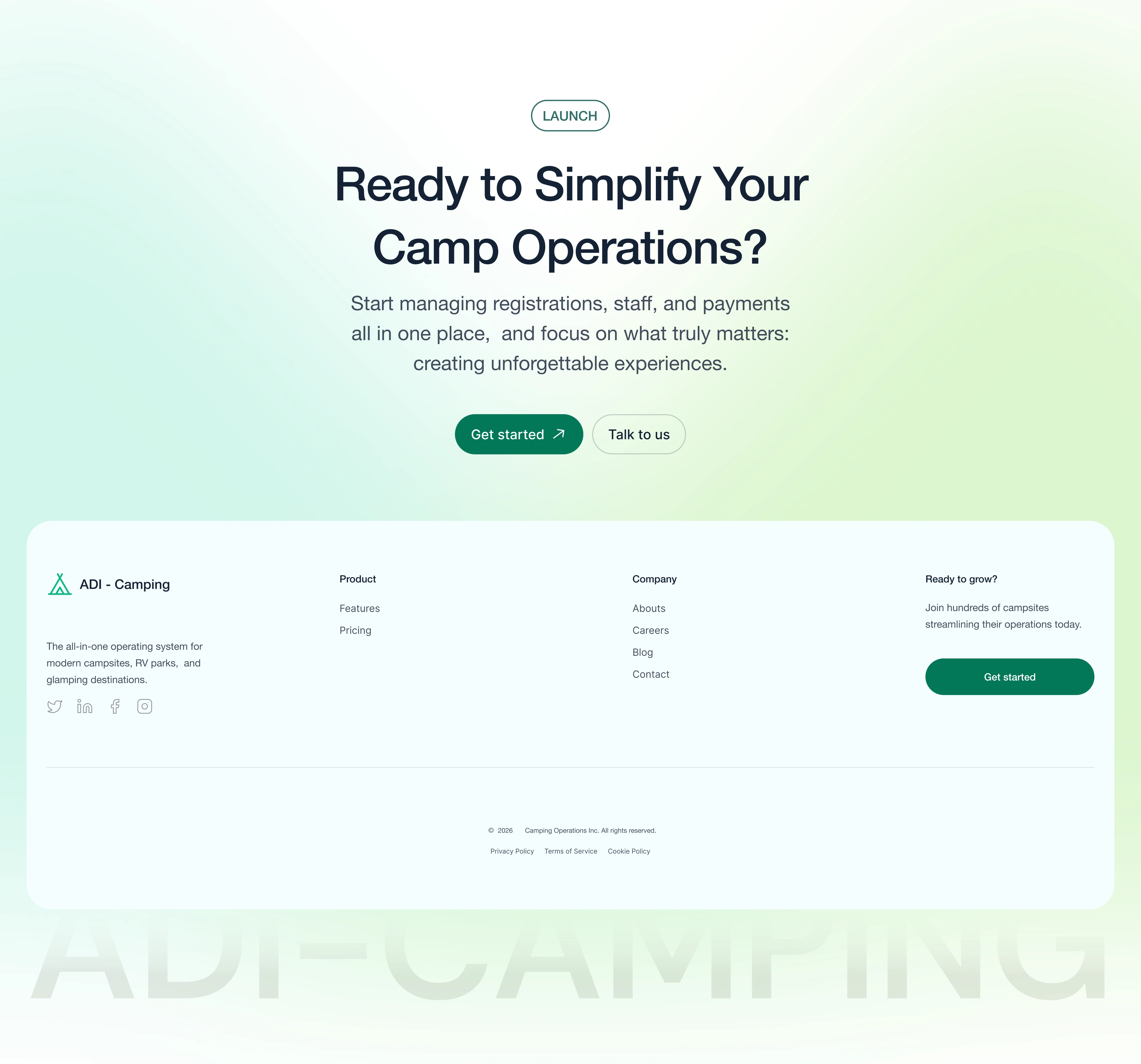
Clear CTAs like:
• “Get Started”
• “Book a Demo”
…are placed strategically to capture users at the right moment without feeling forced.
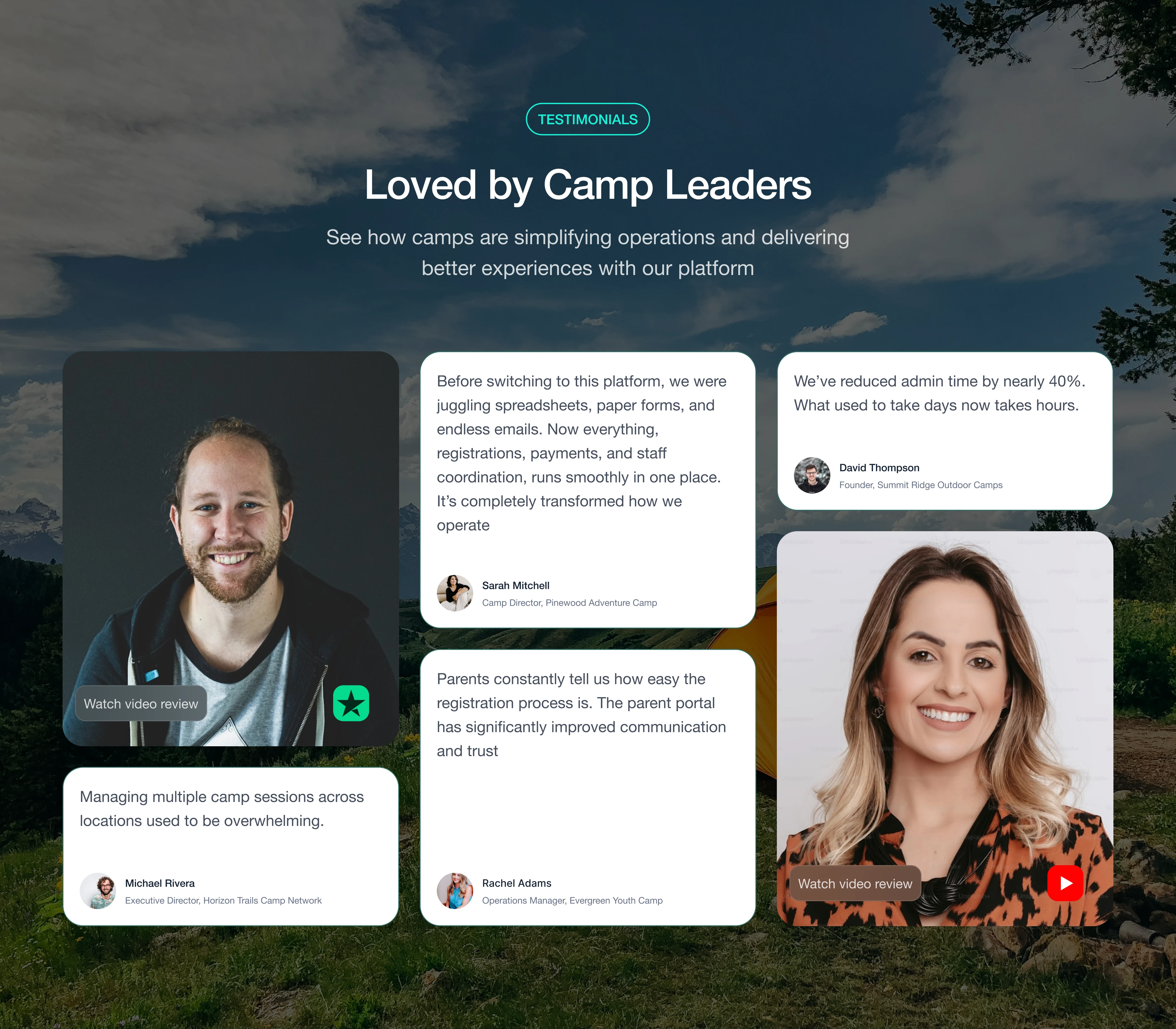
5. Clean, High-Trust Visual Identity
The design system focuses on:
• Generous spacing for readability
• Strong typography hierarchy
• Minimal but purposeful color usage
• Subtle animations for feedback and engagement
This creates a product that feels:
Modern. Reliable. Easy to use.
The visual tone reinforces the idea that AdCamping is built for serious operators who value efficiency and clarity.
6. Scalable Design System
Beyond the landing page, the system was designed to scale.
Components were built with consistency in mind:
• Reusable UI patterns
• Structured layout system
• Consistent spacing and typography rules
• Flexible sections for future updates
This ensures the product can evolve without redesigning from scratch.
7. Smooth Interaction & Micro-Experience Design
Micro-interactions were intentionally subtle but meaningful:
• Smooth transitions between sections
• Hover states that provide feedback
• Clean scroll experience to guide attention
These small details improve perceived performance and make the experience feel polished and premium.
Design Approach
The core philosophy behind this project was:
“Reduce complexity without reducing capability.”
Instead of trying to showcase everything, the focus was on:
• Prioritization — showing only what matters most
• Hierarchy — guiding users through information logically
• Clarity — removing ambiguity at every step
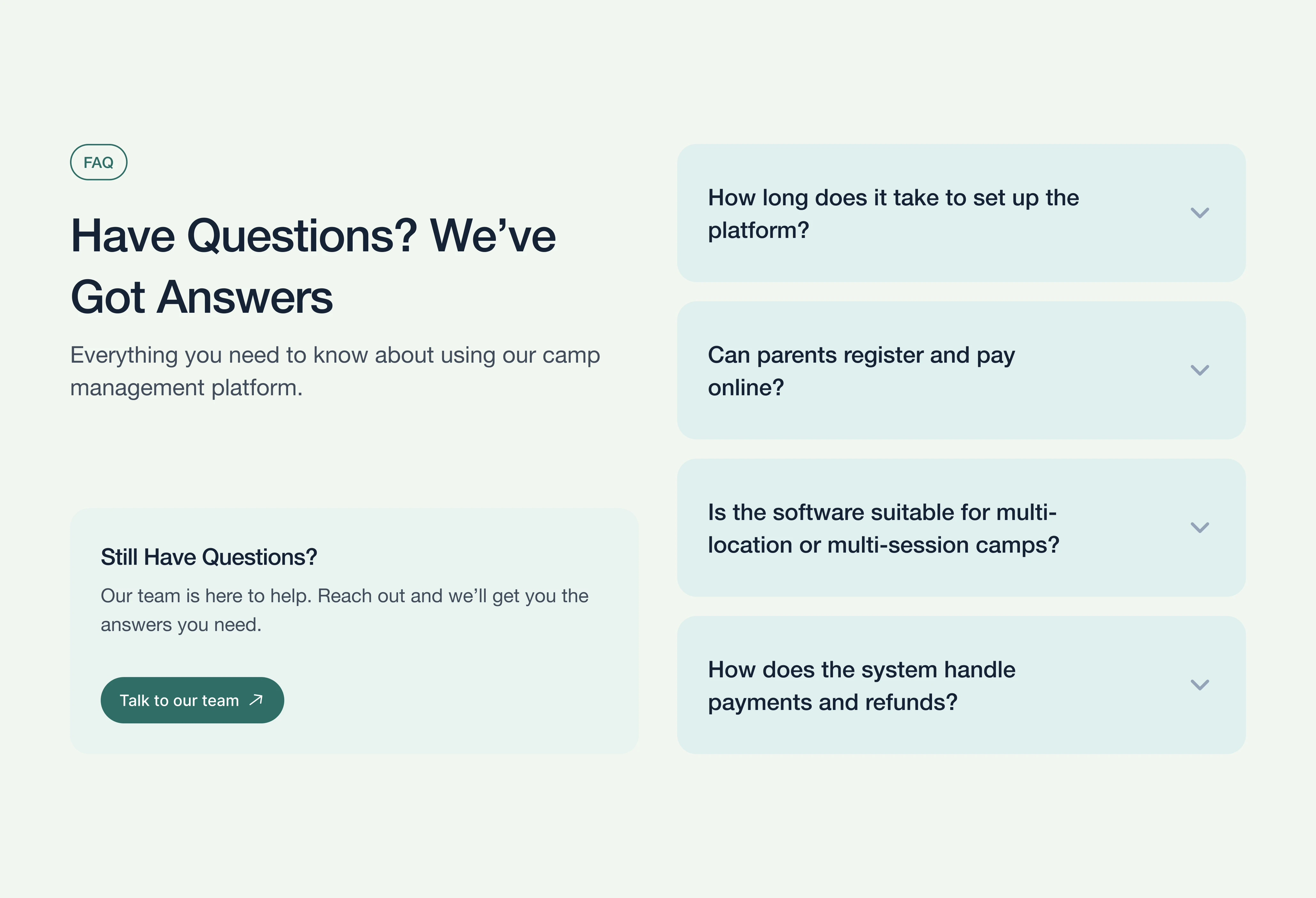
Challenges Solved
1. Overwhelming Feature Set
The product had many capabilities, which risked cluttering the experience.
Solution:
Structured the content into digestible sections with clear narratives.
2. Lack of Clear Positioning
Initially, the product felt generic and undefined.
Solution:
Refined messaging to position AdCamping as a specialized, all-in-one camp management solution.
3. Weak Conversion Flow
The previous structure didn’t guide users toward action.
Solution:
Introduced a conversion-driven layout with intentional CTA placement.
What Elevates It
AdCamping stands out by combining operational depth with simplicity.
It doesn’t just provide tools —
it creates a system that helps camp operators feel in control.
The experience communicates:
• Confidence → “This will handle my operations.”
• Clarity → “I understand exactly how this works.”
• Ease → “This won’t be hard to use.”
Polished Visual Experience
The final product delivers a refined, modern SaaS aesthetic:
• Clean layouts
• Smooth animations
• Strong visual hierarchy
• Consistent spacing and rhythm
This reinforces trust and positions AdCamping as a premium solution.
Reliably Actionable CTAs
Every section leads somewhere intentional.
Users are never left wondering what to do next, whether it’s exploring features or booking a demo.
Results & Impact
While early-stage, the redesign positions AdCamping for:
• Higher user engagement
• Improved conversion rates
• Stronger brand perception
• Easier product adoption
Closing Note
This project is a reflection of how thoughtful design can transform not just how a product looks, but how it’s understood and adopted.
From discovery to execution, the focus remained the same:
Make complexity feel effortless.
Like this project
Posted Mar 19, 2026
AdCamping is an all-in-one camp management platform that helps operators streamline bookings, manage guests and staff, and oversee daily operations
Likes
0
Views
6
Timeline
Mar 12, 2026 - Mar 26, 2026