Wallet Connection Screen Design
Tolulope Amao
This wallet-connection interface provides a clean, intuitive, and secure way for users to link their digital wallets — enabling seamless onboarding into any Web3 application. Designed with clarity, trust, and multi-chain flexibility in mind, it ensures that users can connect their preferred wallet quickly and confidently.
What It Does Well
1. Clear, Minimal, and Trust-Oriented Onboarding
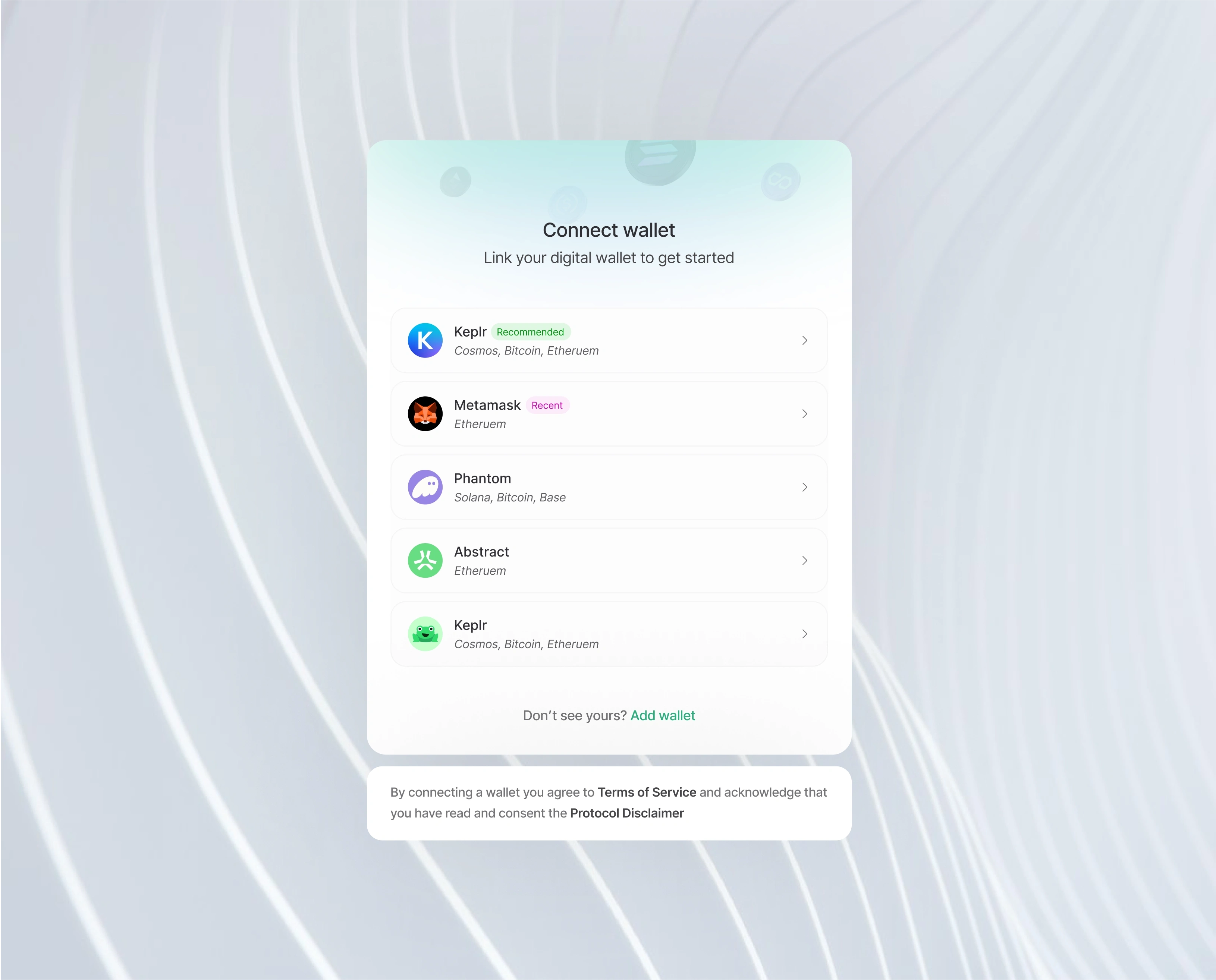
The interface opens with a straightforward headline: “Connect wallet”, paired with a gentle subheading — “Link your digital wallet to get started.”
This sets the tone for a simple, guided onboarding experience. There’s no clutter, no ambiguity, and no technical overwhelm. Users understand exactly what action is required and why.
2. Multi-Chain Support, Presented Elegantly
The design showcases a curated list of popular wallets such as:
Keplr (with a “Recommended” badge)
Metamask (labeled “Recent” for familiarity)
Phantom
Abstract
Additional Keplr options for multi-chain coverage
Each item includes a concise chain summary like Cosmos, Bitcoin, Ethereum — helping users identify compatibility at a glance.
This reduces friction, especially for newcomers, by telling them which wallet works with which chain without needing extra clicks.
3. Smart Use of Familiar Visual Cues
Wallet icons, badges, and chain labels bring familiarity into the interface.
For crypto users — especially those crossing chains — these recognizable elements immediately build trust and reduce decision friction.
Even subtle choices like the “Recommended” and “Recent” badges help guide new users while giving returning users faster access.
4. Friendly, User-First Interaction Flow
Every wallet option includes a clear right-chevron indicator, signaling an easily accessible next action.
The spacing, typography, and soft color palette create an experience that feels safe, modern, and unobtrusive.
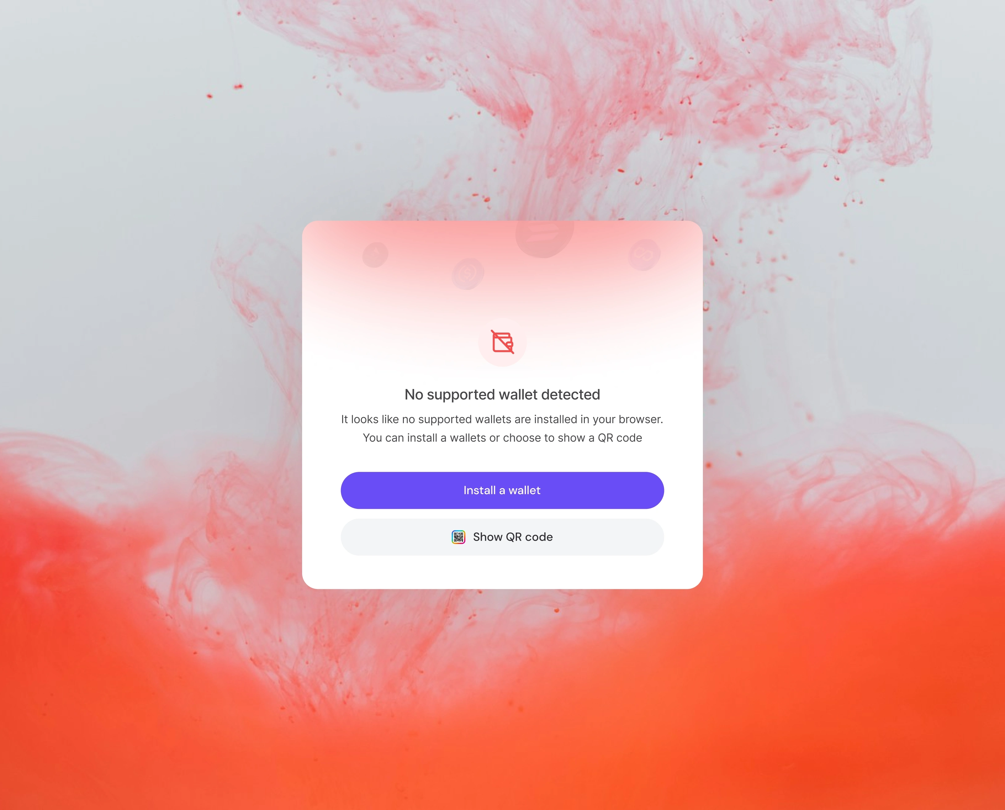
Even better, the interface includes a helpful link — “Don’t see yours? Add wallet” — ensuring users feel supported rather than restricted.
5. Built-In Permission Transparency
At the bottom, a clear legal note reminds users that by connecting a wallet, they agree to the Terms of Service and acknowledge reading the Protocol Disclaimer.
This creates a strong trust foundation, especially for regulated or compliance-sensitive applications.
It reassures users that the platform values transparency and responsible Web3 onboarding.
What Elevates It
This design stands out because it blends Web3 functionality with Web2-level UX polish.
Instead of feeling technical or intimidating, the experience feels refined and welcoming:
Soft gradients and blurred backgrounds create a premium aesthetic
The card-based layout keeps the interaction centered and focused
Visual hierarchy makes scanning effortless
The interface subtly communicates safety and professionalism
Users feel like they’re operating in a trustworthy, high-quality environment — not a fragmented or overly technical crypto experience.
Polished Visual Identity
The interface’s micro-details — card elevation, rounded edges, gentle gradients, and clean typography — come together to create an atmosphere of reliability.
It has the calm, confident look of a product built for real users, not just developers.
Consistency in Calls to Action
Everything is intentional:
Wallets are listed in a visually scannable way
The “Add wallet” link solves the edge case of unsupported wallets
Legal links appear exactly where users expect them
The layout keeps focus centered while avoiding cognitive overload
The result: a frictionless, trustworthy entry point into the application.
Like this project
Posted Nov 29, 2025
This interface provides a simple and secure way for users to connect their digital wallets before entering the application
Likes
3
Views
3