FORDEFI Landing Page Design for Institutional Trust
Tolulope Amao
FORDEFI: Architecting Trust for Institutional Digital Asset Management
This isn't a retail crypto wallet; this is institutional-grade infrastructure. FORDEFI is targeting high-stakes clients (developers, corporate treasuries) who need bulletproof security and granular control over their digital assets. The biggest hurdle for this product is trust—convincing a large business that a crypto-native platform is "the most secure, robust, and flexible" option.
The Challenge: Elevating Security to a Visual Theme
How do you design a hero section that instantly communicates institutional maturity and cutting-edge security, especially when dealing with complex terms like "Wallet-as-a-Service"?
The Solution: Authority, Simplicity, and Depth
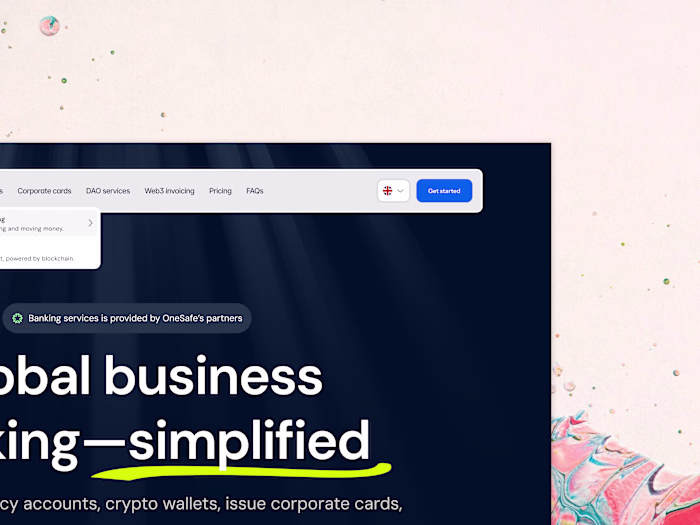
I designed the FORDEFI landing page to be a beacon of professional competence, leveraging a powerful dark theme and strategic information layering.
🌑 Institutional Aesthetic (The Dark Mode Authority)
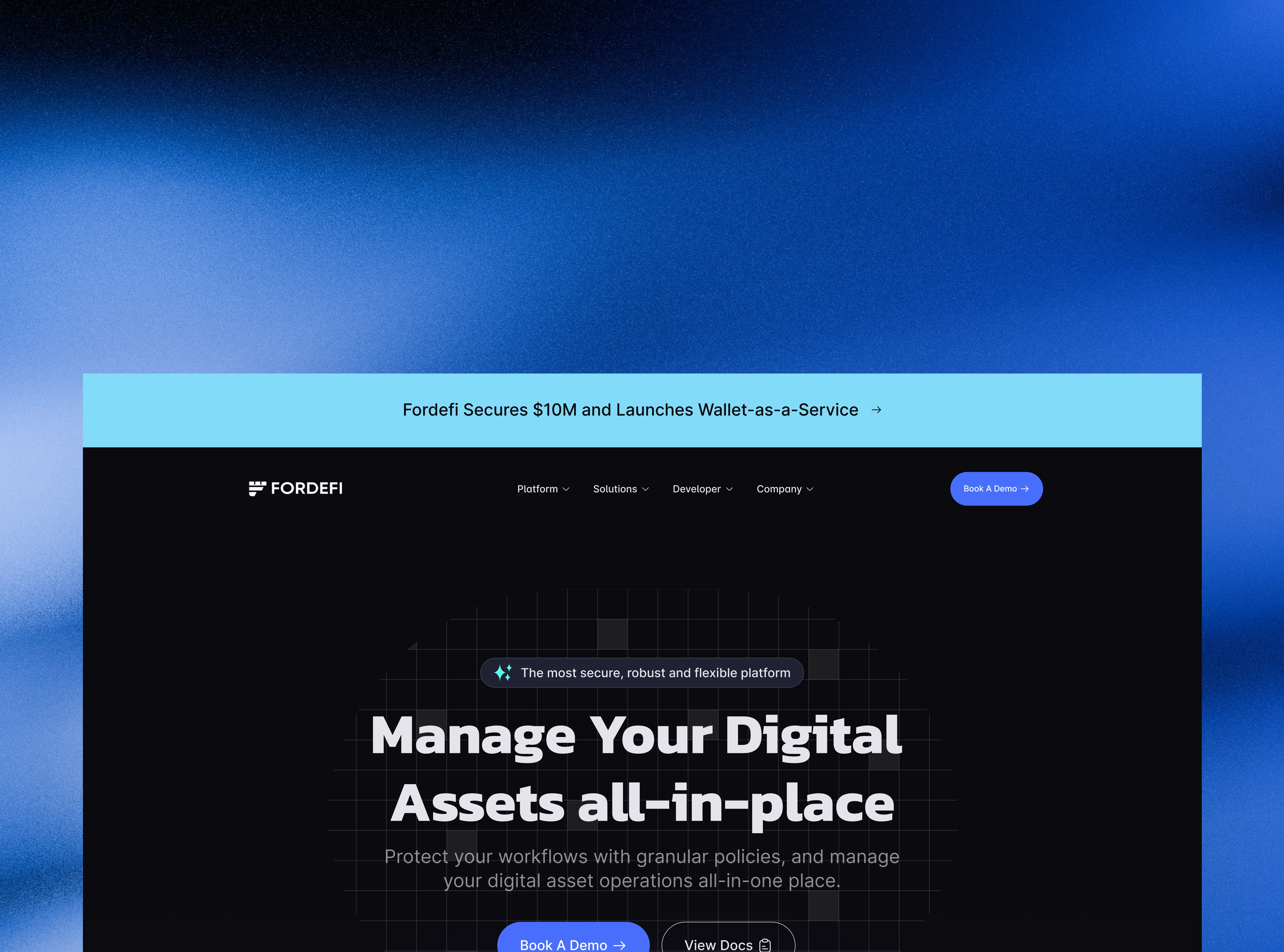
The design uses a deep, rich dark background, which is the default aesthetic for serious financial and developer tools. This is immediately reinforced by the sophisticated, subtle hexagonal security grid overlay in the background, visually hinting at encryption and robust infrastructure.
🛡️ The Triple-Lock Value Proposition
The headline stack is designed for the corporate user who skims:
Context Bar: The first thing the user sees is a banner stating, "Fordefi Secures $10M and Launches Wallet-as-a-Service." This is crucial social proof and funding validation before they even read the headline.
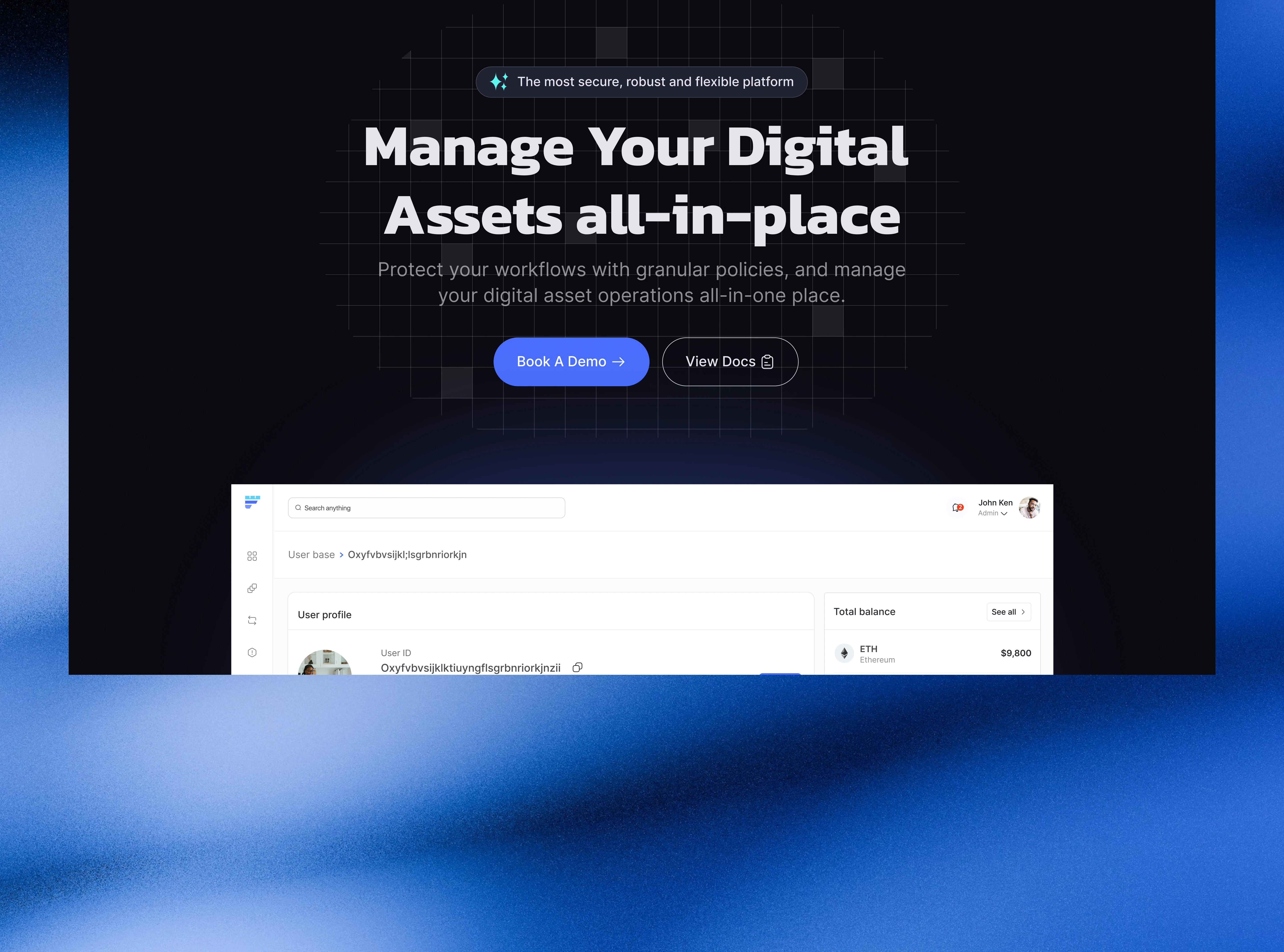
Headline: "Manage Your Digital Assets all-in-place." Simple, clear, and addresses the integration pain point.
Security Tagline: The small, green-accented line: "The most secure, robust and flexible platform" is a key selling point, leveraging the green highlight to suggest safety and growth.
⚙️ The Conversion Path for B2B
The primary Call-to-Action (CTA) is perfectly tailored for a high-touch B2B product:
"Book a Demo": The primary, highly contrasted blue button for serious leads. Corporate buyers need a guided tour, not an instant download.
"View Docs": The secondary CTA for developers and technical leads who perform due diligence. It offers immediate access to technical specs, catering to the entire buying committee.
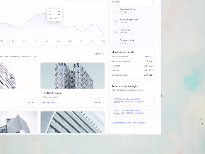
The inclusion of the basic product snapshot at the bottom provides just enough visual proof of the clean, functional user interface (User profile, Total balance) without cluttering the main message. This is high-stakes design focused purely on qualified lead generation and establishing credibility.
#Web3ForBusiness #InstitutionalCrypto #Fintech #B2BDesign #DeveloperTools #SaaSDesign #DigitalAssets #WalletAsAService #SecurityFirst #CorporateTreasury
Like this project
Posted Nov 28, 2025
FORDEFI’s landing page is crafted for institutional trust, clear messaging, strong visuals, and secure design that builds confidence from the first interaction
Likes
1
Views
2