ONESAFE Landing Page Design for Trust and Simplicity
Tolulope Amao
ONESAFE: Designing Trust for Global Business Banking
In the world of corporate finance, trust and clarity are not optional, they are the price of entry. For a platform like ONESAFE, which combines traditional global business banking with the complexity of crypto wallets and multi-currency accounts, the challenge wasn't just what it could do, but how quickly it could prove its security and simplicity to a skeptical business audience.
The Challenge: Bridging Tradition and Crypto
We needed to design a hero section that instantly reassured CFOs and business owners that this platform was both cutting-edge and dependable. The traditional approach would lead with a feature list; my approach was to lead with a solved problem.
The Solution: Simplified Authority and Visual Proof
I designed the ONESAFE landing page to be a beacon of simplicity and authority in the complex financial landscape.
💡 Immediate Value Proposition
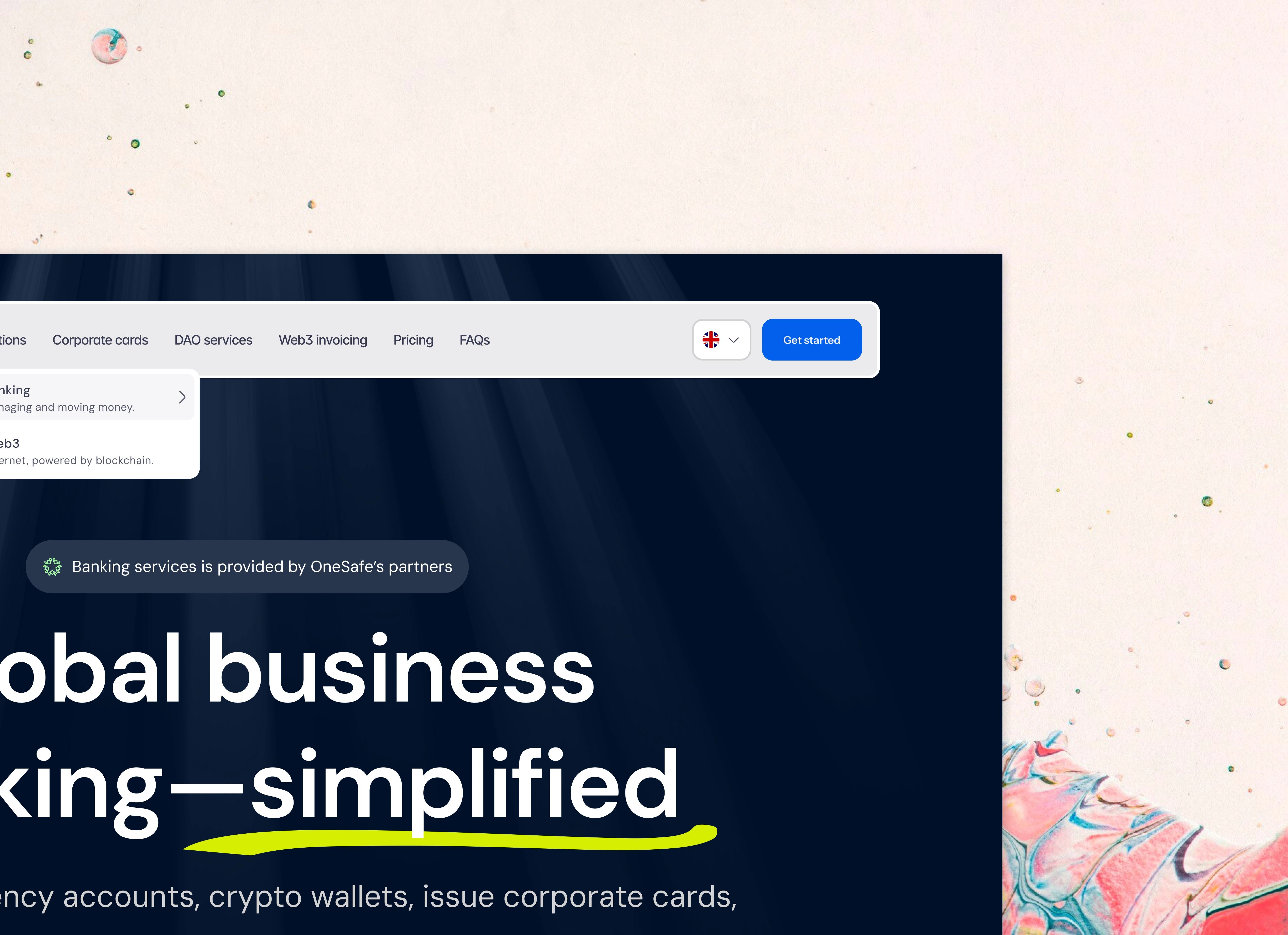
The hero headline cuts straight to the core benefit: "Global business banking—simplified."
The use of the yellow underline on "simplified" draws the eye and hammers home the emotional benefit of using the platform.
The subtext immediately validates the claim: "Open multi-currency accounts, crypto wallets, issue corporate cards, and send global payments, all from one secure platform." (This is the feature list, but delivered after the benefit).
🛡️ Building Trust with Visuals
The visual hierarchy below the fold is critical for conversion:
The Card + Wallet Stack: A clear visualization of the multi-faceted product—physical cards, multi-currency balances (USD, BTC, EURO, ETH), and the digital platform. This shows capability without needing paragraphs of text.
The Confirmation Signal: The prominent "Success" checkmark on the right-hand card, showing a completed transaction ("$300 successfully sent to John"), acts as powerful social proof and security validation. It tells the user, "This system works, and it's secure."
🌑 The Premium Dark-Mode Canvas
The choice of a deep, midnight-blue background contrasts beautifully with the white/yellow text and the product mockups. This color choice conveys:
Premium Quality: Aligns with high-end financial services.
Focus: It directs the user's eye exactly where we want it: the value prop, the call-to-action buttons, and the product visuals.
The design leads with trust, proves its functionality with visual assets, and delivers a clear path forward with multiple calls-to-action ("Create Your Global Account" / "Book a demo"). This is conversion-optimized design for the modern corporate treasury.
#Fintech #B2BDesign #LandingPage #CorporateBanking #UXDesign #WebDesign #Crypto #GlobalPayments #TrustDesign #HighConversion
Like this project
Posted Nov 28, 2025
ONESAFE’s landing page is crafted for trust and simplicity—clean visuals, clear messaging, and an effortless experience that helps users feel secure instantly