Shopmonkey for Techs - Feature Discovery
Polly Lal
My role: Product designer
Objective: Create a set of reusable components and screens to bring awareness to features on Shopmonkey mobile
UX Methodologies: Competitive analysis, iterative prototyping (design explorations, hi-fidelity prototypes), unmoderated user validation testing, UX writing, design systems
Platforms: Shopmonkey for Techs on iOS
Tools: Figma, Maze
Problem
Shopmonkey is an all-in-one management software for auto shops. Shopmonkey for Techs is their iOS app, geared towards technicians who work hands on with cars during the day.
Based on insights from customers, our team noticed a growing problem: though new features are added to the app on a regular basis, users aren’t aware of their existence and hence, could not benefit from them. At the time of the project, no explicit solution existed on the mobile platform to address this issue, other than a list of technical release notes after the app is updated.
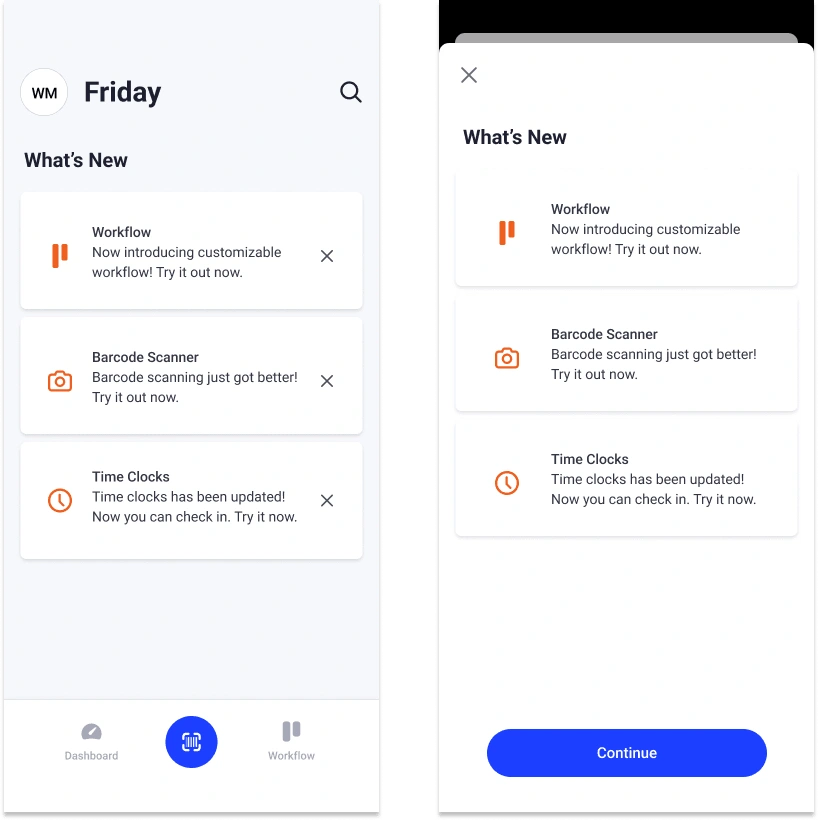
Current “What’s New?” screen on iOS
Overview
The main objective for this project was to create a set of reusable components and screens to add to the existing Shopmonkey design system for mobile, that can be further customized when new features are added.
This design solution needed to address the following, while maintaining consistency with Shopmonkey’s web platform:
1. Tiers 1, 2, and 3 — The marketing team aligns their media campaign announcements based on a given feature’s scope and prominence in the app, and these in-app designs need to align accordingly. For instance, Tier 1 are the largest standalone feature announcements, Tier 2 are mid-sized new features, and Tier 3 are new feature enhancements or reminders for existing features.
2. What’s New? — At the time of this project, the team used a 3rd party tool to show technical release notes to the user on app startup. An additional aim of this project was to come up with new designs that better align with the look and feel of the Shopmonkey design system, that provides a more delightful, engaging, and informative experience for the user.
Due to the cross-functional nature of the project, it was also important to actively include feedback from stakeholders, including members of the product, design, UX writing, UX research, marketing, and customer support teams throughout the design process.
Approach
Target Persona
The iOS Shopmonkey for Techs app is geared specifically towards automotive technicians, who are professionals that fix, inspect, and help maintain vehicles at auto shops.
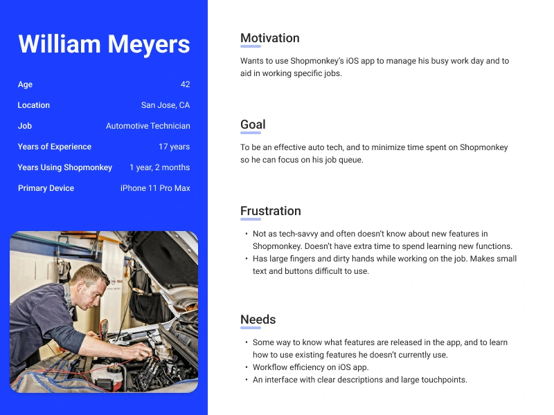
Aggregate persona based on user research
Competitive Analysis
Inspiration from both web and mobile were part of early exploration and analysis. Since an important part of this project was about internal consistency, this also involved incorporating examples of existing feature announcement patterns in Shopmonkey’s web platform.
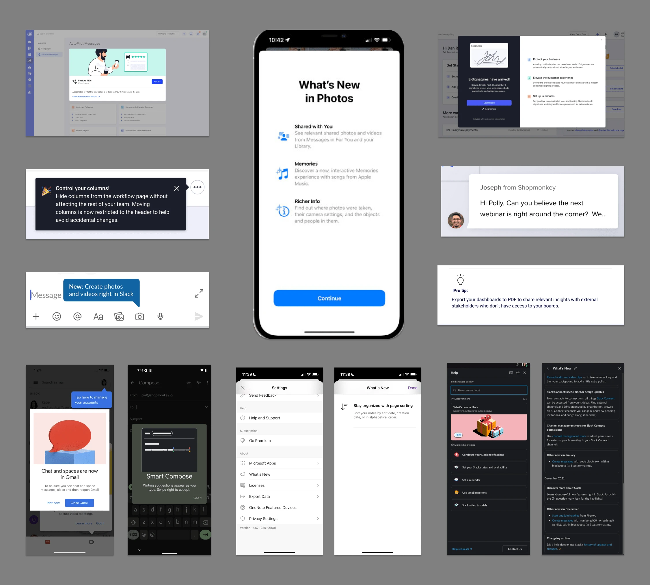
Inspiration and Analysis — Modals, tooltips, full-screen sheets, “What’s New?” menus, etc. examples from Shopmonkey, Apple iOS, Slack, Monday.com, Gmail, and Microsoft OneNote on both web and mobile
Visually, some elements to highlight were:
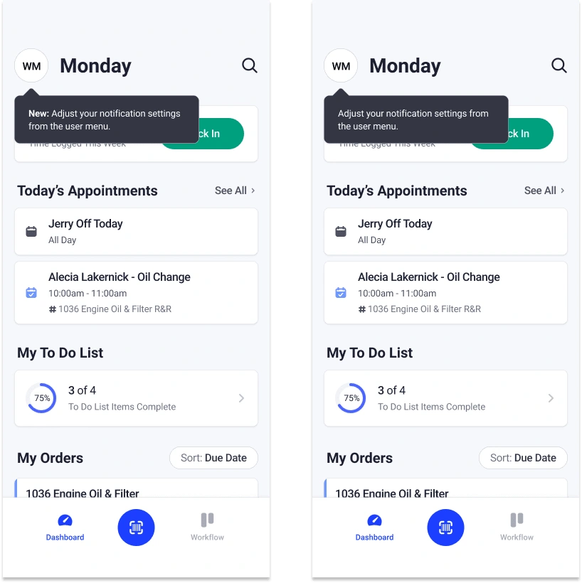
How different features were treated visually, based on size and impact. For example, carousels and modals with overlays for larger features and hidden menu items for less prominent ones. Smaller tooltips were reserved for smaller features or feature enhancements.
Thoughtful use of certain details, such as color choices, shapes, bolded titles, CTA size, and opacity to capture the user’s attention.
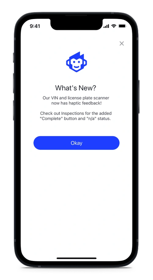
Certain concepts, such as Apple iOS’s “What’s New?” full sheet, and recurring “Pro tips” with a recognizable icon from a marketing email, served as continued points of reference throughout the project.
Exploration
Early design explorations for this project were focused on using existing design system elements used on Shopmonkey web and adapting them for mobile users, to preserve consistency between platforms.
Tiers 1, 2, and 3
The biggest challenge was establishing how to visually distinguish between different tiers, since these elements would eventually be part of the design system and hence would need to be adaptable enough to be applied to a large range of use cases. These screens were high-level explorations for all tiers, that were later brought to stakeholders for feedback about how to further categorize based on product and marketing needs.
These early explorations also include ideas to include brand voice, such as incorporating illustrations or matching web’s help chat and showing a representative from Shopmonkey to help build a stronger personal connection to the user.
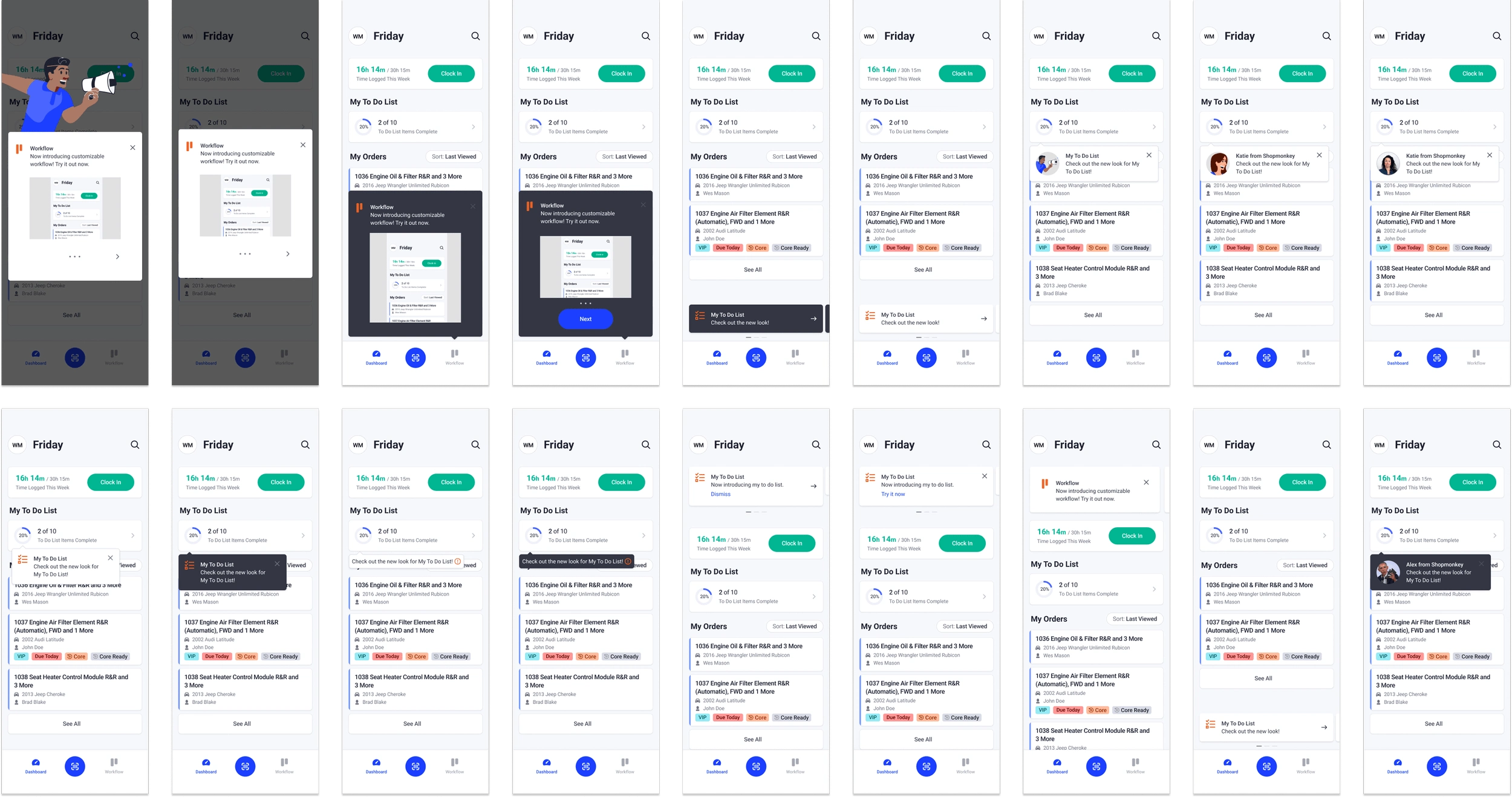
Early explorations for Tiers 1, 2, and 3, including brand voice
What’s New?
These early designs took visual inspiration from Apple’s full-sized “What’s New?” sheet, and also focused on copy and visual treatments that better aligned with the fun and colloquial tone of the marketing team’s brand voice.
Early explorations for “What’s New?”
Refinement
At this point, there was feedback from stakeholders about copy tone and consistency.
In collaboration with the UX writer, we refined the copy to:
Have more emotion and clarity — keep techs in mind and design for delight!
Highlight value and next steps to the user instead of only stating that a new feature existed, which aligned with most of the existing product copy at the time.
Include more “fun” tones in product copy to bridge the gap from marketing team’s colloquial brand voice. This helps provide a more consistent experience between touchpoints in the Shopmonkey user journey as a whole.
Tier 1
More visual refinement was also needed to match existing modal conventions within the Shopmonkey app. Thoughtfully integrating feature icons and illustrations in line with branding were also an important part of this stage. Below are key examples synthesized from over 100 designs.
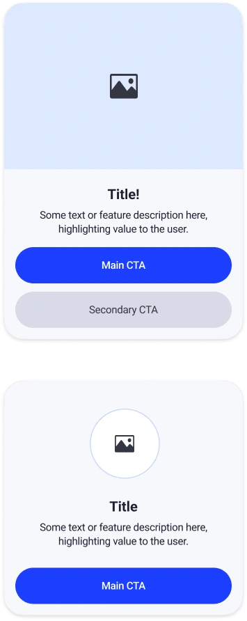
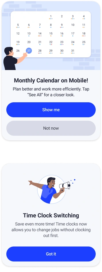
Tier 1 modal refinement, incorporating updated copy and brand voice (bottom row). Also explored displaying multiple large CTAs, prominent icons, and abstracted feature illustrations
Tier 2
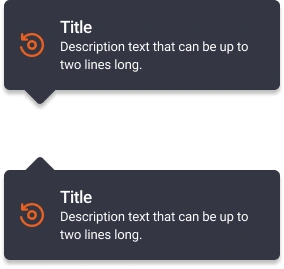
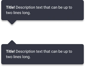
The tooltip explorations shown below are more detailed than in previous stages, adapted from existing tooltips from Shopmonkey web. Some points of focus were to simplify the text by removing the title line, to include a larger icon (if shown), and to use the dark background to make it more eye-catching.
Tier 2 tooltip explorations. Experimented with incorporating icons, illustrations, titles, and matching brand voice from Shopmonkey web
Tier 3
Designs from this stage involved experimenting with titles and text-only content within tooltips, intended to be used as announcements for new feature enhancements or existing features the user has not engaged with yet.
Tier 3 tooltip explorations with text only, experimenting with titles
What’s New?
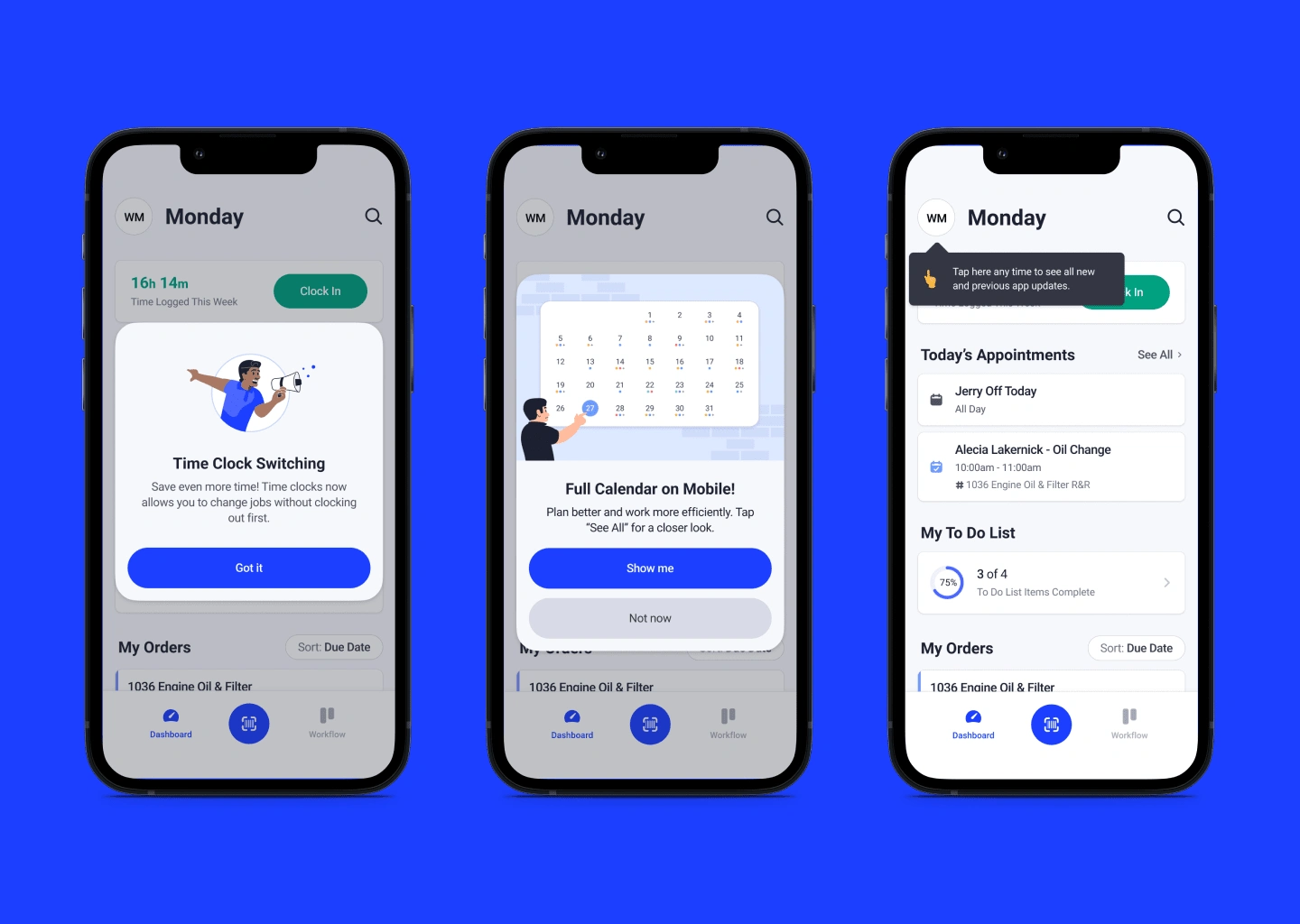
In this next iteration, I coupled brand illustrations with the educational benefits of introducing proprietary icons to users. Another important aspect in this design was to keep dates in the features list. This was due to feedback from the customer support team, when often customers will call in asking when a feature was released. This gives an easy point of reference for customer support to point users to, when needed. Lazy loading was also incorporated based on direct feedback from the engineering team, to ease implementation and for faster loading times.
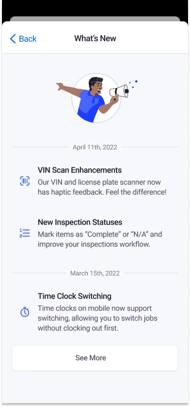
Second iteration of “What’s New?” screen, Including icons for education and illustration highlighting brand voice
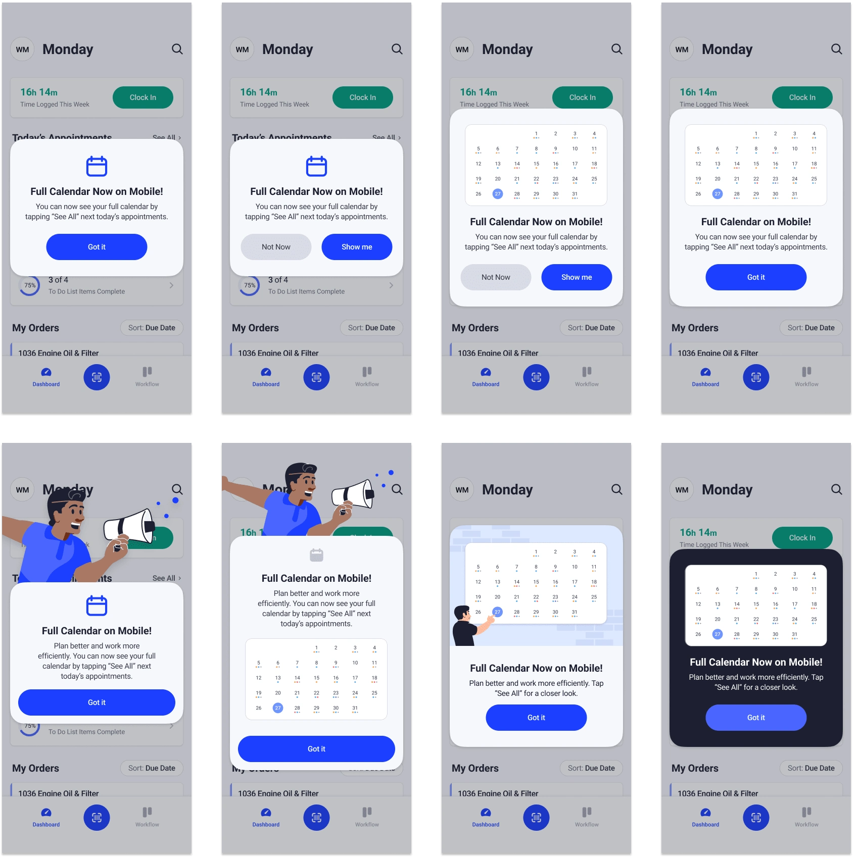
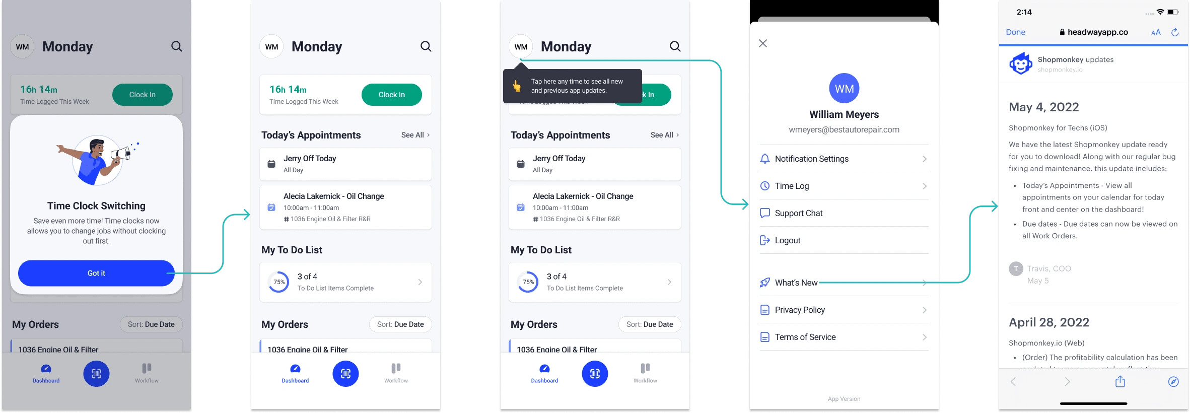
From stakeholder feedback such as engineering, UX research, and design, it surfaced that based on prior user data, it would be easy for a tech to experience a one-time popup screen as an interruption to their busy work day, and would likely dismiss it without reading. In order to address this, I developed a wider UX flow that involved combining tooltips with adding a persistent place in the app where power users can visit to learn more about new features after initial dismissal.
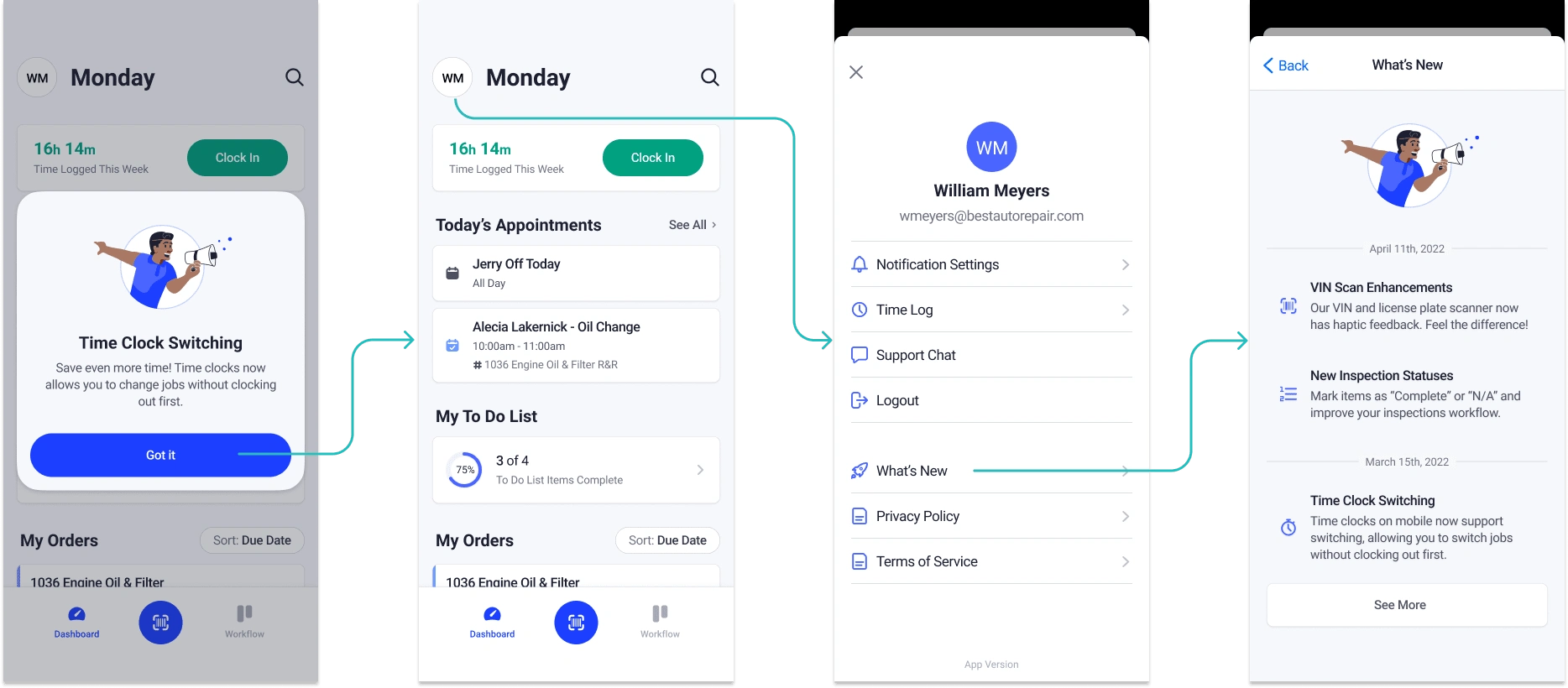
Proposed UX flow for “What’s New?” screen, with lazy loading
User Testing
Once there was a defined direction, it was important to evaluate whether these designs were effective in achieving our original design goals through user validation tests.
Specifically, our team collaborated with UX research to discuss pros and cons to different formats for testing. We ultimately decided to use Maze as an unmoderated testing tool to asynchronously gather both qualitative and quantitative design feedback from general automotive techs who may not necessarily be familiar with Shopmonkey’s platform. This allows us to test the baseline for whether these designs are intuitive and effective. The tests' goals, structure, questions, and wording, and other design aspects were developed in close collaboration as a team.
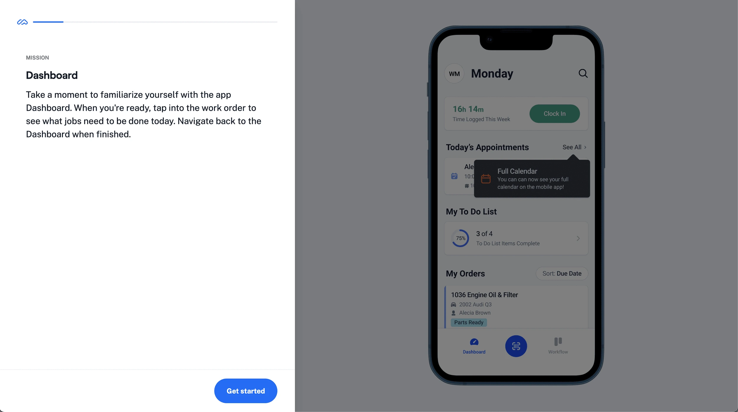
Unmoderated user testing for Tiers and “What’s New?” flows to validate whether these new designs achieve our initial design goals
Solution
Hi-Fidelity Prototype
After user validation testing, there were a few points of feedback that led to notable changes in the final design.
Tier 1
Tier 1 modal designs ended up having two visual treatments, designed to be adaptable for a variety of use cases such as illustration type or number of CTAs. There was also feedback that large illustrations outside of the main modal could potentially be distracting; as a result, these designs include integrated illustrations that visually “show, not tell” what the feature is.
In order below, see the Tier 1 treatment in context, final design system component, and example use cases.
Tier 2
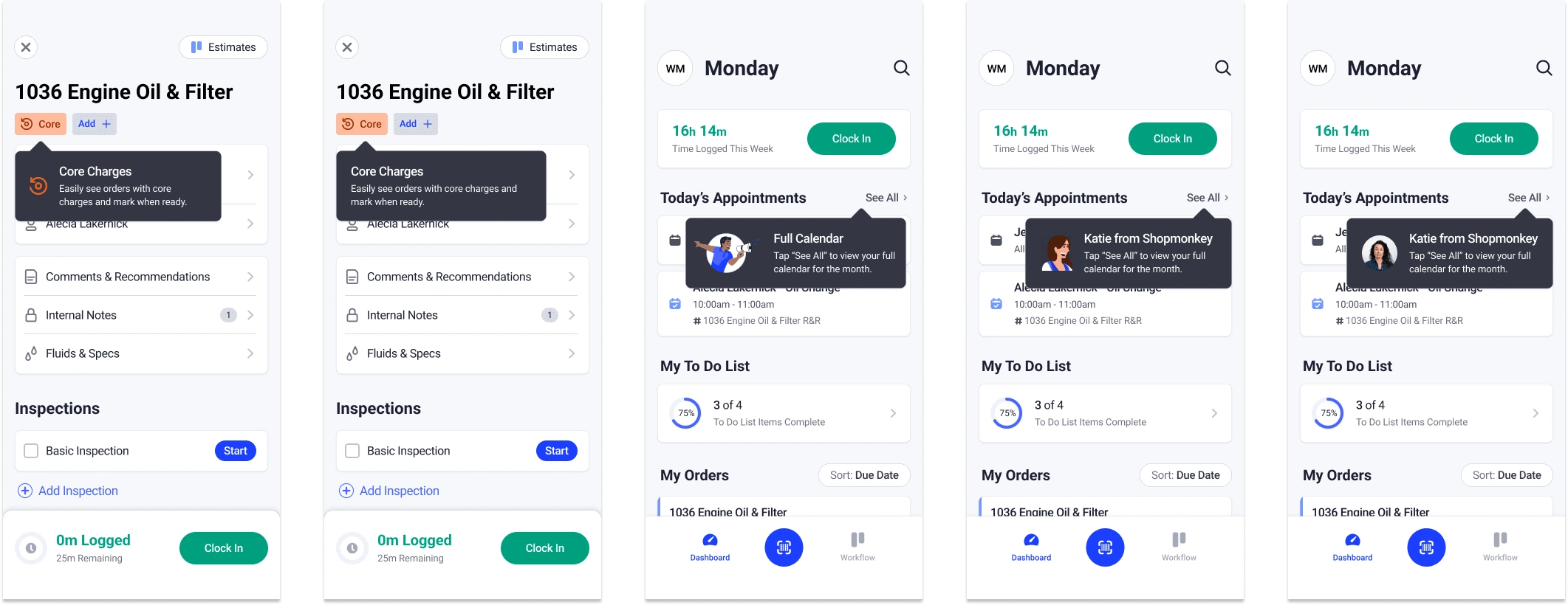
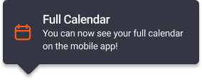
For new Tier 2 features, introducing a large icon with its corresponding tooltip does double duty in not only announcing the feature, but also in educating the user which icon is associated with that particular feature, so it can be reused in other areas of the app. This helps increase learnability for users who do not recognize icons that are unique to Shopmonkey’s product.
Tier 3
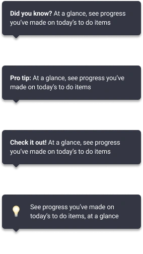
Final Tier 3 designs were separated into new feature enhancements and showing users existing features. New feature announcements would include a descriptive title to help educate the user.
Incorporating the “Protip” concept helped distinguish Tier 3 from Tier 2 designs visually, for existing feature announcements. This reusable copy and emoji icon not only follows a similar visual pattern on Shopmonkey web, but also helps make this component adaptable for a wide variety of use cases. It conveys the intended meaning visually rather than relying on copy as a descriptor, which helps speed up recognition for busy techs using the app, based on prior data.
What’s New?
Since the “What’s New?” flow was hidden deep in the app, there was deliberate discussion within the product team about whether the level of effort in development work would be worth the comparatively small impact it would make in the overall user experience. Because of this, our team ultimately decided to add a persistent entry point to the “What’s New?” screen and link it to an existing embedded web page used by Shopmonkey’s web platform to summarize release notes, since it balanced the team’s resource capacity at the time with achieving the project’s original goals.
Results
These designs are currently in development for Shopmonkey’s design system and in the Shopmonkey for Techs app on iOS. To continue evaluating efficacy, the team will continue to monitor app metrics and usage.
One potential approach is by isolating an existing feature with low current usage and tracking whether there is a sharp increase after designs from this project are launched. If numbers go up significantly, it can be concluded that these designs are effective in achieving our initial goal of bringing awareness to hidden features.
Another potential long-term pitfall is to prevent flooding the user with too many announcements and tooltips, and run the risk of users becoming blind to them. It is important to continue to keep a high-level perspective and make sure these components continue to improve, not detract from, the user’s overall experience of the app.
Lessons Learned
Write with the user in mind
Collaborating directly with a dedicated UX writer for this project was helpful in further understanding that every facet of a design needs to be intentionally centered around the user. In the same way product designers optimize flows, interactions, and visual elements to improve the user experience, UX writing involves the same focused philosophy, but with words and tone, to highlight value to the user.
Keep it real
A few key constraints, such as available project development resources and user testing results, ended up significantly influencing the final design direction for this project. Examples include collaborating closely with the engineering team to weigh the trade off between cost versus impact for the product as a whole, and adapting designs based on concrete user data, stakeholder feedback, and metrics throughout the process.
Great ideas come from anywhere
Each person on a team brings a unique perspective to the table. Some of the most insightful ideas from this project came from teammates I actively sought out that do not specialize in mobile or product design, such as customer support or marketing. Incorporating diverse perspectives throughout the process can lead to a more well-rounded experience for the end user.
Like this project
Posted Nov 26, 2024
Creating a set of reusable components and screens to bring awareness to features on Shopmonkey mobile