Built with Framer
Fina Money Website Redesign
Kalim Khan
Verified
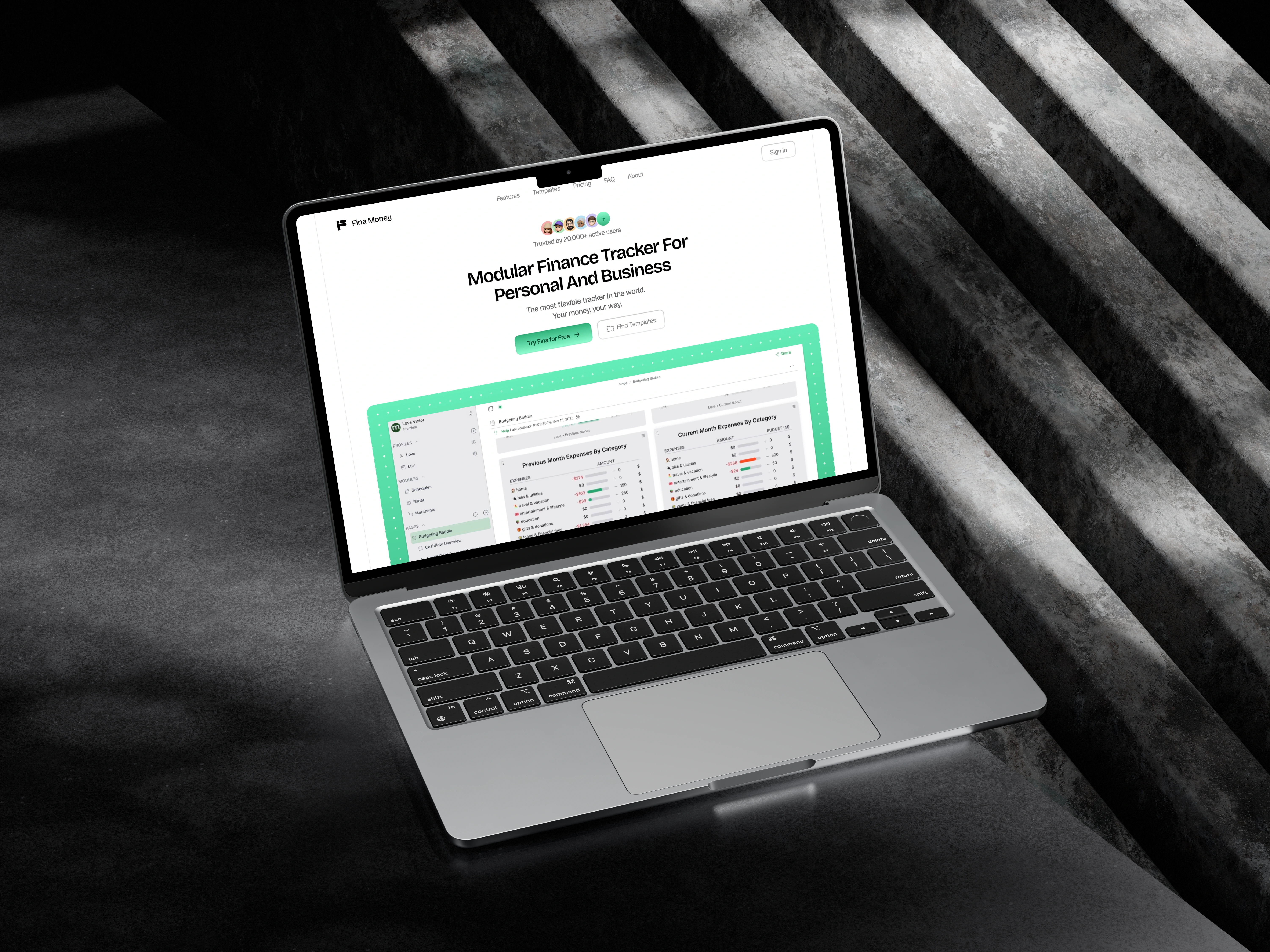
Fina Money Website Refresh
Role: Product Website Design (UX, UI, Copy Structure)
Client: Fina.money (Finance SaaS)
Timeline: 1 week
Tools: Figma, Jitter
The challenge
Fina is a powerful finance platform, but their website didn’t reflect that strength.
The previous website:
Was text-heavy
Made it hard to understand the product quickly
Didn’t guide users through a clear story
Lacked strong visual hierarchy for key features
This created friction for new visitors evaluating the product.
Redesigned website
What I did
1. Clarified the core message: Rewrote and redesigned the hero section to immediately explain what Fina is, who it’s for, and why it’s different.
2. Re-structured the page for clarity: Turned long feature lists into scannable sections with clear titles, short descriptions, and visual previews.
3. Designed for visual understanding: Introduced UI previews, feature cards, and consistent spacing to reduce reading fatigue and help users “see” the product.
4. Built a conversion-focused layout: Reordered sections to guide users naturally from value → features → proof → action.
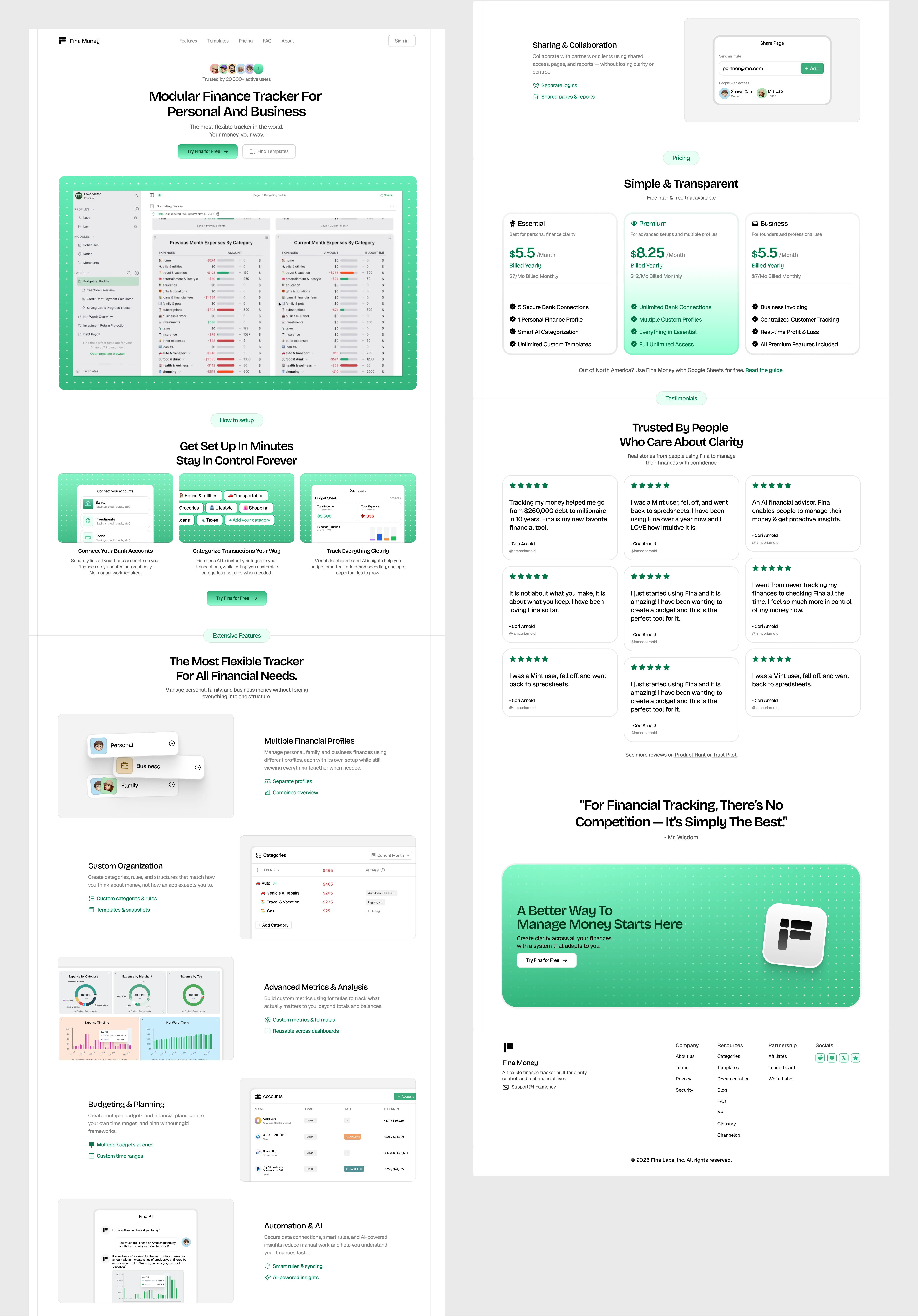
Full Landing page view
The result
The refreshed website:
Feels significantly more clear and premium
Communicates the product value faster
Makes complex features easier to understand
Builds more trust with first-time visitors
The biggest improvement was not just visual polish it was clarity and flow.
Why this approach works
Most SaaS websites fail because they overload users with information.
My approach focuses on:
Clear hierarchy
Visual storytelling
Fast comprehension
Conversion-first layout
This helps strong products communicate their value better.
Want a similar refresh?
If your product is great but your website isn’t converting, I can help you redesign it for clarity, trust, and conversion.
Like this project
Posted Feb 4, 2026
Refreshed a finance SaaS website to improve clarity, visual hierarchy, and user flow so visitors understand the product in seconds.
Likes
0
Views
15
Timeline
Jan 16, 2026 - Jan 30, 2026
Clients
Fina Labs, Inc.