Built with Framer
Vuze website design - A New Era of Creator–Brand Collaboration
Kalim Khan
Verified
Designing the Vuze Website
Vuze was one of the most exciting projects I’ve worked on a creator-brand platform that rewards creators for every view, helping brands launch authentic short-form campaigns with verified creators.
My goal was to design a bold, modern, and high-energy website that captures the heartbeat of the creator economy fast, dynamic, and culture-driven.
The Vision
From the start, I wanted Vuze to feel alive.
The concept wasn’t just a platform it was a movement: connecting creators and brands in a new, fair way.
Every part of the design had to communicate:
⚡ Speed (instant campaigns, instant results)
💎 Trust (verified creators, insured payouts)
🔥 Energy (creator culture meets real business)
So instead of a generic “tech startup” look, I leaned into a cinematic, glowing red aesthetic powerful, emotional, and full of depth.
Hero section
Hero section closeup
Why the Red Theme?
Red wasn’t just a brand color it was the pulse of the product.
It represents:
Action creators posting, brands launching, campaigns going live.
Energy a reflection of short-form platforms like TikTok, YouTube Shorts, and Reels.
Confidence bold enough to stand out, sharp enough to feel premium.
The red-glass UI and subtle gradients added movement and life, while deep blacks and shadows gave it that futuristic luxury edge.
We Made Two Powerful Pages — One for Creators, One for Brands
The Brands page took on a more structured, premium tone — highlighting verification, security, and campaign performance.
Page designed for Brands
Designed for Creators page
The Creators page was designed to feel fast, fun, and full of energy — just like the people it’s built for.
Design Process & Thoughts
The design journey started with three simple questions:
How do we make this feel like a real, living platform not just a static website?
How can creators and brands feel equally seen and valued?
How do we make this visually addictive something that feels scrollable, clickable, and rewarding?
So I designed:
Dynamic split-views (Creator ↔ Brand toggle)
Animated counters and real-time stats for trust
3D glass icons and glowing cards to show depth
Bold typography that matched the creator culture tone punchy, playful, fearless.
Every section was crafted to move like a story from earning per view, to brand verification, to protection and results.
🎯 The Outcome
The client absolutely loved the design it perfectly matched their vision for Vuze as a high-energy creator-brand ecosystem.
However, before development began, the client’s business direction shifted, and we had to pause the website rollout.
Even though the project never launched, it stands out as one of my favorite concept-to-execution designs both visually and strategically.
(I’ll be adding a few design preview images here to showcase the visuals, hero, and section interactions.)
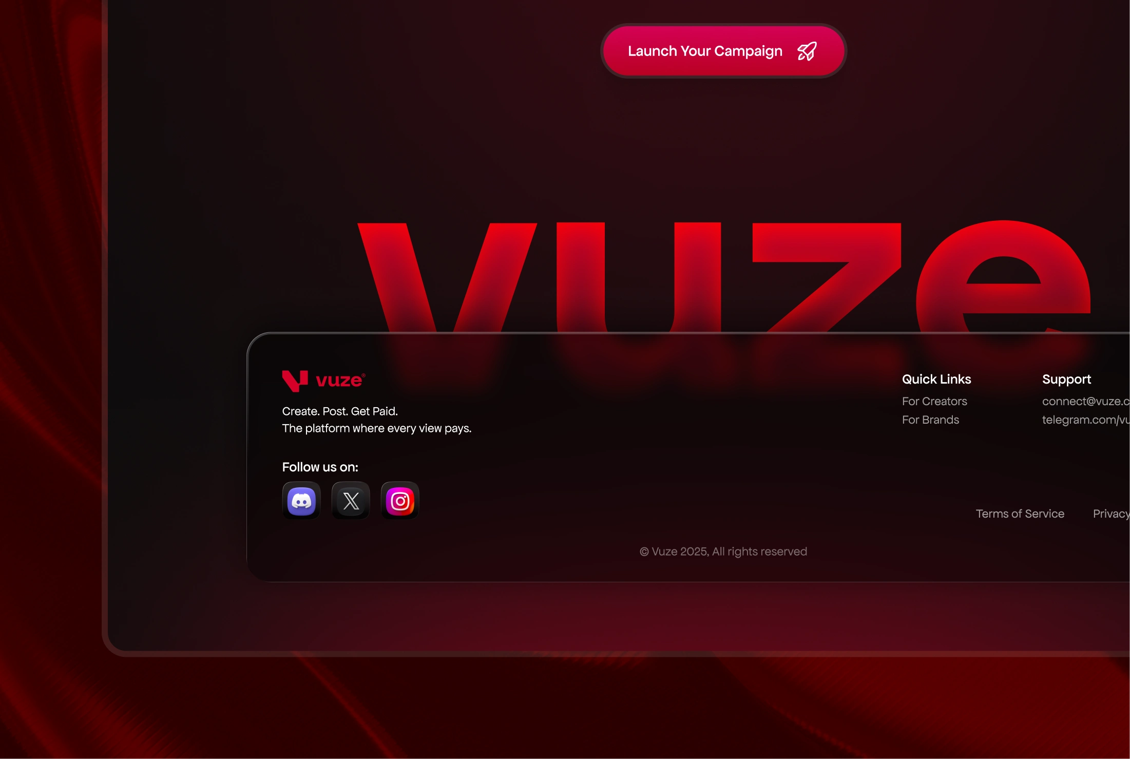
Footer Closeup

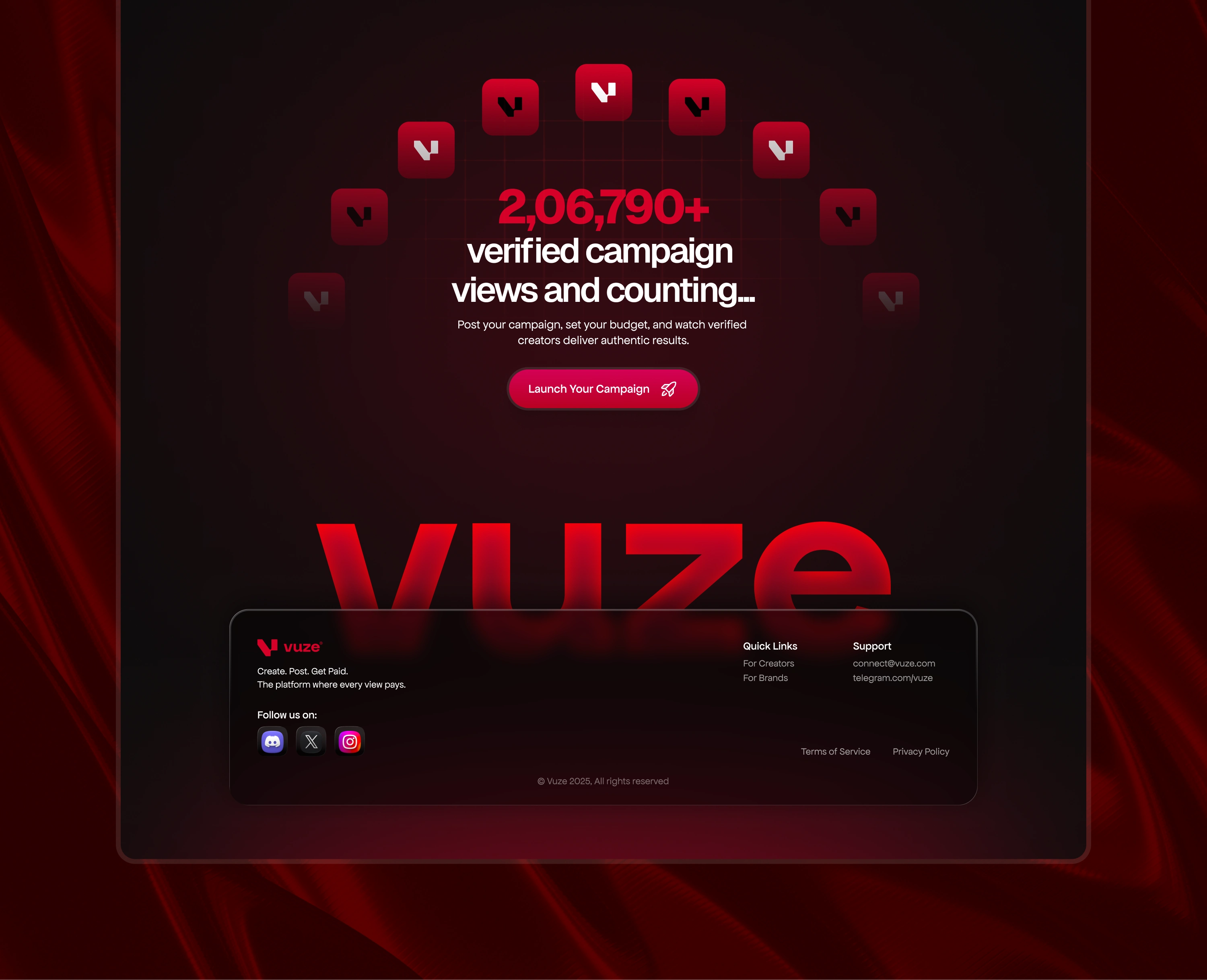
CTA Section
Full footer preview
Full site preview - Brand page
Final Thoughts
The Vuze website was more than a project it was an experiment in blending bold color, creator culture, and trust-based UX into a single, emotionally driven design.
It taught me how powerful vibe can be in web design not just structure or layout.
And honestly, it still stands as one of the coolest things I’ve ever designed.
Ready to Build a Website This Good?
I design and develop, high-impact websites for brand, Startups, businesess of all kinds. If you want something bold, modern, and unforgettable let’s create it together.
Like this project
Posted Nov 30, 2025
A website designed for a fast-growing creator economy built to connect brands and creators through bold visuals, motion, and a powerful red identity.
Likes
1
Views
210
Timeline
Oct 30, 2025 - Nov 22, 2025