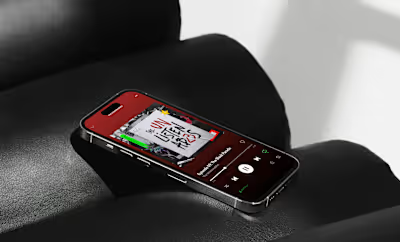
TEDx Boulder | Content and Logo
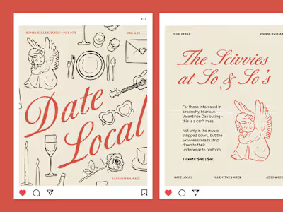
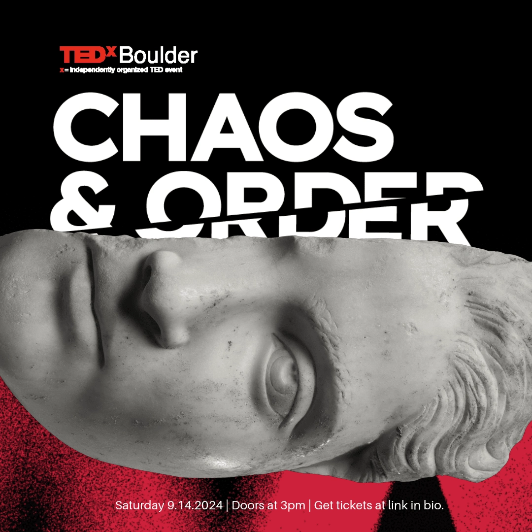
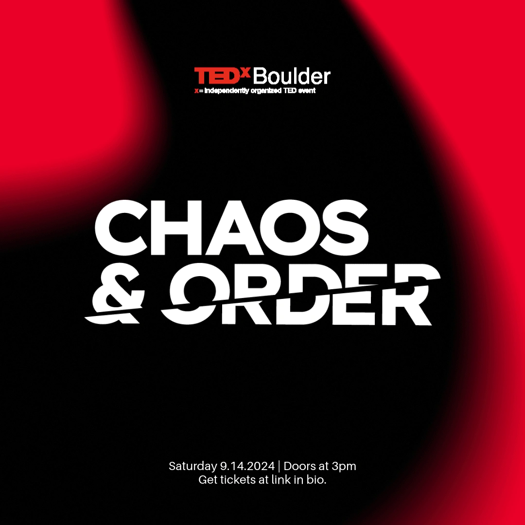
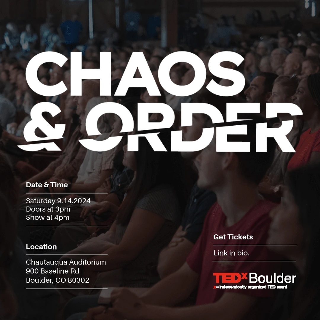
TEDx needed a distinctive logo and content set for their 'Chaos and Order' event in Boulder. Inspired by collage, graffiti and album cover artists, I created a logo and a variety of Instagram posts that played on the oxymoronic theme in a way that was visually interesting whilst remaining accessible and professional.
Texture
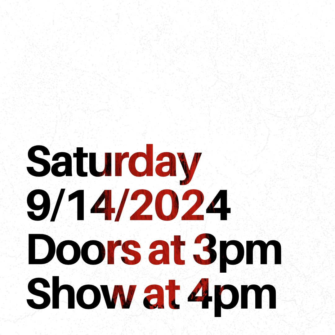
To match the contradictory nature of the event's theme, we explored contrasting textures throughout this project. Namely, we opted to use organic, paper and paint textures, overlaying neat, sans-serif typography.
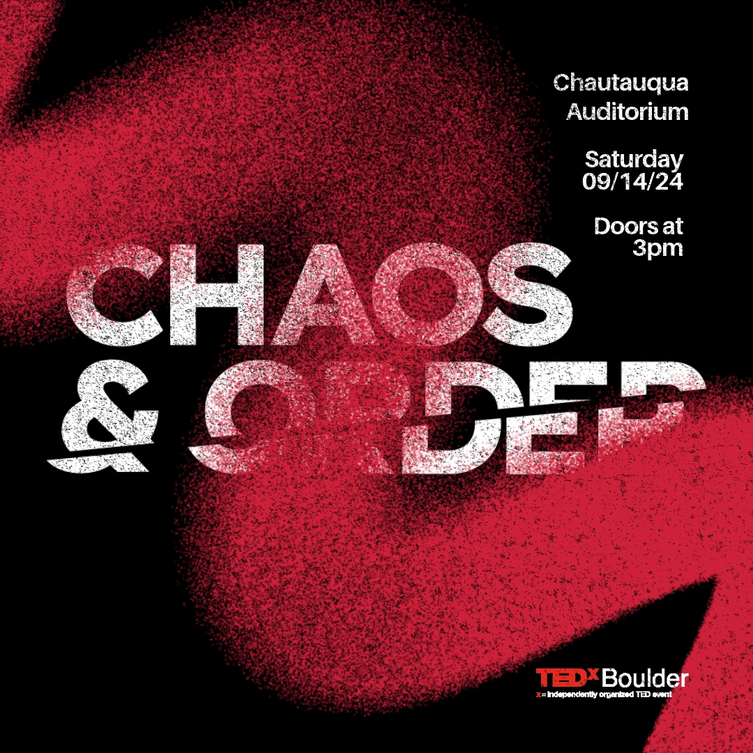
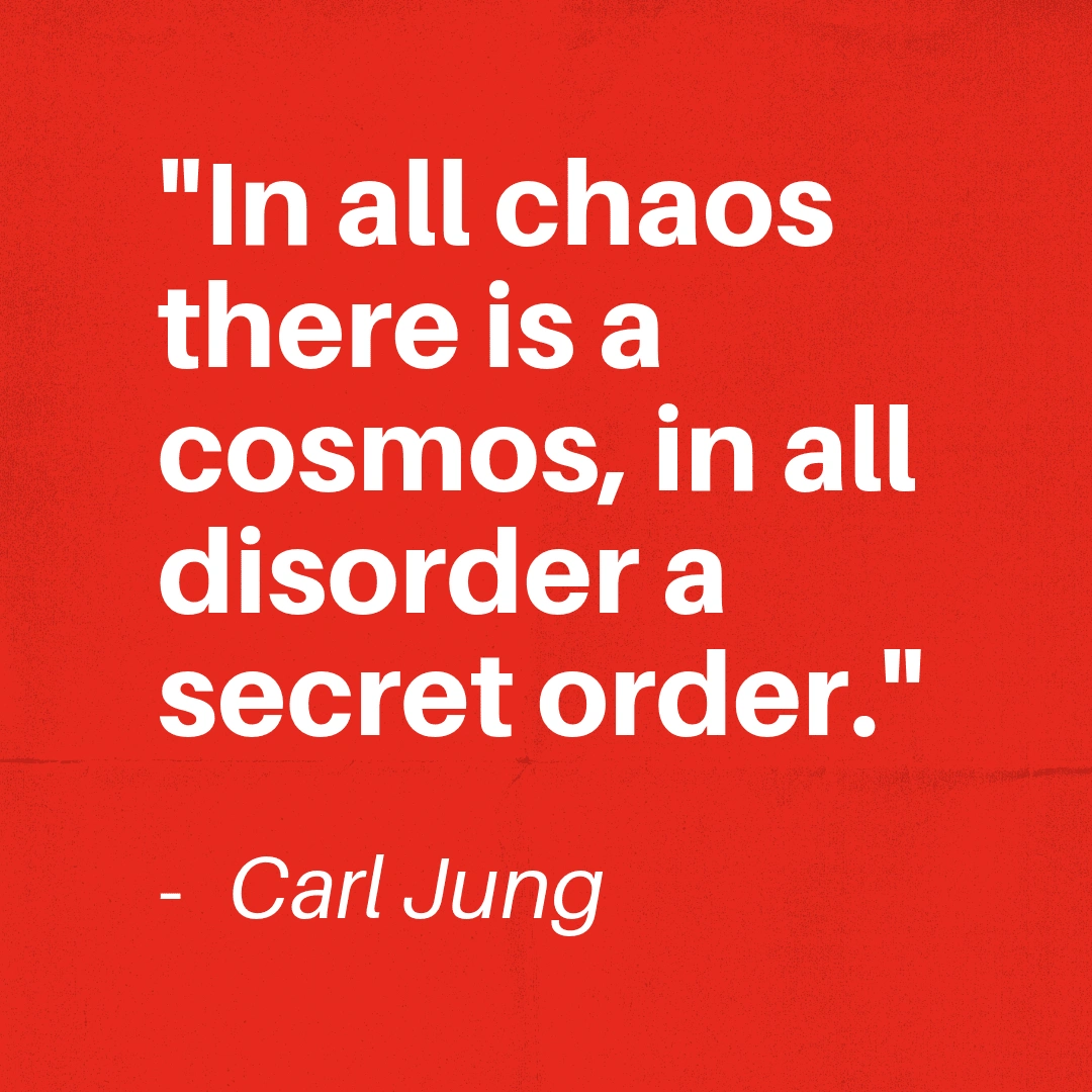
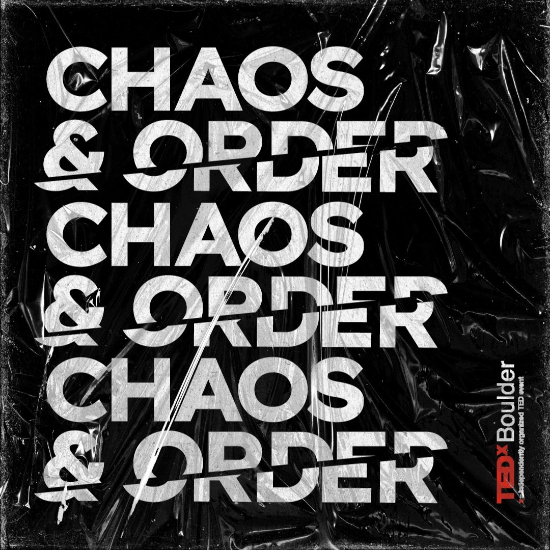
Cara was fantastic to work with. Great revisions, communication, and final product!
- Andrew, TEDx Boulder
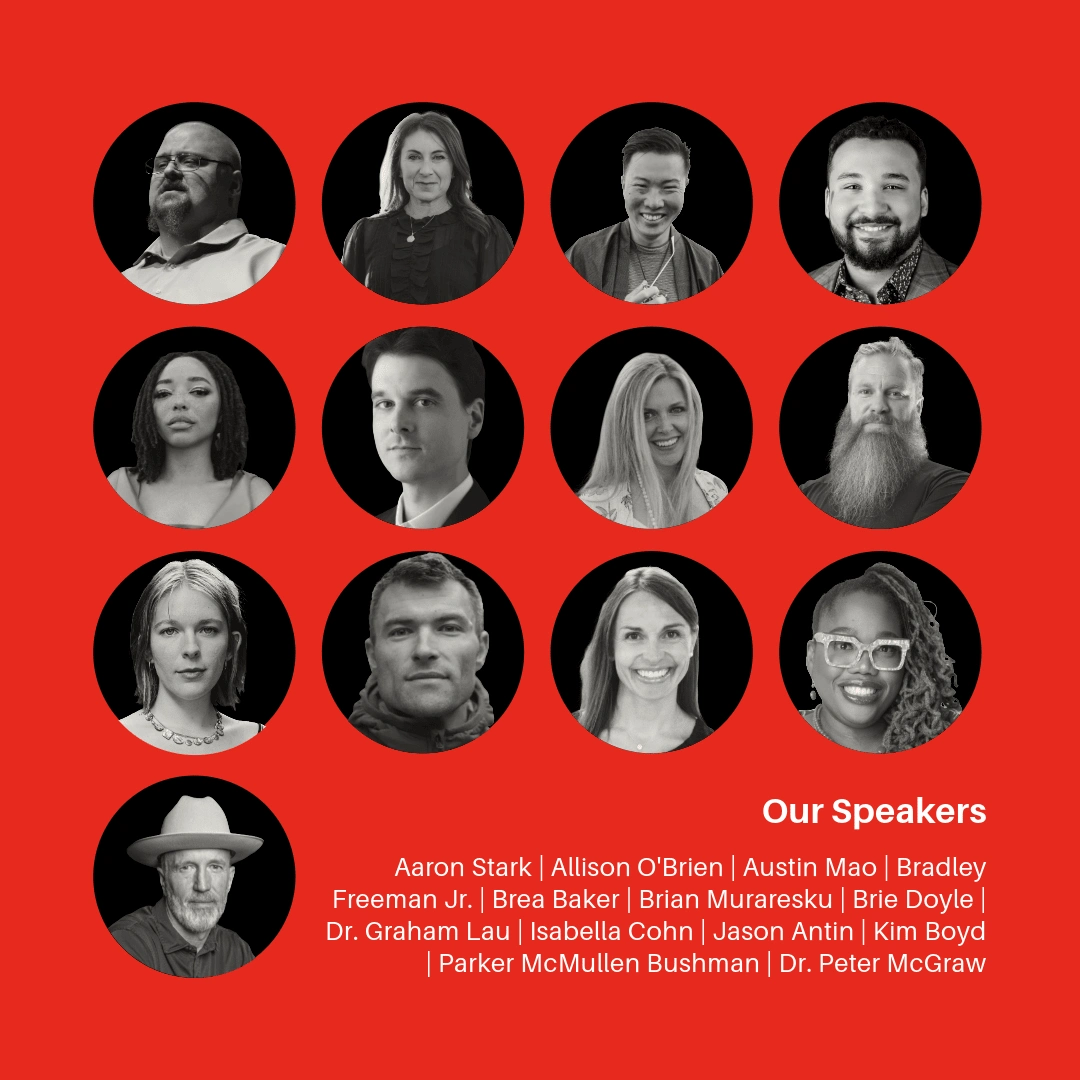
Colour
In order to create visual contrast, and to aptly use TED's brand identity, we heavily focussed on colour for this project, with red and black being our accents and through lines. It was important that colour contrast was used successfully to ensure that all text was legible, and graphical assets stood out.
View this project on my website:
View my full portfolio:
Like this project
What the client had to say
Cara was fantastic to work with. Great revisions, communication, and final product!

Andrew Hyde
Aug 20, 2024, Client
Posted Sep 26, 2024
TEDx needed an eye-catching logo and content pack that reflected their event's theme of Chaos & Order, using collage, colour and texture ❤️🔥
Likes
17
Views
124
Timeline
Aug 15, 2024 - Aug 20, 2024
Clients
TED

TEDx


