Built with Kittl
The Unlistenables | Brand Identity
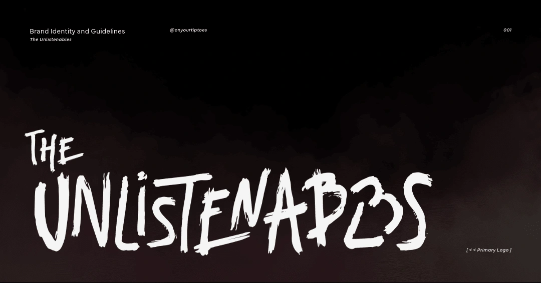
The Unlistenables
The Unlistenables is a podcast all about the alternative music that defined the late 90s and early 2000s. They talk about the rise and fall of the midwest emo, the songs that ruled hearts on MySpace, and the queen herself - Haley Williams.
So, they needed a visual identity that felt both nostalgic and representative of a bygone cultural moment - and perfectly able to hold its own when seen on Spotify or Instagram in 2025.
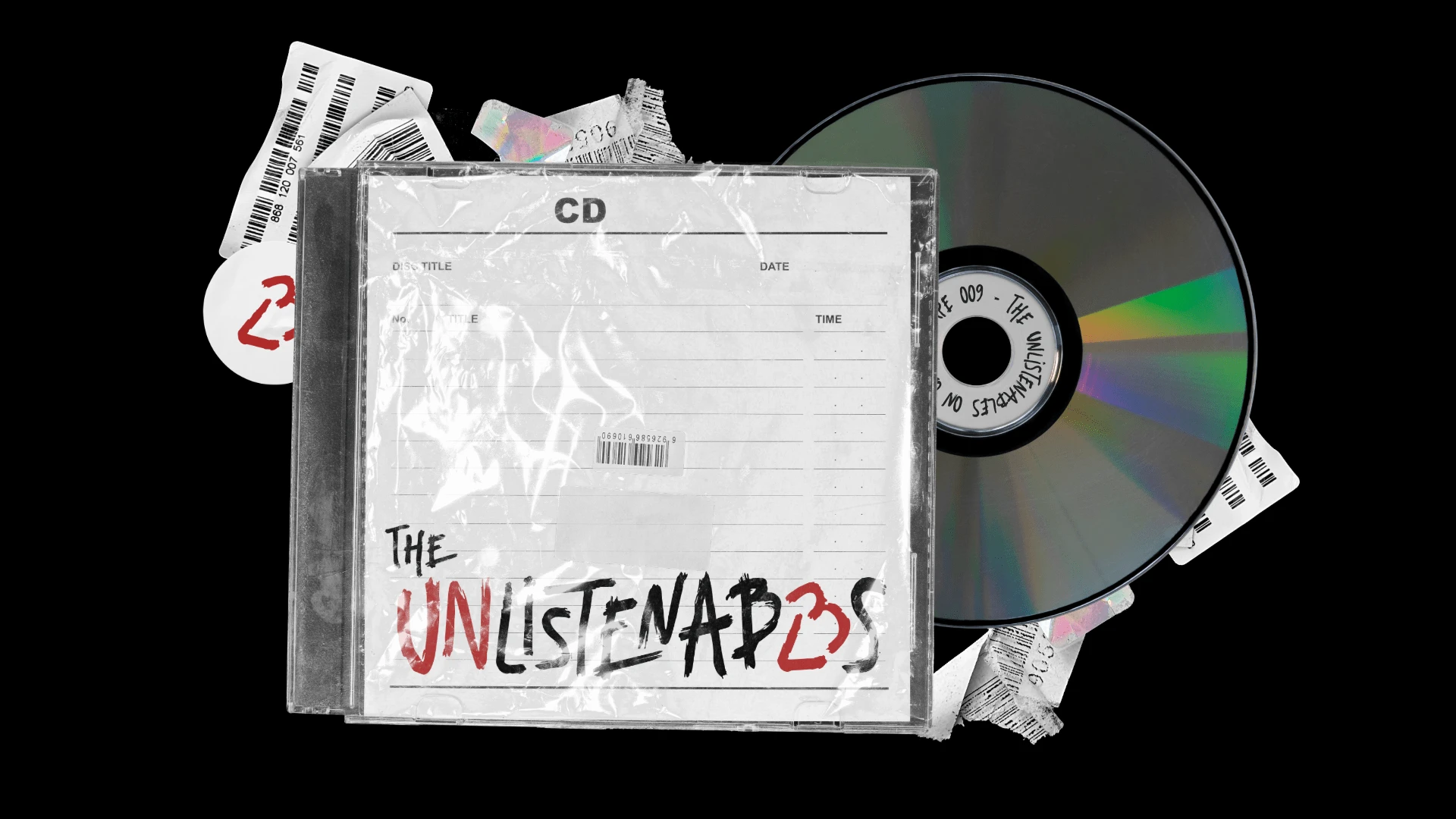
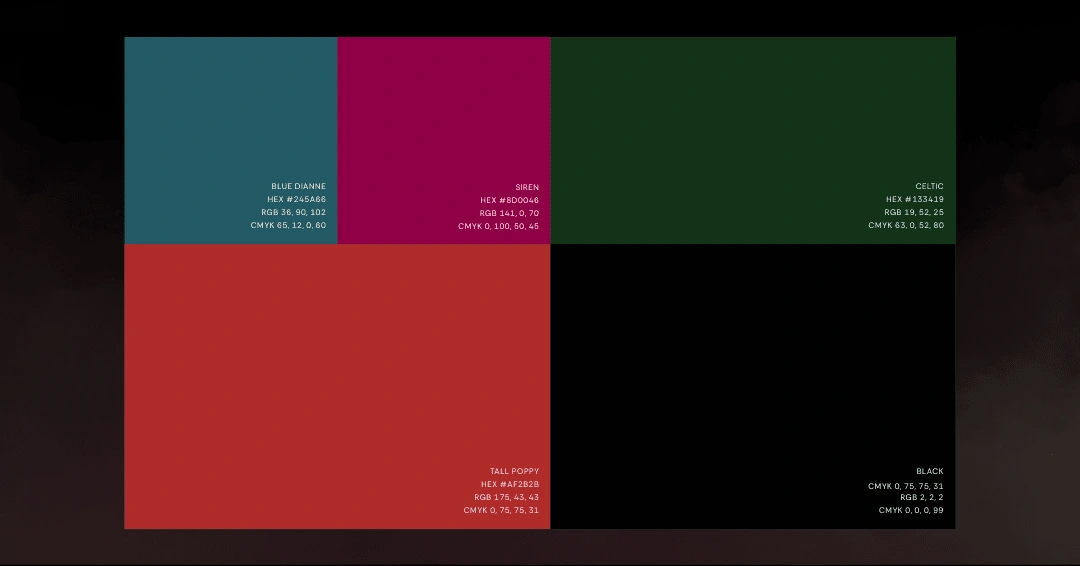
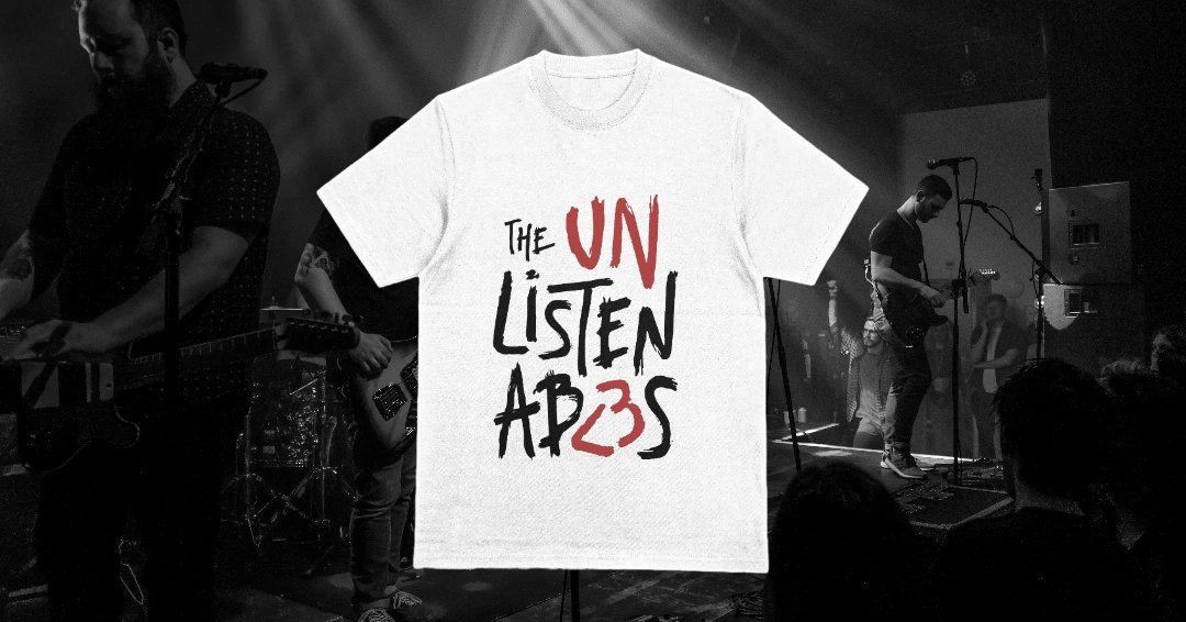
The result was this: a scrappy yet well-balanced logo suite that utilises grungy typography, 00's iconography and the classic emo colors (red and black).
I <3 The Unlistenables
This logo suite's notable feature is, of course, the <3 iconography. I logged back into my teenhood Tumblr account whilst working on this project for inspiration, and I saw a whole lot of this: <3. We knew wanted to give some kind of nod to the tech cultures of this era (MSN, MySpace, Tumblr), so replacing the 'LE' in 'Unlistenables' with '<3' was a perfect fit.
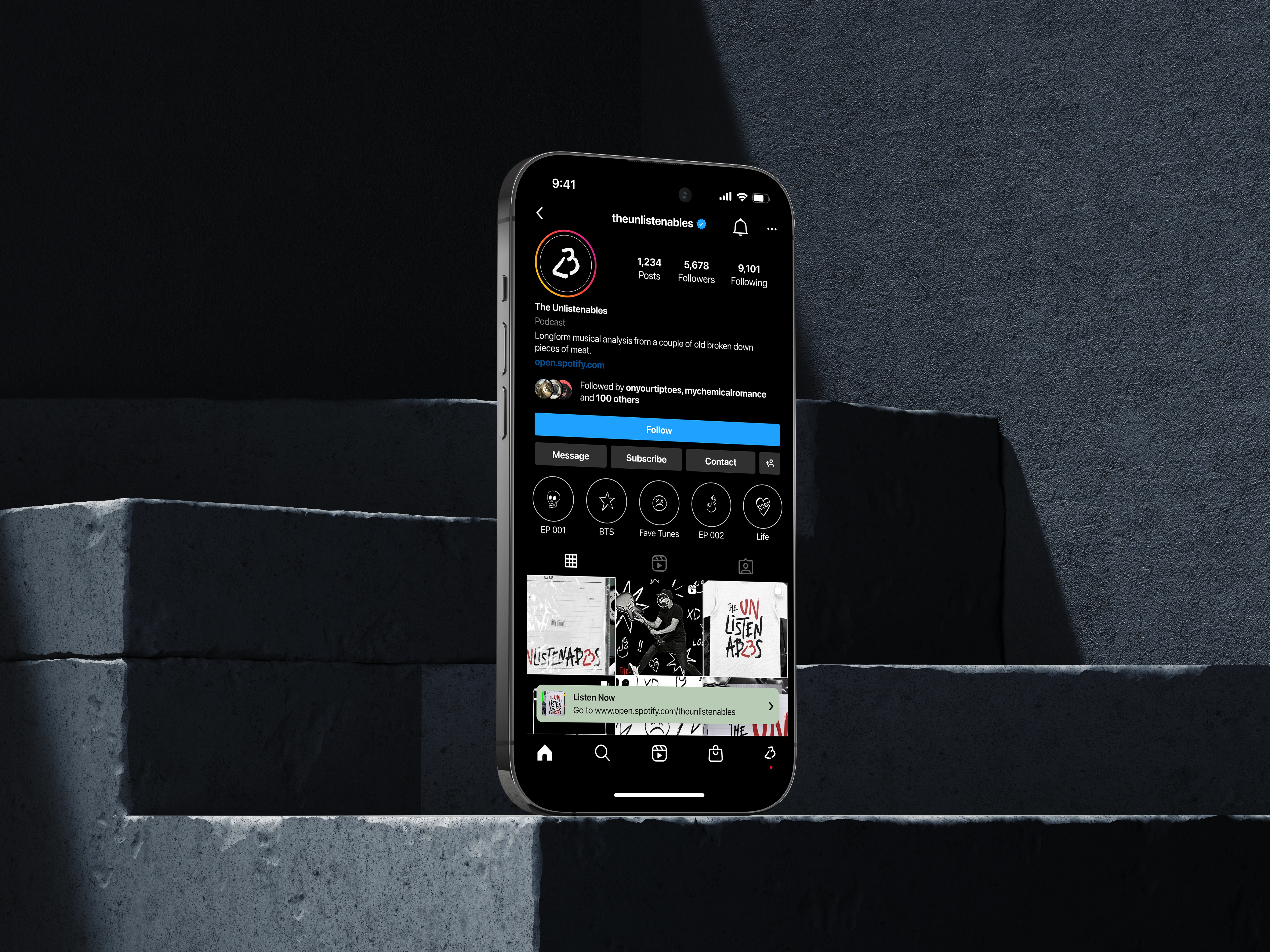
Straight from your middle school notebook...
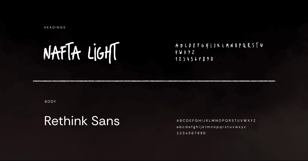
The Unlistenable's brand identity carries the hand-sketched styling from the logo and typeface to their considerately doodled brand asset pack. Skulls, wonky stars, broken hearts and sad faces - the key to any emo-kid's heart, via pen and paper.
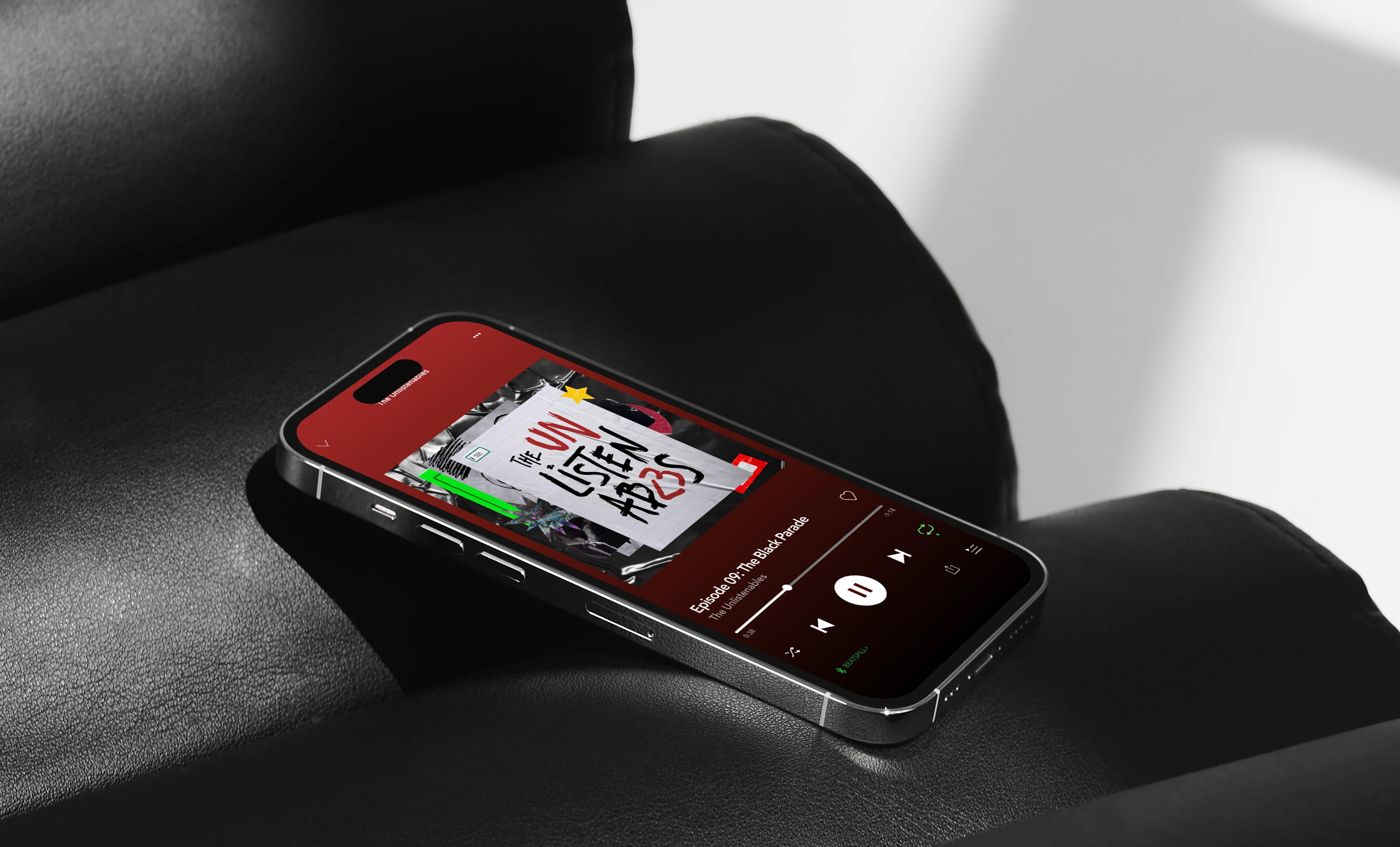
Spotify-ready.
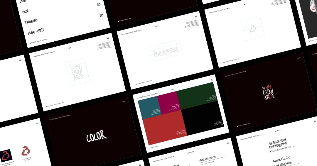
The stackable logo and recommended brand styling isn't just fun, it's purposefully designed to fit snugly inside a square podcast cover or social media post. By designing directly for the platforms the logo will be seen on, we ensure that the brand's visual identity looks effortlessly perfect in context.
View my website:
View my full portfolio:
Like this project
Posted Nov 26, 2024
For the former-emo-kids: a nostalgic yet future-proof brand identity, for a podcast all about the music that defined our adolescence 💀⭐️


