Reinterpreting Luxury: High-Contrast Editorial E-Commerce
Talha Yusuf
Reinterpreting Luxury: High-Contrast Editorial E-Commerce UI.
(Note: Frontend UI prototype focusing on layout architecture. Product pages and figures are mock examples for concept presentation, not a live storefront.)
💡 The Philosophy: Strategic Disruption: My approach is simple: Do something uniquely different than the generic market without disconnecting from the niche it belongs to. Traditional jewelry sites default to thin fonts and cluttered grids, blending into a forgettable corporate blur. This project preserves luxury product clarity while re-engineering the visual framework to deliver a bold, unforgettable editorial attitude.
🛠️ Why It Works:
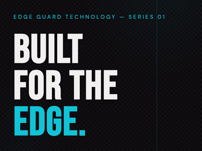
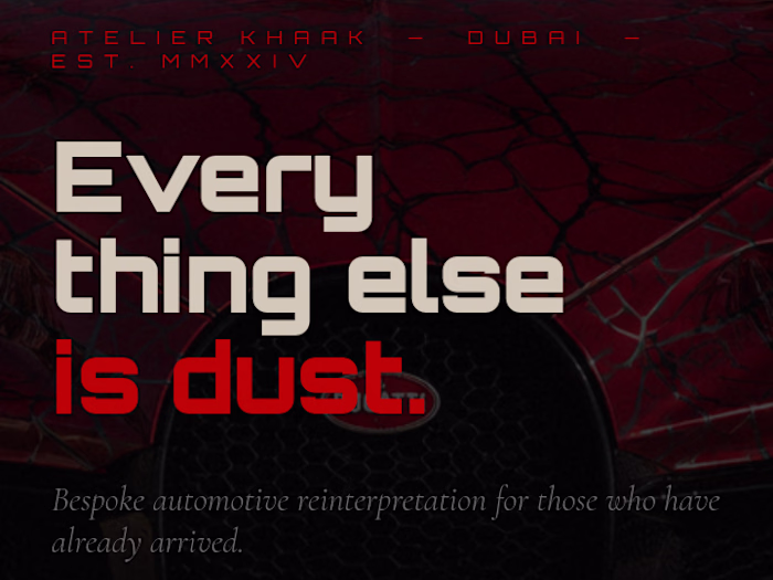
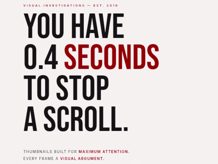
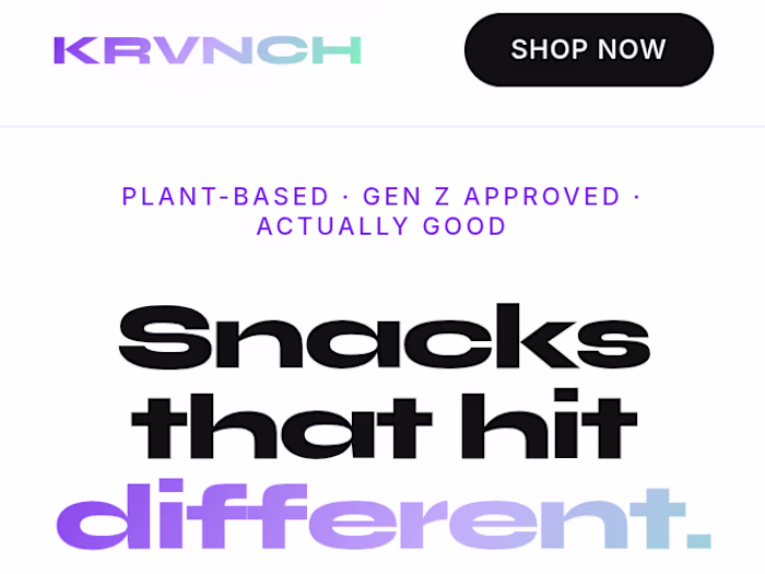
· Disruptive Typography: Swapped delicate luxury lettering for a heavy, high-contrast sans-serif headline style to puncture digital noise and demand immediate attention.
· Low-Friction Architecture: Replaced chaotic thumbnail grids with oversized, isolated product cards to reduce cognitive load and force focus on craftsmanship.
· Cultural Texturing: Embedded a geometric Iranian glass architectural motif into the background canvas, replacing sterile white backdrops with a tactile connection to heritage.
· Visual Speed Bumps: Executed a dramatic light-to-dark background inversion during the scroll to disrupt passive browsing and snap focus onto core brand values.
Like this project
Posted Jun 28, 2026
Reinterpreting Luxury: High-Contrast Editorial E-Commerce UI. 🔗 [https://zarstudios07.netlify.app/] (Note: Frontend UI prototype focusing on layout archite...
Likes
0
Views
0