Talha Yusuf
Creative Designer for Premium Brands & Content Creators.
New to Contra
Talha is ready for their next project!
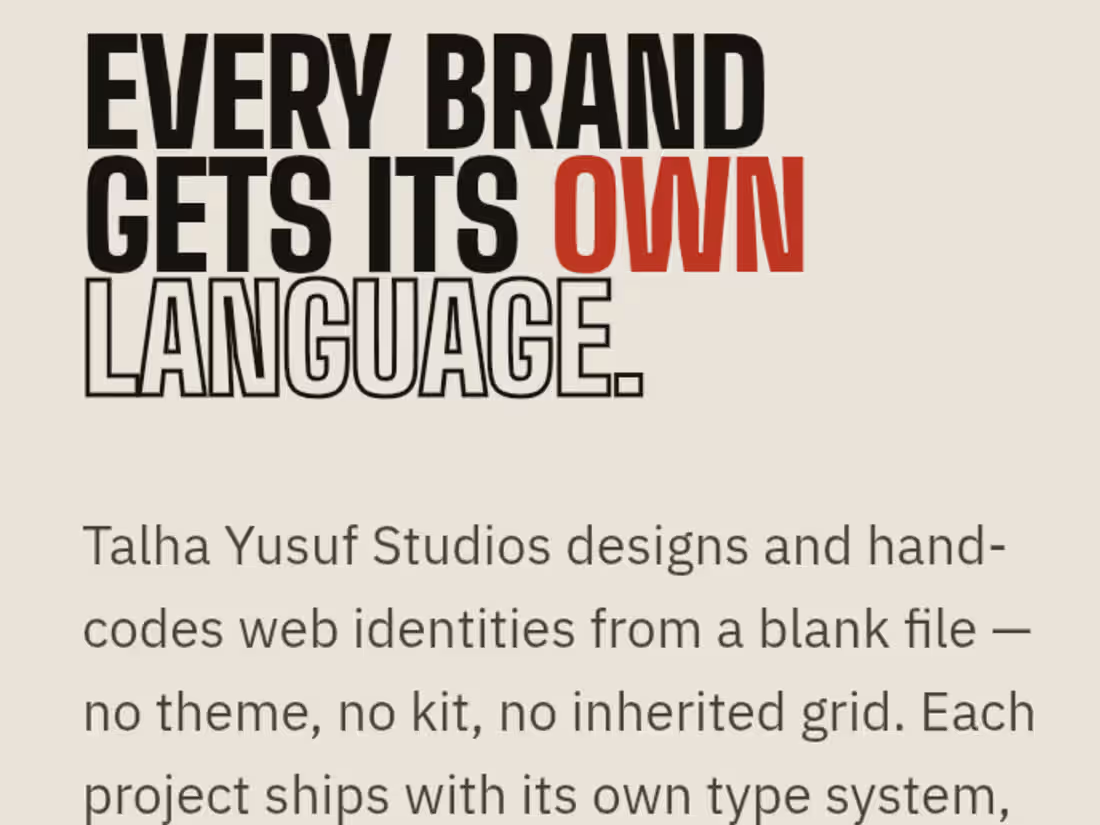
Case Study: Engineering a Zero-Template Agency Manifesto:
Context & Strategy: Most agency portfolios rely on rigid templates, generic layouts, or bloated builders that dilute a brand’s unique identity. To launch Talha Yusuf Studios, the objective was to build a flagship portfolio that practices exactly what it preaches: an elite digital experience coded entirely from a blank file (file-zero) with zero shared components, zero themes, and absolute performance optimization.
System Architecture:
The Code: Built entirely from scratch using lightweight, high-performance semantic HTML and CSS, maintaining an exceptionally low page weight for instant global loading speeds.
· The Interface: Engineered an unconventional, high-fashion editorial index that trades standard grid patterns for an original typographic layout and custom CSS-driven text marquees.
· The UX Flow: Implemented deep-linked anchor routing (#index, #process) to give high-ticket clients frictionless, immediate access to live production assets and the agency's strategic framework.
– The Value Delivered –
· 100% Bespoke Positioning: Establishes an immediate premium contrast against competitors using standard page builders, positioning hand-coded architecture as a luxury asset.
· Accelerated Client Onboarding: Integrates a structured four-stage brief progression directly into the viewport, moving prospective clients from discovery to project inquiry on a single page.
· Live Proof-of-Concept: Serves as a live, fully responsive demonstration of pure frontend fluidity, proving design authority without hiding behind external plugins.
1
0
8
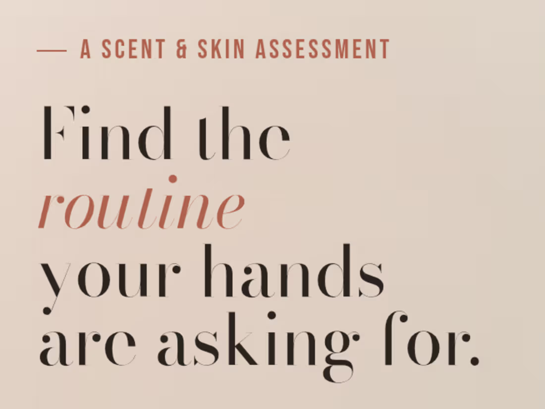
Gloved Hand Care Quiz Concept:
A self-directed concept built to demonstrate interactive product-matching UX for a DTC pitch.
Concept design and build created as a sample piece for a client application showcasing a guided quiz flow that matches users to a personalized hand care routine based on skin type, scent preference, and lifestyle. Built to demonstrate how interactive, personalization-driven UX can replace a standard product catalog for wellness/beauty DTC brands.
Focus areas: quiz logic and flow design, conversion-oriented UX, and clean editorial product presentation.
[https://quizconcept.netlify.app/]
1
0
28
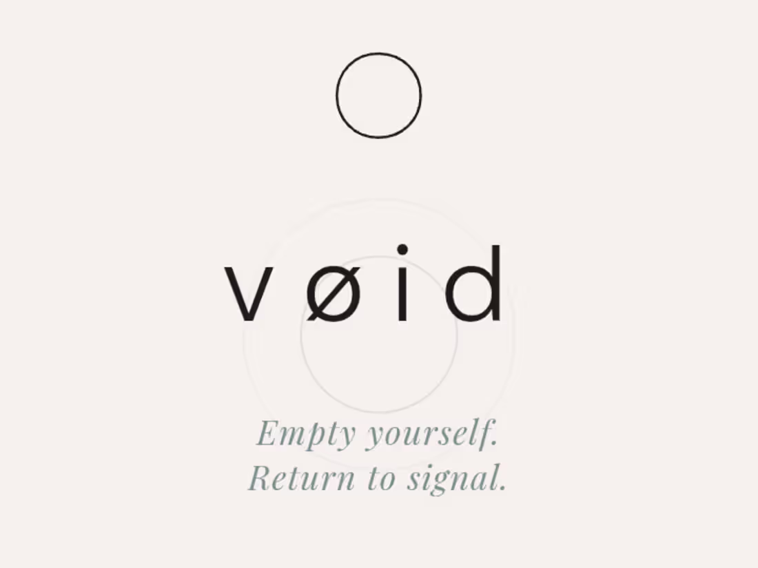
Project: VØID Brand Identity & Conversion Site. Speculative brand system, self-initiated:
The brief I gave myself: Build a complete brand voice and site for a category that's usually either clinical (supplement brands) or soft (wellness brands), and prove I can hold a third tone restrained, precise, almost cold without it collapsing into either.
What I built: Full identity system (typography hierarchy, voice doctrine, product narrative) plus a live conversion site. No template copy anywhere every line, including the brand voice rule itself ("clinical without being cold, spiritual without being soft"), was written to be load-bearing, not decorative. The constraint I set: No urgency language, no inflated stats, no stacked trust badges. Most DTC sites default to more proof points. I went the other way three steps, one product, one sentence per idea because the brand's whole premise is reduction, so the site had to physically demonstrate that, not just claim it.
[https://voidui.netlify.app/]
0
24
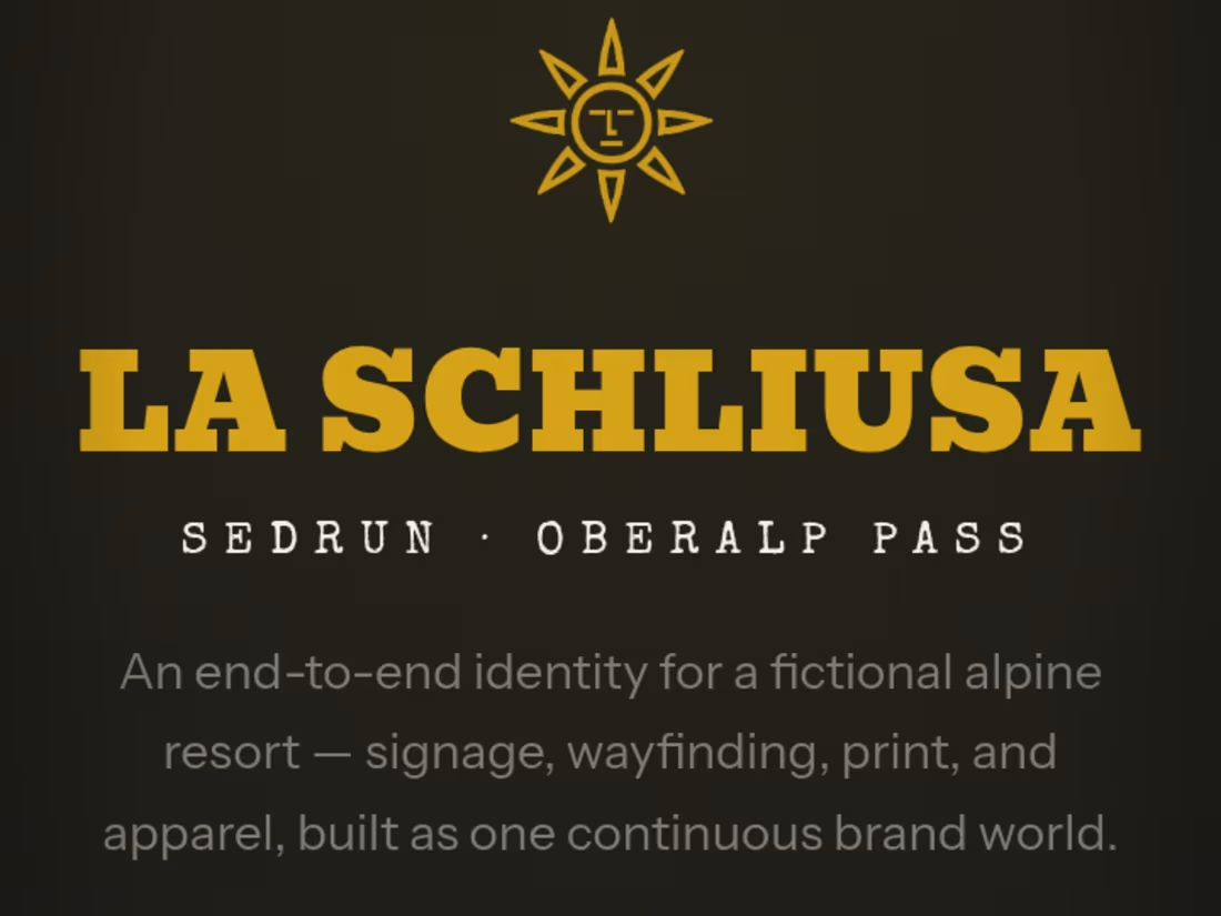
La Schliusa Comprehensive Brand Identity & Digital Editorial:
Most digital designs feel sterile, cold, and entirely detached from physical reality. When building the visual universe for La Schliusa, the mandate was the exact opposite: translate the raw, physical sensory experience of an exclusive alpine retreat into a digital interface. No templates. No generic layouts. Every element was architected from the ground up to command luxury status.
The Strategic Execution:
- Physical-to-Digital Wayfinding: Designed a cohesive visual language that anchors everything from physical stone signage, bespoke dining menus, and custom staff apparel directly into a unified digital ecosystem.
- The Atmospheric Pivot ("Why Warm, Not Cold"): Rejected the predictable, clinical blue-light aesthetics of standard modern web layout. Instead, engineered a custom color shifts across the interface using amber, deep charcoal, and rich cream tones to mimic the exact ambient lighting of an alpine sunset.
- Elite Typographic Architecture: Implemented bold, high-contrast serif headers paired with precise spacing ratios to create a fluid, premium editorial layout that holds attention effortlessly.
[https://la-schliusa.netlify.app/]
The Result: A digital presence that doesn't just display information it establishes immediate cultural prestige and psychological status before a guest even steps onto the property.
1
0
35
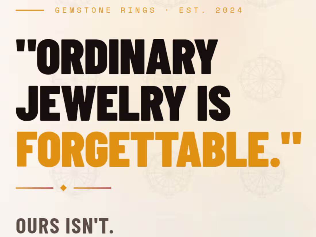
Reinterpreting Luxury: High-Contrast Editorial E-Commerce UI.
🔗 [https://zarstudios07.netlify.app/]
(Note: Frontend UI prototype focusing on layout architecture. Product pages and figures are mock examples for concept presentation, not a live storefront.)
💡 The Philosophy: Strategic Disruption: My approach is simple: Do something uniquely different than the generic market without disconnecting from the niche it belongs to. Traditional jewelry sites default to thin fonts and cluttered grids, blending into a forgettable corporate blur. This project preserves luxury product clarity while re-engineering the visual framework to deliver a bold, unforgettable editorial attitude.
🛠️ Why It Works:
· Disruptive Typography: Swapped delicate luxury lettering for a heavy, high-contrast sans-serif headline style to puncture digital noise and demand immediate attention.
· Low-Friction Architecture: Replaced chaotic thumbnail grids with oversized, isolated product cards to reduce cognitive load and force focus on craftsmanship.
· Cultural Texturing: Embedded a geometric Iranian glass architectural motif into the background canvas, replacing sterile white backdrops with a tactile connection to heritage.
· Visual Speed Bumps: Executed a dramatic light-to-dark background inversion during the scroll to disrupt passive browsing and snap focus onto core brand values.
1
65
CARBEX — Brand Identity & Concept UI
A full brand concept for a premium pickleball gear company. Built to position CARBEX above the generic Amazon accessory bracket technical, clean, and system-ready across product, packaging, and digital. The visual language draws directly from the material: carbon fiber weave, precision geometry, cold teal against near-black. No athlete photography, no generic sports energy. Just the craft.
Delivered as a responsive single-page web experience covering brand identity direction, product presentation, spec system, upcoming paddle teaser, and brand manifesto. Typography set in Bebas Neue and DM Sans. Designed to scale across Amazon listings, Shopify, packaging, and physical product.
Scope: Brand direction · Visual system · UI concept · Tone of voice · Product presentation
0
42
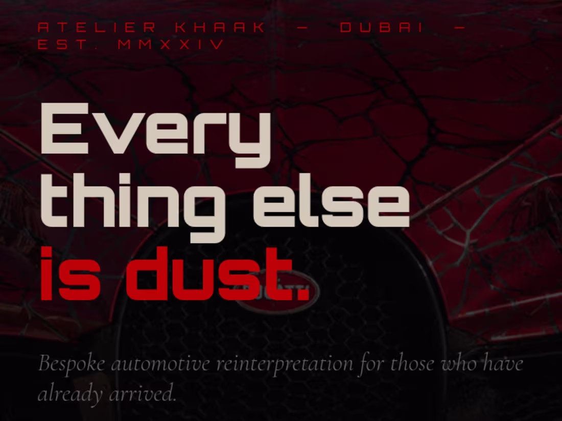
KHAAK is a fictional bespoke automotive atelier built to answer a simple question: What would a luxury brand feel like if it accepted only one commission every year?
This concept explores the intersection of brand strategy, cinematic storytelling, premium UI/UX, and frontend development. Every detail from the typography and visual identity to the motion and custom vehicle presentation was designed to create an experience that feels exclusive, timeless, and emotionally compelling.
Not every brand needs to exist to prove a design philosophy.
[https://khaak.netlify.app/]
0
39
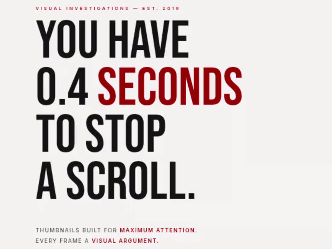
High-Converting Landing Page Design.
Designed and developed a premium landing page focused on elegant storytelling, modern aesthetics, and user experience. The goal was to create a visually immersive website that communicates a strong brand identity while guiding visitors through a clean and engaging journey. The design combines bold typography, refined layouts, subtle animations, and a premium color palette to create an experience that feels both sophisticated and conversion-focused.
0
56
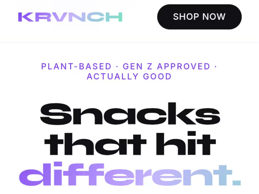
KRVNCH Shopify Landing Page Concept.
Unsolicited sample build for a Gen Z plant-based snack brand. Full landing page: hero, product showcase, brand story, and bundle purchase flow. Direction: white base, iridescent gradients, glassmorphism clean enough to let the packaging do the talking.
Built in HTML/CSS. Shopify-ready architecture.:
0
66
Brand identity concept for a Swiss alpine lodge. Logo, signage system, and color language built around alpine luxury positioning.
0
52
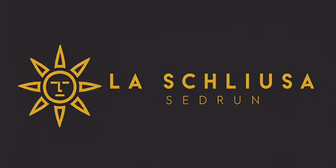
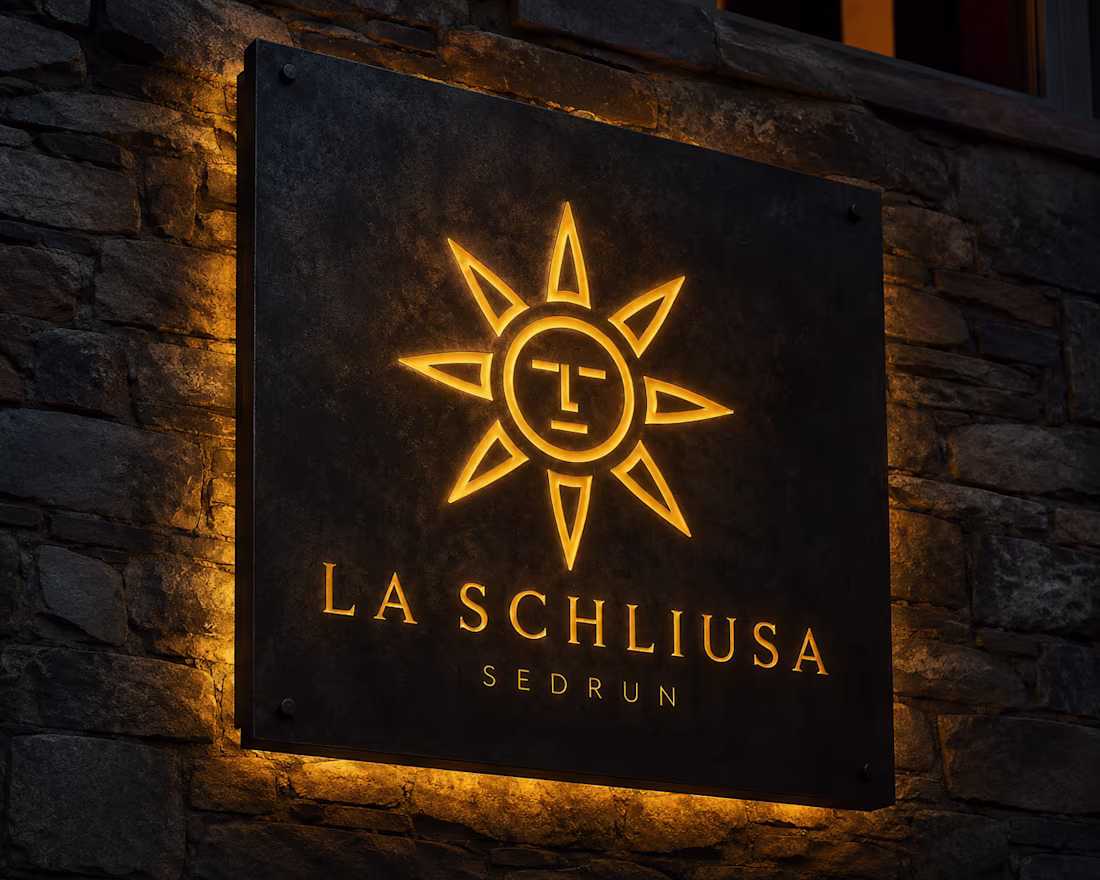
La Schliusa – Heritage Logo Exploration.
An early identity exploration inspired by the historical Sedrun sun, reinterpreted into a timeless symbol of warmth, hospitality, and Swiss alpine heritage.
La Schliusa – Guest Experience Touchpoint Exploration
An exploration of how the identity extends into the guest experience through refined typography, restrained materials, and symbolic storytelling rooted in the spirit of Sedrun.
0
55