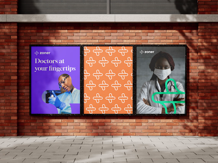
Sickler: A Sickle Cell Platform.
Sickler is a mobile platform that addresses the needs of people living with sickle cell. We envisioned a mobile application that helps these patients manage the disease effectively.
You can view the complete in-depth case study on my Portfolio. For now, here are some fancy shots😁
The Challenge
Creating a mobile app that meets the unique needs of Cameroonians living with sickle cell disease is no small feat. Over 20% of the population are either living with sickle cell or carriers, which is significant. We relied heavily on user feedback throughout the entire design process.

Research & Discovery
To kick things off, we sat down with sickle cell patients - one of them being my brother - and asked them a series of open-ended questions. We wanted to know what they struggled with, what they wished they had help with, and what they dreamed of having in an app. This allowed us to dive even deeper into the needs of our users.
Our research showed that users found these features incredibly helpful, so we decided to prioritise those for our MVP.
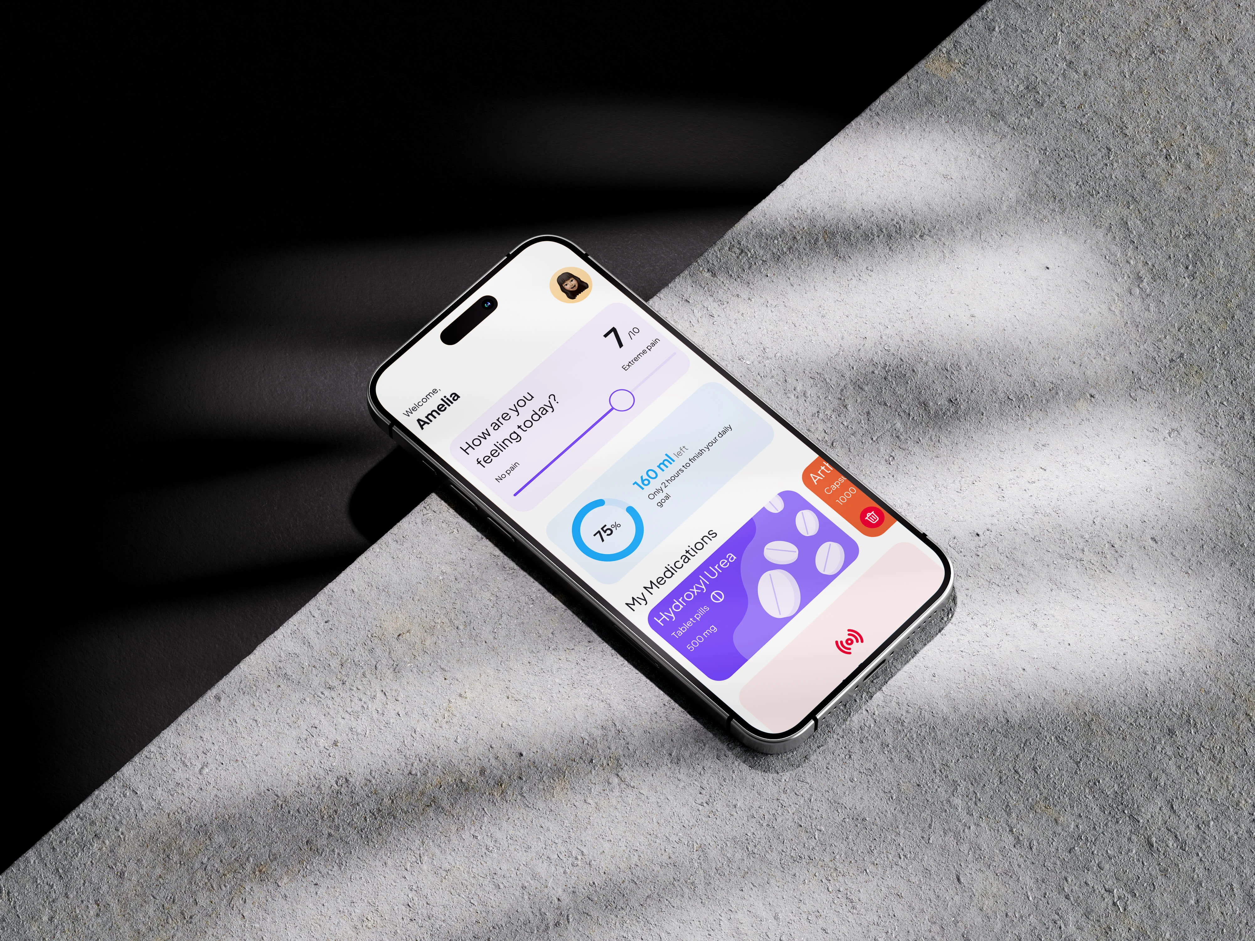
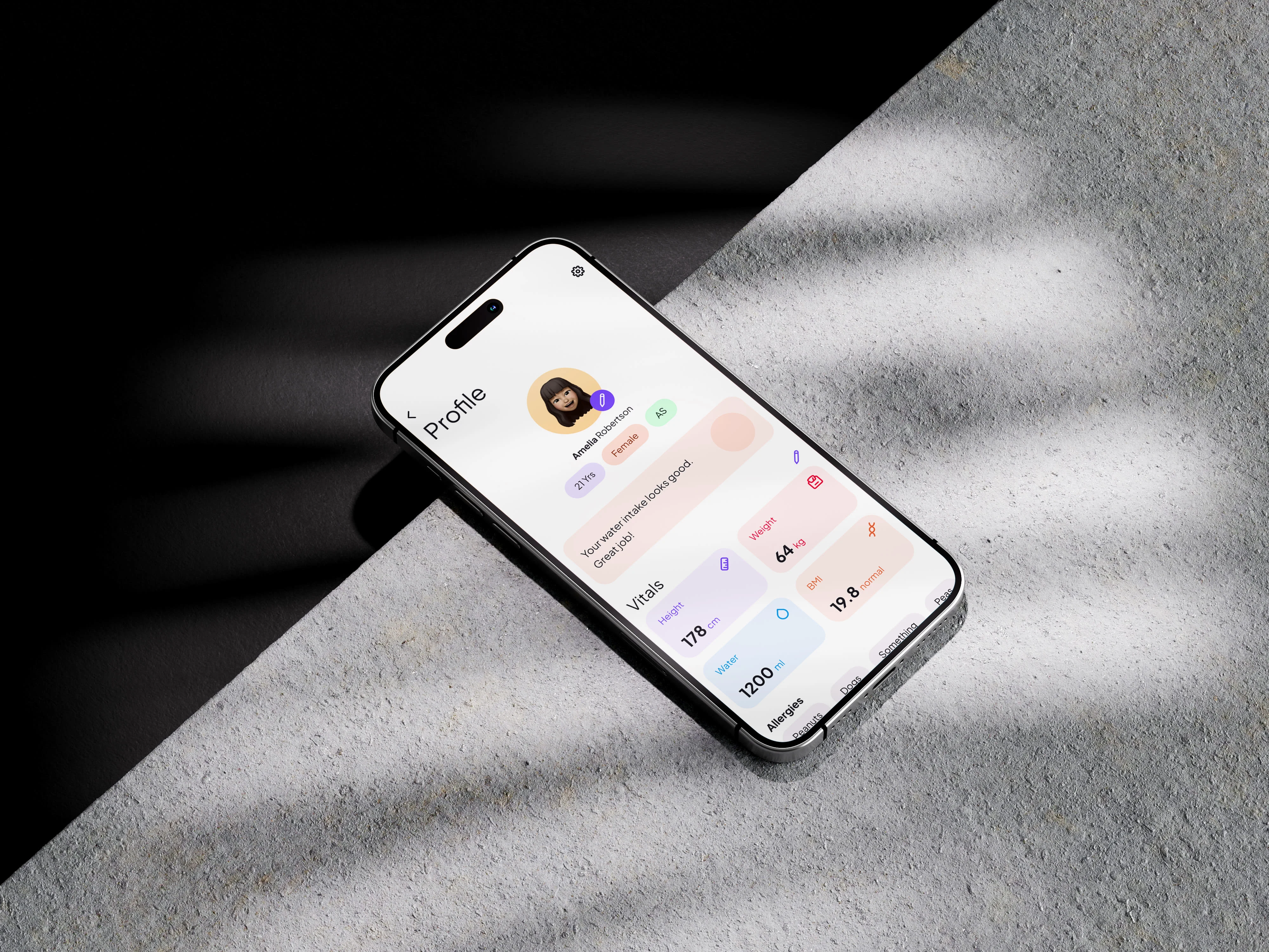
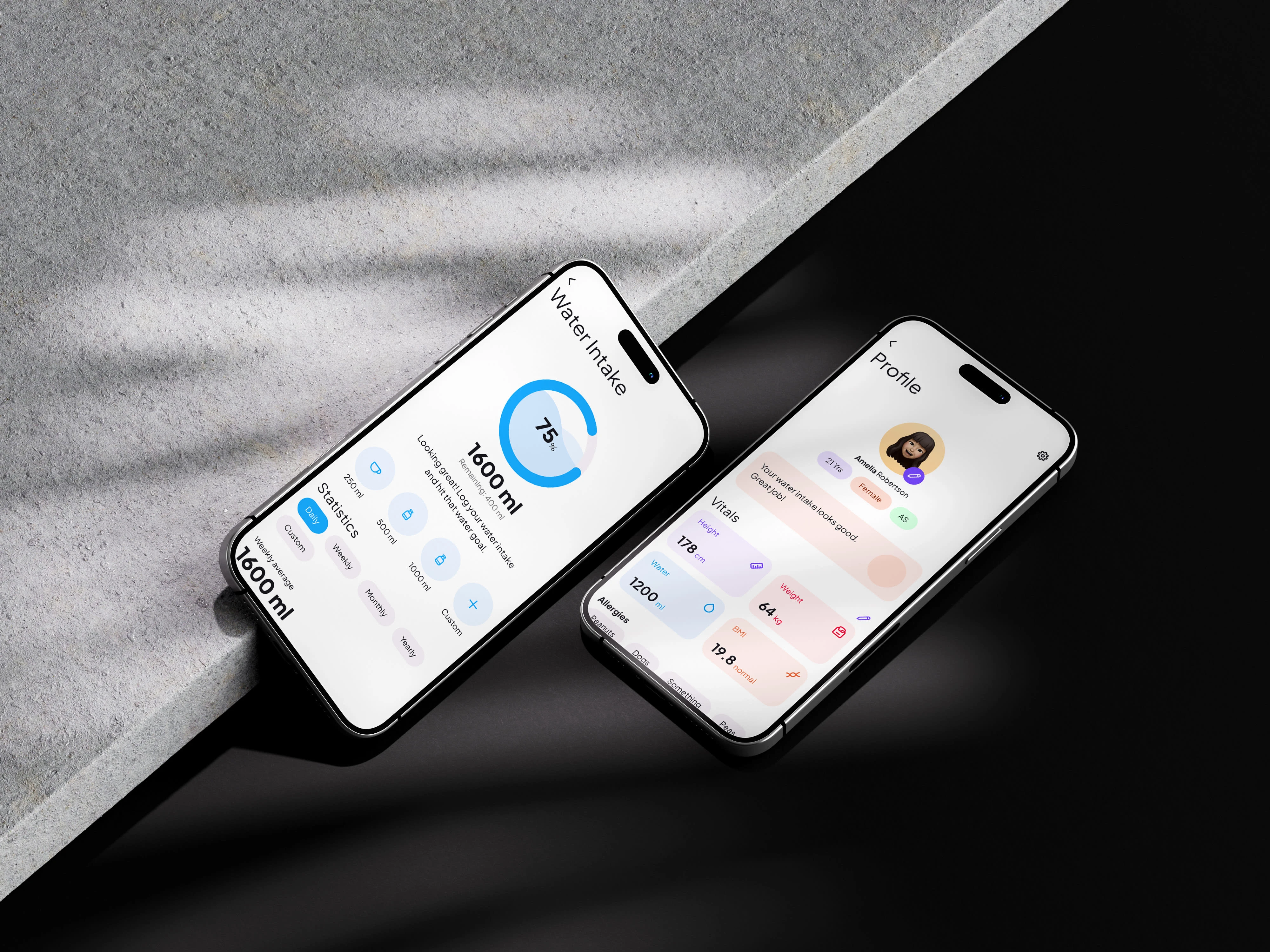
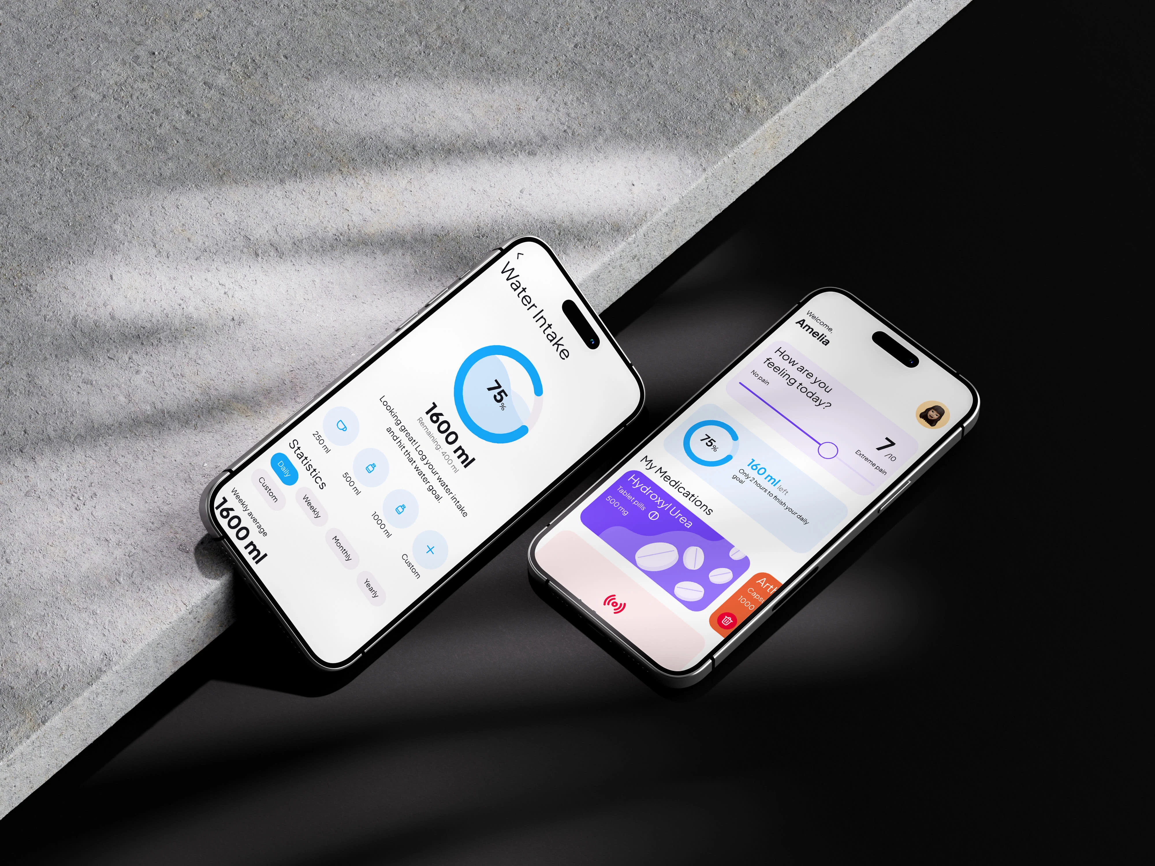
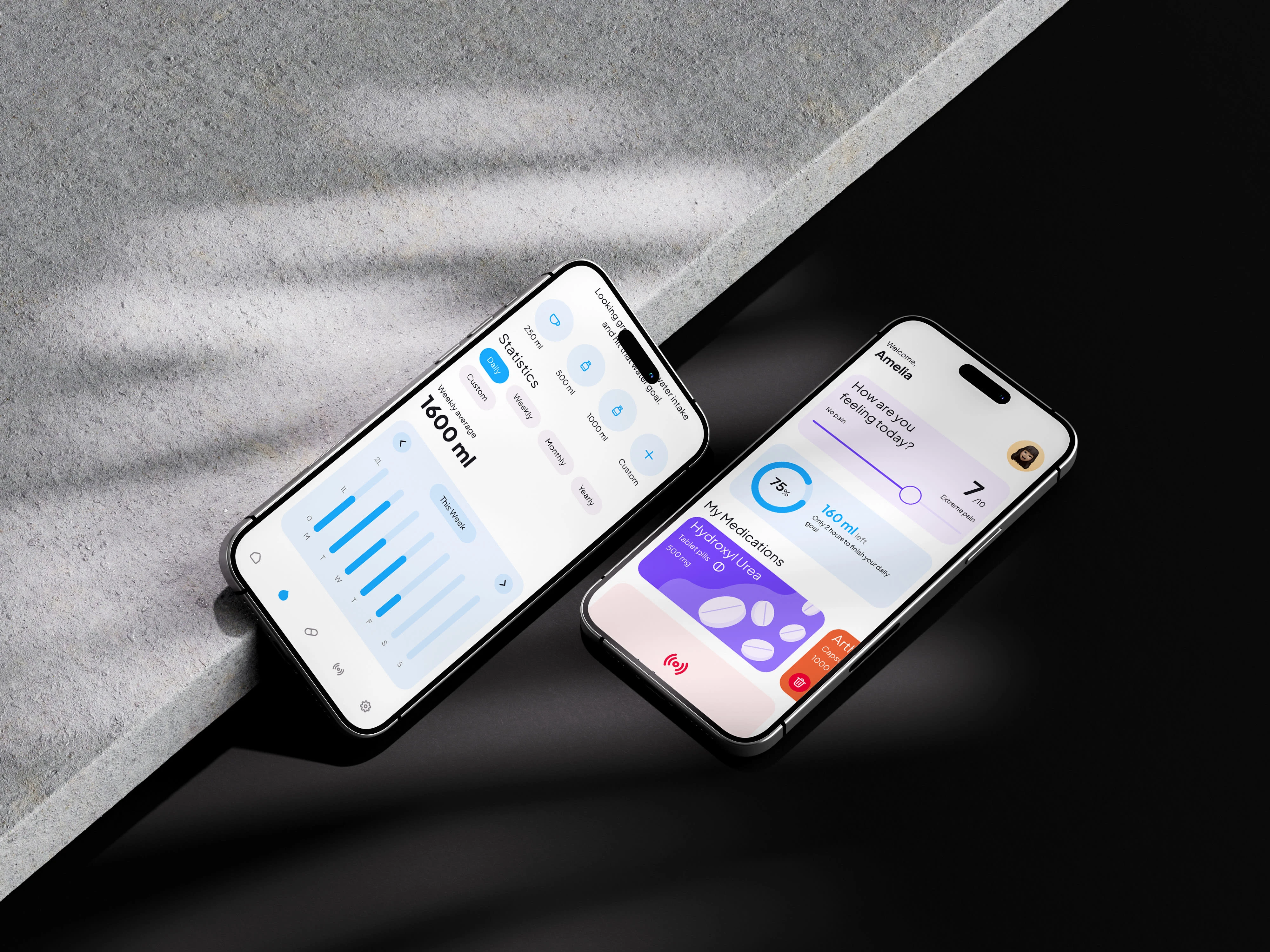
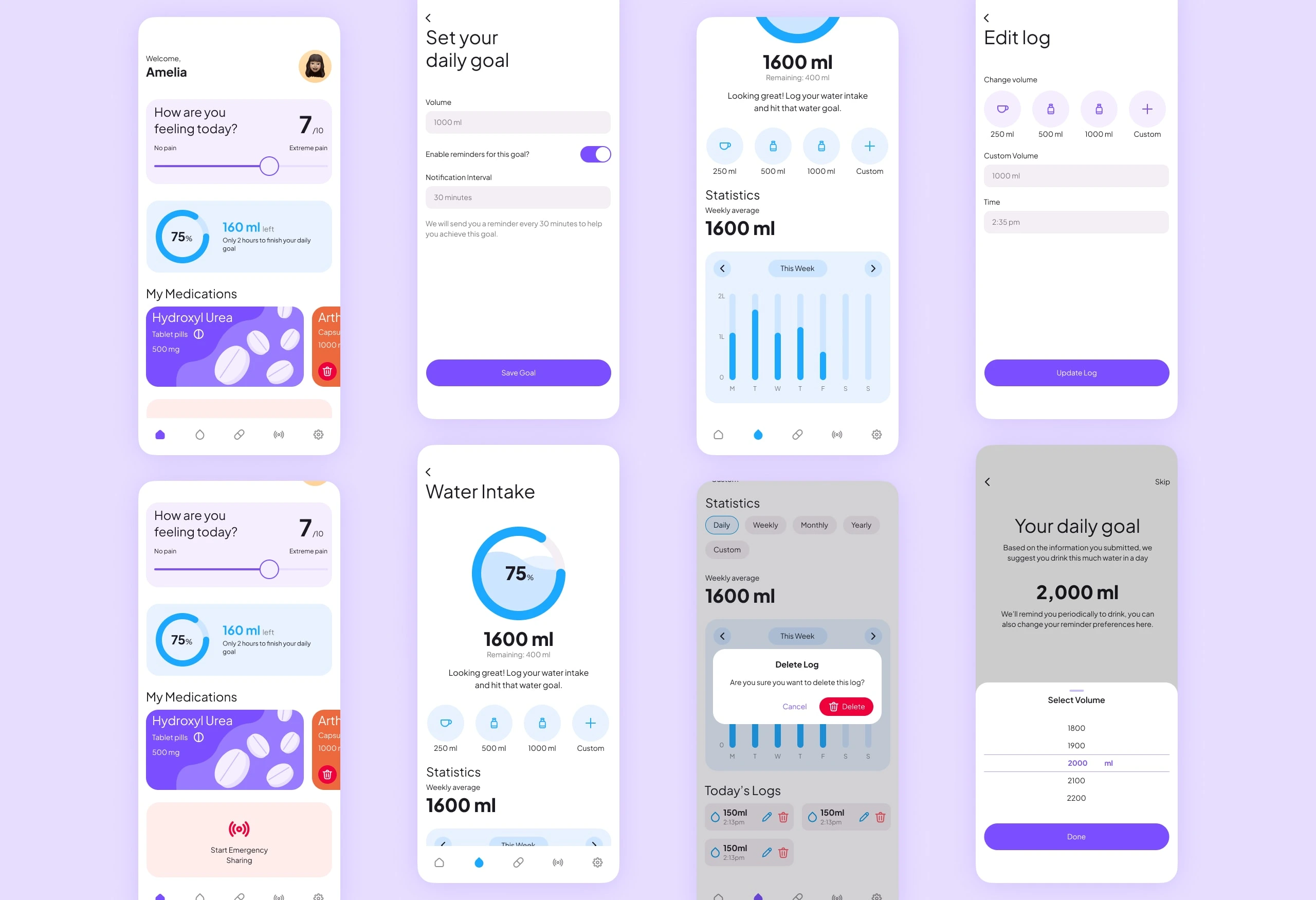
Water Helper: We built a water tracking feature to help users stay hydrated and healthy.
Medication Magic: We designed a medication tracking and reminder system to ensure users never miss a dose.
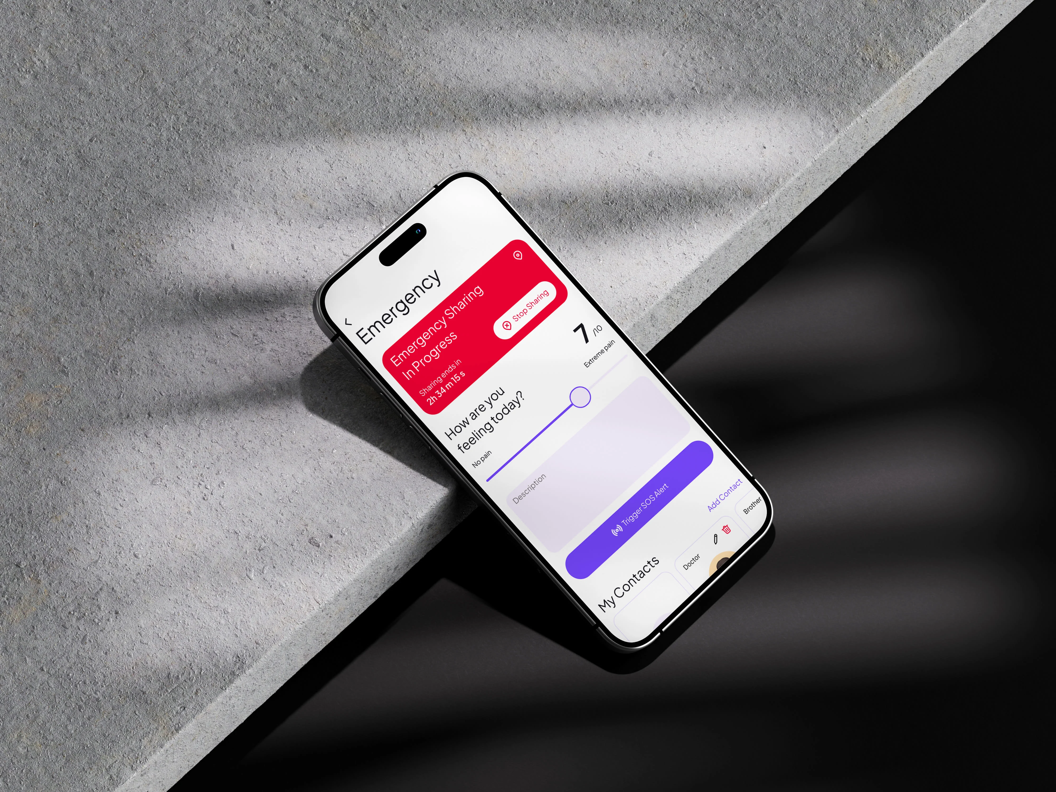
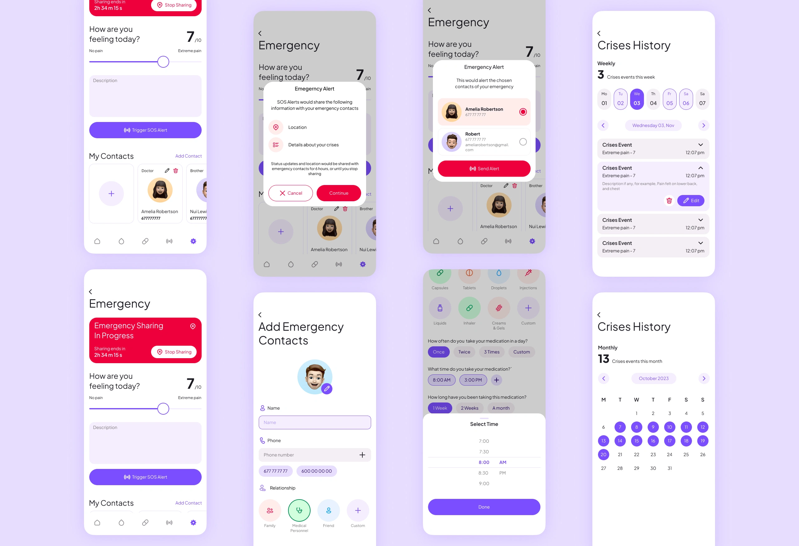
Emergency SOS: We designed and implemented emergency features to provide users with immediate assistance when they need it most
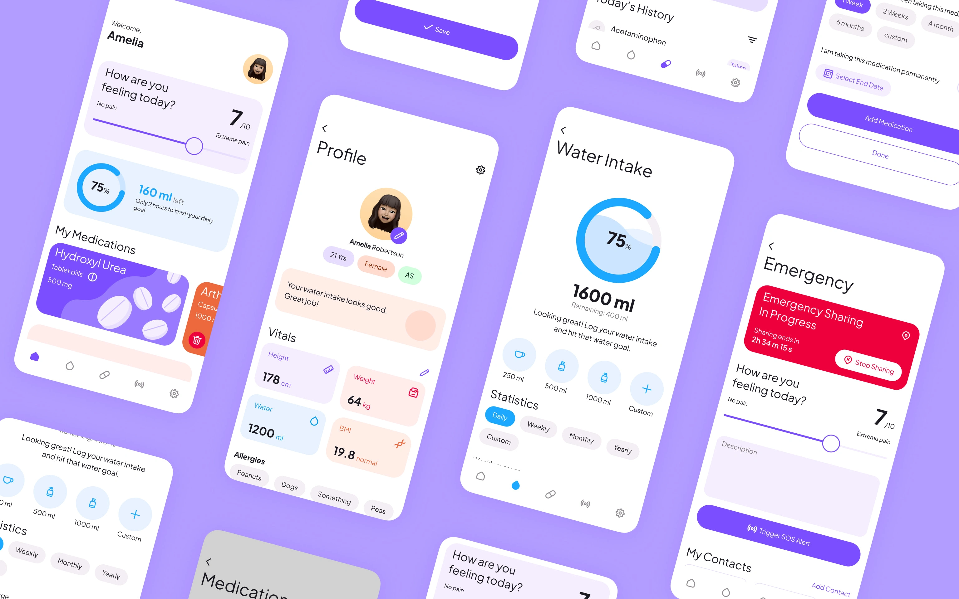
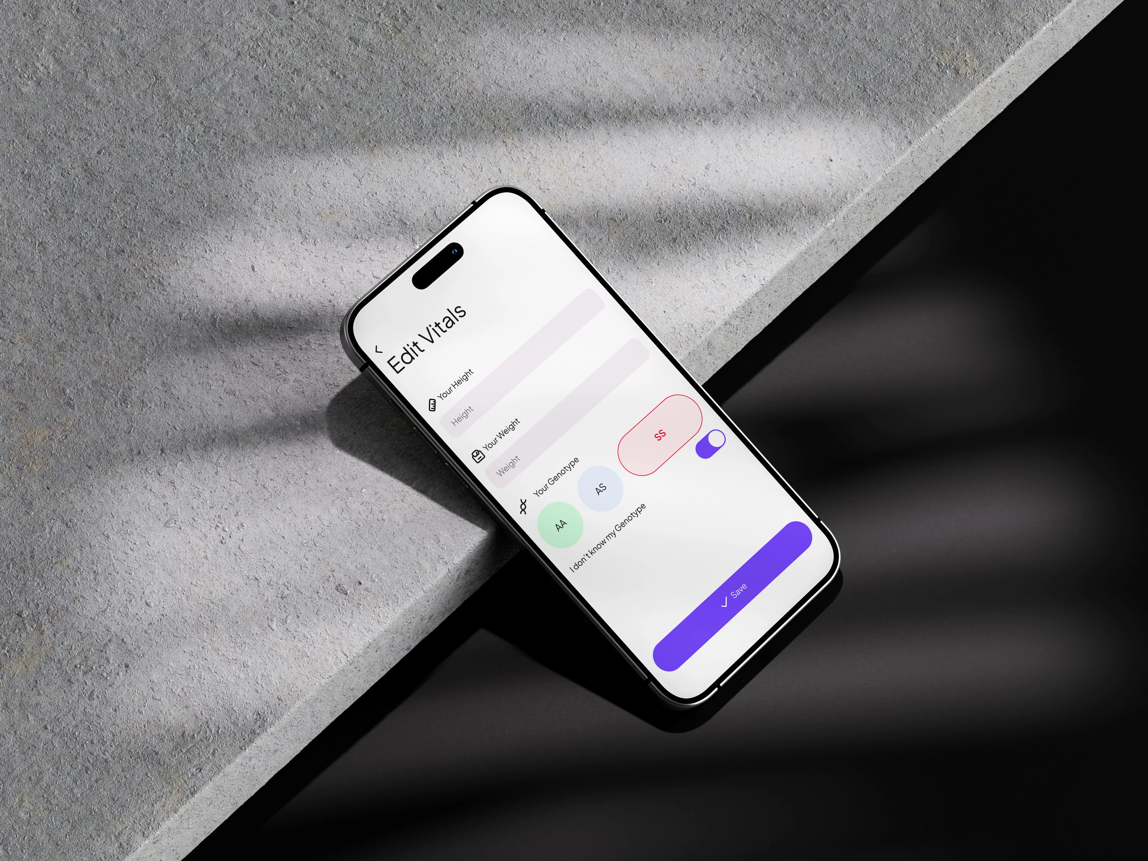
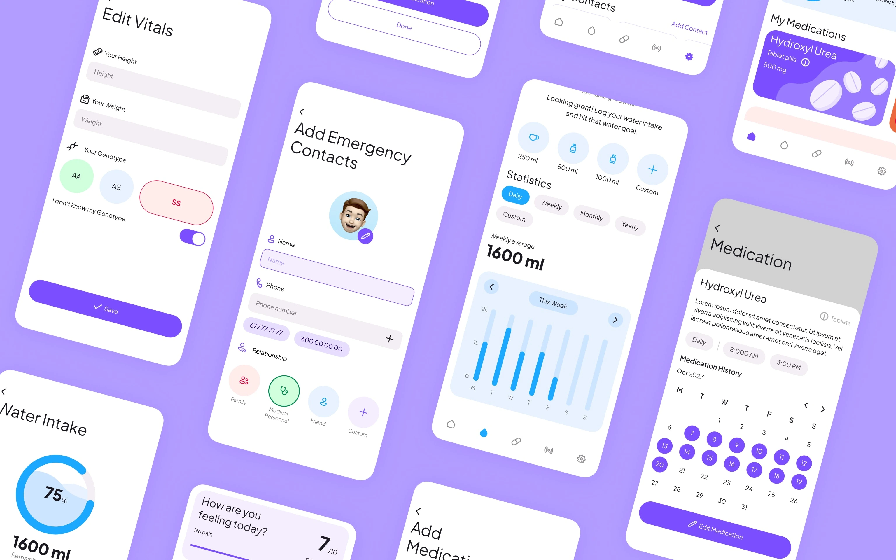
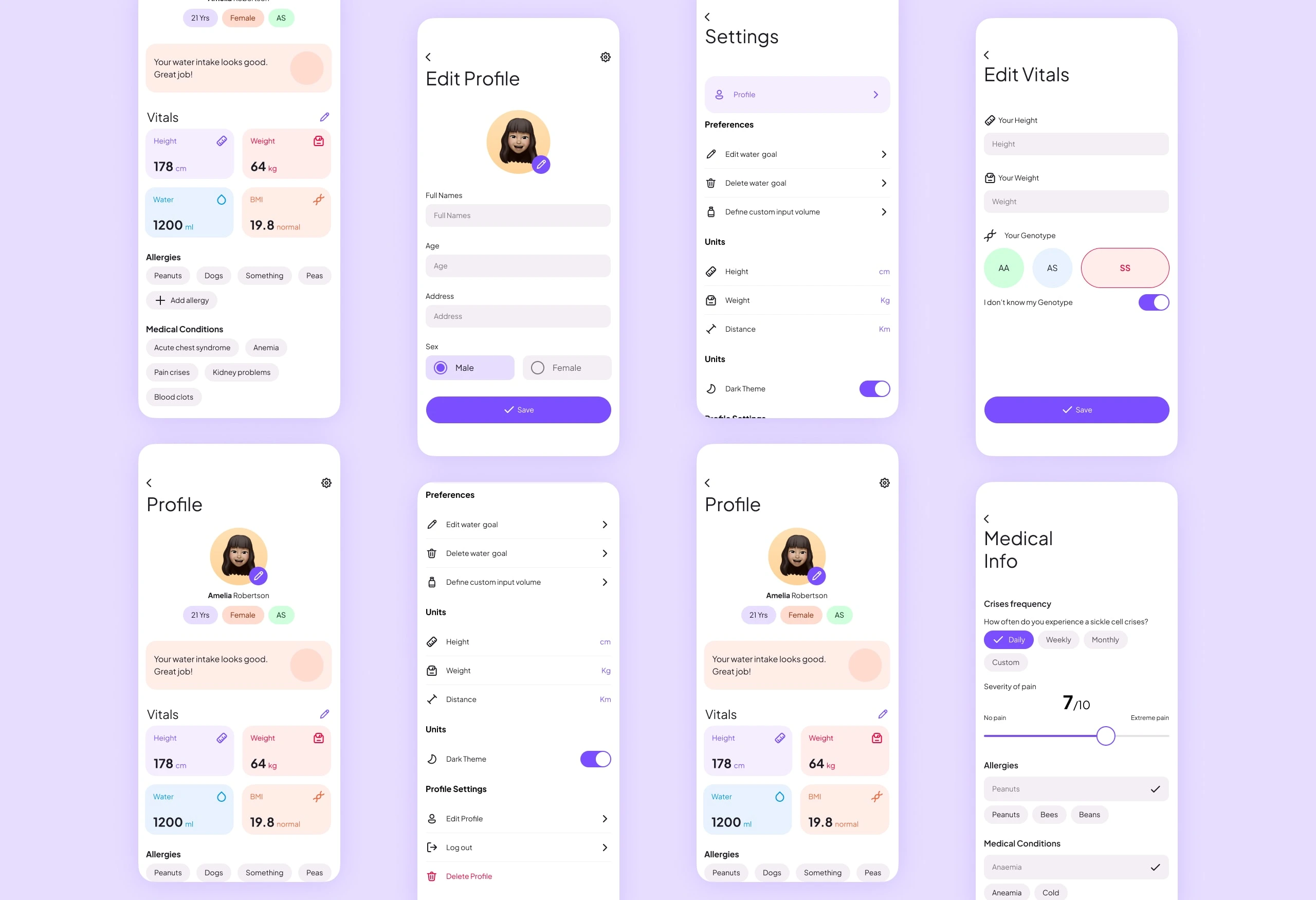
Some finished designed screens.
Design Process
The design process was a journey in itself. We started by mapping out the user's journey through every nook and cranny of the app, from logging in to tracking water intake, medication, emergencies, and more. We wanted to ensure that every step of the way was smooth, intuitive, and tailored to our users' needs
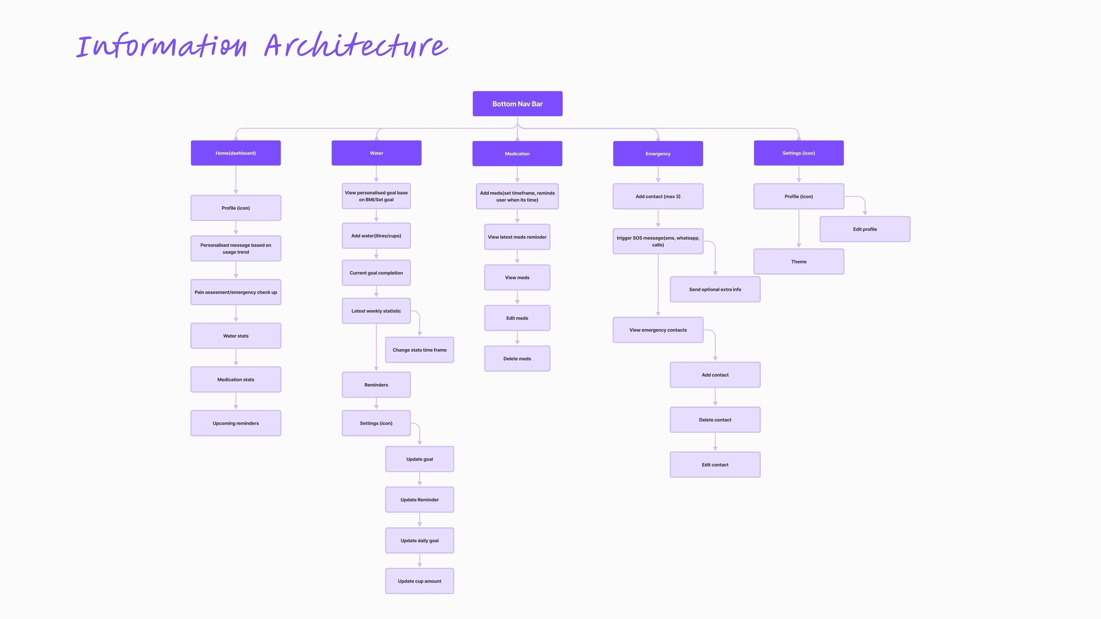
Sickler Information Architecture
Wireframing
Next, we brought our ideas to life with wireframes and prototypes, keeping John's preferences and mindset at the forefront. We didn't stop there, though. We tested, tweaked, and tested again, incorporating user feedback every step of the way to ensure the app was as user-friendly as possible.
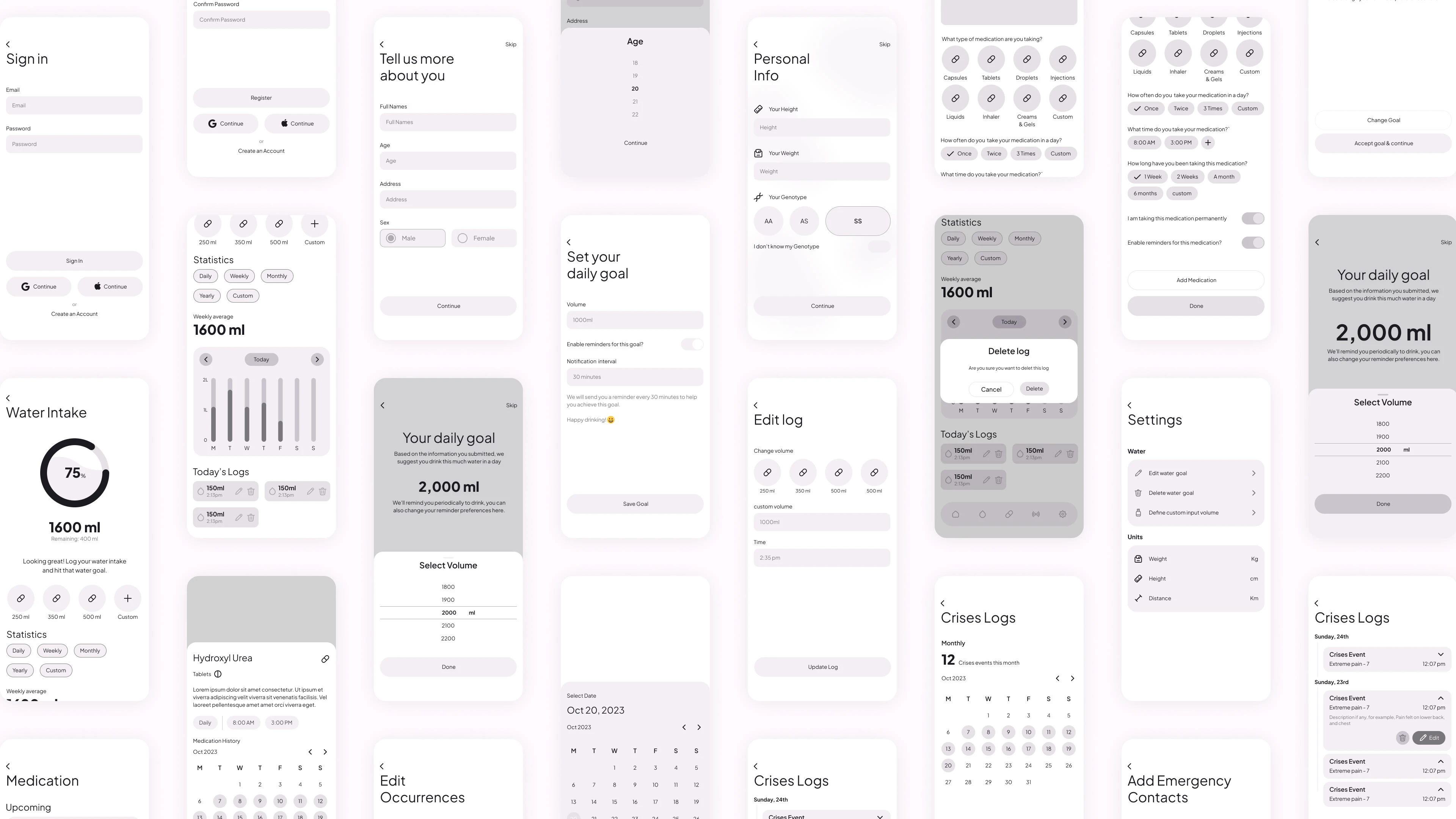
Sickler Wireframes
User Interface Design
To ensure consistency, efficiency, and ease of development, we created a comprehensive style guide and design system for the Sickle Cell Project Mobile App. This included a set of design tokens, which served as the building blocks for the app's visual language, such as colours, typography, spacing, and component styles. By establishing a standardised design system, we aimed to streamline the design and development process and maintain a coherent visual identity across the app.
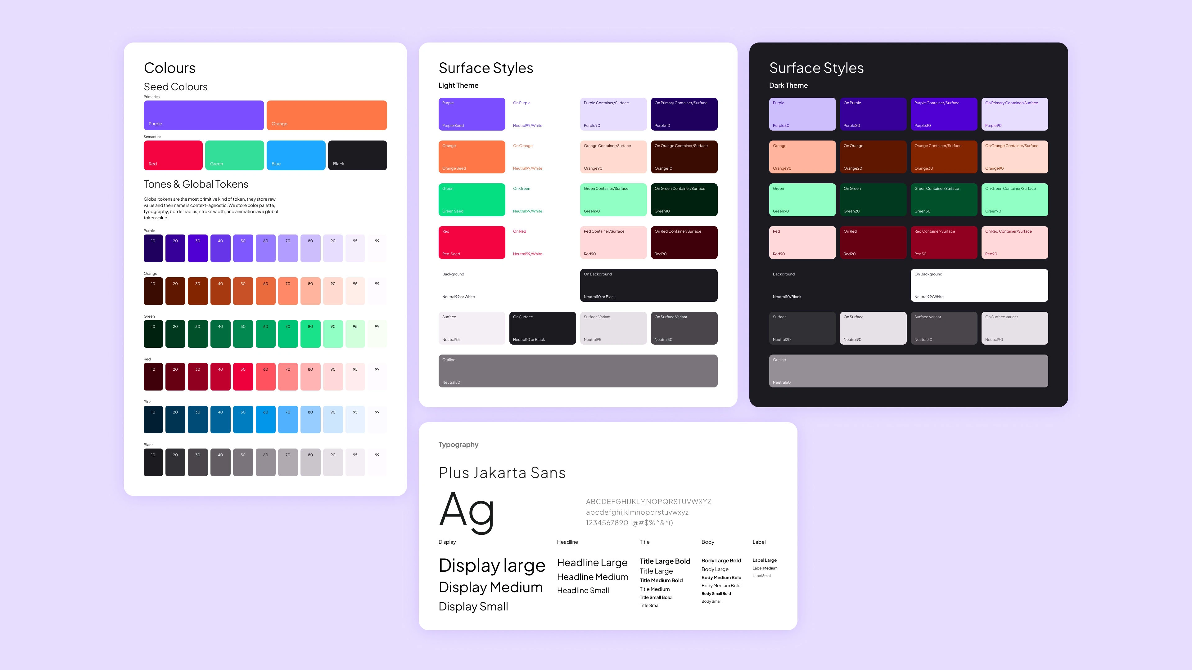
Sickler Design System and Style Guide
The End Result
After all that hard work, we ended up with an app that hit the mark. Users could easily track their medication and water intake, access emergency services, and connect with others in the sickle cell community. We were thrilled to hear that users loved the automated data collection and the inclusion of their priority features. The app was more than just functional - it was making a real difference in the lives of those living with sickle cell disease.
Thank you for watching
Like this project
Posted Mar 2, 2024
Sickler is a mobile platform that addresses the needs of people living with sickle cell, helping them manage the disease effectively.
Likes
0
Views
15


