Frontu Illustration Pack
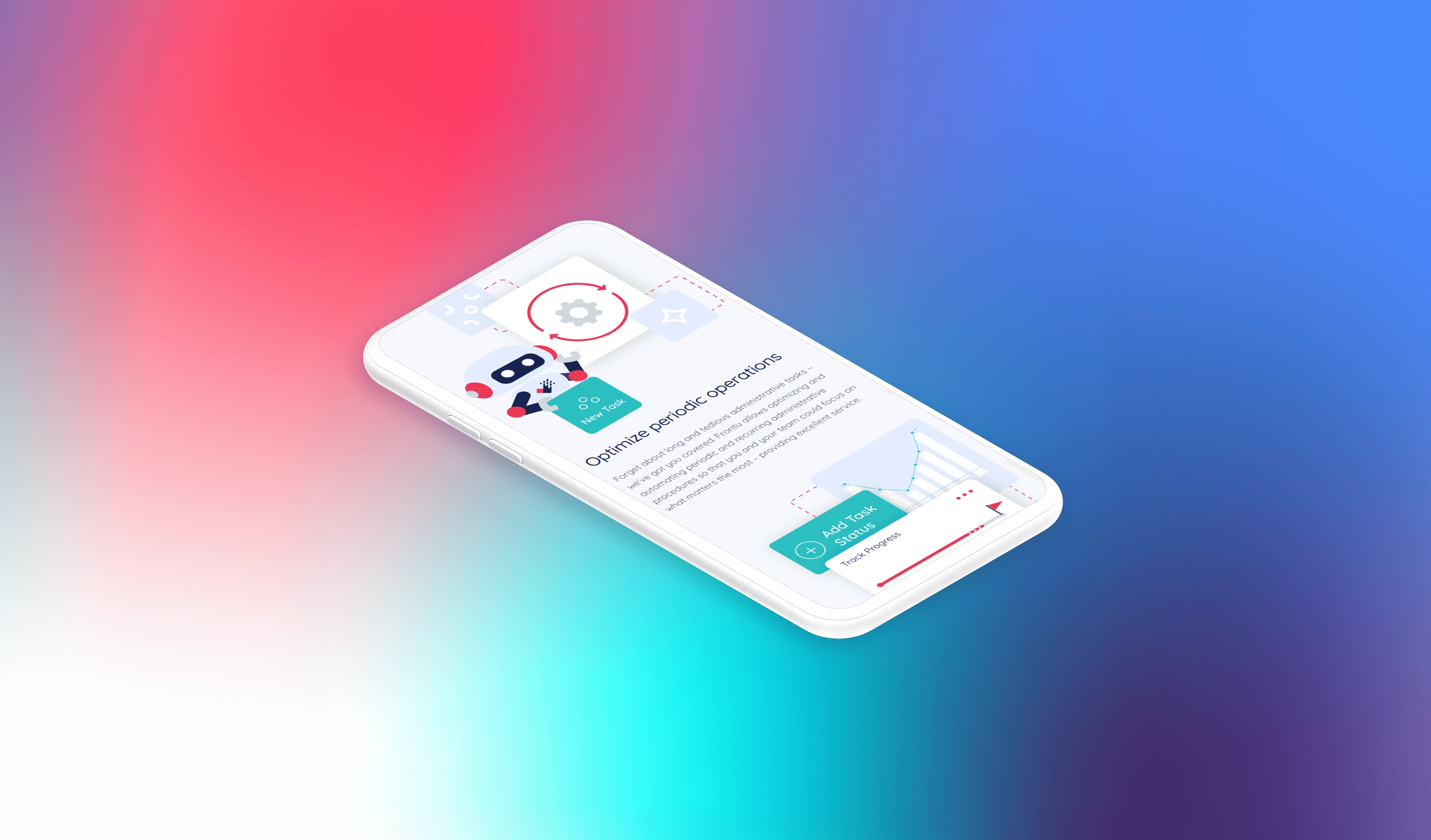
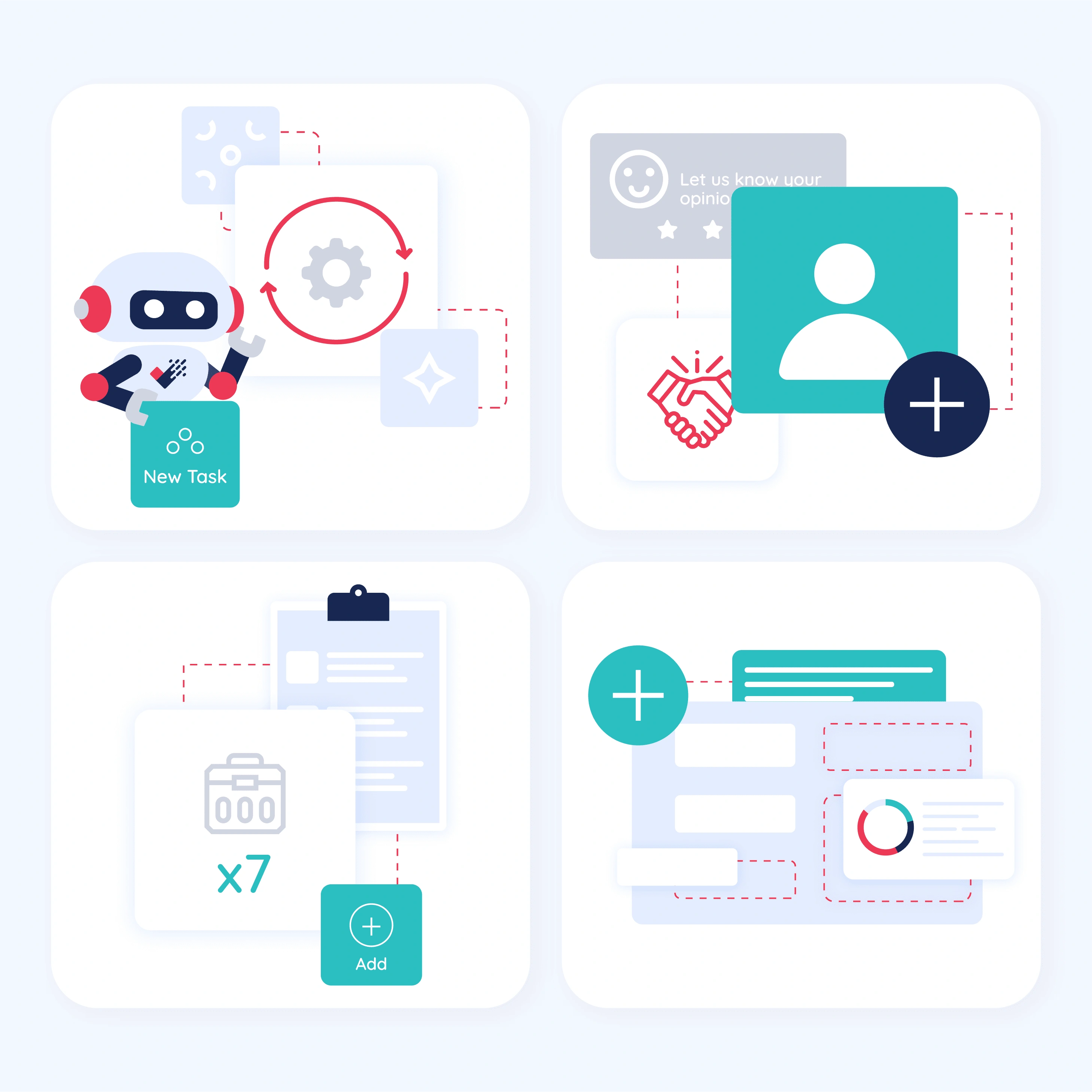
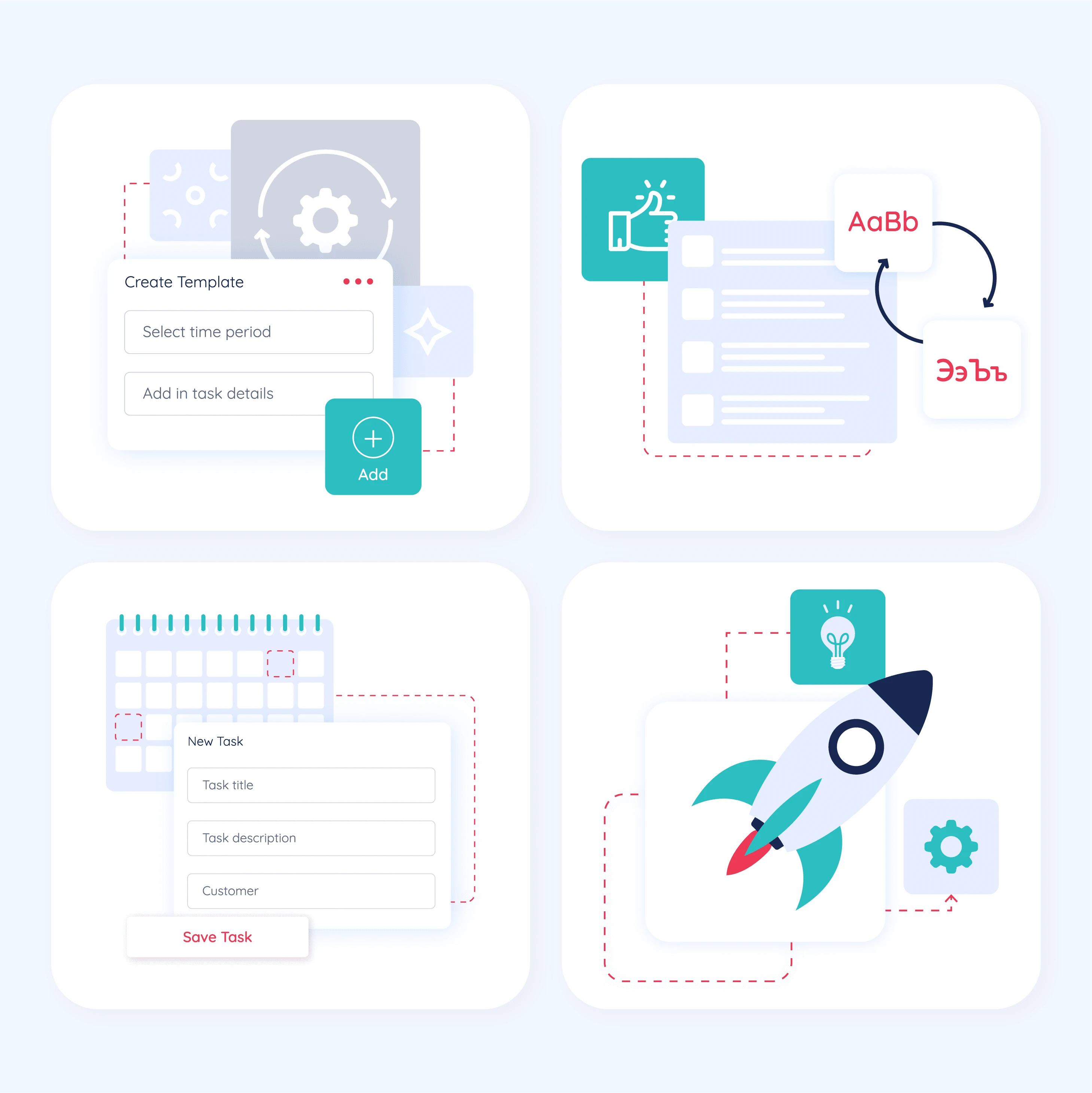
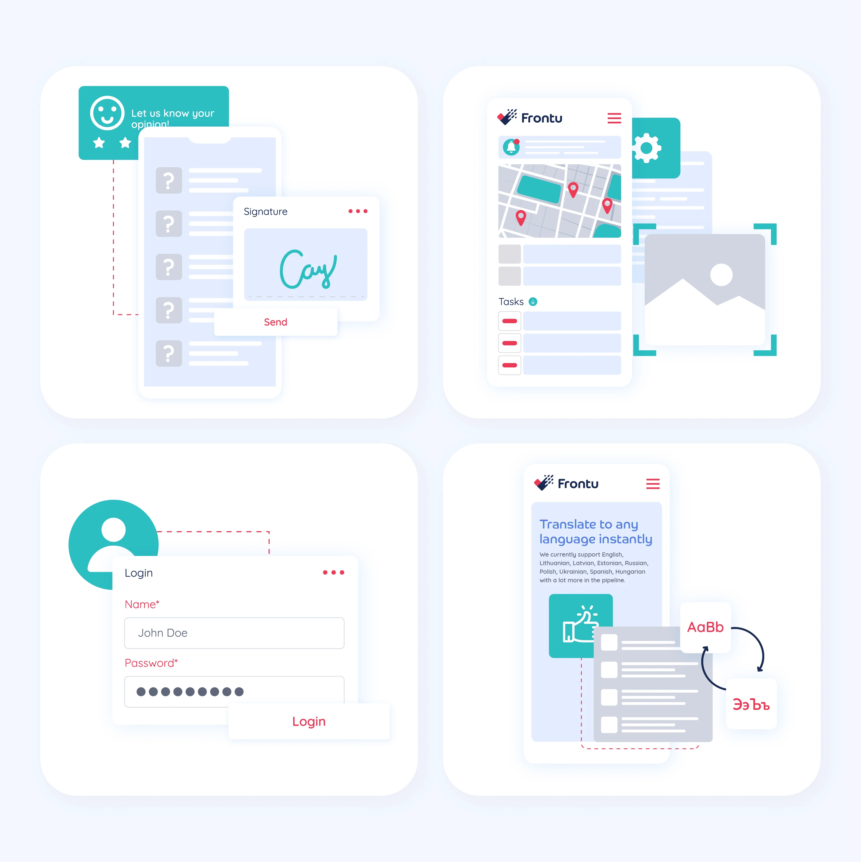
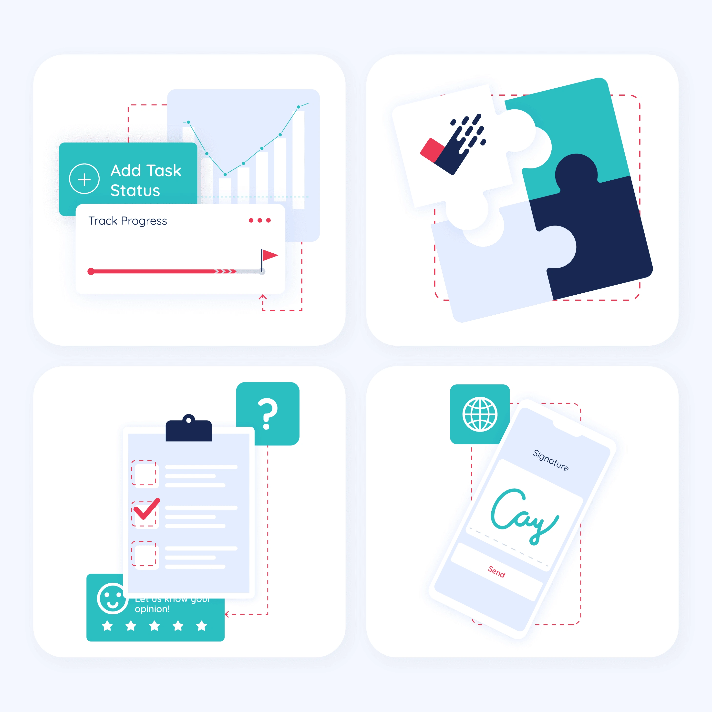
Frontu is a field service management software that helps businesses manage tasks and processes for the mobile workforce. Previously known as Tasker, they were in need of a new visual identity as well as a new website design. They came to us while I was working as Lead Designer at Hatchly. For the new website, I created a pack of original illustrations that would illustrate complex technical processes in a simple to digest visual way.
Like with the website design, I used different shades of grays and light blues, and pink, navy and mint as highlight to create a more dynamic layout. I used overlapping elements and boxes, as well as icons and abstract shapes in order to illustrate the complex processes and demistify what Frontu does, so that the customers can easily grasp the nature of their business and not be intimidated.
Like this project
Posted Jul 14, 2024
Created a custom digital illustration pack for Frontu (previously known as Tasker) to showcase their capabilities and illustrate what they do in a simple way.
Likes
0
Views
5
