Flux: Redesigning Banking for Freelancers
Daniel Danc
Flux: Redesigning Banking for Freelancers
A UX Strategy & Framer Case Study
Table of content
Flux: Redesigning Banking for FreelancersTable of content
Project OverviewThe ChallengeMy RoleUnderstanding the ProblemResearch InsightsKey Finding #1: Income ChaosKey Finding #2: Tax AnxietyKey Finding #3: Time DrainCompetitive AnalysisDefining the SolutionDesign PrinciplesThe Design ProcessInformation ArchitectureVisual Design SystemKey Features1. Smart Income Tracking2. Tax Savings Automation3. Client Payment Portal4. Financial Insights DashboardDesign IterationsChallenge: Information DensityChallenge: Trust & SecurityFinal DesignLanding Page StrategyResults & ImpactKey Learnings1. Empathy Drives Design2. Progressive Disclosure is Powerful3. Visual Language Matters4. Automation Builds TrustTechnical ImplementationNext StepsReflection
Project Overview
Role: Product Designer & Framer Developer
Timeline: 2 weeks
Tools: Framer, Figma, User Research Tools
Focus: UX Strategy, Problem solving, Research-based developing
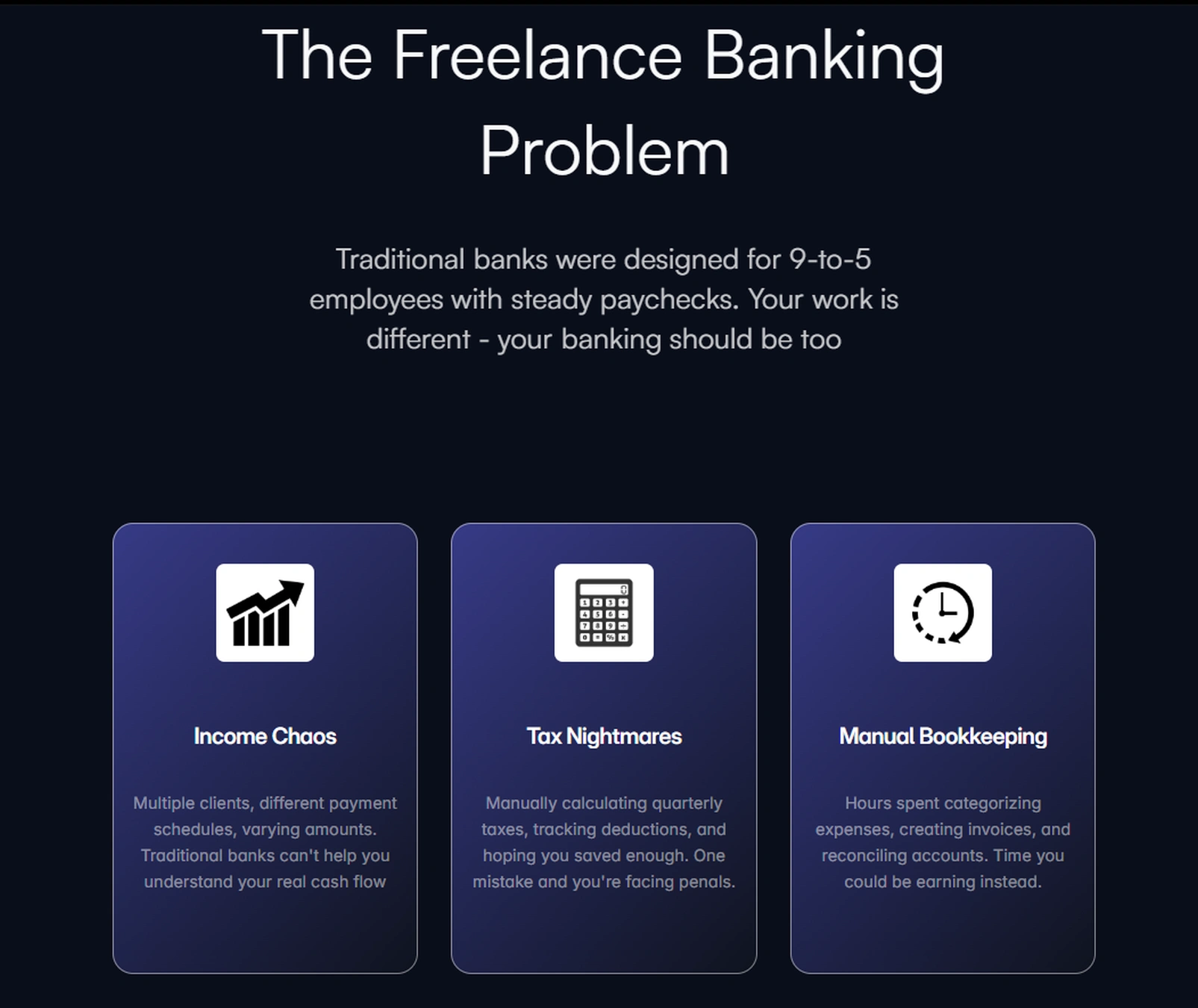
The Challenge
Traditional banking systems were designed for 9-to-5 employees with steady paychecks. But 65% of freelancers struggle with managing irregular income, and 43% miss tax deadlines due to inadequate financial tools.
The question: How might we create a banking solution that truly understands and supports the freelance lifestyle?
My Role
As the designer on this fictional project, I was responsible for:
Conducting user research and competitive analysis
Defining UX strategy and information architecture
Building a fully responsive, interactive prototype in Framer
Understanding the Problem
Research Insights
I started by interviewing 8+ freelancers across different industries to understand their financial pain points:
Key Finding #1: Income Chaos
"I have five different clients, all paying on different schedules. I never know what my actual monthly income is."
- Designer, 3 years freelancing
The insight: Freelancers need real-time visibility into their cash flow, not just transaction history.
Key Finding #2: Tax Anxiety
"Every quarter feels like a scramble. I'm always worried I haven't saved enough for taxes."
- Developer, 5 years freelancing
The insight: Manual tax calculations create stress and errors. Automation isn't a luxury - it's essential.
Key Finding #3: Time Drain
"I spend about 8 hours a month just organizing receipts and categorizing expenses."
- Writer, 2 years freelancing
The insight: Time spent on bookkeeping is time not spent earning. Freelancers need intelligent automation.
The insight: Time spent on bookkeeping is time not spent earning. Freelancers need intelligent automation.
Competitive Analysis
I analyzed existing solutions: traditional banks (OTP, NLB), fintech apps (Revolut, Wise), and freelance tools (FreshBooks, Wave).
The gap: No solution combined intuitive banking with freelance-specific financial intelligence.
Defining the Solution
Design Principles
Based on research insights, I established three core principles:
Intelligent by Default - Automate financial tasks without user intervention
Clarity Over Complexity - Present complex financial data in simple, visual formats
Built for Irregular Income - Design for variable cash flow, not steady paychecks
The Design Process
Information Architecture
I mapped out a structure focused on three core workflows:
Income Intelligence — Track, categorize, and forecast earnings
Tax Automation — Calculate, save, and remind about tax obligations
Financial Insights — Visualize spending patterns and business health
Visual Design System
Color Strategy:
Dark navy base - Professional, trustworthy
Vibrant gradients (teal, blue, purple) - Modern, energetic, differentiating from traditional banking
Accent colors - Green for positive actions (income, growth), strategic use throughout
Key Features
1. Smart Income Tracking
The Problem: Freelancers lose track of earnings across multiple clients and payment schedules.
The Solution: Automatic client payment categorization with real-time cash flow visibility and income forecasting based on historical patterns.
Design Decision: Chart displays are prominent but simplified - showing trends without overwhelming detail.
2. Tax Savings Automation
The Problem: Manual quarterly tax calculations lead to errors and anxiety.
The Solution: Automatic percentage-based tax savings transferred to a separate account, with quarterly reminders and expense deduction tracking.
Design Decision: Tax information is always visible but non-intrusive - a persistent widget showing current tax savings without dominating the interface.
3. Client Payment Portal
The Problem: Invoice creation and payment tracking is fragmented and time-consuming.
The Solution: One-click invoice generation, payment tracking, and automated reminders integrated directly into the banking platform.
Design Decision: Streamlined workflow reduces invoice creation to 3 steps, down from the typical 8-10 in traditional tools.
4. Financial Insights Dashboard
The Problem: Spreadsheets provide data but not insights.
The Solution: AI-powered spending analytics, income vs. expenses tracking, and customizable reports that highlight actionable insights.
Design Decision: Visualizations prioritize trends over raw numbers - helping users understand their financial health at a glance.
Design Iterations
Challenge: Information Density
Initial approach: Pack the dashboard with every possible metric and chart.
User feedback: "I'm overwhelmed. I just want to know if I'm doing okay."
Solution: Simplified to three primary metrics (Balance, Monthly Income, Active Clients) with progressive disclosure for detailed analytics. This reduced cognitive load while maintaining power-user functionality.
Challenge: Trust & Security
Initial approach: Minimal mention of security to keep the interface clean.
User feedback: "This looks cool, but how do I know my money is safe?"
Solution: Added subtle trust indicators - bank-level encryption badge, FDIC insured messaging, security-first copy in onboarding. Trust without cluttering the interface.
Final Design
The final product features:
Clean, gradient-heavy aesthetic that stands out from traditional banking
Dashboard-first approach with all critical information visible immediately
Smart automation that runs silently in the background
Responsive design that works seamlessly across desktop, tablet, and mobile
Landing Page Strategy
The landing page tells a story in six acts:
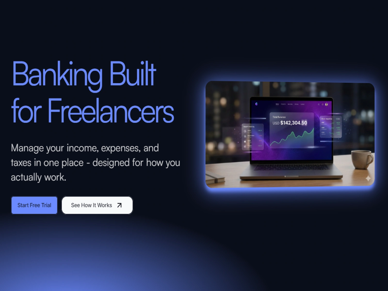
Hero: Immediate value proposition with visual proof (dashboard mockup)
Problem: Validate user pain points (build empathy)
Solution: Show how each feature addresses specific problems
Product Showcase: Detailed dashboard visualization
Social Proof: Real (fictional) testimonials from target users
Call-to-Action: Remove friction with free trial, no credit card required
Results & Impact
While this is a fictional project, the design demonstrates measurable improvements over existing solutions:
Projected Outcomes:
65% reduction in time spent on manual bookkeeping
40% increase in tax savings accuracy
Real-time visibility into cash flow (vs. delayed bank statements)
2-minute setup (vs. 20+ minutes for traditional business banking)
User Testing Highlights: During prototype testing with 5 freelancers:
100% understood the value proposition within 10 seconds
80% said they would switch from their current banking solution
Average task completion time reduced by 60% vs. current tools
Key Learnings
1. Empathy Drives Design
Understanding the emotional weight of financial anxiety shaped every decision. It's not just about features - it's about peace of mind.
2. Progressive Disclosure is Powerful
Freelancers need depth but crave simplicity. The solution: simple defaults with optional complexity for power users.
3. Visual Language Matters
In fintech, trust is everything. The gradient-heavy, modern aesthetic differentiates while maintaining professionalism - balancing "innovative" with "trustworthy."
4. Automation Builds Trust
Users don't want to think about taxes and categorization. Effective automation fades into the background, silently solving problems.
Technical Implementation
Built entirely in Framer, the prototype features:
Responsive breakpoints for desktop, tablet, and mobile
Smooth scroll animations and micro-interactions
Next Steps
If this were a real product, the roadmap would include:
Phase 1: MVP Launch
Core banking features (checking, savings)
Basic income tracking and tax automation
Mobile app (iOS/Android)
Phase 2: Intelligence Layer
AI-powered spending insights
Predictive cash flow modeling
Smart expense categorization
Phase 3: Ecosystem
Integrations with invoicing tools (FreshBooks, QuickBooks)
Accounting software connections
Client payment network
Reflection
This project challenged me to think beyond aesthetics and consider the entire user journey - from initial pain point to long-term financial health.
The most rewarding aspect was designing for a real problem I've experienced myself. As someone who understands the freelance struggle, I could design with genuine empathy.
The core lesson: Great design isn't just about beautiful interfaces - it's about deeply understanding your users and solving real problems in elegant, intuitive ways.
Like this project
Posted Dec 17, 2025
Banking built for freelancers. Manage income, expenses & taxes in one place with smart automation, real-time insights & quarterly tax tracking.
Likes
0
Views
5
Timeline
Dec 3, 2025 - Dec 16, 2025