Landing page redesign for a News web application
Less is more and more can be organized.
Overview.
TUKO News is one of the top media companies whose primary focus is providing news and entertainment to Kenyans. It captures and reports news that is not reported by the mainstream media.
Problem
At first glance, the TUKO News app is clattered and there isn't a concise visual hierarchy to guide the user in his/her interaction with the app. The call-to-action buttons are not highlighted and their position is less than ideal. This has, in the past, created mental fatigue in interacting with the application.
Plan of action
I listed down all the steps for this project that would be effective and inform my design process and decisions:
Assumptions and hypothesis
Primary research (Surveys)
UX research (Personas)
Ideation and brainstorming
Wireframing
UI and prototypes
Tools
Figjam
Figma
Unsplash
Adobe
Team
1 UI designer
My Role
UI design
UX research
Scope of work
Design 3 pages:
Home page/Landing page
Sign up page
Subscription page
My Design Process
Assumptions
I jotted down what could be true about the users and the existing product. The purpose of this was to explore the problem statement from multiple angles and that would inform the choices I make in the design process.
Assumptions about users
Users might be getting overwhelmed by seeing a lot of ads
Users might get distracted by the number of ads in between the articles.
The lack of proper categorization of articles might force users to opt for other news websites.
The pop-up notifications might be annoying and the user ends up canceling them before reading the notifications.
Users might want news customization to their feeds.
Users might prefer push notifications instead of random alerts in the middle of reading an article.
The stark black-and-white contrast might be causing eye strain to users in the higher age bracket.
Assumptions about the product/business
TUKO news might be generating revenue through the ads
Nowadays, news apps are spamming users with a lot of irrelevant news
News apps are providing the TRENDING NEWS section to help users know about the top stories.
Hypothesis
After brainstorming the assumptions that I had, I came up with a few hypothesis statements that listed possible solutions to the problem(s) that I had defined. This will be validated later in the primary and secondary research
Users would prefer a customized feed rather than having random articles in the "recommended" section.
Since the web page would benefit from more interaction, they can introduce a discussion forum where users can react to the articles.
The app can have a "Subscribe" button where users can pick their top 5 categories of news for their customized feed.
Based on the assumptions, I think users might be getting more annoyed by the constant ads. Giving users the option of getting rid of ads through weekly, monthly, or yearly subscriptions would be ideal.
The app serves individuals from different age brackets. Introducing news reels would capture the attention of young readers and also readers on the go.
Secondary research
I went through various sources on the internet to get more insights to validate my hypotheses and find out if I was going in the right direction.
Top Insights
On average, a user takes only 2 minutes on the web page.
On average, a user browses only 2 pages per visit before exiting the web page.
Only 17% of the users are within the age bracket of 18yrs to 25yrs
52% of people feel push notifications are an annoying distraction and 26% prefer to get notifications based on their selected preferences.
The users are evidently annoyed by the ads and more than half of them say they are willing to pay for premium services to eliminate the ads.
source: Similarwebanalytics.com

User Insights
Primary research
I reached out to "real" users to get their insights.
User insights
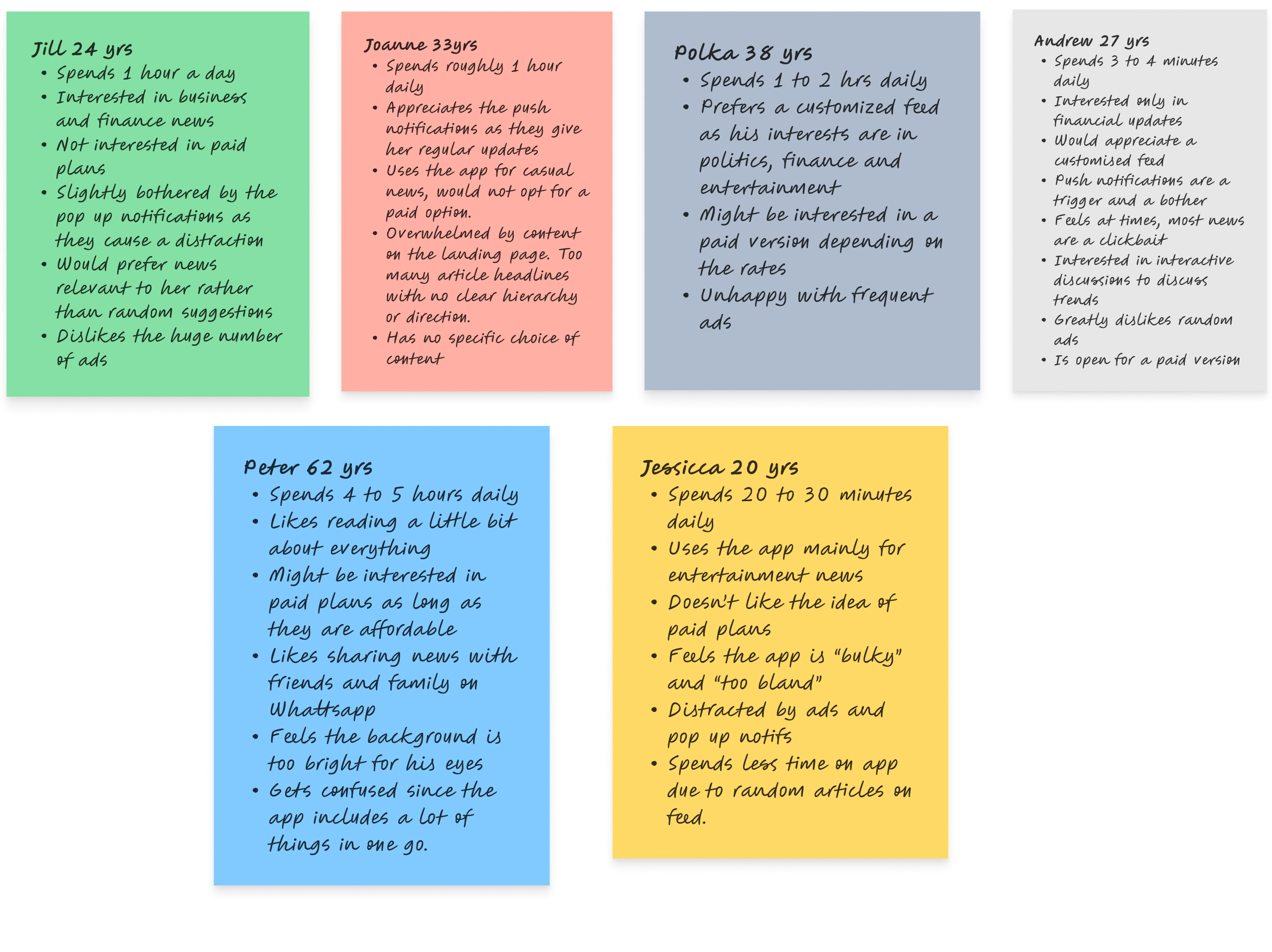
I went ahead and conducted 1:1 interviews with 6 users over a virtual setup. I got useful information from the 6 users whom I chose for this interview
Inferences from user insights
Many users complained of a "bland" and complex UI and complicated categorization making it difficult to find what one is looking for.
Some users prefer discussions on articles with others on the forum.
Some users are open to the paid plans.
Almost all users were unhappy about the unsolicited advertisements.
The users who have a specific interest do not like the amount of content that is not relevant to them on their feed.
Most users prefer a customized feed rather than a random one.
User persona
Features of my product
1. Customization page
First-time users will have the option to answer a few questions based on which the web page will customize their feed.
2. Premium plans
First-time users and returning users who want to eliminate ads on their feed will have the option of weekly, monthly, and annual premium plans.
3. Personalized notifications
Users can set a suitable time when they'd like to receive news updates.
They can decide on the number of notifications they want to receive in a day.
4. Visually appealing landing page
It will be easier to navigate to your category of choice with the introduction of the "Sections" menu button
The number of elements will be reduced to accommodate only "your feed" and "Top stories"
The background will be changed to reduce eye strain and at the same time maintain reasonable contrast
A different typeface will be used.

User Flow diagram
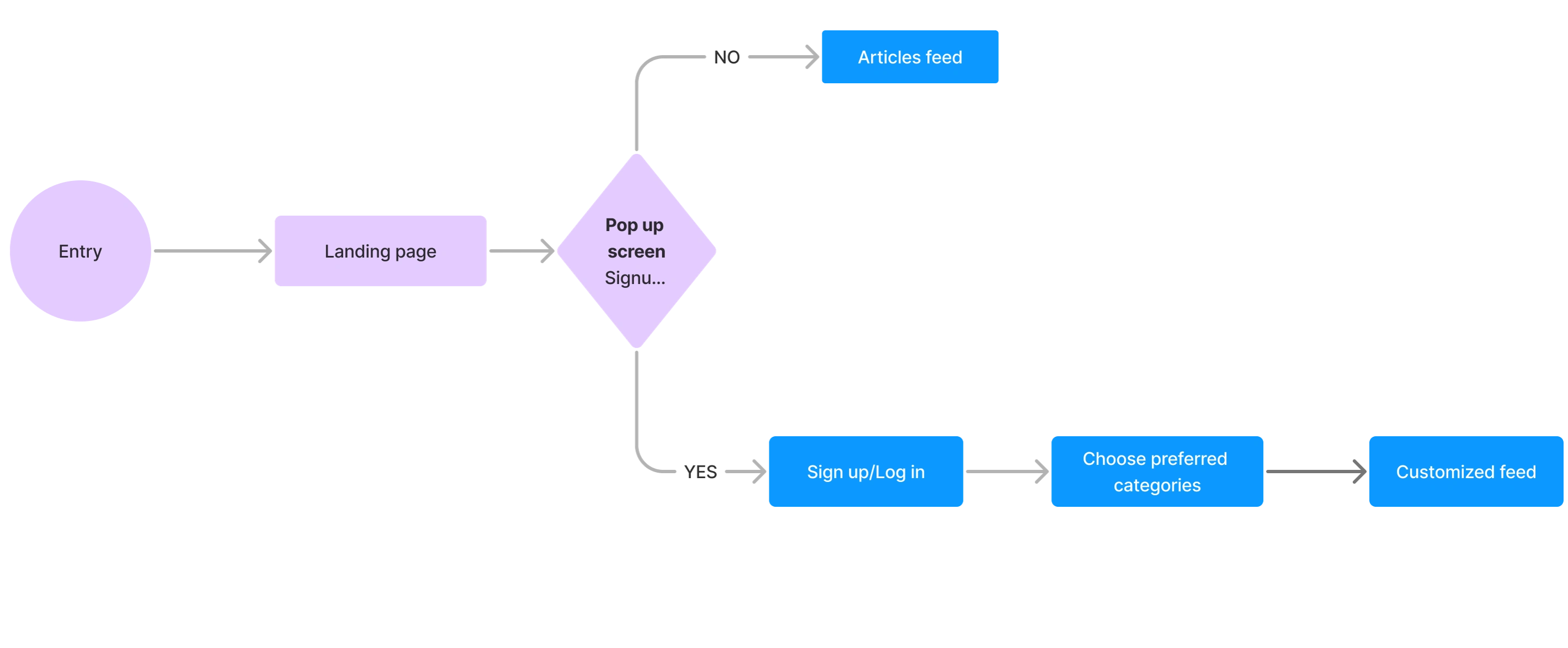
User Flow
User flow is the path taken by the user as they navigate a web or mobile app to complete a task. I came up with the following user flow:

First Iteration of the wireframes
Wireframes
Using Figma, I translated my first sketches into low-fidelity wireframes. Then, I improved them by adding a few relevant stock images and copies provided by the marketing team. At this stage, the wireframes were defined enough for some user testing. Based on 4 tests, I’ve made a few alternations and moved on to creating high-fidelity prototypes.

TUKO NEWS Landing page
UI DESIGN
I moved directly to creating the UI screen and prototype
The landing page features the top stories and recommended articles based on the chosen preferences
The sections button reduces clutter and enables the user to choose a specific category and navigate there directly
The landing page also features a "Subscribe" button that leads to the premium paid plans.
Learnings
It is good to have a visually appealing UI design but it's more important to have a visual design that resonates to the everyday users. Hence, less is more.
Talking to the everyday users gives you a wider perspective that what the statistics on paper do. Users are more than statistics and it's important to resonate to their needs.
Thank you for reading my case study!
Want to work with me? Feel free to contact me!
...or just say hello on my social media.
Like this project
Posted Feb 22, 2024
I’m a UX designer. I’m passionate about creating usable digital products. I have worked with incredibly talented people across different companies.
Likes
0
Views
5


