Tough Roofs Website Redesign
Peter umeh
Project Overview
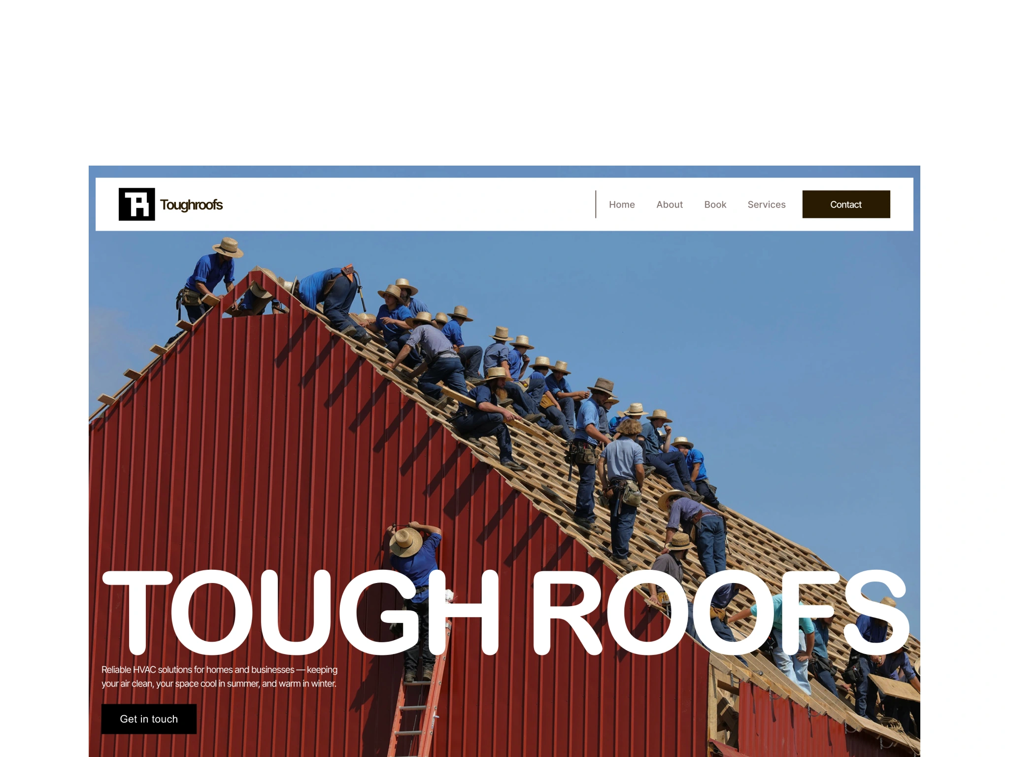
Tough Roofs is a roofing brand that needed a web experience that feels as reliable as the roofs they install. The goal was to design a site that communicates trust, makes services easy to understand, and turns visitors into enquiries with clear calls to action. Modern roofing websites must load fast, highlight trust signals, and guide users to a quote or inspection within a few seconds of landing.
Problem and Objectives
Most roofing brands struggle with generic messaging, poor structure, and unclear next steps, which makes it hard for homeowners to quickly see value and request a quote. For Toough Roofs, I defined three main objectives:
Clarify the value of Tough Roofs with simple language around reliability, cost savings, and long‑term support.
Design a layout that feels structured and premium, reinforcing trust and professionalism.
Make it effortless for users to understand services and take action (request inspection, get a quote, or contact the team)
Need a Designer ? www.peterumeh.com
Design Approach and Process
1. Strategy and Information Architecture
I started by mapping the key decision points a homeowner goes through: understanding what Tough offers, seeing why they should trust the brand, and knowing how to contact them. From this, I structured the experience around:
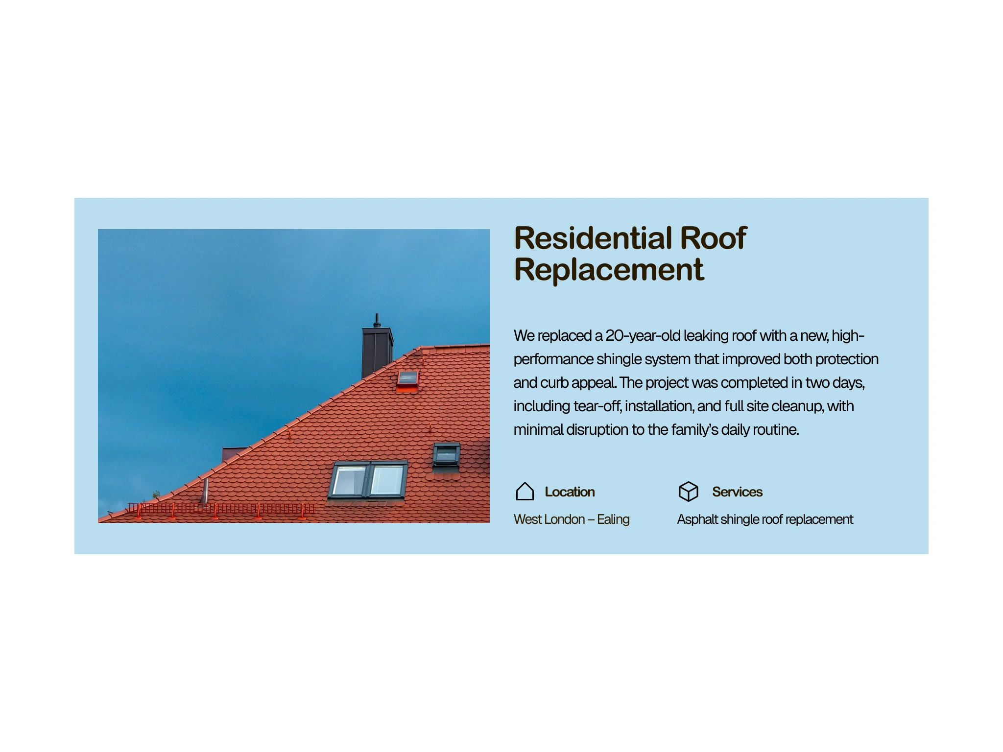
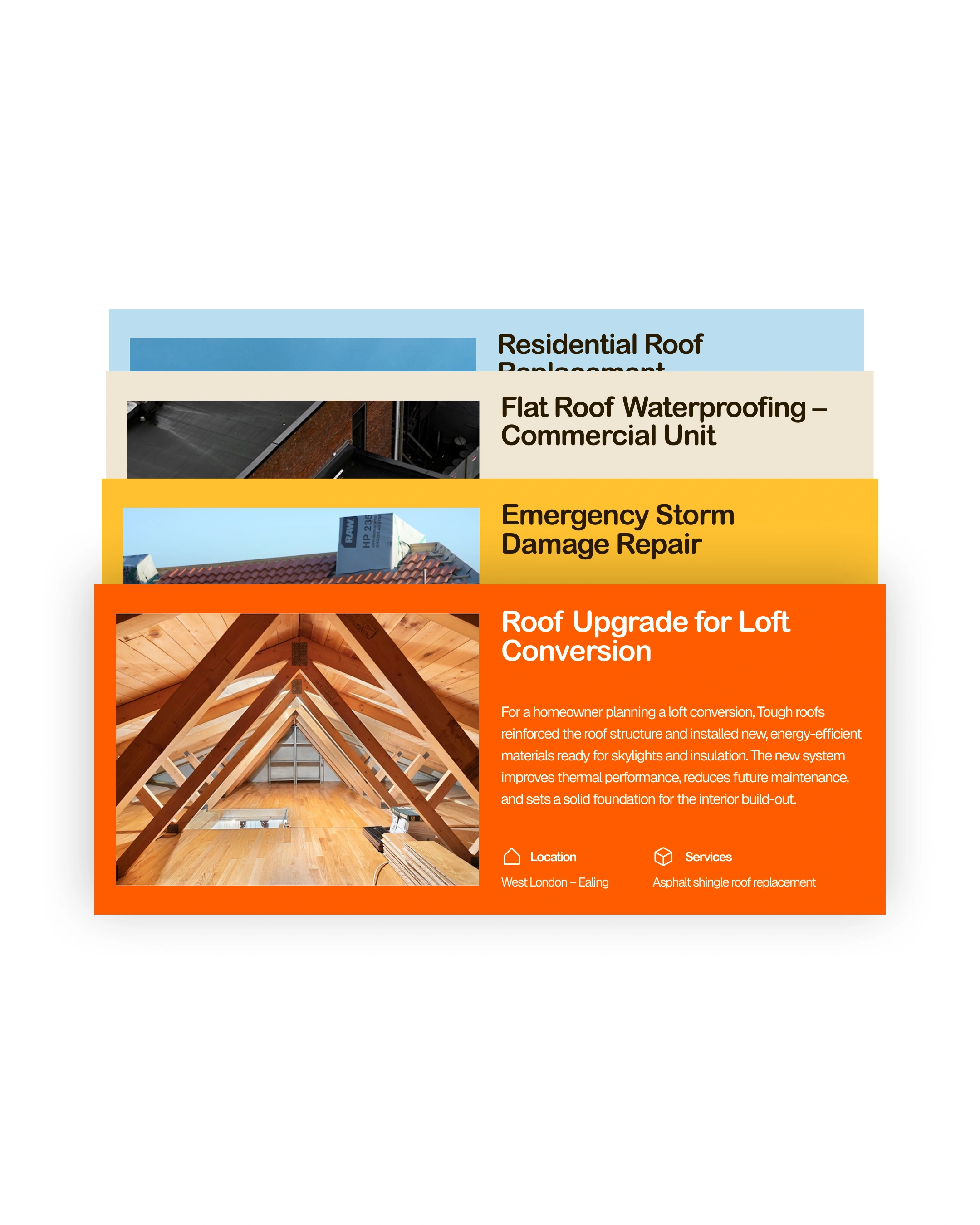
Clear content sections: benefits, services, FAQs, and support.
Repeated trust cues: plain‑language copy, benefit blocks, and supportive messaging rather than technical jargon.
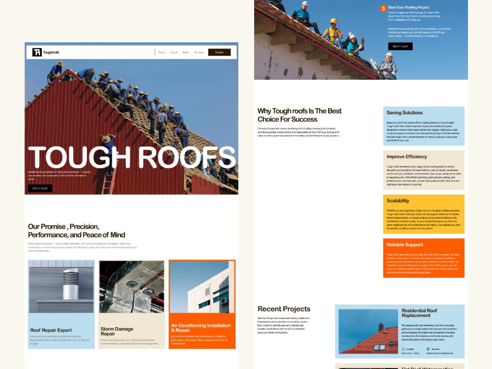
Roofing is a high‑trust, low‑glamour category, so I aimed for a confident but approachable visual style:
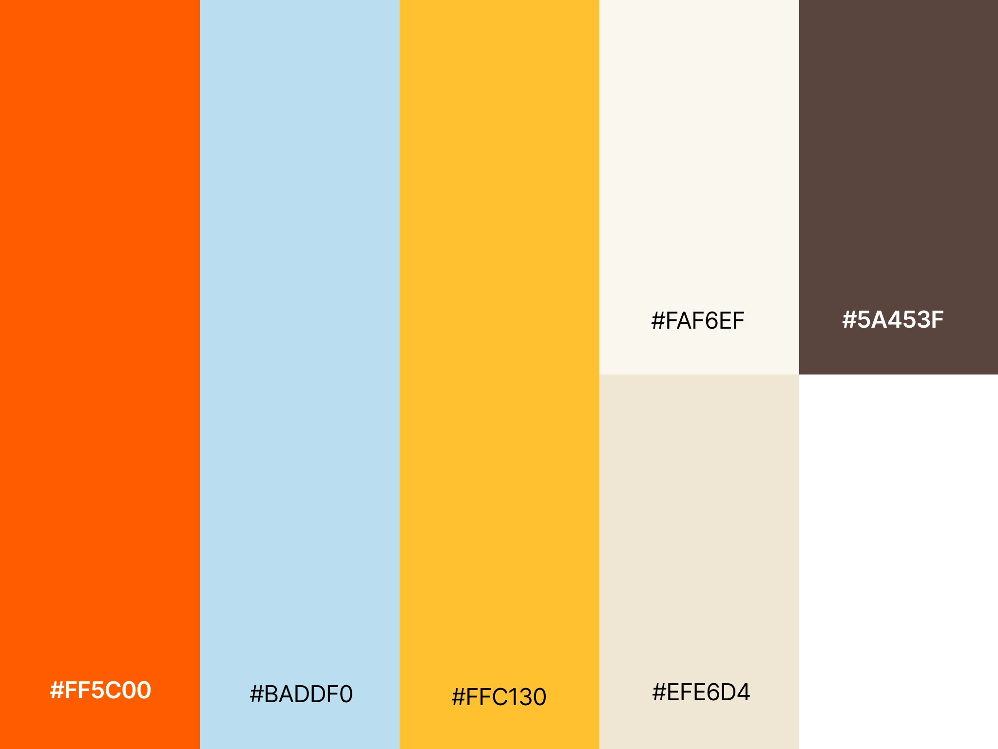
Strong color blocks (e.g., bold orange and muted neutrals) to highlight key promises like “Reliable Support” and “Saving Solutions,” creating immediate visual hierarchy.
Asymmetric and rotated cards (like the diagonal “Reliable Support” block) to add energy and differentiate Toough Roofs from typical, template‑looking contractor sites.
Plenty of whitespace around each benefit card so the copy remains readable and doesn’t feel like an ad banner.
C
Like this project
Posted Apr 30, 2026
Designed a user-friendly roofing website focusing on trust and engagement.