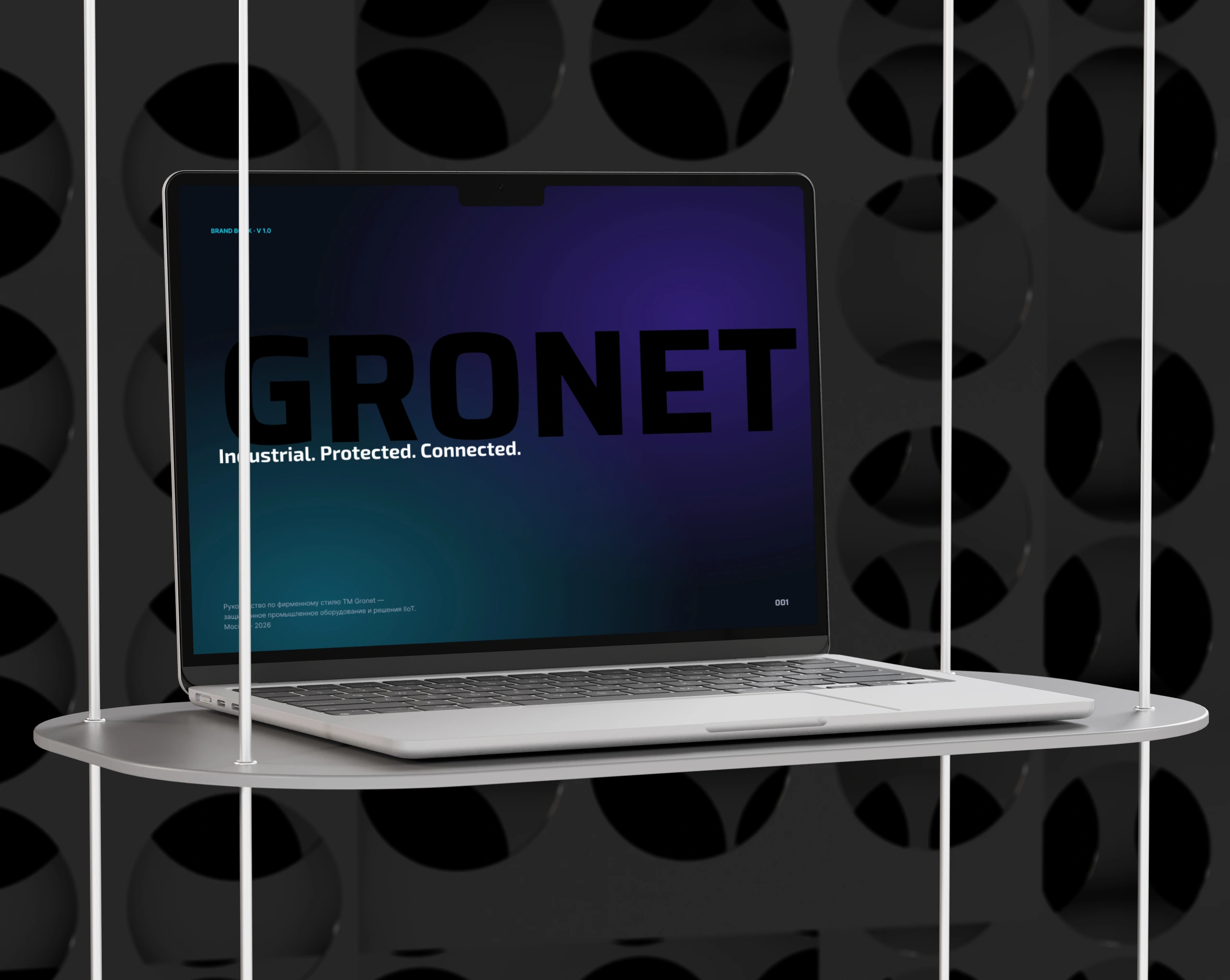
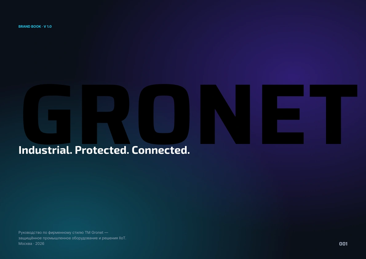
GRONET — Brand Identity System for Rugged Industrial Tech

Igor Solominskiy

GRONET — Brand Identity System for Rugged Industrial TechVisual identity, brand book, and design system for a
manufacturer of IP65 industrial hardware serving energy,
oil & gas, mining, and government clients.
Gronet manufactures rugged industrial hardware — IP65 tablets,
laptops, data-collection terminals, industrial PCs, mini PCs,
comms equipment, and surveillance systems. Their gear is
deployed across power substations, drilling sites, mines,
transportation networks, and government infrastructure.
Section 1 · The Brief
The client came in with one asset: a logotype. No color
system, no typography, no usage rules. Marketing and sales
were assembling materials ad hoc, with every output looking
like it belonged to a different company.
The goal: deliver a complete identity system that lets in-house
designers and external vendors produce on-brand materials
without ever needing to consult the author.
Section 2 · The Challenge
The identity had to work simultaneously across three
contradictory pressures:
— B2B credibility. Materials end up in government tenders
and corporate procurement decks for some of Russia's
largest energy and infrastructure players.
— Engineering honesty. The product proposition is IP65,
MIL-STD-810H, and a 36-month warranty. The brand can't
overpromise where the product undersells.
— Modernity. Competitors in the rugged-computing segment
visually resemble 2008 product catalogues. There's a clear
opportunity to differentiate through design alone.
The system had to be self-explanatory enough that a freelance
designer could pick up the brand book at midnight and ship
a working banner by morning.
Section 3 · Approach & Process
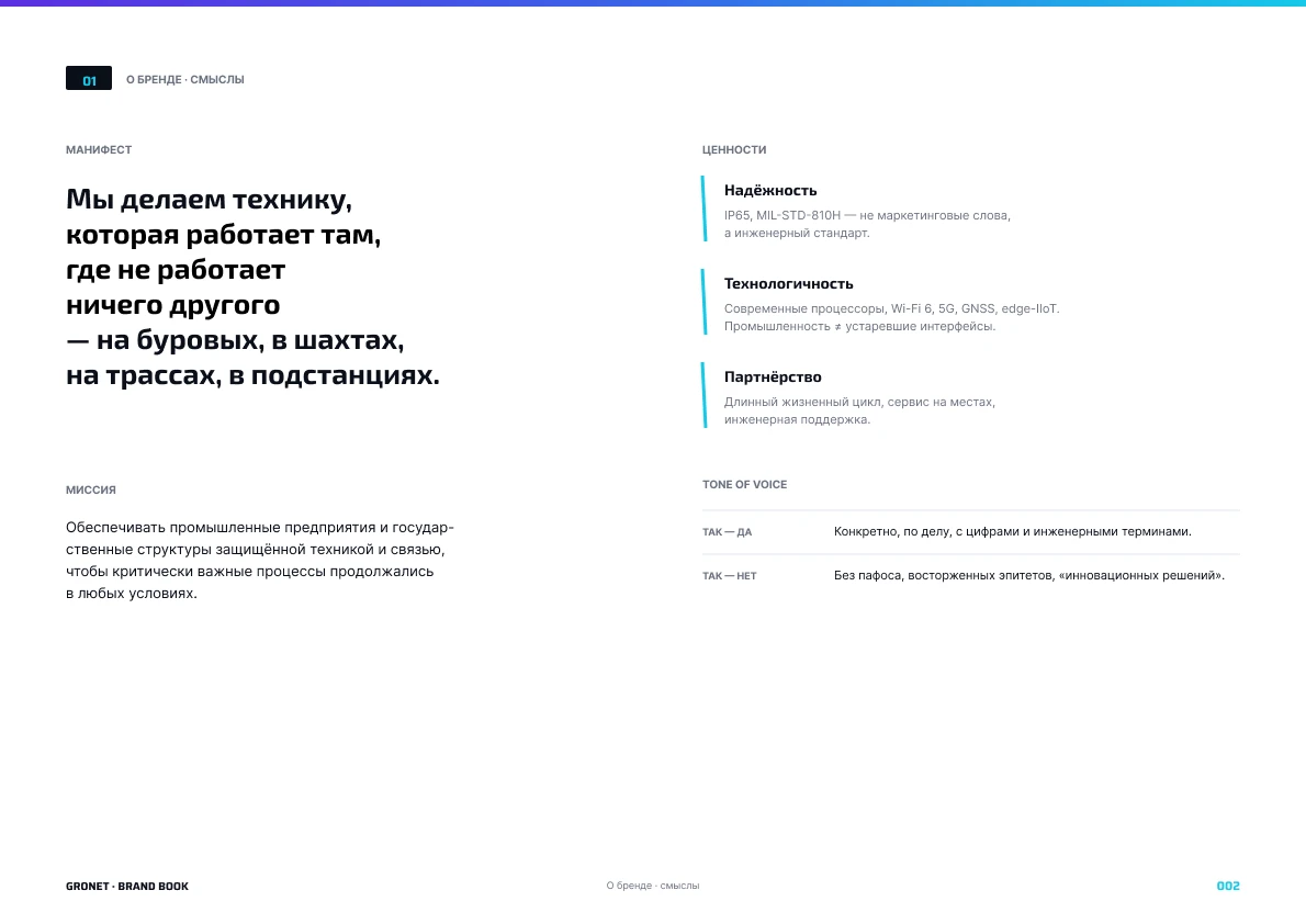
1 · POSITIONING. Wrote the manifesto and three brand values
(Reliability, Technology, Partnership) first. Without them,
any visual decision later becomes a coin flip.
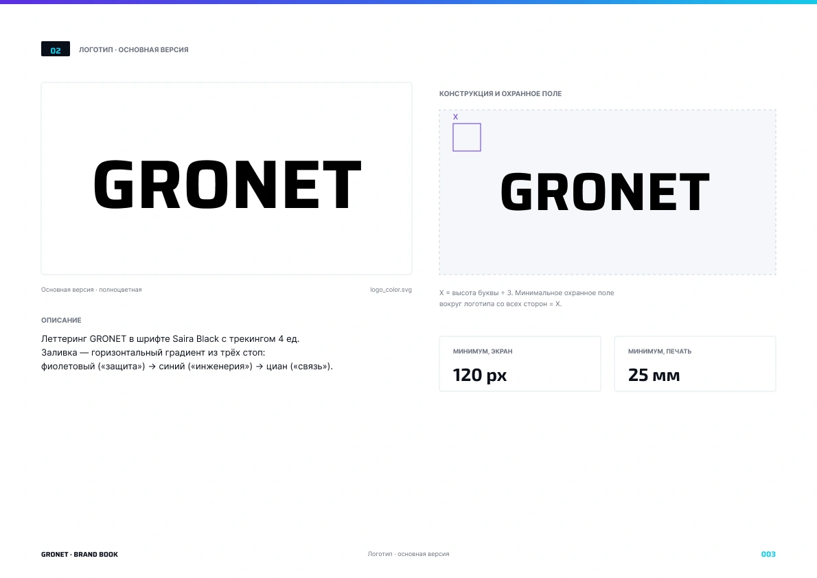
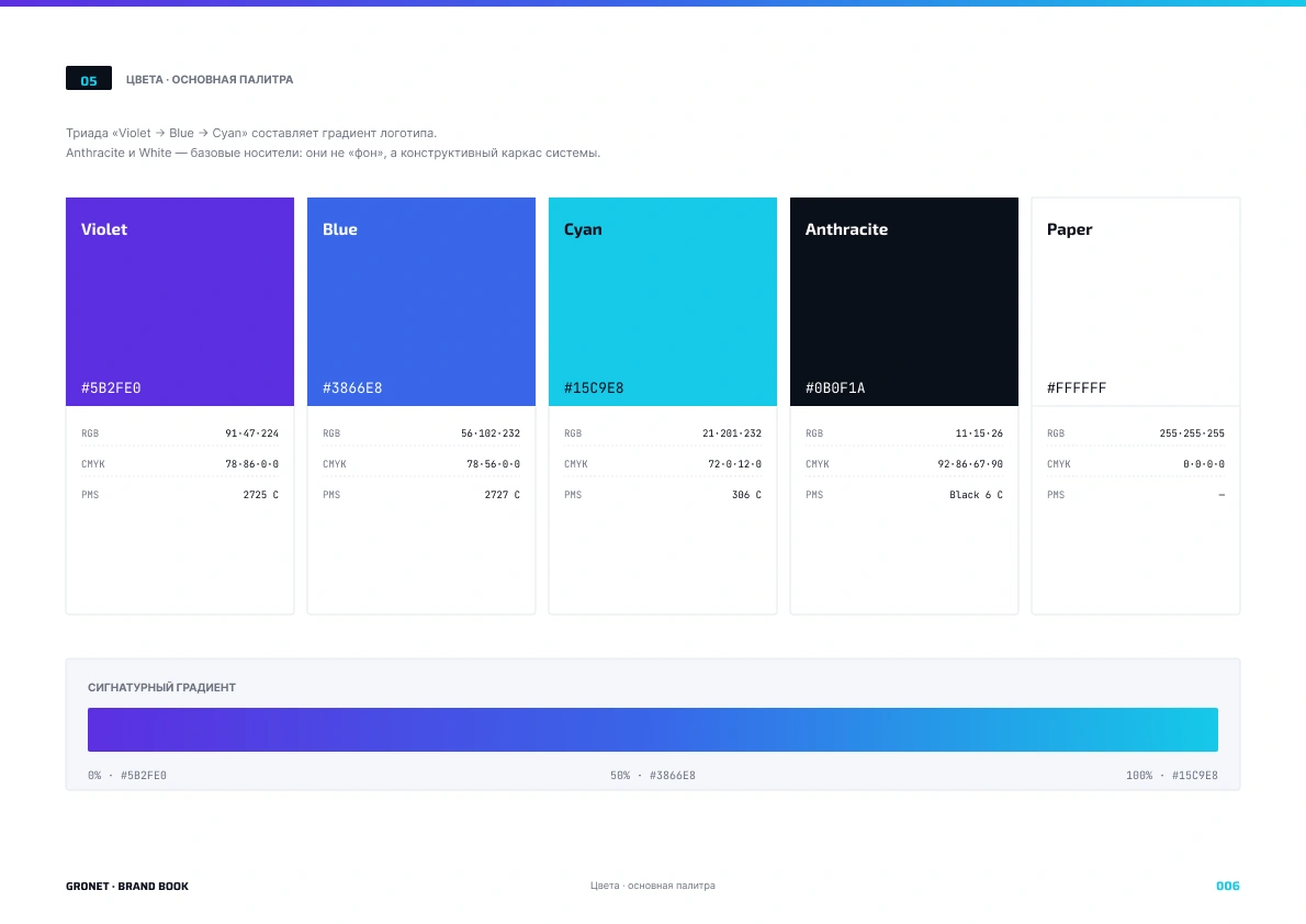
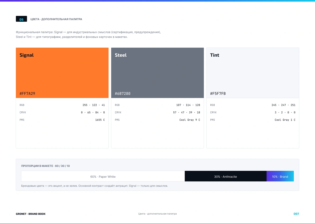
2 · COLOR. Anchored on the existing logotype gradient
(violet → blue → cyan), then extended it into a five-color
primary palette plus a three-color functional secondary
palette. Specified every color in HEX / RGB / CMYK / Pantone.
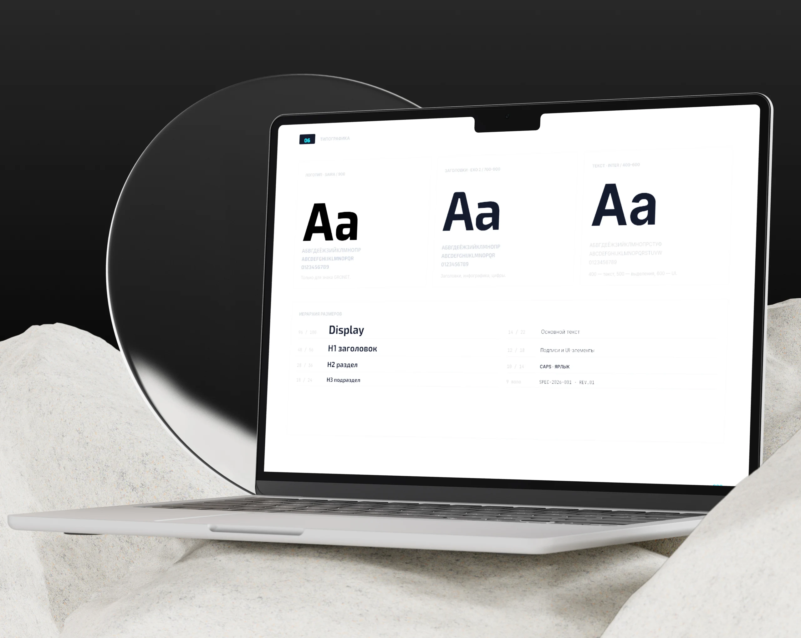
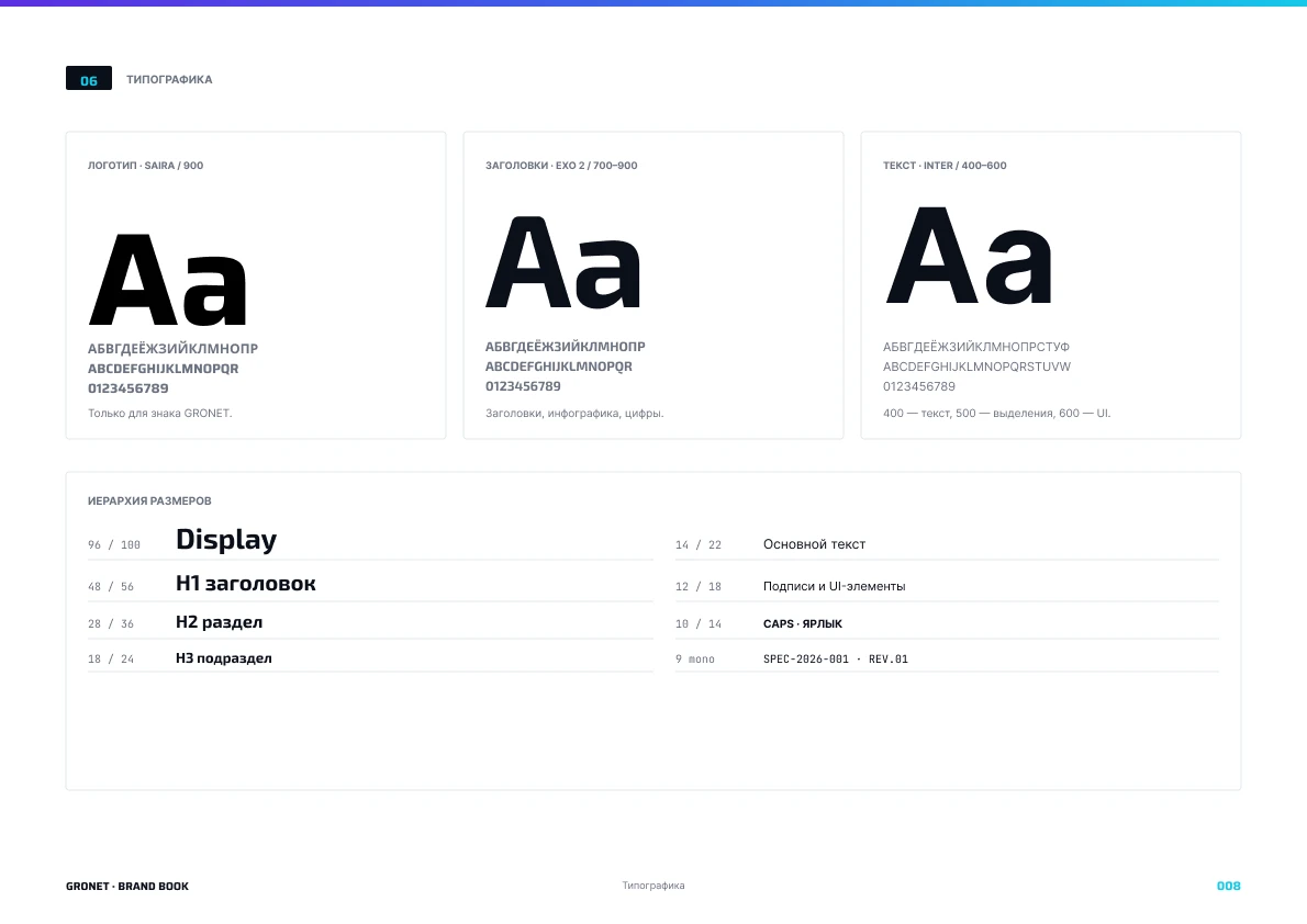
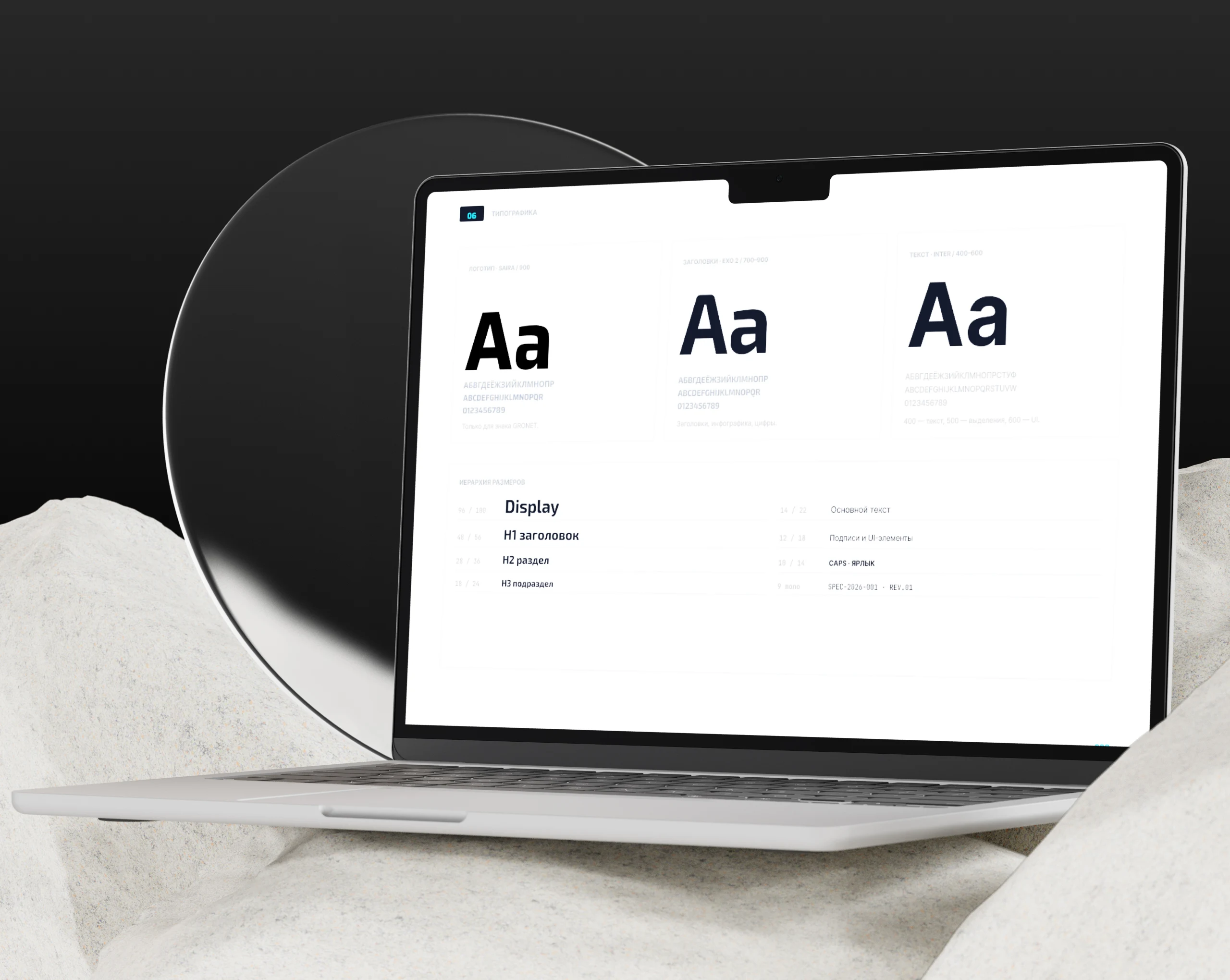
3 · TYPOGRAPHY. A three-typeface system — Saira Black for
the logotype only, Exo 2 for headlines and data accents,
Inter for body and UI, JetBrains Mono for technical IDs.
Each face has exactly one job; the whole system reads as
engineering precision, not graphic-design ornament.
5 · DELIVERABLES. The brand book is a printable HTML document
plus a stacked SVG source — one file that drags into Figma
and instantly becomes an editable, fully scoped design file.
Every asset (logo variants, patterns, icons, spec template)
also ships as an individual SVG.
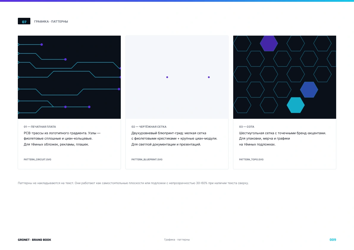
4 · GRAPHIC LANGUAGE. Three pattern families, each mapped to
a context: Circuit (dark, hero surfaces), Blueprint (light,
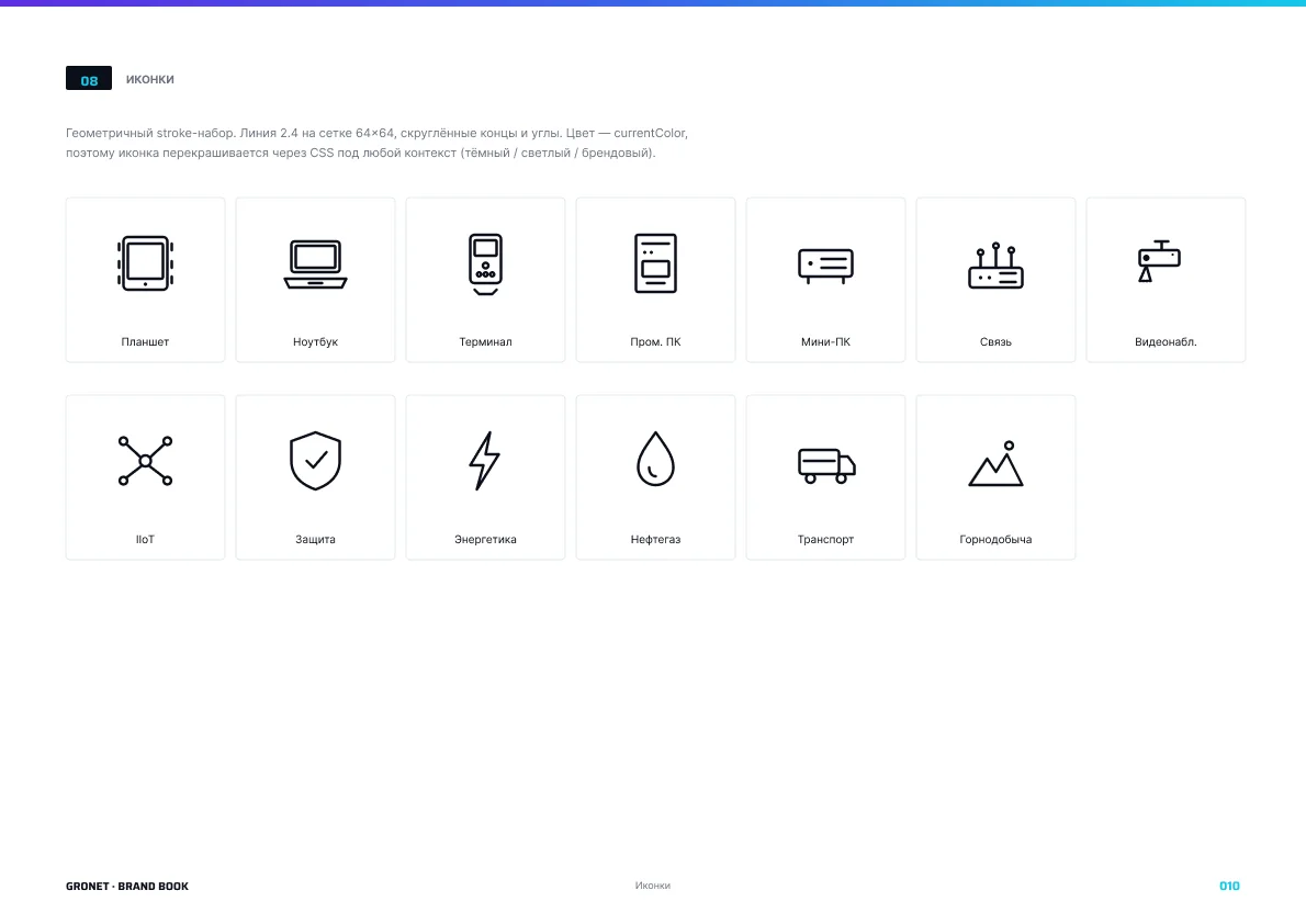
documentation), Hex (dark, packaging and merch). A 13-icon
stroke set on a 64×64 grid, recolorable through a single CSS
variable.
Section 4 · The Solution
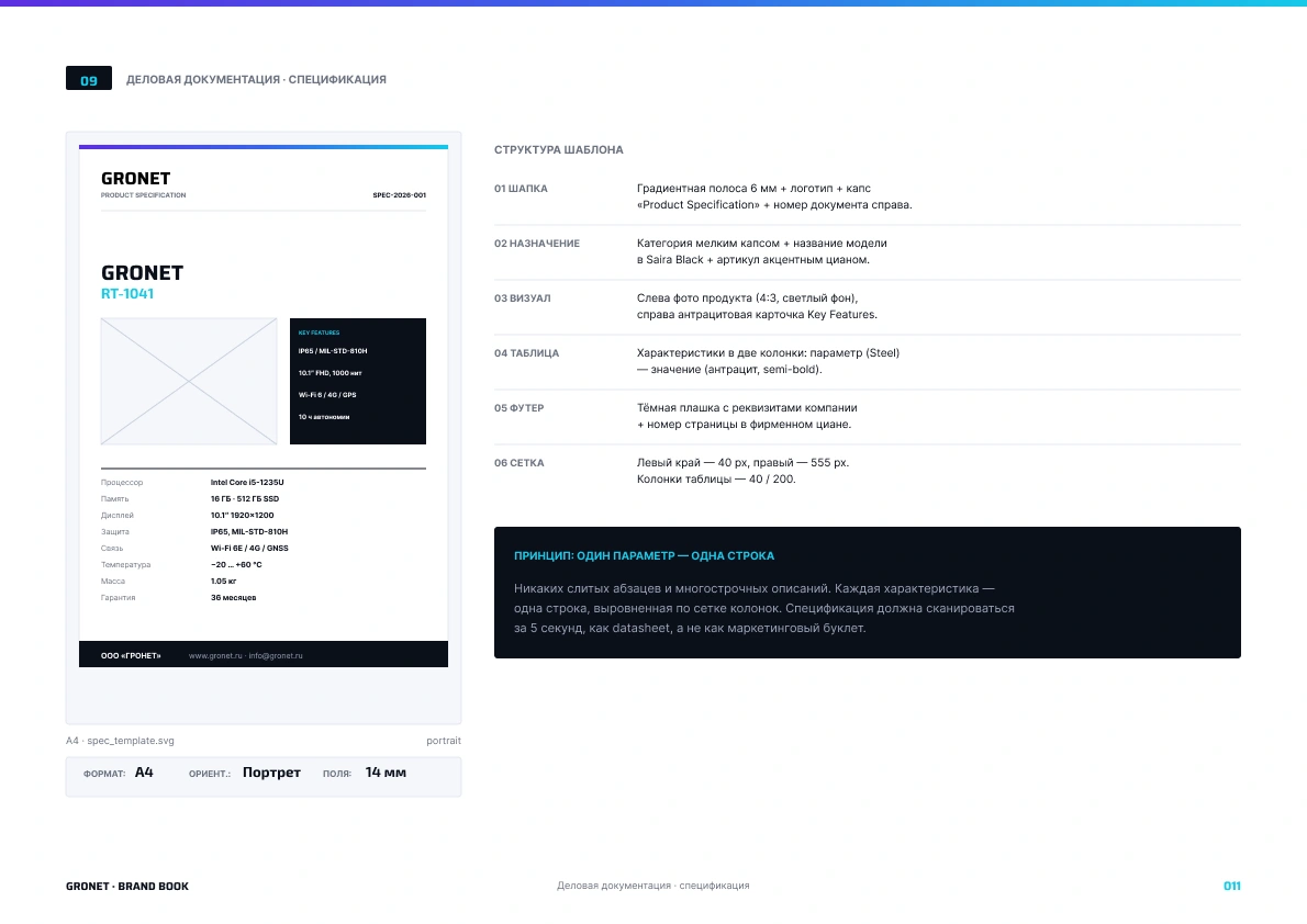
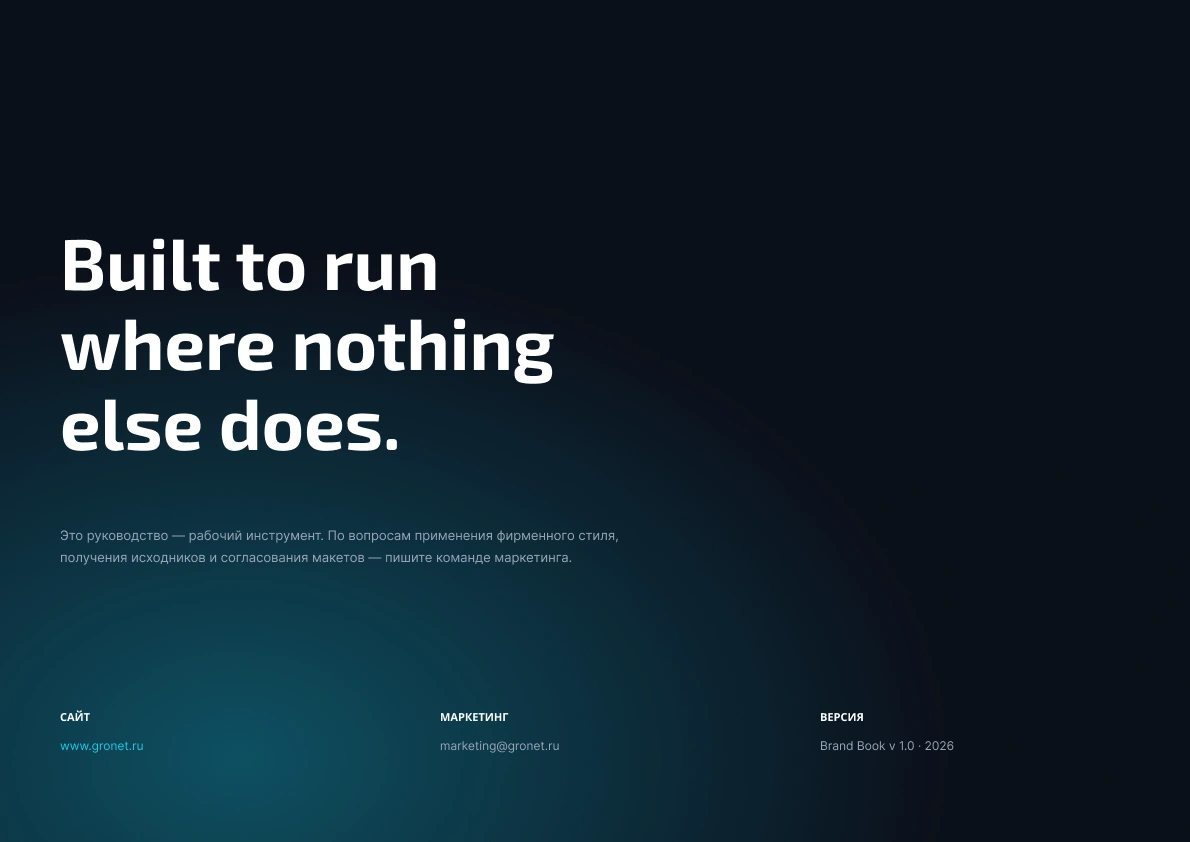
A twelve-spread brand book covering: cover, manifesto and
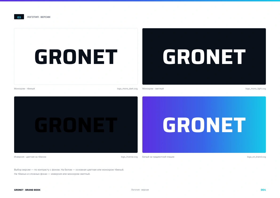
tone of voice, logo and construction, four logo variants,
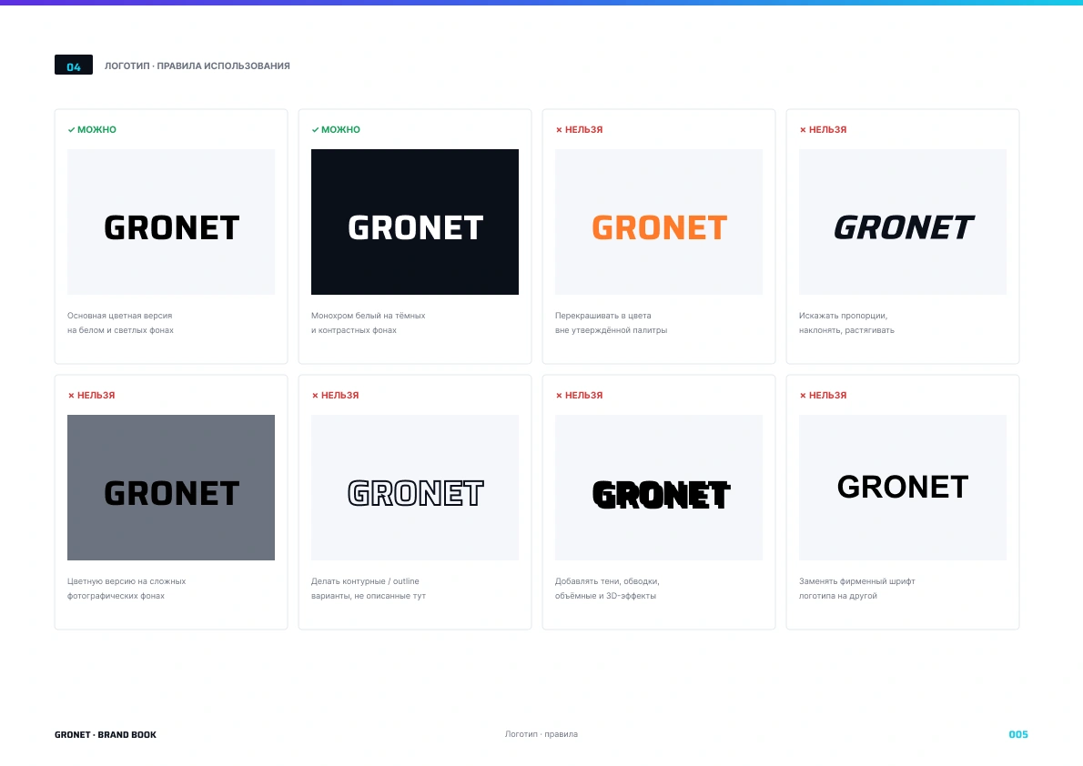
do's and don'ts (8 cards), primary palette (5 colors),
secondary palette and ratio rules, typography and scale,
three brand patterns, thirteen icons, product specification
template, and closing/contacts.
Design principle running through every page: 60% Paper,
30% Anthracite, 10% Brand. Brand color is an accent, never
a flood fill — the contrast comes from the dark base.
Source files: 1 HTML brand book · 1 stacked SVG for Figma ·
24 individual SVG assets · README with import instructions.
Section 5 · Outcome
The client received a working system, not just a document.
A vendor can now assemble a banner, a sales deck, or a
product specification sheet in under an hour, with zero
ambiguity about color, typography, or hierarchy.
The brand book is delivered open-format (HTML + SVG) so
the client can update it internally without locking into
any proprietary tooling.
Section 6 · Reflection
The hardest part of B2B industrial branding is resisting
the urge to make it "exciting." Engineers don't want
exciting. They want to see specifications and certifications.
The palette is deliberately cool. The typography is
deliberately functional. The graphic language is built on
references to the product itself — circuit boards, blueprint
grids, honeycombs. Every choice can be justified in
engineering language, and in B2B that's exactly the source
of its credibility.
Like this project
Posted May 28, 2026
12-spread brand book, full design system, and ready-to-edit Figma source for an industrial IIoT hardware manufacturer.
Likes
1
Views
0
Timeline
May 24, 2026 - May 29, 2026