Igor Solominskiy
Brand Identity & Graphic\Web Designer
New to Contra
Igor is building their profile!

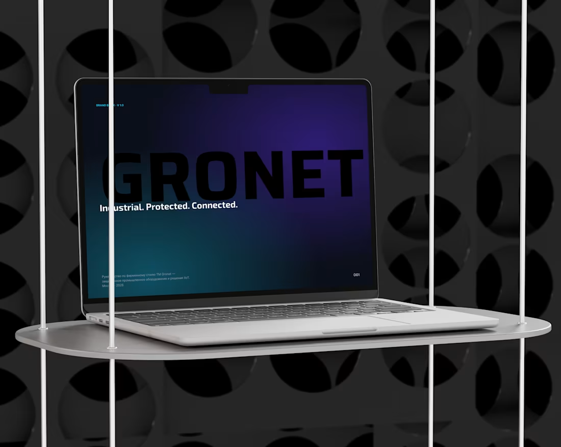
GRONET — Brand Identity System for Rugged Industrial Tech
1
0
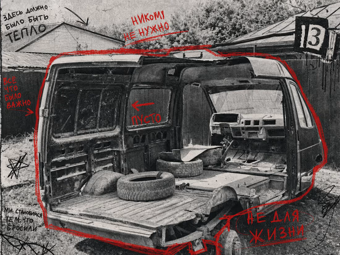
These are not landscapes. These are states of mind.
Shot on the outskirts of Novosibirsk, Russia — in yards, on roadsides, in places no one photographs because there seems to be nothing worth showing.
But that's exactly the point.
Red is the only color here. Not as decoration — as a wound. Handwritten text is not a caption. It's a verdict.
This series is about the specific feeling of a place that has been left behind.
By people.
By time.
By any hope of change.
1
28
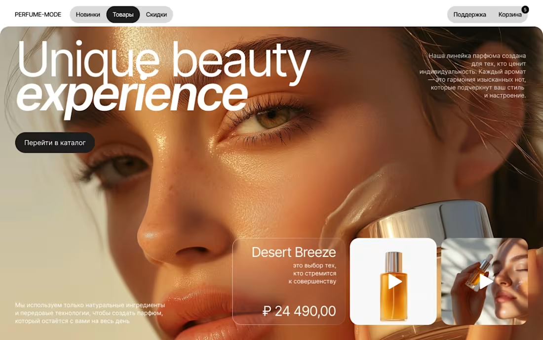
Lending Pages from study case.
1
32
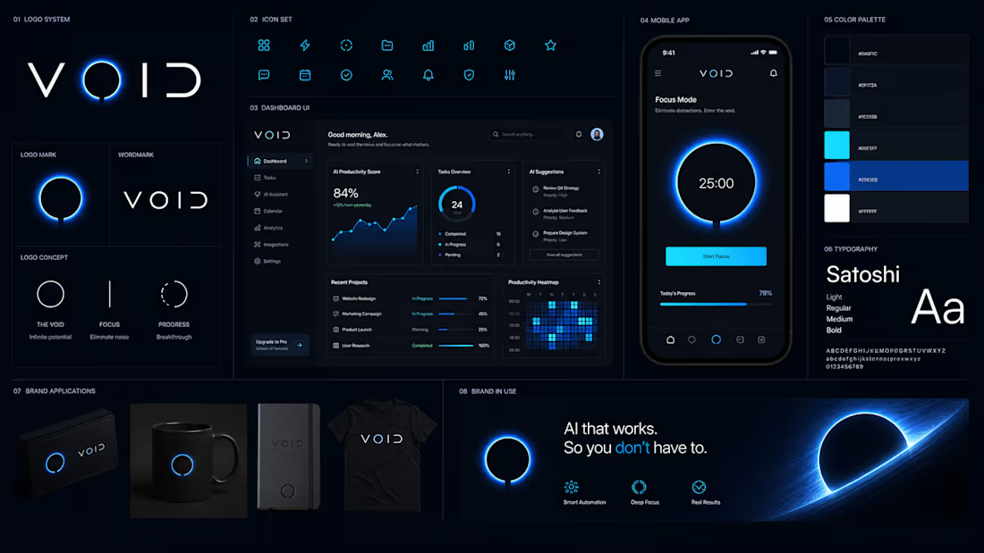
Brandbook for VOID eacommerce company
1
35
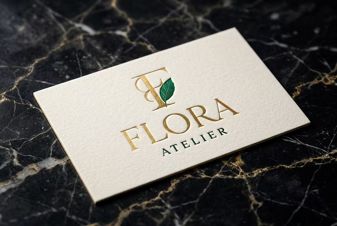
Floral atelier for premium event decoration and bouquet design. Target audience: couples planning weddings, corporate clients, gift buyers in the premium segment.
Problem
No visual identity. The business relied on word of mouth — no brand, no landing page, no consistent communication.
Task
Create a brand identity and landing page that communicates premium positioning and converts visitors into inquiries.
Solution
Developed a full identity system: logo, color palette, typography, and a landing page with clear CTA structure. Soft, elegant aesthetics aligned with the floral premium niche.
1
44
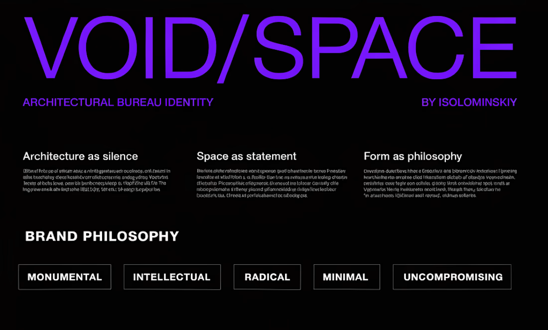
Architectural bureau specialising in commercial and residential projects. B2B audience: developers, investors, property owners.
Problem
Generic visual presentation that didn't reflect the bureau's expertise or build trust with high-budget clients.
Task
Develop a strict, premium identity system that communicates professionalism and architectural thinking.
Solution
Minimalist identity built on geometric logic — mirroring architectural precision. Monochrome palette with strong typographic hierarchy.
Every element has a structural reason.🙌
1
45