Phoenix Energy Drink
Case Study
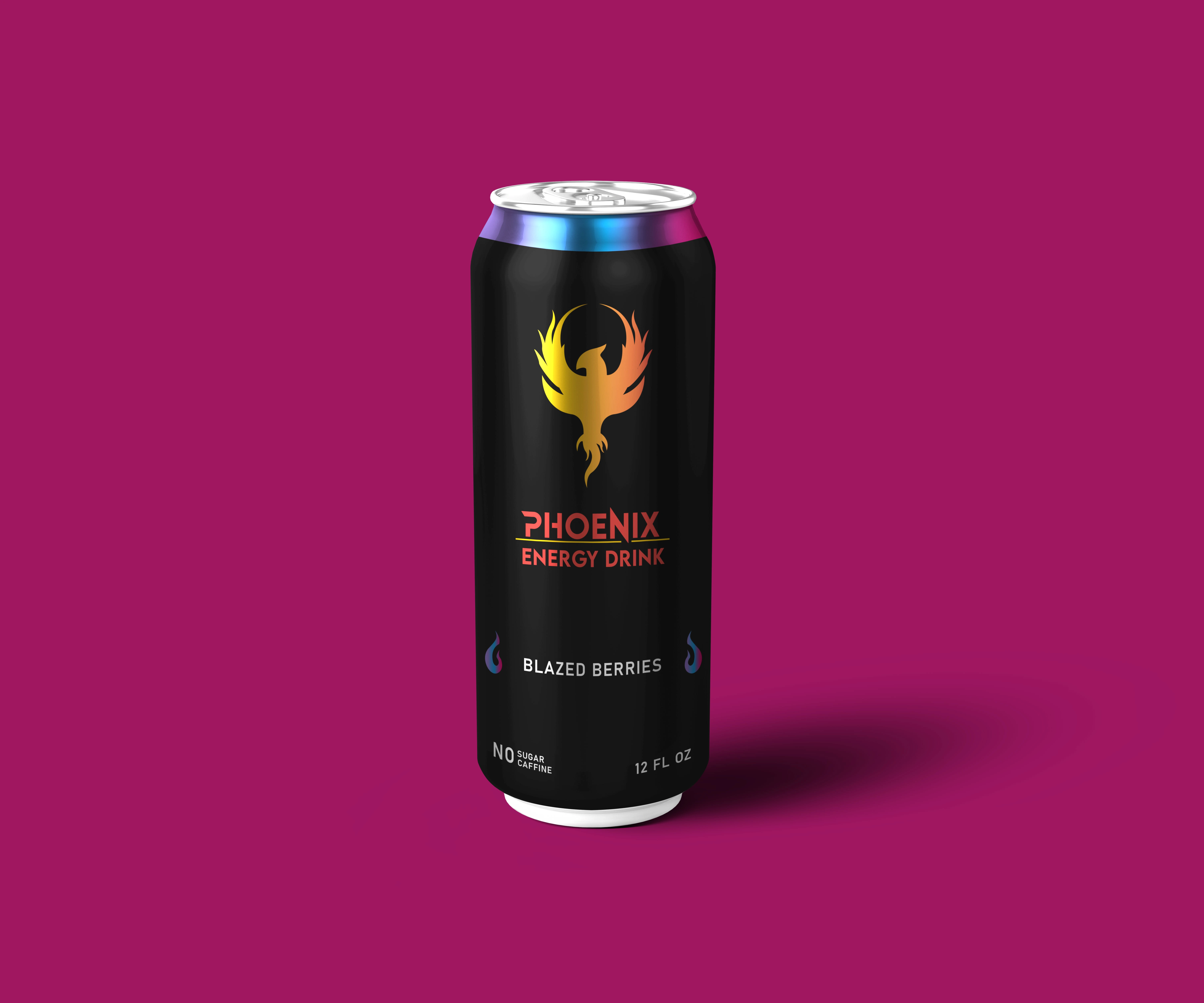
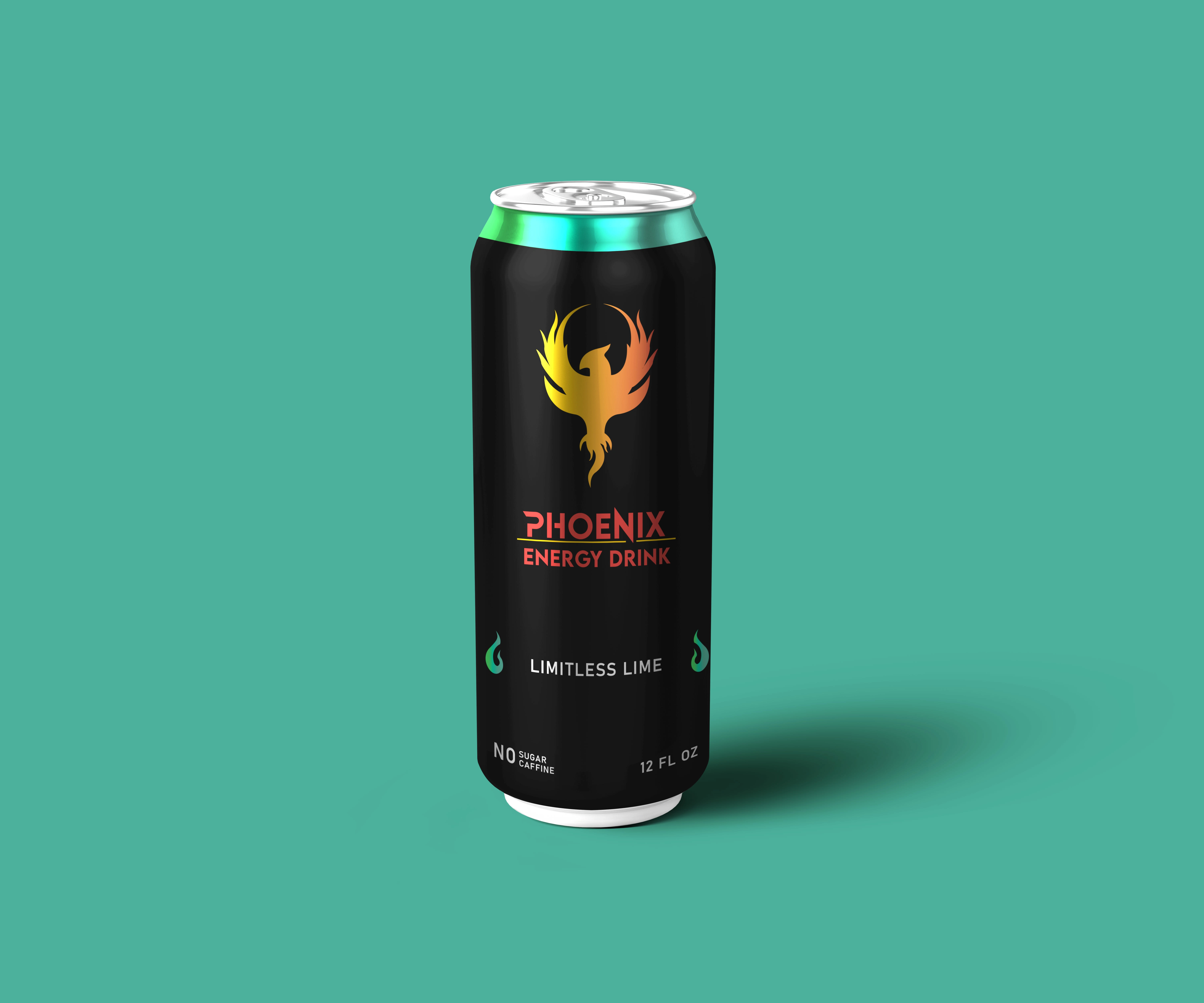
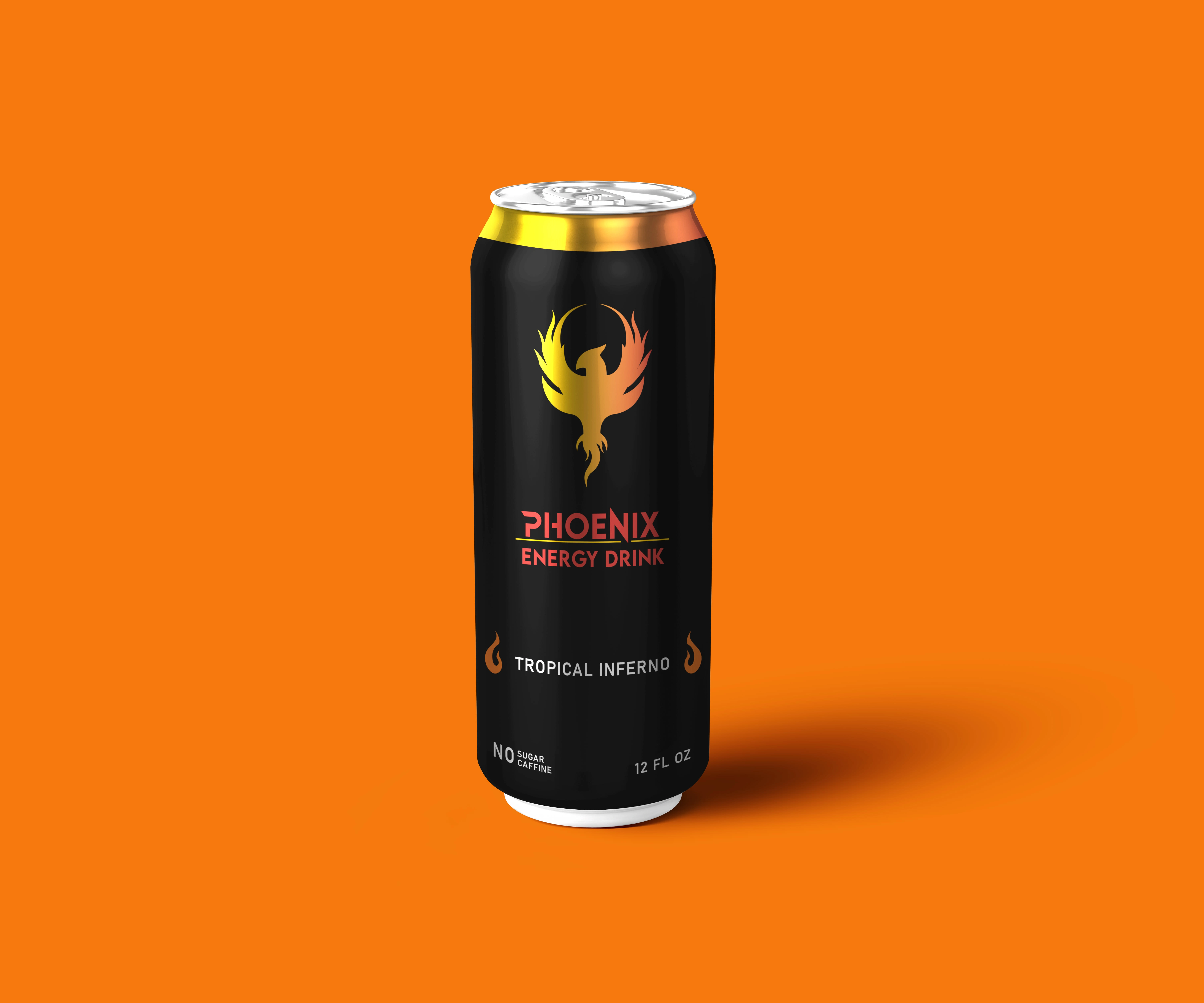
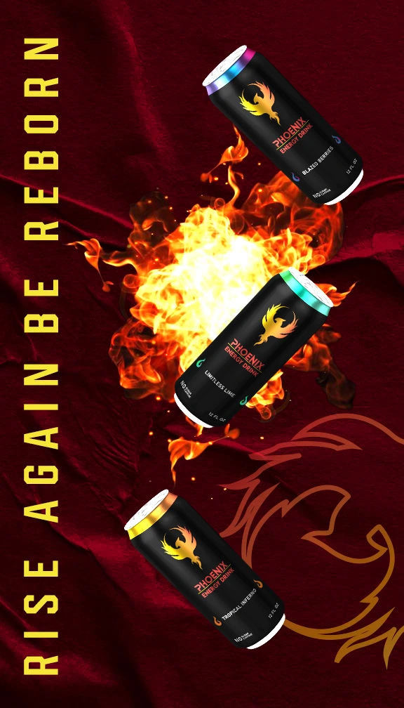
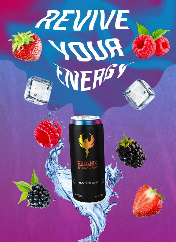
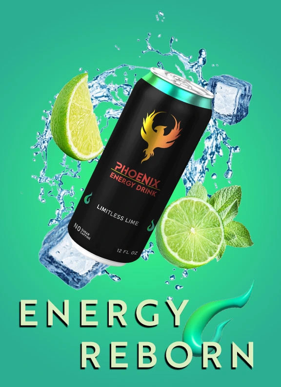
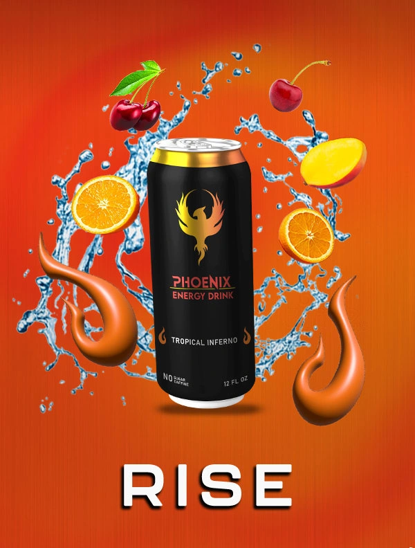
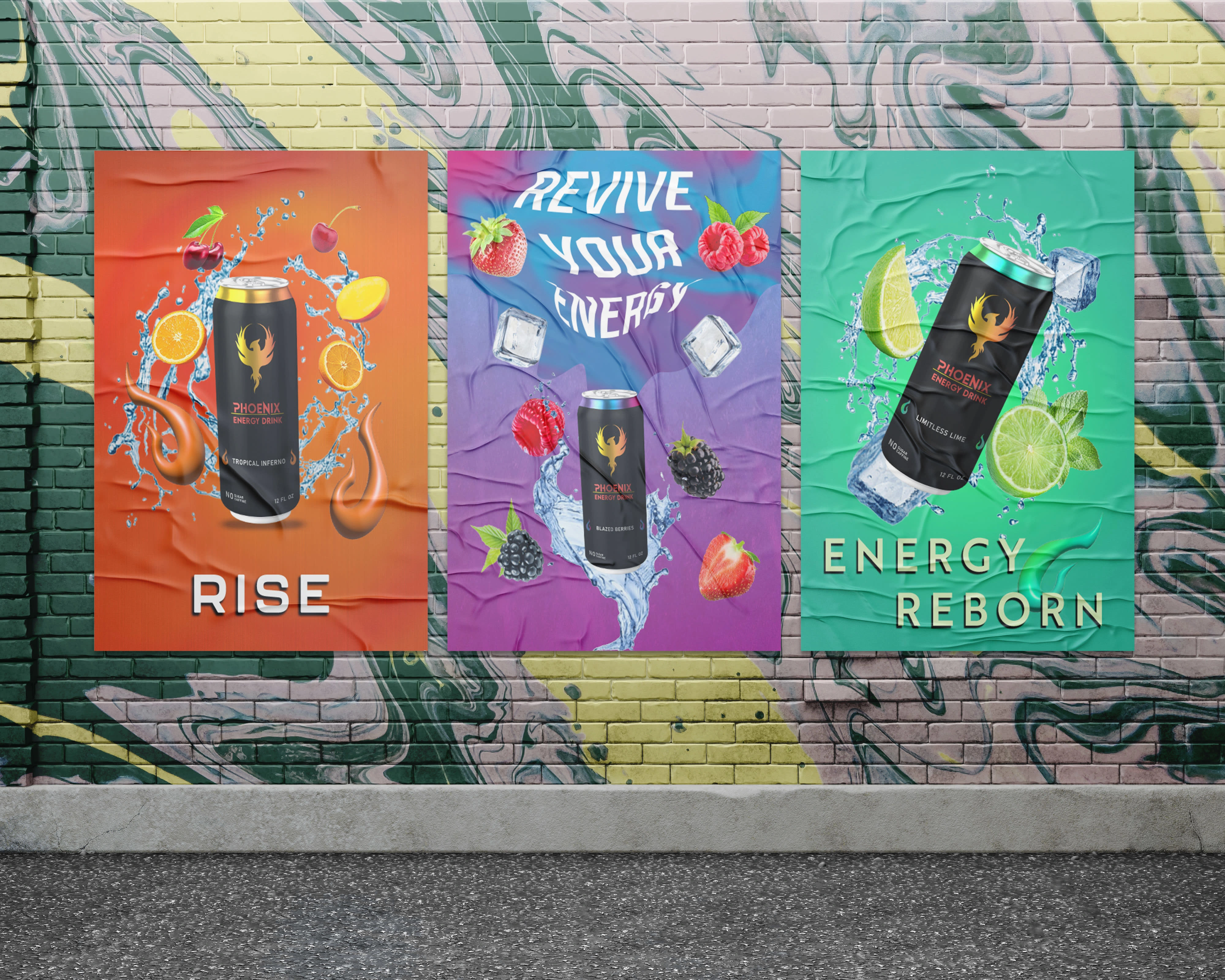
Phoenix Energy is an energy drink for young adults, gamers, athletes, and thrill-seekers. The phoenix inspires the logo and packaging, conveying renewal and vitality. Bold, vibrant, and appealing to an active lifestyle.
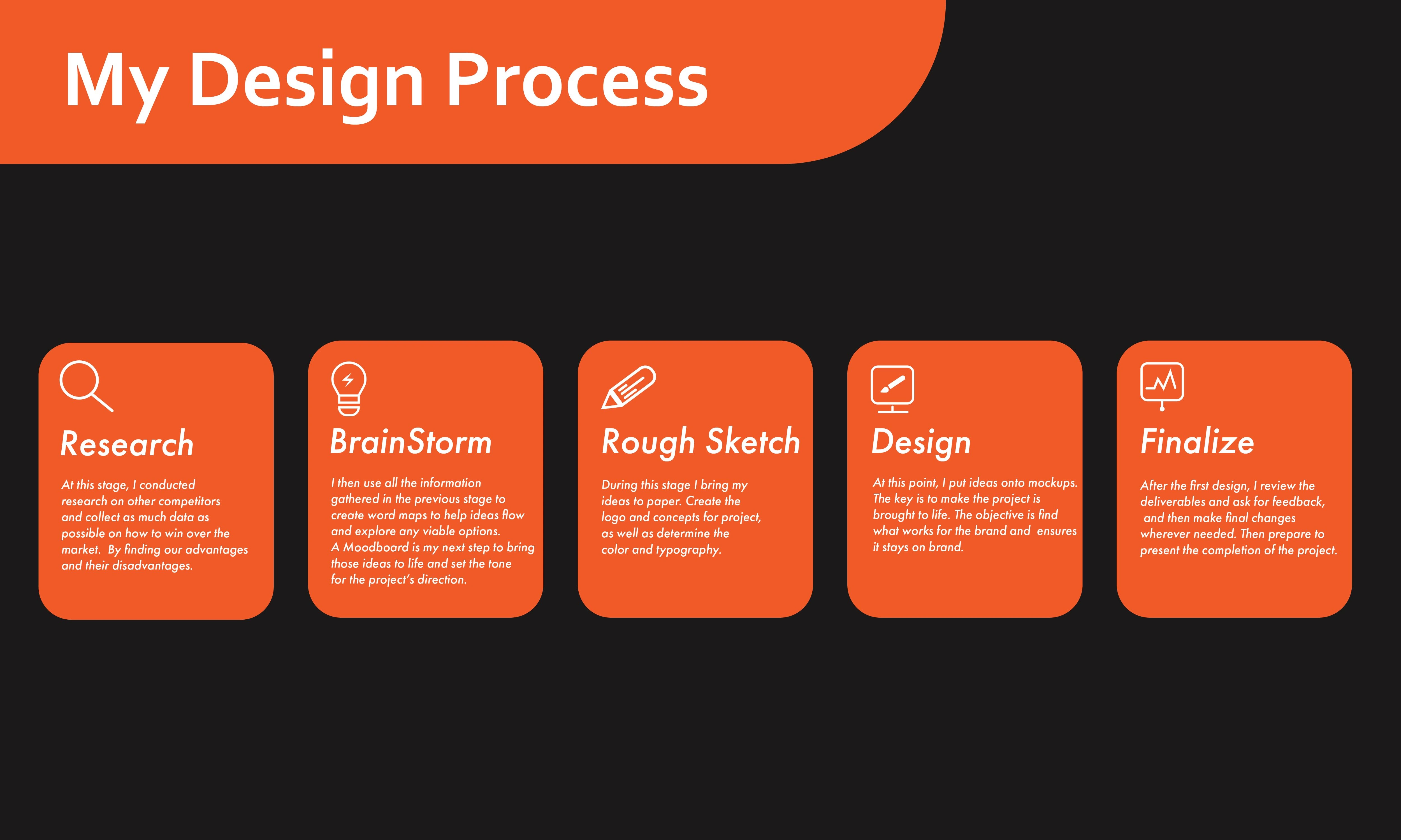
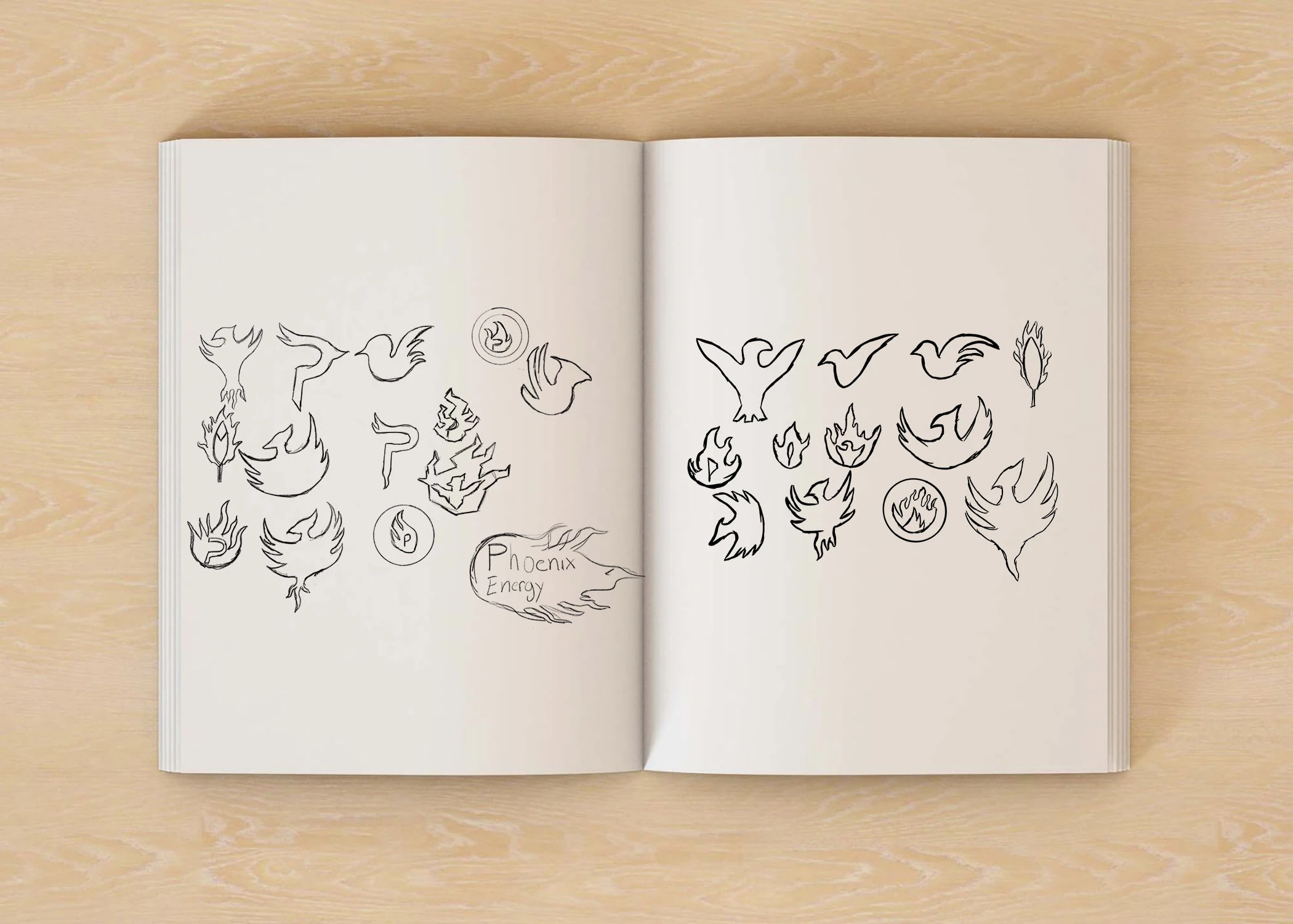
My Though Process
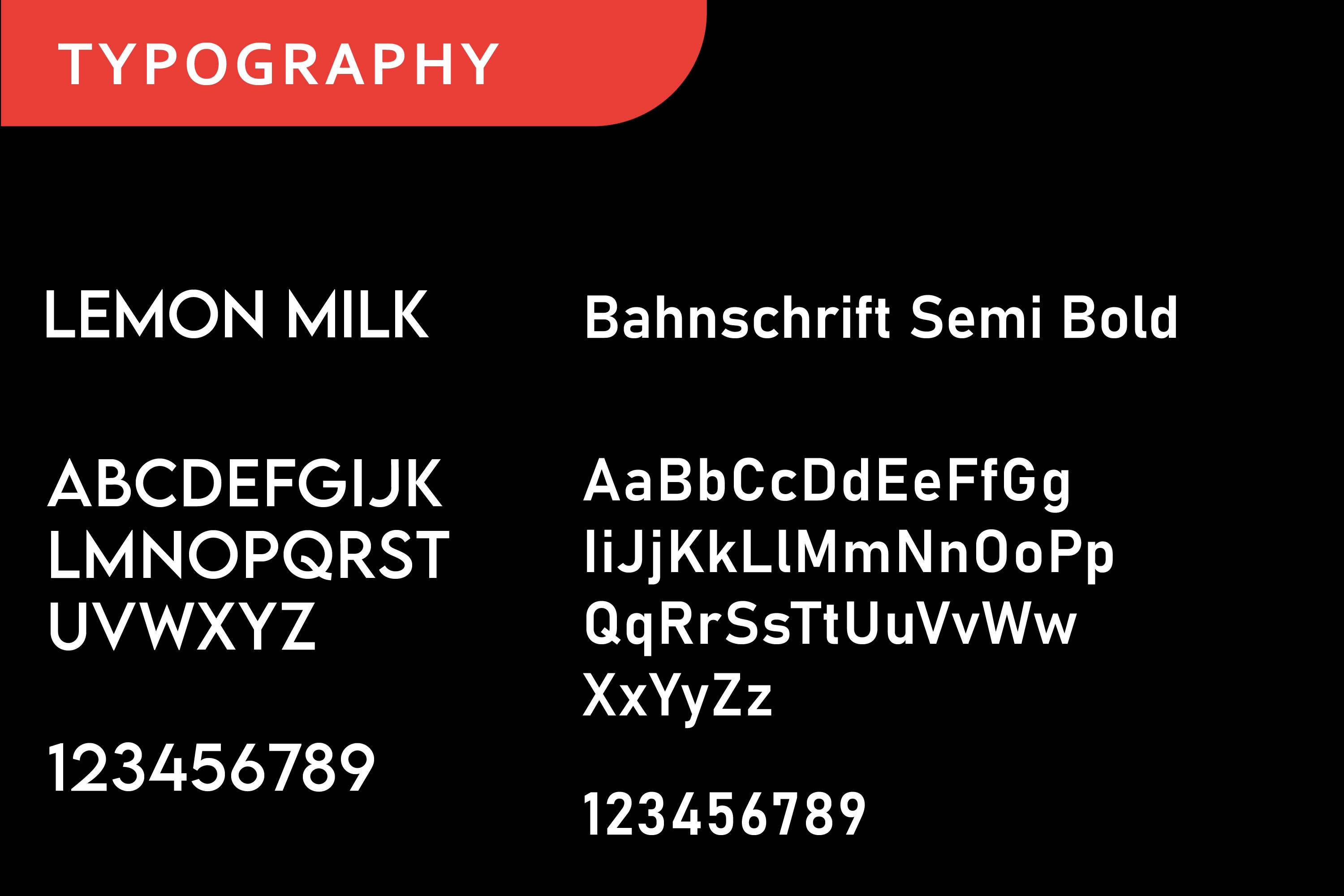
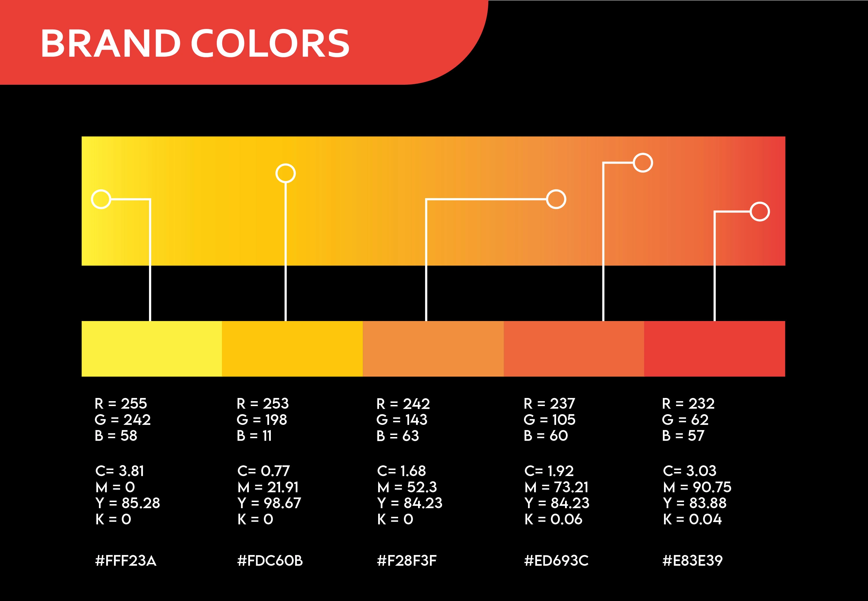
With its dynamic wing pose and fiery gradient, the phoenix logo embodies energy, power, and passion crucial for success in target industries. Modern typography enhances brand cohesion. This design reflects transformation, creating a memorable brand identity for the target audience. Understanding the brand and audience is vital to robust design.
Like this project
Posted Oct 1, 2023
Designed a dynamic phoenix logo for Phoenix Energy, capturing energy, power, and passion for target industries, and creating a compelling brand identity.
Likes
0
Views
121


